Why a Spring Poster Feels So Right Right Now
A spring poster works because it shifts the mood of a room faster than almost any other decorative change. After months of darker tones and heavier textures, walls respond well to imagery that suggests daylight, new growth and softer contrast. Floral studies, airy landscapes and botanical silhouettes all add that seasonal lift without forcing a full redesign.
Spring imagery also tends to be easier to live with than highly themed seasonal decor. A branch in bloom, a field of tulips or a delicate bird illustration feels fresh in March, but it still looks right in June and often through early autumn. That makes a spring poster a practical update rather than a short-lived one.
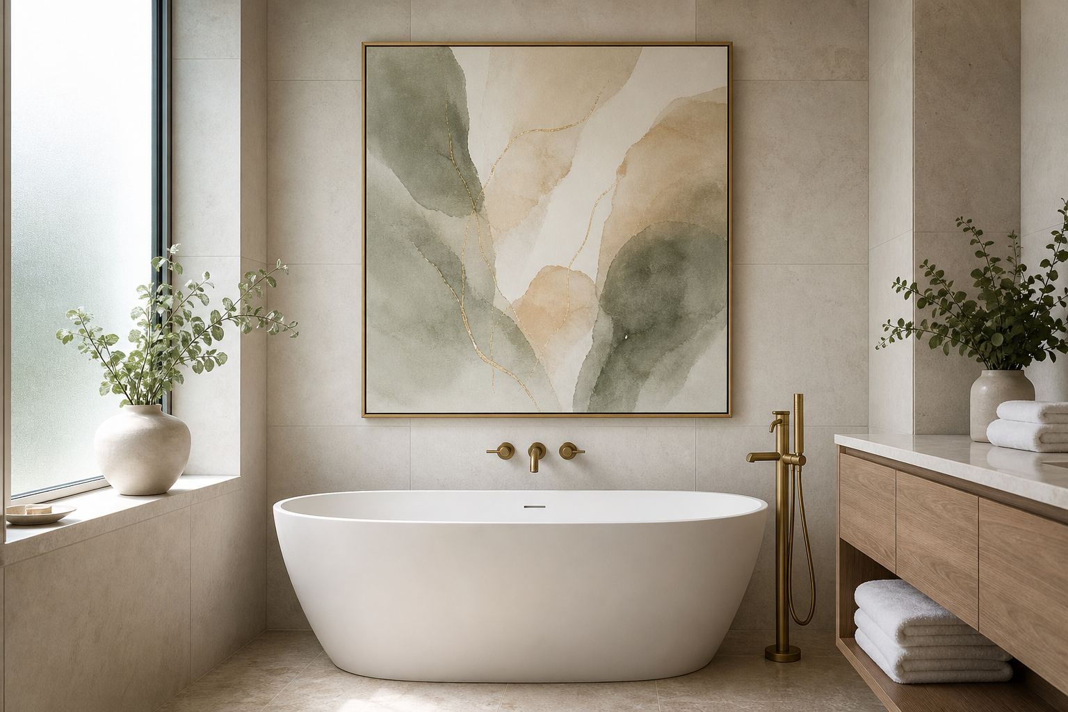
If your room already leans calm and natural, start with pieces from our botanical collection or nature art prints. These categories carry the colour cues that people associate with spring most strongly — sage green, petal pink, soft blue and warm cream.
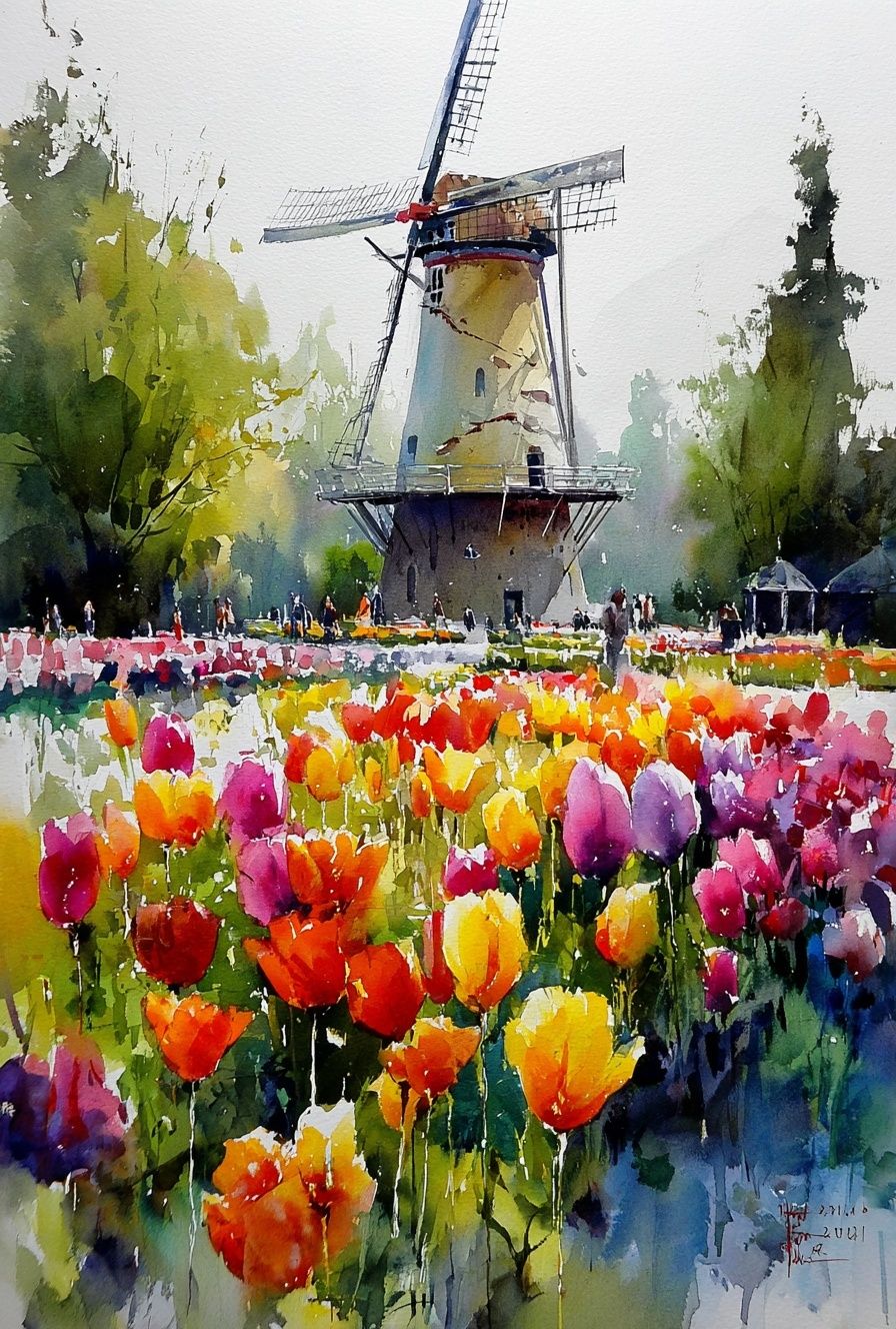
A scene like tulip fields or flowering branches adds seasonal energy without visual noise. In small rooms, choose imagery with open sky or negative space, because it creates more breathing room than dense all-over pattern. In practical terms, a print with 30% to 50% light background usually feels brighter on the wall than one dominated by dark foliage.
Choosing the Right Spring Poster Style
Not every spring poster needs to be floral. Florals are the obvious route, but they are only one of five strong spring directions: botanical patterns, landscape views, bird illustrations, soft abstracts and vintage garden-inspired art. The right one depends on your furniture lines, colour palette and how calm or expressive you want the room to feel.
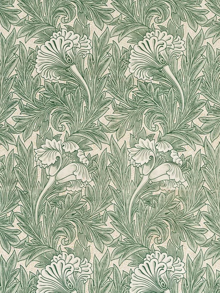
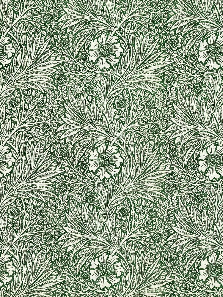
In a classic or slightly traditional home, William Morris designs are a strong fit because they bring spring plant life with more structure than loose watercolor florals. They pair especially well with oak, walnut and painted wood furniture.
If your room is simpler — think white walls, pale wood, low-profile furniture — go lighter and more pared back. A piece from our minimalist art prints such as floral silhouettes or a reduced vase study will feel spring-like without adding too much detail. The same applies to Scandinavian-style spaces where one quiet piece often works better than a busy gallery.
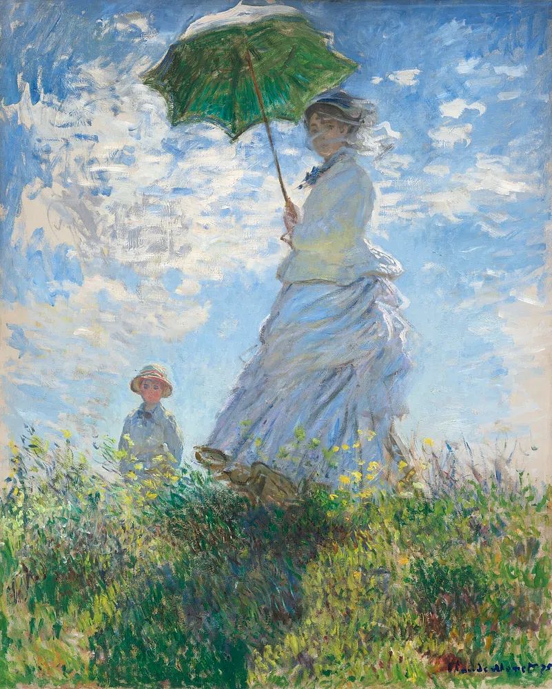
For softer, more romantic interiors, impressionist and painterly works bring movement that feels seasonal without being literal. A piece like Woman with a Parasol has light, breeze and colour built into the composition, which makes it a natural spring choice for bedrooms and sitting rooms. If you prefer a looser decorative layer, explore our fine art prints for landscapes and figure studies with pastel-led palettes.

Bird motifs are another smart option when you want spring without relying on blossoms. They work particularly well in hallways, kitchens and guest rooms where a botanical pattern might feel too dense. illustration prints often have the cleanest outlines and the easiest colour stories to mix with existing decor.
Colours That Make Spring Art Work in Any Space
The most reliable spring palette is built on four groups: pale florals, fresh greens, warm neutrals and one brighter accent. As a formula, aim for about 60% soft neutral base, 30% botanical or sky tones, and 10% stronger colour such as butter yellow, coral or leaf green. That ratio keeps the room fresh instead of sugary.
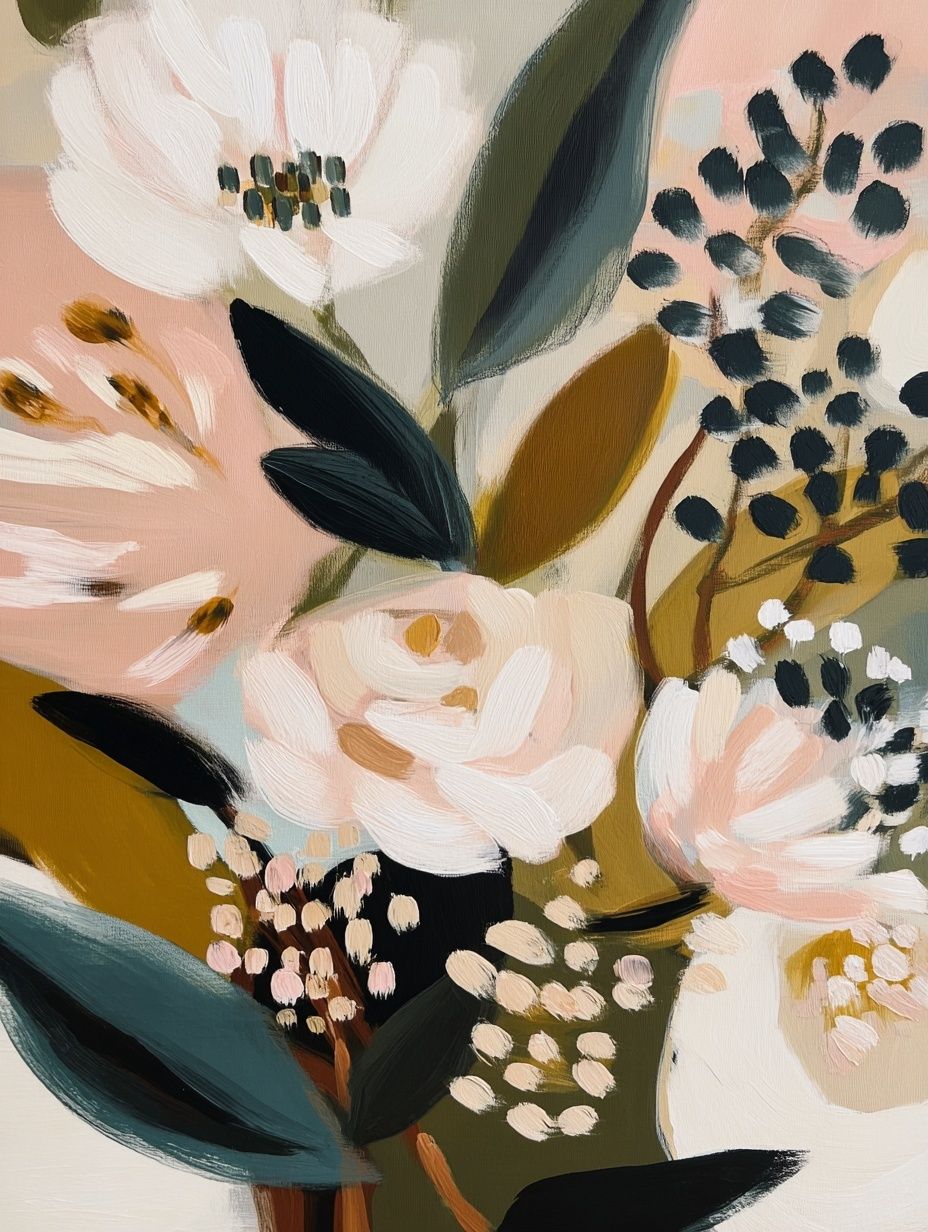
Pastels work best when they are slightly muted. Powder blue, dusty rose and soft lavender are easier to style than candy-bright versions. In living rooms, pair these shades with linen, boucle and light wood so the art feels integrated rather than floating on the wall. In kitchens, a sharper spring palette can work well — yellow, green and white often look crisp against tile, painted cabinetry or open shelving.

Green is the easiest bridge colour for spring art because it connects with both cool and warm interiors. Sage works with beige, olive works with terracotta, and soft mint works with white and gray. If you already have a neutral room, adding even one green-led piece from our Honeysuckle by William Morris or a landscape from the Serene Landscape watercolor print can make the whole palette feel more seasonal.
Brighter accents should stay controlled. One yellow element in the art can be enough to wake up a room, especially if you repeat it once more in flowers, a cushion or a ceramic object. If you use two or three vivid prints together, keep the frame finish consistent so the display still reads as one composition.
Where to Hang a Spring Poster for the Biggest Impact
The biggest impact usually comes from placing a spring poster where natural light already supports the mood. Above a sofa, over a bed, at the end of a hallway or near a breakfast nook are the strongest options because those areas catch the eye several times a day. Good placement makes seasonal art feel intentional rather than tucked into spare wall space.
In the living room, center the artwork at eye level — roughly 145 cm from the floor to the middle of the frame. Above a sofa, the total width of the artwork should be around 60% to 75% of the sofa width. For a 200 cm sofa, that means a single large 120 x 80 cm print or a pair of 50 x 70 cm frames often looks balanced.
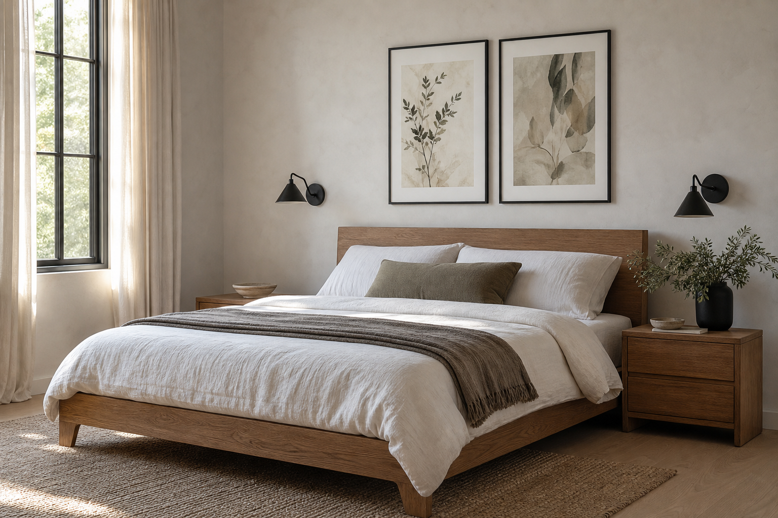
In bedrooms, choose calmer imagery and hang it 15 to 25 cm above the headboard. Floral line work, soft landscapes and airy figure studies are especially effective there because they support rest instead of demanding attention. For narrow hallways, use vertical pieces to draw the eye upward and prevent the wall from feeling cut in half.

Kitchens and dining corners are often overlooked, but they suit spring artwork especially well. A 30 x 40 cm or 40 x 50 cm frame near open shelves, a breakfast table or a sideboard can refresh the whole zone with very little effort. Look at our bohemian wall art if you want a more relaxed, rustic spring look in these spaces.
Framing, Pairing and Layering for a Seasonal Look
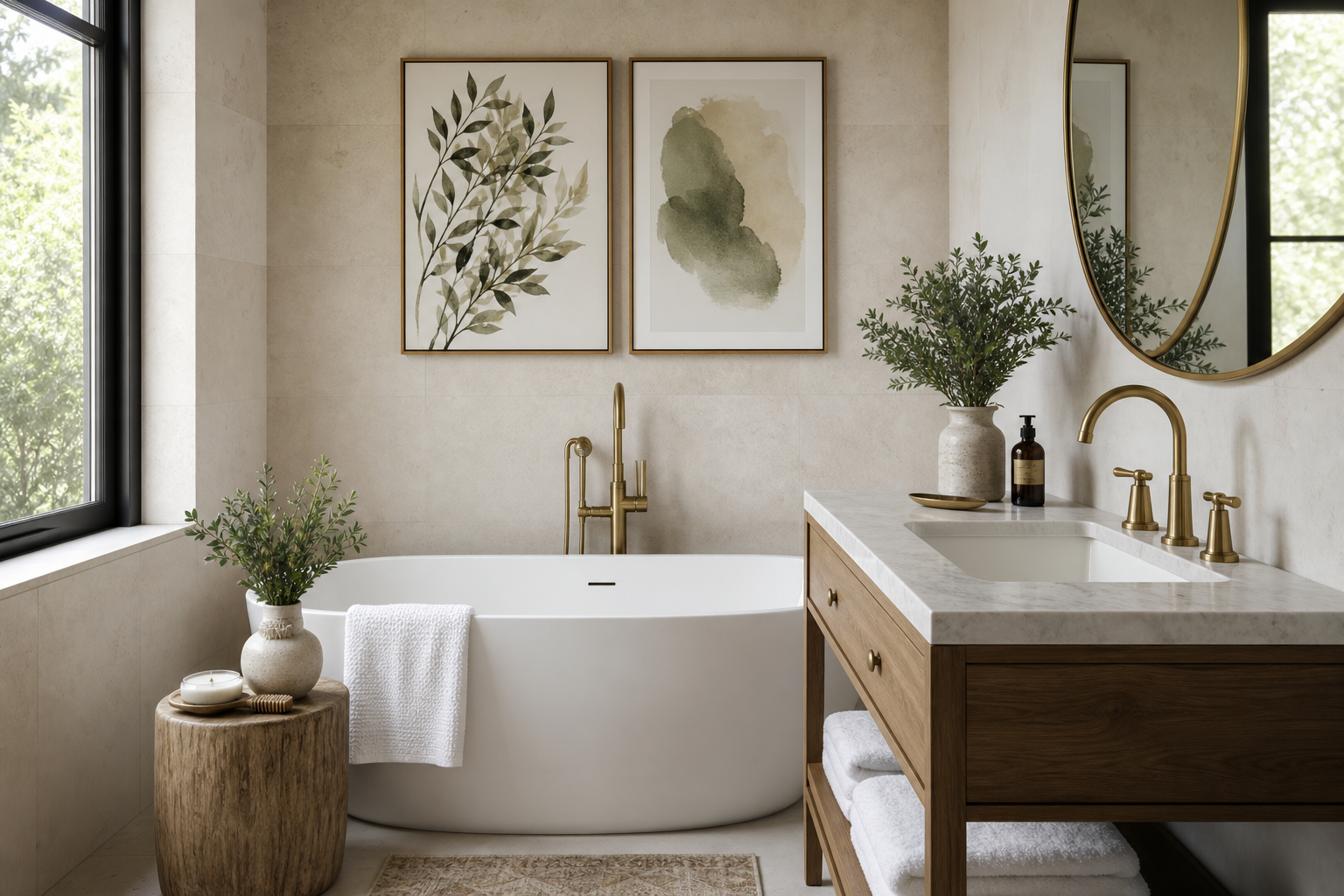
Frame choice changes how a spring poster reads. Light oak makes botanical and landscape art feel casual and Scandinavian. White frames sharpen pastel prints and keep them airy. Thin brass or muted gold brings elegance to vintage floral pieces, especially in more classic interiors. Black works too — but only when the image itself has enough softness to balance the contrast.

When pairing prints, keep one element consistent: palette, theme or spacing. The simplest combination is one focal floral or landscape piece paired with one quieter supporting print. For example, a detailed botanical design can sit next to a more restrained work from our Vase with Flowers minimalist print. That contrast prevents the wall from becoming too decorative.
A spring gallery wall does not need more than three to five pieces. Start with the largest frame first, then build outward using 5 to 8 cm gaps between frames. Mix one pattern-heavy work, one open composition, one vertical piece and one softer accent image. This creates rhythm without making the arrangement feel random.

If you like layered styling, place a smaller framed print on a shelf or console in front of a mirror or lamp rather than hanging everything. This works especially well in rentals because it reduces wall holes and makes seasonal swaps easier. One leaned frame, one vase of branches and one stacked book pile is often enough.
Easy Ways to Switch Your Walls for Spring
The easiest seasonal update is not buying all-new decor — it is rotating 1 to 3 frames in the places you notice most. Focus on one anchor wall in the living room, one smaller piece in the hallway, and one bedside or kitchen print. That level of change is visible, but it does not create storage problems for the rest of the year.
If you want flexibility, standardize your frame sizes. Keeping most of your art in 30 x 40 cm, 50 x 70 cm and 70 x 100 cm formats lets you change the image while reusing the same frame. This cuts the cost of a seasonal refresh significantly and makes a spring poster feel like an easy styling tool instead of a commitment.
A second smart trick is to shift only the top visual layer of the room. Swap a darker winter print for a blossom study, add fresh branches, and lighten one or two textiles. That can change the perceived mood of the space by 70% without moving furniture. If you want a more decorative spring scheme, pieces from our Floral Birds bohemian print or Marigold by William Morris are useful accents because they bring colour and pattern in one step.
Final thoughts
A spring poster works best when it echoes the season through light, colour and subject matter — not when it tries too hard to look themed. Choose imagery that brightens the room you already have, then support it with the right frame, scale and placement.
Small changes are enough. One well-placed spring poster, one softened palette and one or two natural accents can make a room feel newly awake.
Frequently Asked Questions
What frame colour suits spring art best?
Light oak is the most versatile, especially for botanicals and landscapes. White works well for pastel-heavy prints, while thin brass suits vintage floral art.
Can I use spring wall art in a room with dark furniture?
Yes — choose prints with at least 40% light background so the wall art lifts the heavier furniture. Soft greens, cream and yellow are especially effective against walnut or black wood.
How do I hang art if I want to swap it seasonally?
Use the same frame sizes year-round and install two fixed hooks or picture ledges. That way you only change the artwork, not the hardware.
What spring artwork pairs well with minimalist interiors?
Look for reduced floral forms, silhouettes or airy landscapes with plenty of negative space. Avoid dense pattern unless the rest of the room is very restrained.
Is one large print better than several small ones for spring styling?
In most rooms, yes — one large piece creates a cleaner seasonal statement. Use multiple small frames only if you can keep spacing tight and the palette consistent.