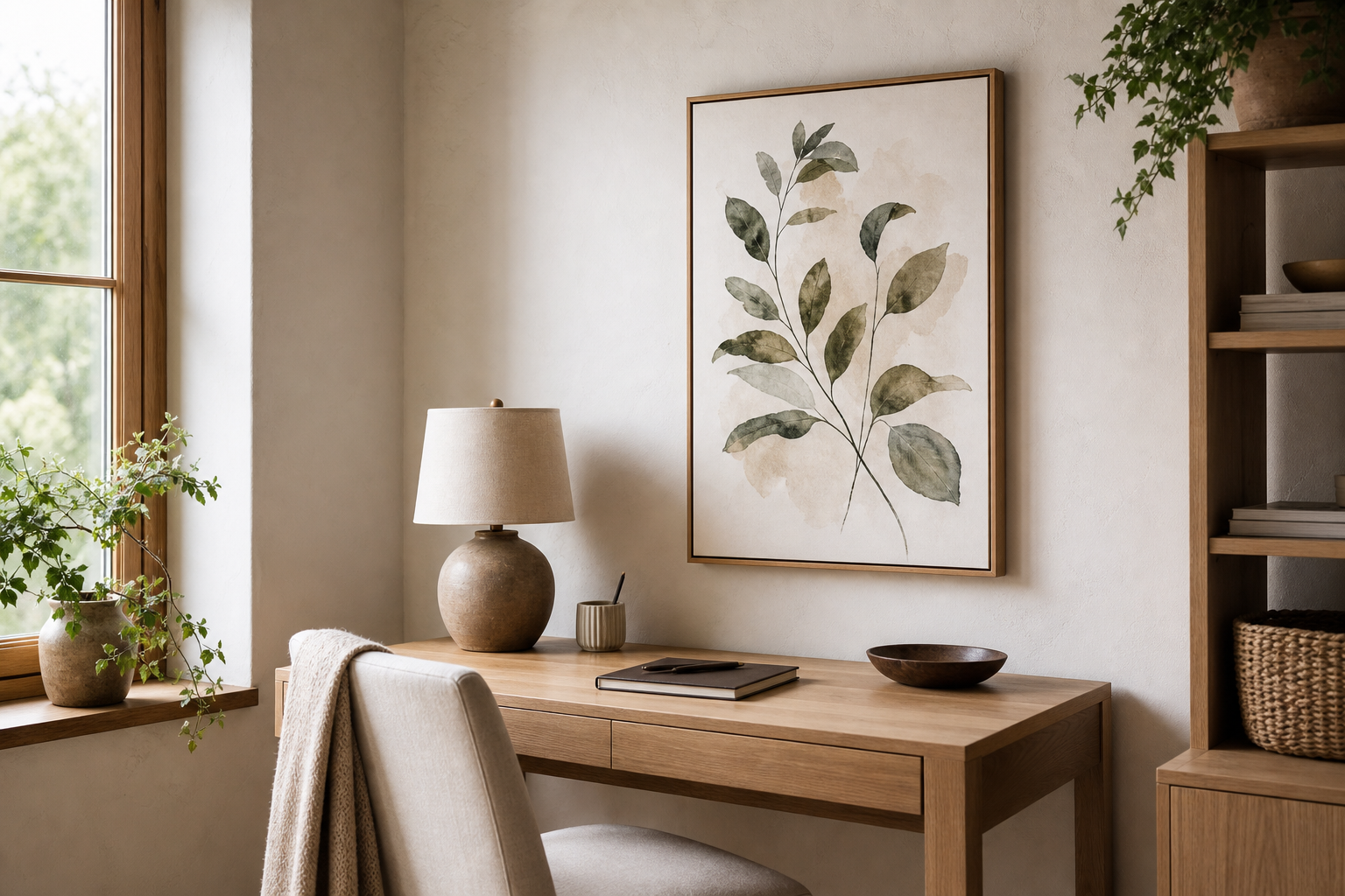
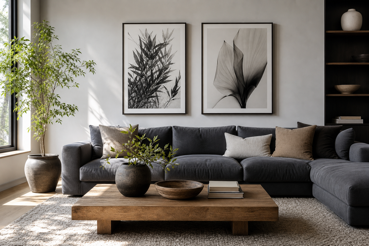
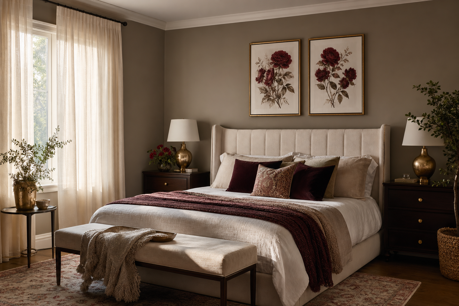
A minimalist architecture poster brings order to a room fast. Strong lines, open space, and restrained detail give the wall structure without making it feel crowded. In interiors that already lean modern, Scandinavian, or softly industrial, this kind of art often works better than busier imagery because it supports the room's geometry instead of competing with it.
A good minimalist architecture poster also has staying power. Unlike trend-led motifs that rely on color bursts or decorative flourishes, architectural subjects age well because they are rooted in proportion, shape, and material. If you already gravitate toward our minimalist collection or clean-lined pieces from our architecture wall art range, this style is one of the easiest ways to sharpen a room without overstyling it.
What Makes a Minimalist Architecture Poster Work
The most effective pieces use three things: negative space, clear geometry, and a limited palette. That could mean a white stairwell against shadow, a facade broken into clean rectangles, or a single building silhouette with plenty of blank sky around it. The eye reads those gaps as calm, which is why architectural prints often make a room feel more spacious.
Subjects matter too. Buildings with repeating windows, curved staircases, concrete walls, or crisp rooflines naturally suit a minimalist look. A print like Modern Minimalist Architecture Poster works because it emphasizes form first, decoration second.
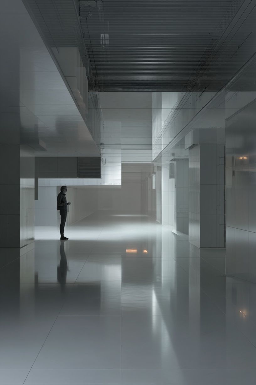
If you want a softer interpretation, line-based architectural art can do the same job with less visual weight. That is useful in bedrooms, narrow halls, or smaller apartments where heavy contrast can feel too stark. Pieces from our abstract collection can also support this look when they echo the same rhythm of curves, grids, or structural repetition.
Choosing the Right Mood and Palette
Color changes the mood of a minimalist architecture poster more than people expect. Black and white feels disciplined and graphic. Warm beige, stone, and sand tones feel quieter and more residential. Gray-on-white creates an airy gallery look that suits rooms with glass, chrome, or cool oak.
If your room already has strong material contrast — black metal shelving, walnut furniture, concrete lamps, or charcoal upholstery — choose softer artwork to balance it. A pale architectural print with lots of white space prevents the room from tipping too hard into cold minimalism. On the other hand, if the room is mostly cream, linen, and light timber, a darker print can add needed definition.

A monochrome piece like Modern White Staircase — Minimalist Print fits rooms that need clarity and crisp contrast. For spaces with warmer undertones, a piece such as Modern Tropical Villa — Architecture Print can soften the mood while keeping the architecture-first focus intact.
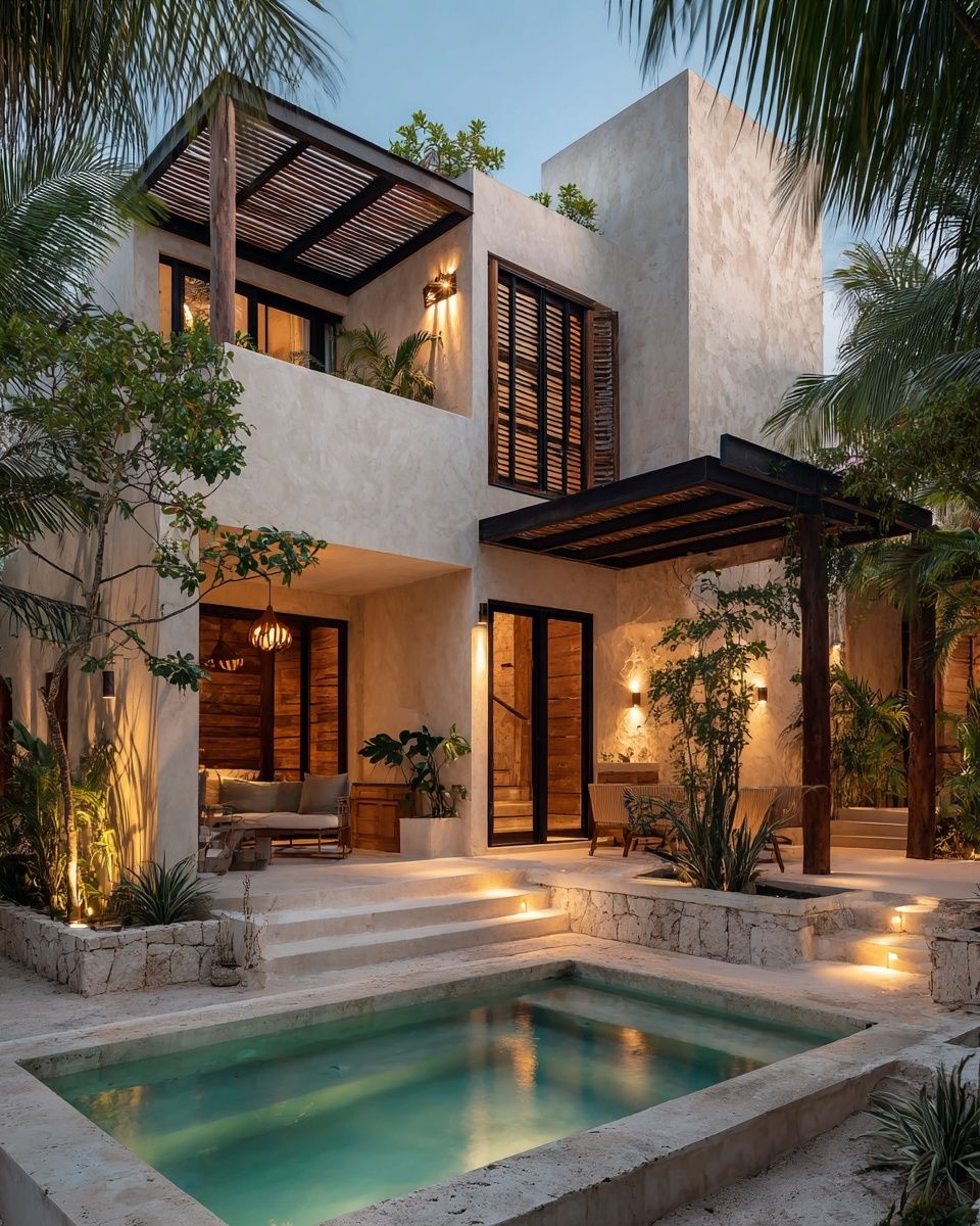


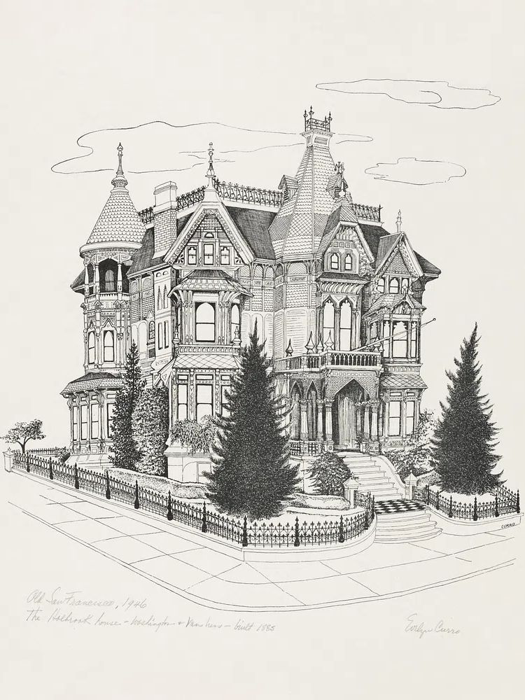
That mix matters when you are building a room, not just decorating a wall. The clean geometry of architecture pairs especially well with restrained companion art — think graphic black-and-white geometry or tonal surfaces from textured white abstract art rather than loud multicolor compositions.
Best Rooms for Minimalist Architecture Art
Living rooms are the most flexible place for this style. A single 50 x 70 cm print above a sideboard looks precise and intentional. Above a sofa, 70 x 100 cm usually has more authority, especially if the sofa is 180 to 220 cm wide. The goal is coverage of roughly 55 to 70 percent of the furniture width below it.
Bedrooms benefit from the calmest versions of architectural art. Choose light palettes, soft shadows, or simple line work rather than dense city scenes. Over a 160 cm bed, one centered 70 x 100 cm print works well, or two 50 x 70 cm pieces with 7 to 10 cm between frames. If you prefer an even lighter look, Parisian Architecture — Line Art Print keeps the theme intact without feeling heavy.
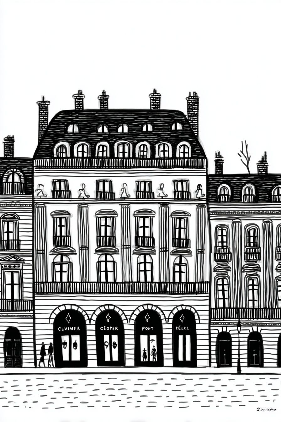
Hallways and entryways are ideal for narrower works because architecture naturally reads vertically. Staircases, facades, and tower forms all suit walls that do not have much width. In a home office, architectural art adds focus. It tends to feel more ordered than landscapes and less distracting than figurative pieces, especially when placed just off-center from the desk rather than directly behind a monitor.

If your entry is small, keep the frame thin — around 1.5 to 2 cm — and leave at least 15 cm between the top of a console and the bottom of the frame. That breathing room is what keeps a minimalist architecture poster looking deliberate instead of squeezed in.
Sizing, Framing, and Placement Rules
Scale is where good styling usually succeeds or fails. Small art on a large wall looks timid. Oversized art on a short wall feels clumsy. As a baseline, use 30 x 40 cm for shelf styling, 50 x 70 cm for compact walls, and 70 x 100 cm when the print is the main visual anchor in the room.
Frame finish changes the tone. Black metal or matte black wood gives the cleanest gallery effect. Natural oak feels softer and more domestic. White frames work best when the artwork itself has enough contrast to keep the edges from disappearing into the wall. If the print has lots of pale stone, concrete, or sky, a black frame usually defines it better.

Placement height should stay consistent with standard gallery rules. Hang the center of the artwork around 145 cm from the floor, then adjust slightly for furniture groupings. Above a sofa, leave 15 to 25 cm between the top of the backrest and the bottom of the frame. Above a bed headboard, 20 to 30 cm usually feels balanced.
A piece like Modern Loft Living Room — Interior Design Print works especially well in black or dark bronze framing because the subject already carries strong interior lines. If you want a more atmospheric option, Rainy Day at Modern Architecture Poster can add mood without losing the minimalist edge.
How to Build a Modern Gallery Wall Around It
Start with one lead piece, then add support rather than competition. The easiest formula is one minimalist architecture poster, one tonal abstract, one geometric print, and one softer texture-based work. Keep the palette within two or three dominant tones — for example white, charcoal, and sand — so the arrangement reads as one composition.
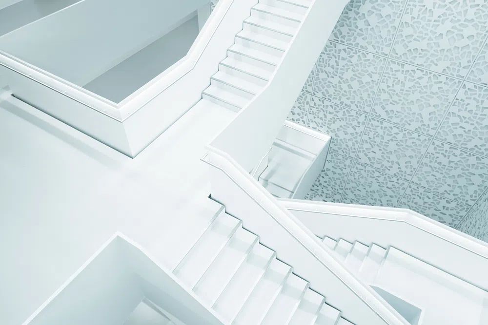
For spacing, use 5 to 8 cm between smaller frames and 8 to 10 cm around larger ones. Mixed layouts look better when one edge aligns — top, bottom, or center line. If every frame floats independently, the wall starts to feel messy, which defeats the purpose of minimalist styling.
The best supporting pieces are those that repeat shape or surface rather than literal subject matter. A stairwell print can sit next to a grid-based abstract, while a villa facade pairs nicely with quiet organic texture. Browse across our fine art prints and mid-century modern artwork if you want subtle warmth alongside clean architectural structure.
Styling Tips for a Calm, Curated Finish
A minimalist architecture poster looks strongest when the surrounding objects are edited. Limit the immediate styling below it to three or four items — for example a lamp, one stack of books, a ceramic vessel, and a small branch. If every surface is full, the art loses its authority.
Materials should echo the artwork's clarity. Concrete, oak, walnut, linen, travertine, smoked glass, and matte metal all support architectural prints well. Curved furniture can be a smart counterbalance too. If the art is all straight lines and angles, a rounded armchair or soft-edged lamp stops the room from feeling rigid.

Lighting makes a measurable difference. Warm bulbs around 2700K keep monochrome architecture from looking harsh at night. If the frame is glazed, angle wall sconces or table lamps slightly away to reduce reflections. In daylight-heavy rooms, choose art with stronger tonal range so it does not wash out by noon.
Final thoughts
A minimalist architecture poster works because it gives a room structure, not noise. It brings clean edges, measured contrast, and a calm focal point that can hold its own in living rooms, bedrooms, hallways, and workspaces.
The best results come from simple decisions done well: the right scale, restrained framing, enough white space, and materials that support the artwork's architectural logic. Keep the palette tight, give the print room to breathe, and the whole interior looks more resolved.
Frequently Asked Questions
What frame color is safest if I change my decor often?
Matte black is the most versatile. It works with white walls, warm neutrals, gray palettes, and both modern and industrial furniture.
Should I choose glass or acrylic glazing?
Acrylic is lighter and easier to handle for larger sizes like 70 x 100 cm. Glass can feel more premium, but it is heavier and more reflective.
Can minimalist architecture art work on colored walls?
Yes — especially on soft greige, pale taupe, olive-gray, or muted clay. Use a print with enough contrast so the artwork does not blend into the wall color.
How wide should a mat be around an architectural print?
A mat of 5 to 8 cm usually looks balanced for medium sizes. Wider mats suit sparse compositions and make minimalist pieces feel more gallery-like.
What pairs well with architectural art if I do not want a full gallery wall?
A single mirror, a sculptural wall sconce, or one quiet abstract print is enough. Keep the companion piece lower in contrast than the architecture so it stays secondary.