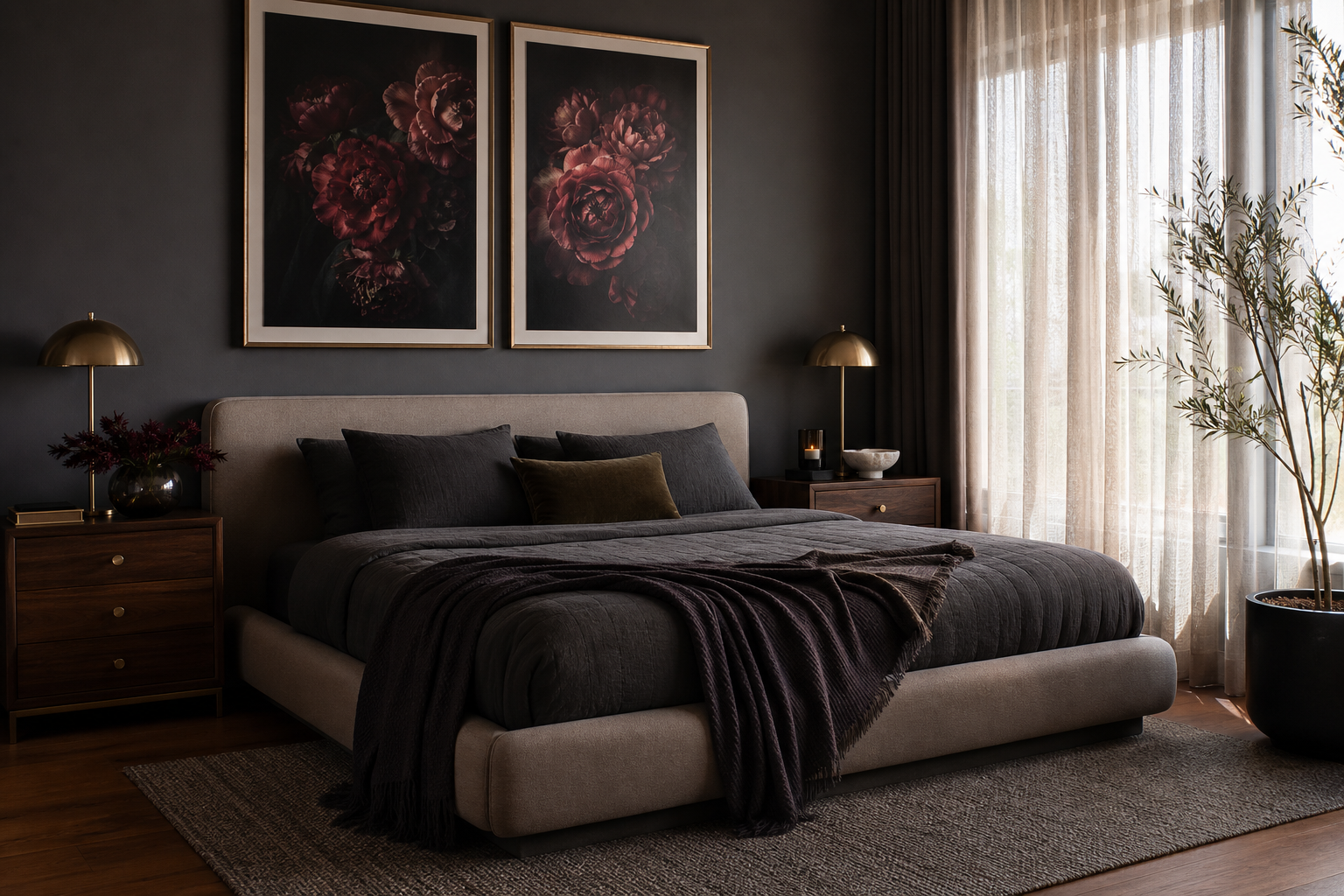
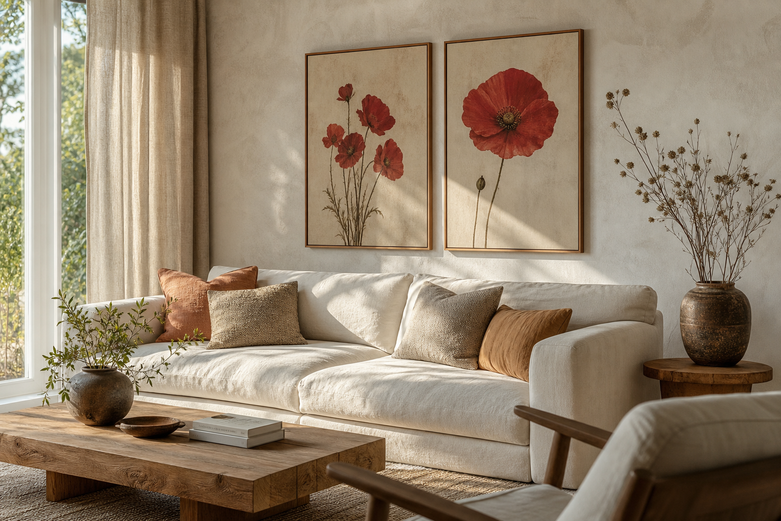
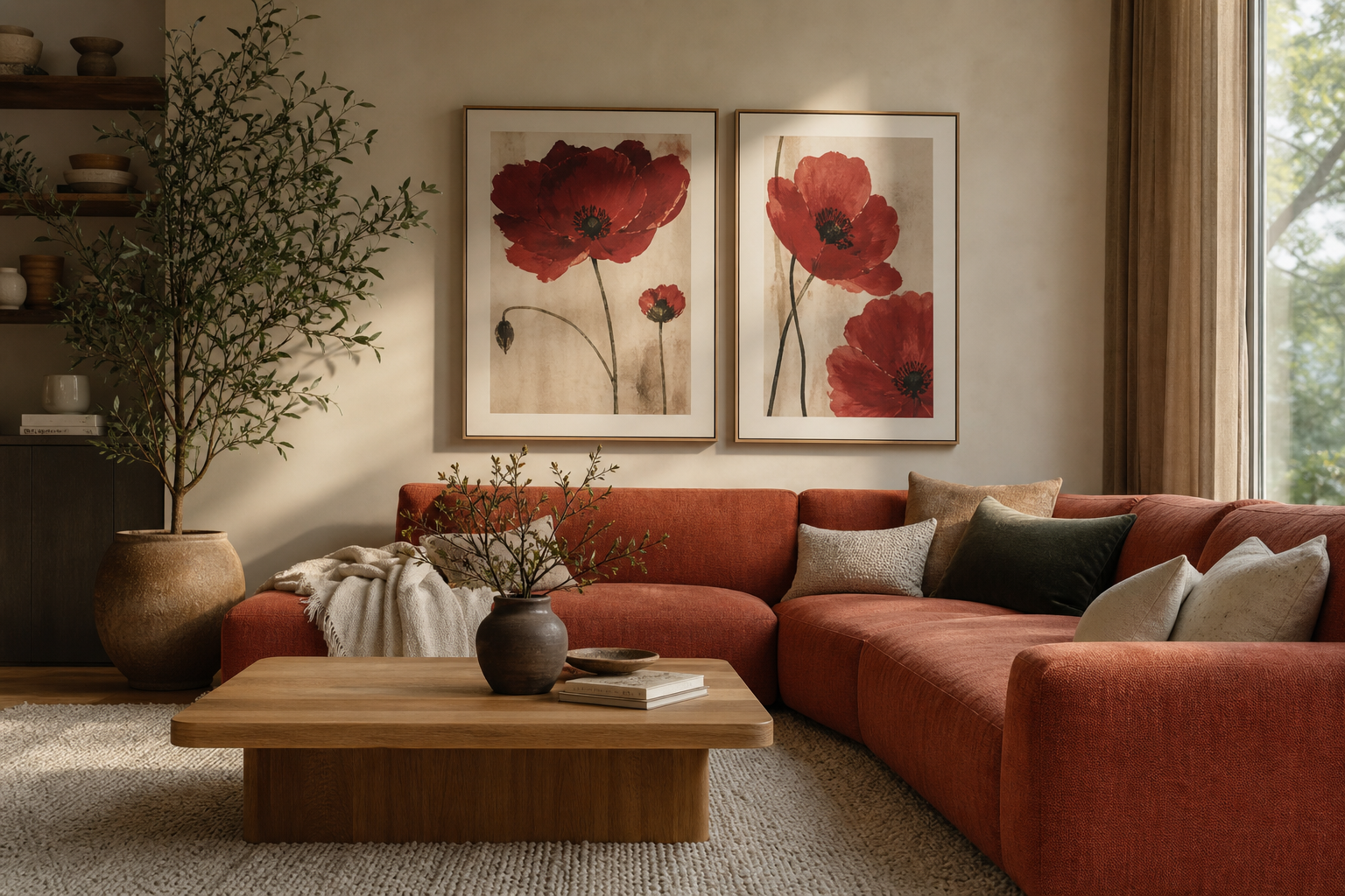
A crimson roses poster print changes the mood of a room fast. Deep red florals bring warmth, contrast, and a sense of permanence that lighter botanical art often does not. In practical terms, red sits forward visually, so even one well-placed floral print can anchor a wall that otherwise feels flat or underfurnished.
The appeal also lies in flexibility. A crimson roses poster print works with traditional detailing, modern upholstery, dark painted walls, and simple neutral rooms because the subject is classic while the colour carries the drama. If you already like pieces from our botanical collection, this is one of the easiest ways to add richer colour without changing your whole scheme.
Why Crimson Roses Feel So Timeless
Red roses have held their place in interiors for centuries because they balance beauty with structure. The flower shape is soft and layered, but the colour is decisive. That combination makes rose imagery feel romantic without becoming overly sweet, especially when the reds lean wine, burgundy, or carmine rather than bright cherry.
Crimson also behaves well across seasons. In autumn and winter, it connects naturally with walnut wood, velvet, and low warm lighting. In spring and summer, it adds depth to lighter rooms filled with stone, linen, and pale oak. That is why red floral art can sit comfortably alongside heritage-inspired pieces such as William Morris's vintage pomegranate flowers or more pared-back options from our minimalist art prints.
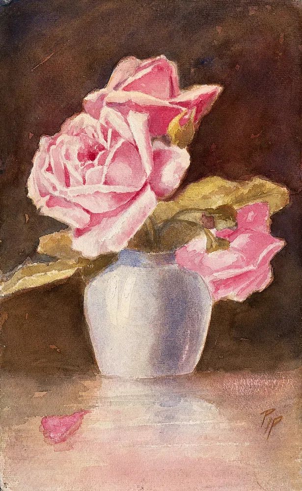
A good way to keep the look current is to focus on floral art with clear composition rather than overly busy detail. One statement bloom, a tight bouquet, or a dark-ground floral arrangement usually feels more refined than a scattered all-over pattern when used as wall art in smaller rooms.
Choosing the Right Room for the Look
Bedrooms are the most natural fit because crimson roses support a softer, more intimate mood. Center one print above a 140 cm to 180 cm bed, and aim for artwork that spans around 50% to 70% of the headboard width. That proportion looks intentional and prevents the wall art from feeling either lost or oversized.

Dining rooms are another strong option because deep red florals pair naturally with wood tables, candlelight, and darker finishes. If your dining area has black chairs, antique brass, or a walnut sideboard, a rose print can connect those elements and make the room feel more deliberate. For a more art-led look, mix floral work with classic pieces from our fine art collection.
Entryways benefit from crimson too, especially if the space lacks architectural character. A narrow hallway often needs one vertical focal point rather than several small accents. In that case, choose a single framed print at 50x70 cm and hang it at eye level — usually with the centre around 145 cm from the floor.
Living rooms can take a bolder treatment. Place a crimson floral above a sofa in a scheme built around warm neutrals, charcoal, or olive. If you want the romance softened, pair it with landscape or line-based work from our nature wall art instead of adding more florals nearby.
Finding the Best Size and Scale
The easiest mistake is choosing art that is too small. For a sofa that is 200 cm wide, your wall art arrangement should usually span 120 cm to 140 cm. For a console table around 100 cm wide, aim for a print or grouped arrangement between 60 cm and 75 cm across.
A single statement print works best when the wall already has visual support from furniture, lamps, or moulding. In compact rooms, 50x70 cm often gives enough presence. On larger walls, 70x100 cm creates a more architectural effect and lets the rose subject read clearly from across the room.
If you want symmetry, use a pair. Two 40x50 cm or 50x70 cm prints with 5 cm to 8 cm spacing suit beds, sideboards, and longer hallways. This approach is especially useful if your room already has balanced furniture placement and matching table lamps.

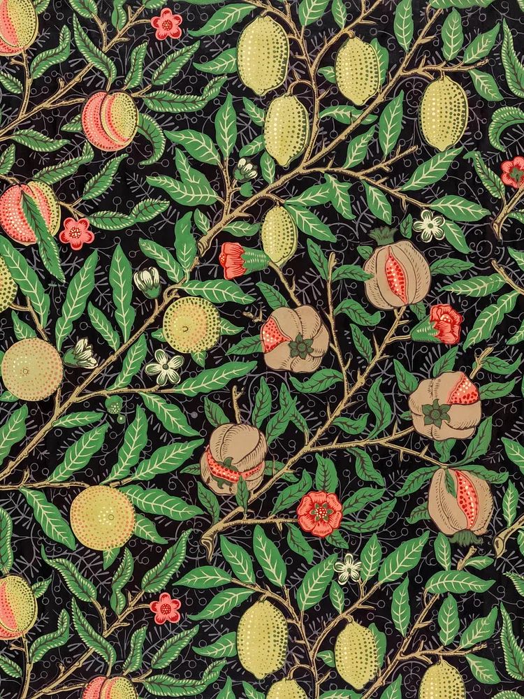
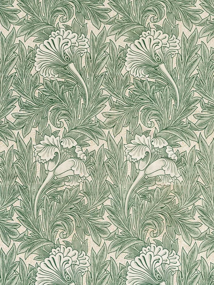
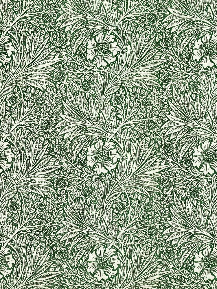
Gallery walls are better when you want a collected, layered result rather than a single romantic focal point. Keep one dominant piece and three to five supporting works. A practical formula is one larger floral, one softer neutral botanical, one figurative or still-life piece, and one simple tonal print to reduce visual noise.
Framing and Finish Ideas
Black frames sharpen crimson tones and give floral subjects a more modern edge. Oak frames warm the image and make it feel lighter, especially against off-white or sand-coloured walls. Antique gold frames are effective if the room already has brass or vintage-style lighting, but use them with restraint so the look stays elegant rather than ornate.

Matting can make a big difference. A white mount around a floral print gives the image breathing room and helps strong reds feel more gallery-like. This is particularly useful for smaller sizes such as 30x40 cm or 40x50 cm, where the added border gives the piece more visual weight on the wall.
For companion styling, a pattern-based botanical like Honeysuckle by William Morris can sit well in a nearby room, while a simpler silhouette such as White Flower Silhouette works beside crimson florals when you want contrast in detail level.

How to Build a Palette Around Deep Red Florals
Crimson looks strongest when the rest of the palette is edited. The most reliable base is warm neutral: ivory, oat, mushroom, taupe, and soft brown. These shades absorb the intensity of the red and stop it from feeling harsh. If your walls are light beige or greige, the floral becomes the colour statement without overwhelming the room.
Dark palettes also work well. Charcoal, forest green, espresso, and ink blue all deepen the rose tones and make them appear more luxurious. In a room with dark painted walls, choose art with some lighter petals or negative space so the image does not disappear into the background.
Metallic accents should be limited to one finish. Brass is usually the best partner because it echoes the warmth of crimson. Add it through a lamp base, picture light, mirror frame, or drawer handles rather than scattering multiple reflective finishes around the room.
If you want a softer interpretation, bring in blush, dusty pink, or muted peach through textiles. That keeps the floral story connected while lowering the contrast. You can also bridge the look with complementary botanical pieces from our vintage chrysanthemum floral art or with a romantic figurative print like Woman in Yellow Flowers.
Styling Tips for a Polished Final Look
Keep nearby decor simple. If the wall art is rich in colour and petal detail, place only two or three objects beneath it — for example, a ceramic vase, a stack of books, and one candleholder. Too many accessories create competition and make the floral art lose its authority.
Lighting matters more than most people expect. Warm bulbs in the 2700K to 3000K range tend to flatter deep red tones, while very cool light can make crimson look flat or slightly brown. If the print hangs in a darker corner, use a picture light or a nearby table lamp to give it enough presence after sunset.

Balance bold florals with calm textures. Linen curtains, boucle upholstery, plaster walls, plain wool rugs, and simple ceramics all help the art stand out. If every surface is patterned, the result can feel busy. A useful target is to let one element dominate: either the wall art or the textiles, not both.
Shop the Look: Keep It Romantic, Not Overdone
The best crimson floral interiors are edited, not themed. Start with one strong piece, repeat the red only once or twice in the room, and use shape rather than colour for the rest of the styling. That might mean curved lamp bases, a rounded mirror, or a soft upholstered headboard that echoes the rose form without copying it.
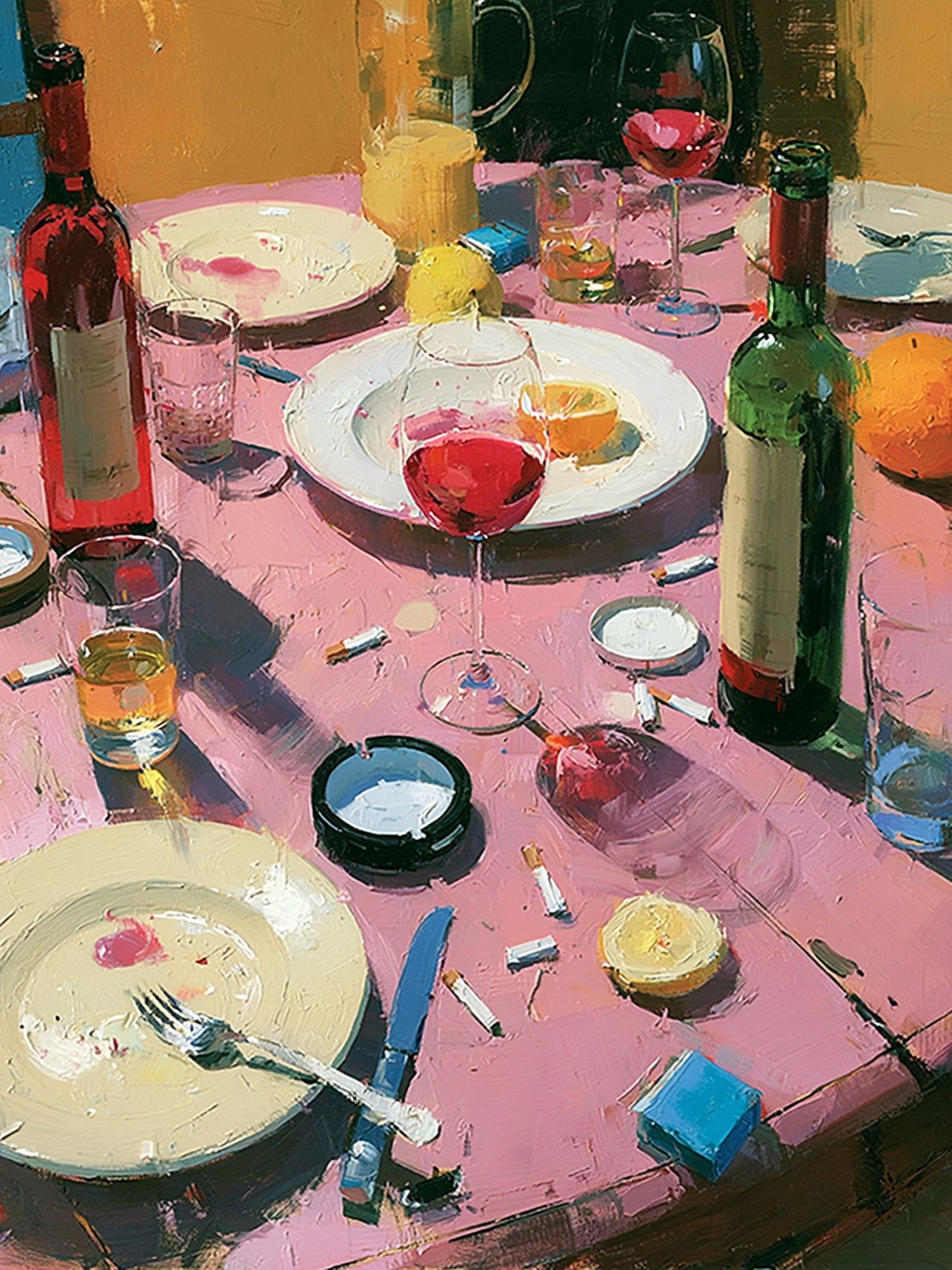
For a more collected wall, combine a floral focal point with one still life and one quiet botanical. A piece like Wine Table Still Life adds richness without introducing another loud colour story, while floral pattern work from our botanical wall art range keeps the room cohesive.
Final thoughts
A crimson roses poster print works best when the room gives it space to lead. Choose the right scale, keep the surrounding palette controlled, and let texture do some of the decorative work. The result feels romantic, grounded, and easy to live with.
If you want the look to last beyond a single season, pair deep red florals with timeless materials — oak, walnut, linen, brass, and soft neutral paint. That combination keeps the statement strong but never heavy.
Frequently Asked Questions
What frame width works best for a floral print?
For most sizes, a frame width of 1.5 cm to 2.5 cm looks balanced. Wider profiles suit larger pieces such as 70x100 cm, while slimmer frames keep smaller prints light.
Should I use glass or acrylic for wall art in a bedroom?
Acrylic is lighter and practical for larger sizes or homes where safety matters. Glass offers a slightly crisper finish, but it is heavier and more fragile.
Can deep red floral art work on white walls?
Yes — white walls make crimson stand out clearly. Add one or two warm materials, such as oak or brass, so the contrast feels intentional rather than stark.
How high should I hang art above a headboard or console?
Leave roughly 15 cm to 25 cm between the furniture and the bottom of the frame. That keeps the art visually connected to the piece below it.
What other prints pair well with roses if I do not want an all-floral wall?
Try a still life, a soft landscape, or a minimalist silhouette. These add contrast in subject and detail while keeping the arrangement calm.