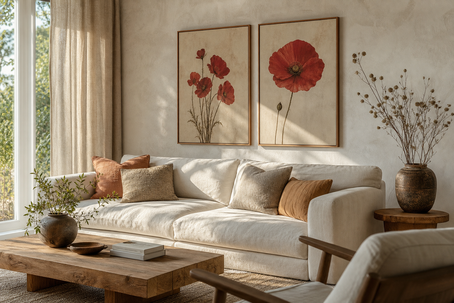
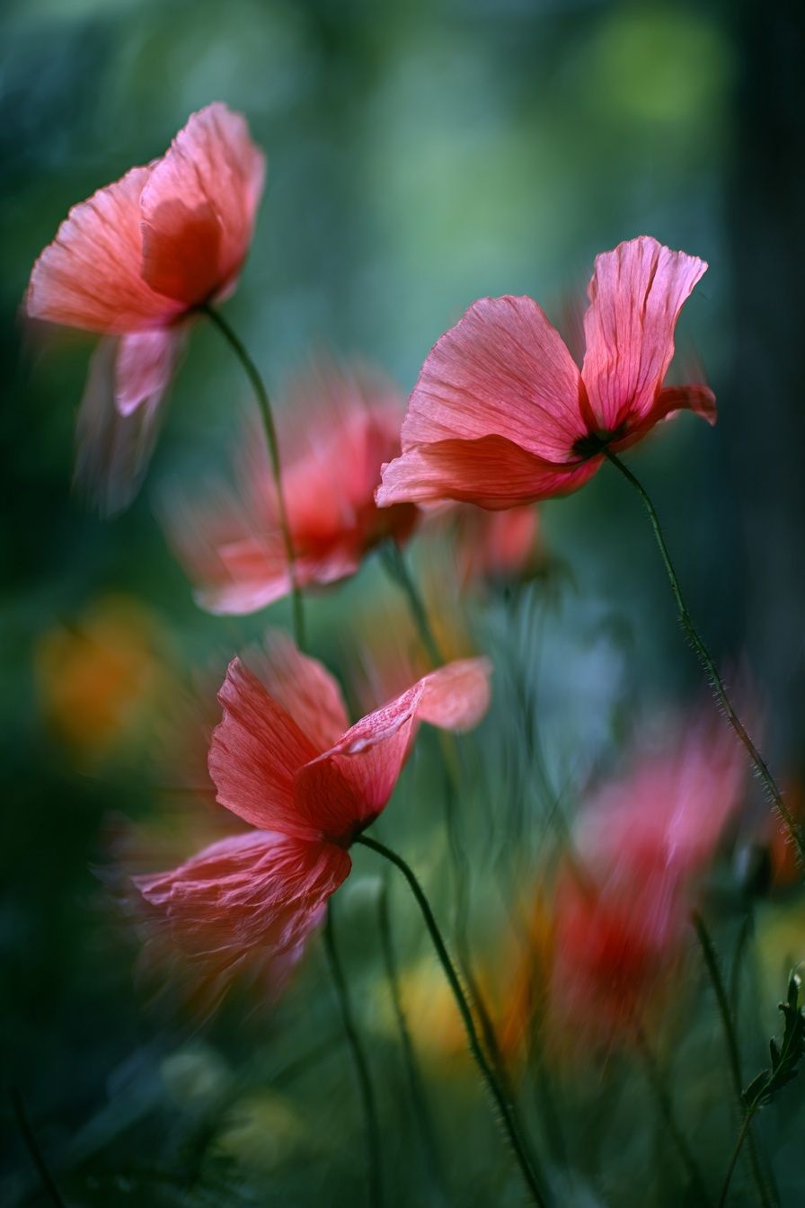
A crimson poppy 1 poster print brings one of the easiest things to add to a room and one of the hardest things to balance: saturated red. That is exactly why it works so well. The flower subject feels timeless, while the crimson tone gives the piece a sharper, more current edge than softer blush botanicals or faded country florals.
Unlike broad multicolour botanicals, a crimson poppy 1 poster print creates a cleaner focal point. The eye lands on the bloom first, then reads the rest of the room around it. In practical terms, that makes it useful in spaces that need one strong visual anchor — above a sofa, over a bed, at the end of a hallway, or behind a desk.
What Makes the Crimson Poppy 1 Poster Print Stand Out
Poppies have a naturally graphic shape: thin stems, open petals, and a recognisable silhouette even from 2 to 3 metres away. In crimson rather than bright cherry or orange-red, they feel richer and more architectural. That balance is what lets this floral work across both traditional and modern interiors.
The strongest floral prints usually do one of two things well: they either soften a room or structure it. A crimson poppy image does both. The organic flower form stops the space feeling rigid, while the deep red acts almost like a design accent — similar to how black, forest green, or navy can define a scheme.
If you already gravitate toward our botanical collection, this kind of piece is especially useful because it adds colour without introducing too many competing shapes. It also sits comfortably beside fine art floral compositions and more heritage-inspired pieces from the vintage collection.
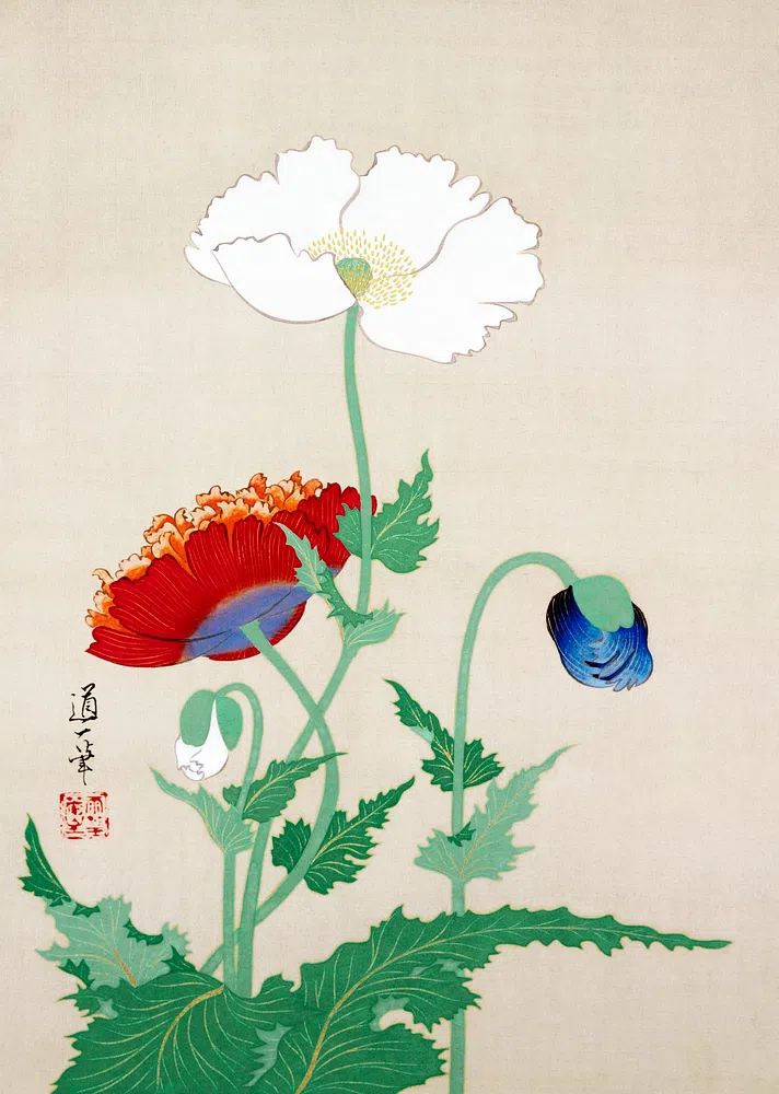
A good reference point is Poppy Flowers — Vintage Print. It shows how poppy imagery can feel classic rather than overly sweet. If you want a room with presence, poppies are more decisive than peonies and less formal than roses.
Choosing the Right Room for a Bold Floral Print
The best room for a crimson floral depends on how much visual competition is already there. In a living room with a sofa in oatmeal, camel, charcoal, or olive, a crimson poppy 1 poster print can work as the main statement piece. Hang it above the sofa with 15 to 25 cm of breathing room above the backrest, and keep surrounding accessories quieter than the art.

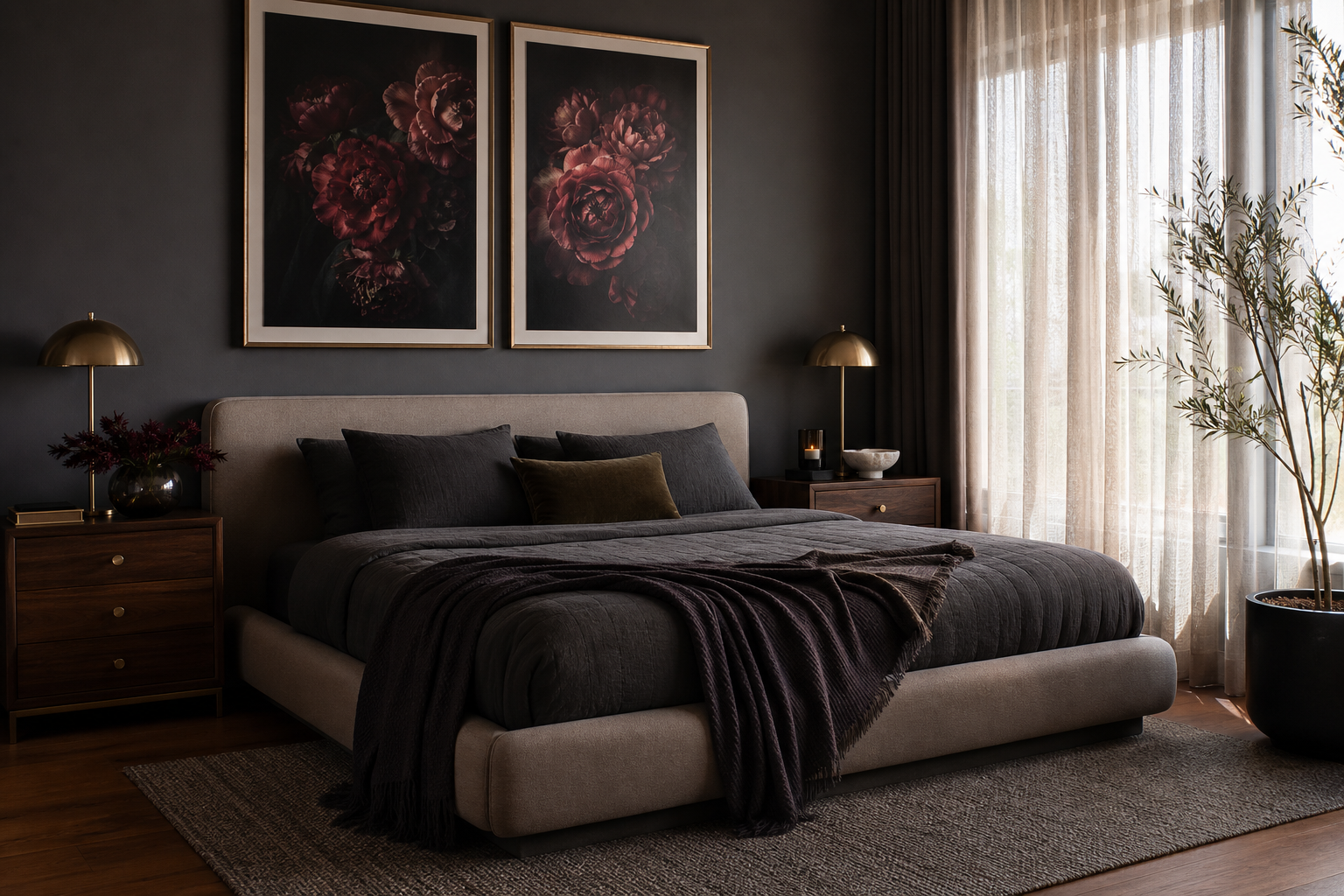
In bedrooms, red art works best when the bedding is restrained. White, stone, mushroom, and muted terracotta all support the flower without making the wall feel heavy. Place the piece centrally above the headboard, ideally covering around 60 to 75 percent of the bed width if it is a single statement artwork. For a 150 cm queen bed, that means a visual width of roughly 90 to 112 cm including frame.
Hallways are often overlooked, but they suit bold botanicals because people experience them in motion. A narrower vertical poppy print can energise a long passage without needing extra furniture or styling. In a home office, the same artwork can bring warmth to a space dominated by flat screens, shelving, and hard lines — especially if your desk area uses black metal, oak, or pale ash.
If you like the idea of a softer floral nearby, Pink Poppy Flowers — Photography Print pairs well in adjacent rooms rather than on the same wall. It keeps the house coherent without making every space repeat the same intensity.
Best Colour Palettes to Pair with Crimson Red
Crimson looks strongest against warm neutrals. Think chalk white, flax, sandy beige, greige, clay, and soft taupe. These colours absorb the drama of red and stop it feeling abrupt. If your wall colour is already bright white, bring in warmth through wood, linen, or jute so the contrast does not become too stark.
For a cooler scheme, pair crimson with smoky blue-grey, sage, or muted green. Green works particularly well because it echoes the botanical subject without becoming too literal. A room with olive upholstery, aged brass, and one crimson floral print usually feels balanced at once.
For accents, keep to one or two secondary tones. Good combinations include: - crimson + walnut + cream - crimson + sage + black - crimson + blush clay + oak - crimson + charcoal + antique gold
Avoid scattering the same bright red throughout the room in small doses. One artwork, one book spine, and perhaps one small textile accent is enough. Once red appears in five or six places, it starts to read as a theme rather than a focal point.
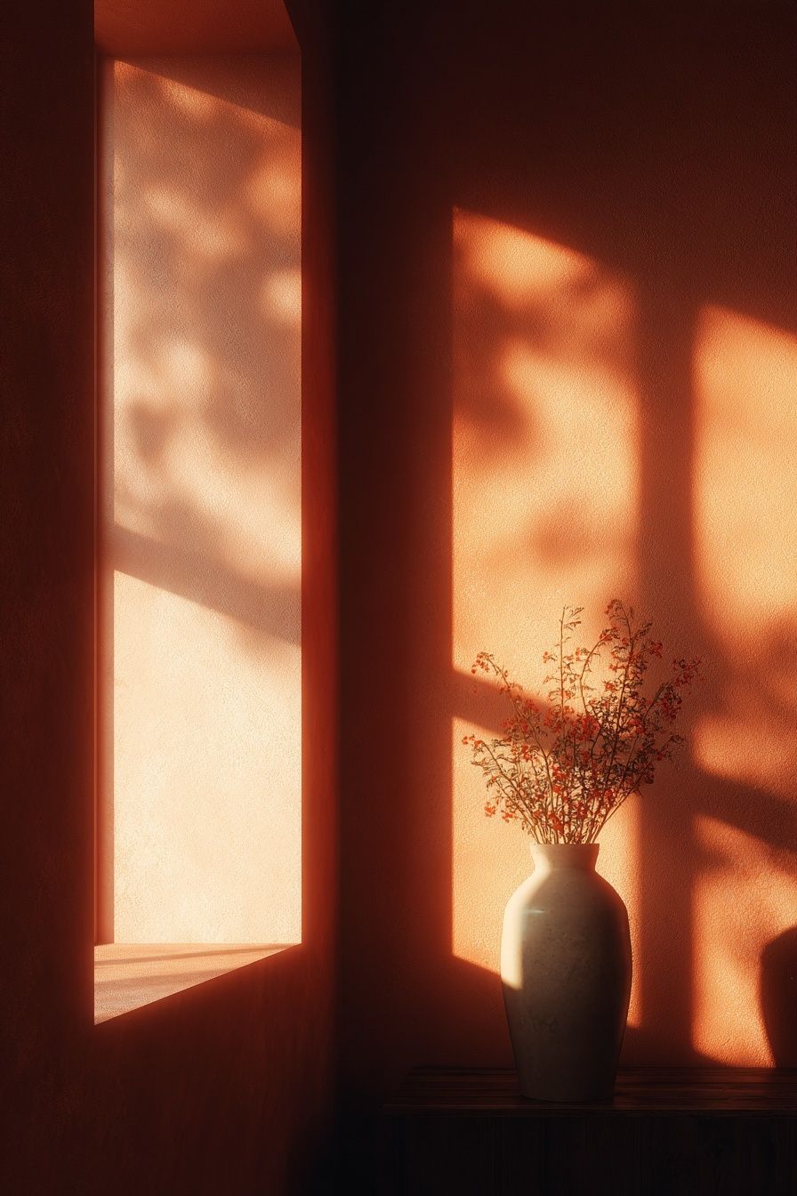
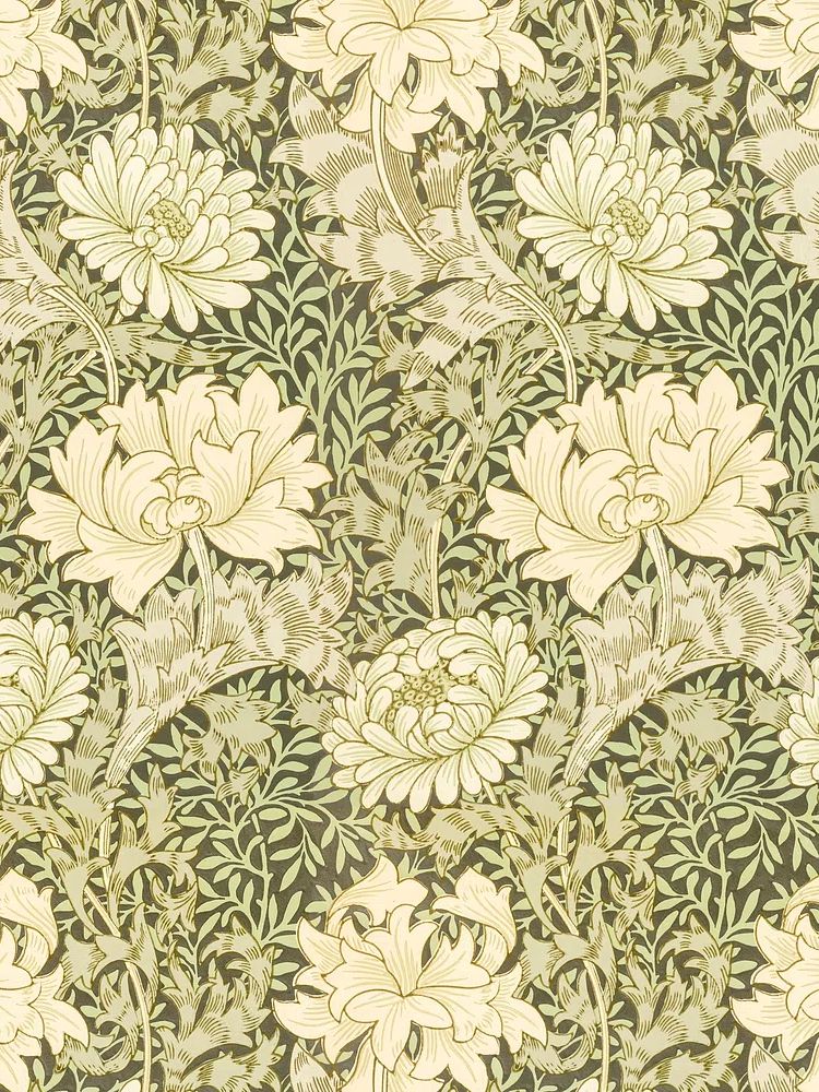


This is where adjacent styles matter. A crimson floral can be sharpened with minimalist art prints or softened with layered pieces from botanical wall art. If you want a more heritage look, patterns such as William Morris's vintage chrysanthemum flower introduce complexity through muted, repeating detail rather than through more strong colour blocks.
How to Frame and Present the Poster
Frame choice changes the mood more than most people expect. A slim black frame gives a crimson floral a crisp, gallery-style finish. It suits modern rooms, white walls, and interiors with black accents in lighting or furniture. A light oak frame feels softer and more Scandinavian — especially effective if the room already includes ash, birch, or pale linen.

If the artwork has strong colour concentration, an off-white mount of 5 to 8 cm can help. It gives the image visual breathing space and makes the red feel intentional rather than crowded. Frameless or edge-to-edge presentation works better when the overall interior is very minimal and the art itself has plenty of negative space.
Decorative gold frames can work too — but only if the room already has a traditional language. In a contemporary flat, ornate framing can overpower a clean floral image. As a rule, the simpler the room, the simpler the frame should be.

A useful companion piece is White Flower Silhouette — Minimalist Print. It shows how a pared-back floral can offset a bolder red botanical. If you are building a pair or a small set, one expressive piece and one quieter one usually look more refined than two equally loud artworks.
Sizing, Spacing, and Gallery Wall Ideas
For single-piece placement, hang the centre of the artwork at around 145 to 150 cm from the floor. That standard works in most homes because it aligns with average standing eye level and prevents the art floating too high above furniture.
For scale, use these quick proportions: - above a sofa: artwork should span about 60 to 75 percent of sofa width - above a bed: 55 to 70 percent of bed width - on a narrow hallway wall: leave at least 10 to 15 cm margin from door trim or corners - between two pieces in a gallery wall: 5 to 8 cm spacing for small to medium frames, 8 to 10 cm for larger ones

A crimson poppy print works well as the anchor in a gallery wall because the red naturally takes the central role. Surround it with quieter works in cream, green, faded pink, or charcoal line work. Good companions include heritage botanicals, floral silhouettes, and restrained landscapes from the nature collection.
If you want a more layered arrangement, pair the central crimson piece with Vase with Flowers — Minimalist Print or with patterned botanicals such as Honeysuckle by William Morris (1874) in nearby areas of the room. The key is to vary scale and detail: one hero floral, one simple silhouette, one pattern-based botanical, one calmer landscape.
Shop Tips for Creating a Cohesive Floral Look
A cohesive room never depends on wall art alone. Repeat the feeling of the crimson poppy through texture rather than exact colour matching. Rust linen cushions, a smoked glass vase, walnut wood, a dark olive throw, or a muted burgundy book cover will echo the print more elegantly than buying accessories in the exact same red.
Look at the room in three layers. First, the wall art sets the focal tone. Second, textiles carry the colour softly across the room. Third, smaller accessories add finish. If all three layers are present, even a bold floral will feel integrated rather than isolated.
When shopping across collections, keep one thread consistent. That thread can be botanical subject, vintage influence, minimalist framing, or earthy colour. Mixing all four at once usually creates noise. Start with the crimson floral, then add one supporting print, one textile accent, and one natural material such as oak, rattan, or stone.
Final thoughts
A crimson poppy 1 poster print works best when the room gives it enough quiet space to lead. Treat it as a focal piece, support it with warm neutrals or muted greens, and choose a frame that matches the architecture of the room rather than competing with the flower.
The most successful styling is rarely complicated. One confident floral, one or two supporting tones, and disciplined spacing will make a crimson poppy 1 poster print feel polished for years rather than seasonal for a few months.
Frequently Asked Questions
What frame colour is safest if I change my decor often?
Light oak is the most flexible choice. It works with warm neutrals, soft greens, black accents, and both modern and classic interiors.
Can I hang a red floral print on a coloured wall?
Yes — muted sage, warm greige, clay, and dusty blue-grey all work well. Avoid very bright red, orange, or purple walls, which can distort the floral tones.
Should I use glass or acrylic for a larger print?
Acrylic is lighter and often easier for frames above 50 x 70 cm. Glass gives a slightly crisper feel, but it is heavier and less forgiving on large walls.
What type of lighting makes floral wall art look best?
Indirect warm light around 2700K to 3000K is usually best. It keeps crimson tones rich without making whites look yellow.
How do I stop a floral print from feeling too traditional?
Pair it with clean-lined furniture, simple frames, and one minimalist companion piece. Too many ornate accessories will push the look into a period style quickly.