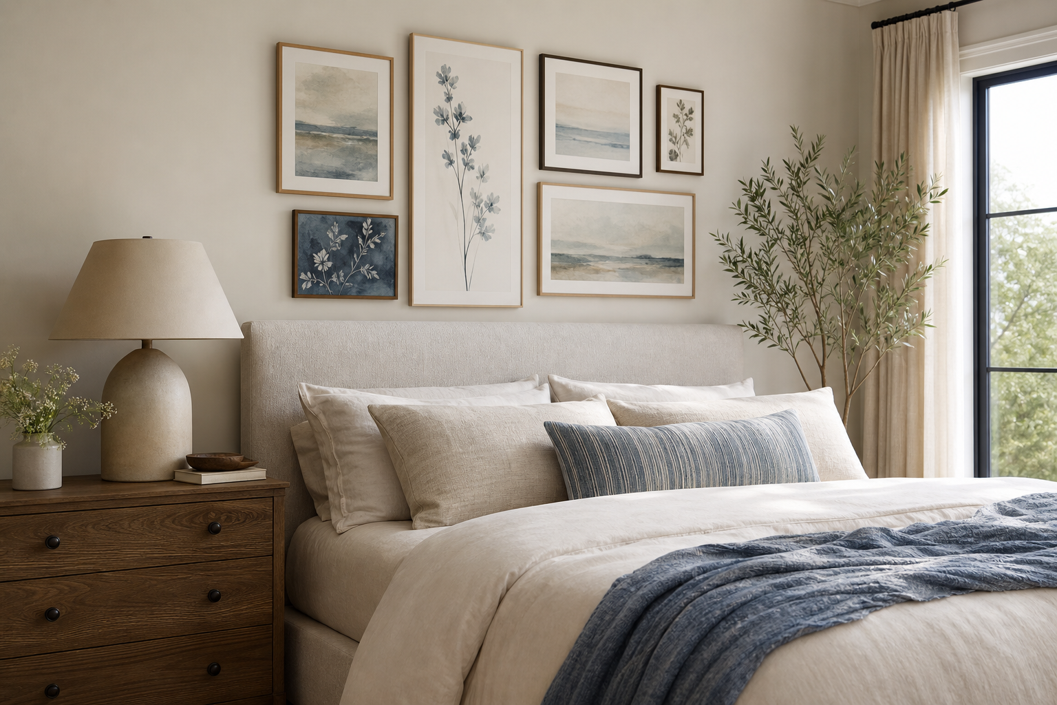
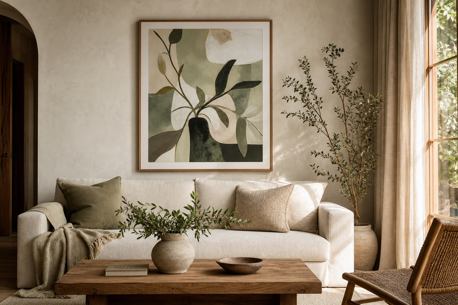
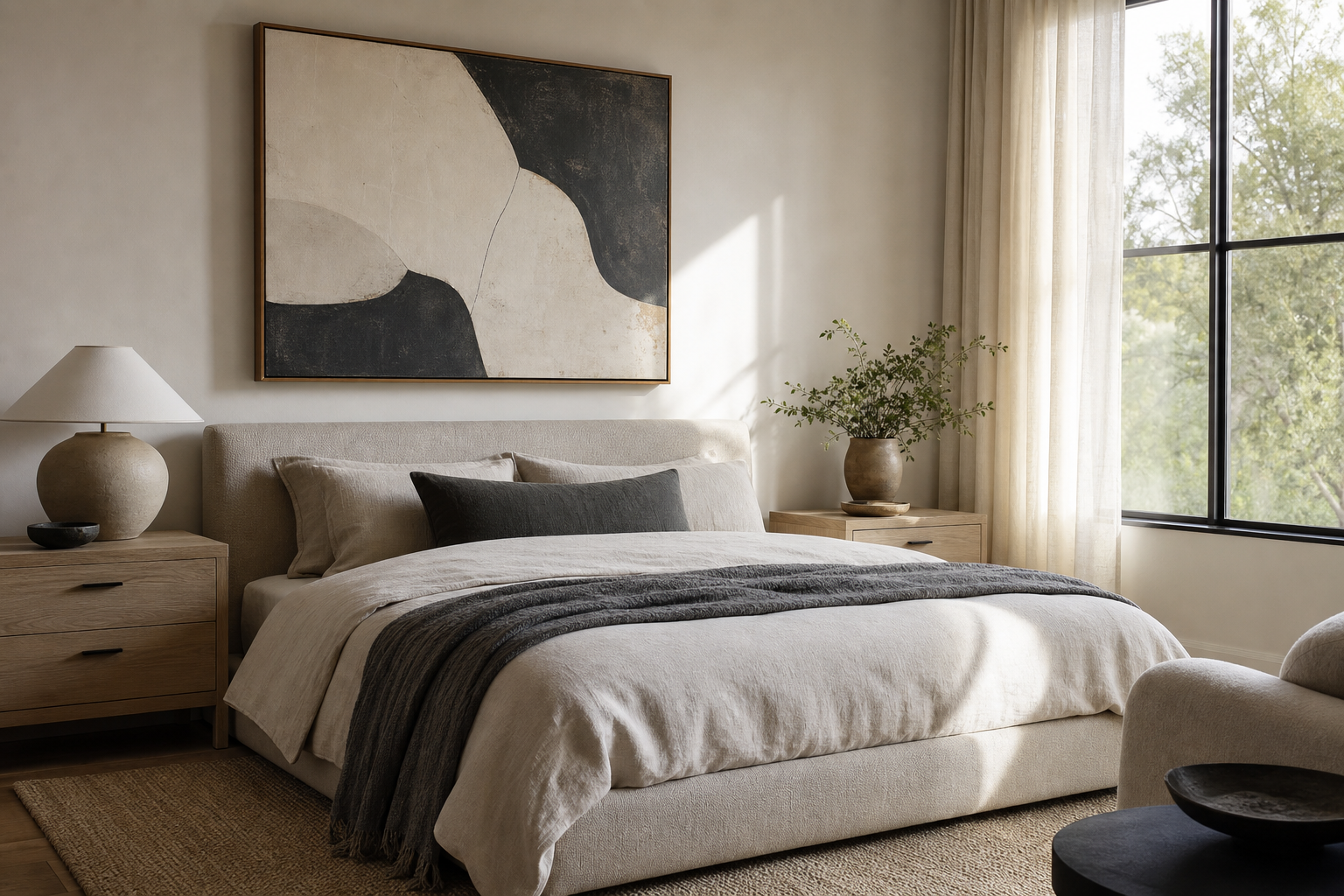
A good bathrooms poster print does more than fill a blank wall. It softens hard finishes, brings color into a room that often leans white or gray, and makes even a small bathroom feel finished rather than purely functional. In a space built from tile, glass, porcelain, and metal, art adds the one thing those materials rarely do on their own — personality.
Why Poster Prints Work So Well in Bathrooms
Bathrooms are usually short on soft detail and long on practical surfaces. That balance is exactly why wall art works here. A single framed piece above a towel rail or beside a mirror can break up a large expanse of tile and make the room feel intentionally designed. In a guest bathroom, one print is often enough. In a primary bathroom with 8 to 12 feet of open wall, two or three pieces create a stronger focal point.
A bathrooms poster print also helps define the mood of the room. Spa-like bathrooms benefit from quiet, low-contrast imagery, while powder rooms can take more character and visual punch. If your finishes are simple — white subway tile, chrome hardware, oak vanity — art is often the fastest way to steer the room toward minimalist, vintage, or softly decorative.
For cleaner, quieter schemes, start with pieces from our minimalist collection or browse soft architectural compositions in our architecture art prints. Both suit bathrooms because they rely on shape, texture, and calm color instead of heavy visual clutter.
Choosing the Right Subject and Mood
Bathroom art works best when the subject feels connected to rest, water, air, or simplicity. Botanically inspired silhouettes, abstract textures, spa-like stones, and light-toned fabric studies all feel natural in humid, bright rooms. High-contrast or very busy imagery can work in powder rooms, but in everyday bathrooms it often competes with mirrors, taps, grout lines, and storage.
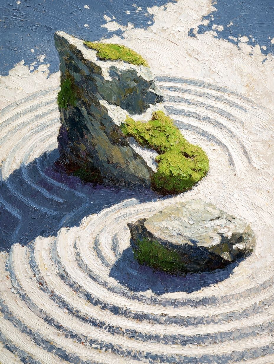
If you want a calm, hotel-style look, choose pale neutrals and organic forms. A piece like Zen Garden Stones brings that quiet rhythm immediately — especially paired with white towels, light oak, and matte black fixtures. For a softer minimalist route, White Flower Silhouette or Elegant White Fabric works well against stone, limewash, or warm beige paint.
A bathrooms poster print can also be slightly more decorative without losing its calm. Vintage female portraits, delicate florals, or softened line work suit powder rooms beautifully, especially when the space has warmer brass finishes or checkerboard tile. If you want that tailored, slightly nostalgic direction, look through our vintage wall art or the more painterly pieces in the fine art collection.

Color matters as much as subject. In small bathrooms, stick to 2 or 3 dominant tones that connect to what is already in the room. Blue-gray art pairs well with chrome, sand and cream work with travertine, and muted greens complement plants and pale wood vanities. If your bathroom already has patterned floor tile, choose quieter art so the surfaces do not fight each other.
Sizing and Placement That Feel Intentional
The easiest mistake is choosing art that is too small. In most bathrooms, a framed print above a toilet, towel bar, or narrow vanity should be at least 30x40 cm. Over a bathtub or a wider wall section, 50x70 cm usually feels more balanced. If you are hanging a pair, two 30x40 cm frames with 6 to 8 cm between them often look cleaner than one undersized piece floating alone.
Placement should follow the furniture or fixtures beneath it. Above a towel rail, keep the art centered and leave roughly 15 to 25 cm of breathing room between the top of the rail and the bottom of the frame. Beside a mirror, align the midpoint of the print close to the mirror’s visual center, not necessarily the room’s exact center. In awkward corners, a vertical piece can make the architecture feel deliberate rather than leftover.
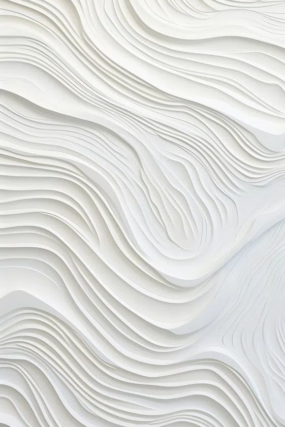
For bathrooms with limited wall width, narrow compositions often work better than square ones. A refined piece like Modern White Staircase suits slim gaps beside cabinetry, while Textured Waves works well above a bathtub where you want a horizontal, restful line.

If you are styling a vanity wall with double sinks, hang art on the adjacent wall rather than squeezing it between mirrors. The room will feel less crowded, and the art will have space to read properly from the doorway. In compact guest bathrooms, one strong print visible as soon as the door opens often has more impact than several tiny frames scattered around.
Framing, Materials, and Moisture-Smart Choices
Humidity changes the practical side of bathroom styling. The safest option is to place framed art on walls that are away from direct splash zones — not directly behind an open showerhead and not where condensation regularly gathers on the surface. If your bathroom has poor ventilation, keep a little extra distance from the bath or shower and use an extractor fan consistently.
Frame choice affects the entire tone of the room. Thin black frames sharpen white tile and modern fittings. Oak or ash frames warm up cooler bathrooms and help bridge stone, linen, and natural accessories. White frames disappear more easily into pale walls, which is useful in small bathrooms under 5 square meters where visual lightness matters.

Protective glazing is worth prioritizing in bathrooms. Acrylic glazing is lighter than glass and less fragile, while sealed backs help reduce moisture exposure. If you want a very clean look, choose prints with a narrow white margin inside the frame — it gives the image room to breathe and makes even a simple bathrooms poster print feel more gallery-like.

Material contrast is useful too. Bathrooms have plenty of sheen already, so art with matte paper, chalky colors, or soft tonal detail creates balance. That is one reason textured minimalist works and fine art studies perform so well in these spaces.
How to Build a Bathroom Gallery Wall
A bathroom gallery wall should be tighter and simpler than one in a living room. In most cases, 2 or 3 prints are enough. Use one of three formulas: two equal frames side by side, one larger frame with one smaller companion, or three aligned pieces in a vertical stack for a narrow wall.
Keep spacing consistent — 5 to 8 cm between frames is a reliable range. Use matching frames if the room already has patterned tile or bold wallpaper. If the bathroom is plain and neutral, you can mix subjects more freely, as long as the palette stays coherent. For example, one architectural print, one abstract texture, and one quiet figurative piece can work together if all three share soft whites, gray-beige, or muted black.
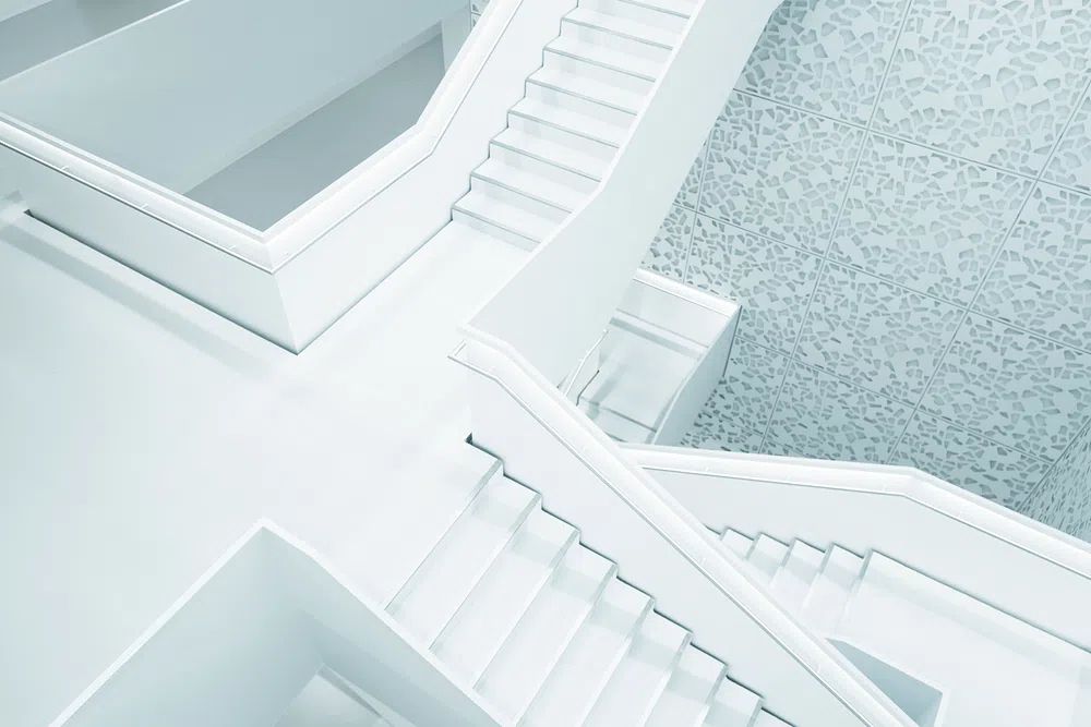
A smart way to build a small bathroom set is to combine one clear focal image with supporting pieces that are lighter and less detailed. You might anchor the arrangement with this crisp architectural print and add softer companions from our minimalist art prints. In a warmer powder room, a portrait such as Elegant Woman Portrait can sit well beside a neutral texture study.

Before hanging, lay the arrangement on the floor and measure the total width and height. As a rule, the full composition should cover about 60 to 75 percent of the width of the surface beneath it — whether that is a console, towel rail, or open wall section.
Final Styling Tips for a Cohesive Look
Tie your art to at least one bathroom element so it feels integrated. Pick up the warm ivory from towels, the charcoal from grout, the sand tone from stone flooring, or the brushed brass from fixtures. If the room has cool tile and chrome, keep the palette crisp with whites, grays, and muted blue-greens. If it has travertine or oak, choose cream, clay, olive, or faded black.
The best bathrooms poster print is usually one that calms the room rather than dominates it. Start with the wall you notice first when entering, choose a size that has presence, and frame it in a finish that echoes the rest of the space. One thoughtful piece can finish a bathroom just as effectively as new hardware or fresh paint.
Frequently Asked Questions
Can I hang art in a bathroom without a window?
Yes — just avoid placing it too close to the shower and make sure the extractor fan is used regularly. In low-ventilation rooms, acrylic glazing and a sealed frame back are the safest choices.
What frame color works best with chrome fixtures?
Black, white, and cool light wood frames usually look best with chrome. They keep the palette clean and do not compete with the reflective finish.
Should bathroom art match the towels exactly?
No. Aim for coordination rather than a perfect match — repeating one shared tone is enough to make the room feel cohesive.
Is one large print better than several small ones?
In most bathrooms, yes. One 50x70 cm piece often looks more polished than multiple small frames, especially in rooms with limited wall space and many hard lines.