Why 16x20 Works So Well
16x20 art prints sit in a useful middle range: large enough to read clearly from 6 to 10 feet away, but not so large that they dominate a modest wall. The size is 40% larger in surface area than 11x14, which gives artwork more presence without jumping to oversized formats like 24x36. That balance is exactly why 16x20 art prints work so well in apartments, family homes, and compact offices.
This format also suits both portrait and landscape compositions. A vertical 16x20 can sharpen a narrow wall between windows, while a horizontal version feels grounded above a console or desk. If you like art that feels intentional rather than improvised, this is one of the easiest sizes to style because it rarely looks too small or too heavy.
For rooms with calm, pared-back styling, simple work from our minimalist collection or abstract art prints often lands especially well at 16x20. The scale gives restrained compositions enough visual weight to hold a wall on their own.

Choosing the Right Room for the Scale
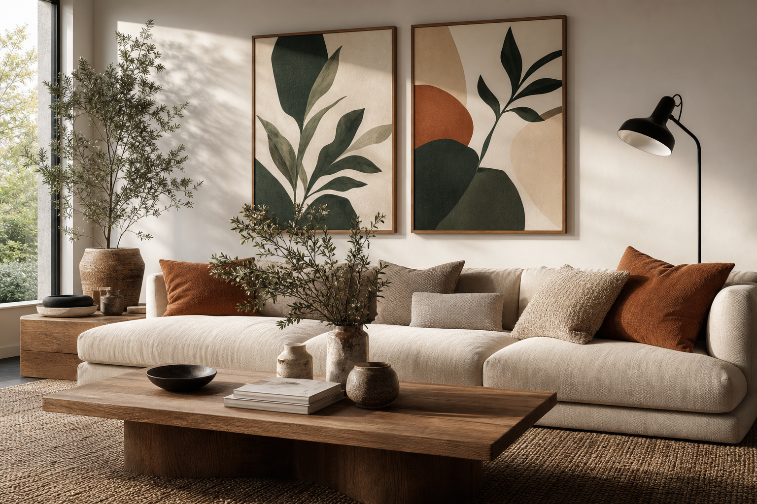
In a living room, a single 16x20 piece works best on walls that are roughly 48 to 72 inches wide, especially above a small loveseat, sideboard, bar cart, or reading chair. Above a full-size sofa, one 16x20 usually looks undersized unless you pair it with a second print or add a wide mat and substantial frame. If your sofa is 84 inches wide, aim for art that spans about 56 to 63 inches total — around two-thirds to three-quarters of the furniture width.

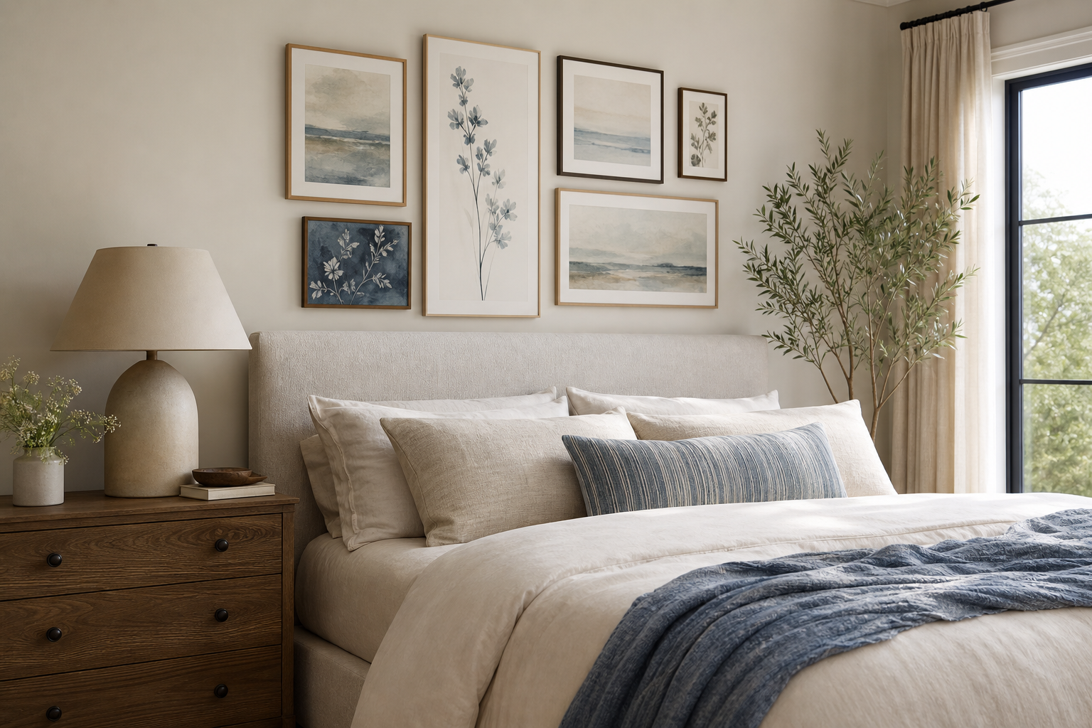
In bedrooms, this size is especially reliable above nightstands, dressers, or a queen bed when used as a pair. One 16x20 centered over a narrow chest feels tailored; two over a headboard feel structured and hotel-like. If you want a softer mood, look through our photography wall art for atmospheric landscapes or quiet nature scenes.
Hallways benefit from 16x20 art prints because they create enough impact in transitional spaces without making a corridor feel tight. In a hallway that's 36 to 42 inches wide, keep the frame profile slim — around 0.75 to 1.25 inches — so the art feels crisp rather than bulky.
Home offices are another strong match. A 16x20 piece above a desk gives the eye a clear focal point during calls and breaks up blank wall space behind a monitor. If you want something structured and graphic, our illustration prints and fine art collection both offer compositions that read well at this scale.
Framing Choices That Elevate the Print
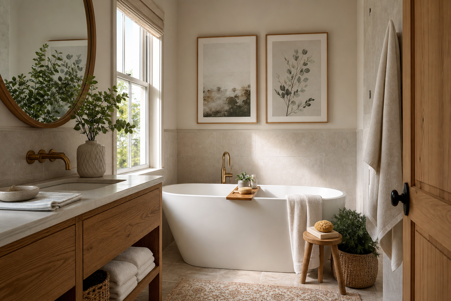
The fastest way to make a 16x20 print feel more expensive is to frame it with restraint. Oak and ash frames warm up photography and botanical subjects; black frames sharpen monochrome work, line-led illustration, and bold abstracts; white frames suit airy rooms with pale walls and low contrast. For most interiors, a frame width between 0.8 and 1.5 inches is the sweet spot.
Matting changes the perceived scale more than people expect. A 16x20 print with a 2-inch mat on all sides typically ends up closer to 20x24 overall, which gives it extra authority on the wall. This is useful when the artwork itself is subtle, such as Window with Sheer Curtain or meditative pieces from the Fine Art category.

If you prefer a cleaner, more contemporary look, skip the mat and let the image fill the frame. This works well with graphic pieces and saturated color. A stronger image can hold the space edge to edge without feeling crowded.

How to Hang One Print or Build a Pair
A single 16x20 should usually be hung so its center sits 57 to 60 inches from the floor — the standard eye-level range in most homes. Above furniture, leave 6 to 8 inches between the top edge of the furniture and the bottom of the frame. Less than 4 inches feels cramped; more than 10 inches often disconnects the art from the piece below it.
If you're building a pair, keep the spacing tight. Two 16x20 prints with 2 to 3 inches between frames look coordinated and custom. Wider gaps make them read as separate objects rather than one visual unit. This approach works especially well above beds, sideboards, and long desks.
For a simple gallery wall, use one 16x20 as the anchor and surround it with smaller formats such as 8x10 or 11x14 pieces. Keep the total arrangement within a clear rectangle, and repeat either frame color or mat style across all pieces. If you like movement and texture, a mix of Textured Waves and classic landscapes from Yosemite National Park makes the arrangement feel collected rather than rigid.


Color, Theme, and Mood Pairings
The easiest way to choose among 16x20 art prints is to match the artwork to one dominant element already in the room: upholstery, rug tones, curtain color, or wood finish. In a neutral space with beige, cream, and pale oak, soft pieces with low-contrast palettes feel settled and expensive. Try tonal works from the abstract category or gentle landscapes from Photography prints.
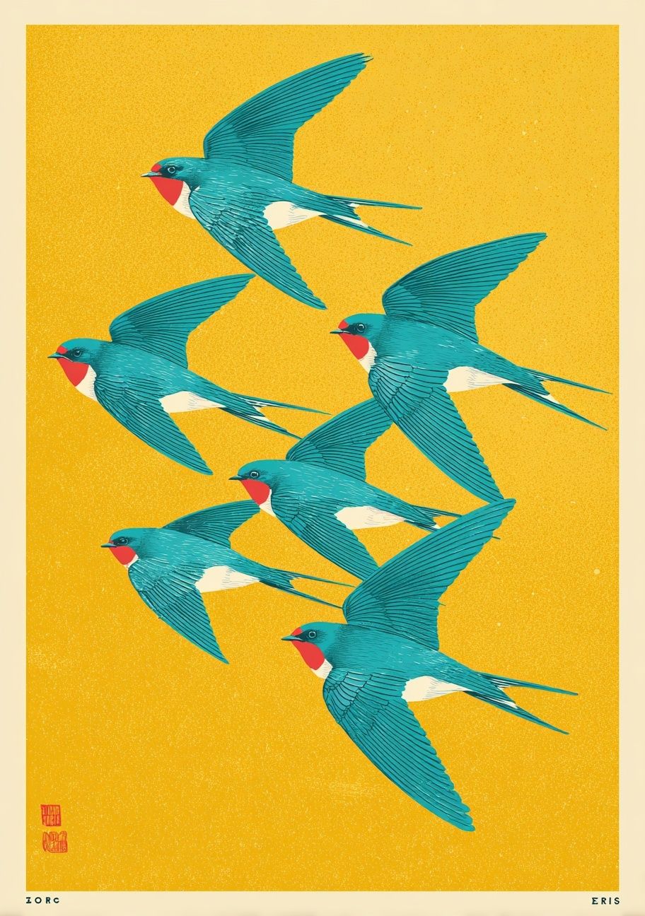
Rooms with stronger accents — mustard, rust, deep blue, forest green — can handle art with more contrast. A 16x20 print is large enough to carry a distinct palette without making the whole room feel loud. If your room already has pattern in the rug or cushions, choose artwork with one focal image and two or three core tones rather than many competing details.

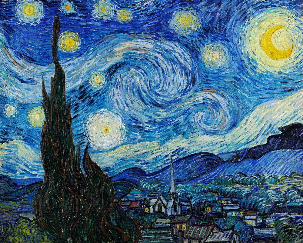
Minimal interiors benefit from simple compositions and generous negative space. Eclectic rooms can take more narrative or painterly work, especially from the vintage-inspired wall art and fine art selection. For example, Starry Night suits a room with deep navy or ochre accents, while softer pieces such as Sunlit Water Surface keep a serene palette intact.

Sizing Rules for Easy Styling
A few measurements remove most of the guesswork. If art is going above furniture, aim for a total width that is 60% to 75% of the furniture below. For a 60-inch console, that means an art arrangement around 36 to 45 inches wide. One 16x20 on its own will be too narrow there; a pair is usually the better choice.
On a blank wall with no furniture underneath, think in terms of breathing room. Leave at least 6 inches from corners, trim, or door frames so the artwork does not feel trapped. In narrow spaces, vertical orientation helps draw the eye upward. In wider spaces, horizontal art or a two-piece arrangement creates better visual spread.
Spacing within groupings matters just as much as print size. Keep 2 to 4 inches between smaller frames and 3 to 5 inches between larger ones. If every gap is different, the wall starts to feel accidental. Consistent spacing is what makes mixed art look curated.
Final Styling Tips for a Finished Look

When in doubt, start with one 16x20 print in the room that needs the clearest focal point. Frame it simply, hang it 57 to 60 inches to center, and make sure it relates to at least one color already in the space. That formula works in nearly every interior style.
If the wall still feels underdressed, do not rush to a much larger size. Two coordinated 16x20 art prints often look more refined than one oversized piece, especially in bedrooms, offices, and living rooms with standard 8-foot ceilings. The size is versatile because it gives you options — single statement, balanced pair, or gallery-wall anchor — without forcing the room to revolve around the art.
Frequently Asked Questions
Is 16x20 a standard frame size?
Yes. It is one of the easiest sizes to frame, with ready-made options widely available in wood, metal, and acrylic-front styles.
Should I use glass or acrylic for a 16x20 frame?
Acrylic is lighter and safer for bedrooms, hallways, and gallery walls. Glass offers a slightly crisper surface but is heavier and more fragile.
Can I lean a 16x20 print instead of hanging it?
Yes — it works well on mantels, shelves, and dressers. Layer it behind a smaller frame or vase so it looks styled rather than temporary.
What wall color makes 16x20 art prints stand out best?
Soft white, warm greige, pale taupe, and muted clay are the most flexible backdrops. Strong art can also look excellent on deep olive, charcoal, or navy if the frame has enough contrast.