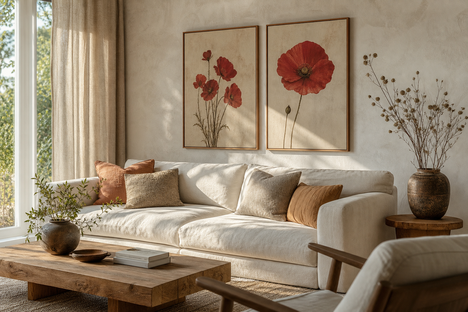
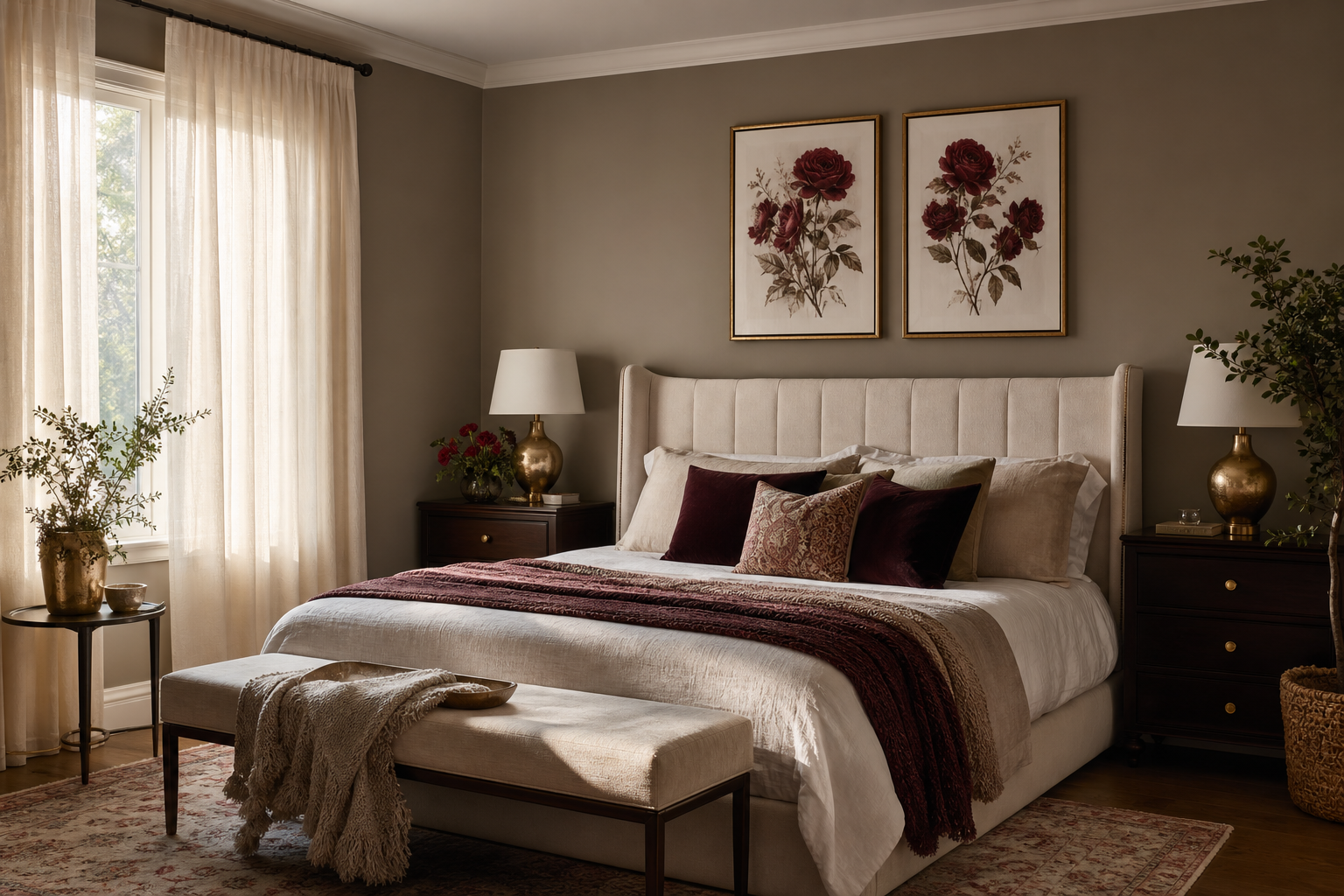
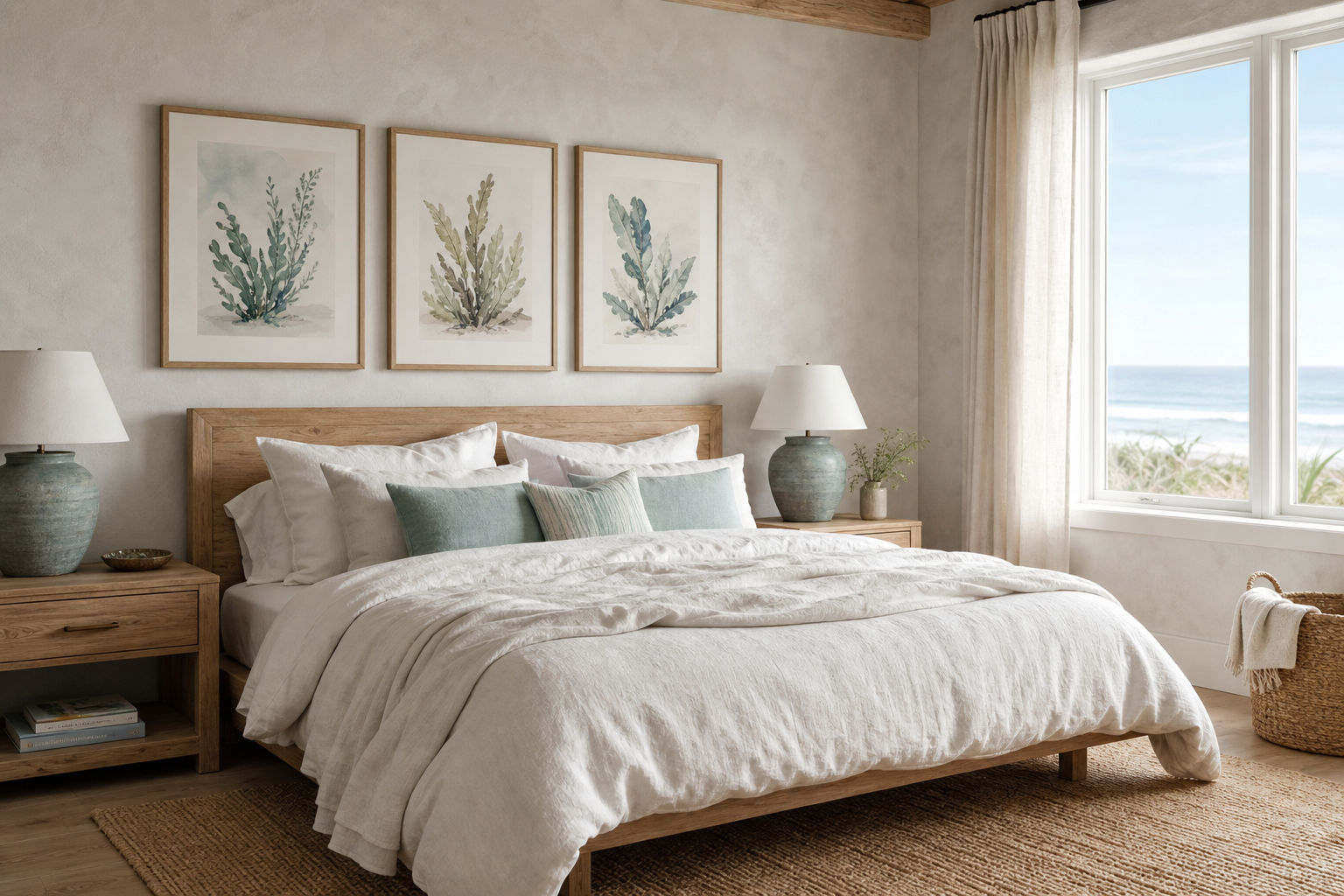
A well-chosen bathroom poster print does something hard finishes cannot: it softens the room. Bathrooms are usually dominated by tile, glass, porcelain, and metal, so even one framed piece can add warmth without taking up floor space. In a room that may only measure 2 x 3 metres, wall art is often the easiest way to make the design feel deliberate rather than purely functional.
Why a Bathroom Poster Print Works So Well
A bathroom poster print works because it adds visual contrast to surfaces that are flat, reflective, and often cool in tone. If your walls are mostly white tile or painted plaster, art introduces shape, rhythm, and a focal point at eye level. That matters especially in smaller bathrooms, where a blank wall above the toilet or bath can make the room feel unfinished.
Bathrooms also benefit from art because the footprint is fixed. You cannot easily add another chair, side table, or floor lamp, but you can use the wall above a towel rail, beside a vanity, or opposite the mirror. A single 30 x 40 cm frame can be enough in a cloakroom, while a 50 x 70 cm piece gives a standard family bathroom a stronger centre of gravity.
If you want a clean, calming effect, start with pared-back work from our Minimalist collection or soft tonal pieces in abstract wall art range. These styles sit comfortably with the simple lines and restrained palette most bathrooms already have.
Choosing the Right Style for the Space
The best style depends on the mood you want the room to hold. For a spa-like bathroom, keep the artwork quiet: misty textures, pale neutrals, watery forms, or stone-inspired compositions. These pair naturally with limestone-look tiles, oak vanities, and white towels.

A strong example is a piece with texture rather than busy detail. It adds depth from a distance and still feels restful up close.

If your bathroom leans more decorative, vintage-inspired pieces can bring in charm. Think soft portraits, faded silhouettes, or elegant figurative work rather than anything overly formal. In practical terms, this suits checkerboard floors, brass taps, painted paneling, or warm cream walls. Browse our vintage print collection if you want that layered, lived-in feel.
Playful bathrooms can handle more character. A guest WC, for example, is often the right place for wit, unusual imagery, or a punchier colour accent. Typography can work well there because the room is used briefly and the styling can be a little sharper. If you prefer something theme-led without feeling obvious, bathroom photography and water-related imagery create a natural link to the room.
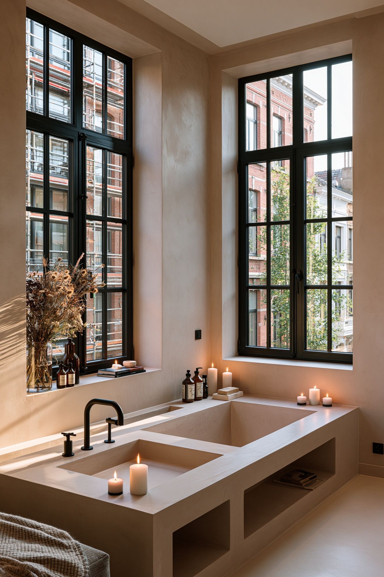
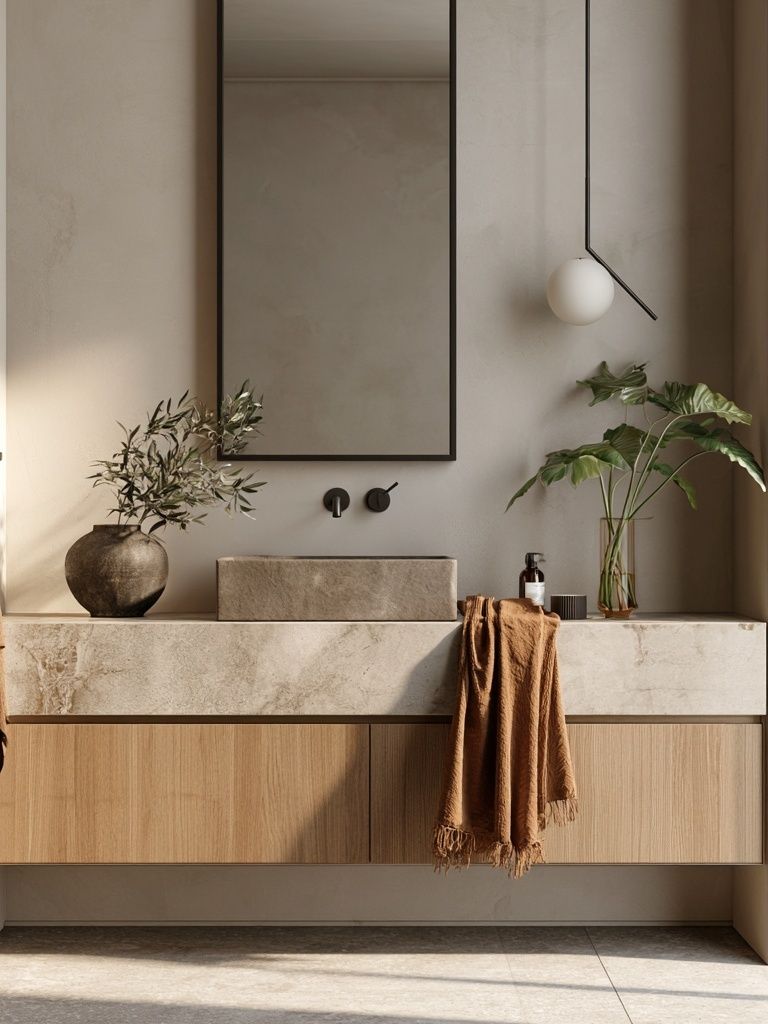
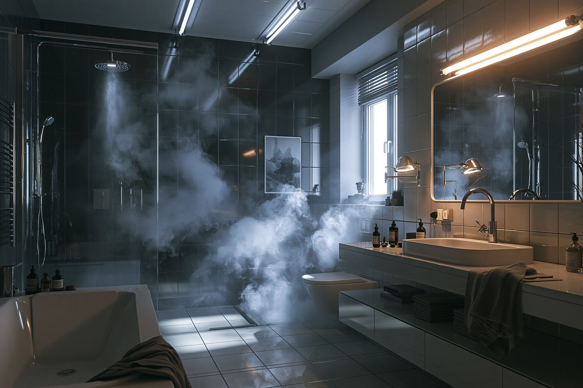
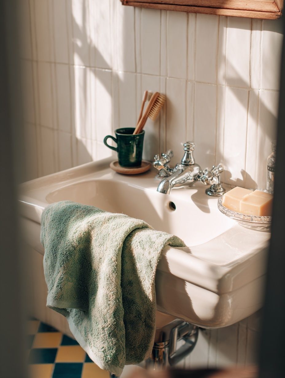
For a subtle design connection, repeat the room's undertones. Cool greys suit concrete, chrome, and white grout. Warmer off-whites and sandy tones flatter travertine, brass, and natural timber. If you're unsure, a piece like White Cream Texture Poster is easy to place because it bridges warm and cool finishes.
Finding the Best Size and Placement
Scale matters more in bathrooms because walls are broken up by mirrors, windows, towel rails, and fittings. As a rule, your art should fill around 60 to 75 percent of the width of the furniture or wall zone below it. Above a toilet, 30 x 40 cm or 40 x 50 cm usually looks balanced. Above a bath, 50 x 70 cm or 61 x 91 cm has enough presence to anchor the wall.
Hang the centre of the frame roughly 145 cm from the floor in a standard bathroom, adjusting down if the piece sits above a fixture. If you're placing art above a toilet cistern or towel rail, leave 15 to 25 cm of breathing room. Above a freestanding bath, 20 to 30 cm usually looks right, depending on ceiling height.

In narrow rooms, vertical pieces elongate the wall. In wider bathrooms, one horizontal print or a pair of smaller frames can make the proportions feel calmer. Avoid placing artwork where it is constantly splashed — directly behind a sink with no backsplash, for example — unless it is very well protected.
If you want a bathroom-specific visual cue, a photographic piece can work beautifully when the room itself is simple.
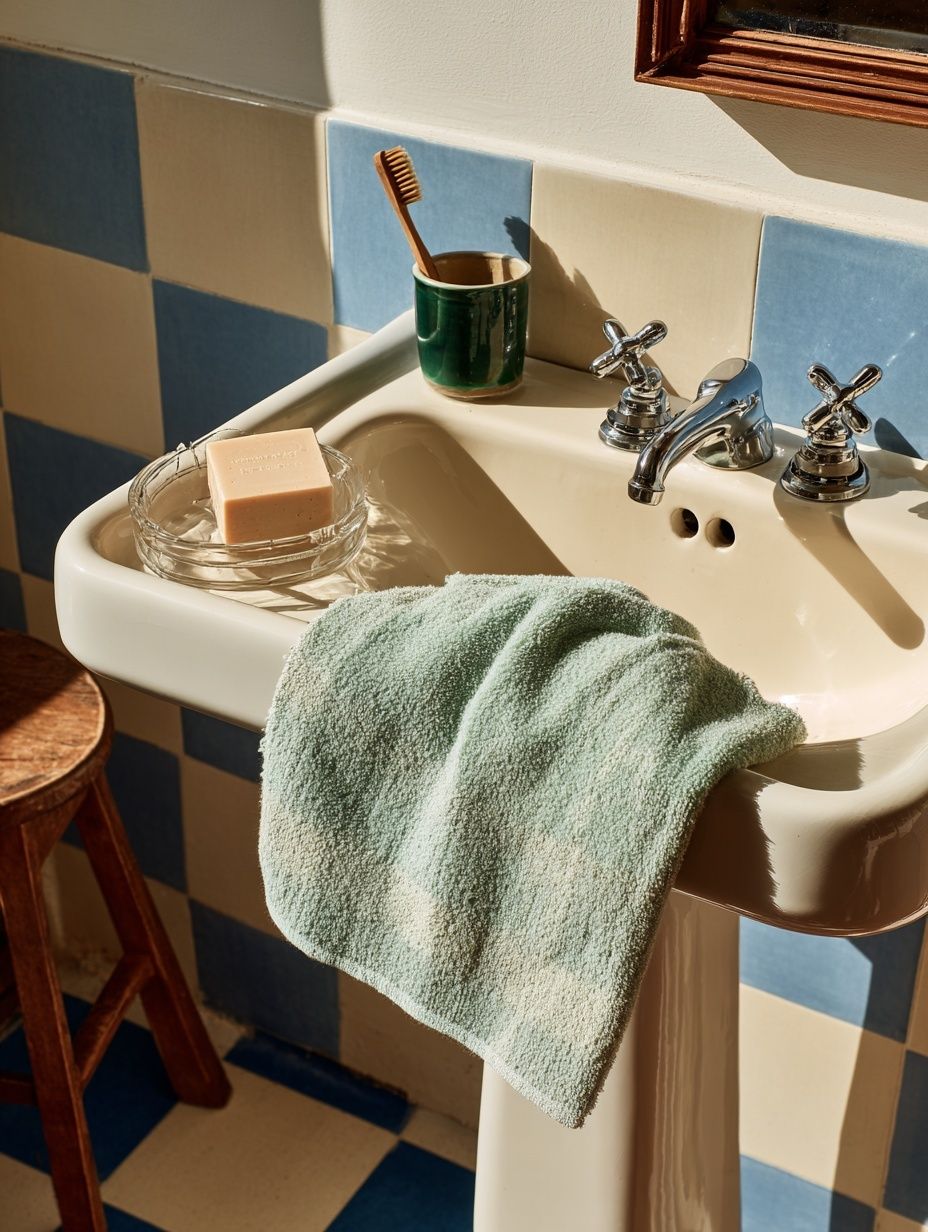
For understated placement near a vanity or window wall, a piece such as Window with Sheer Curtain — Fine Art Print adds softness without competing with mirrors or tapware.
Framing and Finishes That Can Handle Humidity
Humidity is the practical issue that matters most. In a well-ventilated bathroom with an extractor fan, framed prints usually perform well if you choose the right finish. Use sealed frames, avoid flimsy paper backs, and opt for acrylic glazing if the piece hangs near a busy walkway or family bath. Acrylic is lighter than glass and less likely to shatter.
Wood, aluminium, and composite frames can all work, but the smartest choice is a frame with a sealed surface — painted, lacquered, or powder-coated. Raw timber is beautiful, yet it may react more to repeated steam unless the room stays dry. In bathrooms with regular condensation, keep the art on a wall away from the shower zone and wipe down the frame occasionally.

Mounting also helps. A print with a proper mount creates a little visual air around the artwork and reduces the chance of the piece feeling cramped on a hard tiled wall. Slim frames in black, oak, or off-white suit most bathrooms because they echo mirror frames and fittings without looking heavy.
A textured minimalist piece such as Textured Waves — Minimalist Print is especially good in humid rooms because the design reads strongly even through protective glazing.
How to Build a Relaxing Bathroom Palette
The easiest way to make art feel integrated is to pull two or three colours from it into the room. If the print includes warm ivory, taupe, and stone, repeat those tones in towels, bath mats, soap dispensers, or painted joinery. That gives the bathroom poster print a job beyond decoration — it becomes the colour reference for the room.
For a calm result, stay within a restrained palette: one base neutral, one secondary tone, and one accent. A common ratio is 70 percent base colour, 20 percent secondary, 10 percent accent. In a bathroom, that could mean white tile as the base, pale wood as the secondary, and muted sage or charcoal as the accent.
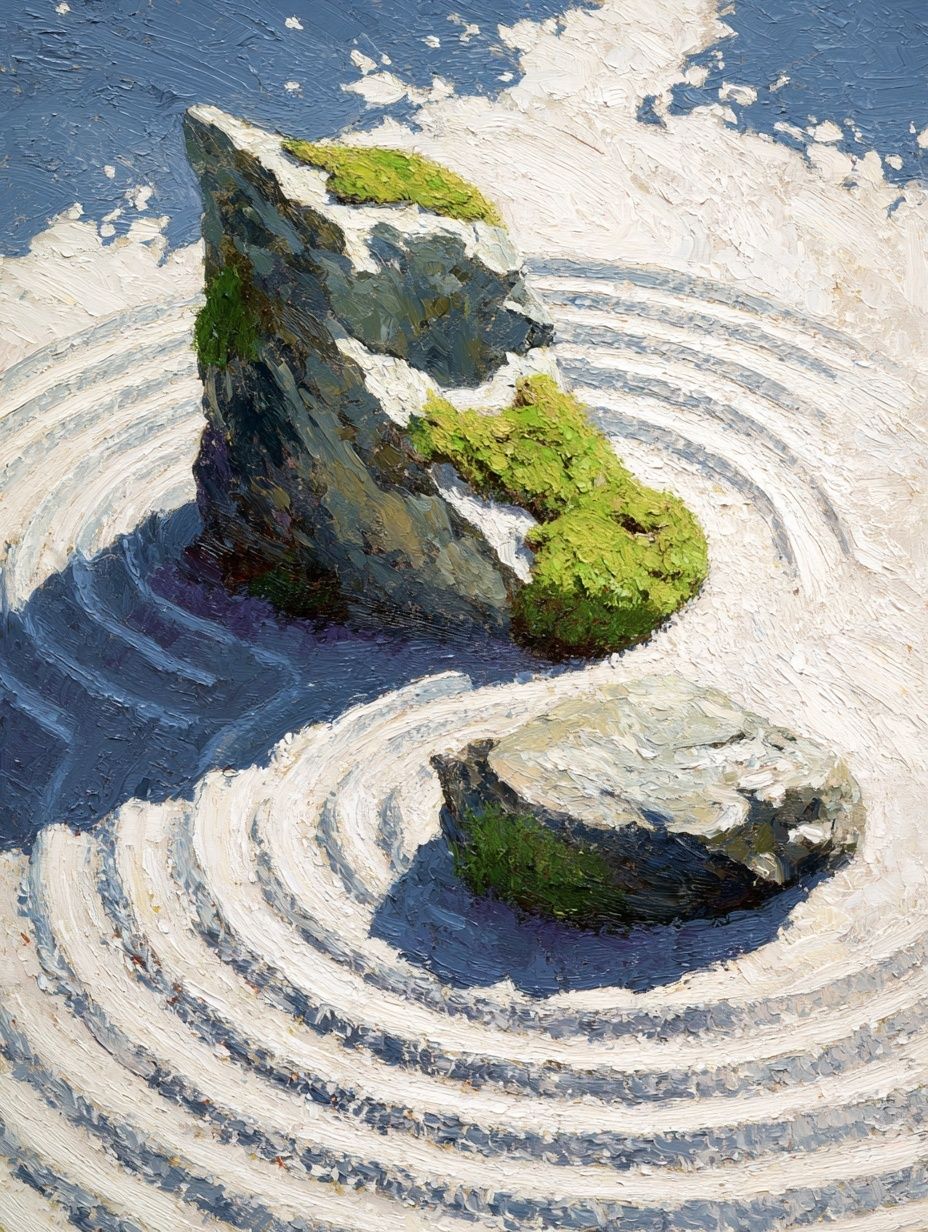
A piece with organic imagery can also soften hard geometry. If your bathroom has square tiles, straight vanity lines, and a sharp-edged mirror, introduce curves through abstract forms or natural subjects. Our Zen Garden Stones — Fine Art Print is a good fit for that kind of tonal, restorative scheme.
If you want more texture than image, look at Textured Fabric — Minimalist Print or Textured Concrete Wall — Minimalist Print. Both work well with plaster walls, limewash finishes, and matte ceramics.
Quick Styling Ideas for Small and Large Bathrooms
Small cloakrooms benefit from confidence. Because the room is compact, one distinctive piece often works better than several hesitant ones. Try one 40 x 50 cm frame above the toilet, or a narrow vertical print on the wall opposite the door so it is visible the moment you step in.
Family bathrooms need balance and durability. Choose art that feels calm but not precious, and keep frames simple so they can handle a room used by everyone. A mid-scale piece above the bath or two matching prints above towel hooks usually look more ordered than lots of small accents.

Large ensuites can take a bolder approach. One oversized piece above the bath creates a hotel-like focal point, while a pair of related works can define a longer wall beside double vanities. In bigger spaces, do not undersize the art — a tiny frame on a 2-metre wall will disappear.
For guest bathrooms, consider a more playful note from our typography print collection or an unexpected piece from illustration wall art selection. Keep the palette tied to the room so the effect still feels edited.
Shop Smart: Final Tips for Choosing the Right Print
Choose your bathroom poster print the same way you would choose a mirror or tap finish: by checking proportion, placement, and how it behaves with the room's materials. Measure the wall first, decide whether you want calm or contrast, and match the undertone of the art to the undertone of the tile, paint, or stone.
A good shortlist is simple: one print that fits the wall, one frame finish that echoes the hardware, and one palette that can be repeated in towels or accessories. If the room is small, go for clarity. If the room is spacious, go for scale. Either way, art is what makes a practical bathroom feel complete.
Frequently Asked Questions
Can I hang a print in a bathroom without an extractor fan?
Yes, but place it away from the shower or bath steam path and choose a sealed frame with acrylic glazing. Open windows regularly to reduce moisture build-up.
What frame colour works best in most bathrooms?
Oak, black, and off-white are the safest choices. Match oak with warm brass and timber, black with modern fittings, and off-white with soft neutral schemes.
Should bathroom art match the towels exactly?
No. It should share undertones rather than match perfectly. A towel that picks up one minor colour from the print usually looks more refined.
Is one large piece better than a gallery wall in a bathroom?
In most bathrooms, yes. One large piece is easier to position around mirrors and fittings, and it creates less visual clutter in a compact room.