A "cat eating taco" print does one job very well: it makes a room feel less serious in under 3 seconds. That matters in spaces that already have hard-working surfaces — kitchens, breakfast corners, home offices — where cabinetry, appliances, and storage can easily feel flat. A playful subject adds personality without needing bold furniture or complicated styling.
The strongest version of a cat eating taco image blends two familiar comforts: pets and food. That combination reads quickly from across the room, which is why it works so well as wall art. If you already like our funny print collection, animal wall art, or food-inspired art prints, this type of piece sits naturally between all three.
Why a Cat Eating Taco Poster Works
Humour in interiors works best when it is visual rather than verbal. A cat balancing a taco, staring at it, or mid-bite creates the joke through the image alone — no caption needed. That keeps the art looking decorative instead of novelty-heavy. In practical terms, it means the print can stay on the wall for years without feeling like a one-season gag.
A cat eating taco subject also has broad placement range. In a kitchen, it feels witty. In a hallway, it becomes an unexpected conversation starter. In a pet corner beside a feeding station, it feels personal. Compared with more niche humour, this kind of image is easy to style because cats, warm food tones, and simple graphic shapes pair well with wood, white walls, black frames, and soft neutral textiles.
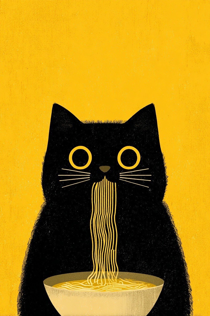
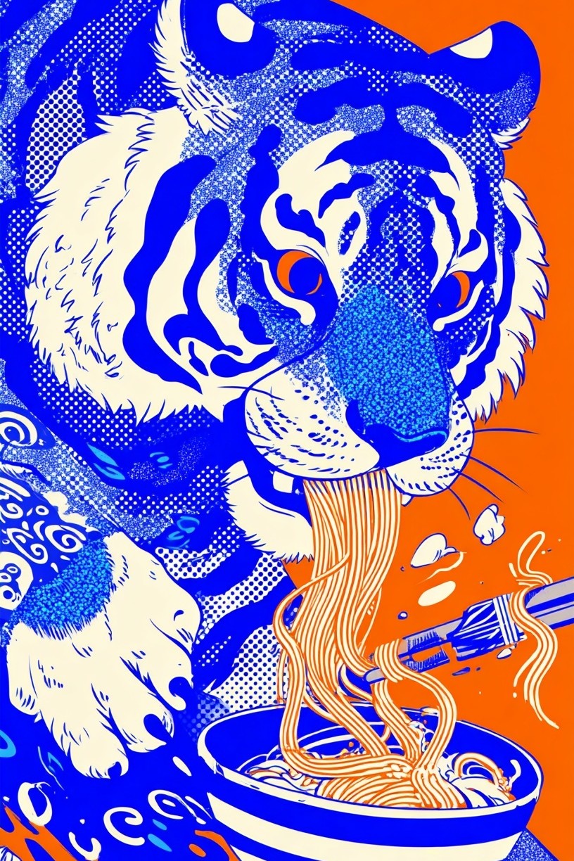
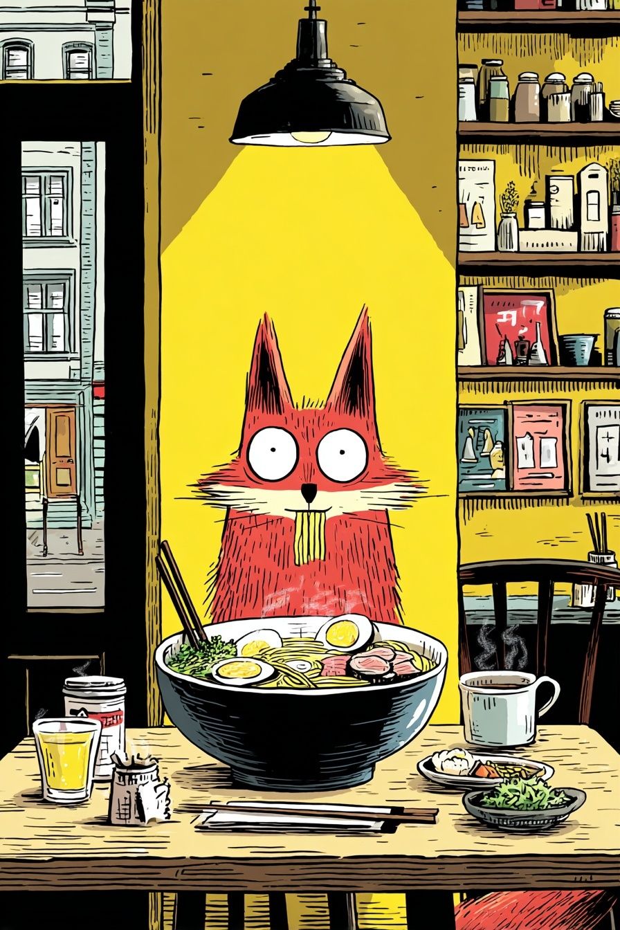
If you want a similar balance of food and character, look at pieces like Cat Eating Noodles — Illustration Print or Fox Eating Ramen — Illustration Print. They show how animal-and-food artwork can feel playful while still reading as considered decor.
Finding the Right Style for the Artwork
Style changes the entire mood of a cat eating taco print. A minimalist illustration with 2 or 3 flat colours — cream, terracotta, charcoal — feels neat and modern. It suits Scandinavian kitchens, pared-back offices, and rented spaces where you want one humorous note without visual clutter. If the room already has clean-lined furniture and open shelving, this is the safest route.
A retro version, on the other hand, leans harder into personality. Think faded oranges, avocado green, tomato red, and a slightly grainy finish. That works especially well with mid-century furniture, checkerboard floors, chrome stools, or vintage-inspired dining corners. The print can handle stronger surroundings because the styling language already supports a bit of visual fun.

Cartoon-led designs feel more energetic. They work best in casual zones: a breakfast nook, dorm room, first apartment kitchen, or creative workspace. If the recipient loves expressive illustration, look through our illustration collection and comic-inspired prints for that bolder, drawn look. A more graphic outline, exaggerated expression, or oversized taco shape pushes the image from "cute" toward "statement piece".
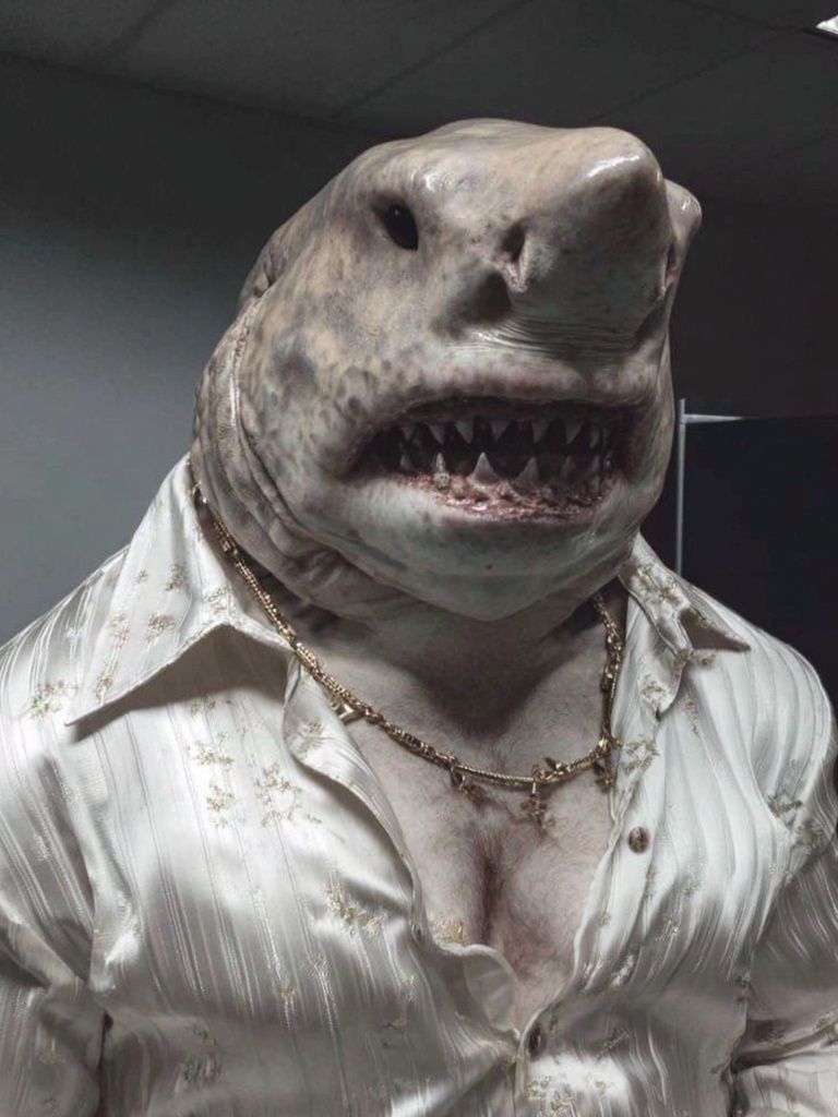
Photographic treatments are trickier. They can be very funny, but they need cleaner execution to avoid looking random. If you prefer realism, keep the rest of the room restrained — white wall, oak shelf, black frame, one accent colour. That gives the humour structure.

Best Colours and Backgrounds to Use
Colour is what makes a cat eating taco print either pop or settle in. If you want a lively effect, build around taco tones: paprika red, avocado green, cheese yellow, and shell beige. These colours are already warm and familiar, so they make kitchens and dining spaces feel welcoming rather than chaotic. A white or pale oatmeal wall gives enough contrast for the art to read from 1.5 to 2 metres away.
Muted backgrounds are better if the print itself is busy. Soft clay, warm grey, dusty sage, or pale sand keep the image grounded. This is useful if the artwork includes several colours or a highly expressive cat face. In smaller rooms — under 12 square metres — calmer wall colour often makes a funny print feel more intentional.
If you prefer stronger colour, choose one dominant hue and repeat it only 2 or 3 times in the room. For example, pick a print with red accents, then echo that red in a tea towel, fruit bowl, or seat cushion. More than that, and the joke can start competing with the decor.
Where to Hang It in the Home
The kitchen is the obvious location, and for good reason. Food-related humour belongs near food. A cat eating taco print works especially well above a breakfast bench, beside open shelving, or on the short wall near a dining table. For a 60 x 80 cm print, keep the centre of the frame around 145 cm from the floor. If you're hanging it above furniture, leave 15 to 25 cm between the top of the furniture and the bottom of the frame.
Dining spaces are another strong choice because they support conversation pieces. One medium print above a sideboard works in smaller flats. In larger dining rooms, pair it with other playful character art for a casual gallery wall. You can mix a food theme with animal humour as long as the palette stays consistent.

Hallways benefit from surprise. A cat eating taco image near the entry sets the tone immediately — friendly, not formal. Home offices are also a good fit, particularly if the room has lots of screens and practical storage. One witty print can soften the space. If you like that approach, pieces such as Duck Doctor Portrait Poster or Monkey in Suit — Funny Print show how character-based art adds humour without needing loud colour.
Pet corners are the most personal option. Hang the print above a feeding mat, next to a cat tree, or near a storage basket for toys and treats. That turns a functional area into a styled one.
How to Frame a Funny Print Without Losing the Joke
The easiest mistake is over-framing a playful image. Heavy ornament, glossy metallics, or novelty frames usually compete with the artwork. A slim black frame, natural oak frame, or white frame with a face width of 1 to 2 cm keeps the focus where it should be. Those three finishes cover most interiors.
Matting helps if the print is busy. A white mat of 4 to 6 cm creates breathing room and makes the image feel more gallery-like. This is especially useful for a cat eating taco design with saturated colour or detailed illustration. In a small frame — say 30 x 40 cm — matting can make the print look more substantial without adding visual noise.

Glass finish matters more than many buyers expect. If the print is going in a kitchen or opposite a window, consider low-reflection glazing so overhead light does not flatten the image. For relaxed interiors, oak is usually the warmest option. For graphic or monochrome rooms, black keeps the joke crisp.
Gift Ideas for Cat People and Taco Fans
This subject is a strong gift because it feels specific without being difficult to place. A housewarming is ideal — especially for someone moving into a first flat or decorating a kitchen from scratch. It also works for birthdays, coworker gifts, and Secret Santa budgets where you want something more personal than candles or mugs.
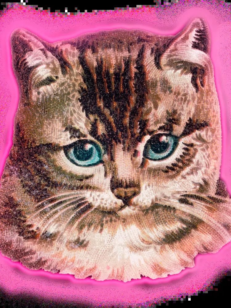
The best recipients are easy to identify: cat owners, people who host casual dinners, taco enthusiasts, students decorating a dorm kitchen, and anyone who already buys quirky art. If their taste already leans toward smart, ironic funny prints or character-led illustrations like Kitten Eating Banana — Animal Photography Print, a cat eating taco print makes sense.
For gifting, size matters. A 30 x 40 cm print is easy to wrap and easy to place. A 50 x 70 cm version feels more substantial for a close friend or partner. If you do not know their wall colour or furniture style, choose a design with a light background and one or two strong accents rather than a fully saturated composition.
Shop Tips for Choosing the Best Version
Start with room function. For a kitchen or dining area, choose brighter food-led colours and clear shapes that read quickly from across the room. For a hallway or office, look for a cleaner composition with more negative space. The image should still be funny at a glance, but it should not dominate the room.
Paper finish changes the effect. Matte paper suits illustration and comic-inspired work because it reduces glare and keeps colours looking soft and rich. A satin finish can add punch to bolder designs, but in bright rooms it may reflect too much light. If the print includes fine line detail, larger sizes — 50 x 70 cm or 60 x 80 cm — will preserve that better than small formats.

Also check the tone of the expression. Some versions are cute, some sarcastic, some chaotic. Match that to the person or room. A calm, stylised cat suits a refined interior. An exaggerated cartoon cat with flying toppings fits a more energetic space. If you want related inspiration before choosing, browse surreal funny wall art, character-driven animal prints, or playful comic cat-and-dog art.
Final thoughts
A cat eating taco print works because it combines humour, warmth, and instant recognisability. It can brighten a kitchen, loosen up a home office, or make a gift feel sharply chosen rather than generic.
The best result comes from balance: one playful image, a clean frame, and colours that connect with the room. Done well, "cat eating taco" art feels less like a gimmick and more like the detail everyone remembers.
Frequently Asked Questions
What size works best for a small kitchen wall?
For narrow walls or spaces between shelves, 30 x 40 cm or 40 x 50 cm usually fits best. If the wall is above a sideboard or dining bench, 50 x 70 cm gives more presence.
Should I choose a frame with or without a mat?
Use a mat if the artwork has strong colours or lots of detail — it gives the image more breathing room. Skip the mat for bold, simple designs where you want a more modern look.
Which frame colour is safest if I am buying it as a gift?
Natural oak is the easiest all-round option because it suits warm, neutral, and colourful rooms. Black is best if the recipient prefers graphic, higher-contrast decor.
Can funny animal art work in a grown-up interior?
Yes — if the composition is clean and the framing is restrained. One witty print often works better than several novelty pieces together.
What pairs well with a cat-and-food print in a gallery wall?
Stick to 2 or 3 related themes such as animals, food, and illustration. Keep the palette consistent so the arrangement feels curated rather than random.