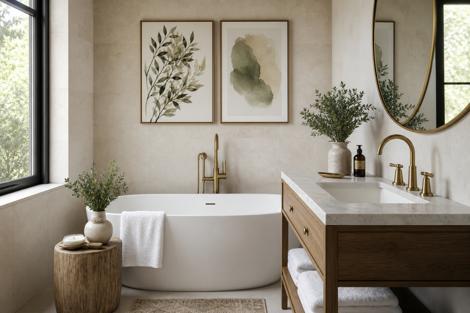
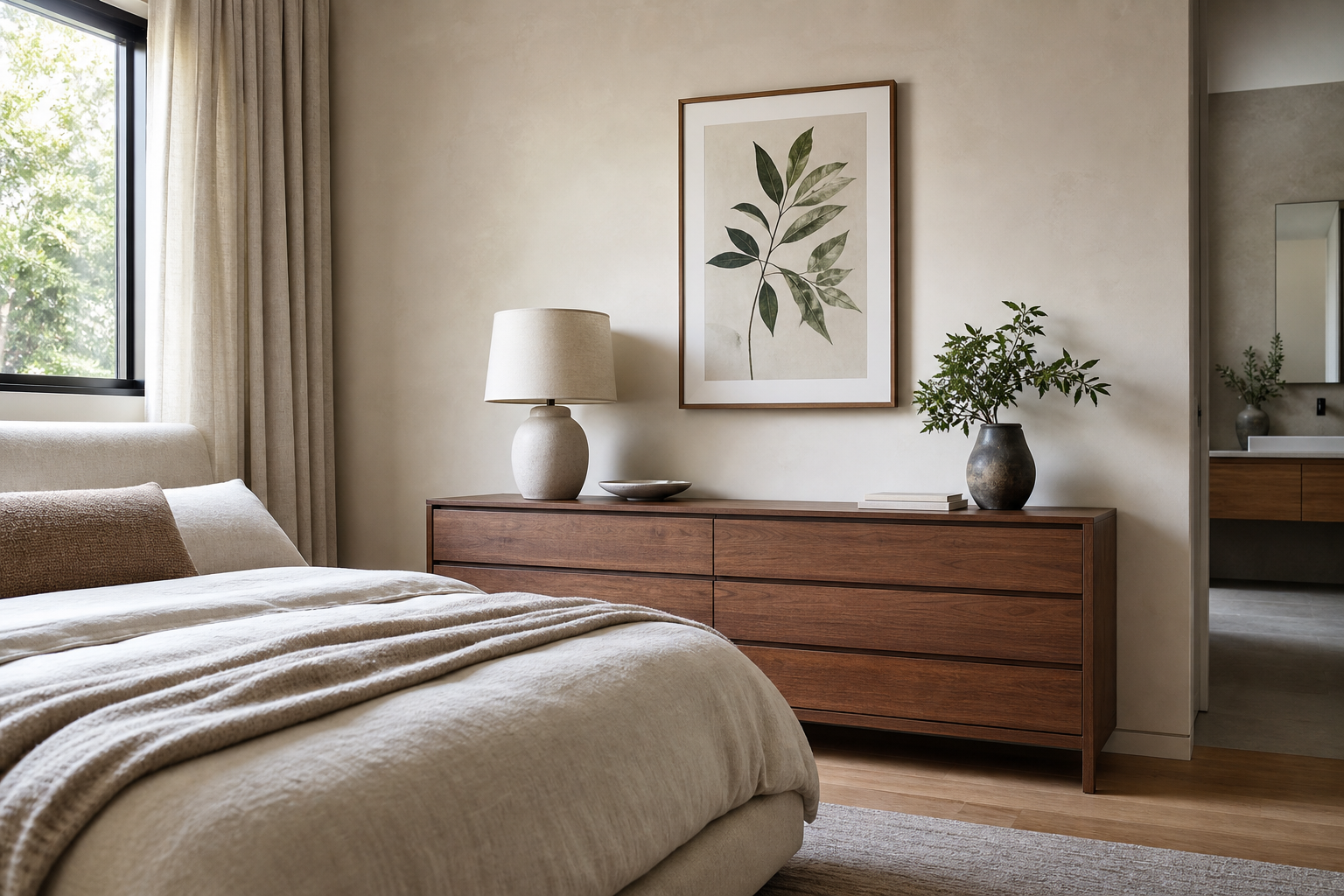
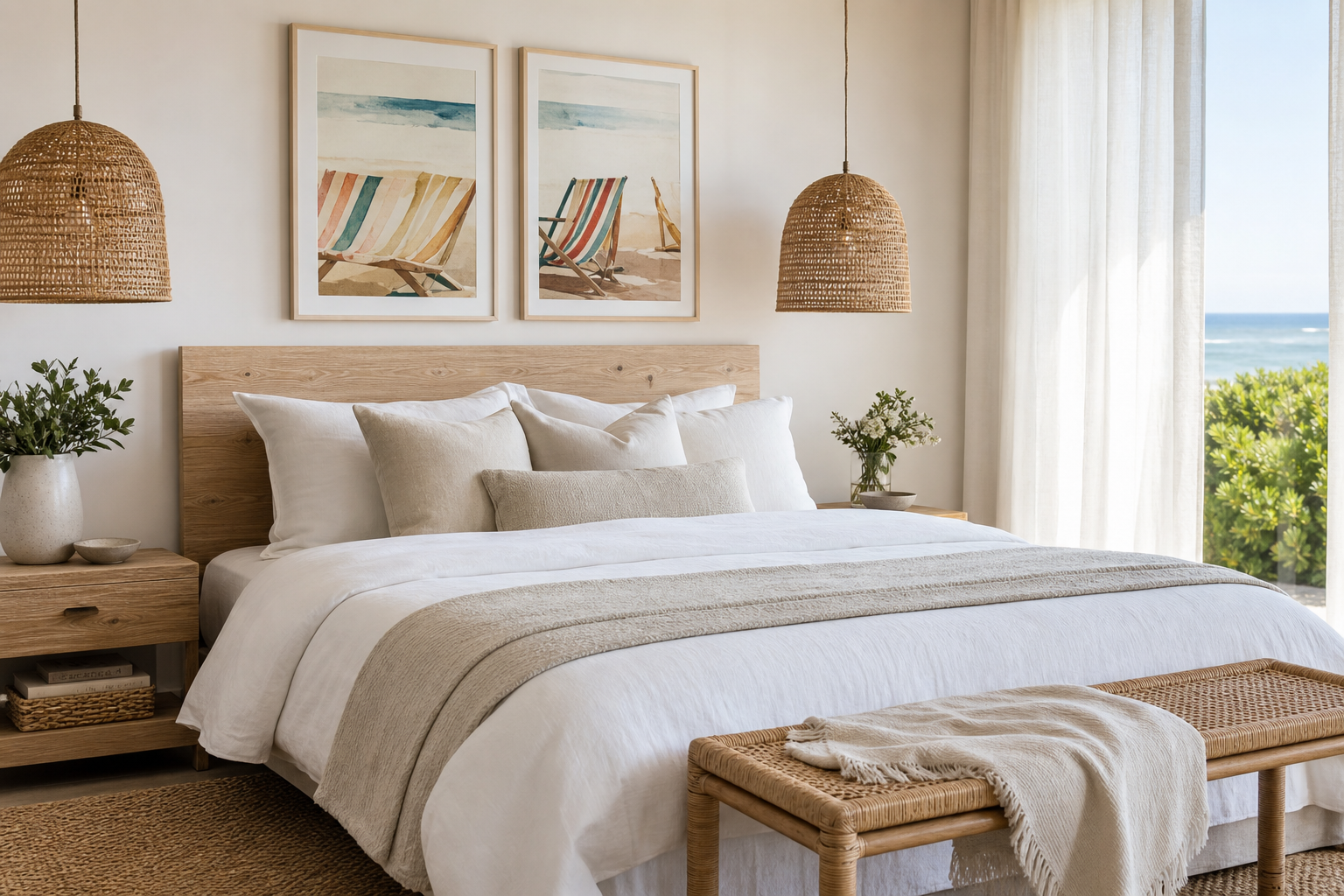
A bear with a red hat works because it lands between character art and clean design. The bear brings softness and familiarity, while the red hat acts like a built-in accent color that catches the eye from across the room. In interiors that rely on beige, white, oak, or muted green, that one red detail can do the job of a cushion, vase, and decorative object all at once.
This kind of motif also avoids the disposable look of overly themed decor. A bear with a red hat feels narrative, but not noisy. It can sit comfortably beside our animal wall art collection, mix with illustration prints with a softer hand-drawn feel, or lean more playful when paired with kids' room art.
Why the Bear With a Red Hat Feels So Fresh
The appeal starts with contrast. Bears are usually associated with earthy tones — brown, caramel, black, cream — so a strong red accessory feels unexpected. That contrast gives the artwork instant presence, especially on a light wall. In practical terms, a small red area can pull visual focus more effectively than a much larger field of grey or beige.
The second reason is storytelling. A hat suggests personality — curious, dressed-up, mischievous, wintery, or slightly vintage depending on the illustration style. That makes the wall art feel considered rather than generic. If you already enjoy charming character pieces such as Birthday Bear Illustration Poster or more humorous animal subjects from our funny prints collection, this motif fits naturally into the same visual language.

A good benchmark: if a room feels flat, one character-led artwork with a bold accent can shift the whole mood in under 50 cm of wall width. That is why these prints work so well in smaller spaces where every decorative choice needs to count.
What This Poster Style Says About Your Space
In a nursery, it reads gentle and imaginative rather than babyish. The bear shape is soft and reassuring, and the red hat adds enough color to keep the room from looking washed out. Pair it with ivory walls, pale wood, and one or two muted red textiles to make the art feel integrated.
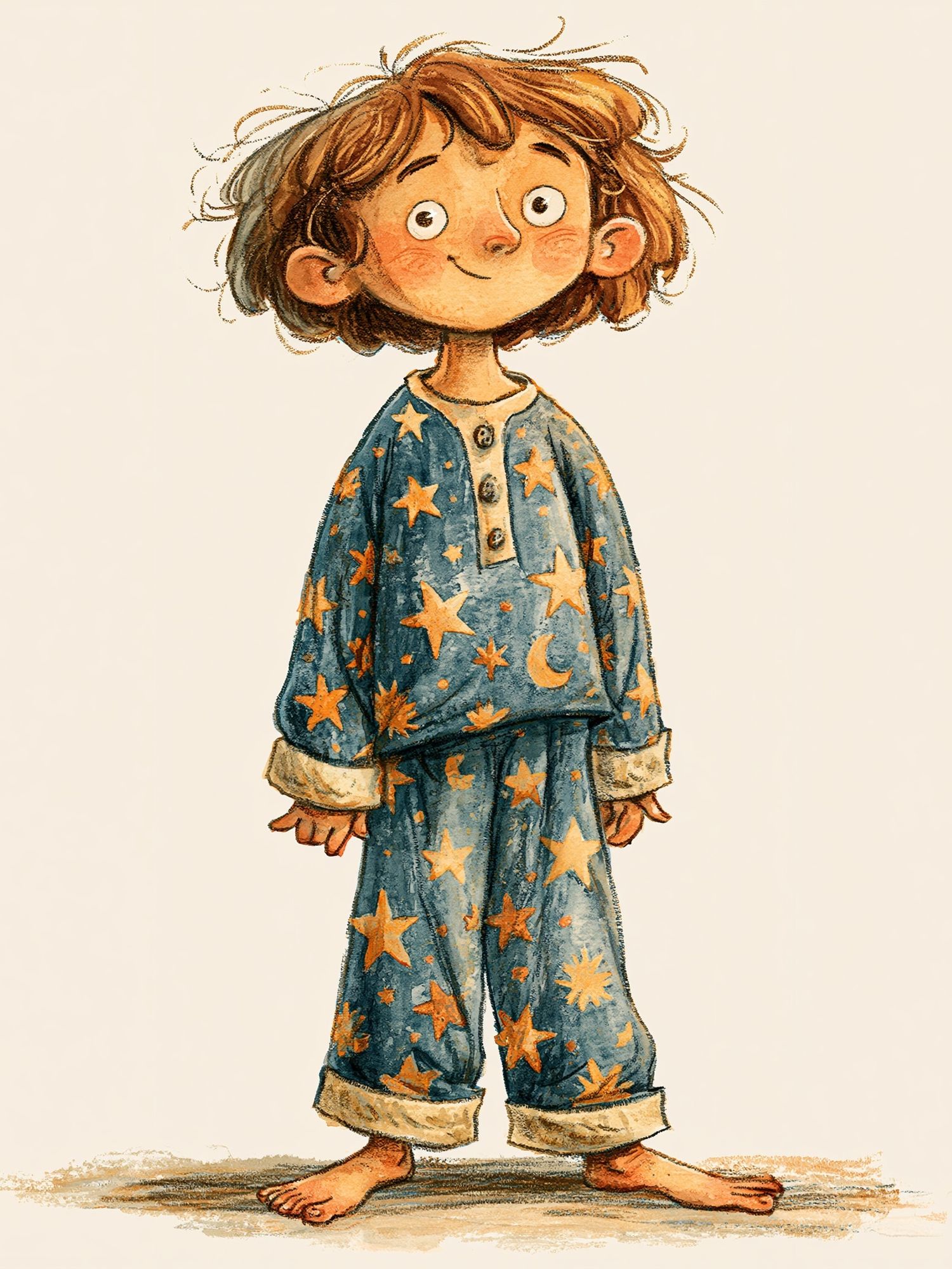
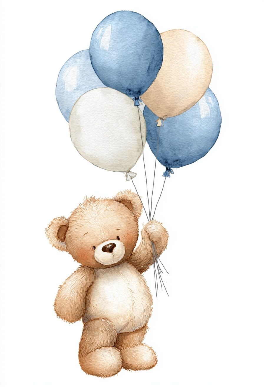
In a kids' room, the message is more confident: this is a space with personality. A bear with a red hat suggests creativity, humor, and a sense of warmth. It sits well alongside playful pieces like Teddy Bear with Balloons or sweeter storybook-style designs from Starry Pajamas Child Illustration Poster.

In a family hallway or reading nook, the same artwork signals approachability. It tells guests the home is styled, but not stiff. That balance matters in transitional spaces, where serious abstract art can feel too formal and overtly childish art can feel out of place. A whimsical animal print offers a middle ground.
Best Colors and Materials to Pair With It
Neutrals make the red hat do the work. Off-white, oat, mushroom, pale taupe, and sand are the strongest base shades because they allow both the bear and the red accent to stand out cleanly. If you want extra depth, add muted clay, dusty rose, or cinnamon in small amounts — about 10 to 15% of the room palette is enough.
Wood tones matter too. Oak, ash, birch, and walnut all support this style, but they change the mood. Pale oak feels Scandinavian and light; medium walnut makes the print feel more curated and grown-up. For texture, linen curtains, boucle seating, wool rugs, and woven baskets all echo the softness of the animal subject without making the room feel overly themed.
A black frame creates stronger contrast if the illustration itself is pale. A natural oak frame is better when the wall art has warm beige or brown tones and you want the whole arrangement to feel quieter. If you like building a playful animal wall, our Animals collection gives you room to echo similar shapes without repeating the same exact color note.
Where to Hang a Bear With a Red Hat Poster
The easiest placement is above a child's bed, dresser, or reading bench. For scale, choose artwork that measures roughly 50 to 75% of the furniture width below it. Above a 90 cm kids' bed, a 40x50 cm or 50x70 cm print usually feels balanced. Above a 120 cm dresser, you can step up to 50x70 cm or build a pair.
In a nursery, keep the center of the artwork about 145 cm from the floor if adults are the main viewers, or slightly lower above furniture for a more intimate look. In a reading corner, hang it where the red accent is visible from the doorway — that first sightline is what gives the piece impact.

Gallery walls are another smart option. Use the bear artwork as the "hero" piece, then support it with quieter companions — line art, soft watercolor figures, or one humorous animal print. Keep spacing between frames tight and consistent, ideally 5 to 8 cm, so the arrangement feels edited rather than scattered.
Framing and Styling Tips for a Polished Look
Matting is the fastest way to elevate playful art. A white mat of 4 to 6 cm gives the illustration breathing room and makes even a whimsical subject look intentional. This is especially useful if the artwork has a lot of negative space or delicate line work.
For the frame itself, keep the profile slim — around 1 to 2 cm. Thick decorative frames can push the look into novelty, while a narrow wood or black frame makes the piece feel contemporary. If you are combining it with more stylized characters, pieces from our illustration category tend to sit together more smoothly than overly photographic images.
Surrounding decor should repeat the red only once or twice. A rust cushion, a small painted stool, or a single book spine in crimson is enough. More than three strong red repeats in a compact room can make the styling feel forced.
How to Make It Work in a Modern Home
The key is restraint. Let the artwork be the playful element, then keep the rest of the room clean. Straight-lined furniture, plain textiles, and simple lighting will prevent the bear motif from tipping into a theme-room effect. In modern interiors, one expressive print often has more impact than four competing ones.
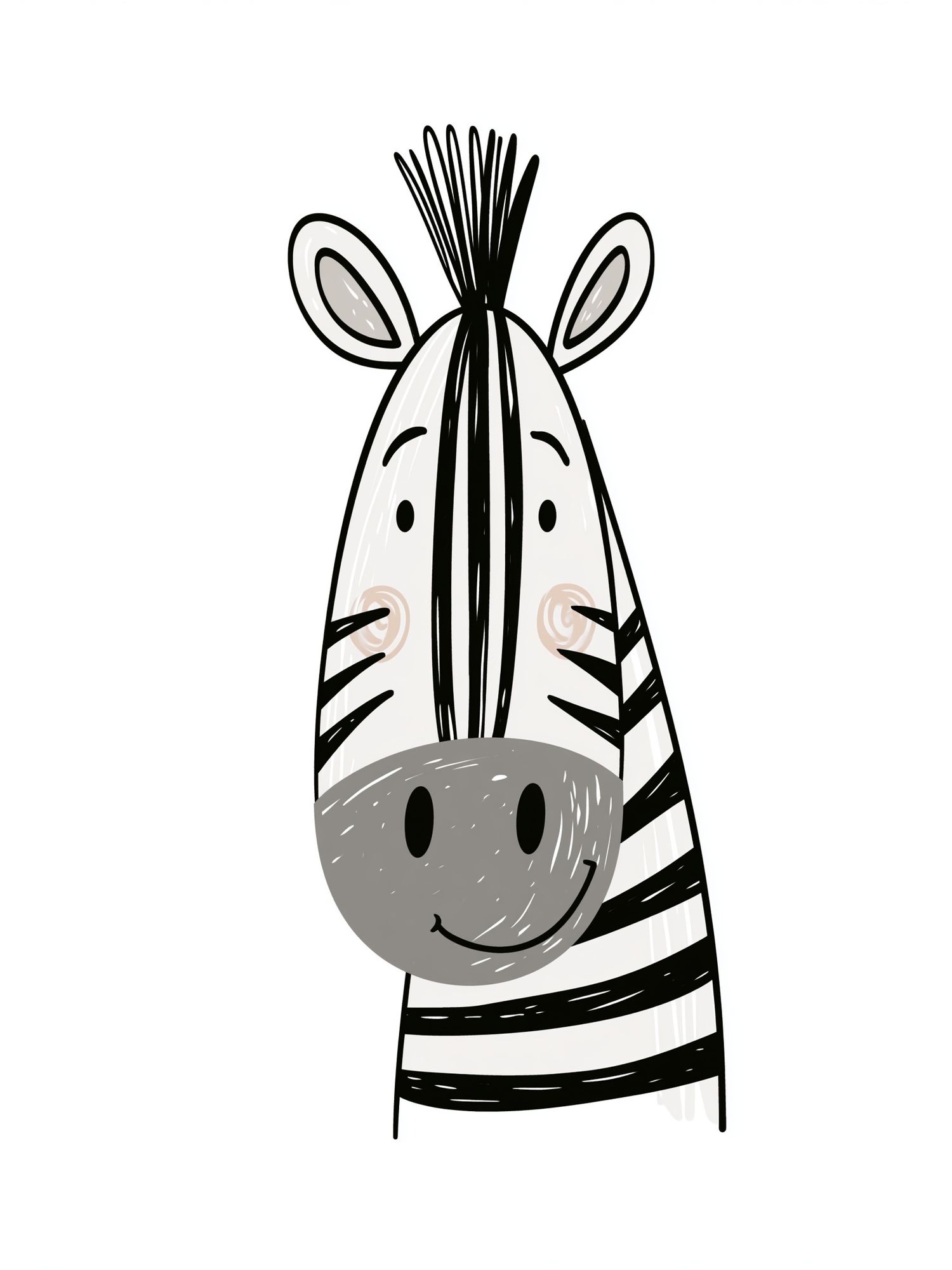
It also helps to mix tone, not just subject. Pair a bear illustration with one understated graphic print, one soft landscape, or one minimal animal drawing. That keeps the room layered. For example, a simpler piece like Cute Zebra Line Art Poster can calm a composition that already includes one stronger character image.

If you prefer a more humorous edge, introduce just one unexpected companion piece rather than several. A witty animal work such as Monkey in Suit — Funny Print can sharpen the styling, but only if the rest of the palette stays disciplined.
Shop the Look: Choosing the Right Size and Finish
For a single statement piece, 30x40 cm works on narrow walls, shelves, and smaller nursery corners. A 50x70 cm format is the most versatile choice for bedrooms, playrooms, and hallways because it reads clearly at a distance of 1.5 to 3 meters. If the wall is large and furniture below it is wider than 140 cm, consider pairing the main print with a second artwork rather than jumping straight to oversized scale.
Paper finish changes the mood more than most buyers expect. A matte finish gives illustration art a softer, more gallery-like look and reduces glare in bright rooms. That is especially useful opposite windows or near desk lamps. Gloss can intensify color, but for a gentle motif like a bear with a red hat, matte usually looks more refined.
Orientation matters too. A vertical print suits narrow wall sections between a window and shelf, while a horizontal arrangement works better above beds and benches. Before buying, tape out the exact size on the wall with painter's tape — it takes 2 minutes and saves the common mistake of ordering art that is 20% too small for the space.
Final thoughts
A bear with a red hat succeeds because it combines warmth, humor, and a clear color focal point in one simple image. It can soften a modern room, give a nursery more personality, or act as the standout piece in a playful gallery wall.
If you style it with restrained color repeats, clean framing, and natural materials, it feels thoughtful rather than overly themed. That is the sweet spot — character on the wall, calm in the room.
Frequently Asked Questions
What frame color works best if my walls are white?
Natural oak is the safest choice for a soft, warm look, while black gives stronger contrast and a more graphic finish. If the room already has oak furniture, matching the wood tone usually looks most cohesive.
Can this style work outside a kids' room?
Yes — especially in hallways, reading corners, family rooms, or creative home offices. Choose a simple frame and keep nearby decor minimal so the artwork feels curated.
How high should I hang the print above a dresser or bed?
Leave 15 to 25 cm between the top of the furniture and the bottom of the frame. That keeps the art visually connected to the piece below it.
Should I use glass or acrylic in the frame?
Acrylic is lighter and safer for nurseries and kids' rooms. Glass offers a slightly crisper surface but is heavier and more fragile during handling.