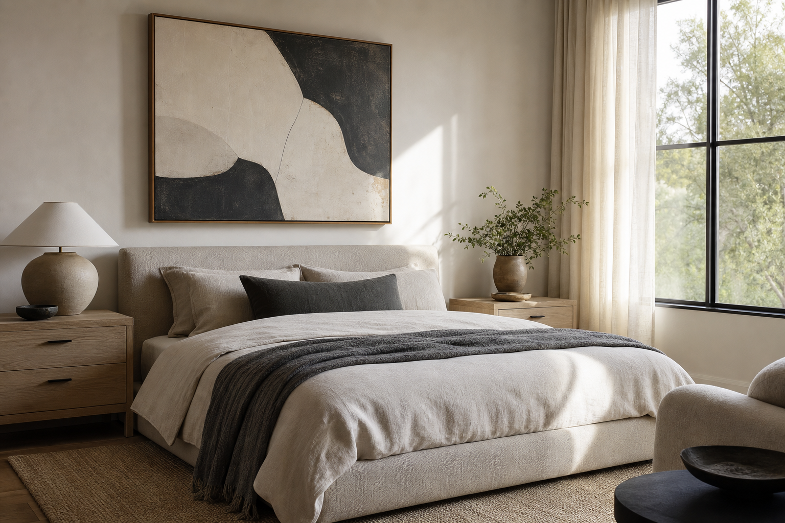
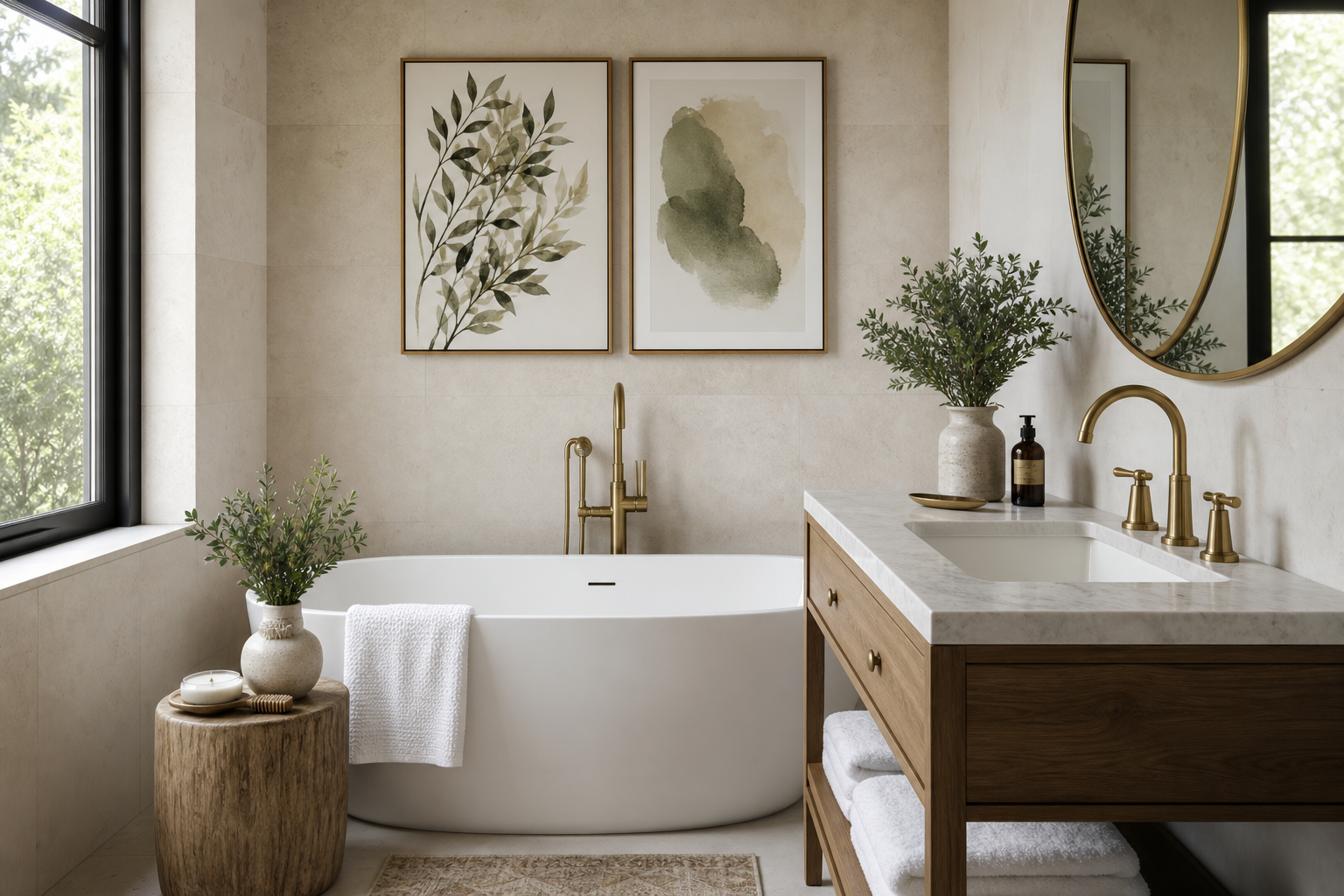
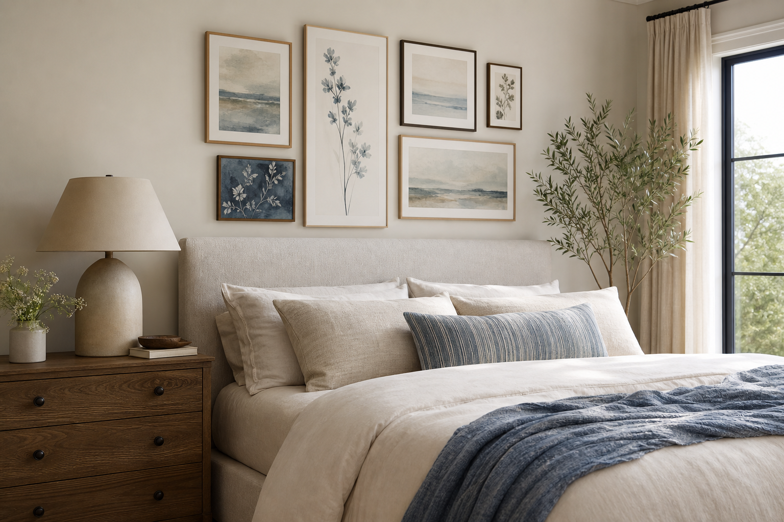
A 16x20 inch poster sits in the sweet spot between accent art and statement art. At 40.6 x 50.8 cm, it is large enough to anchor a wall visually, but compact enough to fit above a nightstand, desk, console, or narrow section of sofa wall without feeling oversized. If you want one piece that reads clearly from across the room without taking over, the 16x20 inch poster format is one of the easiest sizes to work with.
Why the 16x20 Inch Poster Works So Well
The main strength of a 16x20 inch poster is proportion. On a standard 60-inch sofa, a single 16x20 works best as part of a layered vignette or paired arrangement rather than trying to fill the full width. Above a 36- to 48-inch desk, dresser, or bench, however, it often looks perfectly scaled on its own. That versatility makes it useful in rooms where wall space is limited or furniture is modestly sized.
This format also adapts well across styles. Clean line work from our Minimalist collection feels crisp at 16x20, while painterly pieces from the Fine Art selection still have enough surface area to show brushwork and detail. If you prefer scenes, portraits, or softer narrative imagery, a 16x20 inch poster from our Illustration range or Photography collection gives presence without demanding a huge blank wall.
A practical bonus: 16x20 is a standard frame size. That means easier shopping, lower framing costs, and more ready-made options in oak, black, white, or metal finishes.
Where a 16x20 Fits Best
In bedrooms, a 16x20 works especially well above a narrow chest, on the wall beside the bed, or layered on a picture ledge. If you hang it above a nightstand, keep 6 to 8 inches between the furniture top and the frame bottom. That spacing makes the art feel connected to the furniture instead of floating.

In living rooms, the 16x20 inch poster is best used in targeted zones — above a side chair, over a slim console, or as one element within a larger composition. Over a fireplace mantel 48 to 60 inches wide, one vertical or horizontal 16x20 can look refined if supported by candlesticks, vases, or books to broaden the visual footprint.
Home offices are another strong match. A print this size fills the wall above a desk without adding visual weight that competes with shelves or monitors. For a quiet workspace, textured neutrals such as Textured Waves — Minimalist Print or soft architectural imagery from our photography wall art keep the setup focused.
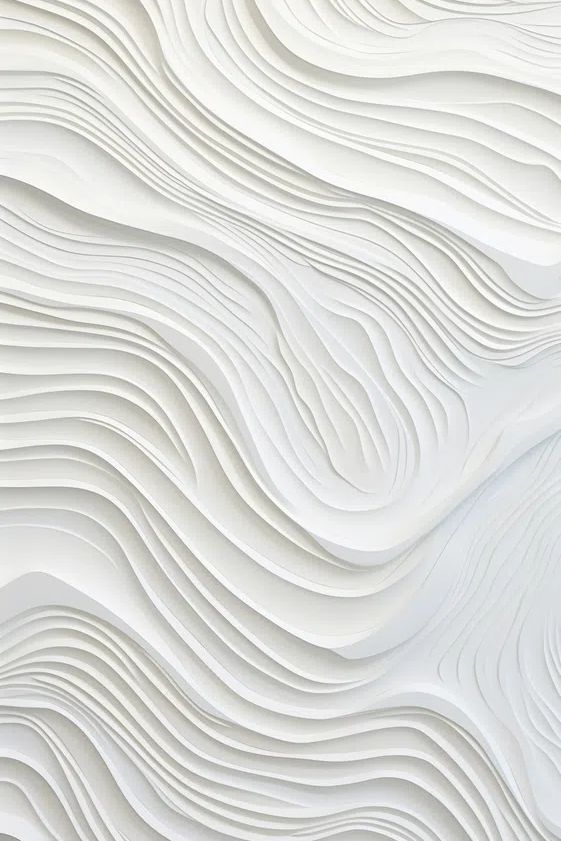
Hallways and small apartments benefit from the format because it is deep enough to read at a glance but not so large that it narrows the space. In a hallway less than 42 inches wide, a 16x20 hung vertically usually feels more natural than a broad oversized frame.
How to Choose the Right Frame
Frame choice changes the tone as much as the artwork itself. Black frames create sharp contrast and suit graphic pieces, monochrome photography, and stronger silhouettes. White frames lighten the look and work well against coloured walls. Natural oak is the most flexible option — it warms up minimal prints and softens detailed fine art.
Matting is worth considering if you want a more finished presentation. A 2-inch mat turns a 16x20 frame into a larger visual block and gives the artwork more breathing room. This is especially useful when the art has subtle detail, such as Window with Sheer Curtain — Fine Art Print, where negative space supports the composition instead of crowding it.

Frameless presentation can work too, but only in specific rooms. A clip-frame or slim acrylic mount suits dorm rooms, casual home offices, or contemporary interiors with a lighter, less formal feel. For living rooms and primary bedrooms, a full frame usually gives a 16x20 inch poster the polish it needs.
If your room already has black metal lighting or table legs, repeat that finish in the frame. If the space leans softer — boucle, linen, travertine, oak — choose wood or off-white instead. Consistency across 2 to 3 finishes is what makes a room feel composed.
Styling a 16x20 Poster on Its Own
A single medium print only looks intentional when the alignment is precise. Center it to the furniture below, not to the entire wall. If your console is 40 inches wide, align the 16x20 to that width and keep the side margins even. That small decision immediately makes the arrangement feel deliberate.
Aim for the artwork center to sit about 57 to 60 inches from the floor in areas where people stand, and slightly lower — around 54 to 57 inches — above seating or bedroom furniture. If you are leaning the frame on a shelf or mantel, overlap it slightly with a vase, branch, or lamp to avoid a showroom-flat look.
A restrained piece often works best when displayed alone. White Flower Silhouette — Minimalist Print is a good example of art that benefits from space around it because the subject is light, airy, and graphic rather than busy.

Add only 2 or 3 supporting elements nearby — for example, a ceramic vase, stacked books, and one small object in a contrasting material. More than that, and a 16x20 can start to disappear into clutter.
Building a Gallery Wall Around It
A 16x20 is an ideal "bridge size" in a gallery wall. It connects larger anchors like 24x36 pieces with smaller prints such as 8x10 or 11x14. One reliable layout is to use the 16x20 slightly off-center, then balance it with two smaller pieces on one side and one larger piece on the other. Keep spacing between frames at 2 to 3 inches for a tight editorial look, or 3 to 4 inches for something airier.

When mixing styles, keep one common thread — colour palette, frame finish, or subject matter. You can combine classic fine art prints with minimalist wall art if both share warm neutrals, charcoal, or muted greens. The wall feels collected rather than chaotic when at least 60% of the pieces speak the same visual language.


If you want a gallery wall that feels calm rather than busy, start with one tonal anchor. Sunlit Water Ripples Photography Poster pairs well with abstract neutrals and soft sketches because the texture is active but the palette stays restrained.
Colour, Mood, and Subject Matter
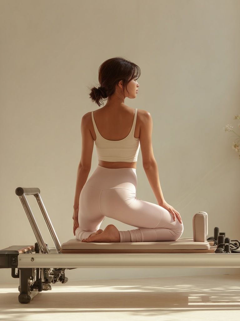
The subject of a 16x20 inch poster has a direct effect on how large it feels. High-contrast black-and-white art reads bolder and more graphic, so it can make a medium size feel larger. Soft tonal work — creams, pale greys, faded blues — feels quieter and visually lighter. That is useful in compact rooms where you want presence without heaviness.
For calm interiors, choose nature, water, fabric texture, or minimal florals. Our photographic prints and minimalist art collection offer subjects that support rest and openness. For richer, more expressive rooms, painterly works from the Fine Art collection can bring depth and warmth in a single frame.

If your furniture is mostly neutral, the artwork can carry the colour. A single yellow, blue, or green note repeated once elsewhere in the room — cushion, book spine, ceramic object — is enough to tie everything together. If the room already has patterned upholstery or colourful rugs, pick art with one dominant tone and a simpler composition.
A good rule is to match the energy of the piece to the room's function. Bedrooms suit softer motion and lower contrast. Offices can handle cleaner lines and stronger structure. Hallways and entryways often benefit from pieces with immediate clarity, such as silhouettes, landscapes, or high-definition photography.
Final Tips for Hanging and Shopping Smart
Before buying, measure both the wall and the furniture below it. A 16x20 inch poster looks best above furniture that is roughly 24 to 48 inches wide when hung alone. If the furniture is 60 inches or wider, either add companion pieces or choose a larger arrangement so the wall does not feel underdressed.
Use painter's tape to mark a 16 x 20 rectangle on the wall before ordering. This takes two minutes and gives a far better sense of scale than guessing from product photos. Also account for the outer frame dimension — a 16x20 print in a frame with a 1-inch profile will occupy more visual space than the paper size suggests.
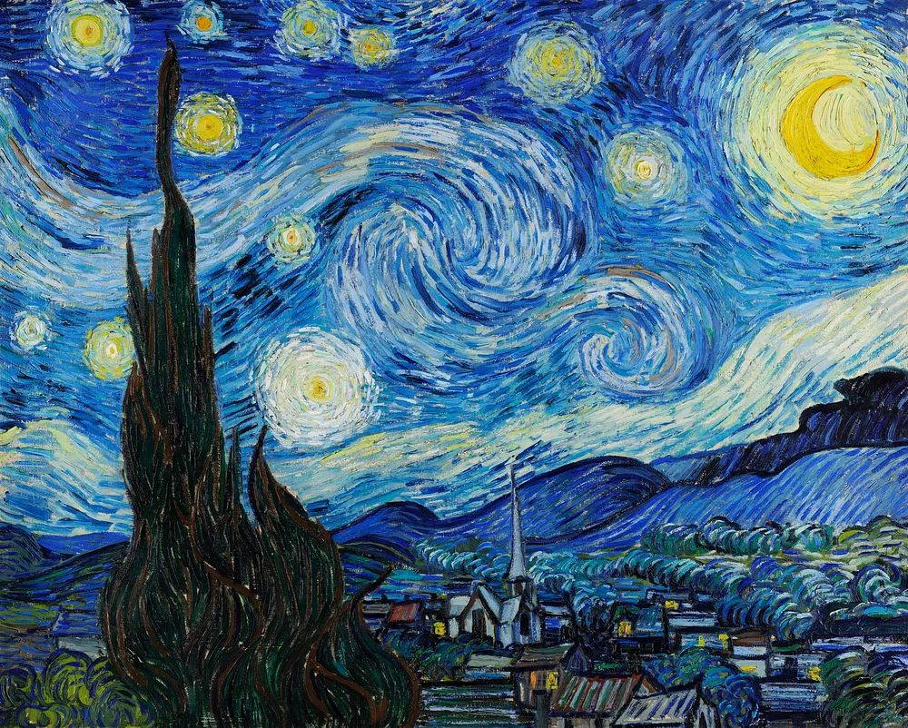
Shop by room mood, not only by image. If the goal is a quieter bedroom or reading corner, browse Elegant White Fabric — Minimalist Print or similar soft compositions. If you want more atmosphere and narrative, pieces like Starry Night — Fine Art Print bring stronger movement and colour.
Putting it together
A 16x20 inch poster works because it is adaptable, easy to frame, and visually strong without being demanding. It can stand alone over a desk or nightstand, or act as the middle layer in a more developed gallery wall.
The best result comes from three simple choices — correct placement, a frame that matches the room's finishes, and subject matter that supports the mood you want. Get those right, and a medium-size print will look far more expensive and intentional than its footprint suggests.
Frequently Asked Questions
Is a mat necessary for a 16x20 print?
No — but a 2-inch mat can make the piece feel more substantial and refined. It is especially helpful if the artwork has delicate detail or if you want a more classic look.
What frame width looks best for this size?
A frame profile between 0.6 and 1.2 inches usually looks balanced. Very wide frames can overpower the art unless the room style is traditional.
Can I hang a 16x20 in a rental without nails?
Yes, if the frame is lightweight. Use high-quality removable strips rated above the frame weight and clean the wall surface first for better adhesion.
Should I choose vertical or horizontal orientation?
Match the orientation to the wall shape and furniture. Vertical works well in narrow spaces and beside windows, while horizontal suits beds, desks, and consoles.
What wall colour works best behind a 16x20 print?
Soft white, warm greige, light taupe, and muted sage are the easiest backdrops. Darker walls can look striking too, but choose a frame with contrast so the art does not visually sink into the paint.