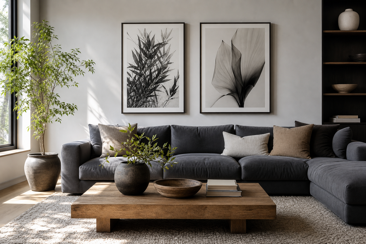
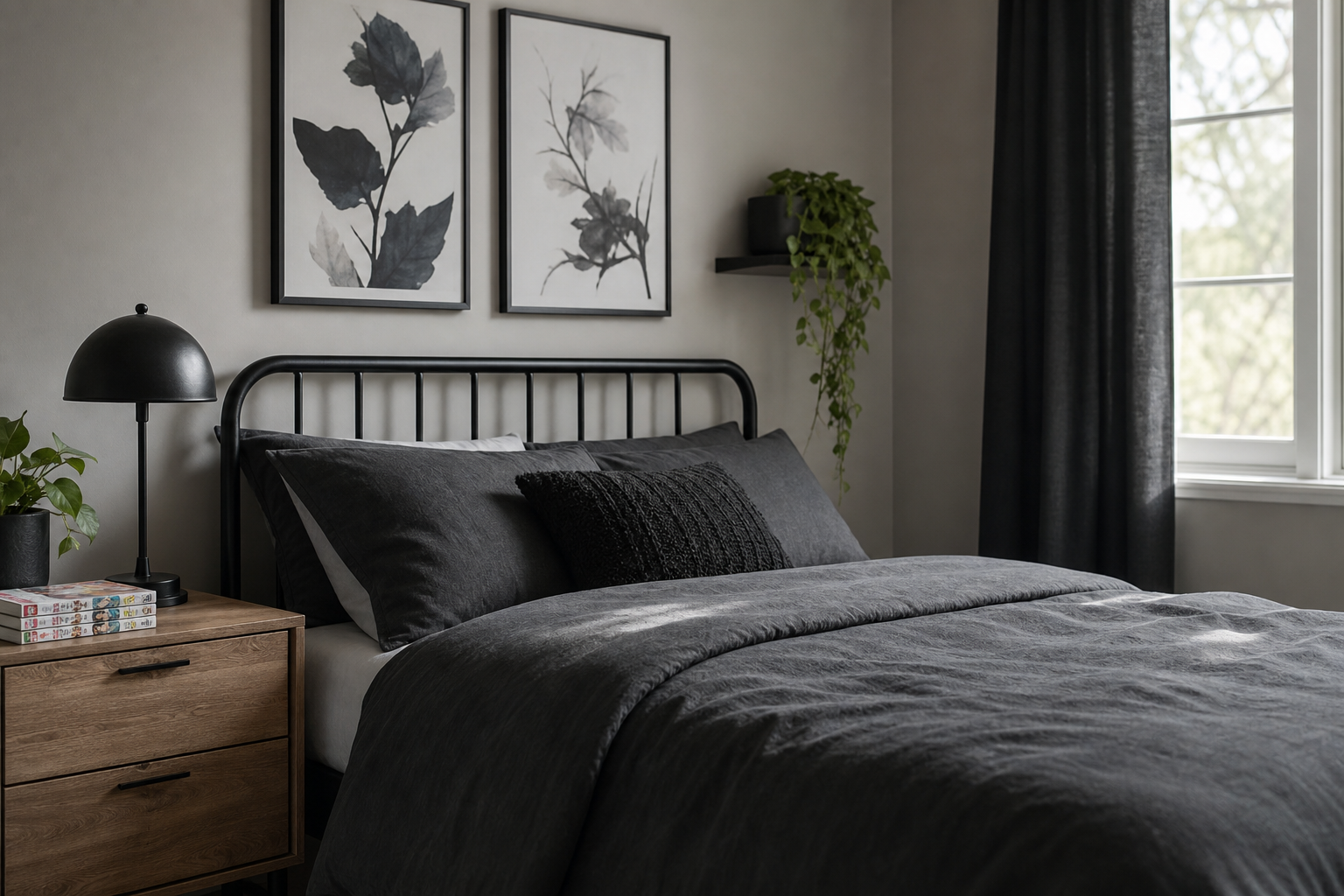
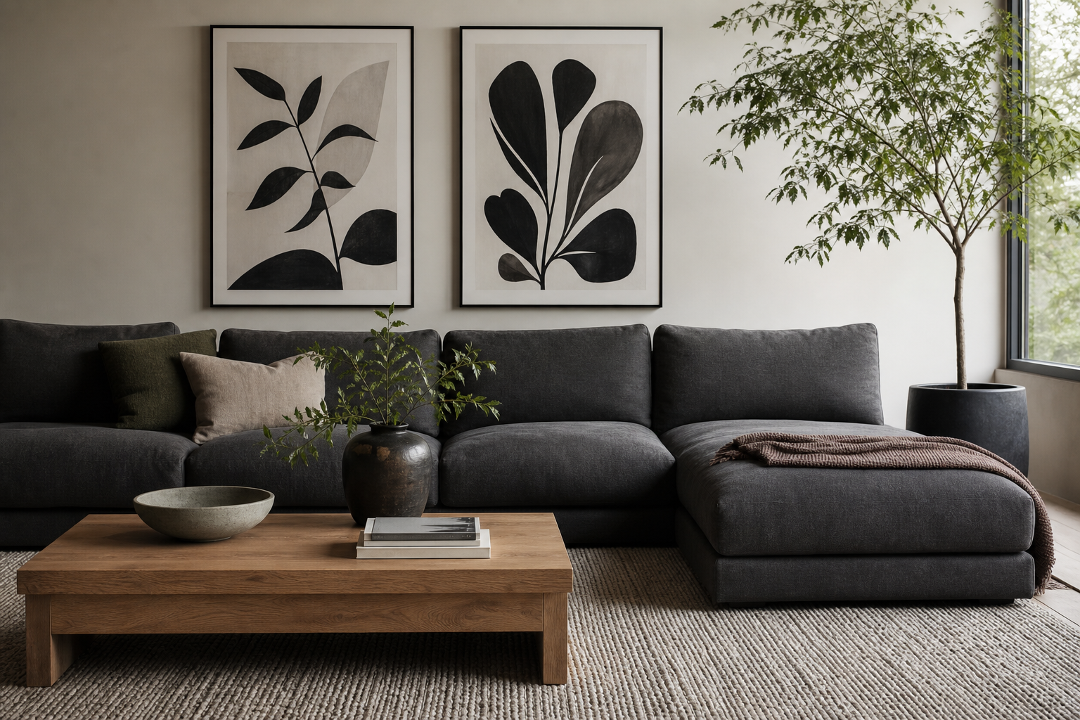
A black and white cat poster has a rare advantage in interior styling: it feels both playful and polished. The feline subject adds personality, while the monochrome palette keeps the look sharp, clean, and easy to place in almost any room. If you want wall art that reads expressive without overpowering the space, this is one of the safest and most flexible choices.
Why Black and White Cat Art Works So Well
Cat imagery naturally brings movement, attitude, and curiosity into a room. Even a still portrait tends to feel alive because cats have strong silhouettes — pointed ears, arched backs, bright eyes, long tails. In black and white, those details become even more graphic, which is why a black and white cat poster works especially well in modern, Scandinavian, and transitional interiors.
Monochrome art also solves a common styling problem: visual noise. Rooms already filled with mixed upholstery, books, wood grains, and textiles benefit from artwork that simplifies the palette. A black and white cat poster can add contrast by up to 70 percent more visibly than mid-tone beige art on a pale wall, especially when hung at eye level around 145 cm from the floor to the center of the frame.
If you like animal subjects but want to avoid a childish effect, keep the styling crisp. Pair feline-inspired wall art with pieces from our minimalist collection or more dramatic wildlife works from our animals collection. The black-and-white approach makes the room feel curated rather than themed.
Choosing the Right Style for Your Space
A photographic cat print suits clean interiors with simple shapes and limited color. Think linen curtains, black metal lamps, pale oak, and a low-profile sofa. In rooms like these, a monochrome animal print acts almost like portrait photography — restrained, elegant, and slightly moody.
An illustrated cat design feels softer and more casual. This works well in apartments with curved furniture, layered textiles, or playful objects on open shelves. If your room already includes hand-drawn details or expressive line work, a piece from our illustration category will usually sit more naturally than a highly realistic animal portrait.

Minimalist cat art is the best option for smaller spaces. A simple line drawing or reduced silhouette leaves more breathing room on the wall, which matters in narrow hallways, compact bedrooms, and home offices under 10 square meters. If you like that pared-back look, mix your cat art with abstract monochrome pieces such as Torn Paper Black and White or soft neutral designs like White Cream Texture.
Vintage-style animal art tends to suit darker woods, brass details, and more traditional rooms. It can also work beautifully in eclectic interiors, especially when combined with one or two classic accents from our fine art collection. The key is contrast: an old-world look on the wall often feels fresher when the furniture underneath is simpler and less ornate.

Where to Hang It for the Best Effect
In a living room, hang the piece 15 to 25 cm above a sofa or sideboard so it feels connected to the furniture rather than floating. A single black and white cat poster in a 50 x 70 cm size is often enough for a two-seat sofa. For a larger three-seat sofa, a 70 x 100 cm print or a grouped arrangement usually feels more balanced.
In a bedroom, cat-themed art works best above a nightstand, dresser, or bench rather than directly competing with a large headboard. If you do place it over the bed, choose one substantial frame centered over the mattress, leaving 20 to 30 cm of breathing space below. Black and white subjects work particularly well in bedrooms because they keep the atmosphere calm.
Hallways are ideal for bolder, more graphic pieces. These transitional spaces benefit from a strong focal point, and animal imagery adds character quickly. If your hallway is narrow, use a vertical frame around 30 x 40 cm or 40 x 50 cm to avoid crowding the wall.
A home office is another strong setting. Cats bring a sense of wit, while monochrome art keeps the desk zone professional. Place the frame slightly off-center above a desk lamp or filing cabinet for a more editorial look rather than a rigid, symmetrical one.

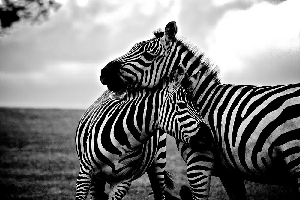
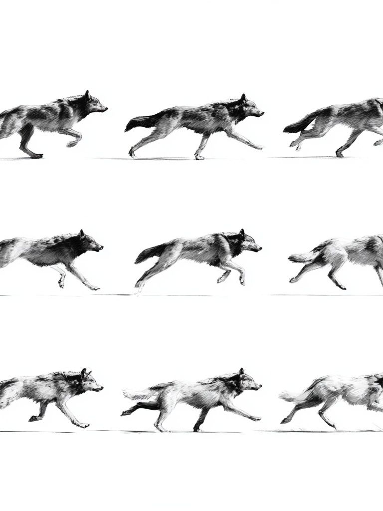
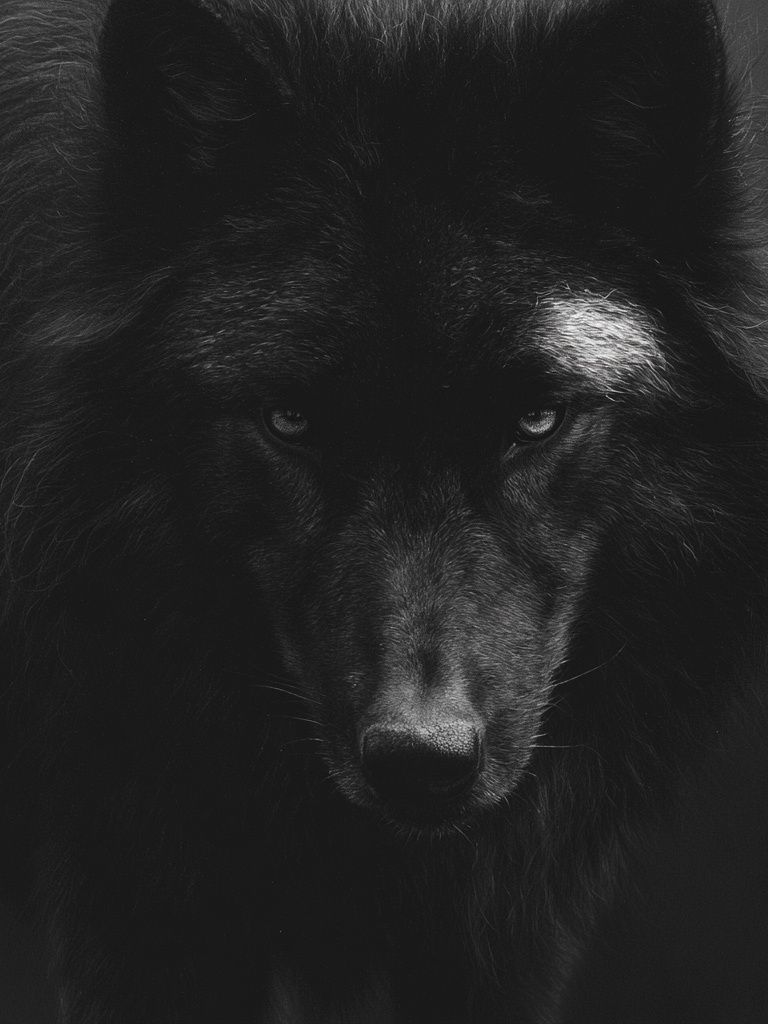
If you are creating a pet corner with a bed, leash hooks, and storage basket, keep the art playful but still clean. Pair your main cat print with refined animal studies such as Wolf Portrait Black-White or Zebras in Love — Black-White if you want a monochrome animal story without clutter.
Sizing, Framing, and Color Pairings
For most homes, three sizes cover nearly every need: 30 x 40 cm for shelves and narrow walls, 50 x 70 cm for standard statement placement, and 70 x 100 cm for a stronger anchor above furniture. If your wall is wider than 180 cm, one small print will look lost. Aim for artwork that spans roughly 50 to 75 percent of the furniture width beneath it.
Frame finish changes the mood more than many people expect. Black frames sharpen the contrast and give a gallery-like result. Oak frames soften the look and make the cat subject feel warmer. White frames work best when the print has a lot of dark detail and the surrounding wall is also pale. If you want a more understated arrangement, use a slim frame profile around 1 to 2 cm rather than something heavy.
For color pairings, black and white art looks strongest with restrained supporting tones. Good combinations include: - white, charcoal, and oak - greige, black, and soft olive - warm ivory, walnut, and muted rust - pale grey, chrome, and deep green
These palettes let the artwork stand out without isolating it from the room. Textural prints can help bridge the gap between a stark cat image and softer decor — pieces like Textured Concrete Wall or Textured Fabric are useful companions when you want depth without adding more subject matter.

How to Build a Cat-Inspired Gallery Wall
The easiest way to build around a black and white cat poster is to treat it as the hero piece and keep the surrounding works quieter. A good ratio is one focal print, two supporting abstracts, and one texture-based design. This 1:2:1 mix prevents the wall from feeling repetitive.
Use spacing consistently — 5 to 8 cm between frames is usually enough for a compact arrangement. Start with the cat print either in the center or slightly off-center, then add one tonal piece, one minimalist line or shape, and one wildlife or fine-art accent. That mix creates rhythm without turning the wall into a novelty display.

If you want the arrangement to feel more collected than matched, combine your central cat artwork with prints that share either color or mood. A dramatic animal portrait from Black Wolf Portrait can echo the intensity of feline imagery, while something softer like White Flower Silhouette can lighten the composition.
For a room that leans classic, add one painterly accent. A piece such as Window with Sheer Curtain introduces softness and prevents the gallery from feeling too hard-edged. The best gallery walls usually repeat one thing only — frame color, palette, or subject tone — not all three.

Shop Tips for a Look That Feels Personal
When choosing your final piece, focus on expression first, not just color. Some cat artworks feel mischievous, some elegant, some mysterious. Match that emotional tone to the room. For a living room, choose a poised or graphic design. For a bedroom, something softer or more contemplative usually lasts longer.
Paper and finish matter too. Matte paper is often the best choice for monochrome art because it reduces glare and keeps black areas looking richer under daylight and lamps. If the frame will hang opposite a window, glare control becomes practical, not optional. Look for clean print detail in the eyes, fur edges, and shadow transitions — these are the first areas that make a black and white animal piece look refined instead of flat.
A black and white cat poster should also feel connected to how you live. If your home is spare and architectural, go crisp and minimal. If your style is layered and collected, pair the cat subject with texture, vintage notes, and one or two softer companion works. Personal taste reads most clearly when the artwork supports the room's mood rather than trying to create it on its own.
Final thoughts
A black and white cat poster succeeds because it balances charm with structure. It gives you a recognizable subject, strong contrast, and enough neutrality to work across living rooms, bedrooms, offices, and hallways.
Style it with the same discipline you would use for any strong monochrome piece: choose the right scale, keep the framing intentional, and let supporting colors and textures do the rest. That is how cat-inspired wall art feels elevated instead of overly themed.
Frequently Asked Questions
What frame glazing works best for black and white art?
Anti-reflective acrylic or glass is a smart choice if the print faces a window or lamp. It keeps dark tones visible and reduces distracting glare.
Can I mix a black and white cat print with colored artwork?
Yes — keep the colored pieces limited to one or two accent tones, such as olive, rust, or deep blue. Too many bright hues can weaken the graphic impact.
Should I use a mat around a black and white cat poster?
A white mat works well for smaller sizes like 30 x 40 cm or 40 x 50 cm because it gives the image more presence. For larger statement sizes, a full-bleed frame often looks cleaner and more modern.
Is monochrome animal art suitable for renters?
Yes — it is easy to move between rooms and usually adapts well to different wall colors. Lightweight frames can also be hung with damage-minimizing hooks, depending on wall type.