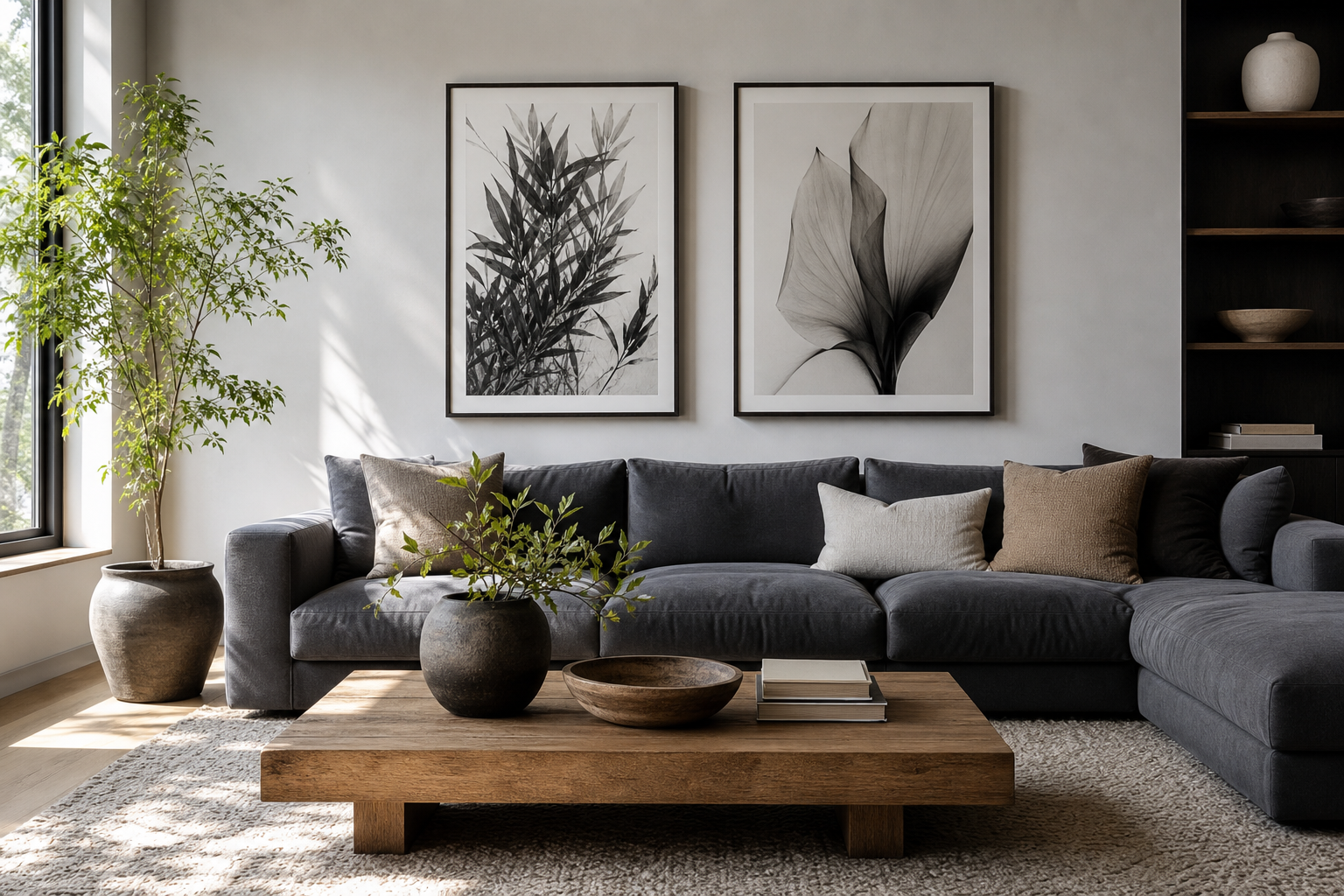
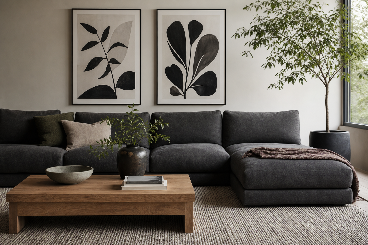
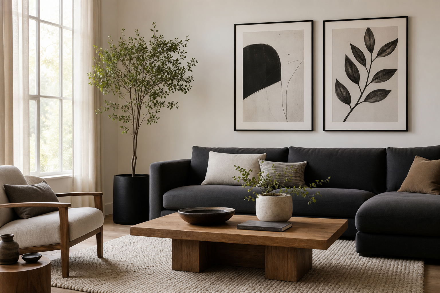
An anime black and white poster works because it brings strong contrast without forcing the whole room into a loud color scheme. In practical terms, black, white, and mid-grey can sit beside oak, walnut, chrome, concrete, linen, or painted plaster without clashing. That makes monochrome anime art easier to live with long term than highly saturated prints that dominate every update you make to the room.
If you want options beyond one piece, start with our Anime collection and mix it with selected pieces from the Illustration wall art range. The key is to treat the anime black and white poster as an anchor piece — one that sets the line quality, mood, and visual weight for everything around it.
Why Black and White Anime Art Feels So Timeless
Black and white anime art has the same advantage as classic ink drawing or editorial photography: it relies on shape, shadow, line, and composition. When color is stripped back, the eye notices expression, movement, and silhouette first. That gives an anime black and white poster a more mature, collected feel, especially in rooms that already use neutral paint, dark furniture, or industrial finishes.
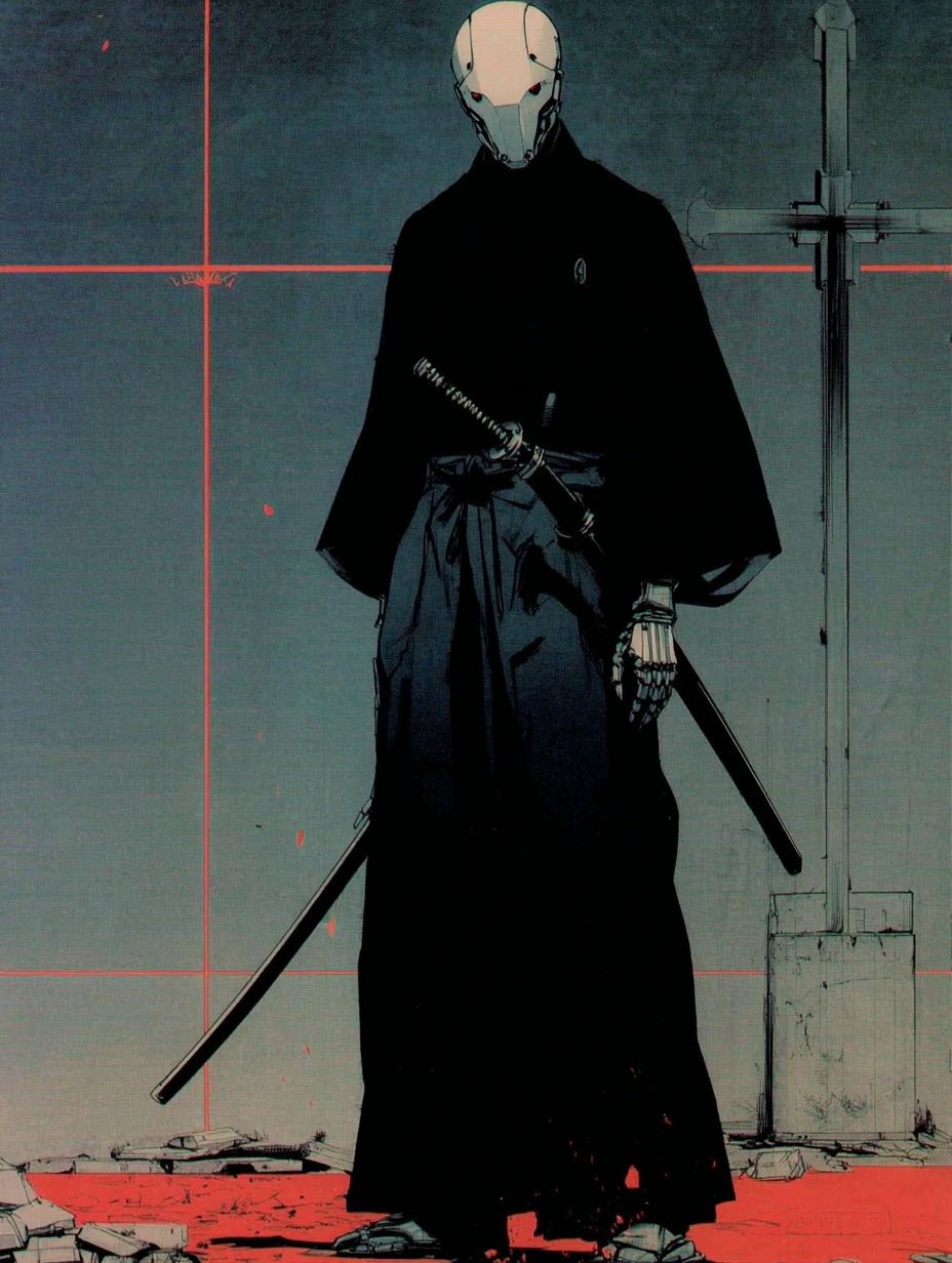
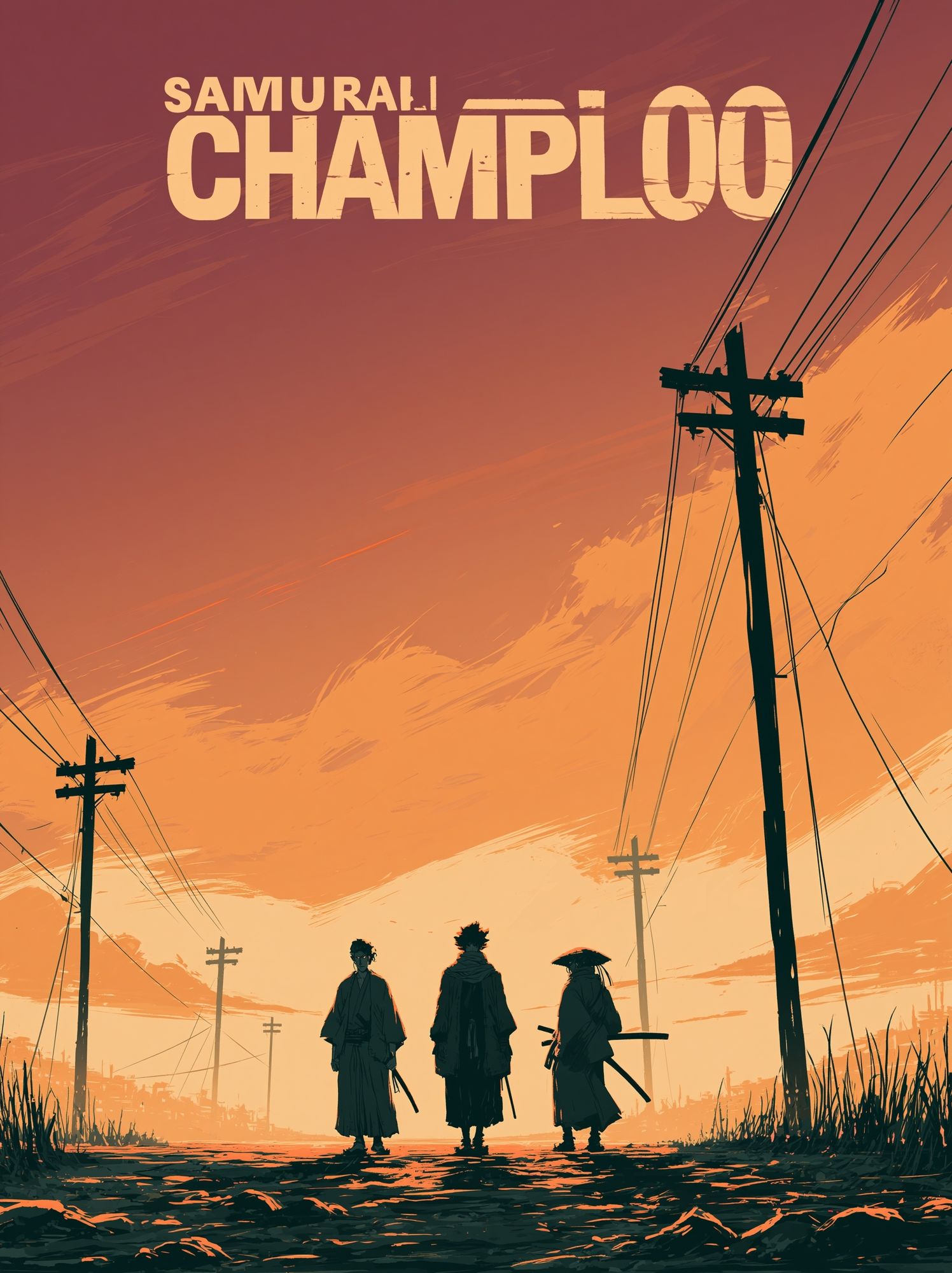
A second reason it lasts is flexibility. Monochrome anime designs can lean minimal, dramatic, nostalgic, or graphic depending on the subject. A close portrait with clean linework feels quiet and refined. A high-contrast fighter or samurai composition feels sharper and more cinematic. That range lets you style for your room rather than chasing a trend.
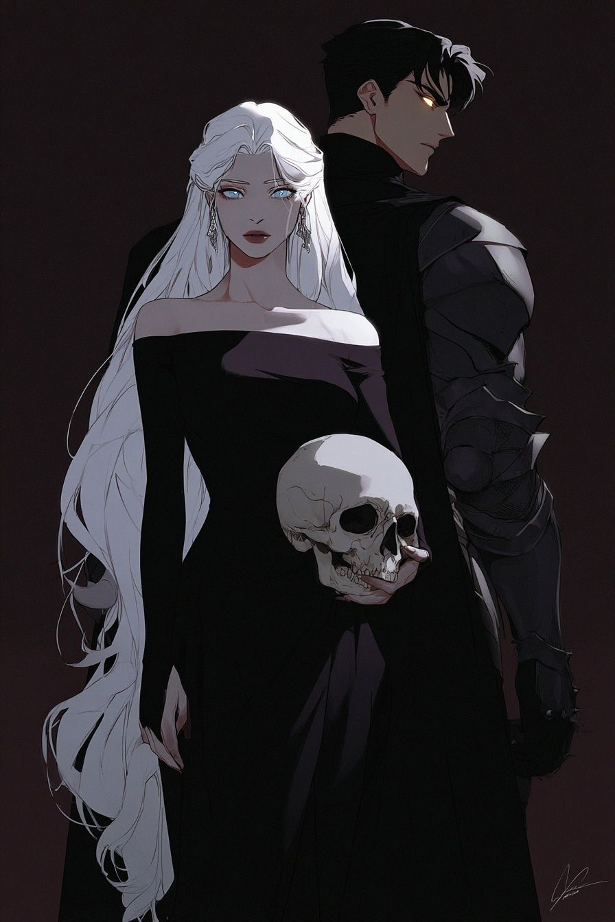
A piece like Dark Elegance — Anime Art Print shows why monochrome-adjacent anime art works so well in adult spaces. The darker tonal range creates depth, while the character focus keeps it personal rather than generic. This is especially effective above low furniture where the artwork needs presence without visual clutter.
Finding the Right Mood for Your Space
The mood of your wall art should match how the room is used for at least 70 percent of the day. In a bedroom, softer compositions, cleaner backgrounds, and elegant portrait framing usually work better than action-heavy scenes. In a gaming corner or studio, stronger poses and denser contrast can handle LED lighting, dual monitors, and darker furniture.
For a calm look, choose anime imagery with more negative space and fewer sharp detail clusters. Portrait-led works such as Anime Character Portrait — Digital Art Print suit this approach because the face becomes the focal point, not the entire wall. Pair that with white or off-white mounts, black frames around 20 to 30 mm thick, and simple bedding or desk accessories.
For a moodier, edgier setup, look for darker backgrounds and stronger outlines. Pieces such as Digital Demon — Anime Art Print or Gothic Anime Girl Illustration Poster can create that effect, especially when the room includes black shelving, smoked glass, or matte metal lighting.

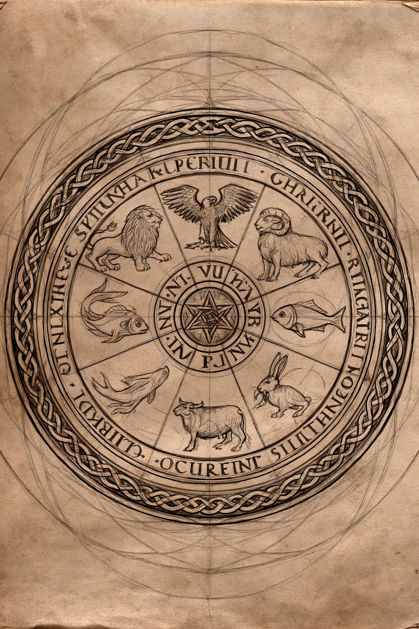
If you prefer a cleaner contemporary look, combine one anime print with non-anime monochrome art that shares similar tonal discipline. Technical linework, sketch-style illustration, and architectural subjects often pair well because they do not compete on color.
Best Places to Hang an Anime Black and White Poster
The easiest placement is above furniture that visually grounds the print. Above a bed, keep the artwork width at roughly 50 to 70 percent of the headboard width. Above a desk, aim for 60 to 75 percent of the desk width. On a narrow wall between a wardrobe and a door, a vertical format works better because it uses height instead of crowding the edges.
Bedrooms are often the best fit for an anime black and white poster because the palette supports rest while still showing personality. Hang the center of the frame around 145 cm from the floor in a standard room, or 15 to 20 cm above a headboard if you want the art to feel connected to the furniture rather than floating.
Gaming setups and workstations benefit from one stronger focal piece slightly offset from the monitors. That avoids visual overload directly behind the screen while still defining the zone. If your setup includes LED strips, keep the frame finish matte to reduce glare and preserve the depth of dark areas in the print.

A home office can also handle monochrome anime art surprisingly well. The cleaner the desk, the more character the wall can take. If the room already has shelves full of books, figures, or hardware, choose one restrained print rather than a busy cluster.

Gallery walls are best on larger blank surfaces — behind a sofa, along a hallway, or on the wall opposite the bed. In these layouts, use your anime piece as either the largest frame or the darkest one. That gives the eye an immediate anchor.
Size, Scale, and Framing Choices
For a single statement piece, 50x70 cm is the most versatile size. It has enough presence for a bed wall, desk wall, or reading corner without requiring oversized furniture. For smaller rooms, 30x40 cm works well on narrow walls or as part of a grouped arrangement. If you want a bold focal point over a sofa or wide bed, step up to 70x100 cm — but only if the surrounding wall stays fairly clear.
Frame choice changes the entire tone. A thin black frame, around 10 to 15 mm, feels contemporary and sharp. A thicker black frame, around 20 to 30 mm, adds more weight and suits dramatic character art. White frames brighten the overall look but reduce some of the intensity that makes monochrome anime pieces compelling. Natural oak frames can work if the room has enough wood elsewhere to make the choice feel deliberate.
Matting is useful when the artwork itself is visually dense. A white mat border of 4 to 8 cm gives the image breathing room and makes smaller prints feel more substantial. If the artwork already has lots of negative space, skip the mat and keep the presentation tighter.

How to Build a Strong Black and White Gallery Wall
A good gallery wall uses repetition, not randomness. Start with one anime black and white poster, then add three to five supporting pieces that repeat at least two of these elements: black linework, muted contrast, portrait orientation, or negative space. That keeps the wall cohesive even if the subjects differ.
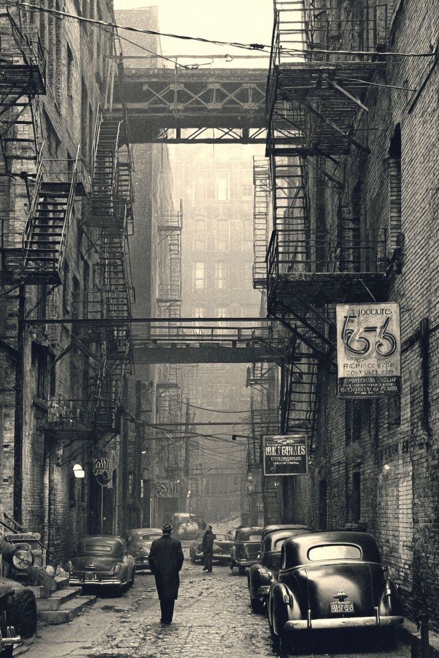
One reliable formula is 1 hero print, 2 medium supporting prints, and 2 smaller tonal accents. For example, pair a character-driven anime piece with a sketch print, a black-and-white city image, and one or two animal or symbolic illustrations. Keep spacing between frames consistent — usually 5 to 8 cm — so the arrangement reads as one composition.
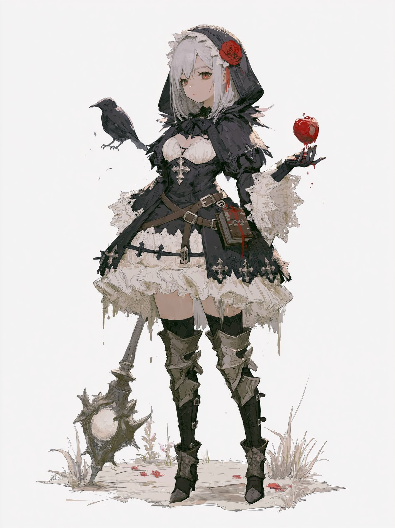
If you like a darker gallery wall, Gothic Anime Girl Illustration Poster can bridge anime style and broader monochrome illustration. It pairs naturally with structured black-and-white works because the line treatment is decorative but still disciplined.
Use texture in the room to stop the arrangement feeling flat. Black frames against a white wall need warmth from somewhere else — wool throws, ribbed glass, brushed metal, dark-stained wood, or a low-pile charcoal rug all help. If the wall color is already deep, such as graphite or muted taupe, use wider white mats so the art does not disappear into the background.

Shop Tips for Choosing the Perfect Print
When buying an anime black and white poster, image clarity matters more than almost anything else. Fine linework, clean edge definition, and smooth shadow transitions are what make monochrome art look intentional instead of muddy. If a design relies on heavy blacks, it should still retain detail in hair, clothing folds, or background elements when viewed from 1 to 2 meters away.
Choose artwork that still feels strong when the room changes. If you swap bedding, repaint the wall, or replace a desk, a monochrome piece should still make sense. That is why character-led works with disciplined composition usually age better than trend-driven graphics packed with effects.
It also helps to think about category overlap. If you know you may expand the wall later, choose a piece that can connect visually with broader black-and-white themes from our Illustration collection or even selected line-based pieces from the anime wall art selection. That gives you more freedom to build around the print rather than being locked into one very specific look.
Final thoughts
An anime black and white poster gives you contrast, character, and flexibility in one move. It can read calm in a bedroom, sharp in a gaming setup, or curated in a gallery wall — provided the size, frame, and surrounding textures support it.
The most successful rooms use monochrome anime art with intention. Pick the mood first, match the scale to the furniture, and let one strong piece lead the rest of the wall.
Frequently Asked Questions
What frame glazing works best for black and white anime art?
Anti-reflective acrylic or glass is the best choice if the print hangs near a window or desk lamp. It reduces glare and keeps dark areas readable.
Should I choose matte or glossy paper for a monochrome print?
Matte or satin finishes usually suit black-and-white artwork better because they soften reflections and make linework easier to see. Gloss can work, but it shows fingerprints and light streaks more easily.
Can I mix black frames and oak frames in one gallery wall?
Yes — but keep one finish dominant. A good ratio is about 70 percent black frames and 30 percent oak so the arrangement still feels unified.
How far apart should gallery wall frames be?
Keep gaps between 5 and 8 cm for most home layouts. Smaller gaps feel more collected, while wider gaps make the wall look fragmented.
What wall color makes monochrome anime art stand out most?
Soft white, warm light grey, mushroom, and charcoal all work well. White gives the highest contrast, while charcoal creates a more immersive, dramatic effect.