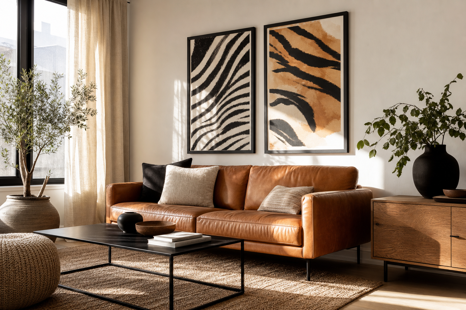
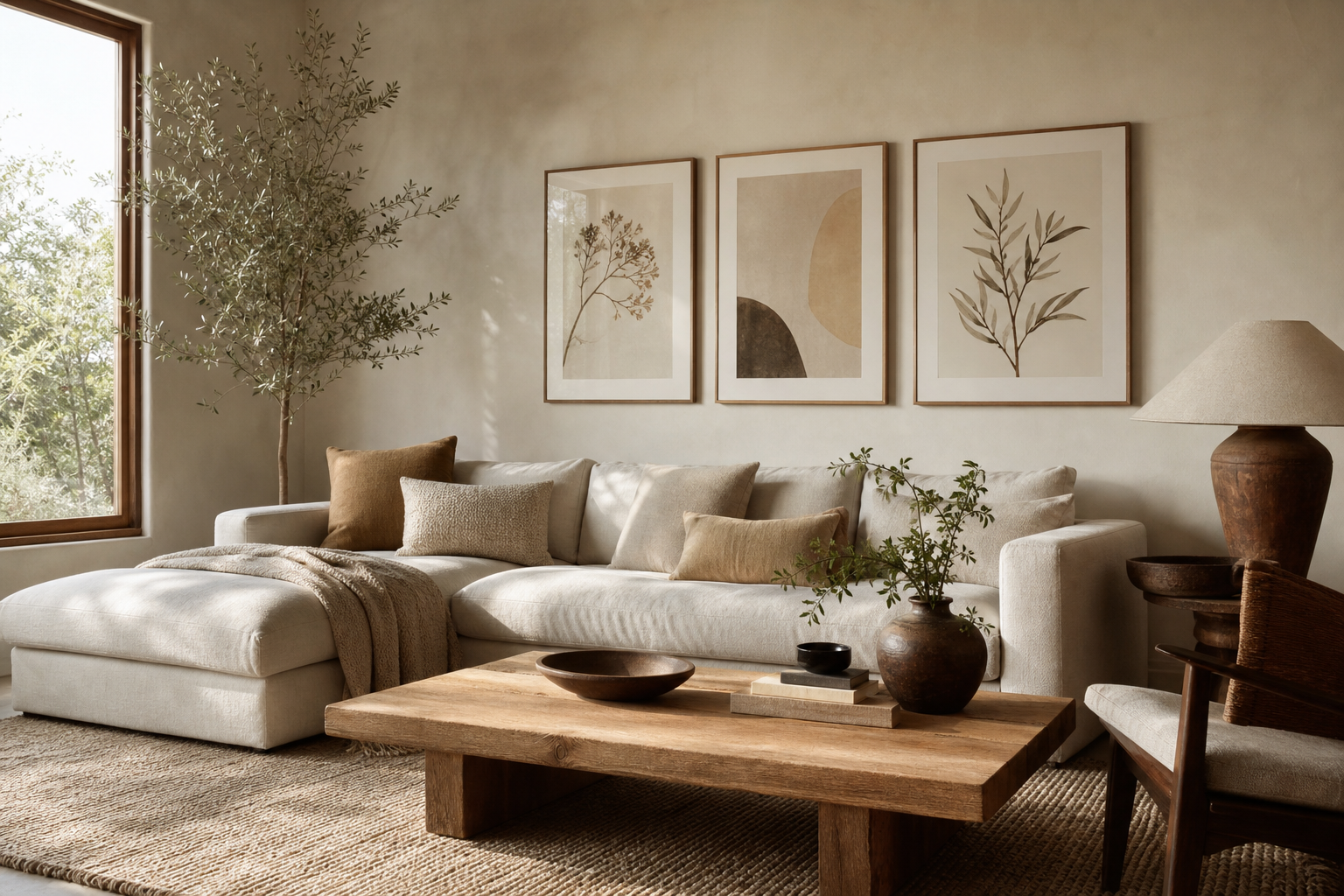
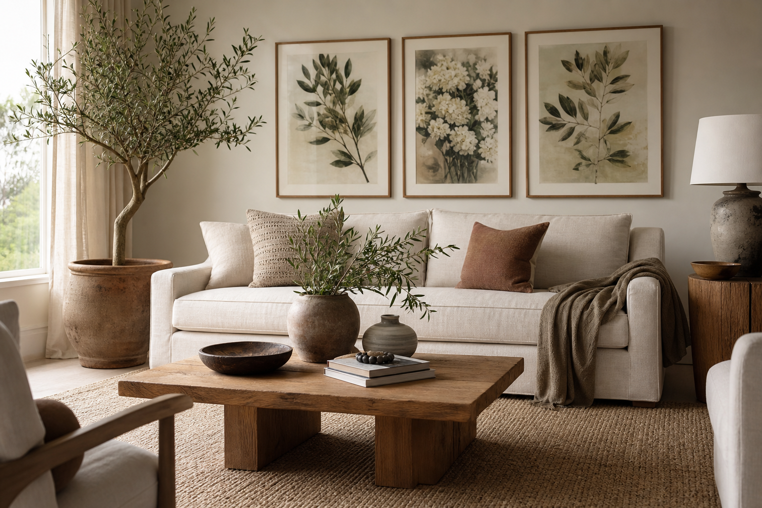
Botanical print posters have an easy advantage in interiors: they add pattern, shape, and color without feeling loud. Leaves, stems, flowers, and vintage plant studies bring in the calm of nature, which is why they work just as well in clean contemporary rooms as they do in classic or layered homes. If you want wall art that feels fresh in spring and still grounded in winter, botanical print posters are one of the safest long-term choices.
Why Botanical Prints Work So Well
Botanical imagery has structure built into it. A fern frond, tulip stem, or trailing vine already has rhythm and balance, so even detailed artwork tends to read as orderly rather than chaotic. That makes it especially useful in rooms that need softness but not visual clutter. In a living room with straight-lined furniture, for example, a few pieces from our botanical collection can break up hard edges and make the space feel more relaxed.
Another reason botanical art lasts is range. Vintage floral studies sit comfortably beside antique wood, while simpler leaf silhouettes work well with minimalist art prints and pale walls. If your home mixes styles — say, modern lighting, a traditional rug, and a mid-tone oak sideboard — botanical wall art often acts as the bridge that makes the room feel intentional.
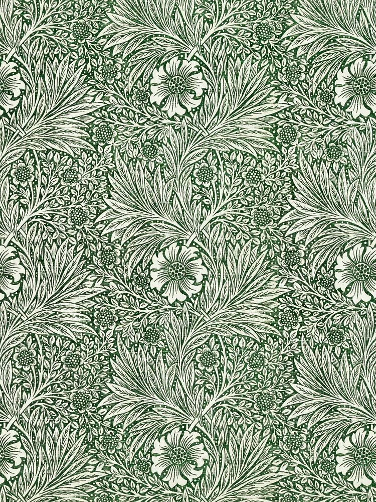
For a more decorative approach, Morris-inspired patterns add richness and movement. A print such as Marigold by William Morris suits spaces that need more than a single stem or bloom. It has enough detail to hold its own above a console or mantel.
Choosing the Right Palette and Subject Matter
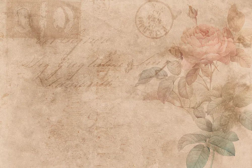
Start with the room's dominant color temperature. If your space is built around warm whites, beige, camel, terracotta, or walnut, look for botanical prints with olive, cream, dusty rose, muted red, or aged gold. Pieces like Vintage Rose Botanical or William Morris's vintage pomegranate flowers sit naturally in warmer interiors because they echo earthy materials rather than compete with them.
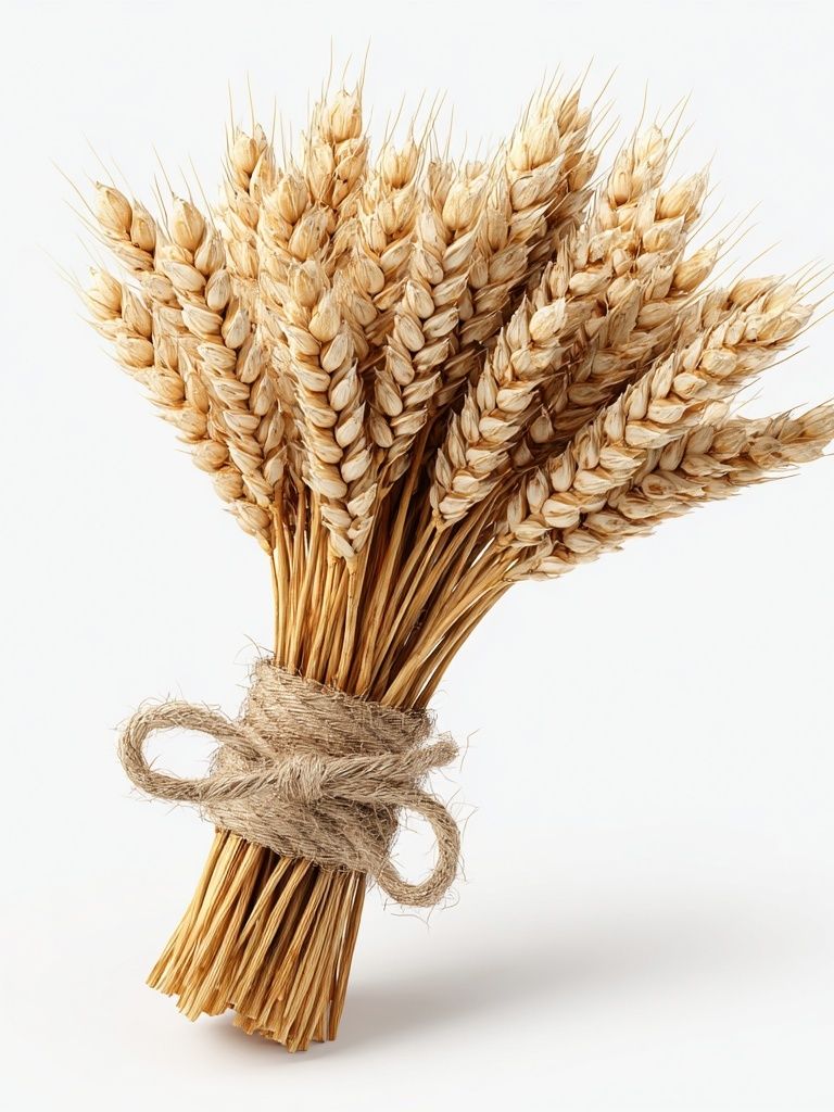
In cooler rooms — think grey upholstery, black metal, white walls, and ash wood — choose cleaner greens, lighter backgrounds, and less densely patterned subjects. Leaf studies, wheat stems, and airy floral illustrations tend to feel sharper in that setting. If a room gets limited daylight, avoid artwork that is too dark overall; pale backgrounds and open compositions will reflect more light and keep the wall from feeling heavy.
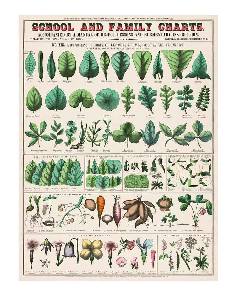
Subject matter matters as much as color. Leaves and grasses feel quieter than full floral clusters, so they work well in bedrooms and home offices. Flower-heavy designs feel more decorative and are often strongest in living rooms, dining spaces, or entryways. If you want a slightly academic look, this vintage botanical school print gives a room that collected, study-like character.

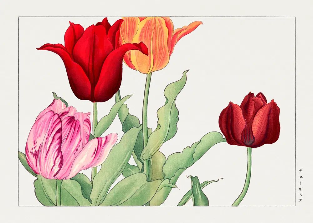
If you prefer softer, more natural color transitions than patterned vintage work, florals with watercolor or hand-painted detail can help. Tulip Bouquet is useful in rooms that need color but still want an airy finish.

Finding the Best Size and Layout
The most common styling mistake is choosing art that is too small for the wall. Above a sofa, bed, or sideboard, aim for the total arrangement to cover around 60 to 75 percent of the furniture width. For a 200 cm sofa, that means a composition roughly 120 to 150 cm wide. Botanical print posters look best when they have enough presence to register from across the room.
A single statement piece works well in narrow spaces or where the furniture is already detailed. One large 50 x 70 cm or 70 x 100 cm botanical print can anchor a hallway end wall, breakfast nook, or writing desk. Pairs are ideal over bedside tables, compact sofas, or dining benches. Keep 5 to 8 cm between frames for a crisp, tailored look.
Gallery walls are better when you want a layered, collected effect. Use four to six frames if the wall is modest, and six to nine only if the wall has real breathing room. Mix one more detailed piece with simpler subjects so the arrangement does not become visually dense. If you are combining botanicals with landscape or bird imagery, draws from our nature prints or illustration art with birds and flora can expand the palette without losing the organic theme.

Framing Ideas That Elevate the Look
Frames change the tone immediately. Oak or light wood makes botanical artwork feel easy and Scandinavian; black frames sharpen outlines and suit more modern rooms; antique gold adds formality and works especially well with heritage-style florals. If your artwork includes cream backgrounds and intricate pattern, a mount can make it look more finished. A mount of 4 to 8 cm is usually enough to give detailed botanical art breathing space.
Glass choice matters in bright rooms. Standard glass can reflect windows and lamps, especially if the artwork hangs opposite natural light. In a sun-heavy living room or hallway, anti-reflective glazing is worth considering because it keeps fine linework and soft color transitions visible throughout the day. This is particularly useful for prints with delicate stems or layered petals.
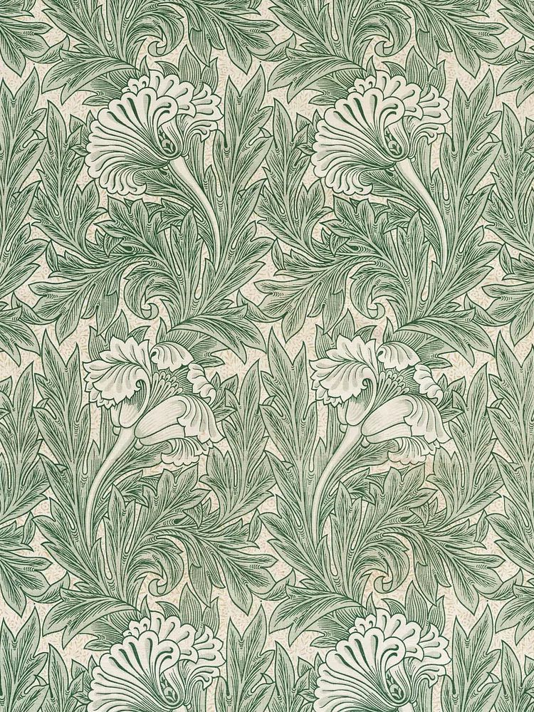
If you are styling more decorative pieces, choose a frame that supports the mood already in the artwork. Green Tulip by William Morris works well with walnut, dark oak, or slim antique brass finishes because those materials echo its heritage feel.
Where to Hang Botanical Prints Room by Room
In living rooms, hang the center of the arrangement around 145 cm from the floor, then adjust slightly if the furniture is low-profile. Over a sofa, keep the bottom edge of the frame group about 15 to 25 cm above the backrest. A botanical piece with strong pattern can stand up to larger furniture, while lighter stems and single blooms are better when the room already has textured curtains, patterned cushions, or a bold rug.
Bedrooms benefit from the quietest side of botanical styling. Choose softer greens, faded florals, or wheat and leaf motifs, and avoid overly busy arrangements above the bed. Two matching 40 x 50 cm frames or one 70 x 100 cm piece usually gives enough scale. If you want something restrained, Vase with Flowers — Minimalist Print pairs neatly with botanical themes without making the wall feel crowded.
Kitchens and dining spaces can handle more character. Small framed botanicals look excellent above open shelving, breakfast corners, or a pantry wall. In these rooms, vintage herb and flower studies feel especially appropriate because they connect naturally with food, seasonality, and domestic detail. Hallways are a good place for a linear series — three matching vertical pieces, for example — because repetition helps narrow walls feel longer and more composed.
In a home office, botanical print posters should support focus rather than dominate the room. Go for one medium statement piece above a desk or a pair beside shelving. Greens are associated with restoration and visual calm, which is useful in workspaces that rely on long screen hours. If you want a softer decorative edge, bohemian floral wall art can be mixed in carefully, especially with natural wood and woven textures.

How to Create a Calm, Collected Finish
The best botanical rooms repeat nature rather than overstate it. If your wall art includes green foliage, echo that color once or twice — in a cushion, a throw, or a ceramic vase — then stop. Two to three related accents are enough. More than that, and the room starts to feel themed instead of composed.
Texture helps botanical print posters settle into the room. Linen curtains, woven baskets, oak furniture, stoneware, and a single real plant create enough material contrast to make framed art feel integrated. You do not need plants on every surface. One tall floor plant and one small tabletop stem arrangement usually do more than six scattered pots.
Spacing also affects calm. Leave negative space around the artwork, especially if the print itself is detailed. If you are styling a shelf below the wall art, keep the objects lower than one-third of the frame height so they do not compete. The goal is layering, not stacking every natural element into one corner.
Final thoughts
Botanical print posters work best when they are matched to the room's tone, scale, and materials. Pick subject matter that fits the mood, size the arrangement generously, and frame it with enough care that the artwork feels part of the architecture rather than an afterthought.
Whether you prefer vintage florals, structured leaf studies, or softer stems, botanical print posters give a home an easy sense of freshness that does not date quickly. A few well-placed pieces from the botanical wall art collection can make a room feel lighter, calmer, and more finished.
Frequently Asked Questions
What frame color works best for botanical art?
Oak is the most flexible choice, black gives a cleaner modern edge, and antique gold suits vintage floral designs. Match the frame to the room's wood tone or metal finishes for a more cohesive result.
Can I mix botanical prints with non-botanical wall art?
Yes — landscapes, bird illustrations, and minimalist line work pair well if they share a similar palette. Keep at least one common element, such as muted greens, cream backgrounds, or vintage styling.
Are botanical prints suitable for humid rooms like kitchens?
Yes, but frame them properly and avoid placing them directly above a kettle, stove, or sink. A glazed frame helps protect the surface from moisture and grease.
How much space should I leave between frames in a botanical gallery wall?
Use 5 to 8 cm for a neat, consistent layout. If the frames are very large, you can stretch that to around 10 cm without losing cohesion.
Do botanical prints work on dark wall colors?
They do, especially if the artwork has cream, blush, sage, or warm green highlights. Use lighter mounts or slimmer frames so the art stands out clearly against deeper paint shades.