Why Beige Posters Work So Well
Beige posters succeed because they soften a room without making it feel flat. A strong black-and-white print can create contrast fast, but beige wall art works differently — it lowers visual noise, adds warmth, and still looks considered. In rooms with hard finishes such as concrete, glass, or painted drywall, beige helps balance the space by bringing in a gentler mid-tone.
This shade also moves easily across styles. In a pared-back apartment, our minimalist collection keeps beige looking clean and architectural. In a more layered home, bohemian art prints and soft fine art pieces add warmth and depth without breaking the calm palette. That flexibility is exactly why beige posters work in modern homes, rental spaces, and transitional interiors alike.
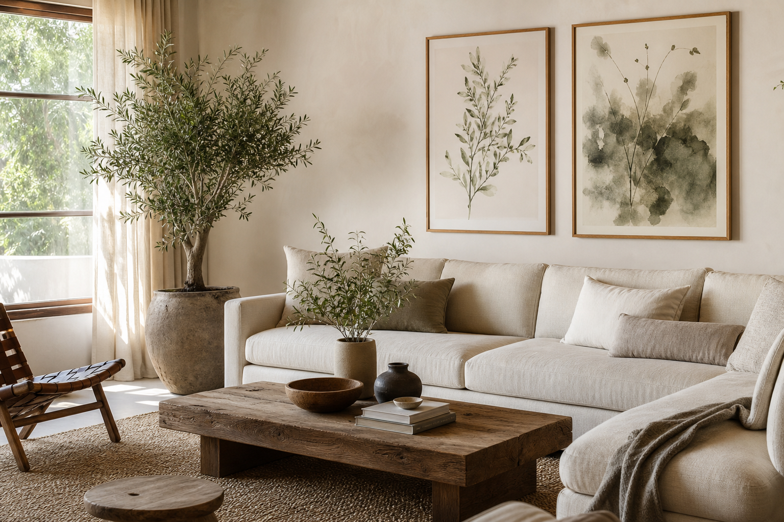
A practical benefit: beige sits comfortably between white walls and darker woods. If your room already has oak, walnut, boucle, linen, or travertine, beige art often looks integrated from day one rather than added as an afterthought.
Choosing the Right Beige Tone
Not all beige reads the same. Sandy beige has a yellow undertone and feels sunlit and relaxed. Taupe leans brown or gray and feels more tailored. Greige sits between warm and cool, making it useful if your room has mixed finishes such as chrome lighting, white walls, and natural oak furniture.
Start with the wall color. If your walls are crisp white, choose beige art with a little depth so the piece does not disappear — think oatmeal, flax, or warm stone. If your walls are already cream or ivory, pick artwork that includes contrast through texture, shadow, or line. A tonal print from White Cream Texture Poster or Textured White Abstract Poster can work well because surface detail keeps the composition visible.
Lighting matters more than most people expect. North-facing rooms tend to cool down beige by 10 to 15 percent visually, so warm sandy pieces feel better there. South-facing rooms add natural warmth, which means taupe and greige often look more refined than yellow-beige. If you shop online, compare the artwork with your floor and sofa rather than your wall paint alone — those larger surfaces affect the read of the color more.
Best Rooms for Beige Posters
The bedroom is the easiest place to use beige posters well. Above a 140 cm to 180 cm bed, one large print in 50x70 cm or 70x100 cm creates a quiet focal point. Two matching pieces work too, especially if the bedding is white, stone, or muted brown. Prints with soft texture or fabric-inspired detail feel especially natural in sleep spaces because they echo upholstery and linens rather than fighting them.

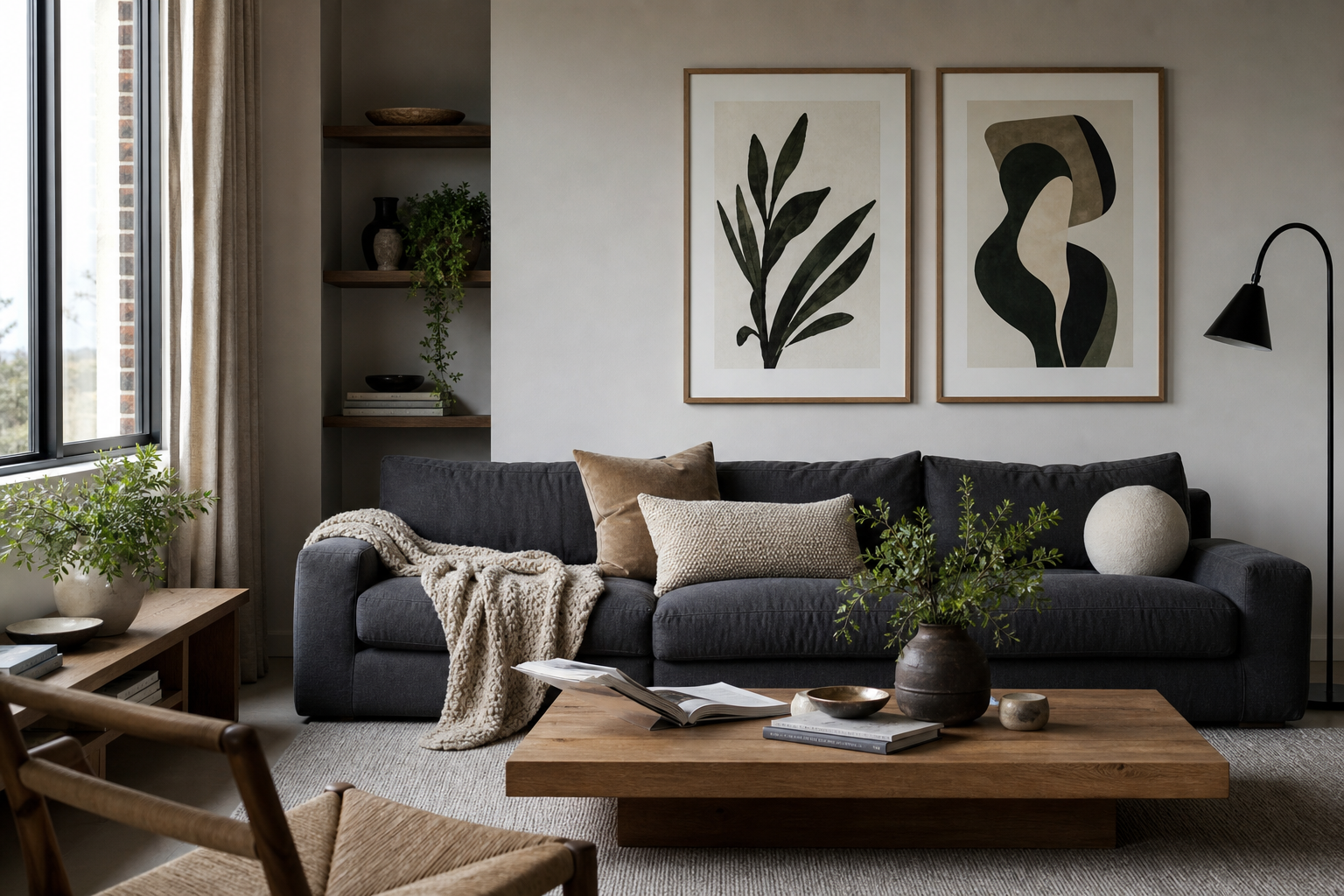
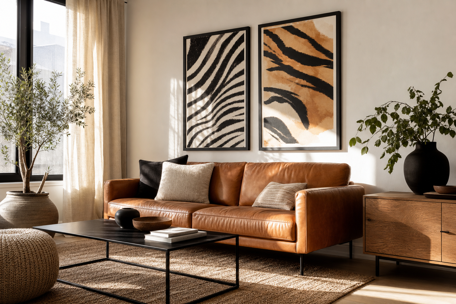
In living rooms, beige art is useful when the furniture already carries weight. A camel leather chair, an oatmeal sofa, or a walnut media unit can make the room feel visually dense. Beige artwork lightens the composition while still relating to those materials. If you prefer a cleaner look, abstract neutral prints keep the room modern. If you want more character, vintage wall art in faded beige and brown brings softness without adding bright color.
Hallways benefit from beige because they are usually narrow and underlit. A sequence of 30x40 cm or 40x50 cm frames in warm neutral tones can make the corridor feel longer and calmer. In a home office, beige prints reduce distraction better than high-contrast art. That matters when the art sits directly in your eyeline above a desk.

How to Style Beige Posters on the Wall
The biggest mistake with beige wall art is going too small. Because the palette is subtle, undersized pieces can vanish. Over a sofa that is 200 cm wide, aim for art that spans roughly 100 to 140 cm total — about 50 to 70 percent of the furniture width. That could mean one 70x100 cm statement piece, two 50x70 cm frames, or a set of three smaller works with even spacing.
Spacing should stay tight. Leave 5 to 8 cm between small and medium frames, or 8 to 10 cm between larger ones. Wider gaps break the calm effect and make the arrangement feel less intentional. Beige posters look strongest when they read as a unified composition rather than separate floating objects.
Pairing is where the style becomes personal. Beige works well with white, brown, black accents, dusty blush, muted olive, and faded terracotta. If you want a very clean result, mix textured minimalist prints with mid-century modern artwork that uses restrained shapes and soft geometry. If you want more movement, blend neutrals with one organic subject such as branches, stones, or draped fabric.

Frames, Textures, and Finishes That Elevate the Look
Frame choice changes beige art more than color choice does. Light oak frames keep the look airy and Scandinavian. Matte black frames sharpen the composition and help pale prints stand out. Walnut adds richness and is especially effective when the room already includes brown wood furniture.
For a soft modern interior, use a white or warm off-white mat around detailed pieces. A mat width of 5 to 8 cm gives small and medium prints more presence and makes subtle tones feel intentional. If the artwork already has plenty of negative space, skip the mat and keep the profile slim — around 1.5 to 2 cm is usually enough.
Texture is another strong tool. Beige pieces with visible fabric, plaster, or watercolor effects feel fuller than flat solid-color works. That is why prints like Elegant White Fabric or Palm Leaves Shadow Beige Background are useful in neutral rooms — the interest comes from surface and shadow, not bold color.

Creating a Warm Neutral Gallery Wall
A good warm neutral gallery wall uses variation, not sameness. Aim for roughly 60 percent beige and cream, 30 percent brown and taupe, and 10 percent darker contrast such as charcoal lines or black frames. That ratio keeps the arrangement calm while preventing the wall from looking washed out.
Choose at least two visual categories. One group might be textural abstracts, and the other might be nature-led or object-based pieces. This gives the eye enough change to stay engaged. Start with one anchor image, place it slightly off-center, then build around it using smaller prints in matching frames.
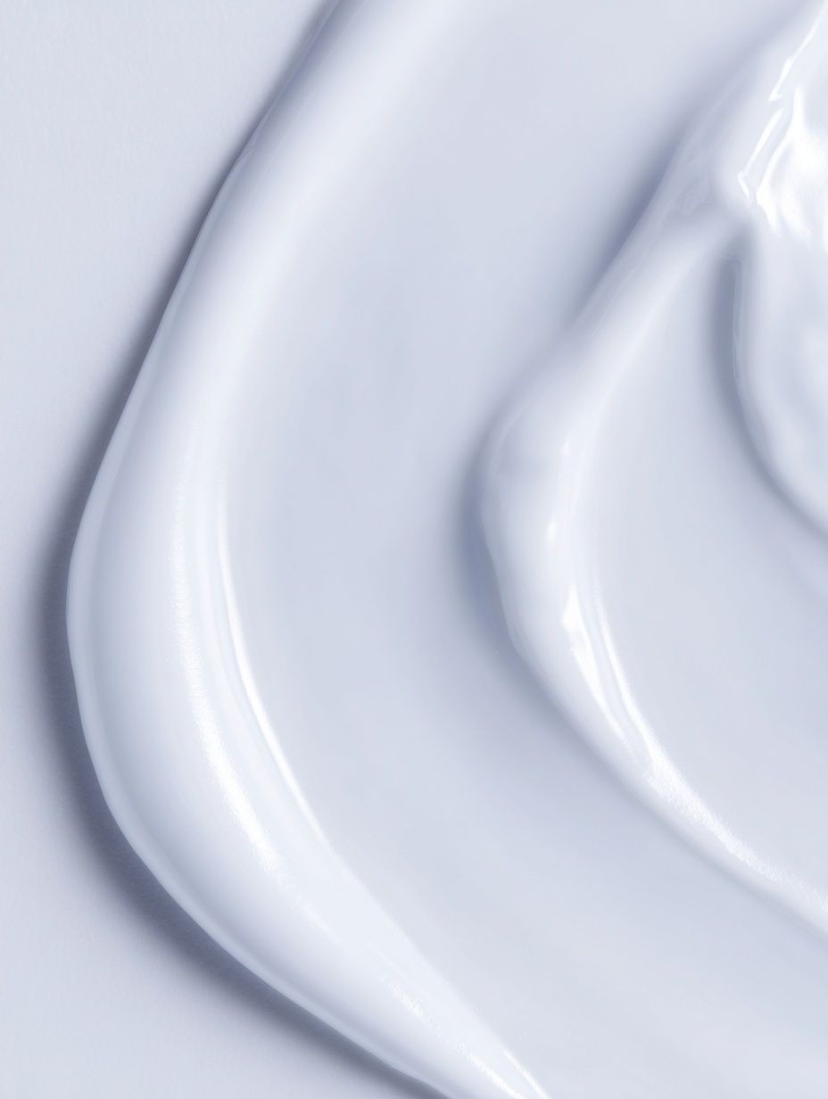
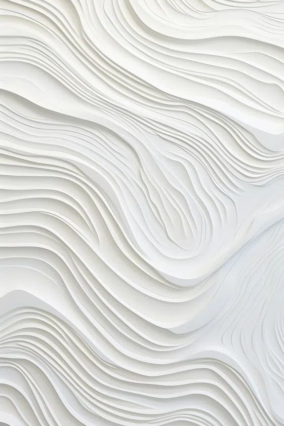
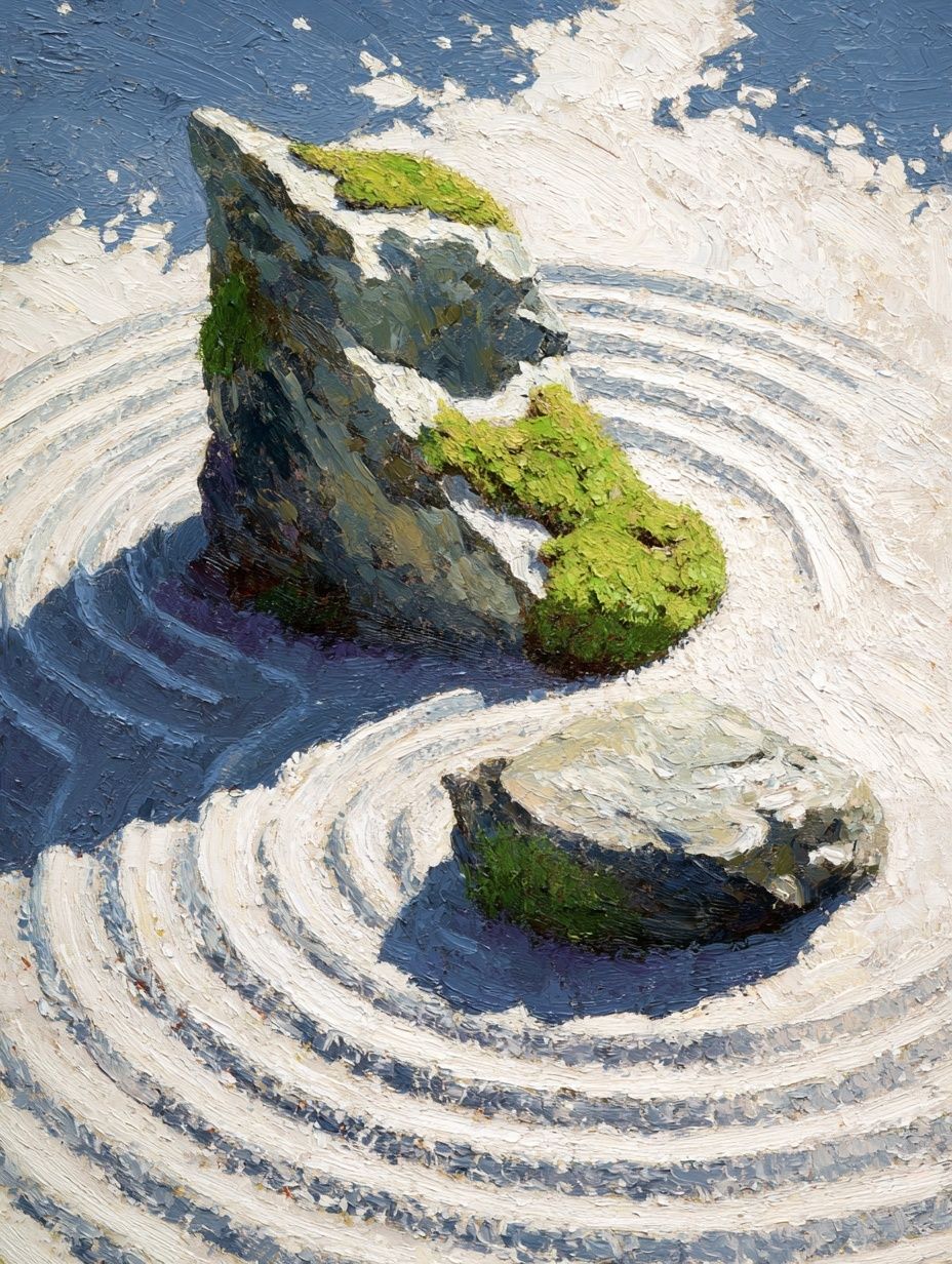
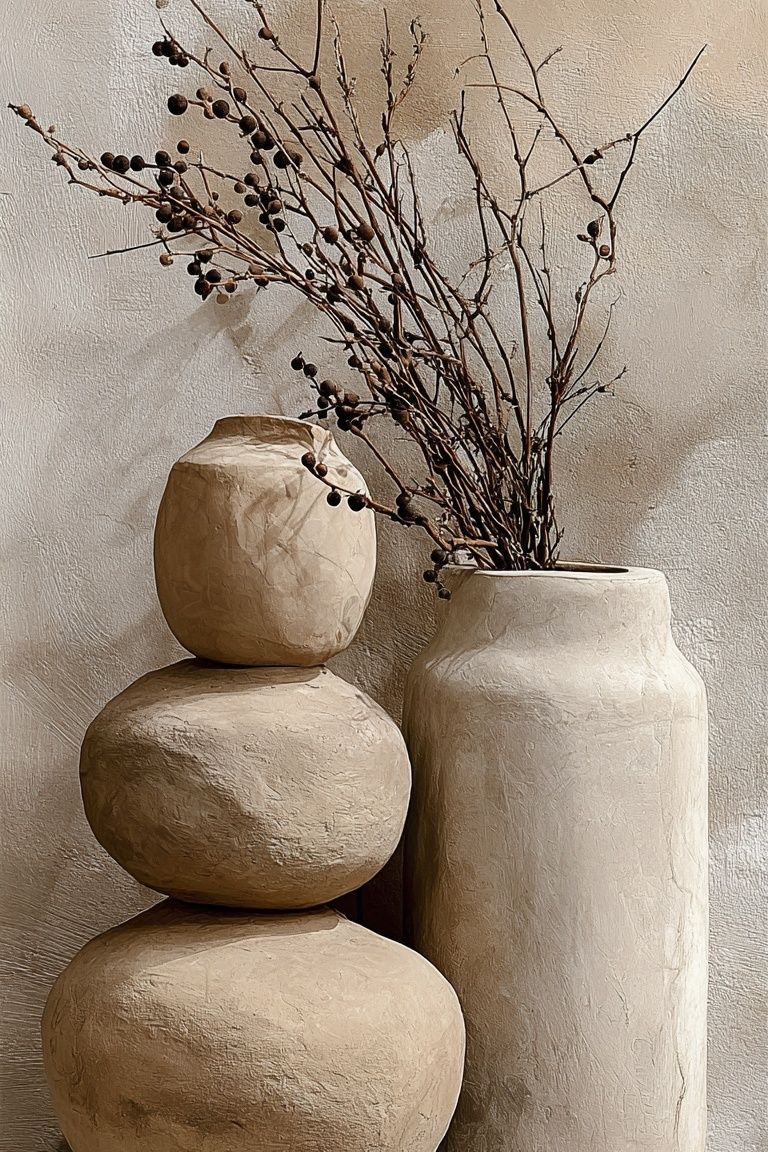
This is also the right place to bring in more character. Zen Garden Stones adds quiet structure. Ceramic Vases with Dried Branches introduces shape and a handcrafted feel. If you want a little pattern, Woven Bamboo Texture keeps the palette grounded.

Shop the Look: Simple Styling Tips to Finish Strong
If you are buying beige posters for one room, begin with the largest wall first. Anchor the room with one main piece or one set above the biggest furniture item, then repeat the tone elsewhere in a smaller frame. This avoids the common problem of scattering small neutral prints around the room without any focal point.
Match the artwork to materials you already own. Beige with linen, oak, jute, and boucle feels soft and modern. Beige with black steel, smoked glass, and concrete looks more architectural. Beige with antique brass, dark walnut, and layered textiles feels warmer and more classic. The art does not need to copy every color in the room — it should connect at least two of them.
When in doubt, choose simpler compositions than you think you need. Beige posters are strongest when the shape, texture, or subject can be read from across the room. If you only notice the piece from 1 meter away, it is probably too quiet for the wall.
Final thoughts
Beige posters work because they do two jobs at once: they calm a room and make it feel finished. The best results come from choosing the right undertone, scaling the art generously, and using frame materials that support the softness rather than overpower it.
If you want a modern home that feels warm instead of stark, beige posters are one of the easiest upgrades to get right. Keep the palette tight, vary the textures, and let the wall art support the room's materials and light.
Frequently Asked Questions
What frame color looks best with beige wall art?
Light oak is the safest choice for a soft modern look. Matte black works well if the print is very pale and needs more definition.
Can beige art work on beige walls?
Yes — but use contrast through texture, mats, or a darker frame. Aim for at least one shade of difference between wall and artwork background.
What size should I choose for art above a bed or sofa?
Use art that covers about 50 to 70 percent of the furniture width. For many homes, that means 70x100 cm for a single piece or two 50x70 cm prints side by side.
Do beige prints suit cooler gray rooms?
They can, especially greige and taupe styles. Add one or two warm materials such as wood or linen so the room does not feel split between warm and cool tones.
Should I use glass with textured neutral prints?
Yes, but keep glare low if possible and avoid placing the frame opposite a strong window. Textured designs show better when reflections are controlled.