Animal print posters bring pattern, rhythm, and contrast into a room faster than almost any other wall-art style. The key is to treat them as a design element rather than a novelty. A striped or spotted motif works much like a strong textile — it adds movement, breaks up flat surfaces, and gives neutral interiors a focal point without demanding a full room makeover.
Why Animal Print Works in Modern Interiors
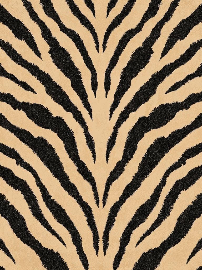
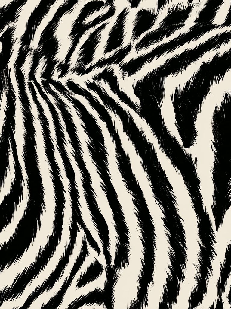
Animal motifs have stayed relevant because they balance organic irregularity with clear graphic structure. Zebra stripes, for example, feel lively but still read as black-and-white geometry, which is why they sit comfortably beside minimalist art prints and clean-lined furniture. In a room filled with smooth finishes — painted walls, glass, metal, lacquer — animal-inspired wall art adds visual texture even when the print itself is flat.
Modern interiors benefit most when the print is edited. One large 50x70 cm piece above a console, or a pair of 30x40 cm frames over a bed, usually looks more refined than scattering five small pieces around the room. If your space already has strong pattern in rugs or upholstery, keep the wall art simpler and look toward monochrome pieces in our animals collection rather than brightly colored variations.
Animal print posters also bridge styles that might otherwise feel disconnected. A zebra-based graphic can sharpen a soft bohemian scheme, while a vintage tiger illustration can warm up a pared-back Scandinavian room. If you like layered interiors, they also mix naturally with abstract wall art and vintage prints because all three categories rely on shape, line, and atmosphere more than literal matching.
Choosing the Right Animal Motif
Different motifs create different moods, so choose the print by the feeling you want in the room. Zebra feels crisp and graphic — ideal for black, ivory, taupe, and walnut interiors. Tiger reads warmer and more energetic because orange, rust, and ochre tones naturally carry more visual weight. Giraffe-inspired pattern tends to feel softer and earthier, especially in beige or camel rooms.
If you want a cleaner, more architectural effect, go for stripe-led artwork. Zebra works especially well in hallways, offices, and dining areas where stronger contrast helps define the space. A piece like Zebra Stripe Pattern Print gives you that sense of motion without introducing too many extra colors.

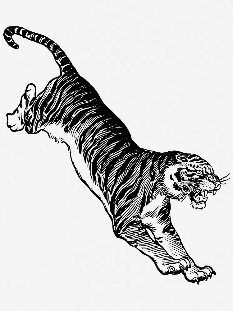
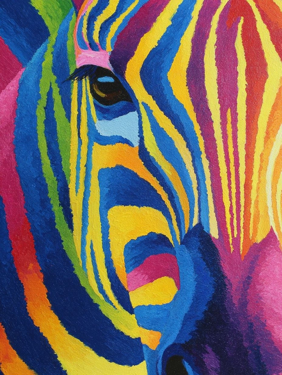
For a more playful room, especially a dressing area or creative workspace, a bolder treatment can work. Colorful Zebra Portrait Poster has stronger personality and suits interiors that already include lacquered finishes, sculptural lighting, or fashion-led accents. By contrast, if you want something more classic, the Jumping tiger vintage animal illustration leans decorative rather than loud.
Finding the Best Color Palette
The easiest palette for animal print posters is a neutral base: ivory, sand, camel, brown, charcoal, and black. In practical terms, aim for a room that is about 70% calm base tones, 20% wood or textile texture, and 10% darker accents. That ratio lets patterned wall art stand out without taking over the room.
Monochrome schemes are especially effective with zebra motifs. White walls, black frames, smoked oak, and one or two ink-black details create a sharp but livable look. If your room feels too stark, add one warming note — cognac leather, brushed brass, or oatmeal linen usually fixes that immediately. Pairing animal print posters with minimalist black-and-white artwork keeps the result intentional rather than busy.
Warm-toned palettes suit tiger and safari-inspired imagery better. Think terracotta, clay, tobacco, olive, and muted blush rather than bright orange. These shades echo natural landscapes and make animal motifs feel collected instead of theme-driven. If you already own woven textures or rattan pieces, you can also borrow from our bohemian collection to soften the contrast.
One useful rule: if the print has high contrast, keep the surrounding decor low contrast. If the artwork is softer or faded, you can afford stronger furniture shapes and darker wood. This balance matters more than strict color matching.
How to Frame and Finish the Look

Frames change the tone of animal print posters more than most people expect. Black wood or matte metal frames make zebra and tiger artwork feel sharper and more contemporary. Natural oak frames soften the graphic edge and are better for beige, bohemian, or Scandinavian interiors. White mats are useful when the artwork itself is dense or dark — a 4 to 6 cm mat gives the image breathing room and makes a 30x40 cm print feel more elevated.
Glossy finishes tend to amplify contrast and reflect light, which can be effective in darker rooms but harsher in sunlit spaces. A matte paper finish is usually the safer choice for patterned artwork because it keeps the lines crisp without glare. If you're hanging the art opposite a window, matte glazing or non-reflective acrylic will preserve detail better during the day.
Go bold with the frame only when the rest of the room is restrained. A heavy black frame around a tiger illustration can look fantastic above a cream sideboard, but the same frame may feel too dense in a room with dark shelving and patterned curtains. When in doubt, choose a slim profile between 1.5 and 2 cm wide.
Where to Hang Animal Print Posters
Living rooms are the easiest place to start because they usually have the clearest wall space. Above a sofa, keep the overall art width at roughly 60% to 75% of the sofa width. That means a 200 cm sofa can comfortably take one 100x140 cm statement piece or a pair of 50x70 cm frames with 7 to 10 cm between them. Zebra-based art works particularly well here because it reads from a distance.
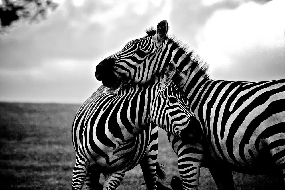
Bedrooms need a calmer approach. Over a 160 cm bed, choose softer monochrome motifs or vintage-toned prints rather than highly saturated pieces. A pair of 40x50 cm works hung 15 to 20 cm above the headboard often feels balanced. If you want symmetry and a gentler mood, Zebras in Love — Black-White Print is an easy fit.
Hallways and home offices benefit from narrower formats and stronger contrast. In a hallway, one vertical 30x40 cm or 50x70 cm print can pull the eye through the space. In an office, place the artwork slightly above monitor level so it remains visible on video calls without feeling crowded. If you want a more characterful look, Zebra Reading Newspaper — Funny Print suits a desk area or creative studio better than a formal sitting room.

Mixing Animal Prints With Other Art
Animal prints look strongest when they are not competing with three other loud motifs. In a gallery wall, let one animal-inspired piece lead, then support it with quieter categories. Good pairings include abstract compositions with similar line movement, vintage animal illustrations for a collected look, or a restrained fashion image from the fashion collection if you want a more editorial finish.
A reliable four-piece arrangement uses one animal print, one abstract, one vintage illustration, and one portrait or fashion-led work. Keep at least one unifying detail across all four — black frames, warm neutrals, or a repeated accent color. Spacing should stay tight and consistent, usually 5 to 8 cm between frames, so the group reads as one composition.
If your animal artwork is already colorful, surrounding pieces should be quieter. That is where Retro Fashion Portrait Poster or muted line-led work can help. If the main piece is monochrome, you can introduce one warmer companion print without disrupting the balance.
Style Tips for a Confident Final Look
Start with one strong piece, then style the room around it rather than buying several competing prints at once. Animal print posters work best when at least one other element in the room echoes their energy — a striped cushion, a dark ceramic object, a warm wood tone, or a curved lamp base. Repetition makes the art feel integrated.
Avoid trying to match the artwork too literally. A zebra print does not need zebra cushions, safari figurines, or overt themed decor. Instead, use contrast: clean furniture, tactile fabrics, and a limited color palette. That combination is what makes animal print posters feel modern rather than predictable.
Final thoughts
The most successful rooms use animal-inspired wall art with restraint. Focus on scale, keep the palette controlled, and choose a motif that matches the mood of the space — graphic zebra for crisp contrast, vintage tiger for warmth, softer monochrome for bedrooms.
If you want a polished result, build from one piece you genuinely like and connect it to the rest of the room through frame choice, texture, and placement. Done well, animal print posters add confidence to an interior without making it feel overstyled.
Frequently Asked Questions
What frame color works best with animal-inspired wall art?
Black frames suit high-contrast zebra and contemporary spaces, while oak frames soften the look in warmer or more natural interiors. If you are unsure, slim black is the most versatile starting point.
Can I use animal print art in a small room?
Yes — choose one medium-size piece such as 30x40 cm or 50x70 cm rather than several small frames. Strong pattern reads better when it has enough visual space around it.
Should I use a mat around animal print posters?
A white mat is helpful for dense, dark, or highly detailed artwork because it creates separation from the frame. A 4 to 6 cm mat usually looks balanced in standard home sizes.
Do animal motifs work with colorful interiors?
They do, but keep one element consistent, such as black accents or warm earth tones. If the room already has many colors, choose animal artwork with a simpler composition.
What art pairs well with zebra prints?
Abstract black-and-white pieces, vintage natural-history illustrations, and restrained fashion imagery are the easiest matches. They share line, contrast, or mood without repeating the same motif too closely.