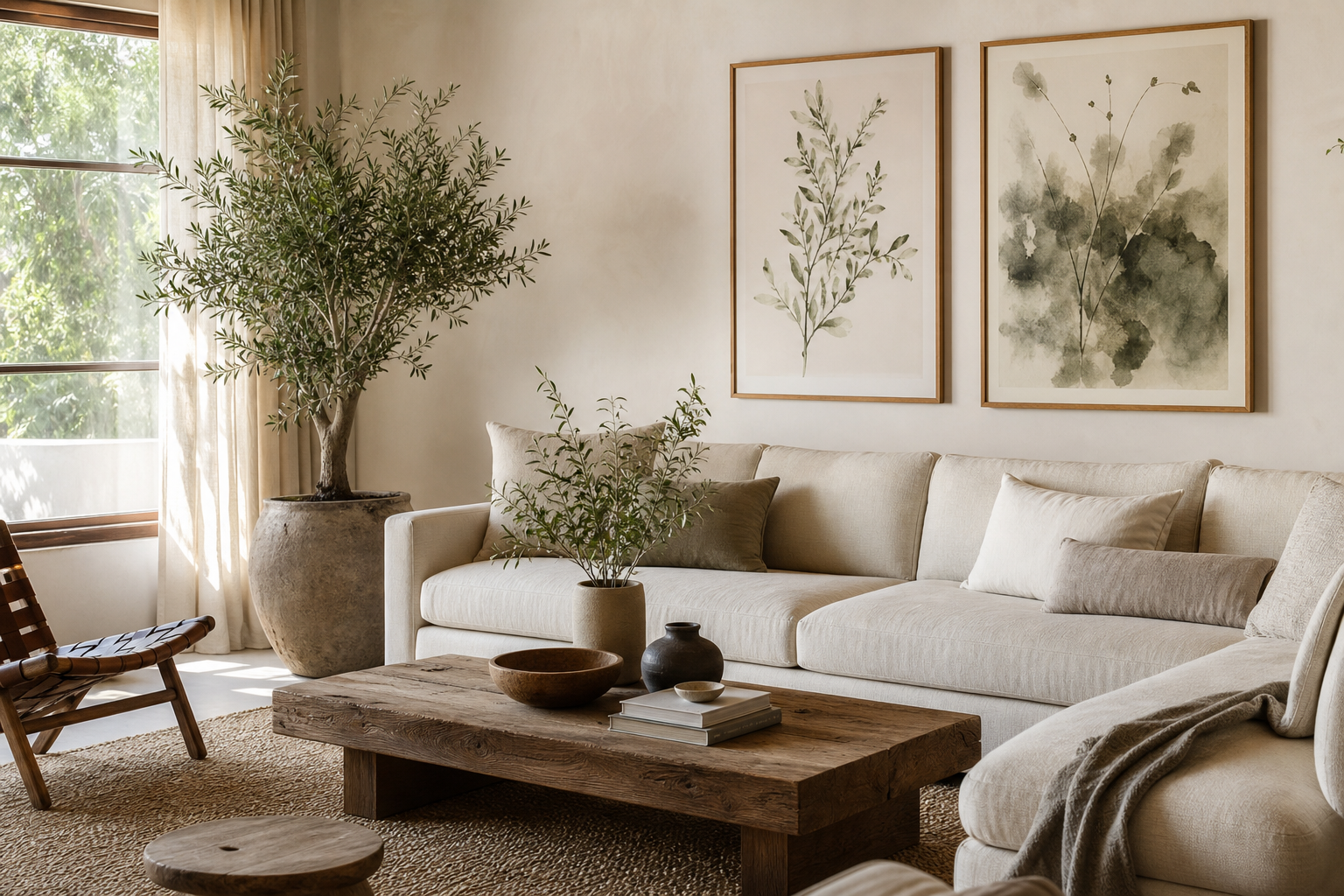
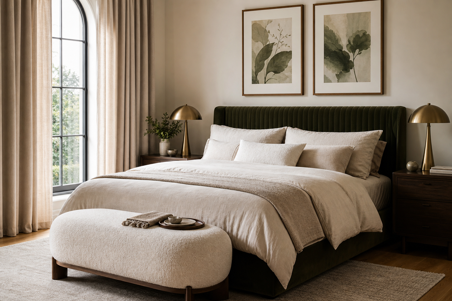
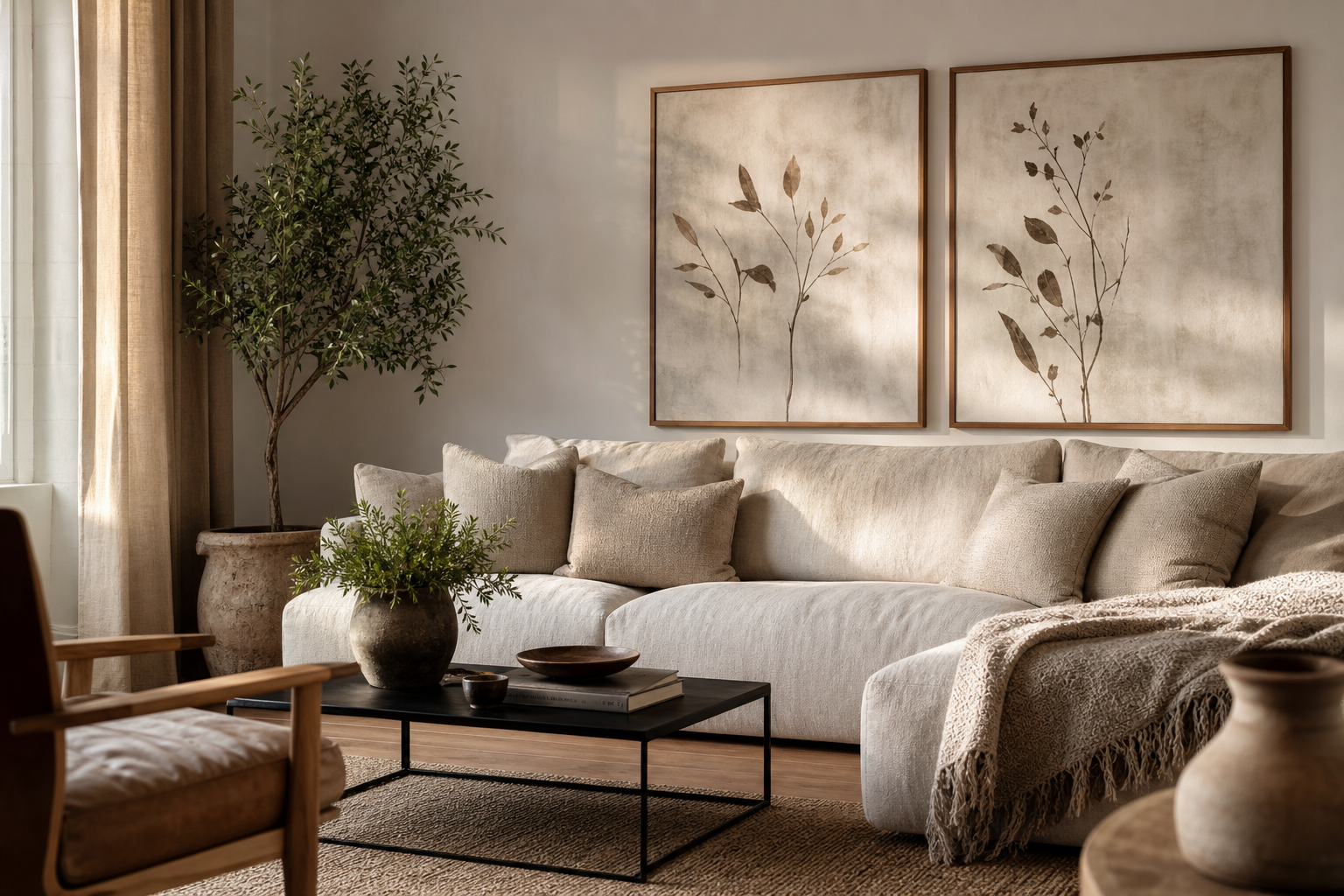
If you want wall art that feels substantial without dominating the room, print 16x20 photo posters. The format lands in a useful middle range: large enough to read from across the room, compact enough to fit above a desk, bedside table, console, or narrow stretch of wall. It is one of the easiest sizes to style because it works as a single statement piece or as part of a broader arrangement.
A 16x20 print has a 4:5 ratio, which gives it a naturally balanced shape. That proportion suits portraits, still-life images, landscapes with a strong foreground, and simple architectural shots. When people print 16x20 photo posters, they often get a more polished result than smaller casual prints because the scale asks for cleaner composition and better framing from the start.
Why 16x20 Works So Well
A 16x20 size covers enough wall area to create presence, but it does not require oversized furniture or high ceilings. Over a nightstand pair, one 16x20 on each side usually looks intentional. Above a desk that is 40 to 60 inches wide, a single centered 16x20 often feels proportionate. Over a console or bench, two 16x20 frames side by side create a neat span of 34 to 38 inches depending on frame width and spacing.
The format also leaves room for styling flexibility. You can hang it un-matted for a sharper, more contemporary look, or add a 2-inch mat to make the image feel more gallery-like. If you like calm, restrained spaces, look at our minimalist collection for ideas on how simple compositions hold visual weight without needing a huge frame.

Another advantage is placement tolerance. A 16x20 can sit comfortably on a wall section as narrow as 24 inches wide if styled alone, and it also integrates neatly into gallery walls made of mixed sizes. Pair it with 8x10 or 11x14 pieces and the larger print becomes the anchor rather than the only focal point.
Choosing the Right Photo for the Format
Image quality matters more at 16x20 than it does on smaller prints. For crisp results, aim for at least 240 to 300 PPI at final size. That means a file around 3840 x 4800 pixels is a strong target, while 1920 x 2400 pixels is usually too soft for close viewing. If your photo looks slightly noisy on screen at 100%, it will often look noticeably rough once enlarged.
Cropping is the second big decision. Since 16x20 uses a 4:5 ratio, many phone photos and DSLR images will need trimming. Portrait-oriented subjects tend to work best when the subject sits slightly above center. Landscapes need a defined focal area, otherwise the crop can feel cramped. Clean, readable subjects usually win at this size: coastlines, architecture, botanical details, portraits, and quiet travel imagery.
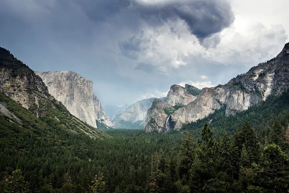
If you want a benchmark for how photographic compositions translate into wall art, our photography collection is useful to study. Pieces like Yosemite National Park. Original image show how depth and contrast help a medium-size print feel expansive, while Sunlit Water Surface proves that softer abstract imagery can still carry a wall when texture is strong.
Photos with too many tiny details can feel busy once framed. If the room already has patterned textiles, open shelving, or visible books, choose a simpler image with one clear subject. A restrained image such as Zen Rock Garden or one from our fine art collection tends to sit more comfortably in layered interiors.
Framing Ideas That Make It Feel Finished
A frame changes the entire read of a 16x20 print. Thin black metal gives a clean, modern edge and works well with monochrome photography, architectural images, and high-contrast compositions. Natural oak softens the look and connects better with Scandinavian, organic, or warm-neutral rooms. White frames brighten low-contrast imagery but need enough wall contrast to avoid disappearing.
Matting adds breathing room. A 16x20 print inside a larger frame with a 2- to 3-inch mat can feel more expensive and more deliberate, especially in bedrooms and hallways. If your photo is already detailed, the mat helps slow it down visually. If the image is minimalist, full-bleed framing can look sharper and more editorial.

Frame depth matters too. Anything around 0.75 to 1.25 inches deep tends to look substantial without becoming bulky. For soft, tonal imagery, you can borrow cues from Elegant White Fabric or Textured Waves—both suggest how muted surfaces and simple framing create a refined finish.

Where to Hang 16x20 Prints
The best hanging height is usually with the center of the artwork 57 to 60 inches from the floor. Above furniture, keep the bottom of the frame 6 to 8 inches above the top edge of the piece below it. Those two measurements solve most placement problems.
In bedrooms, 16x20 prints work well above a dresser, beside a bed, or leaned on a shelf if you prefer a relaxed look. In living rooms, they suit narrower wall zones that are too small for oversized art but too empty for decorative objects alone. In hallways, one 16x20 every 5 to 7 feet creates rhythm without clutter. Over a desk, a single vertical print adds focus, especially when the image has negative space rather than dense detail.

For gallery walls, use 16x20 as the anchor size. Build around it with smaller formats and keep spacing consistent at 2 to 3 inches. If you want a ready-made mix of moods and compositions, this selection works well for planning a photo-led arrangement:
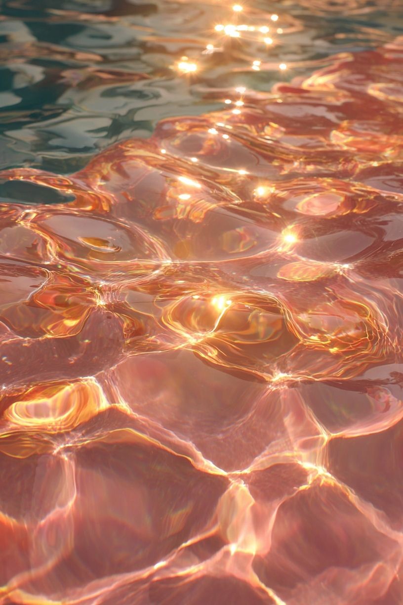
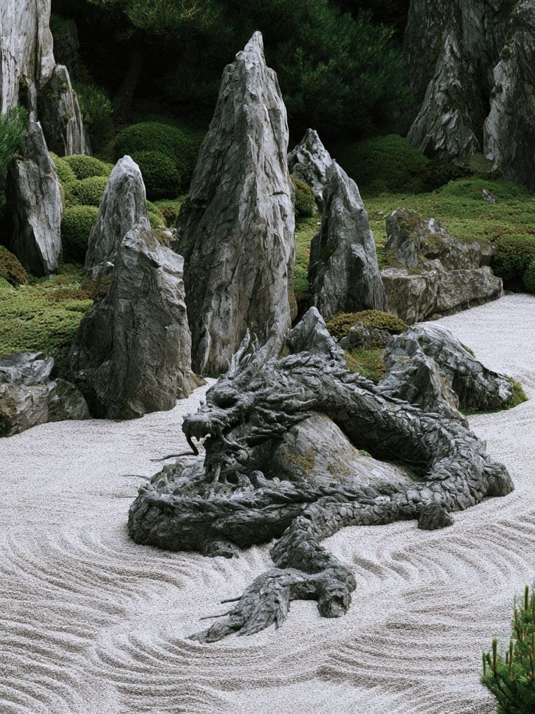

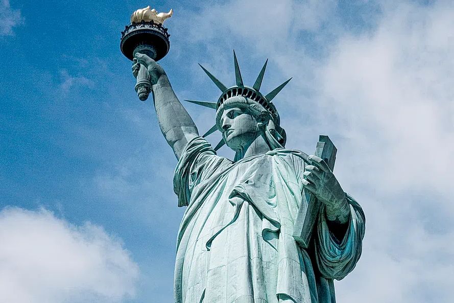
If your room leans classic, one well-chosen piece from our vintage wall art collection can also pair nicely with a personal 16x20 print. The contrast between your own photograph and something timeless like Elegant Woman Portrait gives the wall more character than matching everything too closely.
Styling Around Color and Mood
The strongest rooms repeat color with restraint. Pull one or two tones from the print and echo them elsewhere—in a cushion, rug edge, ceramic object, or lampshade. If your photo includes blue-gray water, sandy neutrals, or mossy green, repeat that family in small doses rather than repainting the whole room around it.
Warm-toned photos sit well with walnut, camel leather, brass, and cream upholstery. Cooler images look cleaner near black accents, pale oak, gray textiles, and white walls. If you print 16x20 photo posters with very high saturation, keep the surrounding decor simpler so the image stays intentional rather than loud.
A mood-driven approach helps. Quiet landscapes, fabric studies, and low-contrast stills create a restful effect in bedrooms. Brighter travel or architectural shots work better in hallways, kitchens, or workspaces where energy is useful. You can see that difference in pieces such as Yellow Mosaic Pool for punchier color, or Window with Sheer Curtain for a softer, lighter mood.

Tips for Printing a Clean, High-Quality Result
Start with the highest-resolution original file you have. Avoid screenshots, compressed social media downloads, and heavily filtered edits. Brighten carefully, but do not lift shadows so much that black areas turn gray and noisy. Slight sharpening can help, but over-sharpening creates halos around edges that become obvious on paper.
Paper finish affects the mood more than many people expect. Matte paper reduces glare and flatters soft photography, portraits, and neutral interiors. Satin or lustre adds a bit more depth and contrast without the heavy reflections of glossy paper. Glossy finishes can work for bold color, but they are less forgiving under lamps, windows, and ceiling lights.
Before you print 16x20 photo posters, soft-proof the file if your lab provides an ICC profile. At minimum, check three things: skin tones, shadow detail, and crop margins. Leave a little breathing room around important edges so nothing feels accidentally trimmed. If you are adding a frame with a lip that covers 0.25 inch on each side, account for that when placing faces, horizon lines, or textural details near the border.
A Simple Way to Turn Favorite Photos into Wall Art
A 16x20 print is one of the easiest ways to make a personal image feel like proper decor instead of a casual snapshot. Choose a photo with a clear subject, crop it thoughtfully to the 4:5 ratio, and give it a frame that suits the room rather than just the image. That is usually enough to make the result feel finished.
If you want extra depth, pair your own print with pieces from our curated photography prints or minimal wall art so the wall feels layered, not random. The format is flexible, the styling rules are straightforward, and one strong 16x20 can shift the whole room.
Frequently Asked Questions
Is 16x20 better with or without a mat?
Use a mat if the photo is detailed or sentimental and you want it to feel more formal. Skip the mat for cleaner, more modern images with strong composition.
What frame size do I need for a 16x20 print?
A true 16x20 frame fits the print directly. If you want a matted look, many people size up to 20x24 or 22x28 depending on the mat width.
Can I lean a 16x20 print on a shelf instead of hanging it?
Yes—just use a shelf at least 3 to 4 inches deep and add a small non-slip pad behind the frame. Leaning works especially well on dressers, picture ledges, and desks.
Which paper finish hides fingerprints and glare best?
Matte is the safest choice for both. It diffuses light well and keeps the surface looking cleaner in bright rooms.
How many 16x20 prints work above a sofa?
Two or three usually work best, depending on sofa width. For a standard 84-inch sofa, aim to fill about 50 to 65 inches total including spacing.