Why Typography Posters Work So Well
Typography posters succeed because they do two jobs at once: they decorate a wall and communicate a message. A landscape print sets a mood visually, but type-led art adds personality in seconds. That is why our typography collection works especially well in modern homes where clean lines, open wall space, and edited styling benefit from one clear focal point.
They are also flexible across interior styles. In a minimalist room, typography posters can act as the only graphic element on the wall. In a more eclectic space, they help anchor busier pieces by introducing structure and repetition. If your room already includes textured fabrics, curved furniture, or patterned rugs, a simple black-and-white typographic print often gives the eye a place to rest. If your room feels flat, bolder options from our abstract collection or illustrative wall art can sit beside type to add movement without losing clarity.
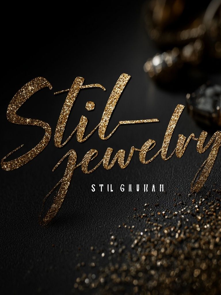
A strong example is a design that uses form as much as wording. The composition matters just as much as the phrase itself—letter spacing, margin width, and contrast determine whether the piece feels gallery-sharp or visually noisy.

Choosing the Right Mood and Message
The mood of typography posters starts with font style. Sans serif fonts with generous spacing feel calm, architectural, and contemporary. Heavier condensed fonts feel louder and more urban. Script fonts can soften a room, but they usually work best when the rest of the decor is restrained. If you want a cleaner result, choose one to six words rather than a full paragraph. Shorter messages read from 2 to 3 metres away, which is the average viewing distance in a living room.
Tone matters more than most buyers expect. Playful wording suits social areas such as kitchens, bars, and guest spaces. More reflective or understated phrases work better in bedrooms or home offices. If the message is ironic, keep the styling disciplined—simple frame, wide mount, limited colour palette—so the room still feels intentional rather than novelty-driven.

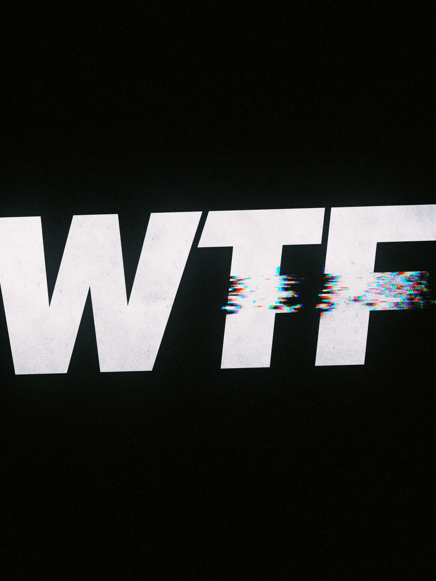
For homes that lean graphic, a piece with distortion or digital texture can add energy without requiring bright colour. In a neutral office or hallway, that kind of contrast prevents the space from feeling too polite.
If you prefer a warmer direction, look at styles that echo older print culture. A retro-inspired type treatment can bridge modern furniture and character-rich accessories, especially when paired with vintage art prints or Mid-Century Modern wall art.
Best Sizes and Layouts for Each Space
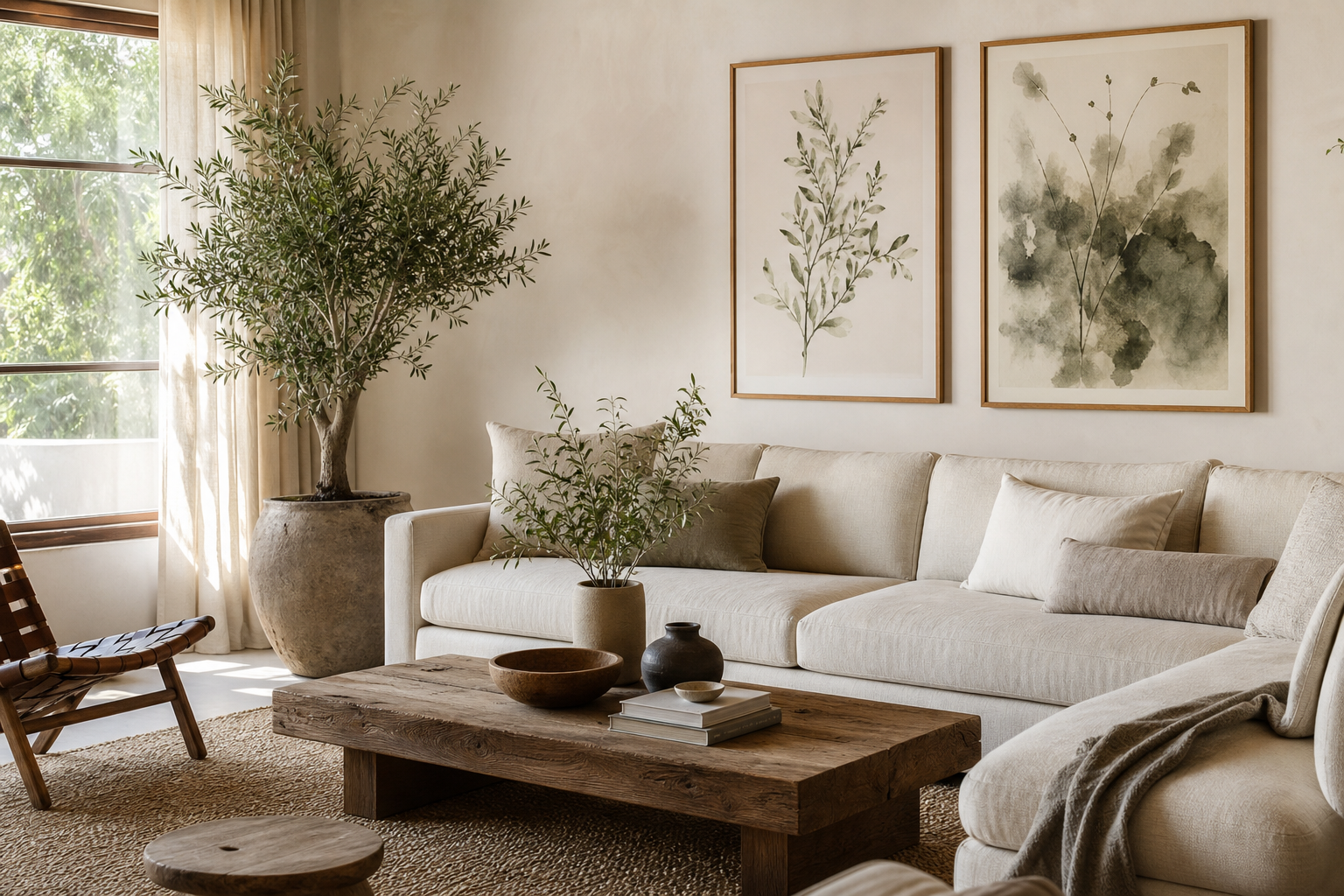
Scale is where many walls go wrong. For a sofa wall, one large typography print in 50x70 cm or 70x100 cm usually looks stronger than two undersized frames. Aim for artwork that spans around 60 to 75 percent of the furniture width below it. Above a 200 cm sofa, that means a visual arrangement roughly 120 to 150 cm wide.
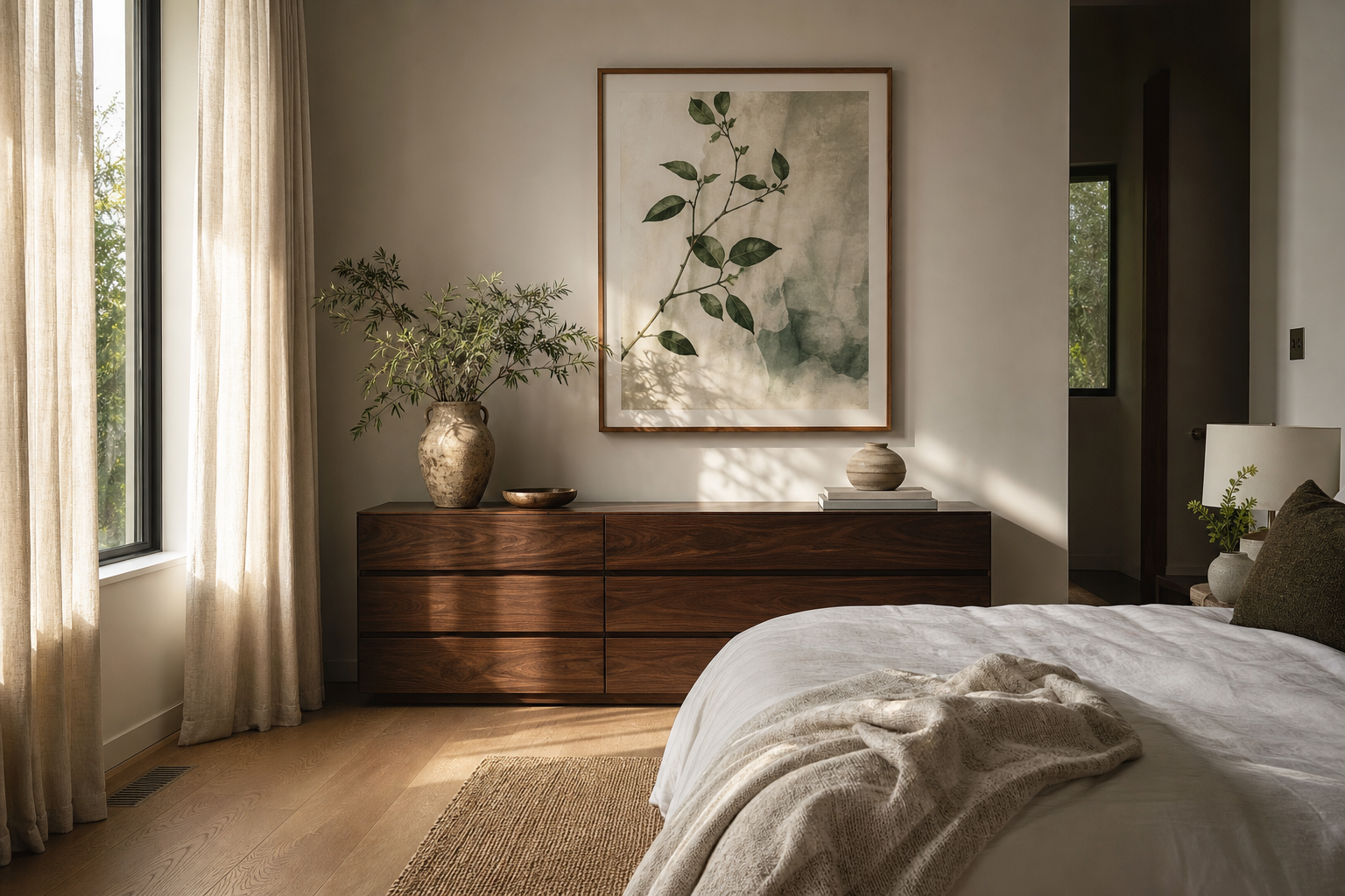
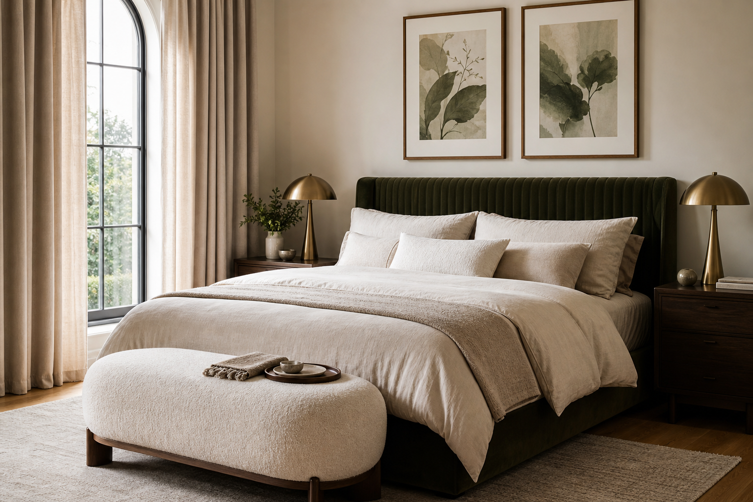
For hallways, pairs work well because the viewing angle is narrow and movement is linear. Two 30x40 cm or 40x50 cm frames with 5 to 8 cm between them create rhythm without overcrowding. Bedrooms benefit from softer symmetry—either one centered piece above the headboard or a balanced pair offset by bedside lamps. In home offices, smaller typography posters at 30x40 cm are often enough because the viewing distance is shorter, often under 1.5 metres.
A gallery wall is the best choice when typography is not your only art style. Combine one dominant text piece with supporting visual prints in different but related formats. Keep at least one common rule across the set: matching black frames, repeated cream backgrounds, or a tight palette of two to three colours.
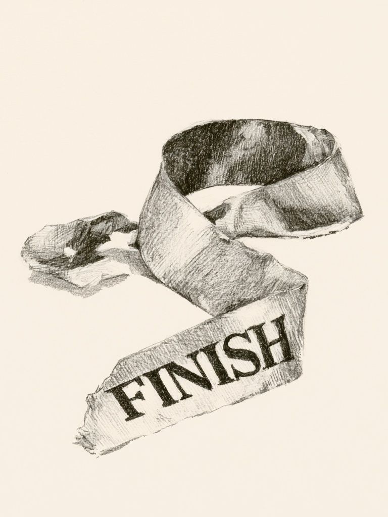
When you want one compact statement piece in an entry or reading nook, choose a design with enough contrast to hold its own from across the room. A small frame should still read clearly at a distance of 1.5 to 2 metres.
Colour, Contrast, and Framing Tips
Black text on white remains the easiest option because it delivers maximum readability and suits almost every material palette—oak, walnut, chrome, plaster, linen, and concrete. But modern interiors do not need to stay monochrome. Cream paper with dark brown or muted green typography tends to feel softer and more residential than hard black. This is especially effective in spaces with warm woods or stone surfaces.
Frames should support the print, not fight it. Matte black frames sharpen modern typography posters and suit high-contrast interiors. Oak frames reduce severity and connect better with Scandinavian or Japandi-inspired rooms. White frames are useful when you want the piece to merge into a pale wall rather than announce itself. If the typography is already dense or decorative, skip an ornate frame. Clean mouldings between 1.5 and 2.5 cm wide usually look most balanced.

Contrast should be planned across the whole wall. If the print is subtle, increase scale. If the message is bold, reduce competing objects nearby. A console with five small accessories under a highly graphic piece often feels cluttered. Two or three objects—such as a vase, stacked books, and a lamp—usually give better balance.
Where Typography Posters Look Best
Kitchens are ideal for witty or conversational type because the room is already active and social. A smaller 30x40 cm frame near a breakfast nook, shelf, or coffee station adds character without needing much wall space. Spaces with tiled backsplashes or open shelving especially benefit from one clear typographic focal point to organise the visual noise.
Home offices reward direct, concise wording. Choose typography posters with disciplined layouts rather than novelty fonts. A grid-based design above the desk or on the wall opposite your chair feels more intentional over time. If your office furniture is simple—black desk, oak shelves, task lamp—consider pairing a typography print with minimalist wall art to keep the room focused.

Bedrooms need a gentler tone. Avoid aggressive slogans and very high-saturation colours. Instead, choose restrained wording, soft neutrals, or letterform-led designs that feel meditative. Shared living spaces sit somewhere in the middle: one piece can be playful, but the styling should still connect to the broader room palette. If your lounge already includes geometric cushions or sculptural lighting, a design with retro structure can echo that language well.
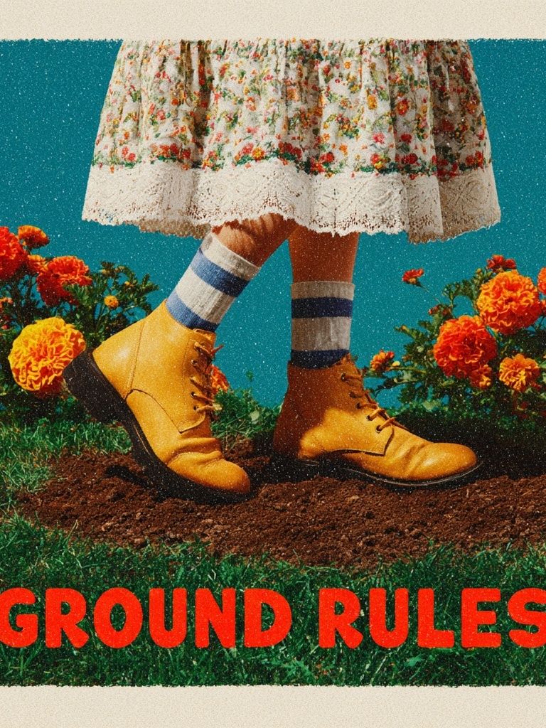
For more expressive spaces, you can also mix text with figurative or era-inspired art. A typographic piece next to Elegant Woman Silhouette or Retro Geometric Shapes creates contrast between message and image while keeping a strong graphic profile.
How to Build a Cohesive Gallery Wall
A cohesive gallery wall usually follows a 60/30/10 rule. Make roughly 60 percent of the arrangement calm and consistent—matching frames, similar backgrounds, or repeated margins. Use 30 percent for variation through scale or imagery. Keep the final 10 percent for the statement piece, which is where typography posters often perform best.
Start with the anchor piece first, normally the largest frame. Place it slightly off-centre if the furniture below is asymmetrical, or dead centre if the room architecture is formal. Then build around it with visual prints that support rather than compete. Photography, abstract shapes, and vintage portraits all pair well with text when they share one colour family or one framing style. Leave 5 to 7 cm between smaller frames and up to 8 to 10 cm around a larger centrepiece.
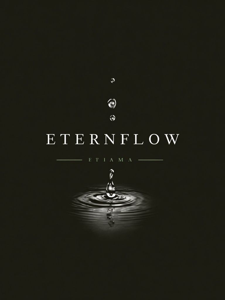
If you mix different genres, repeat one detail at least three times across the wall. That might be black linework, cream paper, rounded forms, or muted terracotta accents. This is why Water Drop Minimalist Typography can sit comfortably beside Vintage Floral Typography or even cleaner forms from the Mid-Century Modern collection—the common thread is graphic restraint, not identical subject matter.
Final Styling Tips and Shop Ideas
Typography posters look best when the message, scale, and room mood are aligned. Choose shorter text for longer viewing distances, let the frame match the furniture tone, and give the wall enough breathing room. A modern interior rarely needs more than one dominant typographic message per zone.
If you want a result that lasts, buy typography posters you would still enjoy reading a year from now. Prioritise layout, contrast, and tone over novelty alone. Start with one strong piece from our typography posters collection, then add supporting art only when it improves the wall rather than fills it.
Frequently Asked Questions
What frame colour works best for typography prints?
Matte black is the safest choice for crisp contrast, while oak feels softer and warmer. Choose black for graphic interiors and oak for spaces with natural wood, linen, or off-white walls.
Should typography art be hung with glass or without?
Glass gives a cleaner, more finished look and protects the print from dust and moisture. In bright rooms, use anti-reflective glazing if the wall gets strong direct light.
Can typography prints work on coloured walls?
Yes—just increase contrast. Cream or white backgrounds read best on olive, grey, terracotta, and muted blue walls, while black-framed pieces help define the edges.
How high should I hang typography wall art?
As a rule, place the centre of the frame around 145 to 150 cm from the floor. Above furniture, leave 15 to 25 cm between the top of the piece and the furniture below.
What kind of typography suits a small apartment?
Choose simple layouts, short phrases, and lighter colour palettes to avoid visual crowding. One 40x50 cm or 50x70 cm piece often looks cleaner than several small competing frames.