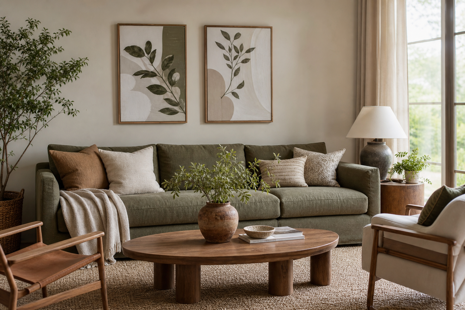
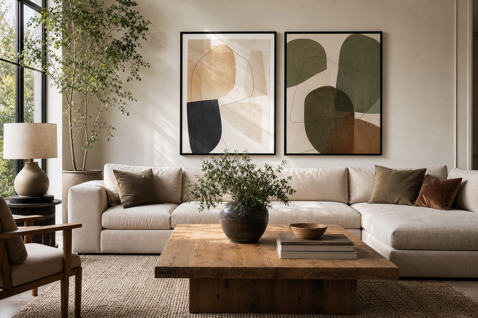
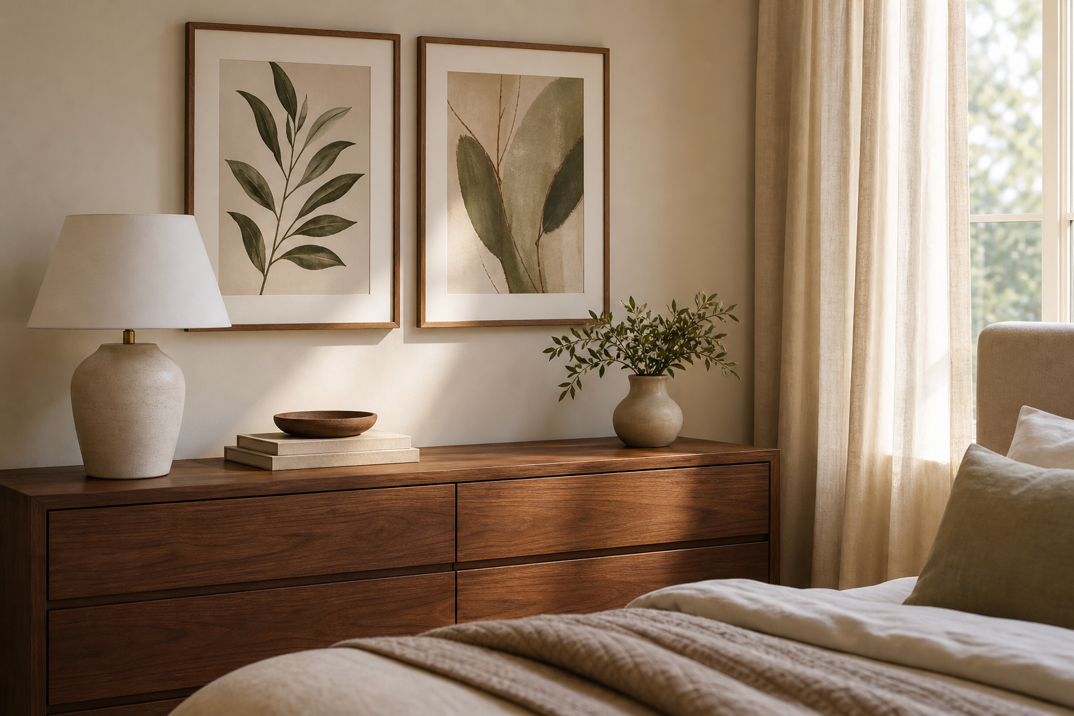
A botanical poster print adds structure and softness at the same time. The natural subject matter feels easy to live with, while the lines of stems, leaves, petals, and branches give a wall enough detail to look finished. That balance is why botanical art works in spaces that need calm, including bedrooms, living rooms, hallways, and home offices.
Why Botanical Prints Work in So Many Rooms
Botanical art has a wide visual range. Delicate line drawings suit pared-back rooms, dense vintage patterns bring warmth to traditional spaces, and looser florals can lighten modern interiors. If you want artwork that stays relevant through seasonal decor changes, a botanical poster print is usually a safer long-term choice than trend-led graphics or very specific colour themes.
In bedrooms, botanical pieces help soften hard lines from wardrobes, headboards, and bedside tables. In living rooms, they bridge upholstery, wood, and natural fibres without competing with larger furniture. In narrow hallways, vertical leaf studies or floral stems make the wall feel taller. In home offices, greenery-based imagery reduces visual heaviness and pairs well with neutral desks, shelving, and task lighting. If you want to browse widely, start with our botanical collection or mix in quieter landscape pieces from the nature art range.

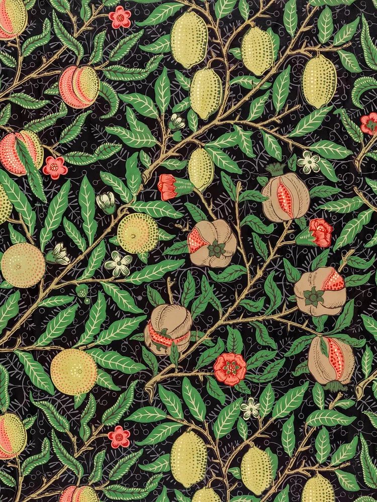
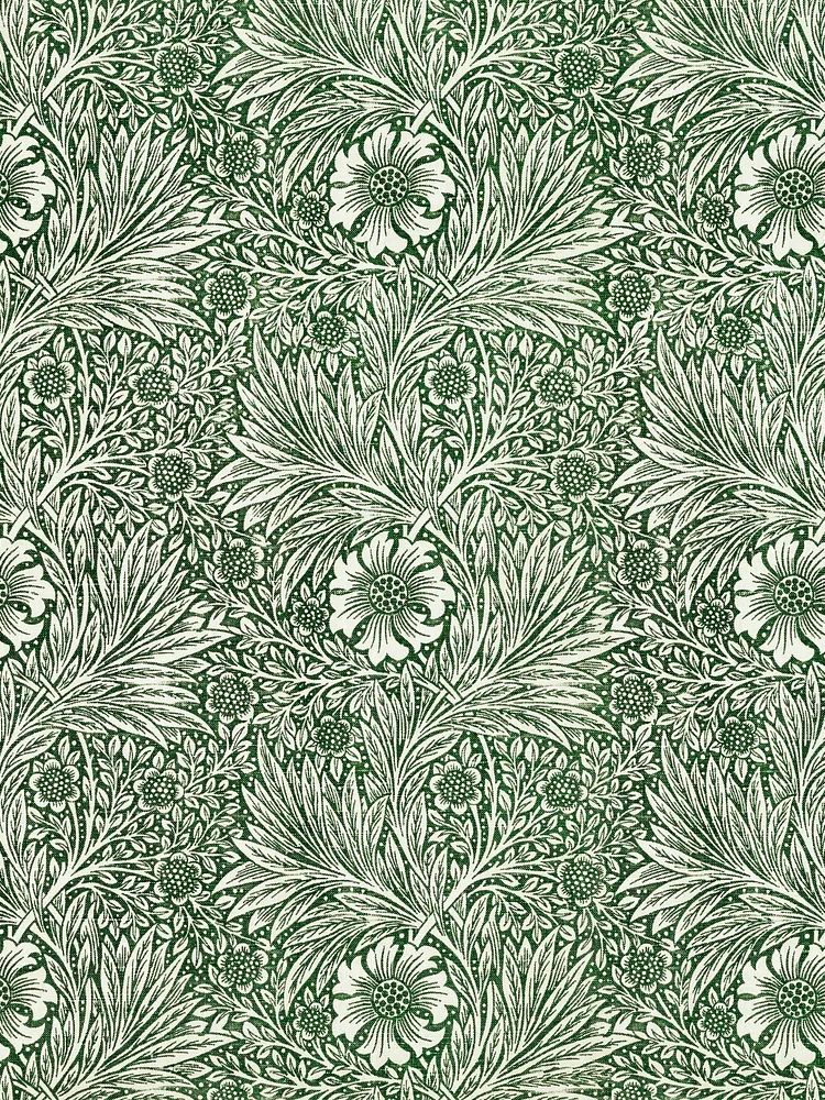
For rooms with traditional detailing, repeating patterns can do more than a single stem study because they hold their own against mouldings, textured curtains, and richer wood tones. A piece such as William Morris's vintage pomegranate flowers works especially well where you want the wall art to feel integrated rather than sparse.
Choosing a Palette That Feels Calm or Bold
Colour decides whether botanical wall art fades into the room or leads it. Soft sage, olive, moss, cream, and faded beige create a quieter look — useful in bedrooms and reading corners where you want low contrast. Stronger tones such as rust, marigold, deep green, and berry feel fuller and more decorative, which suits dining spaces, entryways, or rooms with darker furniture.
A simple rule helps: if your room already has three or more visible colours — for example beige upholstery, black lighting, walnut wood, and green plants — choose artwork that repeats only one or two of them. That keeps the wall from looking busy. If the room is mostly neutral, a stronger floral or heritage pattern can supply the missing depth. Pieces from the vintage art collection often work well here because muted backgrounds keep the palette grounded.
When you want a softer palette with plenty of breathing room, botanical prints can also sit nicely beside minimalist art prints. A restrained floral silhouette or a simple vase study keeps the natural theme but lowers visual noise.



Finding the Right Size and Placement
The most common mistake is choosing art that is too small. Above a sofa, your arrangement should usually span 60 to 75% of the sofa width. For a 200 cm sofa, aim for wall art between 120 and 150 cm wide. Above a bed, the same rule works well, especially if the headboard is low and visually simple.
One large botanical piece suits rooms that already have pattern in rugs, curtains, or cushions. Two or three smaller prints work better when the furniture is plain and the wall needs rhythm. In hallways, a row of 30 x 40 cm or 40 x 50 cm frames keeps the scale tidy. Above a console or sideboard, leave 15 to 25 cm between the top of the furniture and the bottom of the frame. For hanging height, place the centre of the arrangement around 145 cm from the floor — then adjust slightly if the room is viewed mainly while seated.

If you are styling a desk wall or a compact corner, look at lighter compositions such as Wheat Bouquet — Botanical Print or a vintage study like this vintage botanical school print. Their vertical shapes fit narrow sections of wall without feeling cramped.

Frames, Materials and Finish
Frame colour changes the mood fast. Oak and light wood feel relaxed, organic, and Scandinavian. Black frames sharpen the edges and make botanical details look more graphic. Gold or antique brass introduces formality, especially with older floral or heritage-inspired work. White frames are useful when the wall colour is strong and you want the art to read cleanly from a distance.
Paper finish matters too. A matte finish reduces glare and suits most botanical imagery because it preserves subtle greens, dusty pinks, and soft cream tones. Glossy surfaces tend to reflect windows and lamps, which can flatten fine linework. If you are building a cohesive wall, keep the finish consistent even if the subjects vary. A polished look comes from repeating two elements — frame colour and margin size — rather than matching every image exactly.

For a crisp minimalist mix, pair heritage florals with pieces from White Flower Silhouette — Minimalist Print or Vase with Flowers — Minimalist Print. That contrast keeps the room from becoming overly ornate.
How to Build a Botanical Gallery Wall
A good gallery wall needs one dominant thread. With botanical styling, that thread can be colour, frame type, subject, or era. The easiest formula is 4 to 6 pieces with one anchor artwork, two medium supporting pieces, and one or two simpler prints that create visual rest. Keep spacing between frames at 5 to 8 cm for a tight, collected look.
Mixing works best when each print contributes a different job. Use a dense floral pattern for depth, a lighter stem or bouquet for space, a vintage study for character, and a simple abstract or typography piece for contrast. If every artwork has the same level of detail, the wall can feel flat. Botanical prints also pair naturally with illustration prints and selected pieces from the fine art collection, especially when backgrounds stay muted.
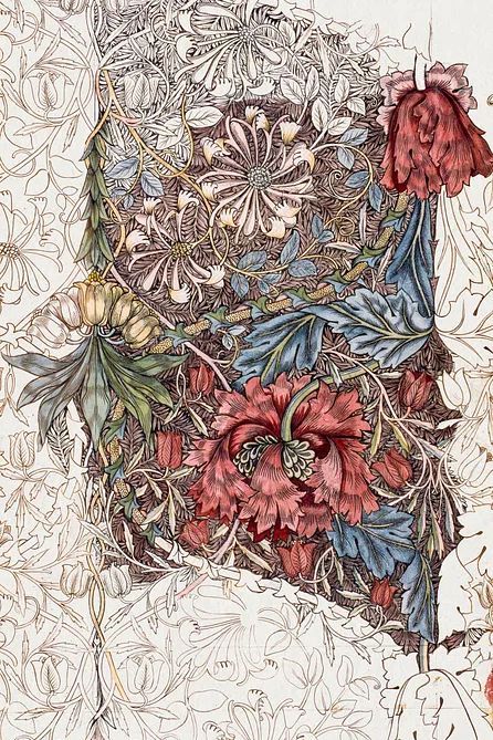
A strong anchor for a gallery wall is Honeysuckle by William Morris (1874) because its pattern is rich enough to set the tone for the surrounding arrangement.
Styling Tips for Different Interiors
Modern interiors benefit from restraint. Choose one oversized botanical print in black, oak, or slim champagne metal, then repeat its colour in a vase or side chair. Minimalist rooms suit fewer stems, lighter backgrounds, and plenty of blank wall around the frame. If that is your direction, a soft mix of botanical and minimalist wall art usually feels cleaner than a dense floral grouping.
Boho spaces can take more layering. Try warm woods, rattan, boucle, terracotta, and slightly faded florals. Botanical art sits well with dried branches, patterned textiles, and pieces from the bohemian collection. A floral print with warmer undertones helps connect rust cushions, woven lampshades, and natural jute rugs.
Classic interiors handle symmetry well. Two matching botanical prints over a sideboard or bed create order, especially with walnut, brass, and heavier drapery. In Scandinavian rooms, look for airy compositions, pale woods, and green-grey tones rather than saturated jewel colours. If you want a gentle bridge between botanical and landscape themes, Majestic Trees — Watercolor Print is a good example of how greenery can feel soft rather than decorative.

Final Tips for Choosing the Right Botanical Print
Start with the room, not the artwork. Measure the wall, note the main materials in the space, and decide whether you need calm, contrast, or pattern. A botanical poster print should repeat something already present — green from plants, beige from upholstery, black from lighting, or warm wood from furniture. That is what makes it feel intentional.
If you are choosing for long-term use, avoid pieces that depend on one trend colour. A botanical poster print in balanced greens, soft neutrals, muted florals, or classic vintage tones will adapt more easily if you change paint, textiles, or furniture later. Buy the largest size your wall and budget can handle — the right scale always looks more considered than a print that gets visually lost.
Frequently Asked Questions
What frame colour works best for botanical prints?
Oak is the safest all-round option because it adds warmth without overpowering the artwork. Black works well in modern interiors, while brass or gold suits more classic rooms.
Should botanical prints match real plants in the room?
No — they only need to relate in tone or shape. If your plants are large and sculptural, choose lighter wall art so the room does not feel too heavy.
Can I hang botanical art in a darker room?
Yes, but choose prints with lighter backgrounds or cream margins so they do not disappear into the wall. A larger size also helps in low-light spaces.
Do botanical prints work with coloured walls?
They do, especially on sage, warm white, clay, or muted blue walls. Use a frame that contrasts clearly with the paint so the artwork stays defined.
How many prints should I use for a gallery wall?
Four to six is a practical starting point for most homes. That gives enough variety for layering without making the wall feel crowded.