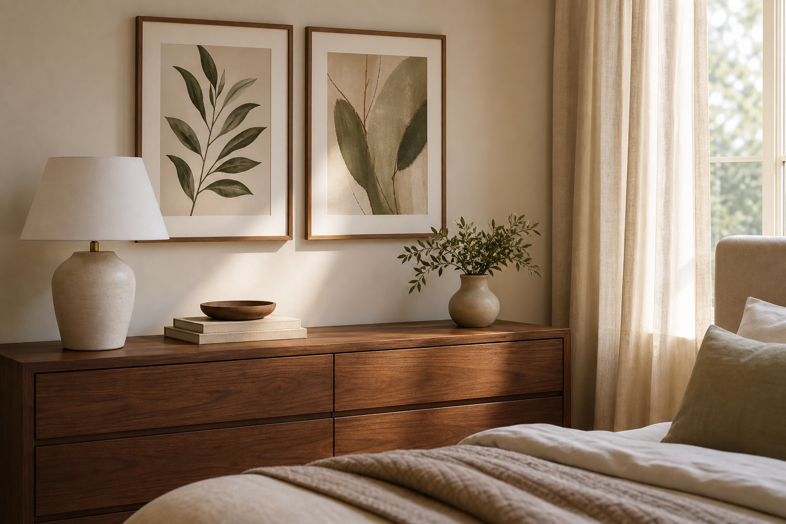
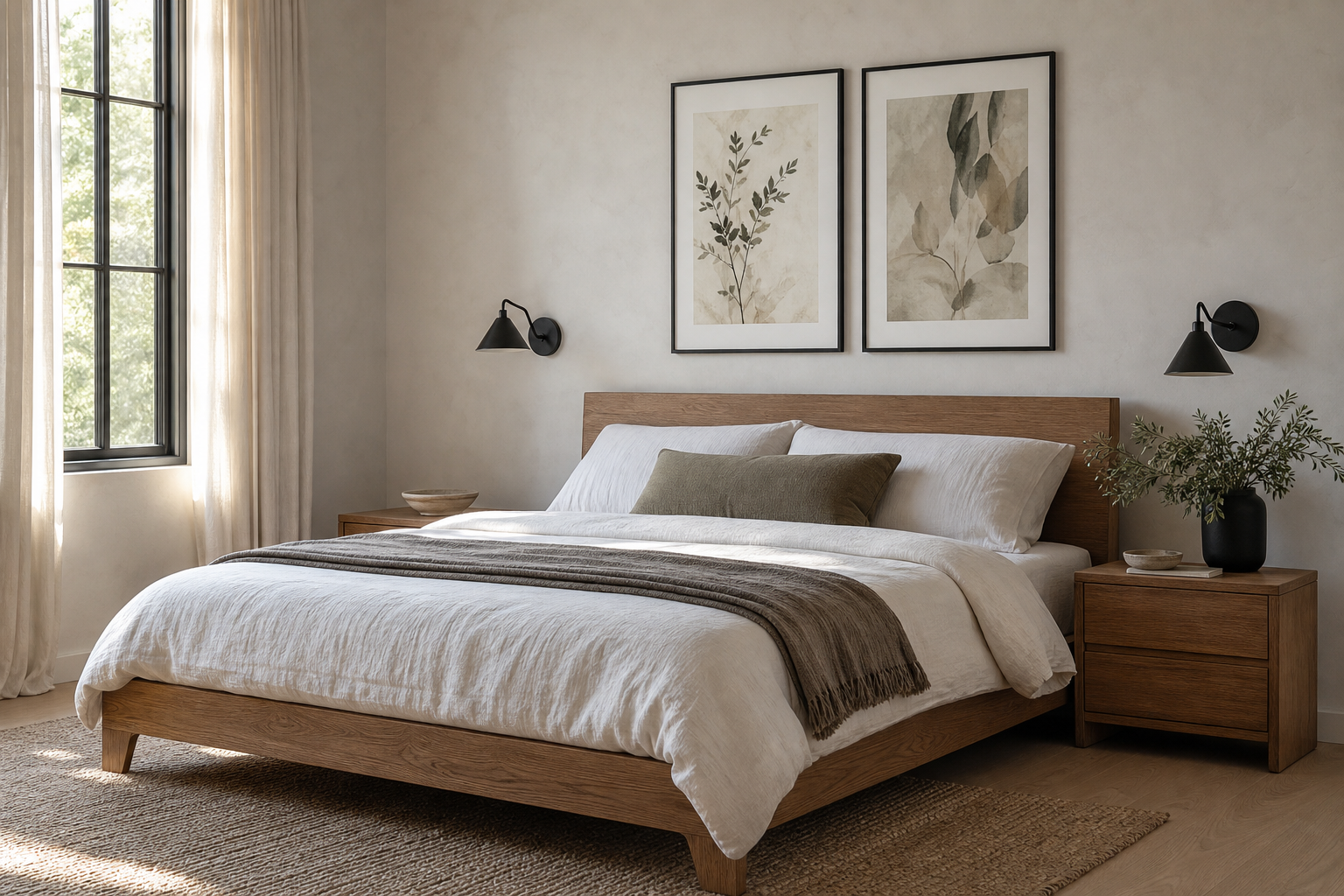
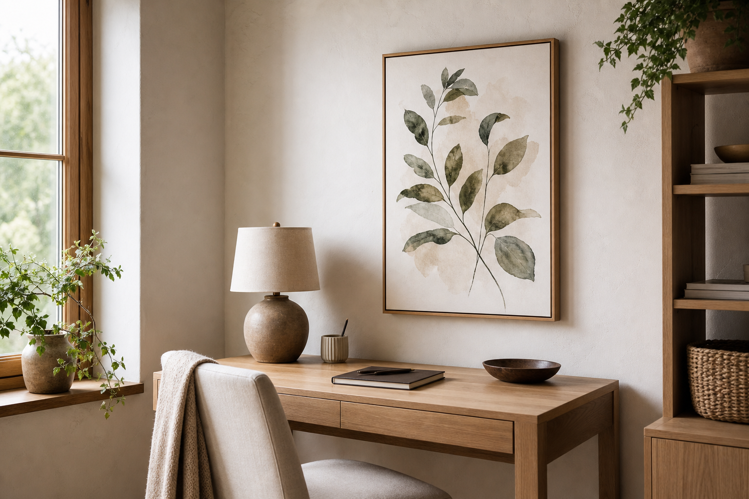
Abstract art poster prints work because they give a room shape, color, and movement without locking you into one obvious subject. That makes them easier to live with over time than highly literal imagery, especially in spaces that already have strong furniture, patterned textiles, or changing seasonal accents.
Why Abstract Art Works in So Many Spaces
In a pared-back interior, abstract work adds depth without clutter. A soft tonal piece can echo plaster walls, boucle upholstery, and pale oak finishes while still giving the eye a focal point. In a layered room, bolder abstracts help connect mixed materials such as walnut, brass, velvet, and stone. That flexibility is why our Abstract collection sits so comfortably beside Minimalist art prints and even warmer Bohemian wall art.
A second advantage is that abstract art poster prints can shift their mood depending on scale. A single large print in 70 x 100 cm feels calm and architectural. A set of four 30 x 40 cm pieces reads more energetic and collected. If you want a good example of a piece that stays clean but still feels expressive, look at Textured White Abstract—its restrained palette suits quiet rooms, but the surface detail stops it from disappearing.

Choosing a Palette That Matches Your Room
Start with the 60-30-10 rule. If roughly 60% of your room is one dominant tone, 30% is a secondary tone, and 10% is accent color, your wall art should usually repeat at least one of the 30% or 10% elements. That keeps the composition linked to the room rather than floating separately on the wall. For example, cream walls, a camel chair, and black lighting fixtures pair well with earthy or monochrome abstracts rather than overly sweet pastel pieces.
If your room is mostly neutral, choose one of two directions: low contrast or intentional contrast. Low contrast means ivory, sand, taupe, soft gray, and muted black. Intentional contrast means one clear color accent repeated once or twice elsewhere—such as teal in a cushion, ochre in a vase, or rust in a throw. Yin Yang Teal Abstract is useful in this kind of scheme because the color has enough presence to sharpen a neutral room without taking over.

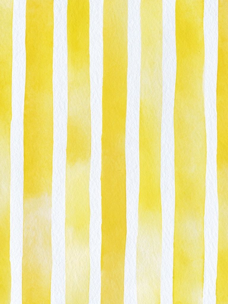
Avoid matching too closely. If your sofa is exactly the same beige as the artwork, both can flatten out. Aim for either a 15% to 20% difference in lightness or a shift in undertone—warmer beige with cooler stone, or cream with charcoal rather than cream with cream. For rooms with stronger color, Colorful Stained Glass Abstract or Yellow Watercolor Stripes can bridge several tones at once.



Getting the Scale and Placement Right
The easiest rule is width: your art arrangement should cover about 60% to 75% of the furniture width below it. Over a 200 cm sofa, aim for a total arrangement width of 120 to 150 cm. Over a 160 cm bed, 100 to 120 cm usually looks balanced. This is the difference between a wall that feels styled and one that feels like an afterthought.
Height matters just as much. Hang the center of the arrangement at roughly 145 to 150 cm from the floor in hallways and open walls. Above furniture, leave 15 to 25 cm between the top of the sofa, bedhead, or console and the bottom of the frame. More than that, and the piece starts to drift away from the furniture line.

For narrow areas such as hallways, stair landings, or the wall beside a desk, vertical pieces work harder than wide ones. A 50 x 70 cm print can elongate a compact space, while a pair of 30 x 40 cm works well where wall depth is limited. If your room needs visual structure, geometric pieces from Sacred Geometry Black-White or textural work from Textured Waves in the Minimalist collection can bring order without adding busy detail.
Framing Ideas That Elevate the Look
A frame should sharpen the artwork, not compete with it. Black frames give abstract pieces a gallery edge and work especially well with white walls, concrete tones, and modern lighting. Oak frames soften the look and connect better with Scandinavian, relaxed, or organic interiors. White frames are best when the artwork itself has enough contrast and you want the wall to stay light.
Matting is worth using when the piece is detailed, high-contrast, or slightly smaller than the wall deserves. A mount of 5 to 8 cm around a 30 x 40 cm print makes it feel more substantial. For larger pieces such as 50 x 70 cm or 70 x 100 cm, a mat creates breathing room and can make a strong abstract feel more refined.

Texture also changes how the piece reads. A print with subtle tonal shifts or a tactile look sits beautifully in spaces with linen, wool, travertine, or limewash walls. That is where Textured Waves — Abstract Print or White Cream Texture can do more than a flat graphic—these styles echo real materials already present in the room.

Building a Gallery Wall with Abstract Prints
The strongest abstract gallery walls balance repetition with variation. Repeat one element at least three times—color, frame finish, shape language, or orientation—then vary scale and composition so the wall does not feel mechanical. A good ratio is 70% cohesion and 30% contrast.
If you are mixing four to six pieces, begin with the largest anchor work and build around it with two medium pieces and one or two smaller accents. Keep spacing between frames tight and consistent—usually 5 to 8 cm. Wider gaps make a group feel disconnected, especially with abstract art where the visual rhythm comes from adjacency.
This is also the best place to borrow from adjacent styles. A clean abstract can sit next to Mid Century Modern prints if the palette overlaps, or beside Fine Art wall pieces if the composition has enough quiet space around it. The point is not to match every piece, but to keep one thread running through all of them.
How to Style by Mood: Calm, Bold, or Playful
For a calm room, stay within a narrow tonal range—white, stone, sand, taupe, charcoal. Choose curved forms over sharp geometry and let texture do the work. Bedrooms, reading corners, and soft living rooms benefit from this approach because the wall art supports the room instead of pushing it forward.
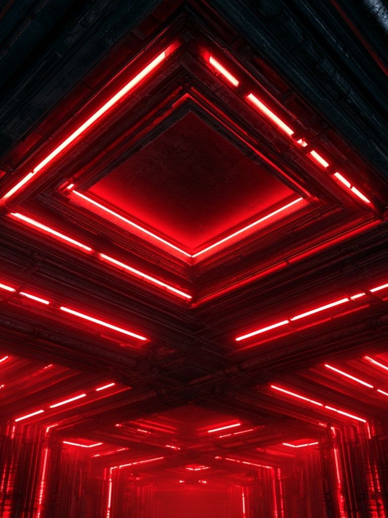
For a bolder effect, increase contrast in either color or form, not always both. Deep black with cream, saturated red with neutral upholstery, or graphic shapes over quiet furniture can be enough. Red Neon Tunnel Abstract Print brings drama best in rooms that already have restraint elsewhere—plain bedding, simple rugs, and uncluttered shelves.
For a playful room, combine two or three clear accent colors and choose pieces with movement—stripes, warped shapes, or layered color blocks. Home offices, creative studios, and family rooms can carry this energy well. A lively option like Rainbow Melting Clock Abstract works best when repeated with one small accessory color elsewhere in the room, such as a lamp base, book spine, or cushion trim.

Wrap-Up: Shop Abstract Prints with Confidence
The best abstract styling decisions come down to four checks: palette, scale, placement, and frame finish. If the colors connect to the room, the size fills 60% to 75% of the furniture width, the bottom edge sits 15 to 25 cm above the piece below, and the frame suits your materials, the result will usually feel considered.
Abstract art poster prints do not need complicated rules to work well. Start with the room you already have, decide whether you want it to feel calm, bold, or playful, and choose pieces that strengthen that direction. When you shop abstract art poster prints in our collection, think less about trends and more about what the room needs—contrast, softness, energy, or structure.
Frequently Asked Questions
What frame size should I choose if I want to add a mat later?
Buy the print first, then size the frame one step up if you want a mount. A 30 x 40 cm print often looks best in a 40 x 50 cm frame with a mat.
Can abstract prints work on colored walls?
Yes—just keep enough contrast between wall and artwork. If the wall is dark, use lighter compositions or a wider white mat so the piece stays visible.
What is the best glass option for a bright room?
In sunny or window-heavy spaces, anti-reflective glazing is the most practical choice. It cuts glare and keeps subtle details visible from different angles.
How do I hang a gallery wall without making extra holes?
Lay the arrangement on the floor first, then tape paper templates to the wall to test spacing. Mark all hook points before installing the first frame.
Which abstract styles pair best with wood furniture?
Warm oak and walnut pair especially well with cream, rust, ochre, muted teal, and textured black-and-white abstracts. These tones echo natural grain without looking overly matched.