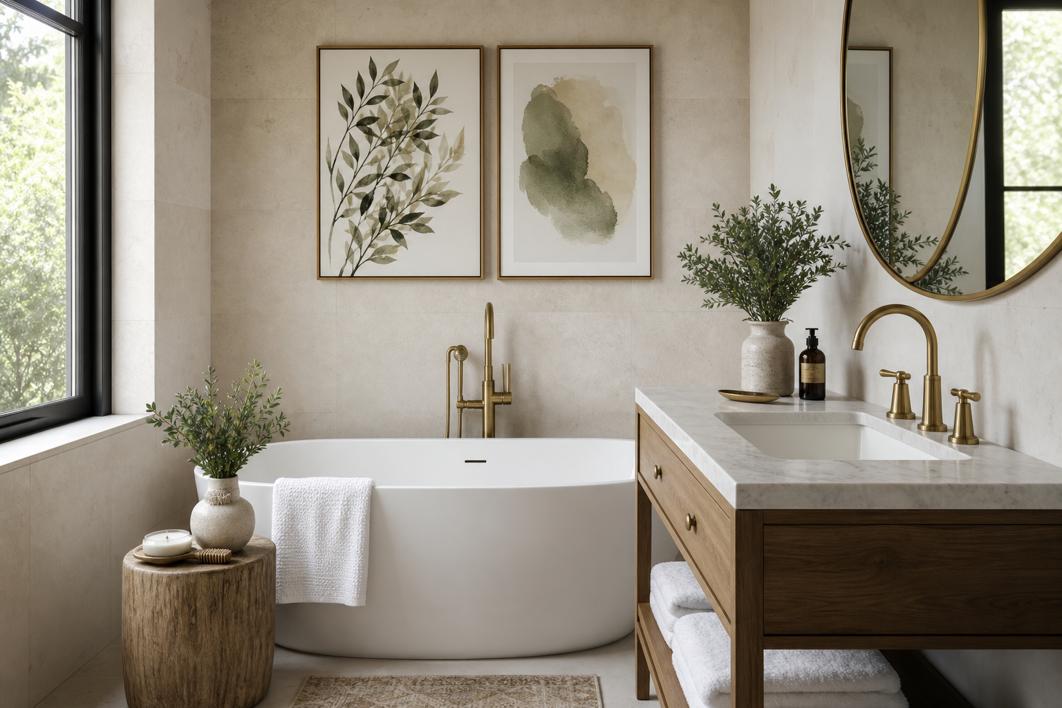
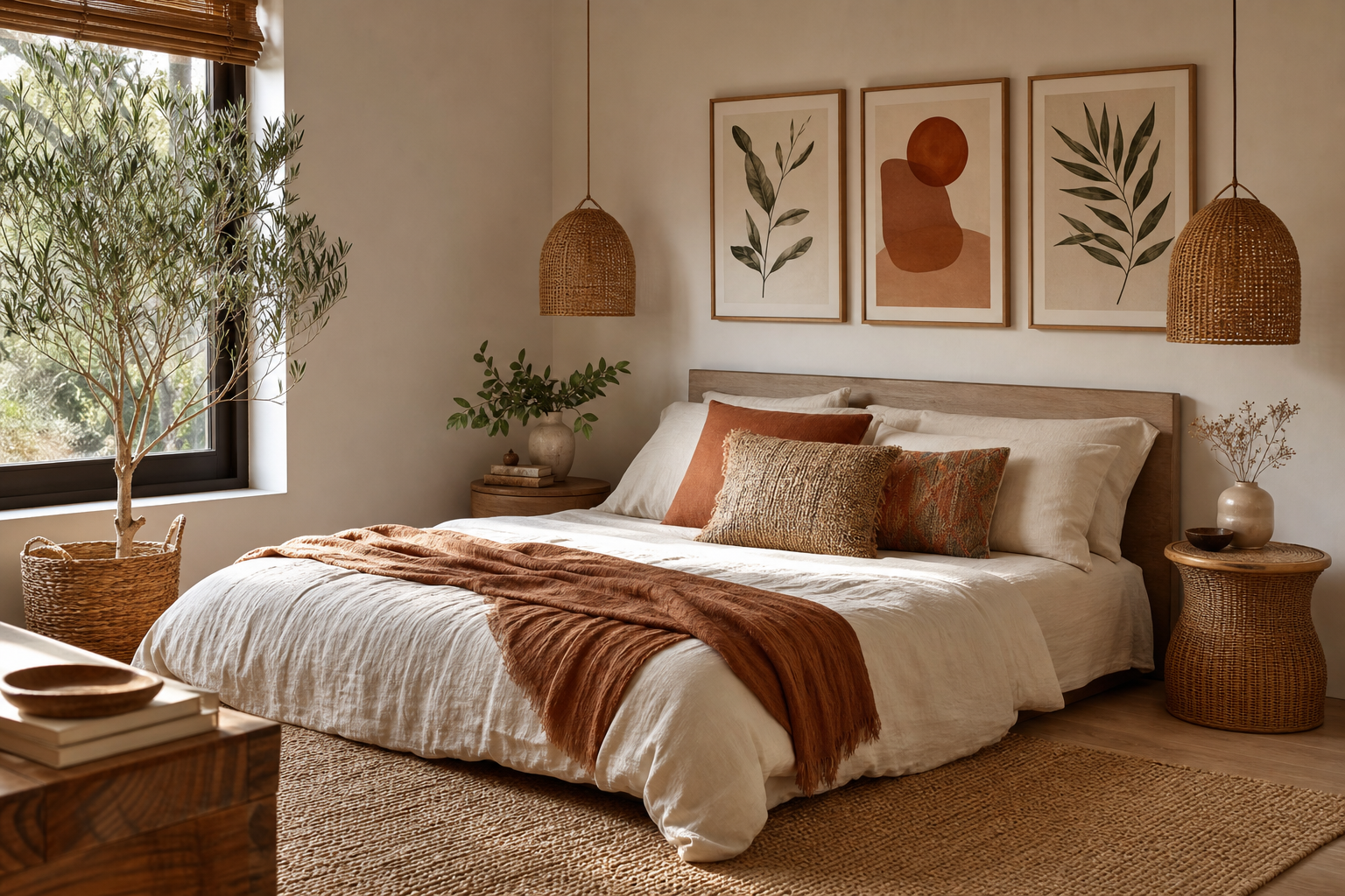
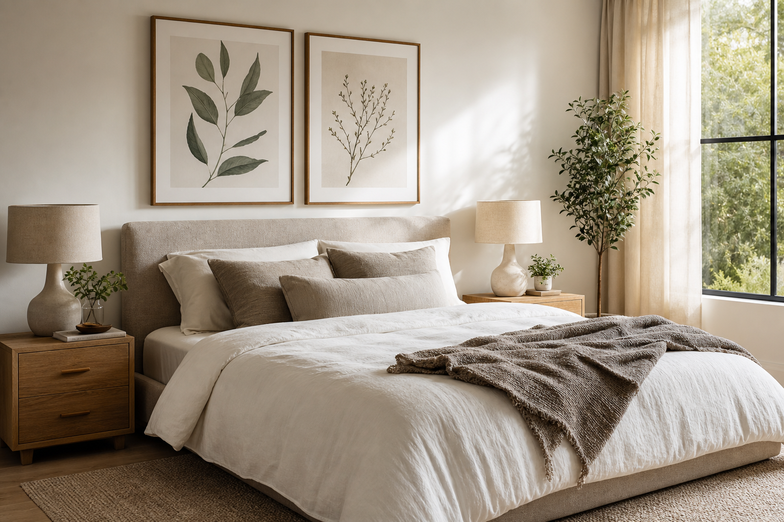
Bohemian prints work best when they look collected rather than coordinated. The style is defined by pattern, warmth, and a slightly relaxed mix of influences — florals, textile motifs, hand-drawn forms, earthy abstracts, and vintage-inspired ornament all belong here. If every piece is too matched, the room feels staged; if every piece competes, it feels noisy. The sweet spot is variety with a clear visual thread.
A practical way to find that thread is to start with one dominant mood: earthy, floral, artisanal, or globally inspired. From there, build around 2 to 3 recurring elements such as terracotta tones, curved shapes, or botanical detailing. Our bohemian collection is a strong starting point, especially when paired with pieces from our botanical collection or selected vintage art prints that share the same softness and depth.
What Makes Bohemian Prints Feel So Distinctive
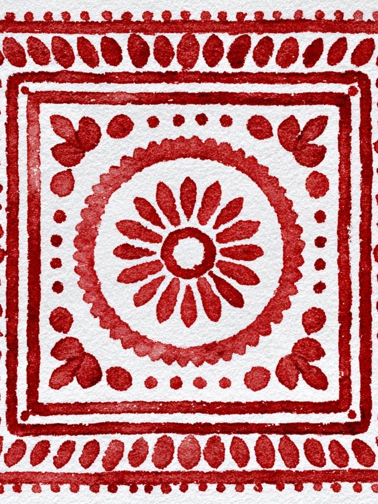
The most convincing bohemian prints usually combine organic subject matter with visible texture or pattern. Think dried branches, folk florals, woven surfaces, mosaic geometry, and portraiture with a handcrafted feel. These details create the "lived-in" quality people associate with boho interiors, even in a newer apartment with clean walls and modern furniture.
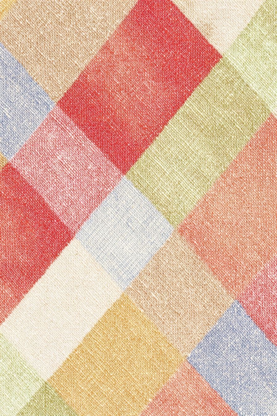
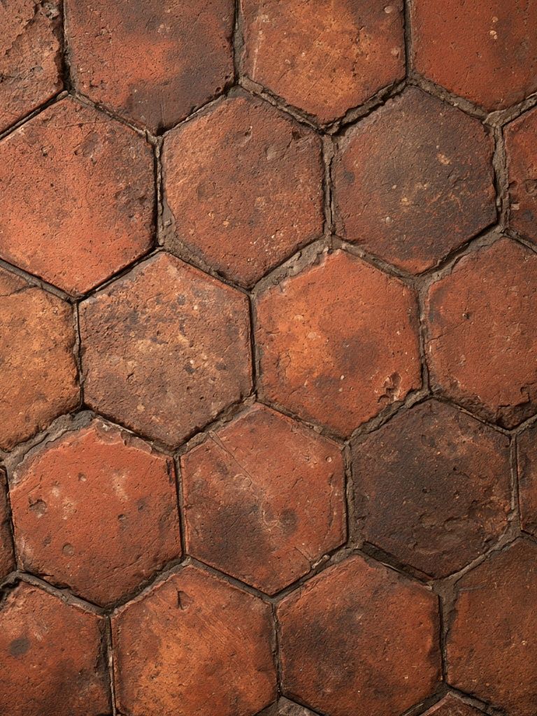
Unlike sharper minimalist schemes, bohemian prints often use lower-contrast color relationships. Clay, ochre, faded red, olive, tobacco, dusty rose, and warm cream tend to sit together easily. That softer palette is why bohemian art can handle more layering than high-contrast black-and-white pieces.
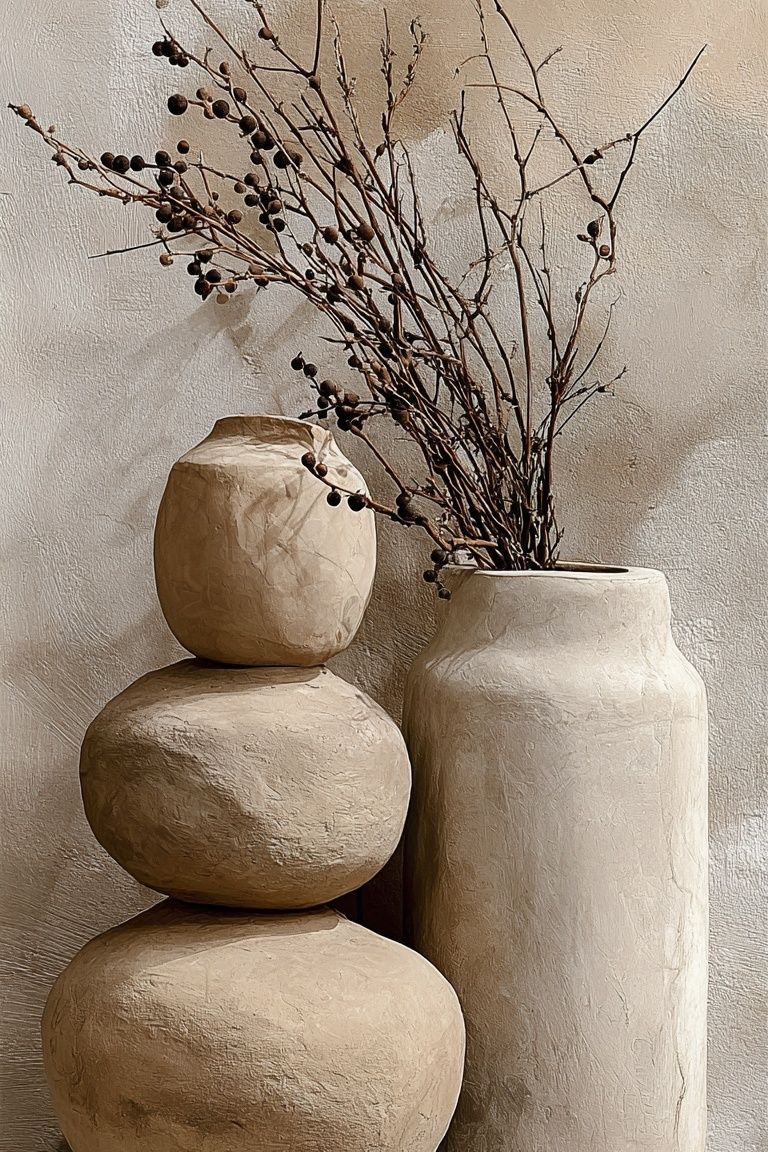
A piece like Ceramic Vases with Dried Branches captures that approach well. It brings shape, natural material references, and muted warmth without demanding the whole room revolve around it. For a more ornamental take, Ornate Paisley Mosaic adds decorative rhythm that feels rooted in textiles rather than rigid geometry.
Choosing a Palette That Feels Collected, Not Cluttered
The simplest palette formula for bohemian prints is 60-30-10. Use 60% warm neutrals — sand, ivory, camel, oat, or soft taupe — then 30% earthy support colors like rust, sage, muted plum, or terracotta. The final 10% can be your accent: deeper aubergine, indigo, brick red, or antique gold.
That ratio matters because bohemian prints often contain multiple colors within a single composition. If your walls, upholstery, rug, and art all compete at equal volume, the room shrinks visually. Warm neutral surroundings let the art do more of the talking. A cream wall, oak frame, and linen-textured sofa will make even a busy print feel calmer by comparison.

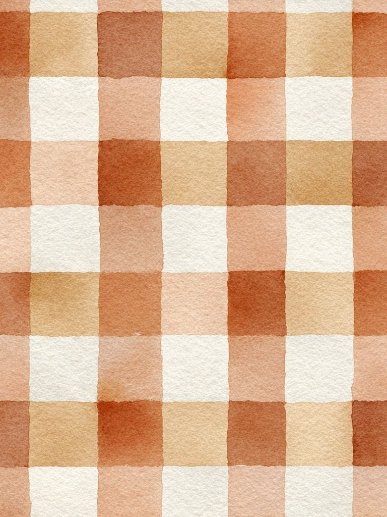
If you want more pattern without visual overload, mix one highly detailed piece with one quieter texture-led piece and one botanical. That keeps the eye moving without creating a single dense block. Browse abstract prints for color bridges — especially warm terracotta and washed watercolor designs that connect patterned bohemian art to simpler furniture.
How to Layer Bohemian Prints on a Wall
A boho wall does not need perfect symmetry, but it does need structure. Start with one anchor piece in either 50x70 cm or 61x91 cm, then add smaller works around it in sizes like 30x40 cm and 21x30 cm. That scale mix prevents the arrangement from looking flat. Keep the spacing between frames fairly consistent — 5 to 8 cm is a reliable range for a gallery wall, while 10 to 15 cm gives a looser, airier result.
Asymmetry works particularly well with bohemian prints because the style already embraces variation. Place the largest frame slightly off-center, then balance it with two medium pieces on one side and a smaller vertical or square piece on the other. What matters is visual weight, not mirror-image placement. A dense patterned print may need more breathing room than a pale botanical.

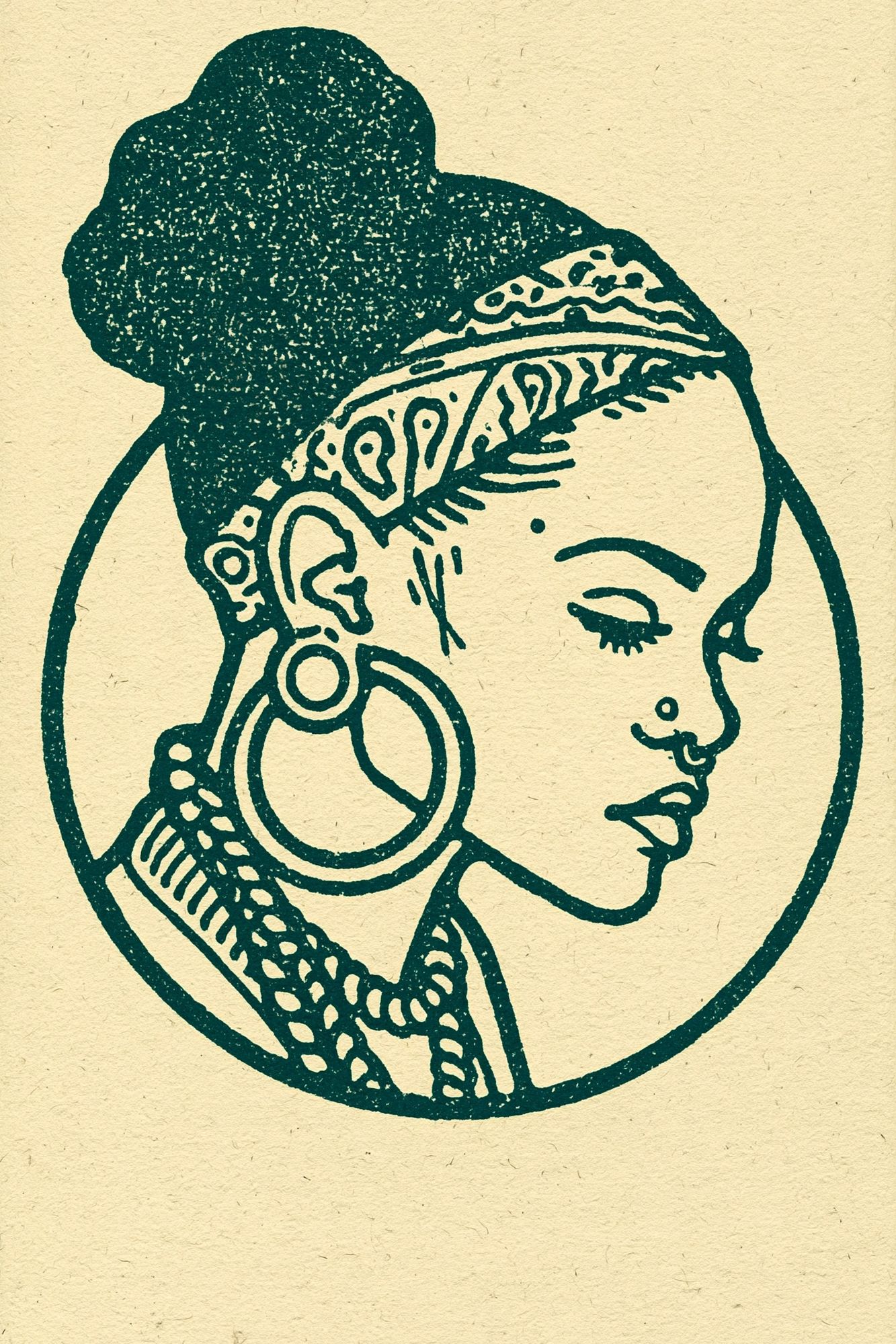
For layered styling on shelves or mantels, overlap frames by 2 to 5 cm and vary heights clearly. Pair a portrait-format piece with a horizontal one, then break the line with a small object — a ceramic vase, candlestick, or stacked books. If you want a stronger focal point, Bohemian Woman Portrait works well as the central piece because figurative art naturally attracts attention first.
Best Rooms for Bohemian Prints
Living rooms are the easiest place to use bohemian prints because they already contain layered materials: upholstery, throws, rugs, wood, and lighting. Above a 200 to 240 cm sofa, aim for art that spans roughly 60 to 75% of the sofa width — usually one 100 to 150 cm arrangement made from two to four frames. This keeps the wall connected to the furniture rather than floating above it.
Bedrooms benefit from softer bohemian prints with less contrast. Floral forms, faded textiles, and gentle portraiture suit the calm mood most people want around a bed. If your headboard is upholstered or wooden, use frames in oak, walnut, or muted gold rather than stark black. Pieces from Floral Birds — Bohemian Print or Honeysuckle by William Morris can bring pattern without making the room feel busy.
Hallways and creative corners are ideal for bolder choices. Because you spend less continuous time there, you can go richer in color or denser in pattern. A narrow hallway wall suits a vertical sequence of 30x40 cm frames, while a home studio can handle a more layered salon-style hang with 6 to 8 mixed pieces.

If you are styling a multifunctional room, use bohemian prints to define the mood zone. A reading chair with one strong piece above it feels intentional immediately. In a guest room, two matching-size frames above a dresser are often enough.
Framing, Materials, and Finishing Touches
Frame choice changes the tone of bohemian prints more than most people expect. Light oak feels Scandinavian-boho and relaxed. Walnut adds richness and pairs well with rust, olive, and burgundy. Thin antique-gold frames work best when the art itself is soft or faded — too much gloss can make the setup feel more formal than boho.
A matte finish generally suits bohemian prints better than a high-shine surface because it supports the tactile, textile-inspired quality of the imagery. This is especially true for woven, floral, and vintage-pattern pieces. When styling around the art, repeat at least two natural materials already suggested by the print: rattan, linen, jute, raw wood, ceramic, or aged brass.
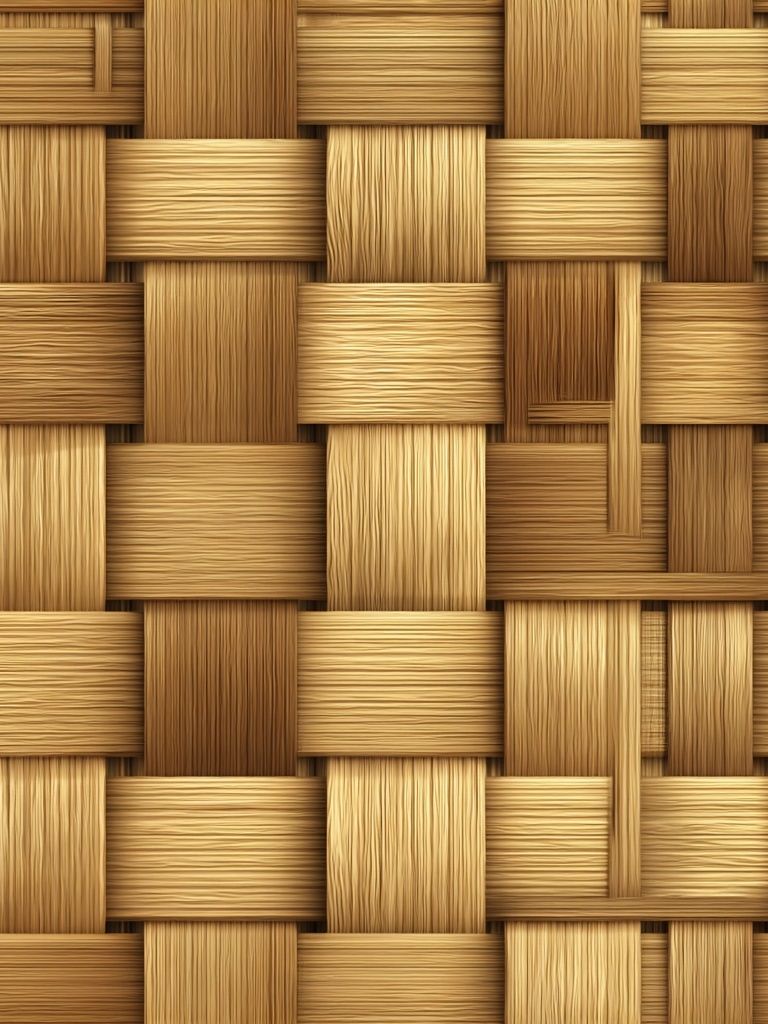
Texture-led work like Woven Bamboo Texture pairs naturally with woven pendants, caned furniture, and nubby upholstery. If your room already has many soft materials, introduce one cleaner note from minimalist art prints to stop the look from becoming too heavy. Bohemian prints do not need every surrounding object to be rustic — contrast keeps the space fresh.

Shop the Look: Simple Styling Tips for a Boho-Ready Space
If you are adding bohemian prints to an existing room, begin with one wall and one color family. That is the easiest way to avoid overbuying. Pull a tone already present in the room — rust from a cushion, olive from a plant, beige from a rug — and choose 2 to 4 prints that repeat it in different ways. Pattern can vary widely as long as the palette stays disciplined.
Mix subjects intentionally. A good four-piece boho grouping often includes one floral or botanical, one texture or textile-inspired design, one geometric or mosaic pattern, and one figurative or still-life work. That combination gives the wall range without looking random. For a collected look, combine pieces from our bohemian prints with one or two designs from fine art prints or botanical wall art that share similar warmth.
Final thoughts
Bohemian prints look their best when the room gives them space to breathe. Use warm neutrals as a base, repeat 2 to 3 colors across textiles and art, and let natural materials carry the look further. A thoughtful mix of pattern, texture, and scale will always feel more convincing than a perfectly matched set.
If you want the result to feel easy, edit hard. Choose fewer bohemian prints, hang them with consistent spacing, and support them with wood, linen, ceramic, and soft light. That is what makes a boho room feel layered rather than cluttered.
Frequently Asked Questions
What frame color works best for bohemian prints?
Oak and walnut are the safest choices because they add warmth without overpowering patterned art. Muted gold also works well for floral or vintage-inspired pieces.
Can I mix bohemian prints with modern furniture?
Yes — this contrast often looks better than a fully themed room. Keep the furniture shapes clean, then add warmth through art, textiles, and natural materials.
How high should I hang boho wall art above a sofa or bed?
Leave around 15 to 25 cm between the furniture and the bottom of the frame arrangement. That keeps the art visually connected to the piece below it.
Do bohemian prints work in small rooms?
They do, especially in lighter palettes. Choose 2 to 3 coordinated pieces instead of a large crowded gallery wall, and use frames with slim profiles.
What pairs well with bohemian prints besides botanicals?
Textile-inspired abstracts, vintage ornament, soft portraiture, and still-life compositions all pair naturally. The key is shared warmth in color and a slightly tactile visual feel.