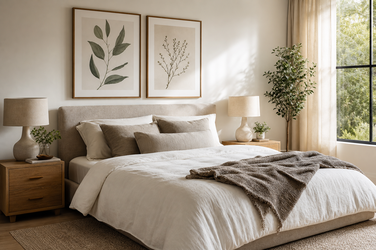
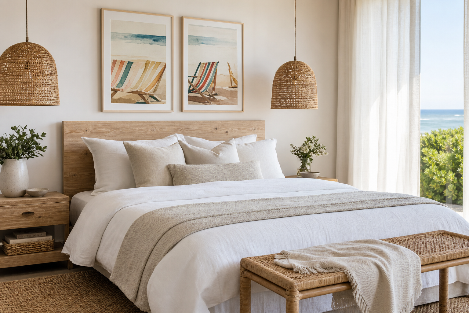
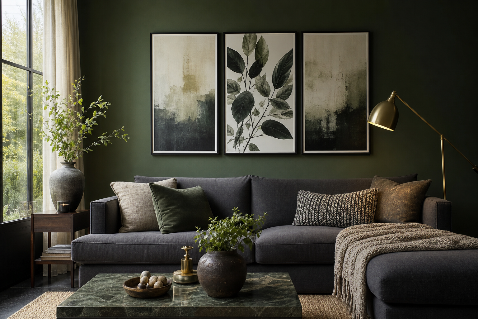
A strong bohemian poster print makes a room feel collected rather than decorated. The difference comes down to detail: layered color, imperfect texture, organic motifs, and a relaxed composition that avoids anything too rigid or glossy. In boho spaces, art works best when it looks like it belongs with natural wood, woven fibers, stoneware, and textiles that have visible grain.
What Makes a Bohemian Poster Print Feel Authentic
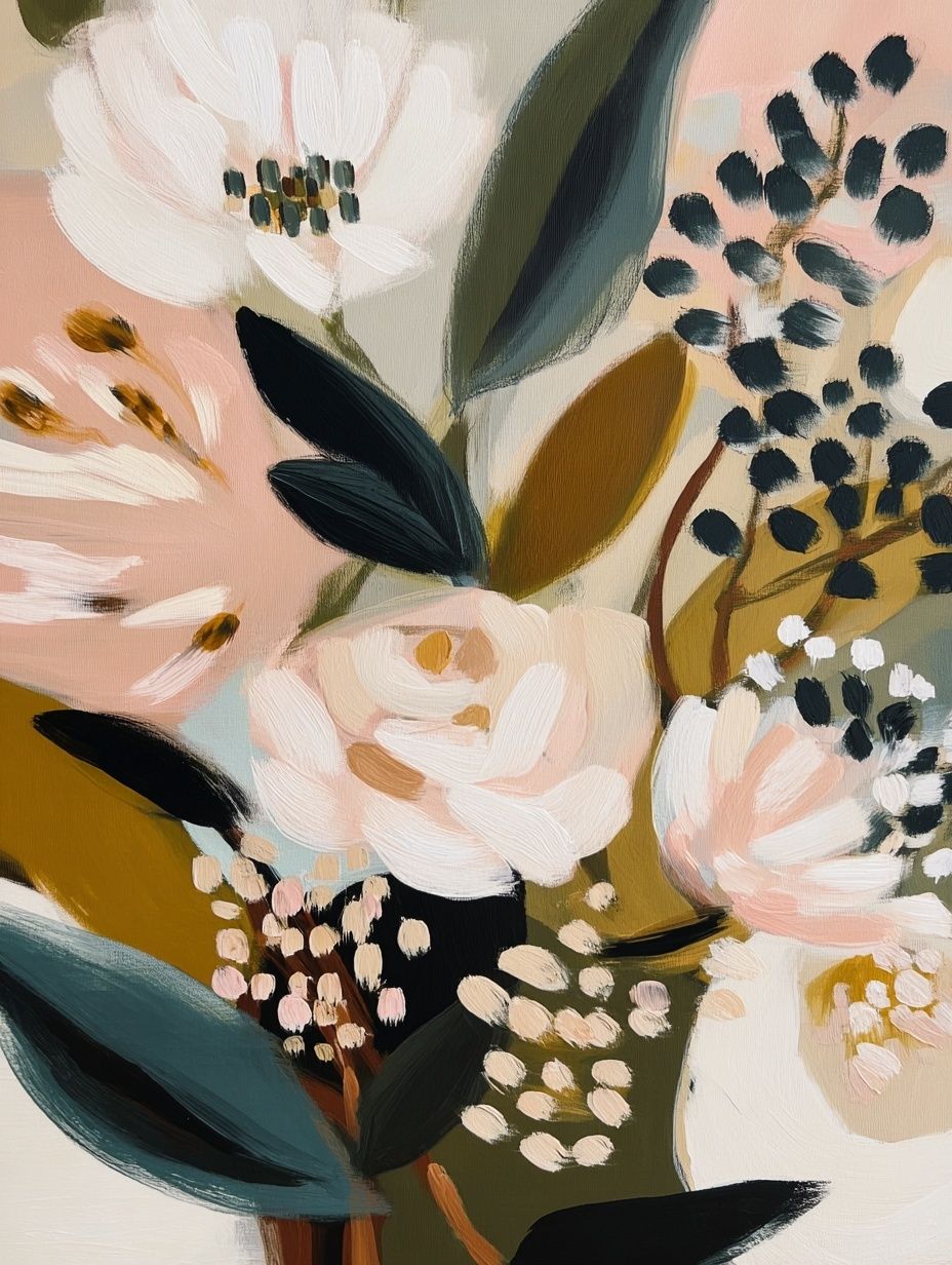
An authentic boho look usually starts with warmth. Think clay, sand, ochre, faded olive, tobacco, rust, and dusty rose rather than sharp black-and-white contrast. A good bohemian wall art collection often includes hand-drawn lines, floral references, woven textures, sun-faded surfaces, or symbolic motifs that feel traveled and tactile. Symmetry is less important than softness — a slightly off-center arrangement often feels more natural than a perfectly measured grid.
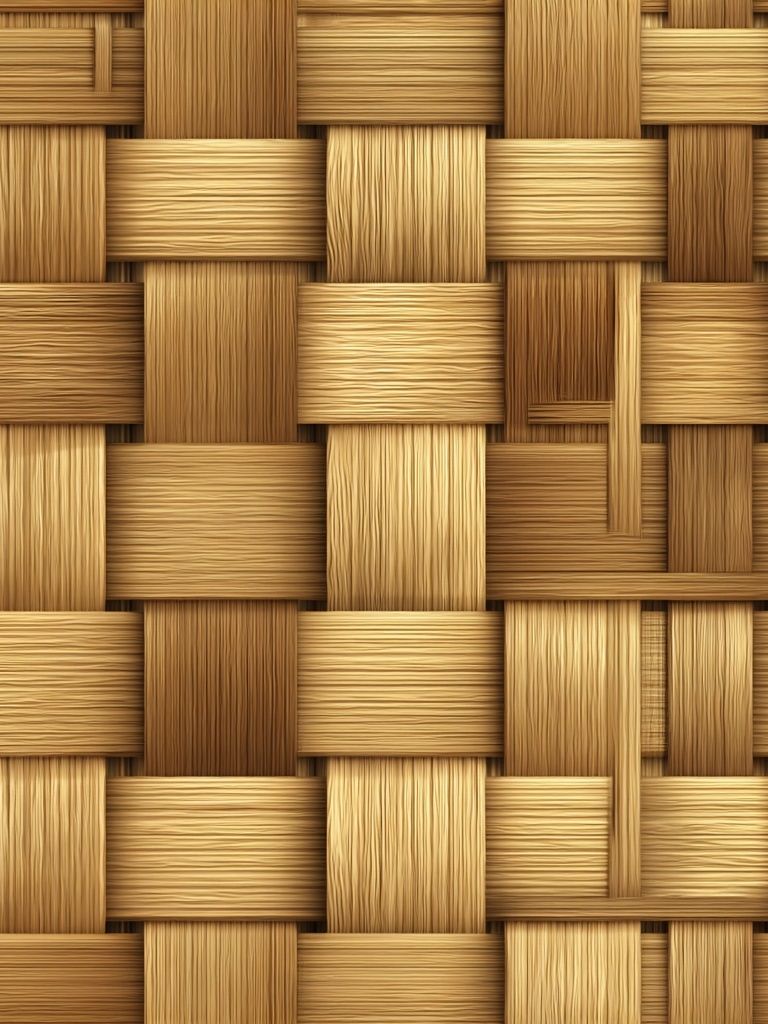
Texture is the other non-negotiable. If your room already has smooth finishes like painted drywall, glass, and polished metal, choose a bohemian poster print that introduces visible weave, brushwork, or textile-inspired pattern. Pieces such as Woven Bamboo Texture or dried botanical still lifes work well because they echo materials already common in boho interiors — rattan, cane, wool, and raw linen.
Portraits and florals can also feel authentic in boho rooms when the color treatment stays muted and earthy. A piece like Bohemian Woman Portrait Print brings personality to a room, but it still reads softly if paired with oak, walnut, or warm white walls. The goal is not to create a themed room. It is to make the art feel like one more layer in a space built from natural materials and personal finds.
Choosing the Right Palette and Motifs
Start with the room, not the print. If your sofa, rug, or bedding already carries warm neutrals, pick art that stays within 2 to 4 main tones. Terracotta, beige, muted sage, and faded burgundy are reliable boho combinations because they connect easily with jute, linen, and medium-toned wood. If the room feels flat, add one richer note — brick red or marigold usually gives enough lift without overpowering the space.
Botanical motifs are the safest route when you want a boho look that will age well. Leaf forms, vines, dried branches, and floral studies soften a room and work across seasons. That is why our botanical collection pairs so naturally with bohemian art prints. If you like pattern, heritage designs from William Morris's Honeysuckle or William Morris's vintage pomegranate flowers can add the dense, layered feeling boho interiors often need.

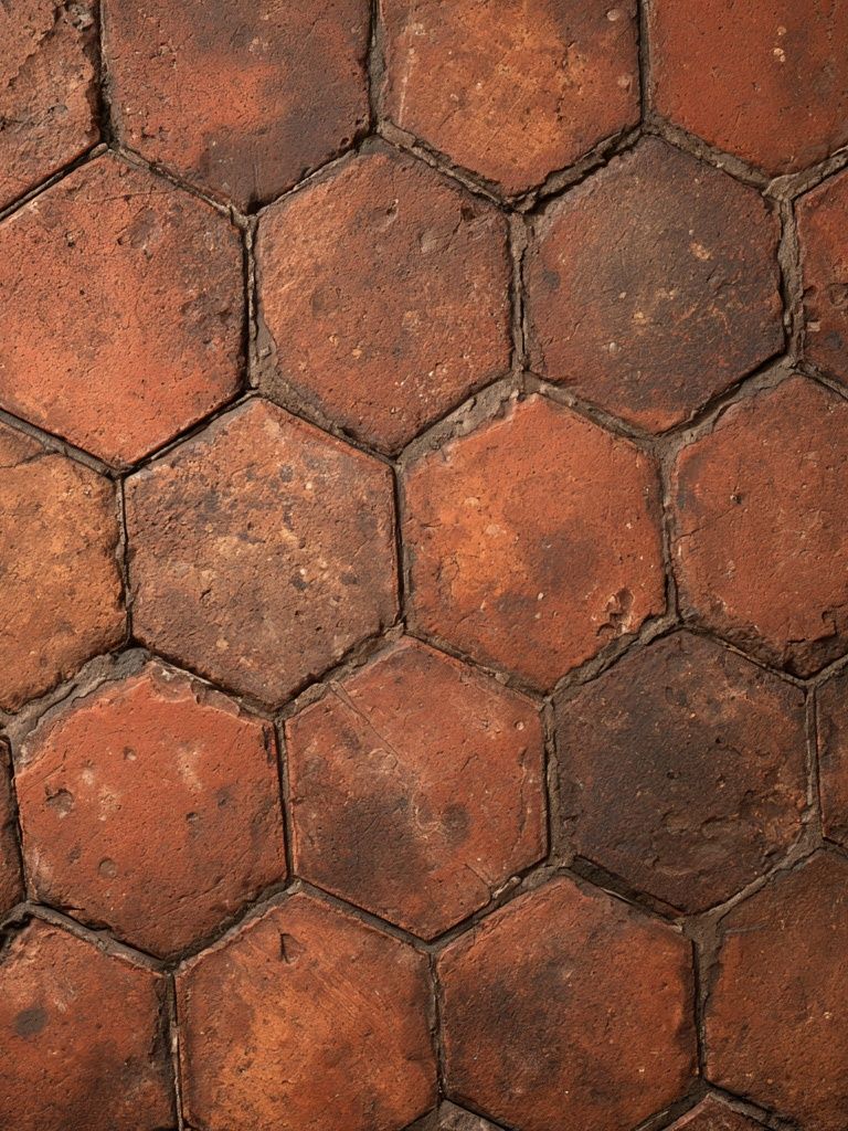
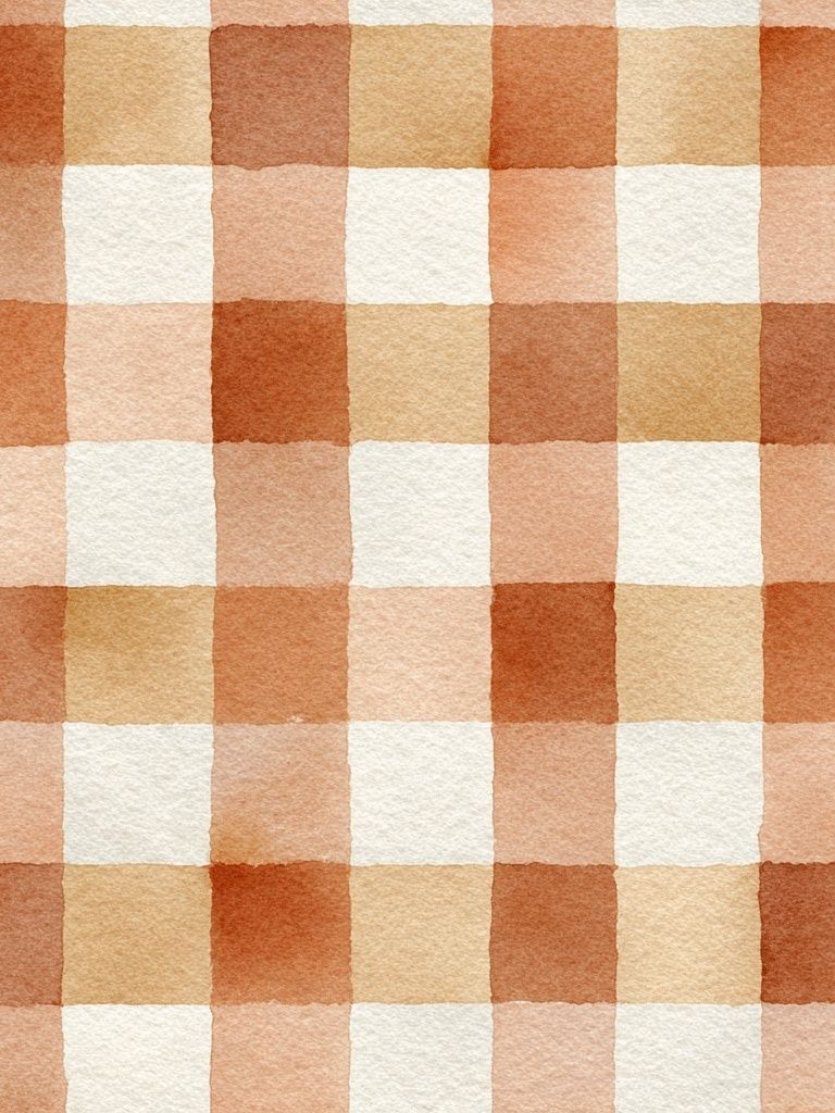
For a more modern version of boho, mix one botanical or figurative piece with one abstract texture-based print. A striped watercolor, a terracotta geometric surface, or a soft blush wash keeps the room from leaning too rustic. abstract art prints with sandy or sunbaked tones can bridge the gap between classic boho and cleaner contemporary interiors.

Where a Bohemian Poster Print Works Best
Bedrooms are often the easiest place to style a bohemian poster print because soft materials are already doing half the work. Above a queen bed, a single 50x70 cm print can look elegant and calm, while two 40x50 cm pieces create better width if your headboard is over 140 cm wide. Keep the art centered roughly 15 to 20 cm above the headboard so it feels anchored rather than floating.
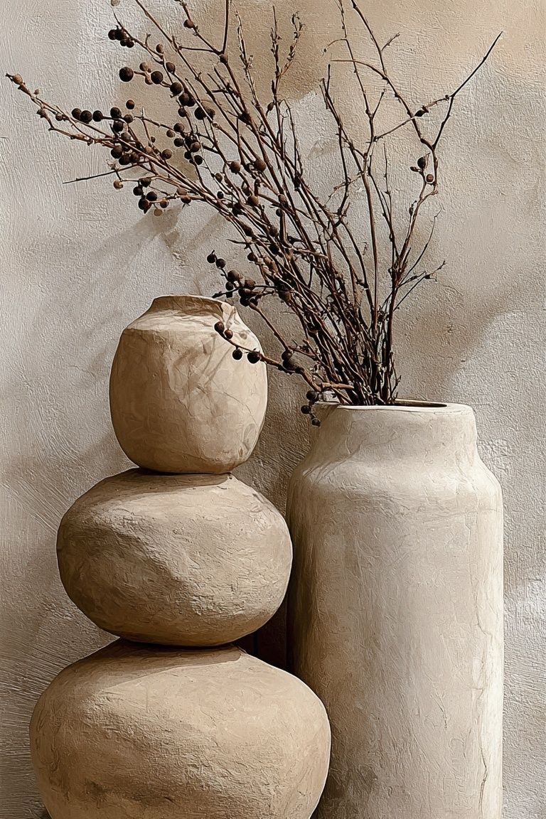
Living rooms allow more variation. Over a 180 to 220 cm sofa, aim for art that spans about 60 to 75% of the sofa width. That usually means one 70x100 cm statement piece or a pair of 50x70 cm prints. If your room has open shelving, woven baskets, and a floor lamp with a linen shade, choose subjects that repeat those materials visually — dried branches, basket-like patterns, or organic florals from the Floral Birds — Bohemian Print or Ceramic Vases with Dried Branches — Bohemian Print direction.
Reading corners and entryways are ideal for smaller works. A 30x40 cm or 40x50 cm print can add enough character beside a mirror, above a console, or over a compact accent chair. These spaces benefit from art that feels inviting at close range, especially pieces with pattern or line detail that reward a second look.

Framing, Size and Layout Tips
Frame finish changes the mood fast. Natural oak, walnut, and light ash are the best matches for boho interiors because they repeat common furniture tones and keep the display soft. Black frames can work, but they are more effective when repeated at least twice in the room — for example with a black lamp base or window trim — otherwise they can feel too stark against a relaxed palette.
If the print is detailed or patterned, give it breathing room with a white mount. A 5 to 8 cm mount around a 30x40 cm or 50x70 cm print adds structure without making the arrangement formal. This is especially useful for richly patterned works such as Ornate Paisley Mosaic Poster, where a visual border helps the design stand apart from layered textiles and busy shelves.
For layouts, use one of three reliable formulas. First, one statement piece for a calm room with lots of texture already present. Second, a balanced pair for above beds or sofas. Third, a salon-style cluster of 3 to 5 frames if you want a more eclectic wall. In that last case, keep a consistent gap of 5 to 7 cm between frames, and repeat at least one common element — same wood tone, same mat color, or a shared palette of rust and cream. If you want a striped or simplified companion piece, Bohemian Stripes — Minimalist Print is useful for breaking up florals and figurative work.
How to Layer It with Textiles and Decor
The easiest way to make a bohemian poster print feel intentional is to echo one color from the artwork in two other places. If the print includes terracotta, repeat it in a cushion and a ceramic vase. If it carries sage green, bring in a plant and a woven throw with green undertones. Repetition at this small scale makes the room feel composed without looking matched.
Mix at least three material families near the art: woven fiber, soft textile, and something solid like wood or clay. For example, pair framed art with a jute rug, slub-linen cushions, and a handmade ceramic lamp base. Rooms with only smooth surfaces can make even beautiful boho art feel flat. Texture nearby matters almost as much as the image itself.

Plants help, but placement matters. One tall plant beside the artwork creates vertical softness, while a cluster of smaller plants underneath can make the area look crowded. Keep at least 20 to 30 cm of clear space between the edge of the frame and large foliage so the silhouette of the art remains readable.
If your room already includes heavy pattern in rugs or bedding, choose calmer wall art. In that case, look at pared-back textures from Textured Waves — Abstract Print or a quieter floral from the Floral Bouquet — Bohemian Print side of the collection. If the room is plain, a bolder motif like Bull Skull with Flowers — Bohemian Print can become the focal point.
Final Styling Notes and Shop-Ready Advice
A good boho wall never looks overplanned. Choose a bohemian poster print that shares your room's warmth, add one natural frame finish, and repeat two colors from the artwork elsewhere in the space. That formula works in bedrooms, living rooms, and smaller corners because it creates rhythm without forcing a theme.
When in doubt, go slightly larger, slightly warmer, and slightly simpler. A bohemian poster print should soften the room first and decorate it second. If the piece still looks good next to linen, wood, dried stems, and a low lamp at the end of the day, you have chosen well.
Frequently Asked Questions
What frame color works best with boho art on white walls?
Natural oak is the safest choice because it adds warmth without harsh contrast. Walnut works well if your furniture is medium to dark wood.
Can I mix bohemian prints with minimalist art?
Yes — keep one shared color family, such as sand, rust, or olive. A 50/50 mix often makes boho interiors feel more current and less busy.
Should I use glass or no glass for framed wall art?
Use glazing in bright rooms to protect the print, but place it away from direct glare if possible. Matte glazing is helpful when art hangs opposite large windows.
What size print suits a narrow entryway?
A 30x40 cm or 40x50 cm frame is usually enough for a wall under 90 cm wide. In very tight spaces, hang the center of the frame at about 145 cm from the floor.
How do I keep a boho wall from looking cluttered?
Limit the palette to 3 or 4 main tones and repeat one frame finish throughout. Leave some open wall space so textiles and decor do not compete with the art.