A well-chosen bedroom poster print does more than fill a blank wall. It sets the emotional temperature of the room. In a space used for rest, reading, and slow mornings, wall art should feel intentional rather than loud. Soft line work, muted color fields, and nature-led imagery tend to work especially well because they shape the room without demanding constant attention.
The most successful bedroom walls usually follow the room's existing rhythm. If your bed, rug, and curtains are already quiet and tonal, art can bring depth through texture instead of contrast. If the room feels flat, one bedroom poster print with a stronger focal point can add definition. This is why pieces from our Minimalist collection and Abstract wall art selection are often strong starting points for bedrooms — they add presence without clutter.
Why a Bedroom Poster Print Changes the Feel of a Room
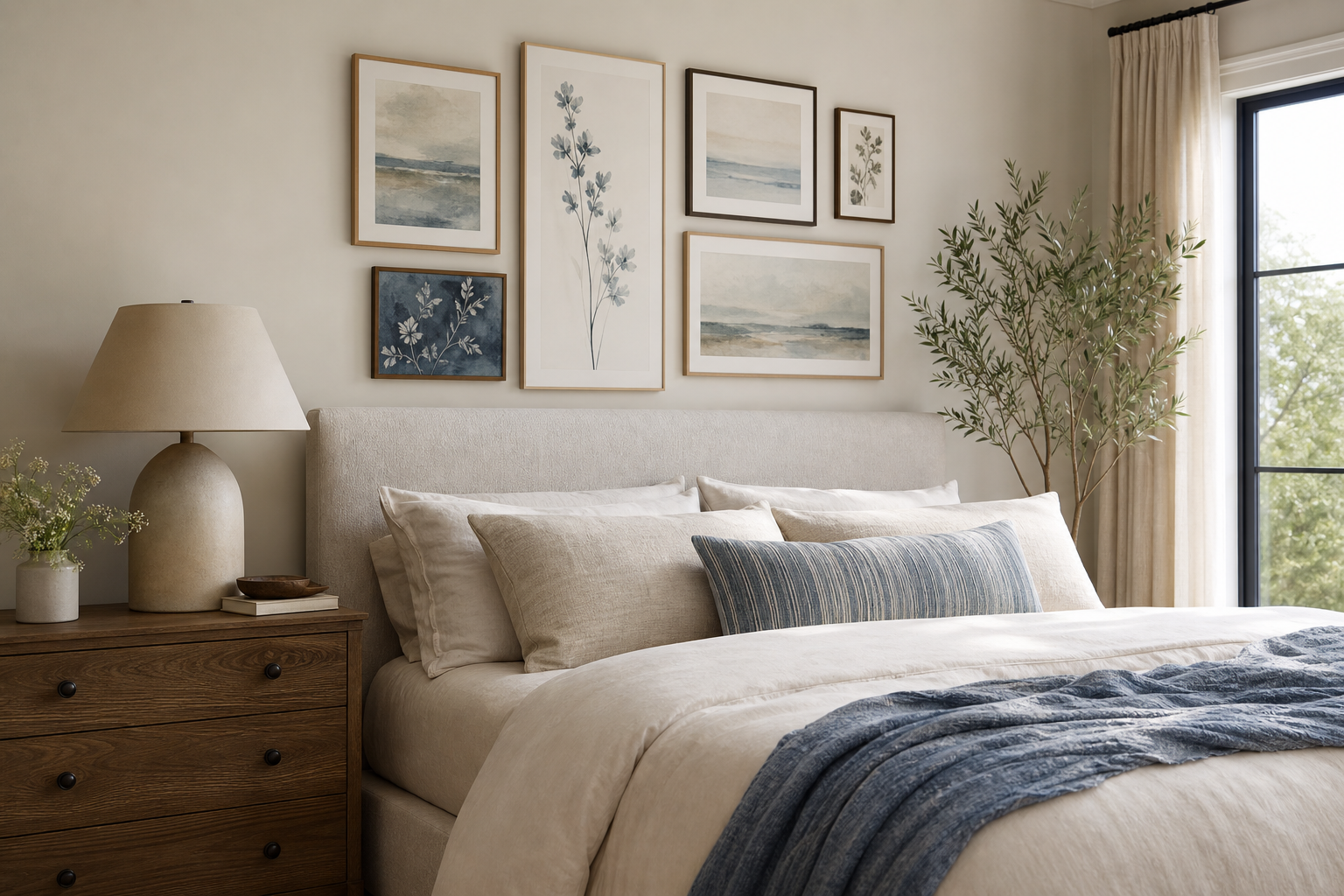
Bedrooms respond strongly to visual balance. A blank wall above the bed can make the room feel unfinished, while a properly scaled artwork creates structure. In most bedrooms, the bed is the largest visual element, so the art above it should help anchor that weight. Even one piece at 50% to 70% of the bed width can make the whole room feel more resolved.
Mood matters just as much as scale. A bedroom poster print in soft beige, dusty pink, sage, charcoal, or off-white will usually read calmer than highly saturated primaries. Gentle imagery also helps — think folds of fabric, botanical forms, abstract brushwork, or open landscapes. If you prefer a pared-back look, Elegant White Fabric — Minimalist Print shows how a restrained subject can still feel rich because of tone and texture.

Choosing the Right Style for Your Space
Minimal bedrooms benefit from art that echoes clean lines and negative space. In that setting, monochrome forms, pale neutrals, and subtle texture prints create calm without making the room feel sterile. Pieces from our minimalist art prints and fine art collection suit this approach because they bring softness through materiality, not noise.
Romantic bedrooms work best when the imagery is delicate rather than overly decorative. Floral studies, soft silhouettes, and impressionist scenes pair well with upholstered headboards, curved lamps, and washed linen bedding. If your room leans classic or feminine, you can mix in romantic wall art or a gentle botanical print to add warmth without turning the room overly themed.
Nature-inspired bedrooms are often the easiest to style because greens, creams, stone, and wood already feel restful. Botanical patterns, soft garden motifs, and landscape-led works pair naturally with oak, rattan, and cotton. If you like a heritage touch, Honeysuckle by William Morris (1874) gives a bedroom more character while staying grounded in organic form.

Abstract pieces are useful when you want color without narrative. A blush wash, terracotta form, or textured white composition can pull bedding, curtains, and rugs together more easily than figurative art. For a warmer palette, the Blush Watercolor Abstract Poster is particularly easy to build around.




Finding the Best Size and Placement
The simplest rule for sizing art above a bed is width. A single piece should cover roughly 50% to 70% of the headboard width. For a queen bed with a 160 cm headboard, that means art around 80 to 110 cm wide. For two pieces hung side by side, keep the total combined width in that same range, with 5 to 8 cm between frames.
Height matters too. Hang the artwork so the bottom edge sits about 15 to 25 cm above the headboard. That gap is tight enough to feel connected, but not so close that the wall looks cramped. If you hang art much higher, the bed and the artwork start to read as separate zones.
For narrow walls beside wardrobes or windows, a vertical format works better than a wide one. One tall print can elongate the wall and add softness near harder furniture lines. In compact bedrooms, a pair of smaller works above each bedside table can also be more balanced than one oversized center piece.

Gallery arrangements need more discipline in a bedroom than in a living room. Keep them tight — usually 3 to 4 pieces — and stay within one palette family. Too many frames above a bed can feel restless. If you want a layered arrangement, choose works that share a visual language, such as pieces from our abstract collection or botanical collection.
Frames, Finishes, and the Details That Matter
A frame changes how polished a bedroom poster print feels. Light oak frames add warmth and work well with Scandinavian, Japandi, and natural bedrooms. Black frames create definition and suit monochrome or more architectural rooms. White frames soften contrast and blend well into pale walls, though they need enough tonal variation in the print to avoid disappearing.
Matte surfaces usually perform better in bedrooms than glossy ones. Bedrooms often have side lamps, pendant lights, and low-angle morning sun — all of which can create glare. Art with soft tonal variation and a refined finish will read better in changing light, especially near windows or opposite mirrors.

Texture is another useful tool. A smooth print with minimal color can look flat if the room already has flat-painted walls and plain bedding. In that case, choose work with visible folds, brush marks, grain, or layered edges. Textured Fabric — Minimalist Print and Textured White Abstract Poster are good examples of quiet pieces that still hold attention up close.
How to Build a Relaxing Bedroom Palette Around Art
Start with the artwork, then pull two or three colors from it into the room. One color can guide bedding, another can appear in cushions or a throw, and a third can sit in smaller accents such as a vase, lampshade, or rug detail. This keeps the room connected without making everything match.
A practical ratio is 60-30-10. Let 60% of the room stay in a base neutral — warm white, greige, sand, or soft grey. Use 30% for a secondary tone found in the art, such as blush, olive, or muted terracotta. The final 10% can be a darker accent like espresso brown, black, or deep green to give the room shape.
If your current bedroom is very neutral, one bedroom poster print can become the palette anchor. A blush abstract can introduce warmth; a botanical print can pull in green; a fine art landscape can add blue-grey depth. For calmer schemes, Zen Garden Stones — Fine Art Print is especially effective because it connects easily with stone, oatmeal, charcoal, and soft wood tones.

Simple Styling Tips for a Finished Look
Symmetry makes bedrooms feel calmer. Matching bedside tables, even lamp heights, and centered artwork all help the room read as restful. If your bed is centered on the wall, keep the art centered too. If the bed sits off-center because of architecture, use one larger vertical print on the wider side of the room to visually rebalance it.
Layering adds warmth, but it should stay controlled. One framed piece on the wall, one smaller frame leaned on a dresser, and one repeated tone in the textiles is often enough. Bedrooms rarely need the density that works in a hallway or living room. Leave breathing space around the bed and headboard so the room keeps its sense of ease.

One more practical tip: repeat shape as well as color. If your art features soft curves, echo that with a rounded lamp, arched mirror, or curved headboard. If the print is more graphic and linear, cleaner furniture silhouettes will feel more cohesive. This is where a bedroom poster print starts to look integrated rather than simply hung.
Wrapping Up: Choosing a Bedroom Poster Print You’ll Love
The right bedroom poster print should suit both the scale of the wall and the mood you want to live with every day. Start with the bed width, choose a palette that supports rest, and frame the piece in a finish that matches the room's materials. When the artwork relates to your bedding, wood tones, and lighting, the entire bedroom feels more complete.
If you want a simple place to begin, explore soft neutrals in our Minimalist range, muted color compositions in our Abstract collection, or classic organic pattern in our Botanical selection. A bedroom does not need many pieces — just the right one, placed well.
Frequently Asked Questions
What size frame works best for a small bedroom wall?
For compact bedrooms, framed art around 30x40 cm to 50x70 cm usually feels balanced. If hanging above a narrow bed, stay closer to the lower end to avoid crowding the wall.
Should bedroom wall art match the bedding exactly?
No — it should relate, not match perfectly. Pull one or two tones from the art into pillows, throws, or curtains for a more natural result.
Can I hang art above the bed without drilling?
Yes, if the frame is lightweight and your wall surface allows strong adhesive strips. Always check the weight limit and avoid placing heavy framed pieces directly above where you sleep without secure mounting.
Which frame color is most versatile for bedroom styling?
Light oak is often the easiest because it works with warm neutrals, soft greens, blush tones, and white bedding. Black is more graphic and best when you want stronger contrast.
What kind of art pairs well with dark bedroom walls?
Choose prints with lighter tonal areas — cream, sand, soft grey, pale blush, or muted green — so they stand out. Thin black or brass-toned frames also help define the edges against deeper paint colors.