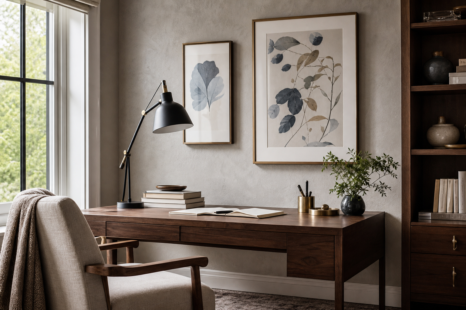
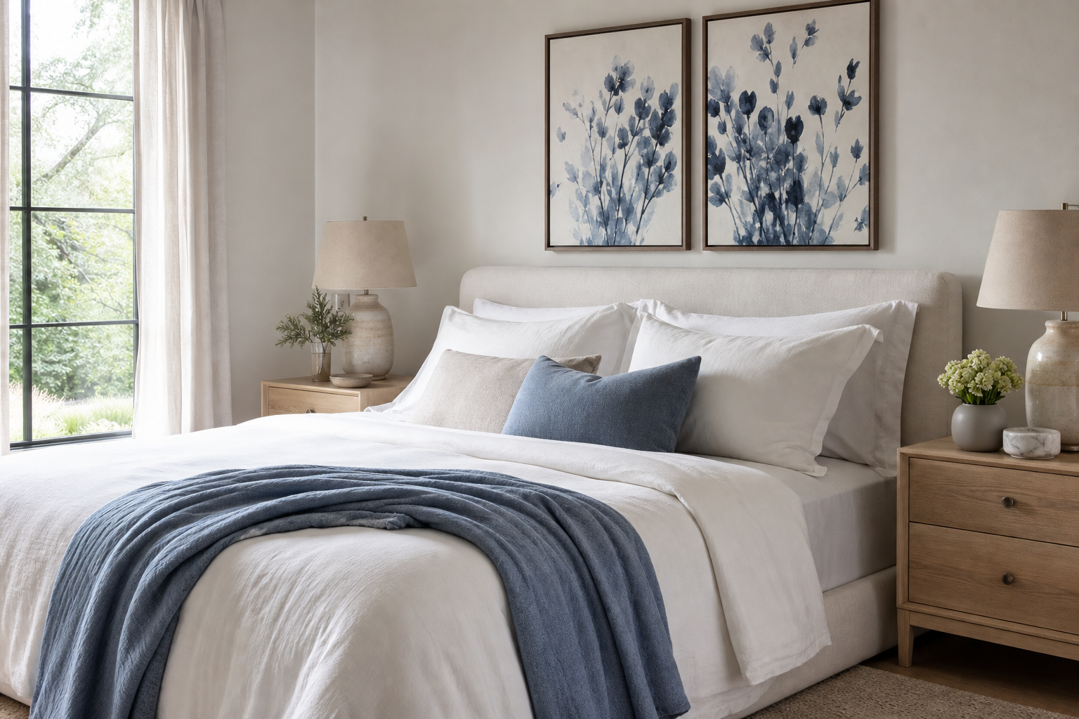
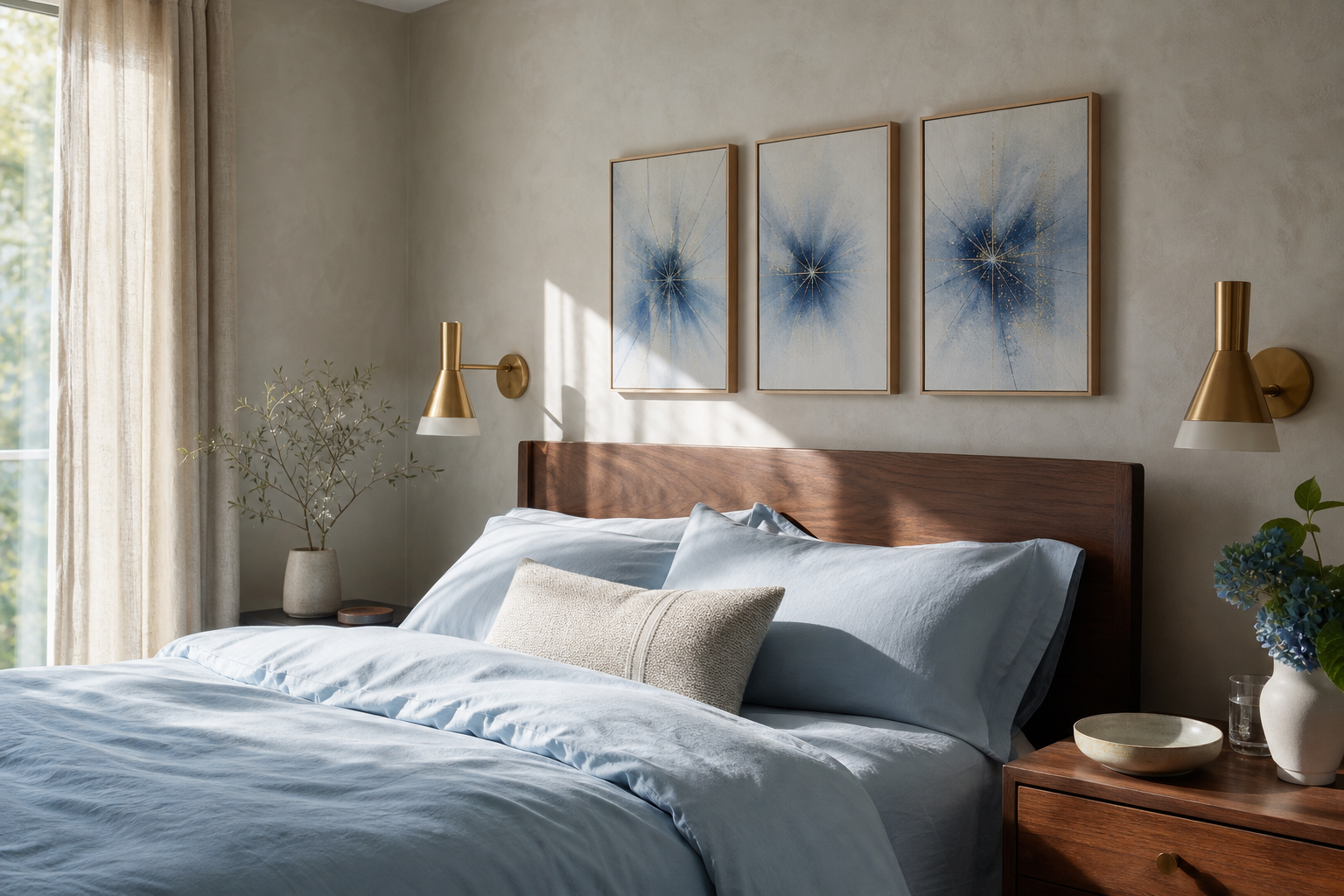
A well-placed blue portrait can quiet a room in seconds. Blue reads as steady, reflective, and slightly distant, which is exactly why portrait art in this palette feels so compelling in contemporary interiors. It brings the emotional pull of a face or figure, but with less visual noise than bright reds, oranges, or heavy black-and-white contrast.
Why Blue Portraits Feel So Captivating
A blue portrait works because it balances intimacy with restraint. Faces naturally draw the eye first, while blue tones slow the pace of the room and reduce visual heat. In practical terms, that makes this kind of wall art especially effective in spaces where you want focus and calm at the same time — bedrooms, reading corners, home offices, and quieter living rooms.
Blue portrait pieces also sit comfortably across styles. In a minimalist room, they add depth without clutter. In a layered space, they anchor softer textures like boucle, linen, oak, or brushed brass. If you already gravitate toward our Fine Art collection or pared-back minimalist wall art, a blue portrait often bridges those two looks better than a louder figurative print.

Choosing the Right Shade of Blue
Not every blue portrait creates the same effect. Pale blue feels airy and open, especially in rooms with north-facing light where sharper colors can go cold. Muted dusty blue is the easiest all-rounder — it softens black frames, works with beige upholstery, and pairs well with natural woods from ash to walnut.
Deep navy and indigo give a portrait more gravity. Use them when you want a focal point with stronger presence, especially on walls wider than 240 cm or above furniture at least 160 cm long. A saturated cobalt blue portrait feels more fashion-led and energetic, so it suits cleaner rooms with fewer competing colors.
If you want a stronger artistic mood, a piece like Vincent van Gogh — Portrait Print shows how blue-led portraiture can feel expressive rather than decorative.
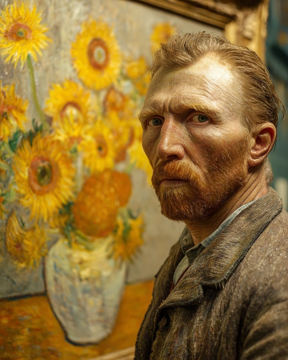
For a softer direction, combine your blue portrait with prints that introduce air and space instead of more faces. That is where Window with Sheer Curtain — Fine Art Print or calm pieces from our abstract collection can stop the wall from feeling too intense.
Finding the Best Room for a Blue Portrait
Bedrooms are the most natural setting for a blue portrait because blue supports a slower, quieter atmosphere. Hang one centered above the bed, keeping the bottom edge roughly 20 to 25 cm above the headboard. For a queen bed, a portrait between 50x70 cm and 70x100 cm usually looks balanced. For a king bed, 70x100 cm or 100x140 cm gives better proportion.
Living rooms benefit from blue portrait art when the seating is neutral or textural rather than brightly patterned. Place the work above a sofa, sideboard, or fireplace and aim for the art to span around 60 to 75 percent of the furniture width below it. That ratio keeps the wall feeling intentional rather than undersized.
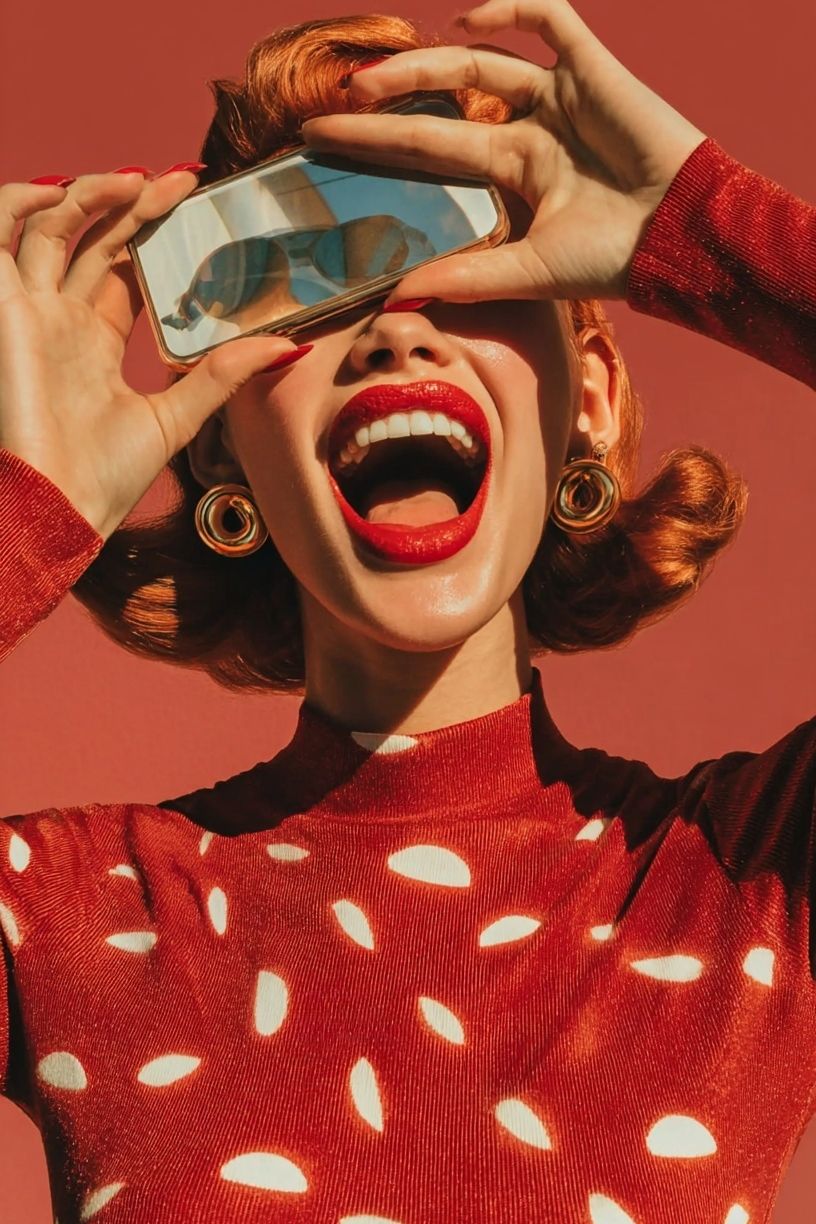
Hallways and home offices are ideal if you want the portrait to feel more editorial. In a hallway, a single vertical blue portrait can sharpen a narrow wall and draw you forward. In an office, it adds character without the overstimulation that comes from busier color palettes. If your room already includes fashion-forward pieces, Retro Fashion Portrait Poster is a smart way to keep a portrait wall feeling modern.

How to Pair Blue Portraits with Your Palette
The safest base is a warm neutral palette: off-white, oatmeal, greige, taupe, camel, and soft brown. These colors absorb the coolness of blue and stop the room from feeling sterile. Warm woods do the same job. Oak keeps the look lighter; walnut gives blue portraits a richer, more dramatic finish.
Brass is often better than chrome with a blue portrait wall because it introduces a small amount of warmth without competing for attention. Use it in lighting, handles, or mirror frames rather than everywhere. One or two brass accents in a room are usually enough.
Blue also pairs well with restrained contrast. Cream, charcoal, deep green, and faded terracotta all work if you keep the proportions controlled — think 70 percent neutral base, 20 percent blue-led art and textiles, 10 percent accent color. If you are mixing in supporting pieces, Yin Yang Teal Abstract Poster brings blue into a more graphic direction, while Textured Waves — Abstract Print adds movement without another figurative subject.


Sizing, Framing, and Placement Tips
Scale matters more than color. A strong blue portrait hung too small will look incidental. As a rule, use 50x70 cm for tighter walls, reading corners, and desks; 70x100 cm for most living rooms and bedrooms; and 100x140 cm when the piece needs to carry a full wall section on its own.
Frame finish changes the tone immediately. Black frames make a blue portrait look sharper and more contemporary. Oak softens it and works especially well in Scandinavian or organic interiors. A slim gold frame can elevate a darker blue portrait, but keep the profile narrow — around 1 to 2 cm — so the frame does not overwhelm the artwork.
Hang the center of the piece at about 145 cm from the floor in spaces where it is viewed standing, or slightly lower above furniture where the eye line drops. If you are using a pair, leave 6 to 10 cm between frames for smaller sizes and 10 to 14 cm for larger formats. One large blue portrait tends to feel calmer; two medium pieces feel more curated and decorative.

Ways to Build a Gallery Look Around One Portrait
Start with the blue portrait as the anchor, then add three or four supporting works with one shared quality: color temperature, line style, or subject mood. The cleanest mix is one portrait, one abstract, one minimal line drawing, and one atmospheric fine art print. That gives variation without losing cohesion.
Avoid adding too many other faces unless the wall is very large. One portrait usually carries enough emotional weight. Around it, choose quieter neighbors from our minimalist collection or soft-edged works from Fine Art prints. A simple option is to pair a portrait with Woman and Dog Sketch Print for line contrast, then bring in a lighter landscape or interior image to create breathing room.

If you want the arrangement to feel fuller, use a 2x2 grid with the blue portrait in the top left or bottom right position. If you prefer a looser salon layout, keep the spacing consistent at 7 to 9 cm and align at least one edge vertically so the display still feels ordered. In most homes, four to six pieces are enough for a gallery wall between 140 and 220 cm wide.

Final Styling Notes and Shop-Smart Advice
The best blue portrait is not just the one you like up close — it is the one that keeps its presence from across the room. Check the room first: wall width, furniture width, natural light direction, and how much warmth already exists in the materials. Then choose the shade of blue, the size, and the frame finish to correct what the room needs.
If the room feels flat, choose a deeper blue portrait with contrast. If it already feels dark, go for a lighter or more muted blue portrait and pair it with airy supporting art. Shop with proportion in mind, keep your palette disciplined, and let one strong portrait lead the wall rather than competing with five average pieces.
Frequently Asked Questions
What frame color is safest for a blue portrait?
Black is the most versatile if you want a crisp modern finish. Oak is safer in softer interiors with beige, cream, or natural wood furniture.
Can I use a blue portrait on a colored wall?
Yes — muted greige, soft taupe, pale sage, and warm white all work well. Avoid matching the wall too closely to the artwork, or the portrait can lose definition.
What size works best above a desk?
A single 50x70 cm or 61x91 cm piece is usually enough above a standard desk 100 to 140 cm wide. Keep at least 20 cm of clear space between the desktop and the frame.
Should glass, matte paper, or canvas look better for portrait walls?
Matte finishes usually suit portrait art best because they reduce glare and keep skin tones and blue shadows looking softer. In bright rooms, this makes a noticeable difference.
What other art styles pair well with a blue portrait?
Soft abstract works, minimalist line drawings, and quiet fine art scenes pair best. They support the portrait without competing with the face or figure.