A blue glass star brings two useful qualities to a wall at once: cool colour and controlled shine. Blue settles a room visually, while a glass-like star shape adds a crisp point of light that feels cleaner than glitter and softer than chrome. That balance is why the blue glass star works across styles that usually do not overlap — modern bedrooms, airy hallways, playful studios, and even pared-back living rooms.
Unlike heavier celestial motifs, a blue glass star feels light on the wall. The shape is familiar, but the finish changes everything. When the surface looks translucent, faceted, or lightly reflective, the motif reads more decorative object than themed decor. That makes it easier to combine with our space art collection or quieter pieces from abstract wall art without the display feeling costume-like.
Why a Blue Glass Star Feels So Fresh
The appeal starts with contrast. A star is graphic and geometric, but glass suggests fluidity, reflection, and depth. In blue, that mix feels especially current because it sits between two moods: coastal freshness and night-sky atmosphere. A blue glass star can brighten an off-white wall in daylight, then look cooler and more luminous under warm lamps in the evening.
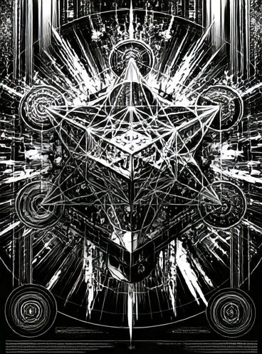
Another reason the blue glass star stands out is that it introduces shine without visual clutter. In practical terms, that matters in rooms with flat materials like painted drywall, linen upholstery, boucle, or oak veneer. One glass-inspired celestial piece can break up all that matte texture and add dimension from 2 to 3 metres away. If you like cleaner arrangements, pair it with restrained geometry such as Sacred Geometry Black-White to keep the look sharp rather than whimsical.

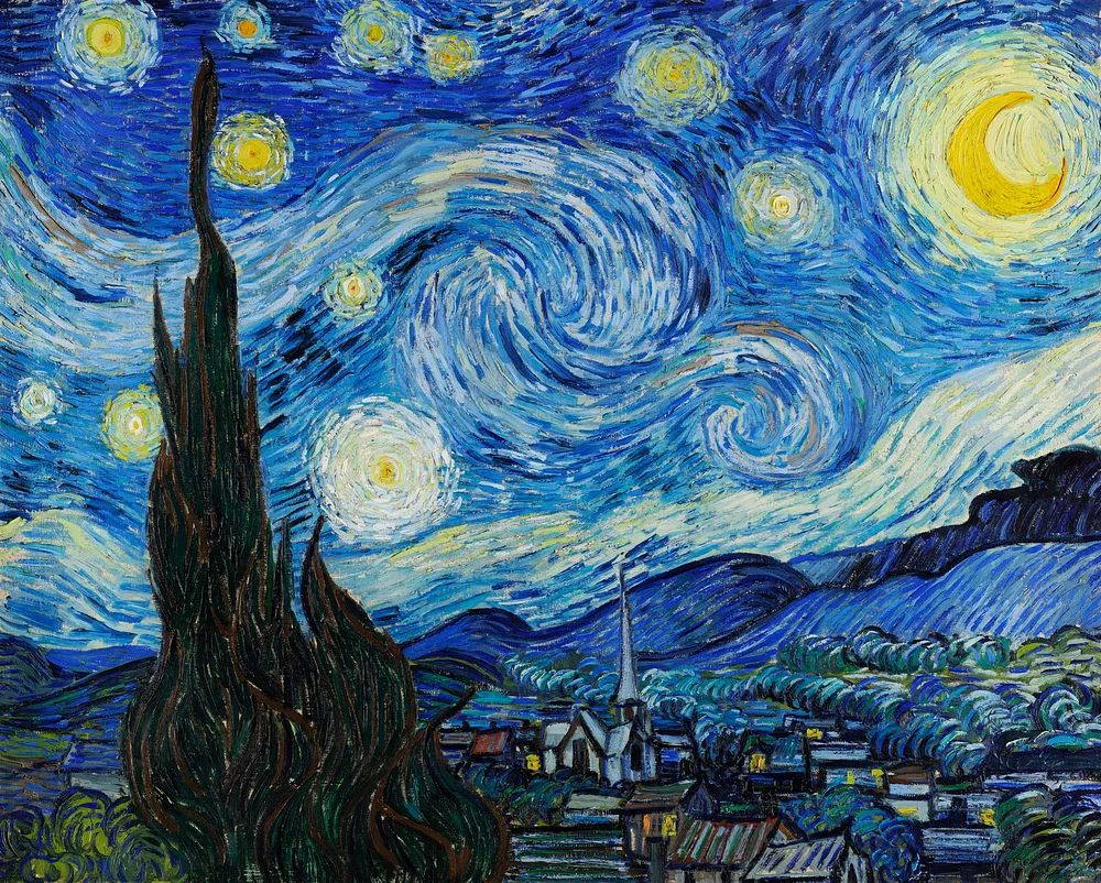
The motif also taps into celestial styling without leaning too literal. If moons, rockets, or planets feel too direct for your room, a blue glass star gives you the same upward, atmospheric note in a more design-led way. That is why it pairs well with painterly pieces like Starry Night and with cooler landscape scenes that echo twilight rather than spell out a theme.
Where It Works Best in the Home
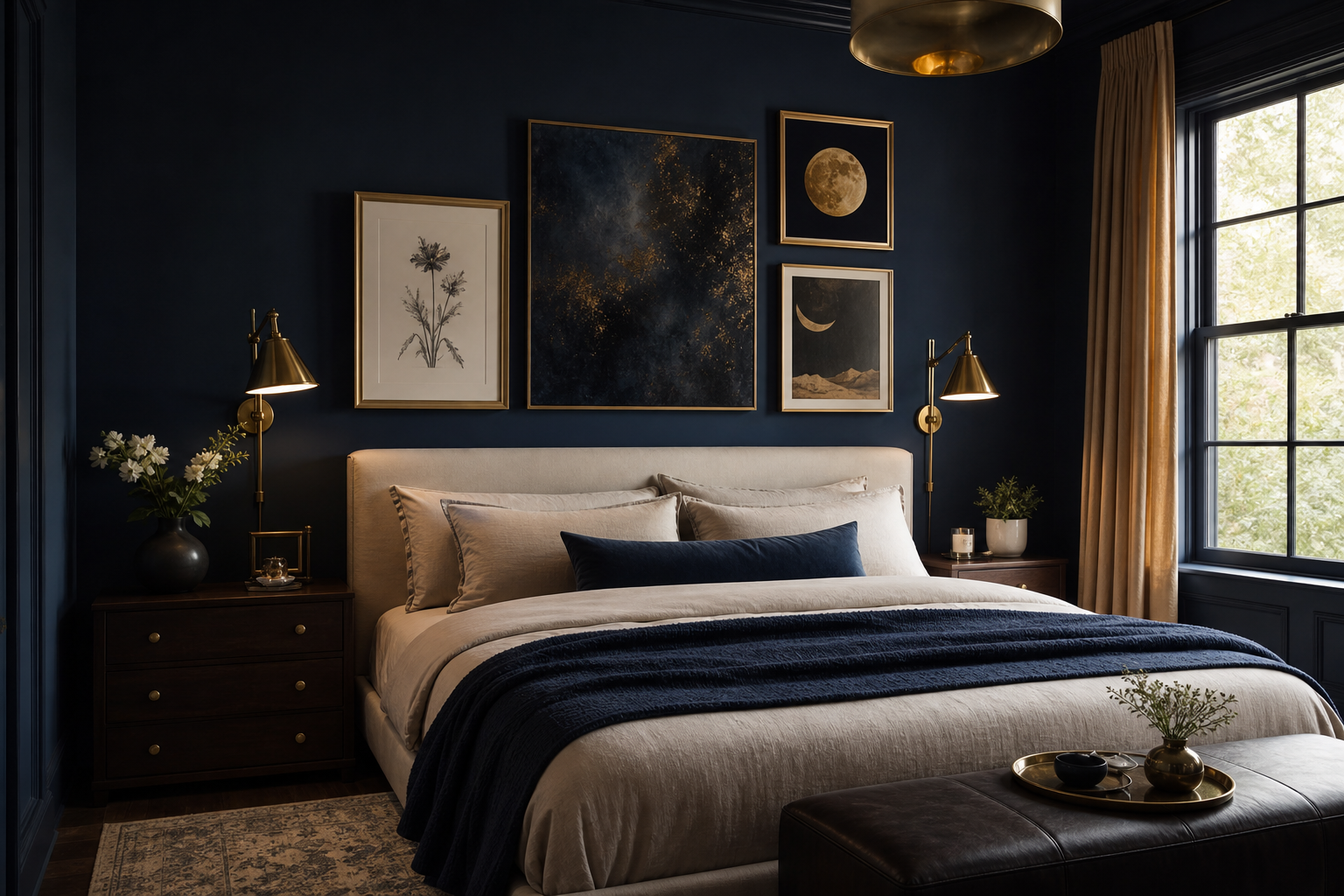
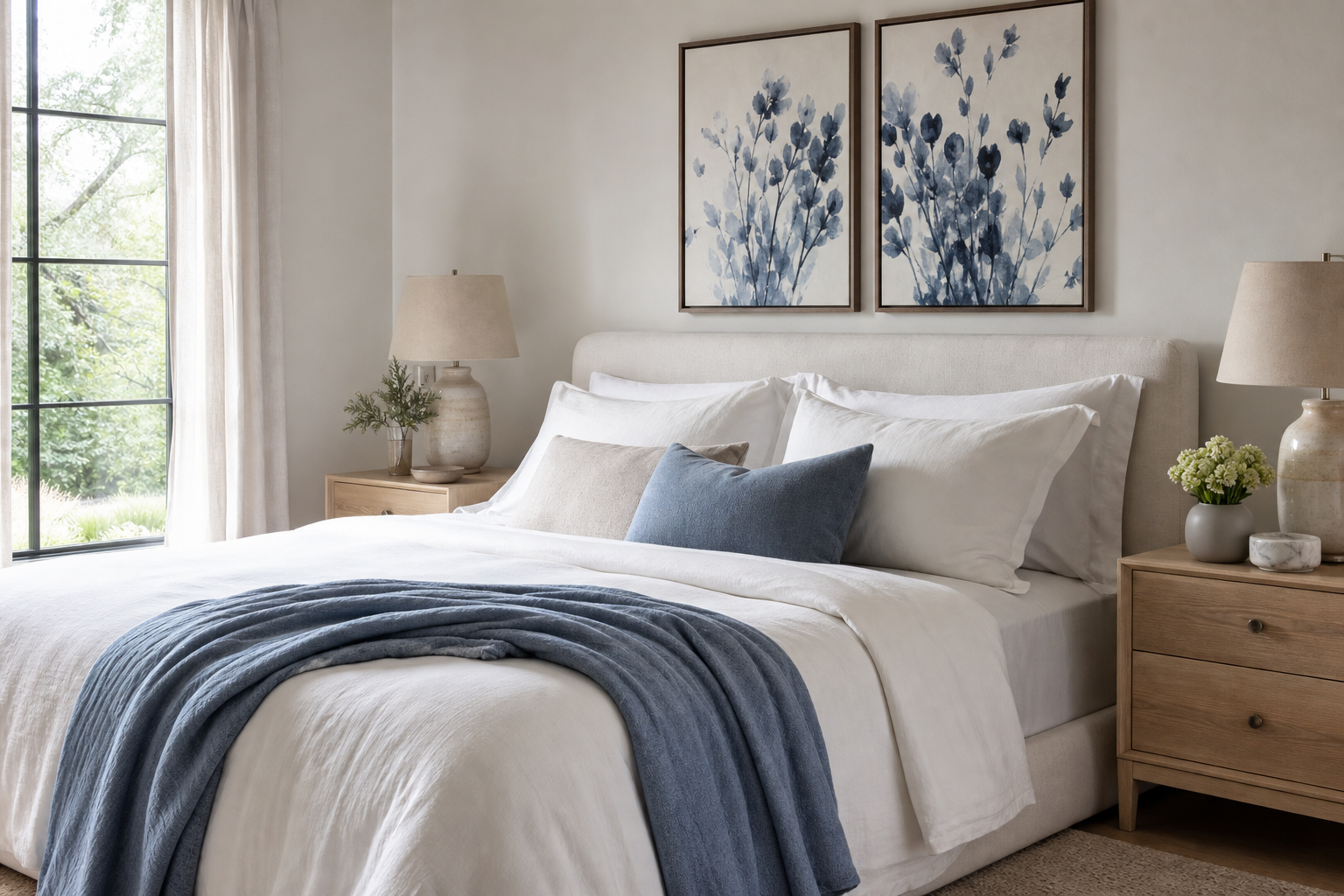
Bedrooms are the easiest place to start. Above a 140 to 180 cm bed, a blue glass star works best as either one larger statement piece or a trio of medium frames. The colour has a calming effect, and the celestial shape naturally suits a room designed for rest. Keep the palette close — slate blue, cloud grey, soft ivory, and a touch of brushed brass — and the wall will feel composed instead of busy.

Living rooms benefit from the motif when the architecture is simple. On a long sofa wall, the blue glass star adds a focal point without darkening the space the way a dense black print might. It is especially effective above cream, greige, or pale grey upholstery, where blue becomes the contrast colour. If you want a broader celestial story, mix it with Solar System — Space Print or a quieter night scene such as Moonlit Winter Landscape.
Hallways and entry zones are strong placements because reflective or glass-like imagery catches attention quickly. These are often narrow areas with limited furniture, so the wall art has to do more of the visual work. A single vertical frame around 50x70 cm can anchor a console table, while two 30x40 cm pieces can guide the eye along the corridor.
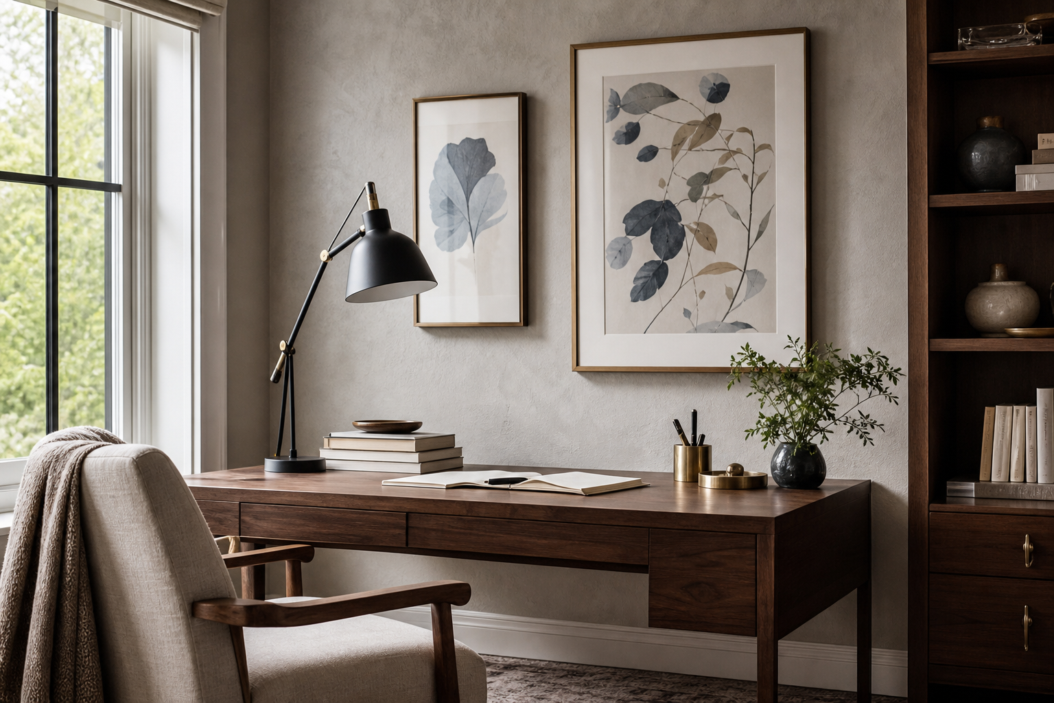
Creative spaces also suit the look. In a home office, studio, or reading corner, a blue glass star adds personality without the visual noise of a multicolour collage. If the room already has shelving, ceramics, or chrome desk details, the motif will echo those surfaces and make the scheme feel intentional.


Choosing the Right Size and Finish
Scale matters more than theme. For a small wall section — between two door frames, above a nightstand, or over a desk under 120 cm wide — choose art in the 30x40 cm to 40x50 cm range. For a bed, sofa, or sideboard wall, move up to 50x70 cm, 61x91 cm, or a grouped arrangement that covers roughly 60 to 75 percent of the furniture width below it.
A blue glass star feels more refined when the finish has variation. Look for imagery that suggests translucency, faceting, frosted edges, or layered blue tones rather than a flat navy silhouette. Transparency makes the motif lighter. Frosted texture feels softer and more Scandinavian. High-contrast shine feels bolder and more contemporary.

Frame finish changes the mood too. White frames sharpen cool blue and keep the look airy. Oak frames add warmth and stop the palette feeling cold. Black frames make the shape more graphic, which can be useful if the room needs stronger definition. In most homes, a mount around 5 to 7 cm wide gives celestial motifs breathing room and prevents smaller art from looking lost.
How to Style It with Colour and Texture
Neutrals are the safest partner, but not all neutrals behave the same way. Crisp white makes a blue glass star look brighter and more modern. Warm beige makes it feel softer and more decorative. Pale grey pushes it toward a moonlit, gallery-style mood. If you want the star to be the clear focal point, keep 70 percent of the room in quiet base tones and let blue do the lifting.
Deep blues create a richer scheme, especially in studies, dining corners, or bedrooms with lower light. Layer midnight, denim, and smoky teal around the art rather than matching one exact shade. That tonal approach feels more elevated than repeating one bright cobalt throughout the room. If you prefer a cleaner composition, bring in geometric structure from our mid-century modern collection or use a restrained piece like Retro Satellite Mid-Century Modern.

Metallics should be used sparingly. A blue glass star already implies shine, so one metal accent is enough — usually brass, nickel, or chrome in a lamp, frame, or vase. Natural wood is the better balancing tool because it grounds the coolness. Oak, ash, and walnut all work, with walnut giving the strongest contrast.
Textiles matter as much as wall colour. Boucle, washed linen, ribbed cotton, and wool throws soften the crispness of celestial shapes. If the room already has a lot of hard surfaces — glass coffee table, lacquered sideboard, polished concrete — add tactile fabrics to stop the display feeling brittle.
Framing, Hanging, and Placement Tips
The most reliable hanging height is to place the centre of the artwork at around 145 to 150 cm from the floor. Above furniture, leave 15 to 25 cm between the top of the sofa, headboard, or console and the bottom of the frame. That gap keeps the art connected to the furniture instead of floating too high.
For groupings, odd numbers work well with a blue glass star because the central piece can hold the celestial focus while the surrounding art supports it. A practical formula is one feature print at 50x70 cm with two smaller companions at 30x40 cm. Keep spacing between frames at 5 to 8 cm for a neat, editorial look.

If you are mixing styles, connect them through colour rather than subject. A blue glass star can sit beside landscapes, abstract geometry, or painterly skies if the tones stay within the same cool family. This is where Wilson Bentley's Snowflake 920 works surprisingly well — its crystalline structure echoes the faceted quality of glass without repeating the exact motif.

Glare is the main practical issue with anything glass-inspired. If the wall faces a large window, use matte glazing or hang the piece on an adjacent wall instead of directly opposite the light source. In small rooms, that one decision makes the artwork easier to read throughout the day.
Shop the Look: Easy Ways to Build a Celestial Wall
The simplest approach is a two-part mix: one blue glass star-inspired hero piece and one supporting print that extends the mood. For a softer scheme, pair it with painterly night colour from our fine art collection. For a more graphic scheme, add a structured piece from space-inspired wall art or a geometric work from our abstract prints.
A three-piece arrangement is often the sweet spot for medium walls. Start with the star motif in the centre, add one atmospheric night scene, then finish with one structural or scientific-looking print. That gives you variation in texture, subject, and rhythm without losing cohesion. If you prefer a cleaner, retro edge, a single celestial accent paired with one mid-century piece can feel sharper than a full galaxy wall.
Final thoughts
A blue glass star works because it combines calm colour with a little light play. It can read dreamy, modern, or architectural depending on the frame, scale, and surrounding palette, which makes it far more flexible than many themed motifs.
Build the look by focusing on proportion first, finish second, and theme third. Once the size feels right on the wall, the blue glass star will do what the best wall art always does — give the room a focal point that feels natural, not forced.
Frequently Asked Questions
What frame colour works best with a blue glass star?
White is the safest for a light, airy result, while oak adds warmth and black creates more contrast. If the room already has metal accents, brushed silver can also work well.
Can I use a blue glass star in a small room?
Yes — just keep the scale controlled. A 30x40 cm or 40x50 cm piece is usually enough for a compact bedroom, hallway, or desk wall.
Should celestial wall art be centred over furniture?
Usually yes, especially above beds, sofas, and consoles. If you are creating an asymmetrical arrangement, keep the full grouping visually balanced across the furniture width.
What colours pair well with a blue glass star besides blue?
Soft white, greige, charcoal, walnut brown, and muted brass all pair well. For a fresher contrast, small touches of icy green or smoky lavender can also work.
Is matte or glossy glazing better for this kind of artwork?
Matte glazing is better in bright rooms because it reduces reflections and keeps details visible. Glossy glazing can enhance depth, but it needs careful placement away from direct window glare.