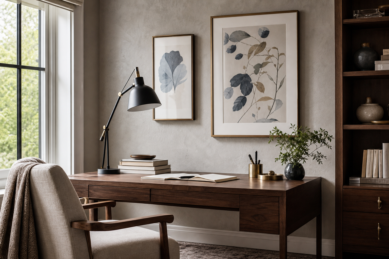
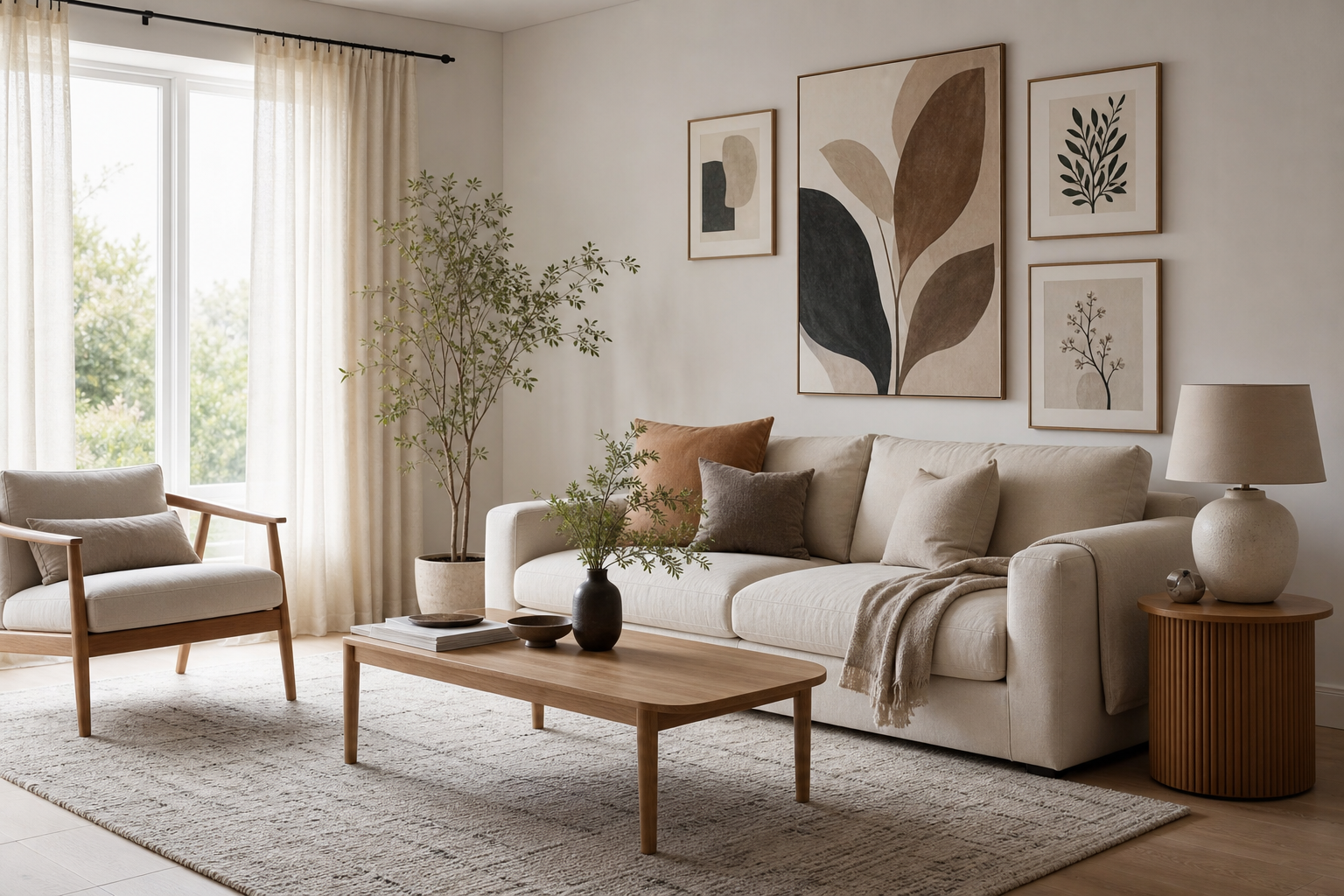
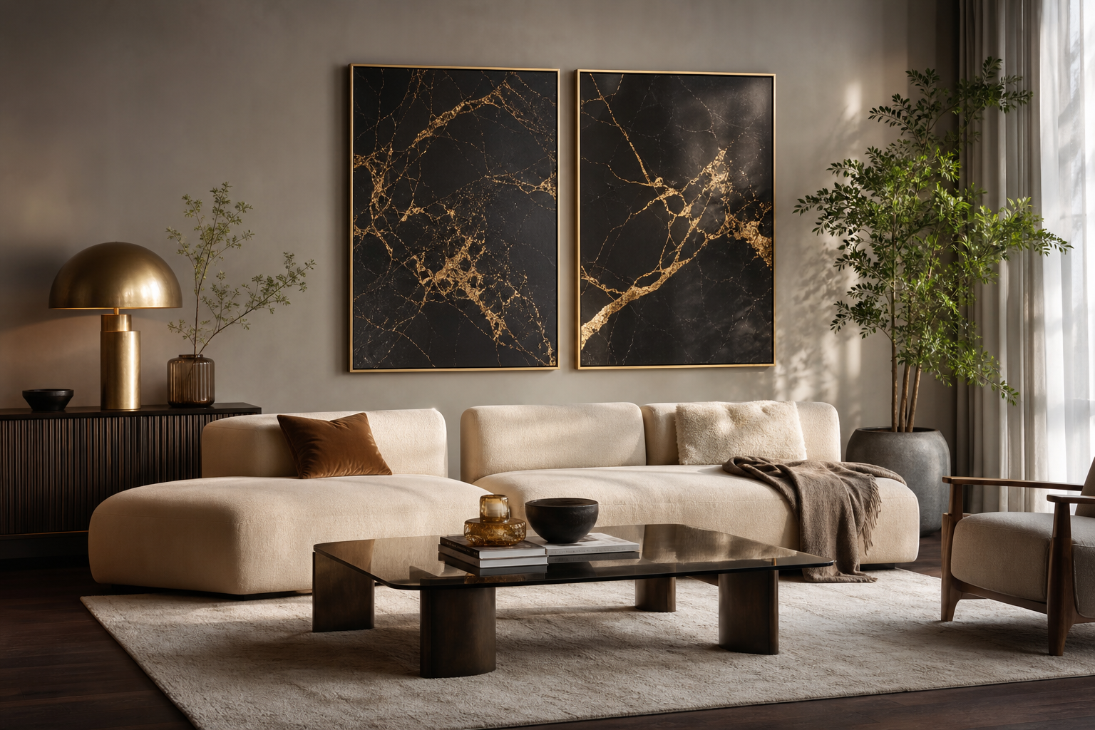
A strong blue and gold celestial aesthetic works because it balances cool depth with warm contrast. Blue creates the quiet, expansive feeling of a night sky, while gold adds focus and polish in small, high-impact moments. When you keep the ratio close to 70% blue and neutrals, 20% soft supporting tones, and 10% gold, the room feels layered rather than flashy.
This look also suits modern interiors because celestial references are naturally graphic. Moons, constellations, orbit lines, and star fields have clear shapes that sit well beside clean furniture, soft textiles, and simple frames. If you want the room to feel dreamy instead of themed, treat celestial motifs as visual accents rather than repeating them on every surface.
What Makes the Blue and Gold Celestial Look Work
The most successful rooms use three visual speeds: one dark anchor, one luminous highlight, and one calm buffer. In practice, that means a navy wall or large rug, brass or muted-gold details, and plenty of cream, stone, or soft grey to stop the palette from becoming heavy. This is what gives the blue and gold celestial aesthetic its luxurious edge without making the room feel dark.
Celestial styling also benefits from a mix of precision and softness. Sharp star maps or orbital lines pair well with painterly skies, textured abstract work, or cloud-like gradients. That contrast keeps the room from looking flat and gives your wall art more presence.
Choose Artwork That Feels Cosmic, Not Cluttered
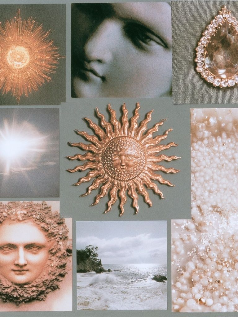
Start with two or three recurring subjects and repeat them across the room. Good combinations include moon phases with abstract night skies, constellations with vintage astronomical details, or a single dramatic cosmic print supported by quieter textures. Too many symbols at once — sun faces, rockets, planets, zodiac icons, and astrology text — can make the wall feel busy fast.
If you prefer a more refined take, mix one representational piece with one abstract or minimal work. Our Space collection is a strong starting point for night-sky themes, while abstract art prints help soften the look with movement and texture.

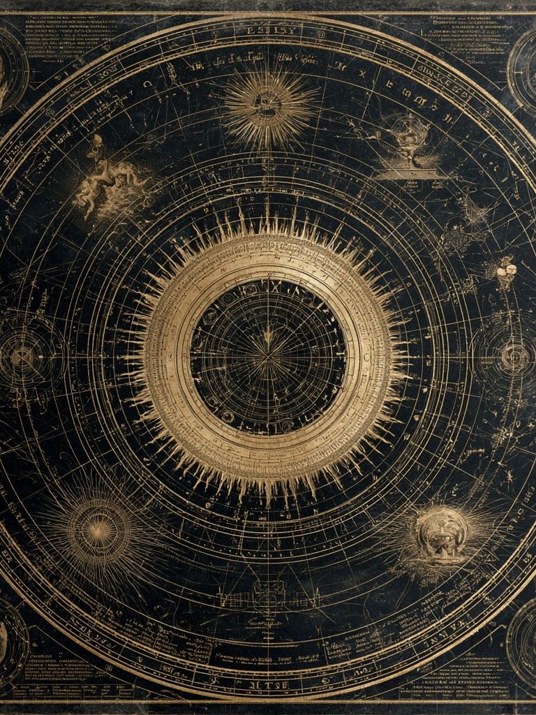
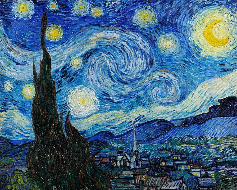
A solar-system piece works best when the rest of the wall stays restrained. Pair it with plain bedding, a simple side table, or a narrow brass lamp so the artwork reads as intentional rather than novelty decor. For a slightly more atmospheric approach, Starry Night — Fine Art Print brings blue movement and warm highlights that fit the palette naturally.

Build the Colour Palette Around Deep Blue and Warm Gold
The easiest way to build this scheme is to choose one dominant blue and one gold finish, then repeat them at least three times each. Midnight blue, inky navy, and muted indigo all work well. For gold, brushed brass and antique gold look more expensive than bright yellow metallics because they reflect light softly rather than sharply.
Keep your supporting shades quiet. Soft ivory, oat, mushroom, charcoal, and dusty grey-blue all help the main colours stand out. If your walls are dark blue, use lighter textiles to avoid visual weight piling up at eye level. If the room is already light, bring blue in through artwork, cushions, or a bench so the palette still has depth.

For a softer version of the palette, bring in sea-glass teal or desaturated blue-greens through Yin Yang Teal Abstract Poster or similar pieces from our Minimalist collection. That shift keeps the scheme airy while still feeling celestial.
Frame and Finish Ideas That Elevate the Theme
Frames matter more than people expect. A thin gold frame gives celestial art a polished, gallery-like edge, especially on cream or white walls. On dark blue walls, black or dark walnut frames create stronger contrast and prevent the metallic accents from taking over. If you are hanging multiple pieces, keep all frames in one finish for a cleaner result.
Paper and print finish affect mood too. Matte surfaces tend to suit cosmic themes better than glossy ones because they deepen darker blues and reduce glare under lamps. Textured pieces — especially abstract skies or wave-like forms — also add richness that supports the night-sky palette without adding more colour.

This kind of texture-driven print is useful when your main celestial piece is detailed. It gives the eye a resting point and helps a gallery wall feel collected instead of repetitive. If you like cleaner layouts, explore Textured White Abstract Poster alongside darker cosmic works for contrast.

Where to Style It: Bedroom, Living Room, or Hallway
In a bedroom, the best placement is usually above the bed, centered and scaled to roughly 60% to 75% of the headboard width. A pair of 50x70 cm prints works well over a double or queen bed, while one 70x100 cm focal piece can suit a smaller room where you want a calmer composition. Bedrooms benefit most from softer celestial imagery — stars, moons, watercolor skies, or abstract cosmic movement.
In a living room, go larger and more structured. Above a sofa, aim for artwork that spans about two-thirds of the sofa width. This is where vintage astronomical pieces or dramatic deep-blue paintings hold up well because the room can carry more visual energy. A hallway, by contrast, works better with vertical pieces or a tidy row of smaller frames spaced 5 to 8 cm apart.

For a statement piece in a living area, Celestial Globe — Vintage Print or Celestial Sun Face Vintage Print can introduce old-world character. If your room is more contemporary, a cleaner option from our space wall art selection will feel sharper.
Layer in Lighting, Textiles, and Decor
Lighting should be warm, not stark. Aim for bulbs around 2700K to 3000K so gold accents read rich and blue tones stay deep rather than cold. One table lamp, one floor lamp, and one reflective surface — such as a brass tray, mirror, or glass vase — are often enough to support the artwork without competing with it.
Textiles should echo the palette in texture first, colour second. Velvet cushions in navy, a cream bouclé throw, gauzy curtains, or a quilted bedspread all help create that nocturnal softness. Avoid too many literal motifs like star-shaped cushions or moon garlands unless the room is for a child or teen — adults spaces usually look more elevated when the celestial theme is implied through colour, shine, and art.

This type of vintage celestial piece pairs well with brass lamps, smoked glass, dark-stained wood, and marble accessories. If you want more pattern, use one controlled element — for example Moroccan Mosaic Pattern Poster — in a nearby nook rather than mixing several decorative prints on the same wall.
Shop the Look: Simple Styling Rules to Keep It Elegant
Limit your wall display to one focal piece plus two to four supporting works. If every print is equally bold, the arrangement loses hierarchy. A good formula is 1 hero artwork, 2 medium companions, and 1 soft abstract piece that acts as visual breathing room. That approach makes the blue and gold celestial aesthetic feel edited and expensive.
Spacing is just as important as the art itself. Leave 5 to 7 cm between smaller frames in a grid, or 7 to 10 cm in a looser salon arrangement. Hang the center of the composition at roughly 145 cm from the floor in living spaces, adjusting slightly lower in bedrooms where furniture sits closer to the wall.
If you are mixing styles, connect them through at least one repeated detail — deep blue, a gold frame, circular forms, or antique astronomy references. A room feels complete when the palette repeats across wall art, lighting, and textiles, not when every piece matches exactly. Browse our Fine Art collection for painterly blue depth and our abstract wall art range for the softer layers that keep celestial styling modern.
Final thoughts
A polished blue and gold celestial aesthetic relies on restraint. Choose a deep blue foundation, add warm metallic highlights in small doses, and let your wall art carry the theme with intention. The result should feel calm, expansive, and slightly luminous — more night sky than novelty.
When in doubt, simplify. One strong celestial print, one textured abstract, and one consistent frame finish will take you further than a crowded wall ever will.
Frequently Asked Questions
What frame size works best for celestial art above a bed?
For most queen beds, two 50x70 cm frames or one 70x100 cm piece look balanced. Keep the total arrangement width between 60% and 75% of the headboard.
Should I choose bright gold or muted brass accents?
Muted brass or antique gold is usually easier to style. It reflects warm light softly and looks more refined next to navy, cream, and walnut tones.
Can I use this style in a small room?
Yes — use one dark blue element, light bedding or upholstery, and no more than two or three artworks. Mirrors and warm lighting help the room stay open.
What colours pair well with a blue and gold celestial scheme besides cream?
Try mushroom, soft grey, charcoal, dusty teal, or muted taupe. These shades support the palette without pulling attention away from the artwork.
How do I stop celestial decor from looking too themed?
Use abstract or vintage-inspired art instead of repeating obvious moon-and-star motifs everywhere. Keep decorative accessories simple and let colour do most of the work.