Black marble gold veins art has a rare balance: it feels bold from across the room, yet detailed up close. The black base adds weight and depth, while the gold veining introduces movement that reads like hand-drawn lines or liquid metal. That contrast is what makes it so effective in interiors that need one strong focal point rather than several small decorative accents.
It also works across styles more easily than many people expect. In a sleek apartment, black and gold looks crisp and architectural. In a softer room, it adds polish against boucle, linen, oak, or brushed brass. If you already gravitate toward our abstract collection, a marble-inspired piece sits naturally beside fluid shapes and tonal textures without feeling too busy.
Why Black Marble and Gold Veins Feel So Elevated
Luxury interiors usually rely on three visual cues: contrast, restraint, and texture. Black marble gold veins combines all three in one composition. The dark ground creates immediate contrast against white, taupe, or warm grey walls, and the fine gold lines keep the artwork from looking flat. Even in a simple 50 x 70 cm frame, the effect is high-impact because the pattern suggests depth and shine.
The second reason this look feels expensive is that it references real materials people already associate with premium spaces — marble, brass, lacquer, and stone. You see the same language in hotel lobbies, boutique dressing rooms, and high-end bathrooms. If you want a similar mood in a home setting, pair marble-style wall art with pieces from our minimalist wall art range so the room keeps that edited, intentional look rather than turning overly decorative.

Gold-dominant art can sometimes feel flashy, but marble-inspired artwork stays grounded because the veining is irregular. That randomness matters. Straight metallic lines feel graphic; organic veins feel natural and layered. If you like artwork with movement but want something calmer than a saturated colour piece, Textured Waves — Abstract Print or marble-inspired black-and-gold visuals strike a similar balance.
Where This Look Works Best at Home
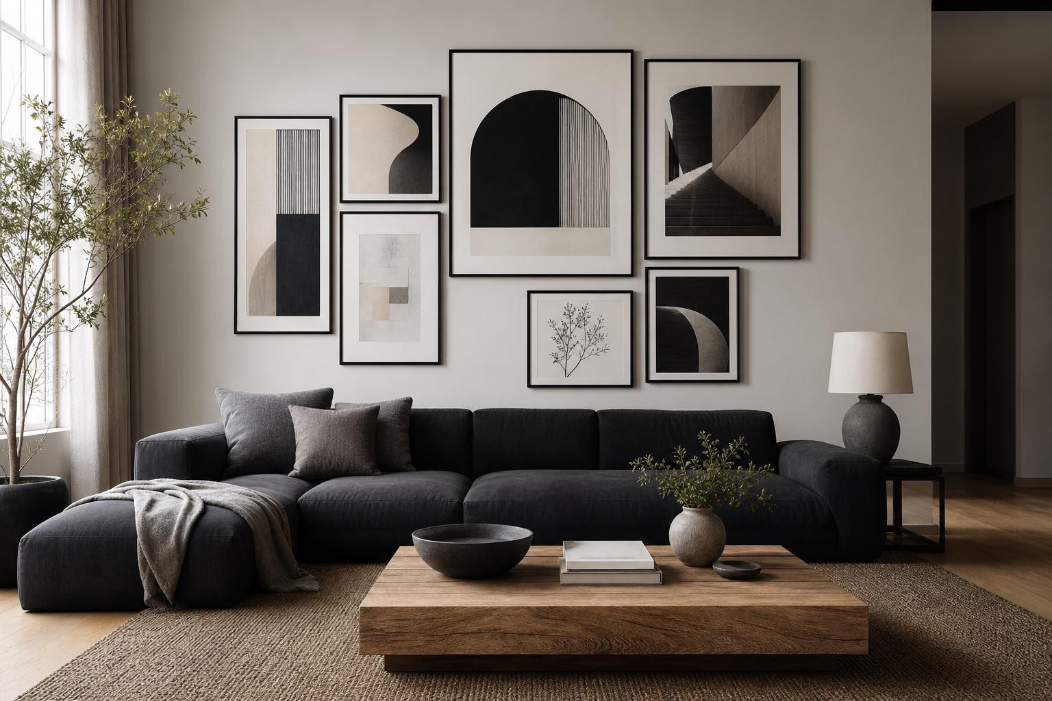
In living rooms, this style works best above a sofa, sideboard, or fireplace where it can anchor the room. A width that covers roughly 60 to 75 percent of the furniture below it usually looks right. Over a 200 cm sofa, that means a single large piece around 120 to 150 cm wide, or a pair of 50 x 70 cm prints with 7 to 10 cm spacing between them.

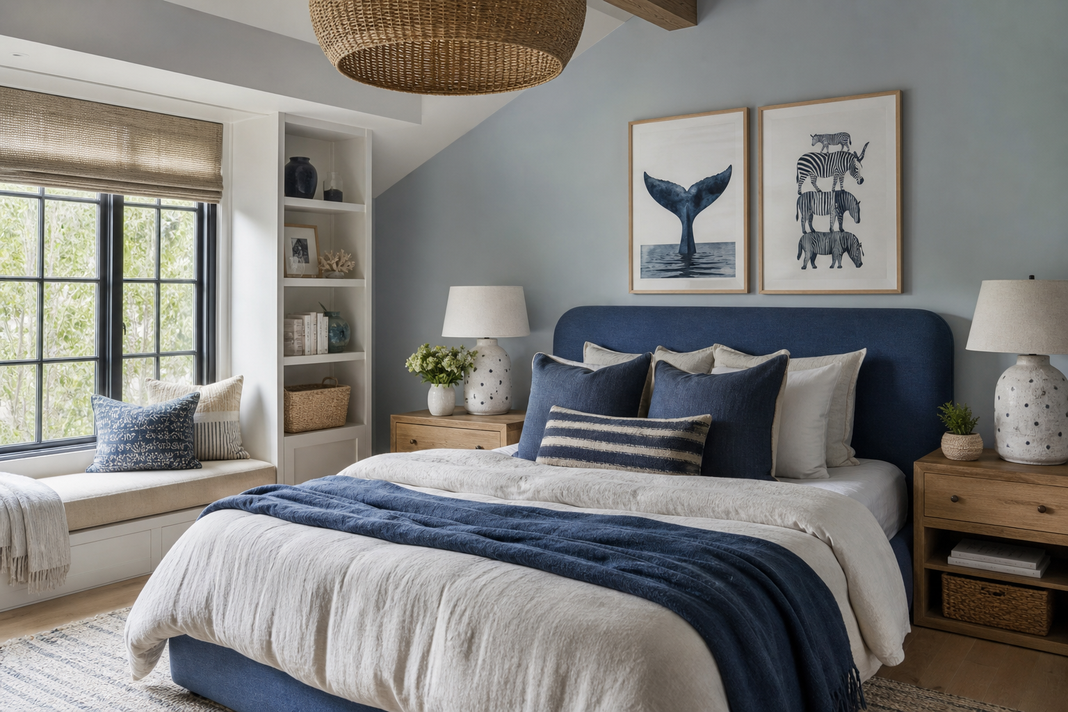
Bedrooms benefit from the softer side of this look. Above a bed, black marble gold veins can add drama without introducing loud colour. Keep bedding in off-white, stone, or muted olive so the artwork stays central. A narrow black frame looks sharper in modern bedrooms, while a thin brass frame softens the contrast and picks up warm bedside lighting.
Home offices and entryways are especially good placements if the rest of the decor is simple. In a compact office, one 40 x 50 cm or 50 x 70 cm print behind a desk adds structure without crowding shelves. In an entry, a vertical format helps draw the eye upward and makes a narrow wall feel more deliberate. For rooms that already mix stone and monochrome details, Zen Garden Stones — Fine Art Print can also work as a complementary piece with a similarly tactile, grounded mood.
Choosing the Right Size and Format
The most common mistake with statement art is going too small. If the wall space above your furniture is 180 cm wide and you hang a single 30 x 40 cm print, it will read as an accessory, not a focal point. For black marble gold veins artwork to deliver that luxe effect, use at least 50 x 70 cm in medium rooms and 70 x 100 cm when the wall is open and uncluttered.
Vertical formats suit entryways, desks, and bedside walls because they occupy less width while still feeling substantial. Horizontal pieces make more sense above sofas and sideboards, especially if the furniture line is long and low. Diptychs are another strong option — two matching or related pieces create rhythm while keeping the palette restrained.
A good visual rule is this: leave 15 to 25 cm between the top of your furniture and the bottom of the frame, and aim for the art grouping to cover around two-thirds of the furniture width. If you want to mix the marble look with softer neutrals, pieces from White Cream Texture Poster or the broader fine art collection help bridge the gap between dark statement art and lighter room palettes.



Frames and Finishes That Match the Look
Frame choice changes the character of marble-inspired art more than most people expect. A matte black frame creates a crisp outline and gives the piece a gallery-style presence. This is the best option if your room already includes black table legs, dark metal lighting, or slim window frames. It keeps the effect clean and contemporary.
Brass or muted gold frames push the look in a warmer, more decorative direction. They work particularly well when the room has brushed metal finishes rather than polished chrome. The key is restraint — use a slim profile, usually 1 to 2 cm wide, so the frame supports the art instead of competing with the gold veining inside it.

Finish matters too. Matte prints tend to look more refined and reduce glare, especially in rooms with large windows or ceiling spotlights. Gloss can enhance contrast, but it also reflects more light and can make dark artwork harder to see from certain angles. If your room gets direct sun for part of the day, matte is usually the safer choice. For a sharper monochrome pairing, Torn Paper Black and White Poster is a useful reference point.
How to Build a Colour Palette Around It
The easiest palette starts with four elements: black, warm white, metallic gold, and one grounding neutral such as taupe, mushroom, or walnut brown. That combination gives enough contrast to feel dramatic, but not so much that the room becomes harsh. In practice, that might mean ivory upholstery, black side tables, a walnut console, and one brass lamp.
Texture is just as important as colour. Black marble gold veins looks strongest when the surrounding materials are tactile rather than shiny — boucle, linen, limewash, ribbed glass, travertine, dark oak. Too many glossy surfaces can make the room feel cold. If you want a lighter companion piece, Elegant White Fabric — Minimalist Print adds softness without breaking the palette.
Avoid adding too many competing accent colours. Emerald, burgundy, and deep navy can work, but use them sparingly — one chair, one vase, or a cushion group is enough. If you prefer a more restrained scheme, stick to black, cream, caramel, and brass. That palette gives the artwork room to lead.

Styling Ideas for a Gallery Wall or Solo Piece
A single oversized print is the cleanest way to use this look. It suits rooms where you want the wall art to act almost like an architectural finish. Over a console in an entryway or dining space, one large frame with black marble gold veins can replace the need for mirrors, shelves, or extra decor entirely.
For gallery walls, keep the mix tight. The strongest arrangement usually combines one dark anchor piece with three or four lighter works in black, ivory, grey, or muted gold. Think of contrast in weights: one bold marble-style artwork, one textural neutral print, one smoky abstract, and one minimal line-based piece. That gives enough variation without losing cohesion. Browsing Abstract Smoke Patterns Poster and related pieces in our abstract wall art edit can help you build that layered effect.

Spacing should stay consistent — usually 5 to 8 cm between frames in a tight arrangement. If you mix frame finishes, repeat each finish at least twice so the wall looks intentional. If not, keep all frames black or all frames brass. A monochrome companion such as Textured Concrete Wall — Minimalist Print works especially well when you want the marble piece to remain the visual lead.

Final Styling Tips for a Polished Finish
Lighting is the finishing layer. Wall art with dark backgrounds can disappear in shadow, so place it where it gets indirect natural light or add a picture light, wall sconce, or floor lamp nearby. Warm bulbs around 2700K to 3000K tend to flatter black-and-gold artwork better than cooler white lighting.
Before you hang, test the size with painter's tape on the wall. Mark the full outer dimensions, then step back 2 to 3 metres. If it looks smaller than you expected, it is. Statement art nearly always benefits from sizing up once.
If your room already contains patterned stone, veined countertops, or strong metallic finishes, choose simpler supporting art and quieter textiles. If the room is plain, black marble gold veins can do more of the visual work on its own. The goal is not to match every finish exactly — it is to echo the room's strongest lines, materials, and tones so the wall feels composed rather than crowded.
Frequently Asked Questions
What wall colour works best with black marble and gold artwork?
Soft white, warm greige, pale taupe, and charcoal all work well. Pure bright white creates the sharpest contrast, while warmer neutrals make the look feel more residential and less stark.
Can I use this style in a small room?
Yes — one medium-to-large piece often works better than several small ones. In a small room, keep surrounding decor simple so the artwork feels intentional instead of heavy.
Should I choose black or gold hardware when hanging it?
Match the dominant metal finish already in the room. If your lamps, handles, or table bases are mostly brass, gold-toned hardware will look more integrated.
What materials pair best with this look besides metal?
Walnut, dark oak, linen, boucle, travertine, smoked glass, and matte ceramics are strong matches. They add softness and texture without competing with the artwork.
How high should I hang a black marble-style print?
As a guide, place the centre of the artwork around 145 to 150 cm from the floor in open wall areas. Above furniture, keep the bottom edge 15 to 25 cm above the top surface.