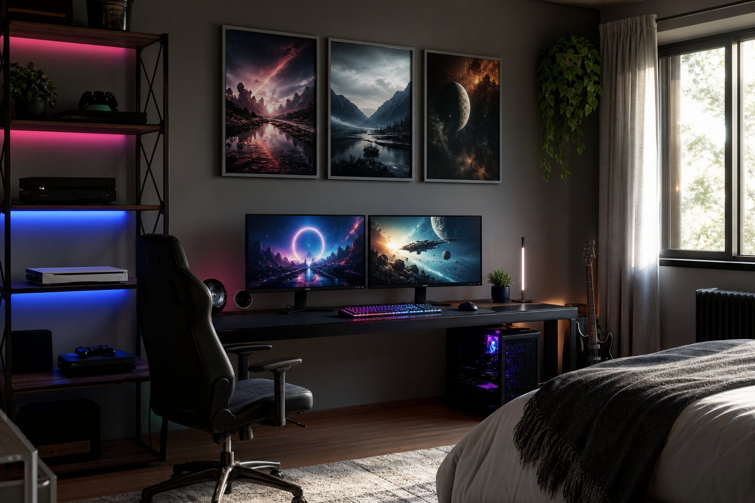
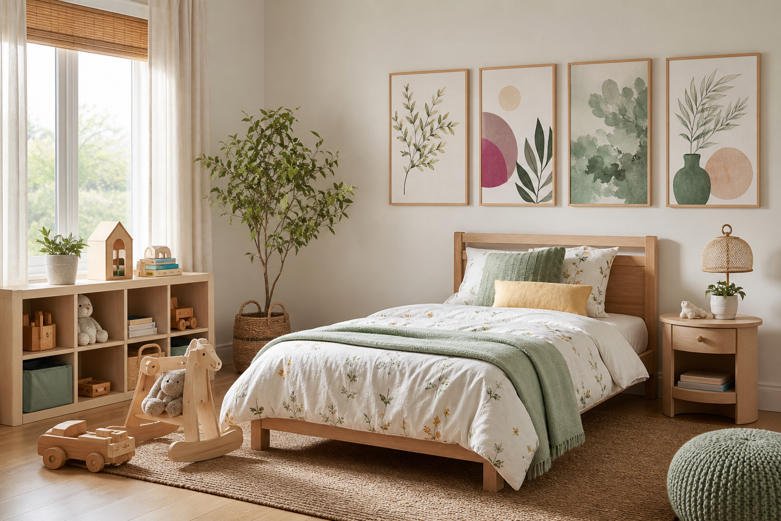
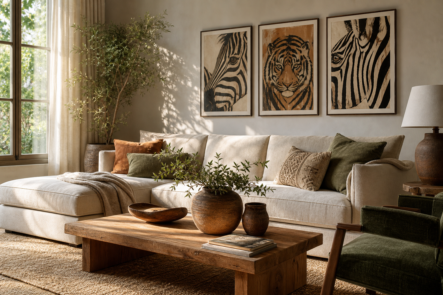
Big tail posters work because they imply motion before you even register the animal. A raised whale tail, a zebra body turning away, or a curved tail shape crossing negative space gives the eye a clear path to follow. That movement makes the wall feel less static, especially in rooms that rely on simple furniture and limited color.
Why Big Tail Art Works
Oversized tails also create balance. In visual terms, a tail acts like a counterweight — it stretches the composition horizontally or diagonally, which helps a print feel dynamic instead of centered and stiff. That is why big tail posters often look stronger than straightforward animal portraits in the same size.
The subject also brings personality without becoming childish. A tail can feel playful, but the effect depends on treatment. A dramatic ocean photograph from our nature art collection reads calm and sculptural, while a striped animal print from our animal wall art range feels graphic and energetic. If you want character on the wall without heavy detail, tail-led compositions are a smart middle ground.
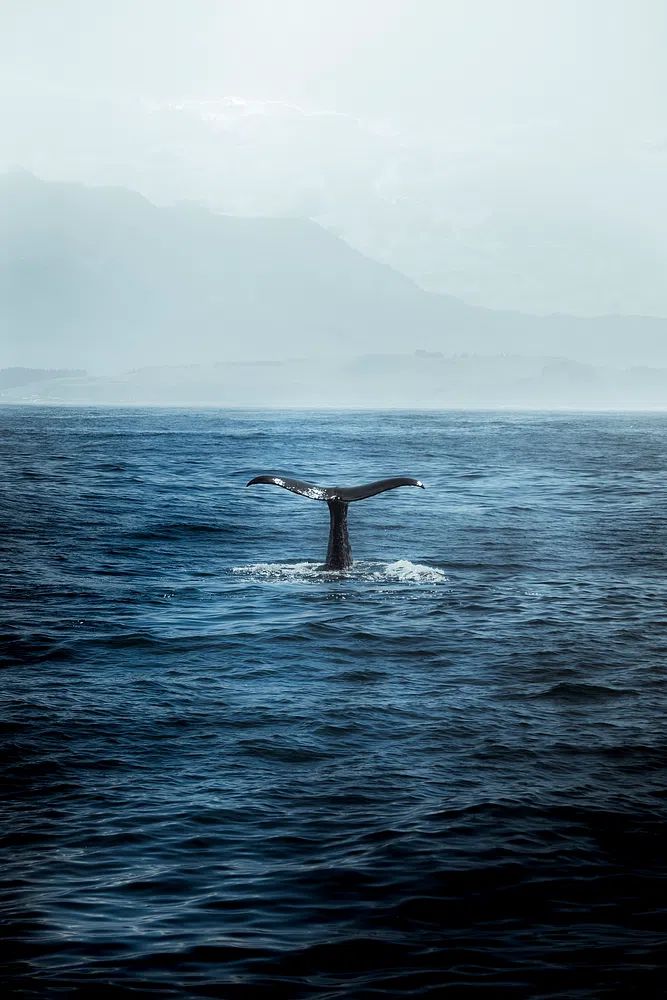
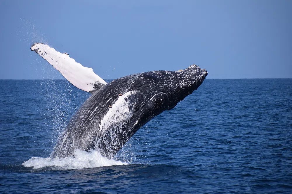
"Whale Tail in Ocean" is a good example of how one bold shape can carry an entire room. The dark tail against open water gives you contrast, movement, and a clean silhouette, which works particularly well in bedrooms, hallways, and quiet home offices.
Best Rooms for Big Tail Posters
Bedrooms suit big tail posters because the imagery adds motion while the room itself stays restful. Above a 140-160 cm bed, a single 50x70 cm or 70x100 cm print with a clear tail silhouette gives the wall a focal point without crowding the headboard. Ocean scenes and softer wildlife illustrations tend to work best here because they keep the mood calm.

Kids' rooms and play corners can carry more humor and brighter color. Tail-focused animal art helps children read movement quickly, so the pictures feel lively even from across the room. A print like Curious Zebra — Cartoon Print adds that energy in a friendly way, and it pairs naturally with pieces from our kids wall art collection when you want a room to feel cheerful rather than theme-heavy.
Hallways are another strong option because people experience them in motion. A turning zebra, breaching whale, or sweeping tail shape reinforces that sense of movement. In narrow spaces, choose vertical formats around 30x40 cm or 50x70 cm so the artwork elongates the wall instead of making it feel boxed in.
Creative corners — a reading chair, compact desk, or shelf wall — benefit from prints with a stronger outline. Here, the art does more visual work because the footprint is small. A striped subject such as Zebra Stripes Abstract Print can sharpen a quiet corner in seconds.
Choosing the Right Size and Scale
A good rule is to make the artwork 60-75% of the width of the furniture beneath it. Over a 150 cm console, aim for total art width between 90 and 112 cm. That could be one 70x100 cm statement piece or two 50x70 cm prints with 7-10 cm spacing.
Big tail posters need enough breathing room for the tail shape to read clearly. If the composition is cropped too tightly by surrounding shelves, lamps, or molding, the energy disappears. Leave at least 15-20 cm between the frame edge and nearby objects so the silhouette stays legible.
If you are working with a small wall, choose artwork with a simple background. Detailed scenes shrink badly, while one bold tail or striped body stays readable at 30x40 cm. If your wall is large and plain, scale up fast — 70x100 cm often looks more intentional than two undersized prints floating too high.
Colors, Styles, and Mood
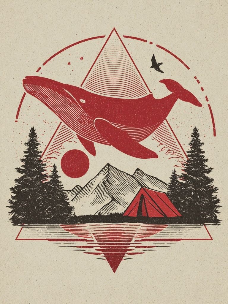
Color changes the mood more than the animal itself. Blue, grey, and sea-green tail imagery feels grounded and spacious, which is why whale compositions fit coastal, Scandinavian, and pared-back interiors so well. For that direction, Whale and Mountains — Vintage Print offers a softer, more illustrative take than photography.
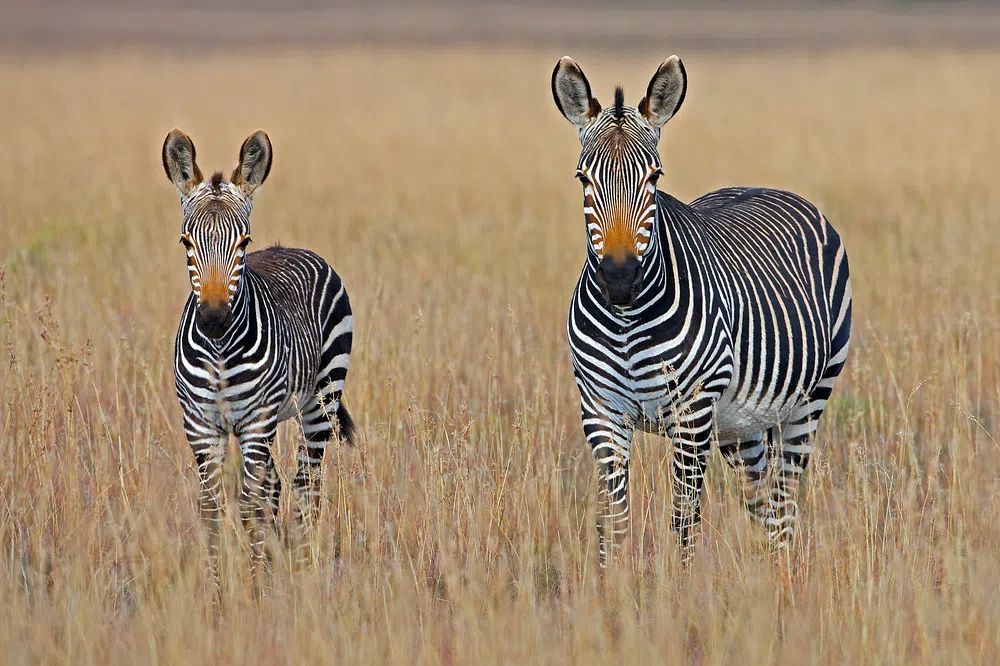
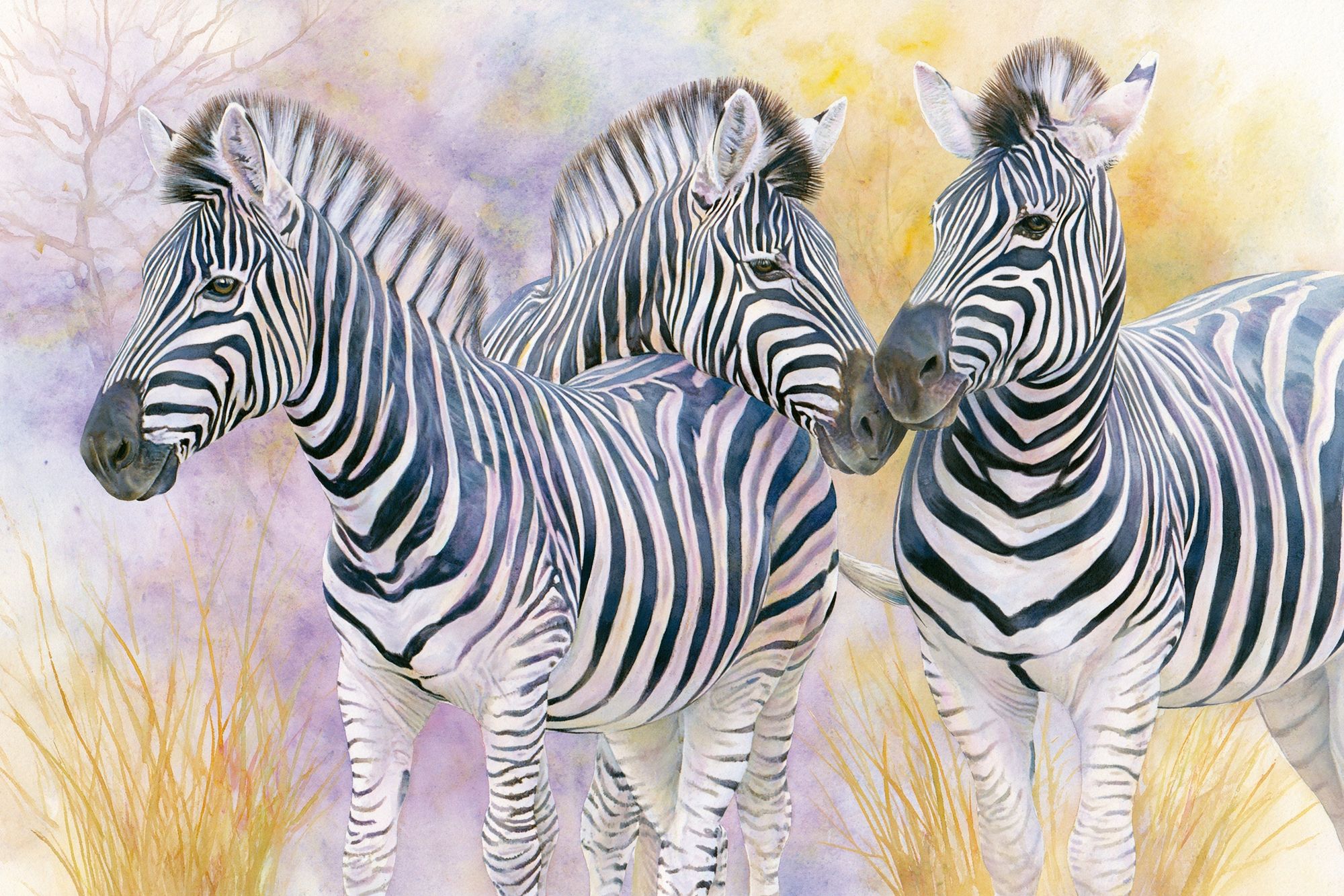
Striped black-and-white subjects create a more graphic effect. Zebra-based big tail posters work especially well in rooms with black accents, walnut wood, or off-white walls because the contrast feels crisp rather than busy. The clean patterning in Zebras in Love — Black-White Print suits modern interiors where you want animal art to feel grown-up.
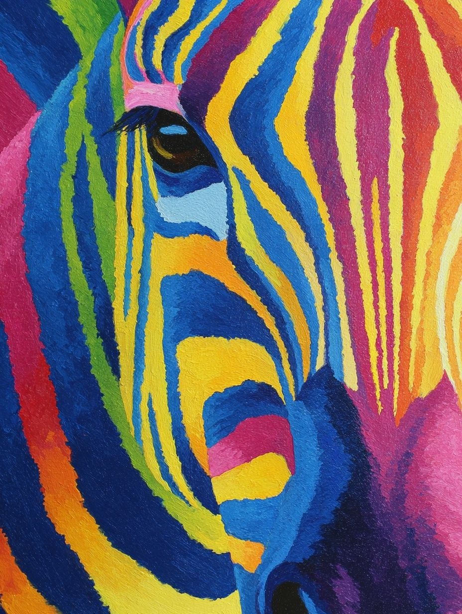
If you want more energy, bright illustration or painterly color blocks can carry the room. "Colorful Zebra Portrait" works best when at least one of its accent tones — such as rust, blue, or pink — is repeated somewhere nearby in a cushion, throw, or rug. Repeat one or two colors, not five, and the wall will feel edited.

Framing and Placement Tips
Frame finish matters because tail-led artwork often relies on silhouette and contrast. Black metal or black wood frames sharpen striped or photographic animal pieces. Oak and light ash soften illustrated works and suit children's spaces, especially when paired with cream mounts.
Hang the center of the artwork around 145 cm from the floor as a starting point. Above beds, sofas, or desks, keep the bottom of the frame 15-25 cm above the furniture. That distance is close enough to feel connected, but far enough to keep the composition open.
If the image is visually heavy on one side — common with tails sweeping upward or outward — correct the balance with nearby decor. A table lamp, tall branch arrangement, or stacked books on the lighter side of the furniture helps the whole setup feel stable.

How to Build a Playful Animal Wall
A playful animal wall works best when one print leads and the others support. Start with one large anchor — usually 70x100 cm — then add two or three smaller pieces in 30x40 cm or 50x70 cm sizes. The anchor should carry the boldest tail or strongest movement.
Mix subjects by rhythm, not by species. A whale tail, a zebra turn, and a forest animal can work together if they share one of three things: palette, line quality, or negative space. Pull from our illustration collection if you want softer drawn pieces, or from our animal print selection if you want stronger realism.
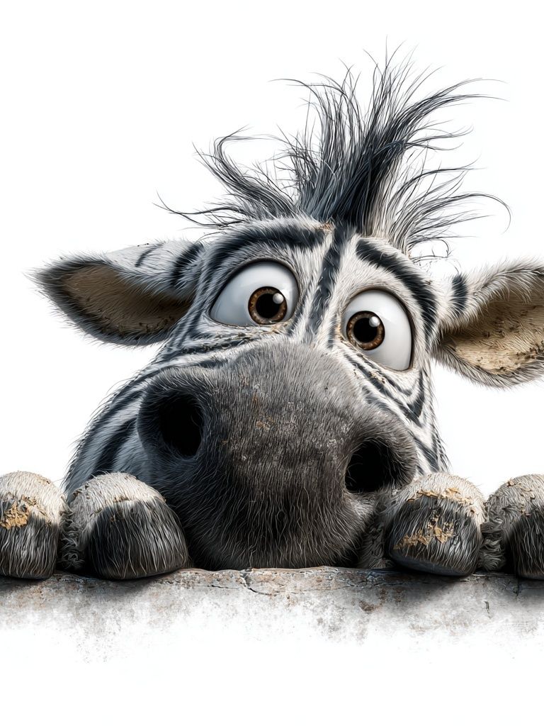
For family spaces, combine one playful kids' print with one or two calmer companions so the arrangement has range. "Curious Zebra" is especially useful in nurseries, reading nooks, and shared bedrooms because its expression is light, while the tail and stripes still give the wall structure.
You can also build a more mature gallery around monochrome wildlife. For example, a zebra-based print pairs well with muted landscapes from our fine art collection or atmospheric scenes from Wolf in the Forest — Nature Print when you want the animal theme to feel subtle.
Shop Tips for a Better Finish
Print clarity matters more with big tail posters than with highly detailed scenes because the silhouette has to look crisp from a distance. Check that dark edges look clean, stripes remain sharp, and large color fields do not band. On a 50x70 cm or 70x100 cm print, weak contrast is easy to spot from 2-3 meters away.
Paper choice affects the finish as much as the image. Matte stock usually suits animal artwork better than glossy surfaces because it reduces glare and keeps black tones looking deeper under everyday room lighting. If the room gets strong direct sun, UV-protective glazing is worth considering to preserve both dark neutrals and bright illustrated colors.
Choose a design you can live with for at least a few seasons. The safest route is to match the artwork to the room's existing 2-3 dominant tones, then let the animal subject provide the fun. That balance is what keeps big tail posters playful without feeling temporary.
Final thoughts
Big tail posters succeed because they add movement, shape, and personality in one clean gesture. Whether you prefer a calm whale silhouette, a graphic zebra turn, or a playful kids' illustration, the best result comes from getting three things right: scale, breathing room, and a frame finish that supports the artwork.
If you want the wall to feel polished, start with one strong piece and build around it slowly. The subject already has energy — your job is simply to give it enough space to work.
Frequently Asked Questions
What frame color works best with big tail posters?
Black frames suit high-contrast zebra and wildlife photography, while oak or ash softens illustrated animal prints. If your room already has black lighting or hardware, black is the easiest match.
Can I use big tail posters in a small room?
Yes — choose a simple composition in 30x40 cm or 50x70 cm so the tail shape stays clear. Avoid busy multi-subject scenes on short walls.
Do whale tail prints work outside coastal interiors?
They do. Whale imagery also fits minimalist, Scandinavian, and nature-led spaces because the shape is graphic and the palette is usually restrained.
Should I use glass or acrylic glazing?
Acrylic is lighter and safer for kids' rooms or large frames, while glass offers a slightly crisper surface. In bright rooms, pick anti-glare or UV-protective glazing if possible.
What can I pair with a zebra print to avoid an overly themed room?
Combine it with abstract line work, muted landscapes, or simple black-and-white pieces. Keep the connection in color or contrast, not in matching animal subjects.