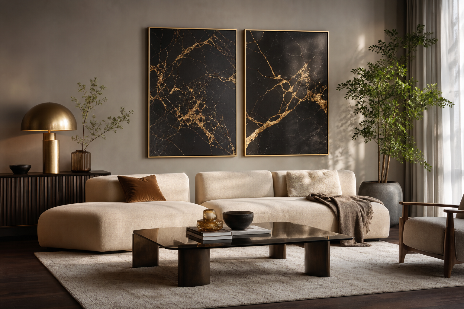
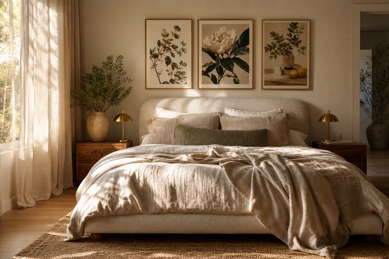
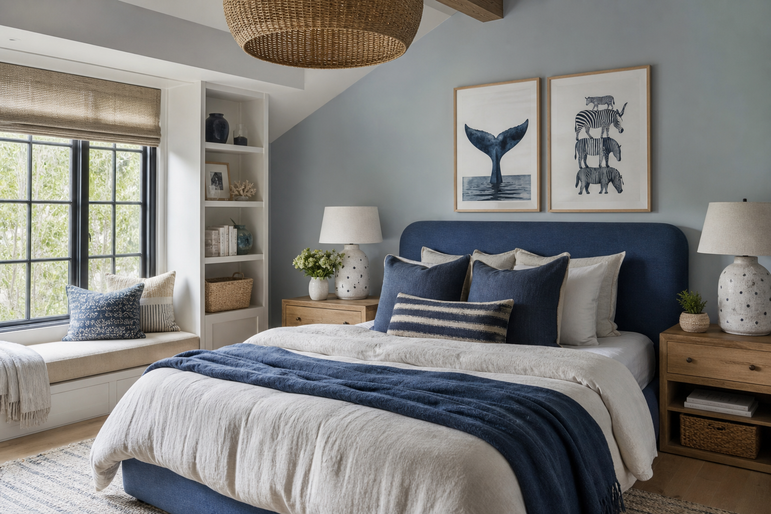
A blue rat print does something most wall art cannot: it makes a room feel considered and slightly subversive at the same time. The subject is familiar, the colour is unexpected, and that contrast gives the piece real presence. In interiors that already lean clean or neutral, a blue rat becomes the detail that breaks the formula without creating clutter.
The appeal is partly visual and partly psychological. Blue reads calm, intelligent, and slightly cool; a rat reads clever, urban, and mischievous. Put them together and you get wall art that feels witty rather than childish. That is why blue rat art works especially well next to refined finishes such as oak, black metal, off-white paint, and smoke-grey textiles.
Why Blue Rat Art Works So Well
Unusual animal art tends to succeed when it balances novelty with restraint. A blue rat image has enough personality to start a conversation, but it does not need loud patterns or oversized typography to do it. In practical terms, that makes it easier to live with than trend-led novelty art that can feel tired after six months.
A second reason is contrast. Most animal wall decor falls into one of three lanes: realistic wildlife, cute nursery imagery, or humorous caricature. A blue rat sits outside those defaults. It can lean graphic, surreal, urban, or painterly depending on the treatment, which gives you more freedom when pairing it with pieces from our animal wall art collection or more stylised work from our illustration prints.
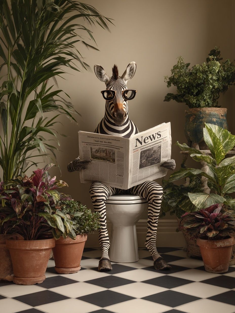
If you want that same clever-animal energy in a more openly comic direction, this print shows how character-driven subject matter can still look sharp on a wall:
Choosing the Right Style
Style changes the entire mood of a blue rat piece. An illustrated version with simplified lines and flat colour feels playful and modern — ideal for a studio, hallway, or desk wall. A surreal version with dramatic shadows or unexpected settings feels more grown-up and gallery-like, especially in rooms with darker paint colours. A vintage-inspired treatment can soften the subject, making it feel more like a collected curiosity than a joke.
Minimalist blue rat artwork works best when the composition is stripped back to one subject, one ground colour, and plenty of negative space. In a frame measuring 30x40 cm or 50x70 cm, that kind of layout feels deliberate and contemporary. If the rat is rendered with finer detail, richer blues, or layered textures, larger sizes such as 70x100 cm usually give the image enough room to breathe.

When you are choosing companion pieces, focus on mood rather than literal matching. A blue rat artwork can sit comfortably with clever, slightly offbeat subjects, graphic line work, or rich colour studies. That is why pieces from our funny print selection or bolder works in our abstract art range often pair better than conventional wildlife photography.
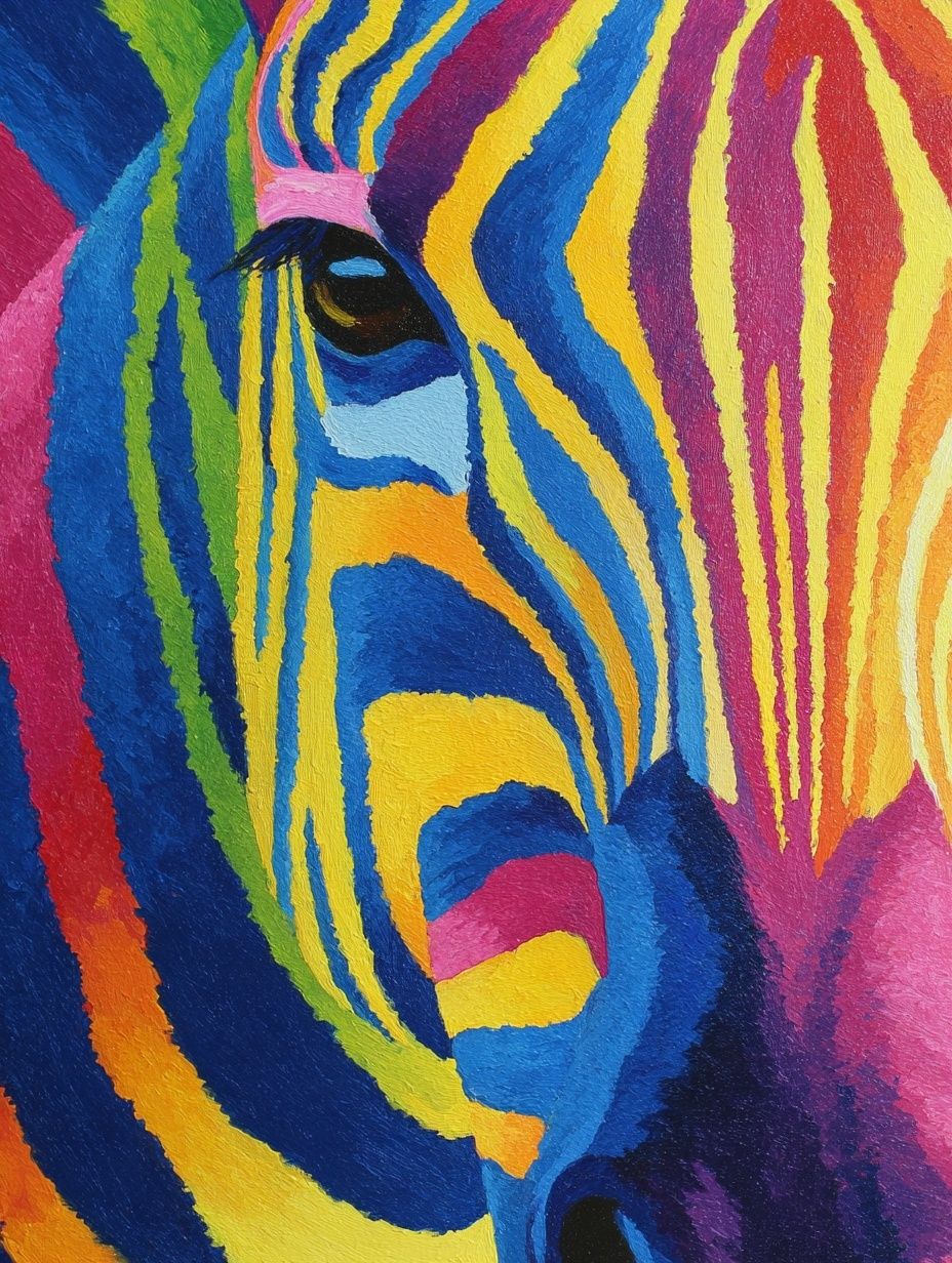
This is a strong example of colour-led graphic styling that can support the same room mood as blue rat wall art:
Best Rooms for a Blue Rat Print
A home office is the easiest place to start. Desks, shelving, and task lighting already create a more edited, personal zone, so a blue rat print feels intentional there. Hang one 15 to 20 cm above the desk, or offset it with a narrow shelf and a small object in cobalt glass to repeat the colour.
Hallways are another smart location because they benefit from art with immediate character. In a corridor that is only 90 to 120 cm wide, one vertical 30x40 cm or 50x70 cm piece can make more impact than a busy cluster. A blue rat image gives guests something memorable the moment they enter, especially against pale stone, white, or greige walls.
Eclectic living rooms also suit this subject, particularly when the rest of the space is restrained. If your sofa is oatmeal, charcoal, or olive, a blue rat print can become the one crisp note that lifts the whole palette. For living rooms, centre the frame at around 145 cm from the floor, or keep the bottom edge 20 to 25 cm above a console or sideboard.

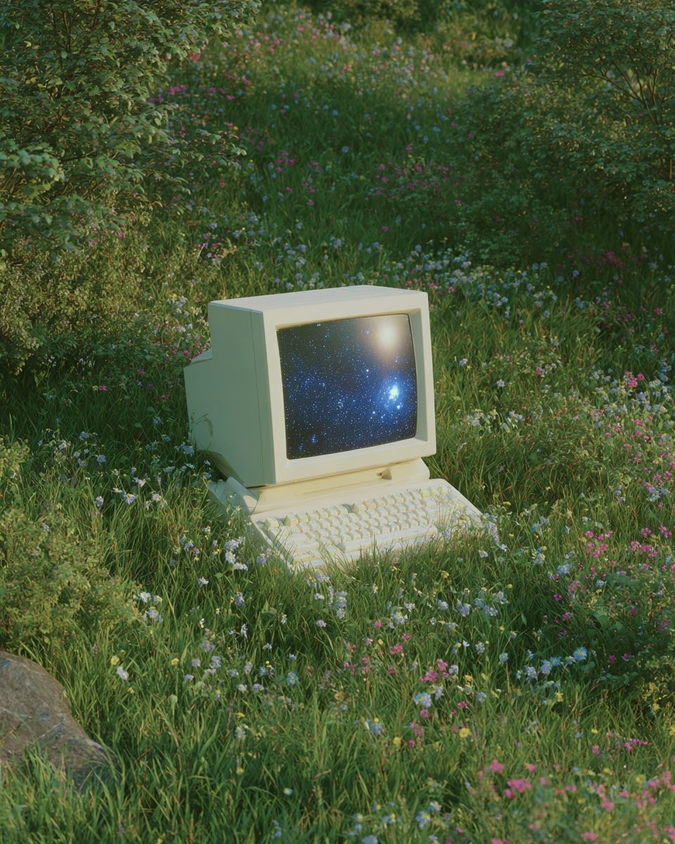
For a more imaginative setup, combine your main piece with adjacent prints that echo colour, wit, or urban energy rather than the same animal theme. The right mix often comes from crossing categories — for example, a playful animal print beside a more conceptual work from our fine art collection or a digital piece such as Vintage Computer in Nature.
Colours, Scale, and Framing
Blue rat art works best when the blue is repeated at least once elsewhere in the room. That repeat can be subtle: a cushion edge, a ceramic vase, a spine on a stack of books, or a rug line. You do not need a fully blue scheme. In fact, the strongest combinations usually rely on 10 to 20 percent blue within a mostly neutral room.
For paint pairings, try warm whites, clay neutrals, mushroom grey, deep forest green, or muted blush. Avoid matching the wall too closely to the print if the artwork is pale or powdery blue — you need enough contrast for the subject to read from 2 to 3 metres away. Dark navy walls can work too, but only if the artwork has lighter accents or a pale mount.
Frame choice matters more with a quirky subject. A thin black frame gives a blue rat print a graphic, contemporary edge. Natural oak makes it friendlier and slightly softer. White frames can work in bright Scandinavian-style rooms, but only when the artwork itself has enough tonal contrast. If the image is detailed, use a mount of 3 to 6 cm to keep it from feeling cramped.
A blue-forward abstract can help you test framing and palette relationships before building out a full arrangement:

How to Build a Gallery Wall Around It
Treat the blue rat as the anchor piece, not the filler. Start with the most characterful work first, then add three to five supporting prints around it. A reliable layout is one hero piece at 50x70 cm, two secondary works at 30x40 cm, and two smaller accents at 21x30 cm. Keep spacing between frames consistent — usually 6 to 8 cm is enough for a tight, curated look.
The best supporting themes are intelligent animals, expressive colour, surreal objects, or lightly humorous illustrations. That mix keeps the wall playful without becoming chaotic. If every piece is equally odd, the arrangement can feel random. Aim for one strong focal subject, two quieter connectors, and one or two colour bridges.
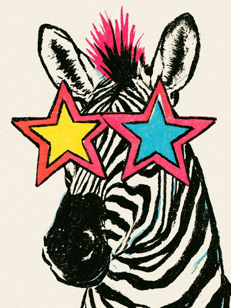
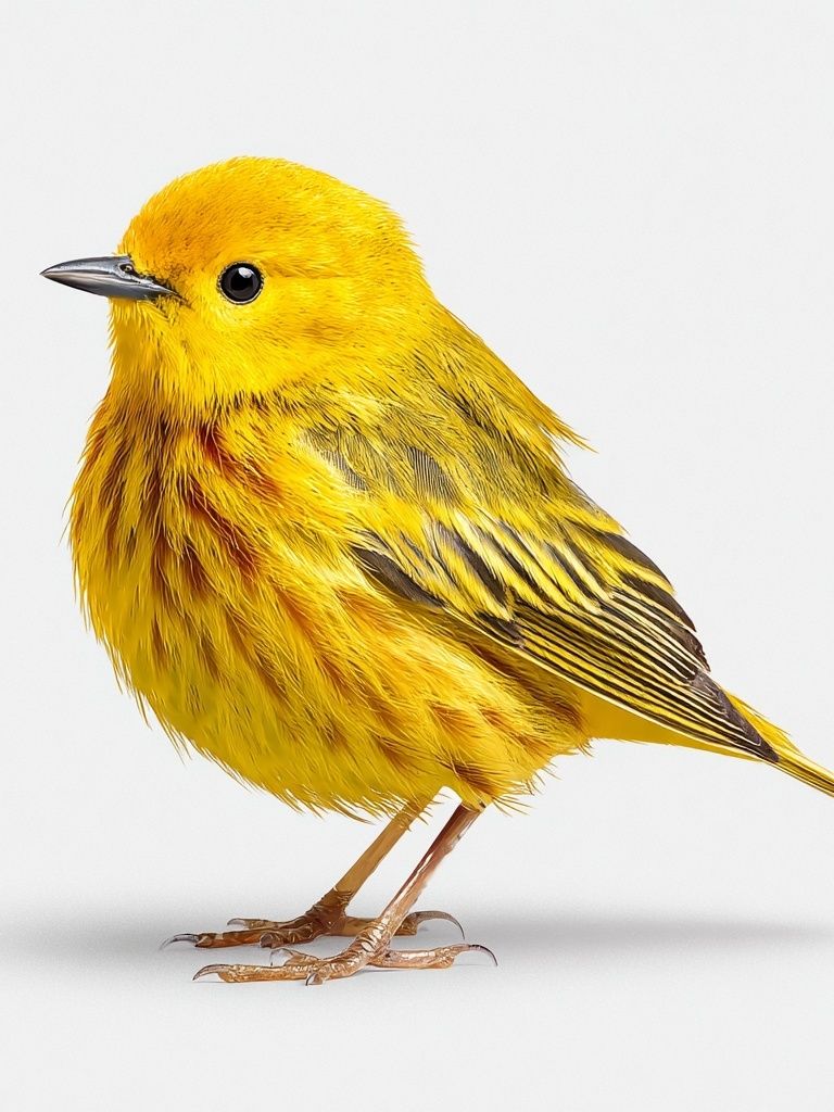
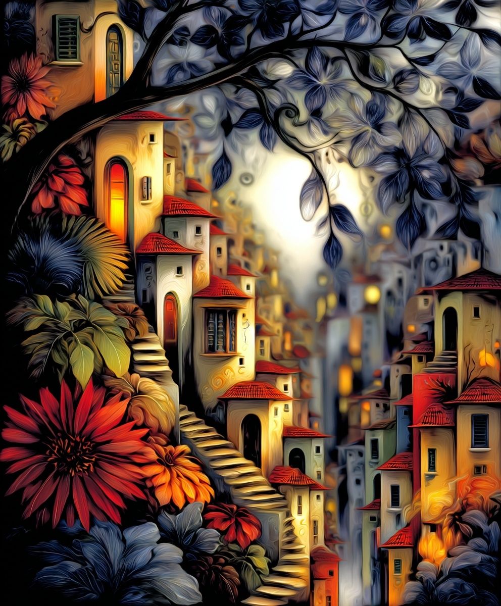

If you want the wall to feel more cohesive, repeat one of three elements across the set: frame finish, background tone, or dominant accent colour. Linking by just one of these is enough. You can explore smart pairings through our Zebra Pop Art and Yellow Bird illustration if you want neighbouring pieces that keep the tone lively without competing too hard.
Shop the Look: Tips for a Balanced Finish
When buying blue rat wall art, think about finish first, then size. Matte paper is usually the safer option for quirky illustrated subjects because it reduces glare and keeps the colours looking rich from different angles. In rooms with multiple light sources — ceiling spotlights, floor lamps, and windows — a low-glare finish will read more consistent throughout the day.
For a polished result, limit the number of strong colours around the art. A blue rat already carries a lot of personality, so the room does not need five competing accent tones. Keep the palette to blue, one grounding neutral, and one warm counterpoint such as rust, tan, or brass. That formula gives the display tension without visual noise.
If you are building a fuller scheme, use category links strategically: browse our kids art collection for softer illustrated line work, or return to our illustrated wall art for more graphic companions. The goal is not to make every piece match literally; it is to create a wall that feels edited, personal, and slightly unexpected.
Final thoughts
Blue rat wall art succeeds because it mixes oddity with control. The subject is playful, but the styling can be sharp, elegant, and highly intentional when you handle scale, colour, and framing well.
If you keep the surrounding room simple, repeat the blue once or twice, and let the blue rat act as the focal point, the final result feels confident rather than chaotic. That is the sweet spot — quirky enough to be memorable, polished enough to stay on your wall for years.
Frequently Asked Questions
What frame size should I choose for a small blue rat print?
If the print is A4 or 21x30 cm, add a mount and use a 30x40 cm frame. That extra border gives the artwork more presence and stops small subjects from looking lost on the wall.
Should blue rat wall art go behind glass?
Yes, especially in hallways, offices, and homes with pets or children. Acrylic glazing is lighter and safer than standard glass for larger frames.
What other colours pair well with blue rat artwork besides neutral tones?
Muted ochre, rust, forest green, and dusty pink all work well. Use just one of them as an accent so the artwork stays dominant.
Can I mix a blue rat print with vintage-style art?
Yes — it works particularly well if the vintage piece shares a subdued background or dark frame. Keep one common element, such as tone or frame finish, to make the pairing feel intentional.
How high should I hang a blue rat print in a hallway?
Place the centre of the frame at roughly 145 cm from the floor. In narrow hallways, that height keeps the work easy to view without feeling too low or crowded.