A blue blossom poster print brings together two qualities that are hard to get right at the same time: colour and quietness. Blue has enough presence to shape a room, but floral forms keep it soft rather than stark. That balance makes it useful in spaces that need visual interest without feeling busy.
The best blue blossom poster print usually sits somewhere between decorative and restful. It can cool down a room with warm woods, soften a wall with strong architectural lines, or add pattern to a simple neutral scheme. If your palette already includes white, sand, grey, or light oak, blue blossoms tend to slot in with very little effort.
Why Blue Blossoms Work So Well on Walls
Blue is consistently associated with calm interiors because it visually recedes more than red, orange, or yellow. On a wall, that means a floral piece in dusty blue, indigo, or slate often feels less intrusive than the same composition in warmer tones. Blossom imagery adds movement through petals and stems, but the overall effect stays gentle.
Floral art also solves a common styling problem: how to make a pared-back room feel finished. A plain wall can look cold; a highly geometric print can feel rigid. Blue blossoms land in the middle. They introduce organic curves, layered detail, and enough tonal variation to keep the eye interested from 1.5 to 3 metres away.
For rooms that lean classic, pieces from our botanical collection work especially well because they bring historical pattern and natural structure together. If you want a more gallery-like finish, the softer brushwork in fine art florals and painterly prints creates a calmer, more atmospheric result.
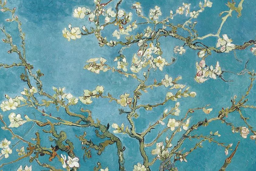
"Almond Blossom" is a strong example of why blue florals last. The composition has open space, delicate branch movement, and a clear sky-toned palette, so it feels light rather than ornamental. In smaller bedrooms or reading corners, that kind of airy structure keeps the wall from feeling crowded.
Choosing the Right Look for Your Space
A blue floral theme can lean in several directions, and the right one depends on your furniture and wall colour more than the blossom subject itself. Painterly styles suit relaxed, layered interiors with linen, wool, and rounded shapes. Vintage botanical work suits more detailed spaces with mouldings, antique wood, or brass finishes. Minimal floral silhouettes fit contemporary rooms with fewer objects and sharper lines.
If your room already has pattern — striped cushions, textured rugs, ribbed glass, or veined stone — go for a simpler floral composition with more negative space. A minimal option from our minimalist art print selection keeps the scheme from becoming visually crowded. If the room is very plain, a more intricate botanical design can add depth without needing extra accessories.

Vintage-inspired blue florals tend to work best in living rooms and hallways where a little pattern is welcome. William Morris 's (1834-1896) Blue is ideal if you want denser detail and decorative rhythm rather than a single blossom on a plain field.
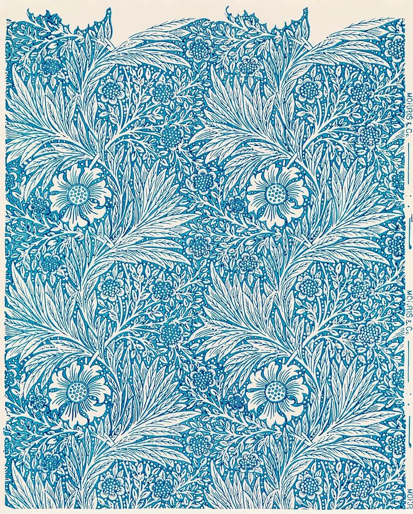
For a cleaner, modern look, look for simplified floral shapes and limited colour contrast. White Flower Silhouette and Vase with Flowers — Minimalist Print are useful references if you prefer blue blossom art to play a supporting role rather than dominate the room.
Best Rooms for a Blue Blossom Poster Print
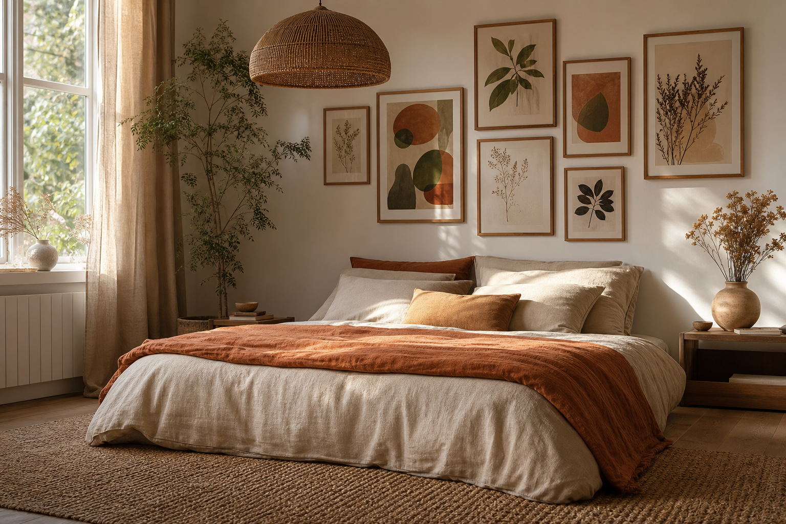
Bedrooms are the easiest match because blue naturally supports a slower, more restful mood. Above a 140 cm to 180 cm bed, a single 50x70 cm print works well if the room is compact. For a wider wall, two 40x50 cm pieces hung 7 to 10 cm apart give symmetry without looking formal. Keep the top of the headboard and the bottom of the frame about 20 to 30 cm apart.
Living rooms benefit from blue blossoms when the sofa and rug are mostly neutral. Over a 200 cm sofa, aim for artwork or a grouping that spans around 120 to 140 cm total width — roughly 60 to 70% of the sofa width. That proportion looks intentional and avoids the common mistake of hanging art that is too small for the furniture beneath it.
Hallways and transitional spaces suit narrower formats or vertically oriented florals. These areas usually have less furniture, so a blossom print can act as the main softening element. If the hallway is dark, choose artwork with a lighter ground rather than deep navy, which can flatten the wall.
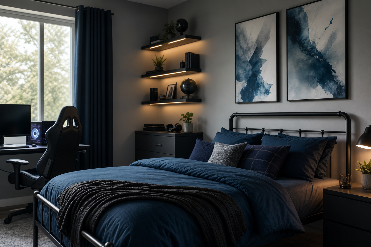
Home offices are another smart spot for floral art, especially when the desk setup includes black metal, white shelving, or screens that make the room feel hard-edged. Blue blossom imagery introduces curve and colour without becoming distracting on video calls.

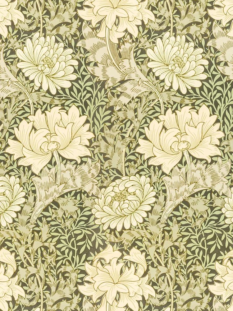
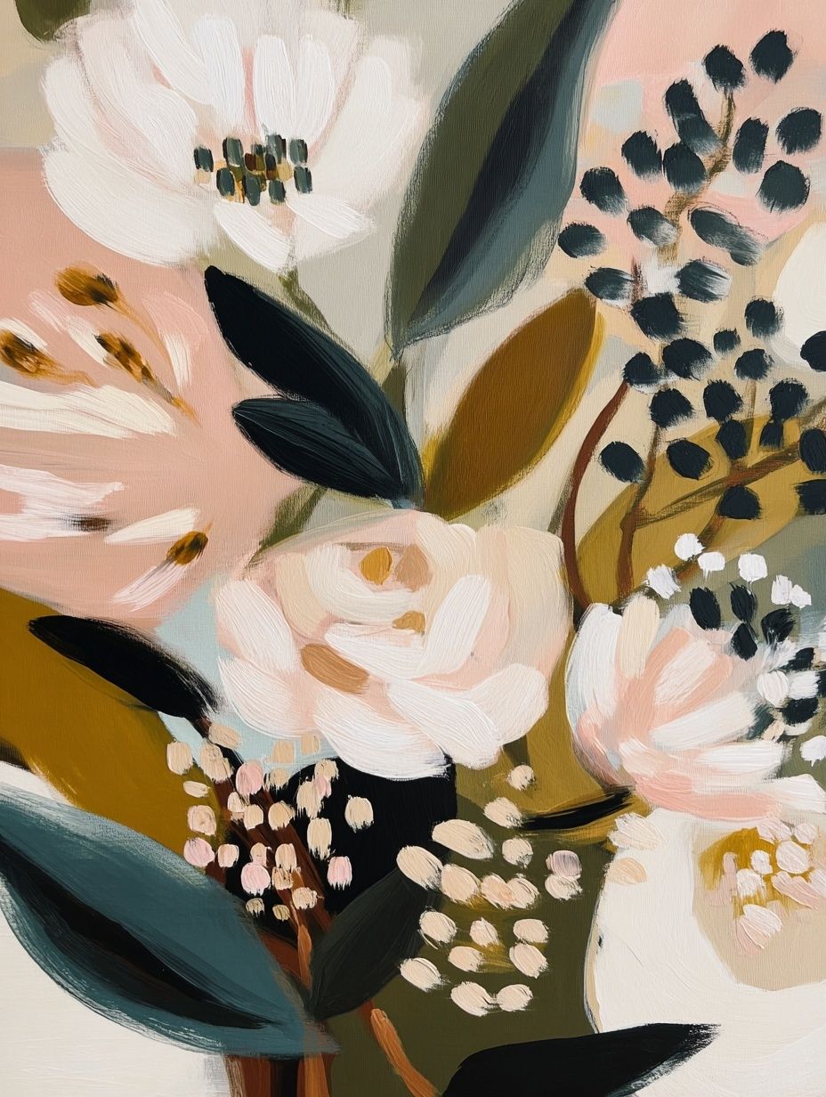
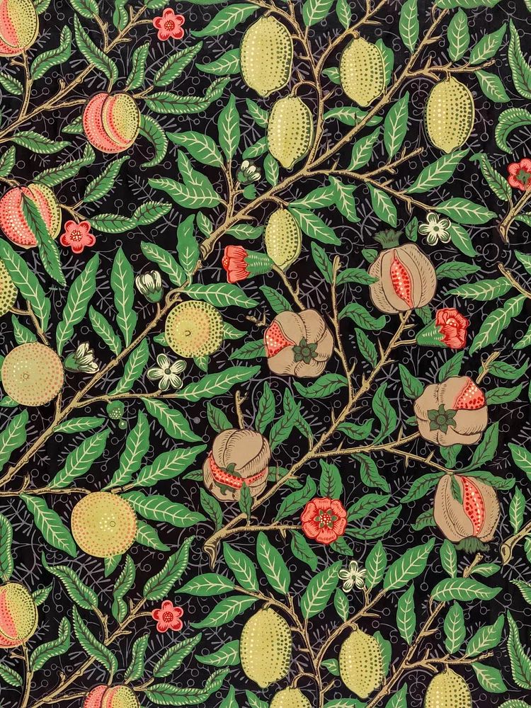
If you are styling a compact nook, entry bench, or vanity corner, one floral piece is usually enough. In larger rooms, pairing a blossom print with a landscape from our nature wall art range can make the wall feel broader and more collected rather than overly themed.
How to Size and Position Floral Prints
The most reliable hanging height is to place the centre of the artwork around 145 cm to 150 cm from the floor. That measurement works in most homes because it aligns closely with average eye level. When hanging above furniture, priority shifts to the relationship with the piece below — not the overall wall height.
A single floral print works best when the image has one clear focal point or a strong open background. Pairs work better when the designs share palette and visual weight. If one piece is dense and the other is airy, the wall can feel lopsided even when the frames match.
For common sizes, 30x40 cm suits narrow walls, shelves, and smaller corners. 50x70 cm is the most versatile option for bedrooms, desks, and medium-sized living rooms. 70x100 cm makes sense when you want one statement piece and have at least 30 cm of clear wall space around it. Keep spacing between multiple frames tight — 5 to 8 cm usually looks cleaner than 12 cm or more.

If you are mixing floral work with other subjects, keep one shared element consistent: blue tone, frame finish, or paper texture. That approach makes a wall arrangement feel curated rather than improvised.
Framing, Paper, and Finish Details
Frame colour changes the mood more than most buyers expect. Light oak keeps blue blossoms fresh and Scandinavian. Black frames sharpen soft floral forms and work well in modern interiors with contrast already present elsewhere. White frames are safest on coloured walls because they keep a clear boundary between the art and the paint.
For traditional botanical pieces, a narrow to medium frame — around 1.5 to 2.5 cm wide — usually looks best. Thick frames can overpower delicate petals and stems. If the artwork has fine linework or detailed pattern, matting can help; a 4 to 6 cm white border gives the image more breathing room and improves presence on larger walls.

Paper finish matters too. A matte surface reduces glare and suits floral subjects because it preserves soft colour transitions. This is especially helpful in rooms with side windows or pendant lighting opposite the wall. Glossy surfaces can make pale blue details harder to read in bright daylight.
Styling with Colour and Accessories
Blue blossoms are easiest to style when the rest of the room stays restrained. White, warm beige, mushroom, light grey, and oat tones all support the artwork without competing with it. Natural wood helps the blue feel warmer and more livable, especially in oak, ash, walnut, or lightly weathered finishes.
Textiles should echo the softness of the floral theme. Linen curtains, cotton bedding, and wool throws all reinforce the calm character of the piece. If you add ceramics, choose chalky whites, sand tones, or muted blue-grey glazes rather than highly saturated cobalt unless you want a stronger decorative effect.
A blue blossom print also pairs well with subtle secondary art. William Morris's vintage willow leaves adds another natural note without repeating the same flower form exactly. For a more expressive wall, Almond Blossom — Fine Art Print can sit alongside softer landscapes or quiet abstracts.
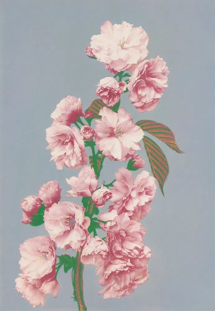
If your space leans relaxed and eclectic, pieces from our bohemian floral collection can bridge blue blossoms with woven textures, rattan lighting, and layered textiles. If it leans classic, staying within decorative botanical wall art creates a more coherent finish.
Final Thoughts and Simple Shop Tips
A blue blossom poster print works best when you match the artwork to the room's pace. Airy, open compositions calm small bedrooms and reading corners. Richer botanical patterns suit living rooms, hallways, and homes with more layered furniture and textiles. Size matters just as much as style — most walls need a print larger than buyers first expect.
Start with the wall, not the artwork in isolation. Measure the furniture width, check the natural light, and decide whether the room needs softness, pattern, or colour first. Once those three points are clear, choosing the right blue blossom poster print becomes much simpler.
Frequently Asked Questions
What frame colour is best for blue floral wall art?
Light oak is the most versatile, especially with white or beige interiors. Black works better when the room already has dark accents like metal lighting, black tables, or charcoal textiles.
Can blue blossom prints work on coloured walls?
Yes — they look especially good on warm white, pale grey, soft sage, and muted greige walls. Use a white or light wood frame to keep separation between the art and the paint colour.
Should I choose one large print or two smaller ones above a bed?
Choose one large piece for a simpler, calmer look. Pick two smaller pieces if you want more symmetry and the wall is at least 160 cm wide.
Do floral prints suit modern interiors?
They do when the composition is pared back and the frame is clean. Look for simplified blossoms, soft backgrounds, and limited contrast rather than highly ornate patterns.
How do I stop floral wall art from feeling too sweet?
Pair it with structured furniture, natural wood, matte ceramics, and plain textiles. Keeping the rest of the room simple makes the floral detail feel refined rather than overly decorative.