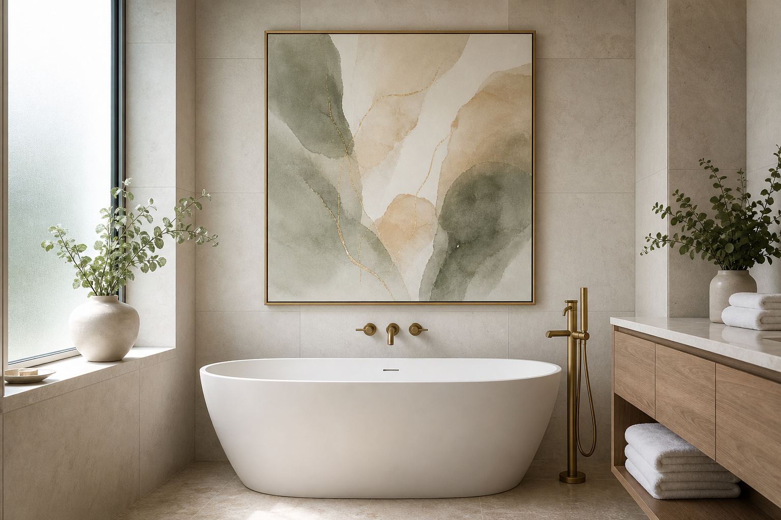
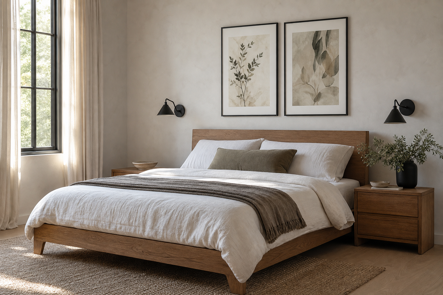
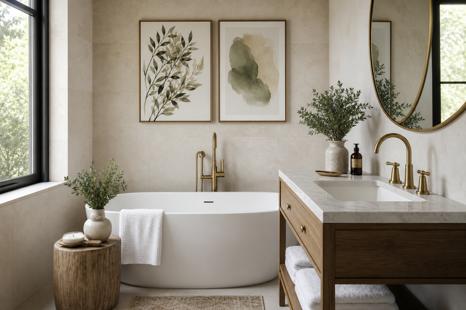
A well-styled banquet poster does two jobs at once: it sets the visual tone and gives the room a focal point before guests take in the smaller details. Whether the event is a wedding dinner, gala, charity fundraiser, or private celebration, the right banquet poster helps the space feel considered rather than improvised. It should connect to the table styling, the lighting, and the level of formality in the room.
Unlike casual party signage, a banquet poster works best when it feels integrated into the decor. That usually means a clear subject, restrained color palette, and enough scale to read from 2 to 5 meters away. If the print is too busy or too small, it disappears into the background. If it is too loud, it competes with centerpieces, menus, and architectural features.
What Makes a Banquet Poster Work
A strong banquet poster starts with mood. In practical terms, that means choosing imagery that reflects the atmosphere guests are about to experience: candlelit and intimate, airy and floral, classical and formal, or modern and minimal. A banquet poster should support the event's pacing and tone, much like music or tablescape styling.
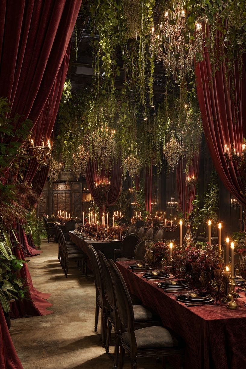
For formal dinners, imagery with symmetry, rich shadows, and layered texture tends to work best. Scenes with long tables, candles, draped fabrics, or still-life dining elements create instant context. If you want a more traditional look, pieces from our fine art collection or vintage art prints give the display more depth than generic event decor.
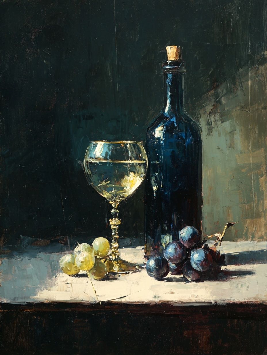
If the event is food-led — such as a wine dinner or tasting banquet — a banquet poster can also reference what guests will enjoy at the table. In that case, still-life imagery from our Food Drink collection works especially well because it echoes glassware, bottles, fruit, and serving pieces already present in the room.
Choosing the Right Style for Your Event
Match the artwork style to the dress code and venue first. In a ballroom with chandeliers, ornate molding, or velvet upholstery, classical and vintage-inspired pieces feel natural. In a loft, gallery, or hotel event space with clean lines, simpler compositions from our minimalist art prints often look sharper and more current.
A formal black-tie banquet benefits from artwork with a controlled palette — ivory, charcoal, burgundy, muted gold, or deep green. That palette reads as elegant under low light and pairs easily with black frames, brass easels, or cream matting. For this kind of event, Classical Banquet Hall is a direct fit because the subject already carries ceremonial weight.
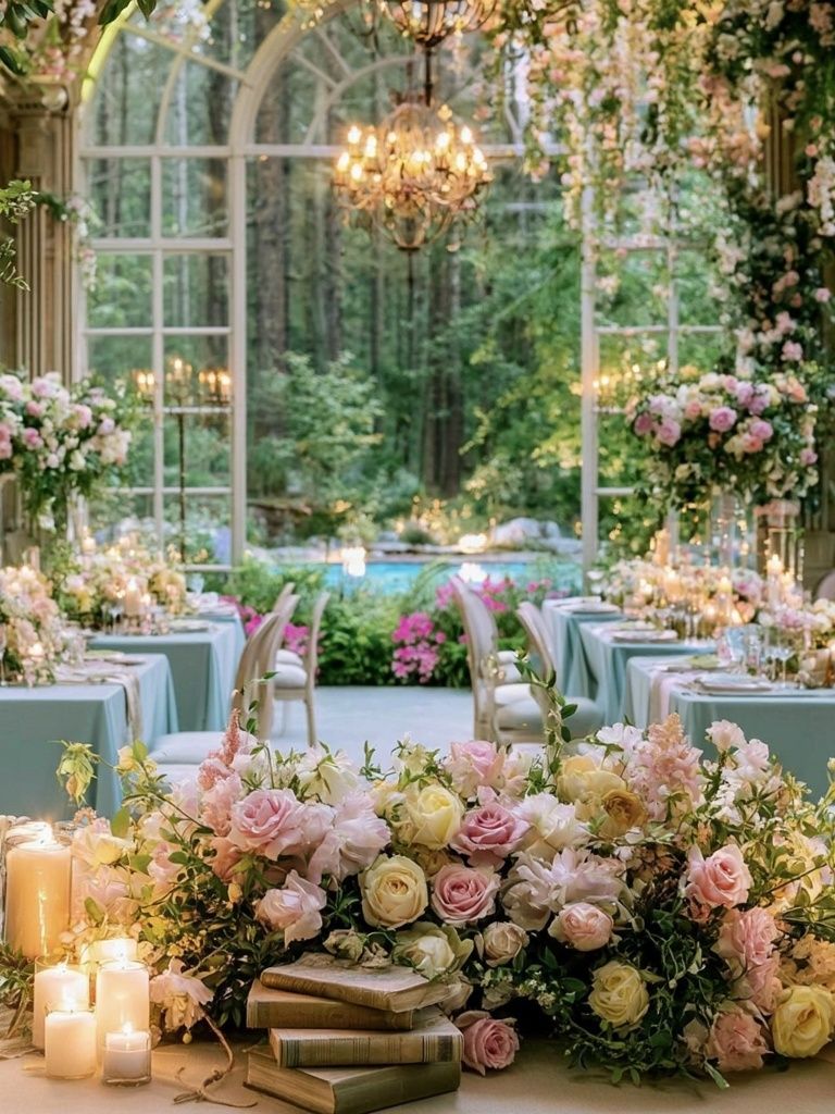
A spring luncheon or outdoor reception can shift lighter. Floral compositions, garden banquet scenes, and softer brushwork feel more open and sociable. If your tables include pale linens, glass vases, and fresh greenery, Floral Garden Banquet or a botanical-leaning piece from our bohemian wall art collection can bridge the decor without looking overly themed.

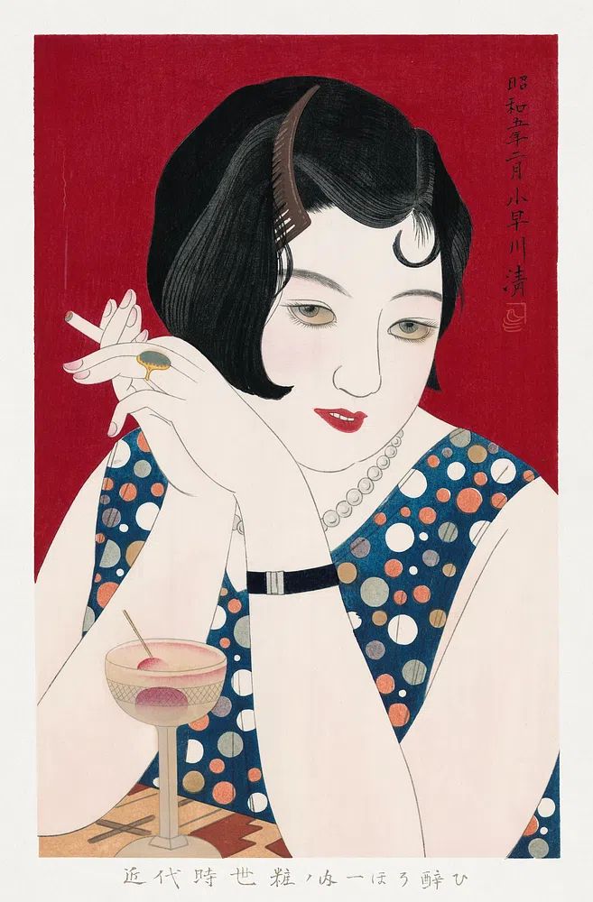
Vintage-themed banquets work best when you keep the reference refined. One or two evocative pieces are enough. Rather than crowding the space, use artwork with strong silhouettes or elegant figures to suggest the era. Elegant Woman with Cocktail adds a polished social-club feel without turning the room into costume decor.
Sizing, Placement, and Visibility
The most common mistake is choosing a banquet poster that is undersized for the wall. For a welcome area, 50 x 70 cm works well in a compact venue, while 70 x 100 cm has stronger presence in hotel foyers and larger reception rooms. If the piece sits behind a guestbook table, bar, or buffet, aim for the artwork to span roughly 50 to 70 percent of the furniture width below it.
For readability and impact, hang the center of the frame around 145 to 150 cm from the floor in standing areas. If the poster is placed behind seated dining guests, raise it slightly so it clears chair backs and heads in photographs. In large halls, use one oversized statement piece rather than several small frames that disappear beyond 3 meters.

Placement matters as much as size. The strongest positions are the entrance, the welcome table, behind a drinks station, or at the end of a room axis where guests naturally look when they arrive. If your banquet includes speeches or a head table, avoid placing highly detailed artwork directly behind speakers — medium-contrast imagery photographs better and distracts less on camera.
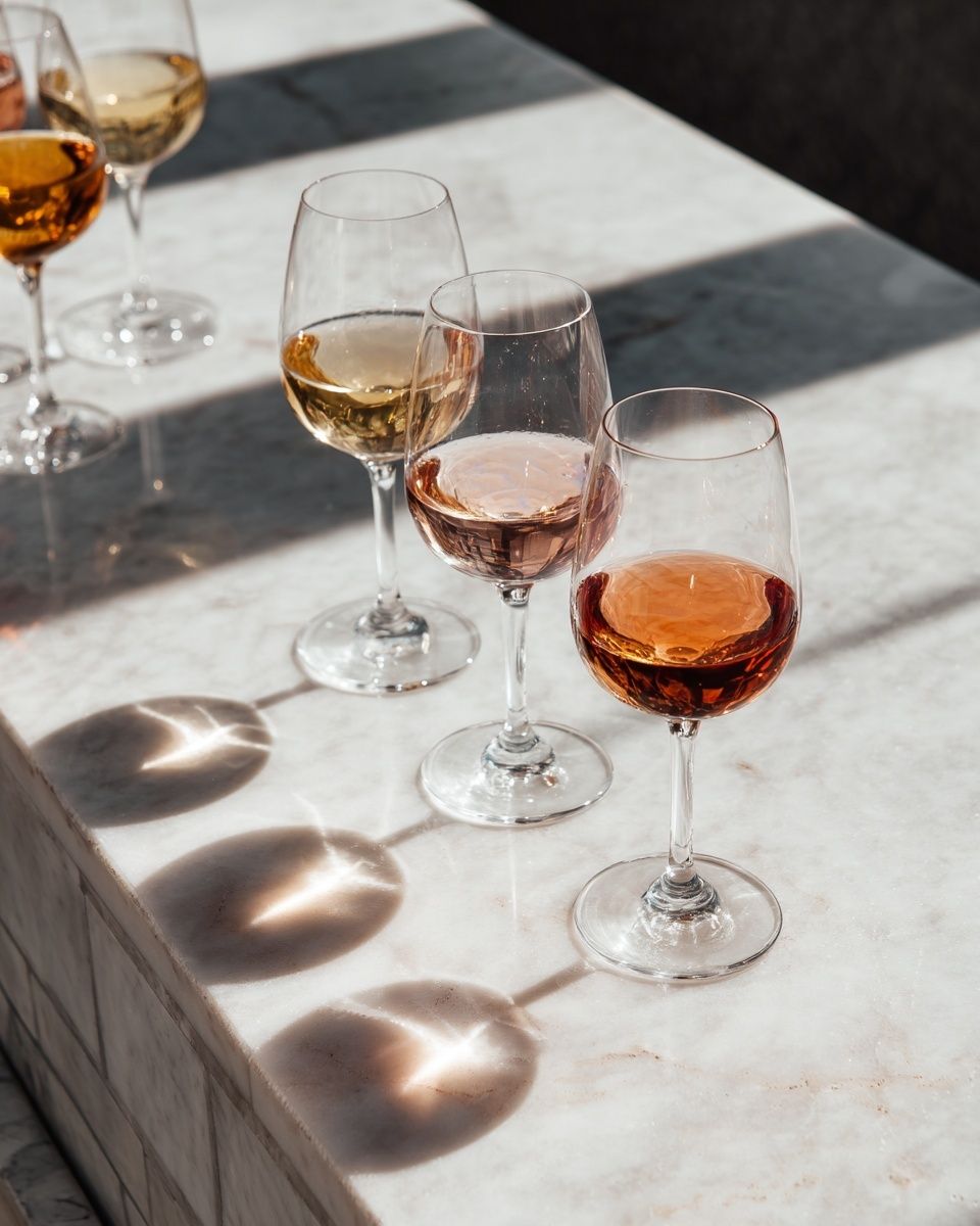
If you are styling a corridor or pre-function area, consider a sequence of two or three related works instead of a single image. Keep spacing between 6 and 10 cm for medium frames so the grouping reads as one installation. For a dining-led display, Wine Table Still Life or Wine Glasses on Marble Table can anchor a bar or tasting zone with visual relevance.
Framing and Finishing Details
Frames determine whether the banquet poster feels temporary or editorial. A slim black, dark walnut, brushed gold, or champagne-toned frame covers most event settings. Black works well in modern venues, walnut softens neutral rooms, and metallic finishes reflect candlelight effectively without needing extra decoration.
Matting adds structure. A white or warm ivory mat of 5 to 8 cm gives smaller artwork more presence and helps the display read as premium. For richly colored prints, this border also keeps the composition from feeling too dense against textured walls, drapery, or floral installations.

Finish matters under event lighting. Matte surfaces reduce glare from chandeliers, uplights, and flash photography, which is useful in venues with many reflective surfaces. Gloss can look sharp in daylight, but at evening banquets it often picks up hotspots. If the framed piece will be moved or reused across events, choose sturdy backing and easy-hang hardware rather than temporary adhesive fixes.
Working With Color, Lighting, and Surrounding Decor
A banquet poster should repeat at least one or two colors already present in the room. That may be burgundy from napkins, cream from linens, green from foliage, or amber from candlelight. This repetition is what makes the installation feel tied to the event rather than borrowed from another space.
If your decor is already detailed — patterned china, layered florals, metallic chargers — select calmer wall art with one dominant subject. Pieces from our minimalist collection or a restrained print such as Textured Waves — Minimalist Print can balance a visually rich banquet without flattening it.
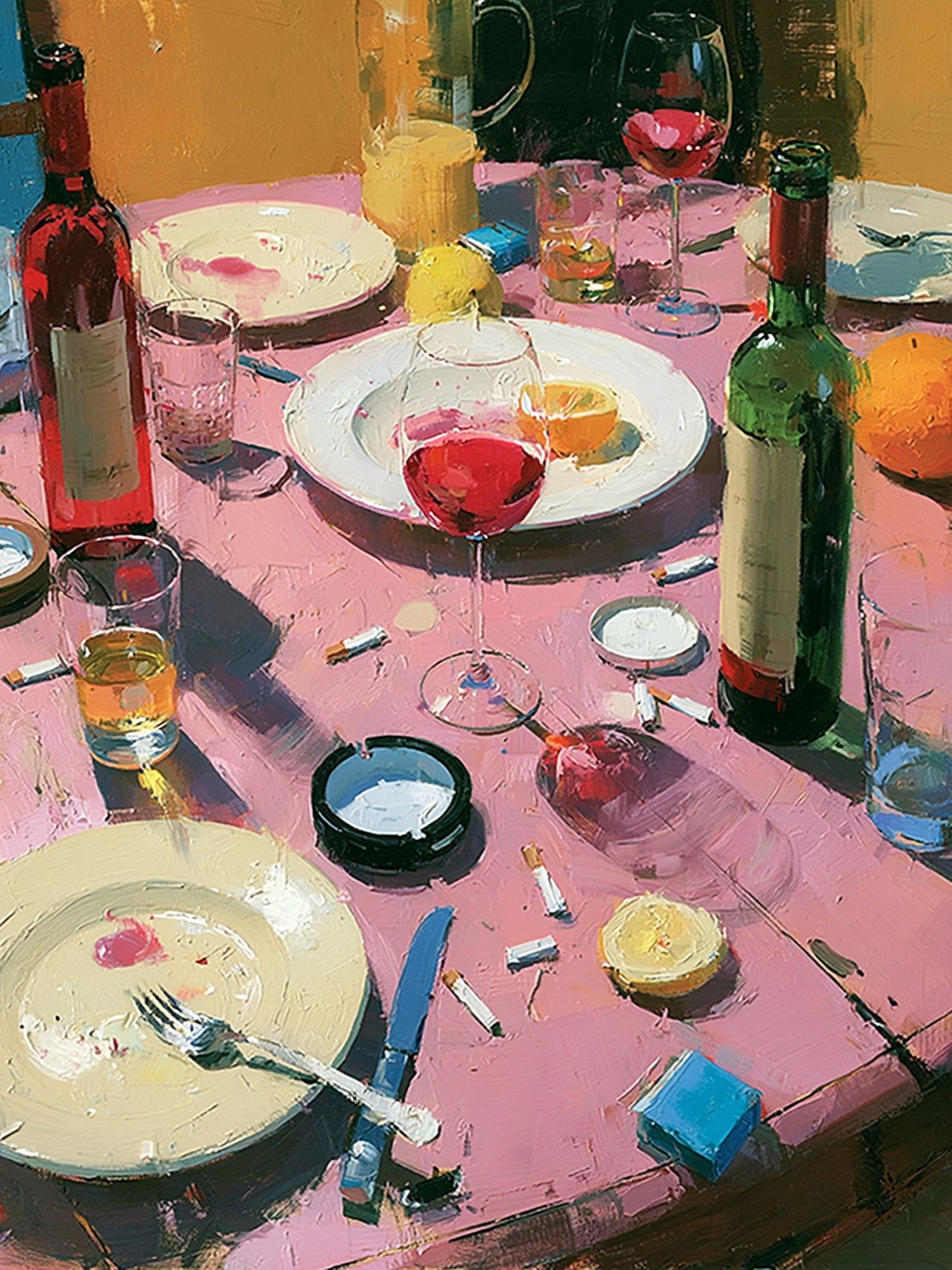
Lighting should flatter the artwork, not wash it out. A pair of warm spotlights at roughly 30 degrees creates enough definition without harsh glare. In low-lit evening spaces, candle-adjacent displays work best with medium-tone art — not very pale, not nearly black — because detail stays visible in person and in photos.

Creative Uses Beyond the Main Display
A banquet poster does not have to be limited to one hero position. Secondary placements often make the event feel more layered and intentional. At entrances, use a single framed piece on an easel to establish tone. Near the bar, choose dining or wine imagery that supports the function of the zone. In buffet areas, art can soften practical service furniture and make the setup feel less utilitarian.
For photo backdrops, keep the artwork large and simple. Guests stand in front of it, so the image needs to read as atmosphere rather than detailed decoration. If the event has cultural or historical references, choose one statement piece with enough scale to register in wide shots. Elegant Chinese Banquet Scene works well for this type of use when the room styling has similarly formal detail.
You can also use a banquet poster in seating zones or sponsor corners. In those areas, the art should frame the purpose of the station without looking branded or commercial. For example, a sponsor table beside Ritual Banquet Hall feels more elevated than a plain sign setup, especially when paired with one floral arrangement and a lamp or candle cluster.
Final Styling Tips for a Memorable Banquet
The best banquet poster is not always the most dramatic one. It is the piece that fits the room scale, supports the event palette, and gives the eye a place to land. Start with venue style, then choose art that reflects the mood in a clear way. After that, size and framing do most of the heavy lifting.
If you want a reliable formula, use one framed banquet poster at 70 x 100 cm in the main arrival zone, echo one key room color in the artwork, and keep the frame finish aligned with table hardware — black, wood, or brass. That combination looks deliberate in nearly every banquet format, from intimate dinners to larger formal receptions.
Frequently Asked Questions
Should a banquet poster be portrait or landscape?
Portrait works best for entrances, easels, and narrow wall sections. Landscape suits buffet walls, bar areas, or spaces above long consoles.
What frame color is safest for most banquet venues?
Black and brushed gold are the easiest choices. Black suits modern venues, while gold works well with candlelight, cream linens, and formal table settings.
Can I use more than one banquet poster in the same room?
Yes — use 2 to 3 pieces if the room is large and the artwork shares a common palette or theme. Keep one piece dominant and let the others support secondary zones.
How far in advance should I test placement?
At least 1 day before the event if possible. This gives you time to check sightlines, glare from lighting, and whether the scale feels right once tables and florals are in place.
What pairs well with banquet-themed wall art?
Low florals, candles, linen-covered tables, and one material repeated nearby — such as brass, walnut, or marble. These details make the display feel anchored rather than floating on the wall.