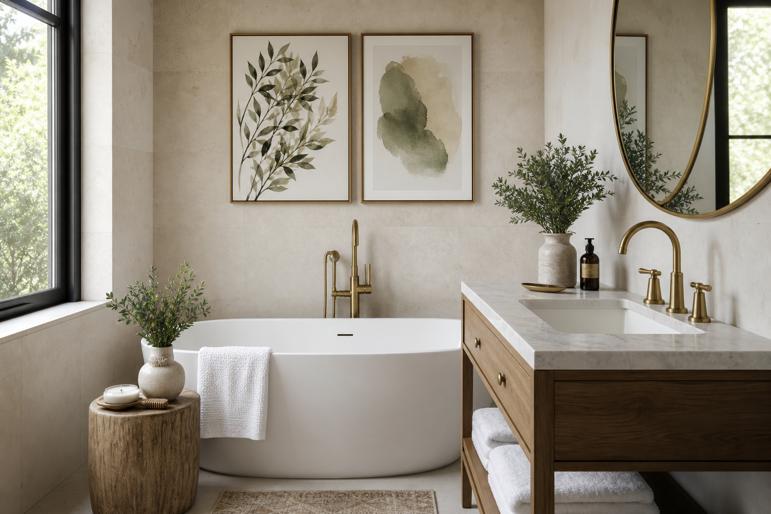
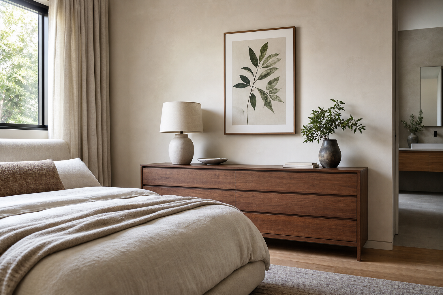
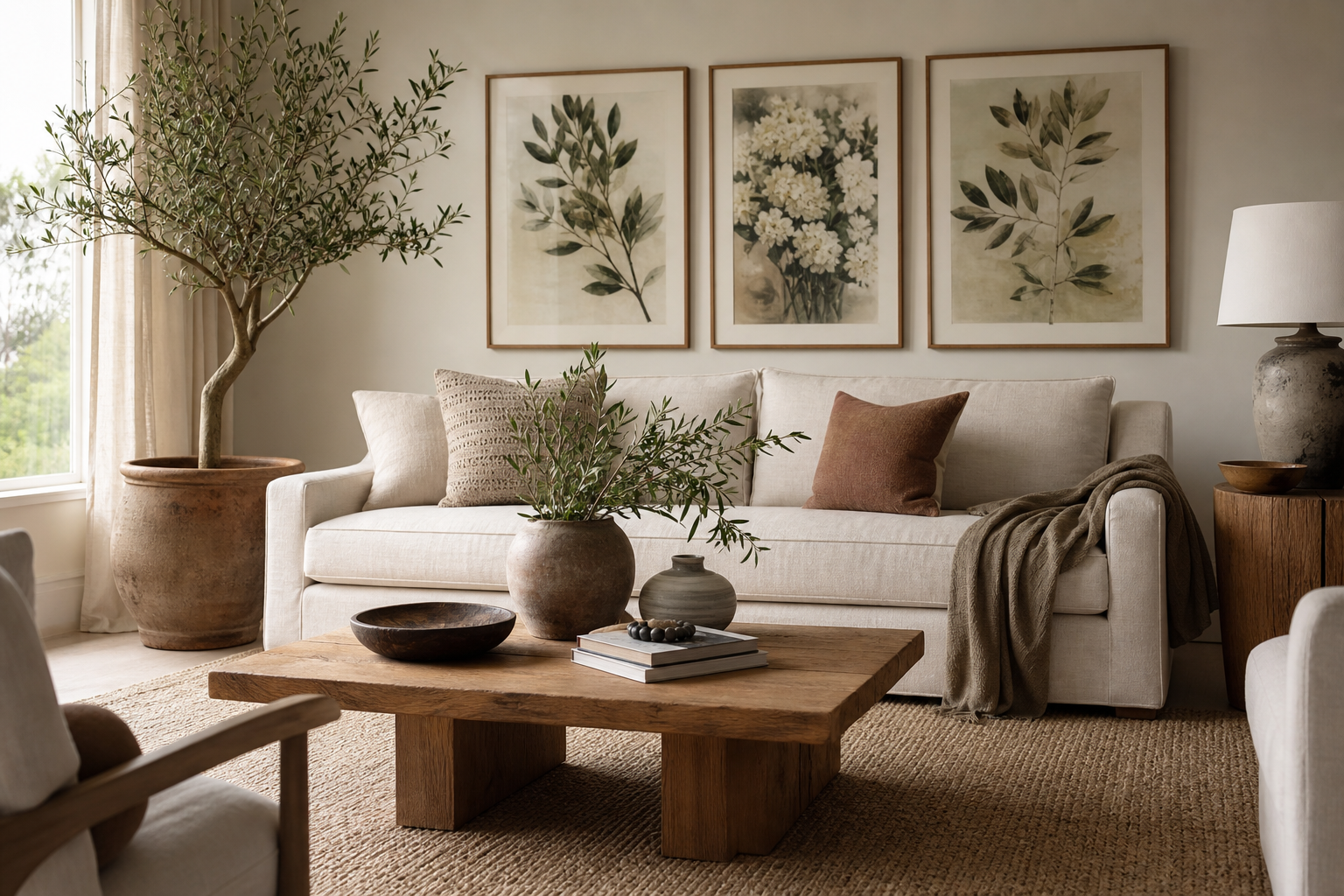
An art deco room poster print works best when the room already has structure. Art Deco is not a casual style — it relies on symmetry, crisp lines, and a clear focal point. If your space has one strong anchor, such as a sofa, bed, or console, the artwork should reinforce that axis rather than compete with it. This is why a single oversized piece or a tightly planned pair often looks more convincing than a scattered salon wall.
The easiest way to make an art deco room poster print feel deliberate is to combine geometry with a sense of polish. That can mean architectural imagery, graphic abstraction, or vintage-inspired nightlife scenes, especially when paired with brass, walnut, lacquer, velvet, or smoked glass. If you want a broader starting point, our Vintage collection and Architecture prints both offer strong foundations for this look.
What Gives Art Deco Its Signature Look
Art Deco interiors are built on five clear traits: symmetry, geometric pattern, rich material contrast, metallic detail, and a limited but dramatic palette. Think fan shapes, sunbursts, stepped forms, arches, checkerboard floors, and vertical lines that pull the eye upward. A room starts to read as Deco when these features repeat at least two or three times across furniture, lighting, and wall art.
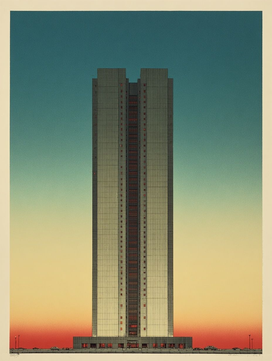
Architecture is especially effective because it naturally carries the era's sharp silhouettes and glamour. City skylines, grand facades, and streamlined towers echo the style without feeling costume-like. That is why pieces from our Empire State Building cityscape print or Modern Skyscraper vintage print can set the tone quickly.

If you prefer something less literal, abstract pieces with strong line work can deliver the same effect. Black-and-white geometry, repeated curves, and stained-glass-like color blocking all feel aligned with Deco's graphic confidence. Browse abstract art prints if you want pattern and structure rather than historical reference.
Choosing the Right Poster Print for the Room
The right subject depends on the room's mood. In living rooms, architectural forms and nightlife-inspired fine art tend to feel the most sophisticated because they hold visual weight across a wider wall. In bedrooms, choose softer glamour — cream, bronze, deep green, muted gold, or dusty blush with strong outlines. In hallways, narrow vertical works often perform better than wide compositions because they emphasize height. In offices, graphic black, ivory, and metallic-adjacent tones look focused and tailored.
An art deco room poster print should also match the furniture scale. For a sofa around 200 cm wide, art between 100 and 140 cm total width looks balanced. For a queen bed around 160 cm wide, aim for 96 to 120 cm total width above the headboard. Smaller prints can work, but only if the frame and mount add enough visual presence.

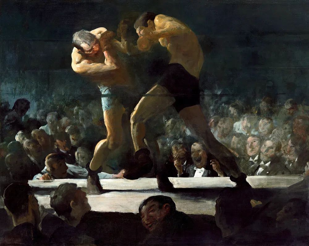
For a more atmospheric Deco note, figurative and social scenes can be excellent. A piece like Club Night (1907) adds vintage drama and pairs beautifully with velvet seating, mirrored trays, and low ambient lighting.
Best Sizes and Placement for an Elegant Finish
Placement is what makes the display feel expensive. Hang the center of the composition at roughly 145 cm from the floor in hallways and freestanding walls. Above furniture, use the furniture edge as your guide instead: keep the bottom of the frame 15 to 25 cm above a sofa back, console, or headboard. Any higher and the work starts to float.
A single large print in 50x70 cm or 70x100 cm suits narrow Deco spaces, especially entryways and home offices. Above a three-seat sofa, a pair of 50x70 cm frames with 6 to 8 cm between them creates clean symmetry. For a console wall, three aligned frames can work, but keep the total arrangement within about 70% of the furniture width.
Gallery walls are less typical for Art Deco than for eclectic interiors, so use them sparingly. If you build one, keep the spacing tight — 5 to 7 cm — and maintain a strict grid. Geometric consistency matters more than variety.


Framing Ideas That Make the Style Feel Luxurious
Frames do a huge amount of work in Deco styling. The strongest options are thin brass-toned metal, satin black wood, dark walnut, or high-gloss black finishes. A slim profile of 1.5 to 2.5 cm usually looks sharper than a chunky rustic frame. If the artwork is highly detailed, add a cream or off-white mount of 5 to 7 cm to create breathing room and make the piece feel curated.
Glazing affects the finish too. Standard clear acrylic works in most rooms, but in bright spaces near large windows, anti-reflective glazing gives a more polished result because the image stays legible from different angles. This matters especially with dark prints, where glare can flatten the contrast.

If you want the room to feel especially tailored, repeat the frame finish elsewhere — brass in lighting, black in side tables, walnut in cabinetry. That repetition ties the art into the architecture. You can also mix one bolder architectural piece with softer works from our Fine Art collection to avoid making the room feel too rigid.
Colour Palettes That Work with Art Deco Interiors
Classic Deco palettes are compact and high-contrast. Black and gold is the obvious standard, but it only looks refined when softened with cream, stone, or smoked glass. Emerald and cream feels richer and more residential. Burgundy, navy, and aubergine also work well when used as accents rather than wall-to-wall color.
For black-dominant rooms, choose prints with visible light areas so the wall does not become visually heavy. Pieces with ivory, champagne, pale grey, or muted metallic tones help. In cream or taupe rooms, stronger graphic works create the contrast Deco needs. Sacred Geometry Black-White is a useful option when you want crisp contrast without introducing extra color.

Jewel-toned rooms benefit from controlled repetition. If your upholstery is emerald velvet, pull in one or two artworks that include green, teal, or bronze rather than five different accent colors. Colorful Stained Glass Abstract works well when the room already has brass, walnut, and dark paint because the segmented shapes echo classic Deco geometry.
Mixing Modern Posters with Vintage-Inspired Details
The best Deco rooms mix period cues with cleaner contemporary pieces. That keeps the result elegant instead of theatrical. Use one or two vintage notes — a scalloped mirror, ribbed glass lamp, fluted sideboard, or brass floor lamp — then let the artwork bridge old and new. A modern abstract next to a velvet armchair can feel more Deco than a room filled with overtly retro objects.
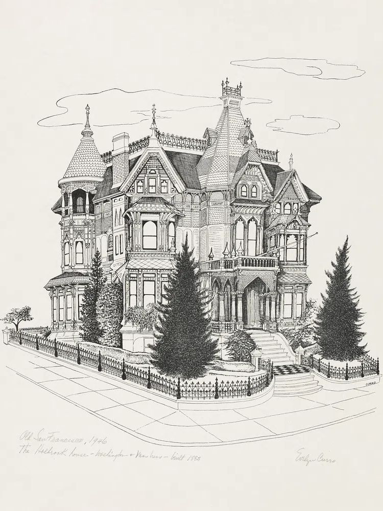
Materials should be layered in contrasting finishes. Pair matte walls with glossy frames. Combine velvet with marble, brass with dark wood, smoked glass with cream boucle. This contrast is central to Deco's appeal. Architectural prints are especially useful in these settings because they sharpen the room's silhouette. Take a look at Victorian Mansion Illustration or the wider architecture wall art range for pieces that add structure.

Avoid overmatching. If the rug has a strong zigzag or fan motif, keep the art calmer. If the artwork is bold and angular, let textiles be solid or lightly textured. One statement in each zone is enough.
Shop Tips for Creating a Polished Art Deco Wall
Start with one anchor piece and build outward. For most rooms, that means investing first in the largest print and best frame, then adding supporting pieces over time. A 70x100 cm framed work will have more impact than three small unframed prints. This is often the fastest route to a polished art deco room poster print arrangement.
Paper finish matters too. Smooth or lightly satin paper tends to suit Deco better than heavily textured stock because the style favors crisp edges and cleaner contrast. If you are mixing categories, keep the palette disciplined so the wall still reads as one collection. A smart route is combining one piece from our Aeronautics Vintage Print with more geometric work from the abstract collection and one grounded architectural piece.
Budget framing realistically. In many rooms, frames and mounts account for 40% to 60% of the final look. Spending slightly more on consistent framing will usually make mid-priced art look better than expensive art in mismatched finishes. Measure first, buy second, and leave room for upgrades later rather than filling the wall too quickly.
Final thoughts
A strong art deco room poster print scheme is less about quantity and more about precision. Focus on symmetry, scaled placement, dark-and-light contrast, and frames that feel intentional. When the palette is restrained and the materials are rich, even a simple two-piece arrangement can look grand.
The most convincing Deco interiors balance geometry with warmth. Choose artwork with structure, repeat one or two luxe finishes, and let the room breathe around each piece.
Frequently Asked Questions
What frame color works best for Art Deco prints?
Black, brass-toned metal, and dark walnut are the safest choices. Pick one finish and repeat it at least once elsewhere in the room for a more cohesive result.
Can I use Art Deco wall art in a small room?
Yes — use one larger piece rather than several small ones. A single 50x70 cm or 70x100 cm print keeps the wall cleaner and often makes the room feel taller.
Do Art Deco prints need a mount?
Not always, but a 5 to 7 cm cream mount adds polish and makes the artwork feel more substantial. It is especially useful with darker prints and black frames.
What lighting suits an Art Deco wall display?
Warm bulbs around 2700K to 3000K flatter brass, walnut, and jewel tones. Wall sconces or a picture light can highlight the frame without creating harsh glare.
What pairs well with geometric Art Deco art?
Velvet upholstery, smoked glass, marble surfaces, ribbed lamps, and mirrored accents all work well. Keep surrounding patterns limited so the geometry stays sharp.