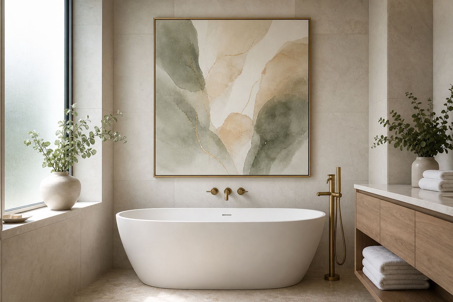
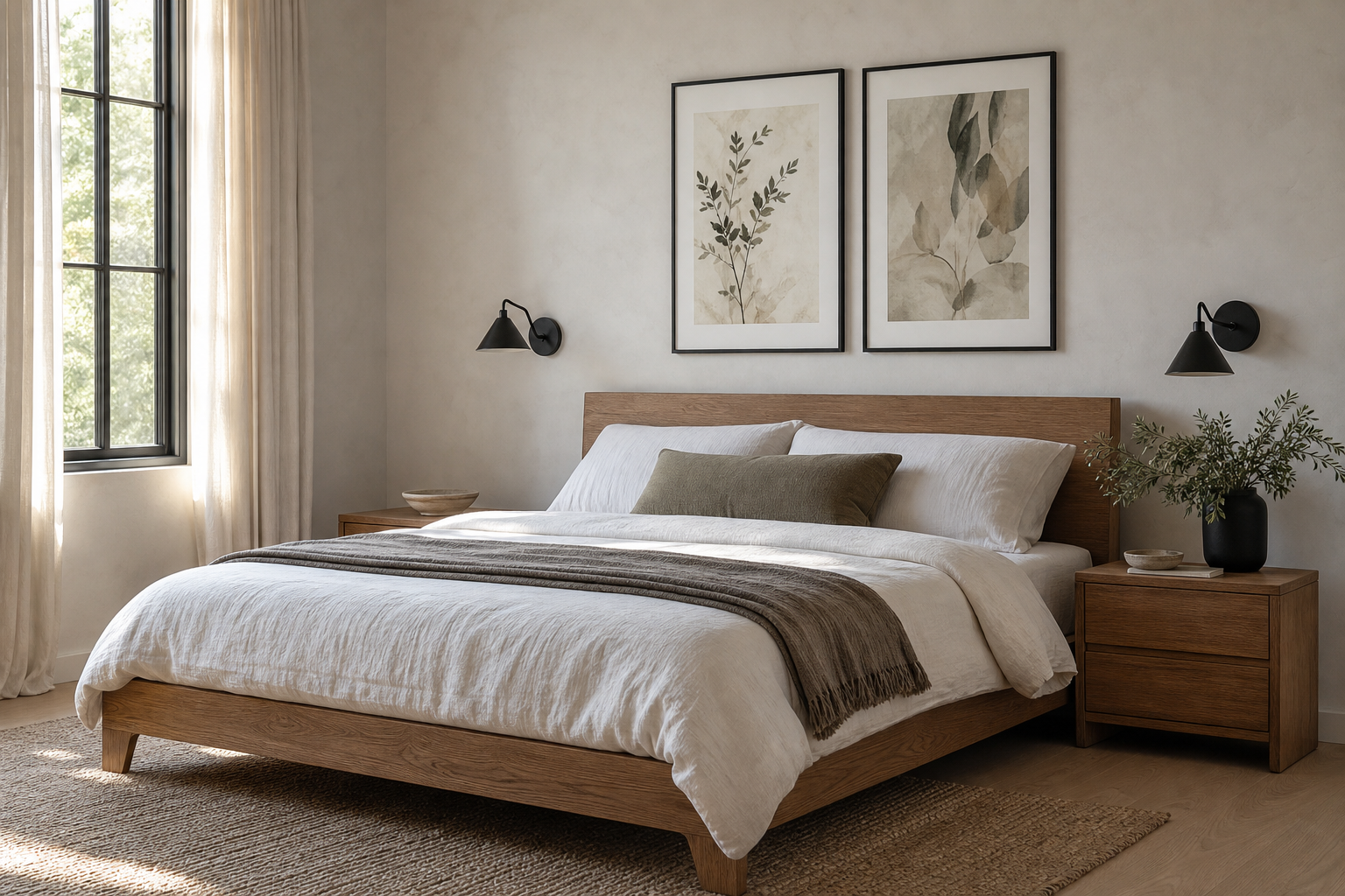
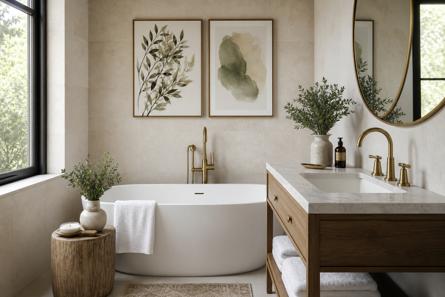
A 16 x 20 poster sits in the sweet spot between accent art and statement art. At 40.6 x 50.8 cm, it is large enough to read clearly from across a room, but compact enough to fit above a desk, bedside table, entry console, or narrow section of wall. That balance is exactly why a 16 x 20 poster works so well in apartments, bedrooms, and home offices where every 10 cm matters.
Why the 16 x 20 Poster Works So Well
The biggest strength of a 16 x 20 poster is flexibility. It can stand alone on a small wall, anchor a pair above nightstands, or act as the center of a gallery wall without overpowering the room. Above furniture, it usually works best when the frame is around 55% to 75% of the furniture width. Over a 120 cm desk, for example, one 16 x 20 piece in a frame feels balanced rather than undersized.
This size also makes styling less risky. A very large print demands precise placement and strong subject matter, while smaller formats can disappear once the room fills up with lamps, shelves, and textiles. A 16 x 20 poster gives you visual presence without forcing the entire room to revolve around it. If you like calm, pared-back interiors, our Minimalist collection is especially strong in this format because clean compositions hold their shape even on compact walls.
In tighter rooms, vertical orientation works well between a window and a wardrobe, or above a slim chest of drawers. Horizontal art in this size is useful over benches, small sofas, and short headboards. If you want a soft focal point instead of a high-contrast one, muted pieces from our Abstract art prints or Fine Art collection tend to settle into the room more naturally than loud graphic work.
Choosing the Right Frame and Finish
A frame changes the tone of the art as much as the art itself. Black metal or slim black wood gives a 16 x 20 poster a sharper, more architectural look. Oak or ash warms it up and suits Scandinavian, organic modern, and softer minimalist rooms. White frames are useful when you want the wall art to blend into pale walls rather than draw a hard outline.
Matting is worth considering if you want a more finished, gallery-style result. A white mat of 2 to 3 inches can make a 16 x 20 poster feel more substantial and refined, especially in bedrooms or formal living spaces. Without a mat, the piece feels more contemporary and direct. This is often the better choice for graphic work, textured neutrals, or bold color fields from Textured White Abstract or Torn Paper Black and White.

Finish matters too. Matte surfaces reduce glare, which is helpful if the art hangs opposite a window or under ceiling spots. Glass with strong reflection can flatten subtle tones during the day. That is especially noticeable in quiet, texture-led prints where shadow and surface variation are the whole point. If your room already has polished finishes — lacquered furniture, glossy tile, chrome lighting — a matte frame and non-gloss art usually create better contrast.

For a softer, layered look, tactile pieces work particularly well at this size because viewers can appreciate the surface up close. Prints like Textured Fabric — Minimalist Print and Textured Concrete Wall — Minimalist Print pair well with boucle, wool, oak, and limewash walls.
Where to Hang a 16 x 20 Poster
The safest rule is to hang the center of the frame at about 57 to 60 inches from the floor. That museum-style height works in most rooms. If the art goes above furniture, leave 6 to 8 inches between the top of the furniture and the bottom of the frame. More than 10 inches often makes the art feel disconnected.
In a living room, a 16 x 20 poster is ideal for narrow wall zones that a larger piece would overwhelm — beside shelving, above a drinks cabinet, or centered above a compact two-seat sofa. In a bedroom, it works above a nightstand, over a dresser, or as one side of a symmetrical pair above the bed. In a home office, hang it 8 to 12 inches above the desk so it stays visually linked to the workspace.

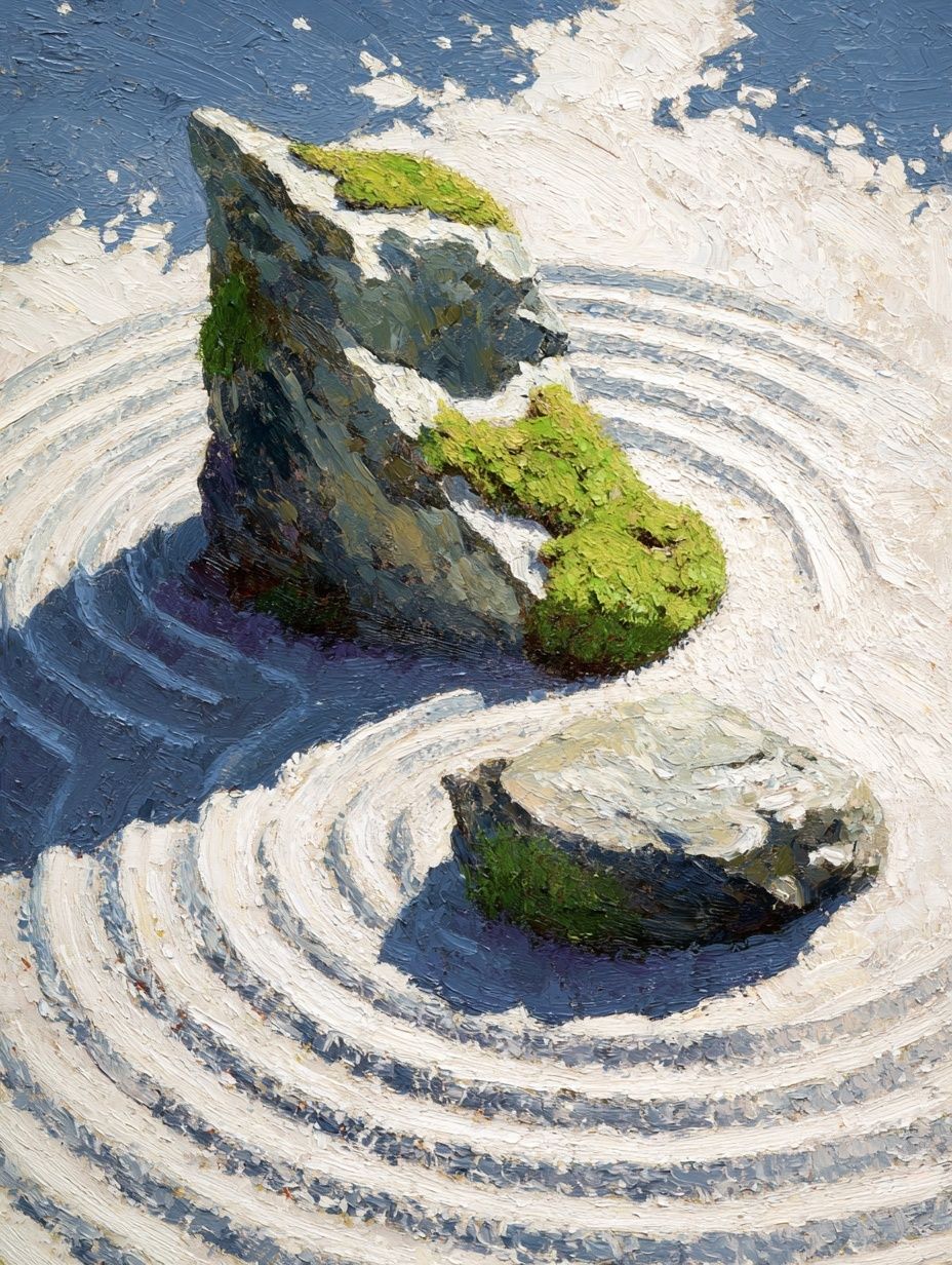
Room function should guide subject matter. Calming pieces suit work zones and bedrooms better than visually noisy designs. Zen Garden Stones is a good example of art that brings structure without clutter. For livelier spaces like an entry or breakfast nook, stronger shapes from the Typography collection can add energy in a small footprint.
How to Build a Layout Around One Piece
A single 16 x 20 poster can work as the focal point if you give it enough breathing room. Leave at least 20 to 30 cm of open wall on each side where possible. That negative space makes the piece look intentional instead of undersized. This is especially effective with restrained art — tonal abstract work, line-based minimalism, or one strong figurative piece.
If you want a fuller composition, use the 16 x 20 poster as the anchor and build around it with smaller works. A reliable layout is one 16 x 20 centered with two 8 x 10 pieces beside or below it. Another option is one 16 x 20 paired with two vertical 12 x 16 prints for a clean three-piece arrangement. Keep spacing consistent — 2 to 3 inches between frames usually looks polished in residential interiors.

When mixing subjects, hold one element steady. That element can be palette, frame color, or composition style. For example, you can combine a painterly piece like Woman with a Parasol with quieter abstracts if they share soft blues, creams, or muted greens. If you prefer graphic cohesion, build the wall around black, white, and sand tones.



Colors, Themes, and Mood
A 16 x 20 poster should support the room palette rather than compete with it. In minimalist rooms, stick to two or three dominant tones — ivory, black, stone, sand, gray. This keeps the art feeling integrated with the architecture. Pieces from our minimalist wall art range and abstract collection are useful here because they rely on shape, texture, and tonal contrast more than visual noise.
For modern interiors, stronger geometry and bolder color blocking can carry the space. Teal, terracotta, rust, mustard, and charcoal all read well at 16 x 20 because the scale is large enough to show contrast, but still easy to place. If your room has warm woods or clay-toned textiles, Terracotta Hexagon Texture Print makes sense. If the scheme leans cooler, Yin Yang Teal Abstract Poster brings color without feeling chaotic.

Vintage and classic interiors often benefit from fine art subjects with softer edges and established color harmony. Florals, landscapes, portraits, and still lifes feel especially natural in this size because they can fill a secondary wall elegantly without needing oversized scale. In more playful rooms, typography can work well — but choose it like furniture, not decoration. One sharp text-based piece can energize a corner; too many can turn the wall busy fast.
Quick Styling Tips for a Finished Look
Scale the styling around the art, not against it. If the 16 x 20 poster hangs above furniture, add objects below that vary in height by 20% to 30% — for example, a 45 cm lamp beside a 25 cm vase. That staggered line keeps the whole vignette from looking flat. Repeat one color from the art in a cushion, book spine, throw, or ceramic piece so the wall art feels tied into the room.
If you are choosing a print online, measure the actual wall first and mark the frame size with painter's tape. A 16 x 20 poster often looks larger on paper than it does on a 2.7 m wall, and slightly larger than expected over a 100 cm console. Taping out the footprint helps you decide whether the piece should stand alone or be part of a grouping.

For a polished finish, keep these numbers in mind: center height at 57 to 60 inches, 6 to 8 inches above furniture, and 2 to 3 inches between grouped frames. Those three measurements solve most styling mistakes before they happen. A good 16 x 20 poster does not need complicated styling — it needs correct proportion, a frame that suits the room, and a subject that belongs with the palette.
Final thoughts
A 16 x 20 poster works because it gives you enough presence to shape a wall without taking over the room. That makes it one of the most useful sizes for real homes — rented apartments, compact bedrooms, practical offices, and layered living rooms.
Start with placement, then choose frame finish, then choose subject. When those three decisions line up, the room looks considered rather than decorated.
Frequently Asked Questions
Is a 16 x 20 size better with or without a mat?
Use a mat if you want a more formal or gallery-style look, especially in bedrooms and dining spaces. Skip the mat for modern, graphic, or minimal art where you want a cleaner edge.
What frame color is the safest choice for a 16 x 20 poster?
Black is the most versatile if your room has contrast or metal accents. Oak is usually the safest warm option for neutral interiors with wood, linen, and soft textures.
Can I lean a 16 x 20 poster on a shelf instead of hanging it?
Yes — it works well on picture ledges, mantels, and deep consoles. Use museum putty or shelf grips if the frame sits in a high-traffic area.
What wall color works best behind this size?
Soft white, warm greige, pale taupe, and muted gray are the easiest backdrops because they do not compress the art visually. Dark walls can look striking too, but choose lighter art so the piece does not disappear.