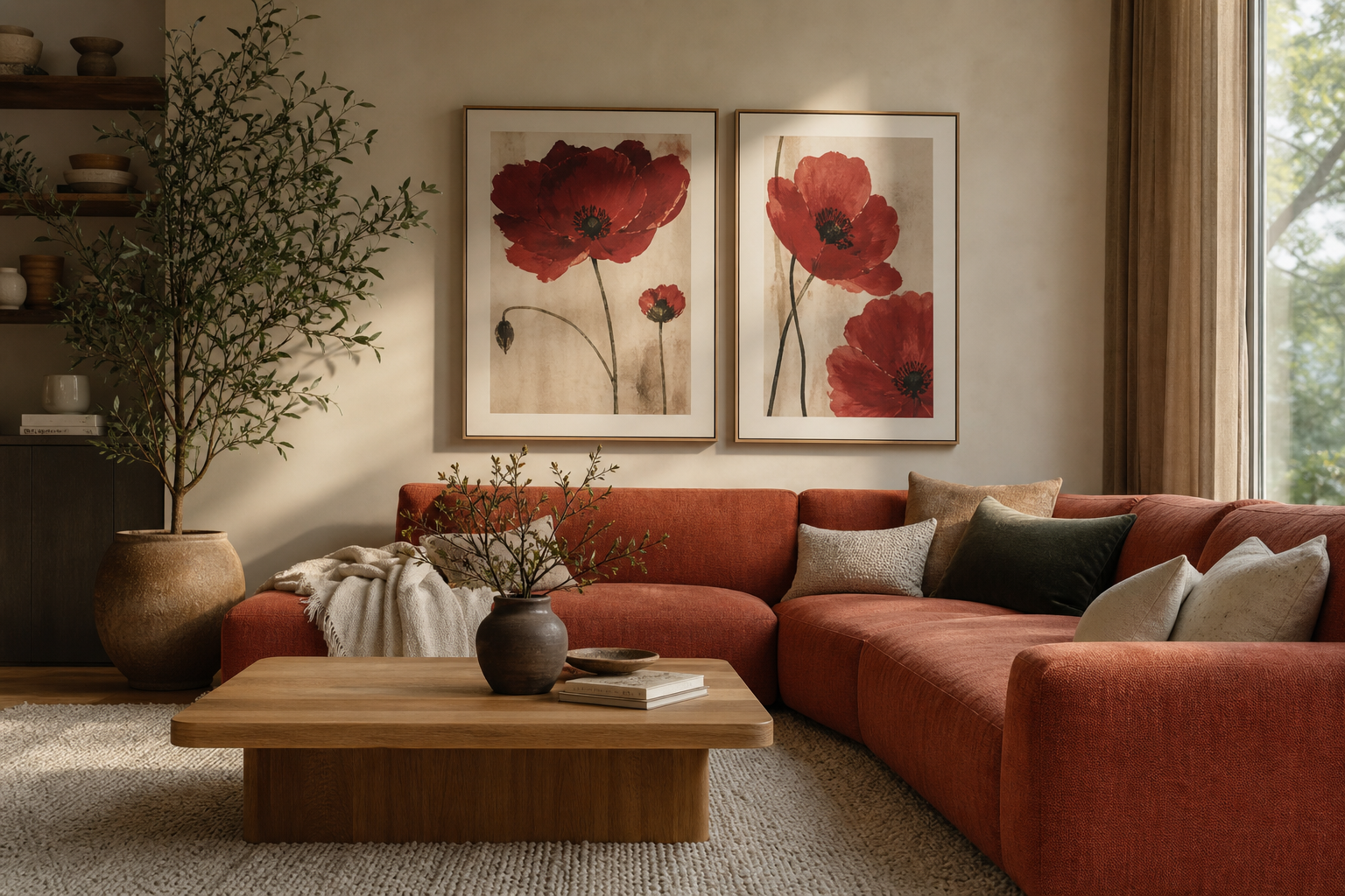
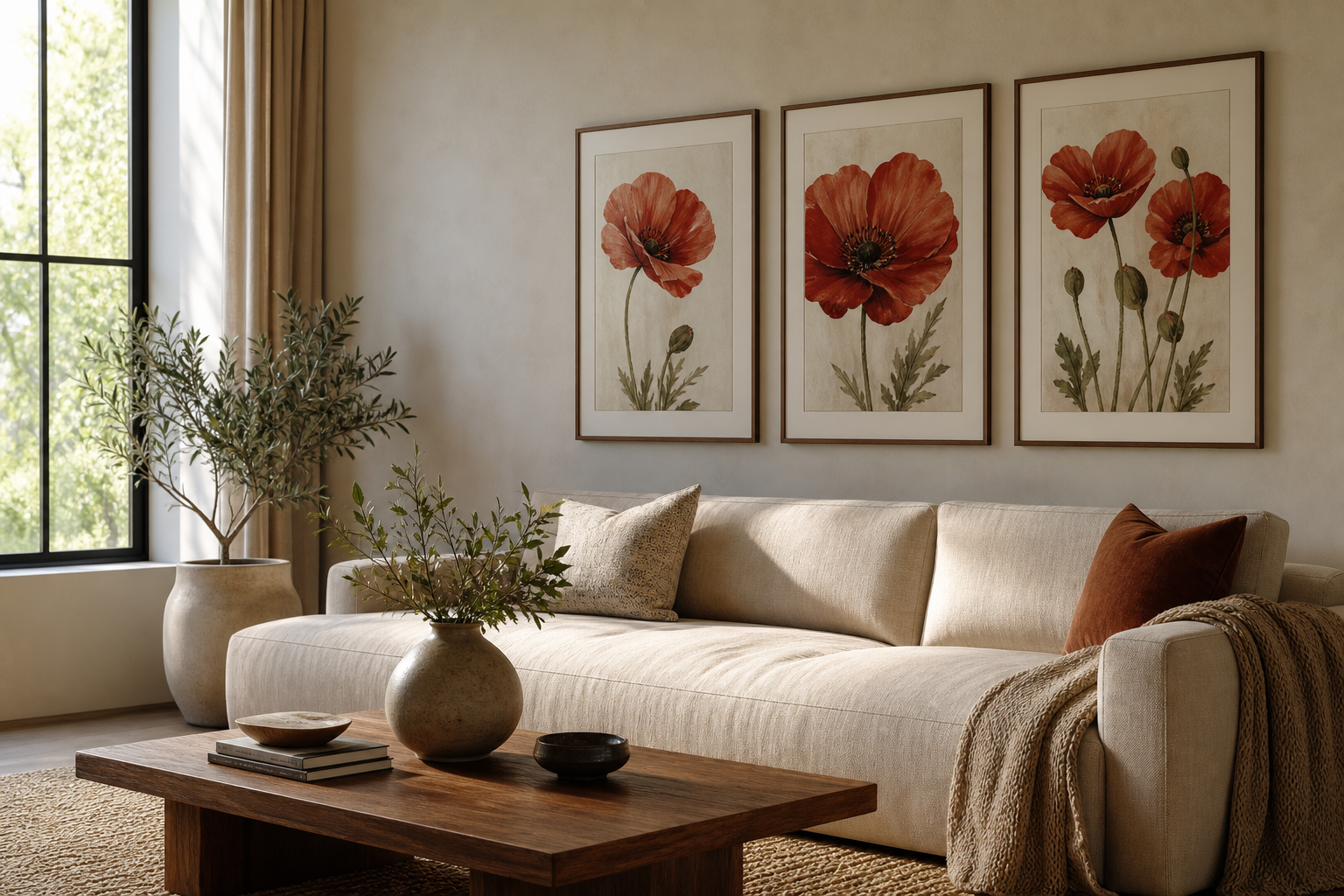
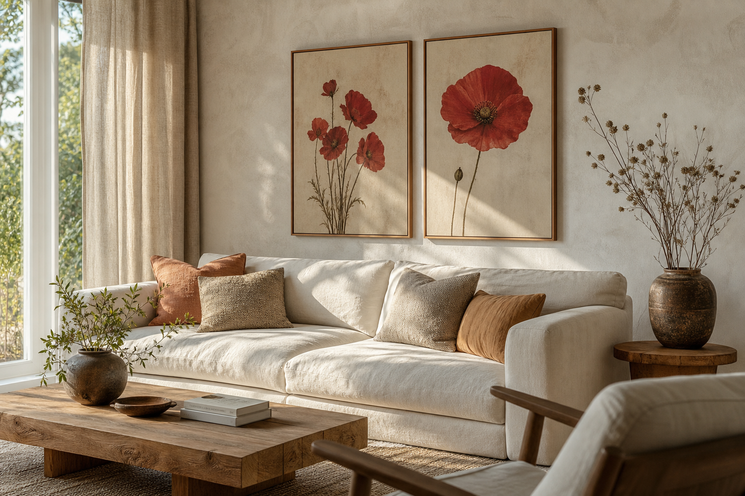
A crimson poppy poster print brings two qualities that are often hard to combine: strong colour and lightness. The red is vivid enough to anchor a wall, but the petal shape stays airy and graceful, so the artwork feels lively rather than heavy. That balance makes it useful in rooms that need a focal point without the visual weight of dark abstract art or dense pattern.
Why Crimson Poppy Art Feels So Fresh
Poppies have a loose, open shape that reads as relaxed and natural. Unlike tightly layered roses or highly structured geometric florals, a crimson poppy poster print has movement in the petals and stems, which adds softness to straight-lined interiors. In modern rooms with flat-front cabinets, simple sofas, and clean white walls, that organic shape creates contrast fast.
Crimson also lands in a sweet spot between warm and dramatic. It has more depth than coral, more softness than pure scarlet, and it works across seasons. In spring and summer, it looks bright against white, sand, and pale oak. In autumn and winter, it sits comfortably beside rust, olive, chocolate brown, and charcoal. If you already enjoy pieces from our botanical collection, a poppy motif is one of the easiest ways to introduce stronger colour without losing a natural feel.
A poppy print also pairs well with both vintage-inspired and pared-back styling. If your home leans classic, decorative florals such as Marigold by William Morris, can reinforce the botanical story. If your space is simpler, a cleaner floral composition from our minimalist art prints keeps the room crisp.
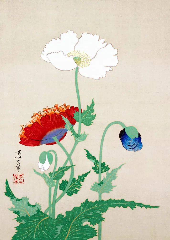
Choosing the Right Room for the Print
The living room is often the best place to start. A crimson poppy poster print works particularly well above a 180 to 220 cm sofa, where a single 50x70 cm or 70x100 cm piece can add enough colour to wake up a neutral seating area. If the room already has beige upholstery, cream curtains, and pale wood, the red acts like a visual accent in the same way a cushion or throw would — only more structured and lasting.

Bedrooms benefit from poppy art when you want warmth without visual clutter. Above the bed, choose one larger piece rather than several small frames. The floral subject keeps the wall gentle, while the crimson tone stops an all-neutral bedroom from feeling washed out. This works especially well with camel, taupe, and muted terracotta textiles.
Hallways are ideal for narrower formats. A 30x40 cm or 40x50 cm print can give a small transition space more identity, especially when hung above a console or near a mirror. In home offices, the print adds energy without the hardness of high-contrast graphic art. If you work at a light wood desk, the red will feel focused and uplifting, especially when balanced with green foliage or nearby nature pieces from our nature wall art selection.
Pairing Crimson With the Right Palette
The safest palette for a crimson poppy print is a calm neutral base. Think warm white walls, oatmeal upholstery, light oak, walnut, stone, flax, and black accents. This gives the red enough breathing room, and it stops the floral subject from becoming overly sweet. In practical terms, if red is the strongest colour in the room, keep the next supporting tones at least 40 to 60 percent quieter in saturation.
Earthy shades are the next strong match. Terracotta, clay, rust, cinnamon, and muted brown pick up the warmth of the poppy without trying to compete with it. A room with walnut furniture, a rust cushion, and a crimson poppy poster print often feels more complete than a room that relies on red alone. That layered warmth is especially useful in north-facing spaces, which can otherwise feel flat.
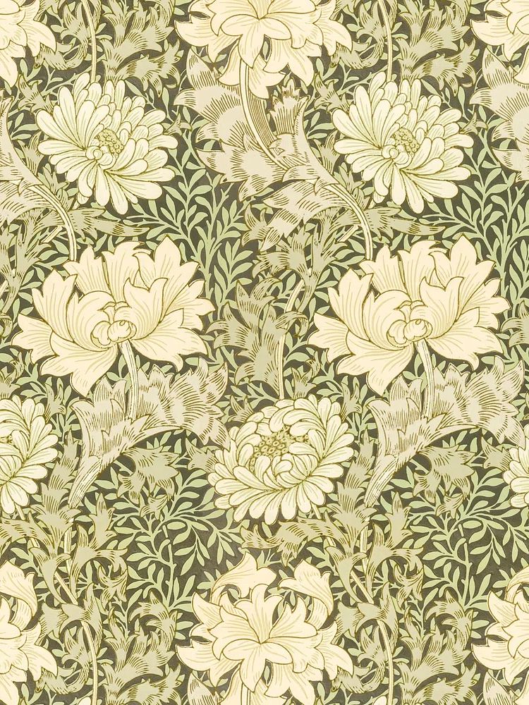
Deep greens are another reliable partner because they echo the stem and leaf side of botanical art. Olive, moss, forest, and eucalyptus all help the crimson read as more natural. If you want to build a fuller gallery wall, combine the poppy with floral and foliage-based pieces from our botanical prints or with cleaner floral silhouettes such as White Flower Silhouette for contrast in scale and detail.



Avoid pairing poppy red with too many other saturated brights in the same zone. Royal blue, neon pink, and bright orange can push the look into visual noise unless the room is intentionally eclectic. If you want one stronger companion shade, choose only one — deep green is usually the easiest.
Finding the Best Size and Placement
Scale matters more than style in getting wall art right. As a rule, artwork above furniture should cover around 60 to 75 percent of the furniture width. Above a 200 cm sofa, aim for a total art width of roughly 120 to 150 cm. That could mean one 70x100 cm crimson poppy poster print, or a pair of narrower floral works with 7 to 10 cm between frames.
Hang the centre of the artwork around 145 cm from the floor in most homes. If the print sits above a sofa, bed, or console, leave 15 to 25 cm between the bottom of the frame and the top of the furniture. This keeps the artwork connected to the furnishing below instead of floating too high.
A single poppy print works best when the image itself has strong presence — bold blooms, generous negative space, or a tall vertical format. Use a gallery wall when you want the red to feel more integrated and less dominant. Pair it with quieter companions such as Woman in Yellow Flowers or decorative botanical pieces like Honeysuckle by William Morris to spread colour and pattern across the arrangement.

Framing Ideas That Elevate the Look
A slim black frame gives crimson florals a sharper, more contemporary edge. This is the right choice if your room has black lighting, metal table legs, or graphic lines. Black creates contrast around red petals and makes the print feel intentional, especially on white or pale greige walls.
Warm oak frames soften the overall effect and make the artwork feel more organic. Oak is particularly strong in Scandinavian, Japandi, and relaxed contemporary interiors, where pale wood already appears in coffee tables, shelving, or flooring. If you like softer floral styling, oak often beats black because it supports the natural subject rather than outlining it too strongly.
A white mat mount can make a medium-size print look more premium and give the floral image extra breathing room. For a 50x70 cm print, a mount window around 40x50 cm often feels balanced. This is especially useful when the print has rich colour at the edges, since the white border calms the composition.

If you want a more decorative mix, combine the poppy piece with classic botanical works in similar frame finishes. Prints such as vintage pomegranate flowers or Green Tulip by William Morris work well in oak or antique-look wood when building a warmer, collected wall.

How to Build a Calm but Colourful Display
The easiest way to keep a red floral print calm is to repeat the colour only two or three times in the room. That might mean the art, one cushion, and a small ceramic object. Once red appears in five or six places, the room can start to feel themed rather than styled.
Texture should do part of the balancing work. Linen curtains, bouclé upholstery, jute rugs, ribbed ceramics, and matte wood surfaces all soften the intensity of crimson. If every surrounding surface is glossy or high-contrast, the artwork can feel harsher than intended. A poppy print looks better next to tactile materials than next to too much shine.
Lighting matters as well. Place the print where it can catch indirect daylight, or use a picture light or wall lamp at 2700K to 3000K for evening warmth. Cooler bulbs around 4000K can flatten red tones and make floral art look less rich. In darker rooms, choose slightly larger artwork so the colour still reads clearly from across the space.
For a cohesive display, borrow one supporting note from nearby art. If your crimson poppy print has a soft green stem or creamy background, echo that in adjacent pieces. Gentle companions like Vase with Flowers or painterly works from our fine art print collection can create rhythm without competing for attention.
Wrap-Up: Shop the Crimson Poppy Look
A crimson poppy poster print works best when you treat it as a colour anchor and a soft botanical accent at the same time. Give it enough wall space, pair it with restrained tones, and choose a frame that matches the room's material story — black for contrast, oak for warmth, white matting for polish.
If you want the look to feel timeless, start with one floral focal point and build outward with quieter botanical or minimalist pieces. A well-placed crimson poppy poster print can shift a room from flat to expressive in one move, especially when the surrounding palette stays calm.
Frequently Asked Questions
What frame size should I choose for a 50x70 cm poppy print?
A standard 50x70 cm frame works well, but adding a white mat with a 40x50 cm opening gives the artwork a more refined, gallery-style finish.
Can red floral art work in a small room?
Yes — choose one medium piece rather than several small ones. Keeping the rest of the palette light helps the red feel crisp instead of crowded.
Which wall colour suits crimson poppy art best?
Warm white, soft greige, muted sage, and pale sand are the easiest options. These shades support the red without draining its warmth.
Does poppy artwork pair better with black or wood furniture?
Both can work. Black furniture gives a sharper, modern contrast, while oak and walnut make the floral subject feel softer and more natural.