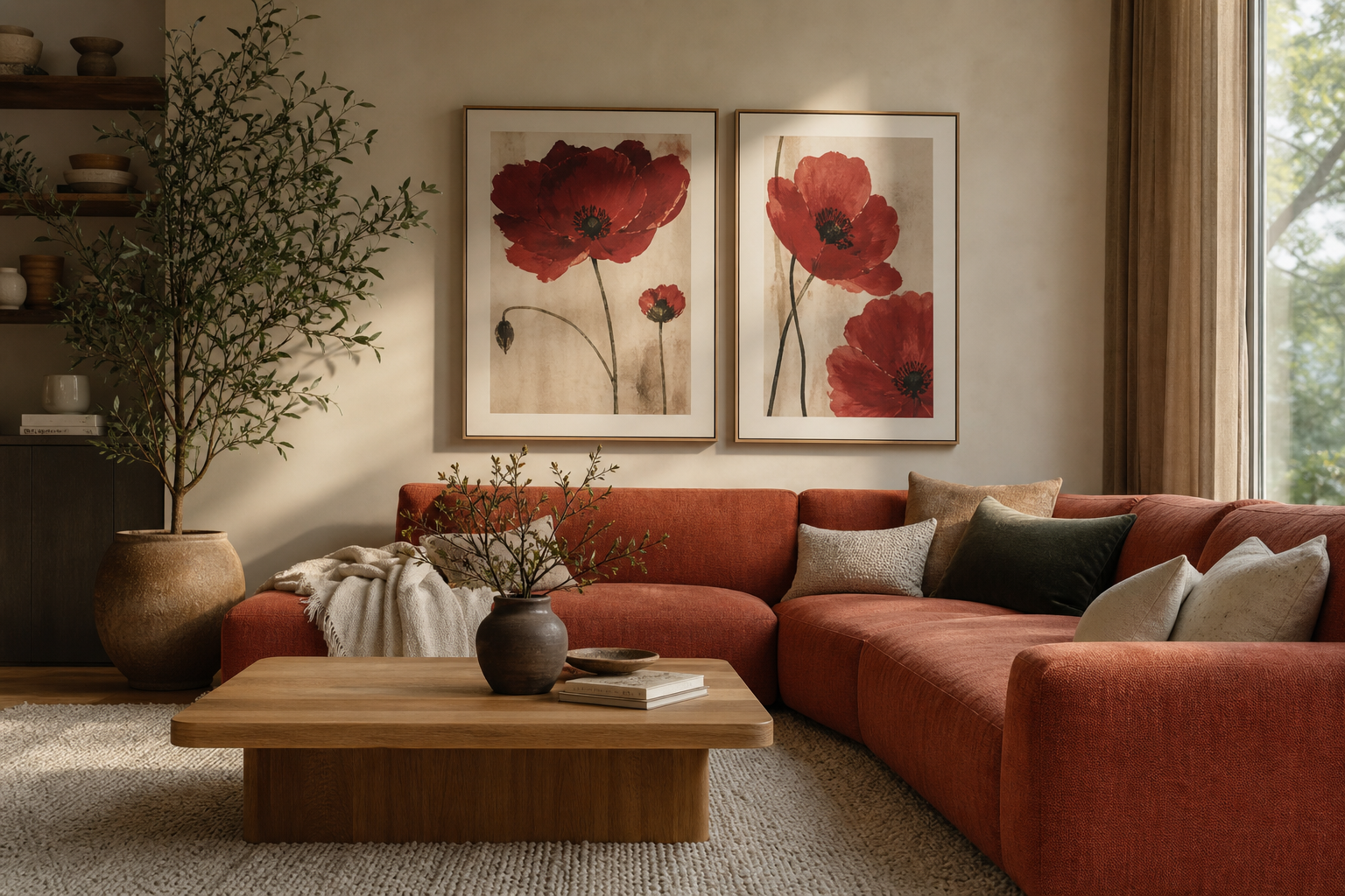
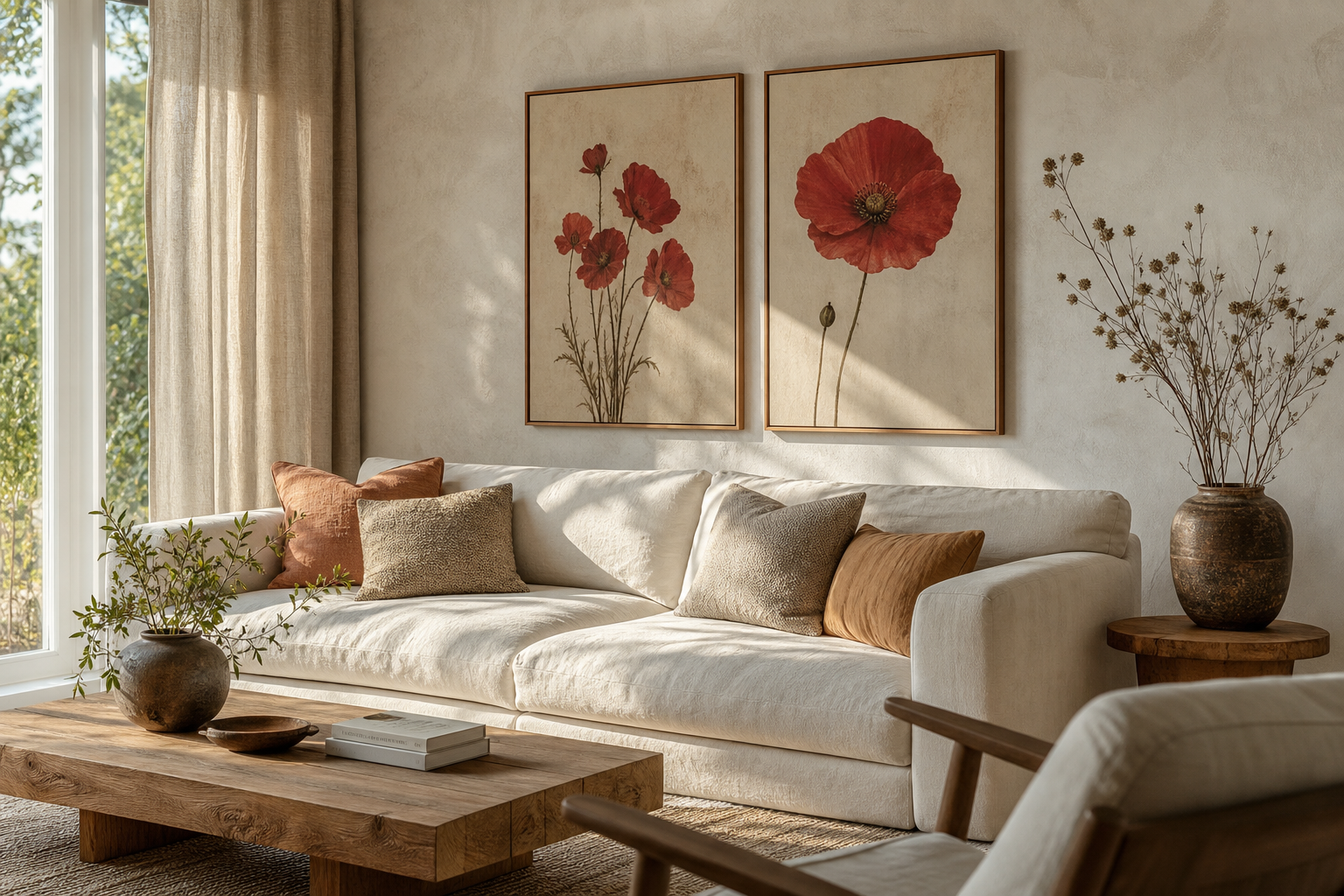
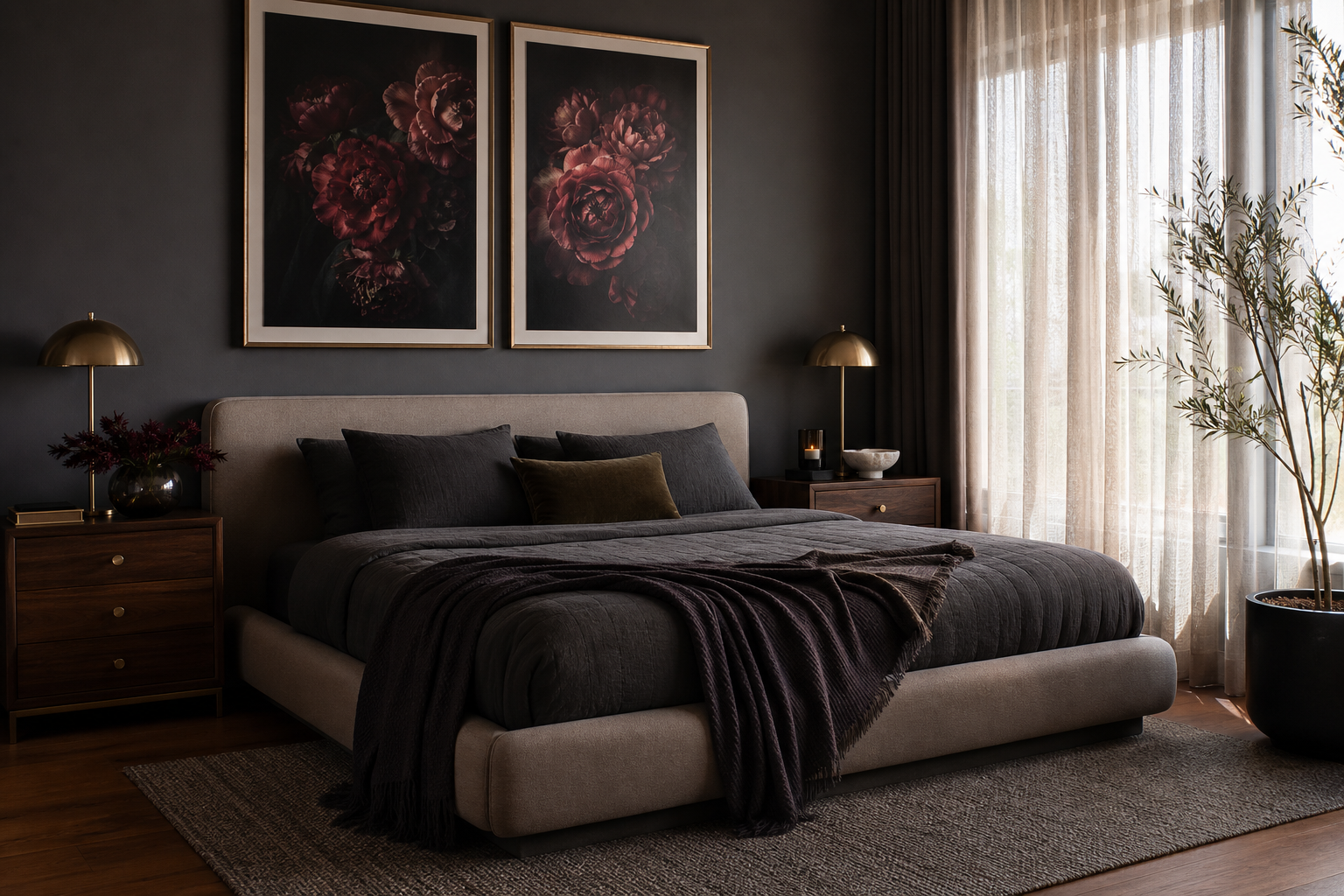
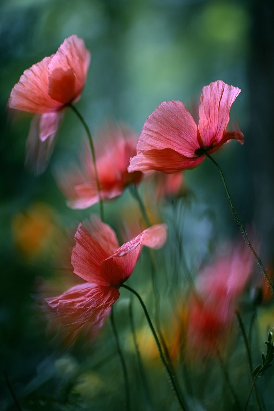
A crimson poppy 2 poster print works because it combines two things interiors often need at once: a strong focal color and an organic shape. Crimson brings energy, while the poppy form keeps that energy soft rather than harsh. In a room full of beige, oak, ivory, or charcoal, that single floral note can shift the whole balance of the space.
What Makes the Crimson Poppy 2 Poster Print Stand Out
The appeal of a crimson poppy 2 poster print starts with contrast. Crimson sits in that useful middle ground between red and burgundy, so it feels richer than bright primary red and easier to live with long term. Against pale walls, it reads crisp and clean; against darker tones, it feels dramatic and collected.
Botanical subjects also have unusual flexibility. They suit traditional spaces because flowers are timeless, but they also fit modern rooms because a single bloom or stem often has a simple, graphic silhouette. That is why a red floral print can sit comfortably near our minimalist collection just as easily as it can beside our botanical collection.
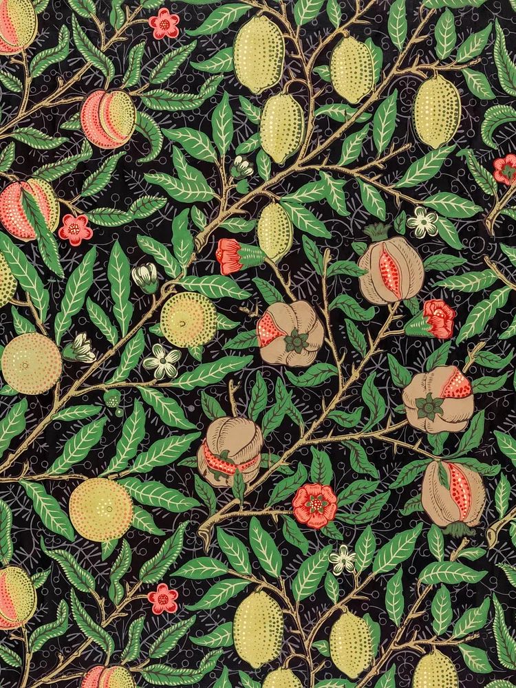
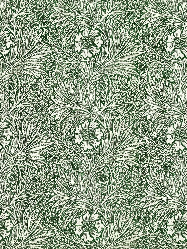
If you want the look to lean more heritage than contemporary, pair the poppy with older botanical references and decorative pattern. Prints such as William Morris's vintage pomegranate flowers or Marigold by William Morris echo the floral language without copying it exactly.
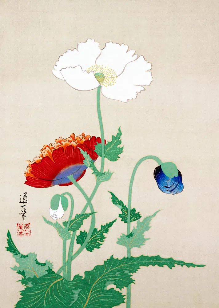
Choosing the Right Room for a Crimson Accent
A living room is usually the easiest placement. Above a sofa that measures 180 to 220 cm wide, a floral print in the 50x70 cm or 70x100 cm range has enough presence to hold the wall without needing a full gallery. Crimson warms up rooms that rely heavily on stone, boucle, light oak, or off-white upholstery.
Bedrooms are another strong option because floral art softens the architecture of the bed wall. Above a 140 to 160 cm bed, center the piece so the bottom of the frame sits roughly 20 to 25 cm above the headboard. That keeps the composition connected instead of floating too high.

Hallways and creative workspaces benefit from crimson because they often lack natural focal points. In a narrow corridor, one 50x70 cm print can add rhythm without crowding the wall. Near a desk, a floral piece introduces color that feels less visually noisy than abstract multicolor art, especially when paired with White Flower Silhouette or Vase with Flowers — Minimalist Print.
Best Color Pairings and Supporting Decor
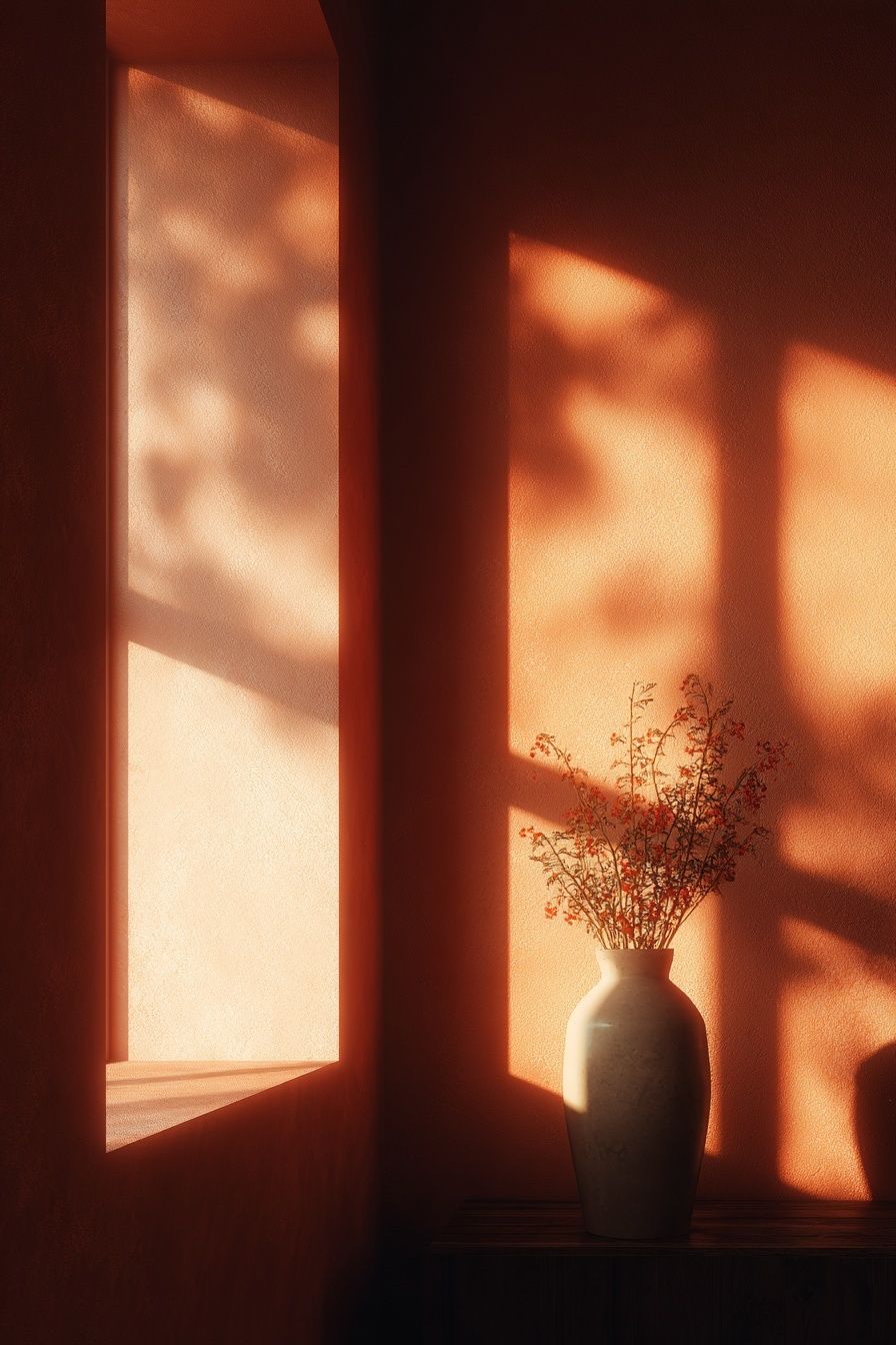
The most reliable background for crimson is a soft neutral palette: ivory, mushroom, sand, taupe, and warm gray. These tones let the flower carry the strongest saturation in the room. If your walls are white, add at least one warmer material — oak, walnut, linen, or terracotta ceramic — so the red does not feel isolated.
Deep greens are the second-best partner. Olive, eucalyptus, moss, and forest green all pull the botanical theme forward and make crimson feel grounded. A room with a green armchair, walnut sideboard, and brass lamp gives the print a fuller story than a plain white wall ever could.
Muted pinks and dusty rose tones also work well, but they need restraint. Keep them at about 10 to 15% of the visible room palette — a cushion, throw, or lampshade is enough. Too much pink can flatten the crimson and reduce the impact.


For supporting art, mix one bold floral with quieter companions. A photographic floral piece like Pink Poppy Flowers softens the palette, while decorative botanical work from Honeysuckle by William Morris introduces detail and pattern. If the room already has strong textiles, bring in simpler forms from minimalist art prints instead of another dense pattern.
Frame Styles That Elevate Botanical Art
Frame choice decides whether the art feels airy, traditional, or bold. A natural oak frame keeps a crimson floral print relaxed and contemporary. It is usually the best fit for Scandinavian, Japandi, and soft modern interiors with pale woods and neutral textiles.
A black frame creates sharper contrast. This works well if you want the print to read more graphic than romantic, especially on white or light gray walls. In offices, dining areas, or hallways, black frames often make botanical art feel cleaner and more architectural.
Matting changes the mood just as much as the frame finish. A white mat of 5 to 8 cm gives the artwork breathing room and makes smaller formats, such as 30x40 cm or 40x50 cm, look more substantial. Skip a mat if you want a more contemporary edge or if the piece already has strong white space in the composition.

If you like a layered botanical wall, pair the crimson piece with something more ornamental such as William Morris's vintage chrysanthemum flower. For a cleaner two-piece arrangement, use a pared-back companion like Vase with Flowers — Minimalist Print.
Sizing and Placement Tips for a Balanced Look
For a single statement piece above furniture, aim for art that covers about 60 to 75% of the furniture width. Over a 200 cm sofa, that means a framed piece or grouped arrangement spanning roughly 120 to 150 cm. One 70x100 cm print can work, or two smaller pieces can create the same visual weight.
Hanging height is simple: the center of the artwork should land around 145 to 150 cm from the floor in most homes. If the print hangs above furniture, use the furniture as the anchor and keep the gap between 15 and 25 cm. Wider than that, and the art starts to feel disconnected.
In tighter spaces, go vertical. A 50x70 cm crimson floral print suits narrow wall sections beside a cabinet, between windows, or at the end of a hallway. In larger rooms with 2.6 m ceilings or more, a 70x100 cm size often feels more proportionate.
How to Build a Gallery Wall Around One Bold Print
Start with the crimson poppy as the anchor piece and place it slightly off-center if needed. Gallery walls look better when they respond to furniture placement rather than forcing perfect symmetry. Build outward with quieter works in cream, green, soft pink, or sepia.
Use three visual roles: one hero piece, one or two mid-tone supports, and one lighter artwork to create breathing room. That balance prevents the wall from becoming too heavy in one color family. A floral hero can sit beside a patterned botanical such as William Morris's Honeysuckle (1876) and a softer landscape from our nature collection.

Keep spacing consistent — 5 to 8 cm between frames is the range that looks intentional in most homes. If all pieces are different sizes, match frame finish instead. If all frames differ, keep the palette tighter. Consistency in one dimension is what makes an eclectic wall feel edited.
A useful four-piece mix could combine decorative floral detail, one lighter botanical, and one calm landscape to offset the crimson. That is where pairings like William Morris florals and gentle nature scenes earn their place rather than competing for attention.
Final Styling Tips and Where to Start
If you are starting from scratch, choose the room first, then the size, then the frame. That order prevents the most common mistake — falling for an image and buying it too small. In most living rooms and bedrooms, 50x70 cm is the minimum size that gives a crimson floral enough presence to read from across the room.
Treat the crimson poppy 2 poster print as the room's color cue. Repeat that crimson tone two or three times at most — in a book spine, a ceramic object, or a textile detail — and let the rest of the palette stay calm. That makes the art feel integrated rather than matched.
A crimson poppy 2 poster print is at its best when it does one clear job: bringing warmth, softness, and focus to the wall. Build around it with natural materials, measured contrast, and one or two supporting prints that share its botanical language.
Frequently Asked Questions
What frame color is safest if I change my decor often?
Natural oak is the most flexible choice. It works with warm neutrals, green accents, black furniture, and softer pink tones without needing a full room update.
Can I hang botanical art in a darker room?
Yes — just choose a larger size or a lighter mat so the piece does not disappear. In low light, a 70x100 cm format often reads better than a 30x40 cm print.
Should I use glass or acrylic for framed wall art?
Acrylic is lighter and easier to hang, especially in larger sizes. Glass gives a slightly crisper surface but is heavier and more fragile.
What wall color makes crimson floral art look best?
Warm white, soft taupe, pale greige, and muted olive are the easiest pairings. Stark blue-undertone whites can make crimson feel harsher than intended.
How many red accents should I repeat in the same room?
Usually two or three small repeats are enough. More than that can make the room feel overly themed and reduce the artwork's focal impact.