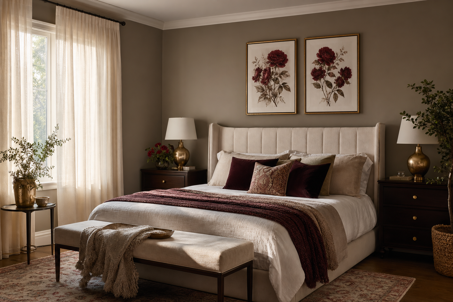
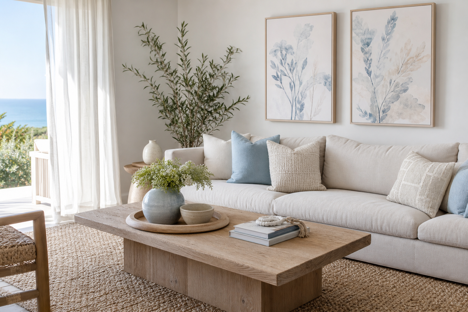
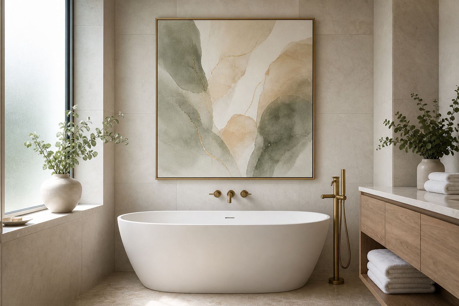
A courtyard i poster print works because it combines order with softness. Architectural subjects bring visible structure — lines, arches, thresholds, shadow patterns — while the courtyard theme keeps the image feeling calm rather than severe. In practical terms, that means it can hold a wall on its own without fighting for attention against rugs, upholstery, or shelving.
The other advantage is range. A courtyard i poster print sits comfortably beside our architecture collection, but it can also bridge into minimalist wall art or more painterly pieces from fine art prints. If your room already has clean-lined furniture, stone, oak, boucle, or matte black accents, this kind of print usually looks considered within minutes rather than overly styled.
What Makes the Courtyard I Poster Print Work
Courtyard imagery tends to have built-in balance. You often get centered composition, repeated shapes, and a controlled mix of open space and enclosure. That makes the piece especially useful in rooms that need visual stability — for example, a long wall behind a sofa or a narrow entry where too much movement in the art would feel busy.
Architectural art also ages well in interiors because it is less trend-led than slogan prints or very saturated graphics. If you want a similar crisp mood, Modern Minimalist Architecture Poster is a strong reference point: linear, restrained, and easy to integrate with contemporary furniture.
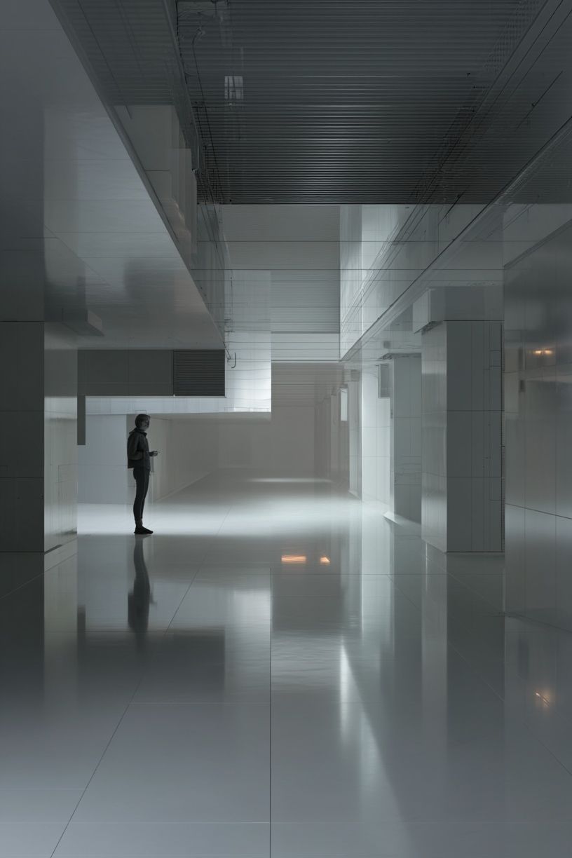
A courtyard-themed print also gives you subtle depth. Doorways, terraces, paving, and planted edges create perspective, which helps a flat wall feel more dimensional. That is useful in smaller rooms where layered decor would take up too much floor space.
Choosing the Right Room for It
The living room is the safest choice, especially above a sofa between 180 and 240 cm wide. A courtyard i poster print adds focus without overwhelming conversation areas. Hang it centrally above the sofa and keep the frame width at roughly 60 to 75 percent of the sofa width for a balanced look.

Hallways are another strong fit because architecture-themed art suits transitional spaces. In a corridor 100 to 140 cm wide, choose one vertical piece or a pair of smaller works to echo the long sightline. Courtyard imagery feels especially appropriate here because it suggests passage, entry, and movement from one space to another.
Bedrooms benefit from the print’s quiet order. Above a 150 cm queen bed, a single framed work around 70 x 100 cm usually has enough presence without feeling heavy. Pair it with soft textiles in flax, clay, or warm white for a room that feels settled. If you prefer a gentler companion piece, Window with Sheer Curtain — Fine Art Print has similar calm and softness.
Home offices often need art that sharpens the room without adding noise. A courtyard i poster print does that well because the geometry feels focused. It works particularly well above a desk, beside open shelving, or on the wall visible during video calls.
How to Frame a Courtyard I Poster Print
The cleanest option is a thin frame in oak, black, or walnut. Oak keeps the look light and organic, black gives stronger contrast, and walnut adds warmth in richer interiors. For most modern homes, frame widths between 1.5 and 2.5 cm look refined and keep the image doing the work.
A mat can make the print feel more deliberate. Use an off-white mat of 5 to 8 cm if the artwork is medium-sized — for example 50 x 70 cm. That extra border helps architectural images breathe, especially if the composition already includes a lot of stone, plaster, or shadow detail. If the print is large, such as 70 x 100 cm, skip the mat if you want a more contemporary effect.

Avoid ornate mouldings or glossy gold finishes unless the rest of the room already leans classic. A courtyard i poster print depends on restraint. Too much decorative framing can pull attention away from the architectural composition and make the piece feel less current.
Sizing and Placement Tips
Scale decides whether the art feels anchored or accidental. For a sofa wall, 50 x 70 cm works on compact seating around 160 to 180 cm wide, while 70 x 100 cm suits most standard sofas from 200 cm upward. In dining areas or entryways with higher ceilings, a vertical format can emphasise height and make the room feel more open.
The standard hanging height still applies: place the centre of the artwork around 145 to 150 cm from the floor. Above furniture, leave 15 to 25 cm between the top of the furniture and the bottom of the frame. Less than 10 cm feels cramped; more than 30 cm often makes the art float.
If the wall gets direct sun for several hours a day, use UV-protective acrylic or glazing. This matters most in bright rooms with south- or west-facing windows. It keeps subtle tonal variations intact over time — important for courtyard scenes, where shade and light transitions carry much of the image.
Colour Palettes That Complement the Look
Neutral palettes are the most natural partner. Think chalk white, warm beige, taupe, stone, and soft brown. These shades support the architectural feel without flattening it. If your furniture includes linen upholstery, pale oak, or travertine, the courtyard i poster print will usually slot in with almost no adjustment.
Earthier rooms can go deeper with terracotta, olive, sand, and muted rust. Those colours echo courtyard materials — clay walls, pavers, sun-washed surfaces, planted edges — and make the print feel grounded. In that setting, pieces like Modern Tropical Villa — Architecture Print or Serene Garden Courtyard Photography Poster can extend the same mood.
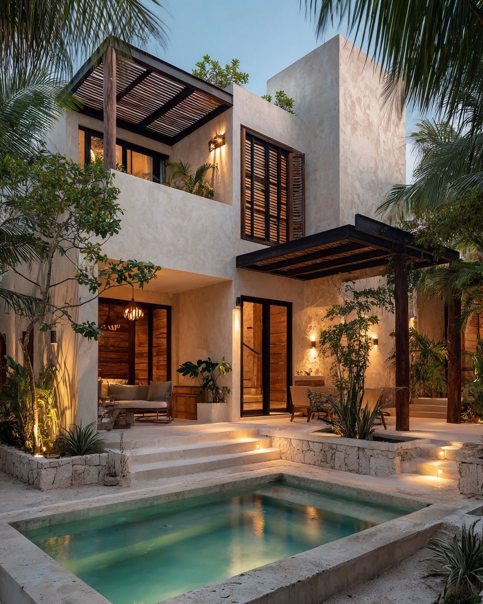
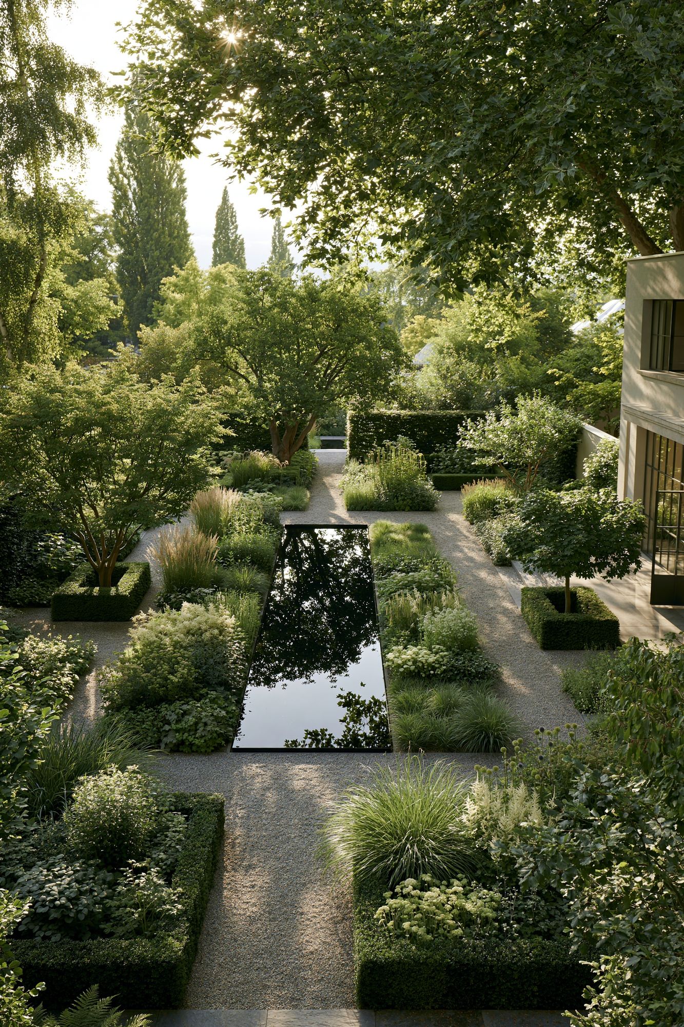
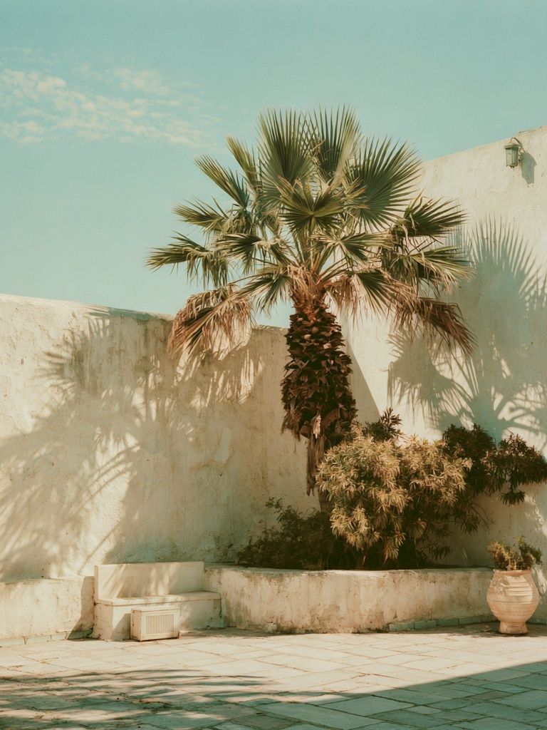
For a monochrome scheme, use charcoal, ivory, greige, and black accents. This suits homes with steel lighting, black-framed windows, or streamlined cabinetry. Add one softer textile — a wool throw or textured curtain — so the room does not become too sharp.
Creating a Gallery Wall Around It
A courtyard i poster print makes a strong anchor piece in a gallery wall because it already has structure. Start with it as the largest work, then add 2 to 4 supporting pieces that share either subject, tone, or spacing. Keep the gap between frames consistent — 5 to 7 cm is a reliable range for a tight, editorial arrangement.
The easiest mix is one architectural print, one soft fine-art piece, one minimal abstract, and one organic illustration. That gives enough contrast without visual drift. For example, you could pair the main print with Modern Loft Living Room — Interior Design Print for another interior-architecture note, then soften the set with Swallows in Flight — Illustration Print.

If you want the wall to feel more design-led, introduce one geometric piece from our Mid Century Modern collection. The key is control: repeat at least one element across the grouping, whether that is black frames, warm paper tones, or a palette limited to five colours.
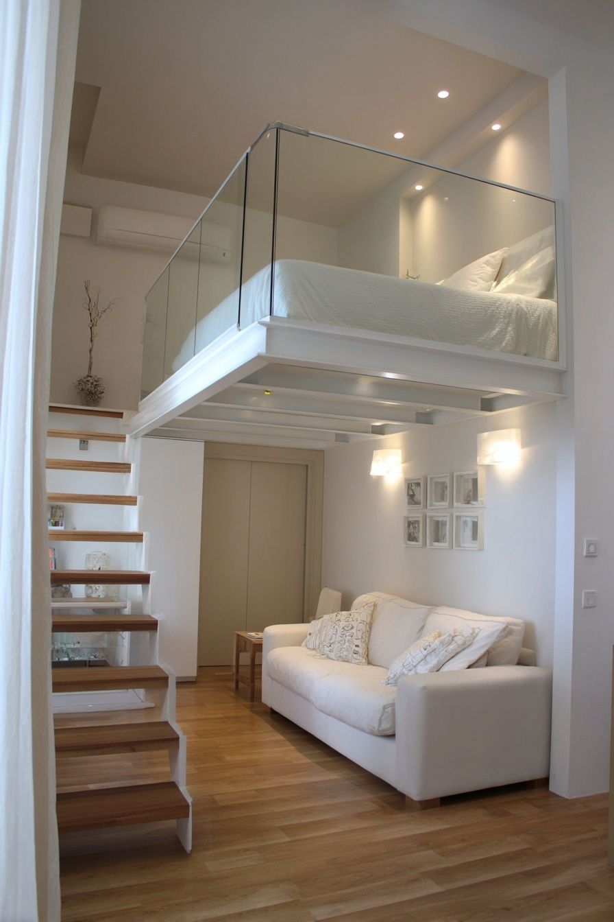
When planning layout, tape kraft paper templates to the wall first. Live with the arrangement for 24 hours before making holes. That small pause often catches spacing problems you miss when styling quickly.
Final Styling Notes and Shop Tips
A courtyard i poster print looks best when the surrounding decor gives it room. If the wall already has floating shelves, bold wallpaper, or a TV unit with many objects, simplify first. Remove 20 to 30 percent of nearby accessories and the art will immediately read more clearly.
Before buying, measure the wall, not just the furniture. Note the total width, ceiling height, and window position, then compare those numbers to the print size you are considering. If you are choosing between two sizes, the larger one is usually the better option for open walls — especially in living rooms where undersized art is the most common mistake.
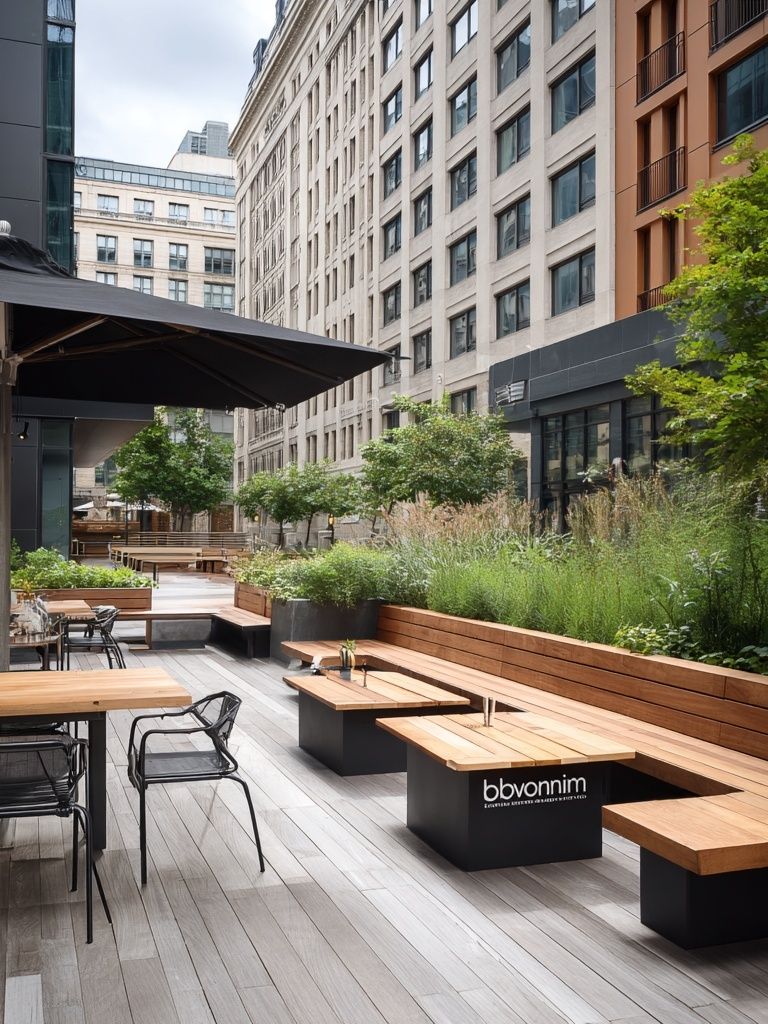
For a slightly more urban interpretation of the theme, Urban Courtyard Terrace Photography Poster offers a layered architectural feel that works well in contemporary spaces with concrete, black metal, and lighter woods. If you want something warmer and more residential, Modern Mountain House — Architecture Print brings similar composure with a softer natural setting.
Putting it together
A courtyard i poster print earns its place because it is calm, architectural, and flexible. It can sharpen a living room, quiet a bedroom, or give an entryway a more intentional focal point — especially when the frame, size, and palette are chosen with the room in mind.
Keep the styling simple: right scale, restrained framing, and materials that echo the print’s clean structure. Once those three choices are right, the rest of the room tends to fall into place.
Frequently Asked Questions
What frame colour is safest if I change my decor often?
Natural oak is the most adaptable. It works with warm neutrals, darker woods, black accents, and most fabric colours without feeling tied to one trend.
Should I use glass or acrylic for a large print?
Acrylic is usually better for sizes like 70 x 100 cm because it is lighter and safer to hang. Choose a matte or UV-protective version if the room is bright.
Can this type of print work on a narrow wall between windows?
Yes — choose a vertical format or a narrower frame profile. Leave at least 8 to 12 cm of wall visible on each side so it does not feel squeezed in.
What curtain and rug textures pair well with architectural wall art?
Linen curtains, low-pile wool rugs, and subtle woven textures work best. They add softness without competing with the clean lines of the artwork.
How do I test whether the size is right before ordering?
Mark the full frame size on the wall with painter’s tape. View it from the doorway and from your main seating position to check balance at a distance.