A camellias-4 of 8 poster print works best when you treat it as a refined botanical focal point rather than a filler piece. Camellias have rounded petals, soft symmetry, and a classic garden feel that reads polished in both traditional and modern rooms. That balance makes the print easy to place alongside our botanical collection, quieter minimalist art prints, and even selected fine art wall pieces.
Why Camellias Work So Well in Modern Interiors
Camellia imagery has structure. Unlike looser wildflower motifs, camellias tend to appear fuller and more sculptural, which helps the artwork hold visual weight without feeling loud. In practical terms, that means a camellias-4 of 8 poster print can stand alone over a console or layer neatly into a salon-style wall without getting lost.
The other advantage is its palette flexibility. Most camellia artwork leans into petal whites, blush pinks, soft reds, olive greens, and warm neutrals. Those shades sit comfortably with contemporary interiors that already use limestone, beige, mushroom, charcoal, or muted sage. If you want a room to feel calmer by roughly 20 to 30 percent, botanical forms with rounded petals usually do more than angular geometric art.
For a slightly more layered botanical scheme, pair camellias with historic floral work rather than unrelated graphics. A detailed pattern-based piece such as William Morris's Honeysuckle (1876), or a softer single-subject print from our nature prints, gives the arrangement depth without competing for attention.

Choosing the Right Room for a Botanical Poster
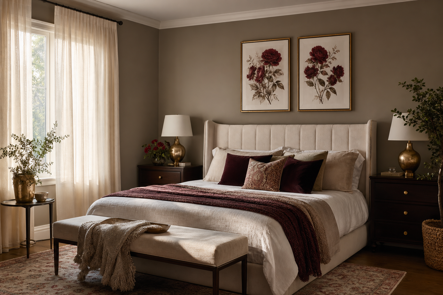
Bedrooms are the most natural fit for floral art with a soft rhythm. A camellias-4 of 8 poster print looks especially strong centered above a 140 cm to 180 cm bed, where the floral shape can soften the straight lines of a headboard. Keep the artwork width at around 50 to 75 percent of the bed width for a balanced proportion.
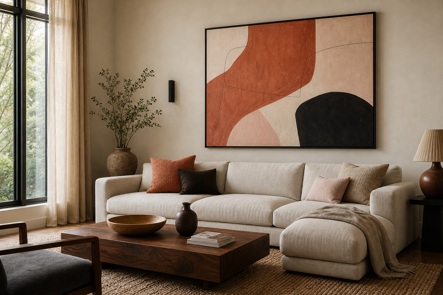
Living rooms suit camellias when the furniture is clean-lined. If you have a sofa in ivory, grey-beige, or olive, hang the print 15 to 20 cm above the backrest so it feels anchored to the seating area. In a hallway, use the print to add detail where furniture is limited — over a slim console, next to a mirror, or at the end of a narrow corridor where a floral focal point helps the space feel finished.
Home offices are often overlooked, but they are ideal for botanical wall art because floral subjects reduce the visual hardness of desks, screens, and shelving. Place the print slightly off-center above a desk if one side of the room includes a lamp or stack of books — asymmetry often feels more editorial than rigid centering.

If you are building a fuller floral story in shared spaces, a decorative companion such as this vintage chrysanthemum print can reinforce the botanical theme while keeping the room collected rather than overly matched.
How to Match the Print with Your Color Palette
In neutral interiors, let the artwork bring the room’s most delicate color. Think warm white walls, flax linen, pale oak, and sand-toned upholstery. Here, the camellia print becomes the softest point of contrast, especially if the petals include blush, cream, or muted rose.
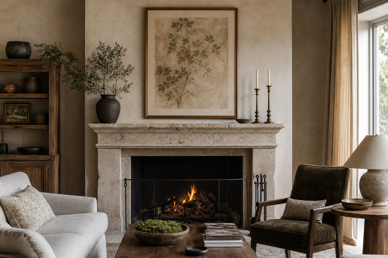
Earthy spaces need stronger grounding. If your room uses terracotta, tobacco brown, moss, or clay, pull out the foliage tones in the artwork through cushions, ceramics, or a darker wood frame. This prevents a floral print from floating too lightly in a room with heavier materials.
Romantic interiors suit camellias naturally, but restraint matters. Keep the palette to three main tones — for example dusty pink, ivory, and walnut — so the room feels elegant rather than sweet. For moody rooms, use the print to break up charcoal, deep green, or aubergine walls with something more luminous. A floral image with pale petals becomes far more dramatic against darker paint than on white walls.



A good rule is to repeat one color from the art at least twice elsewhere in the room. If the print includes sage leaves, bring that shade into a cushion and a glass vase. If it includes cream petals, echo that in lampshades or bedding. That repetition makes the camellias-4 of 8 poster print look intentionally chosen rather than newly added.
Frame and Finish Ideas That Elevate the Artwork
The frame changes the tone more than most people expect. Light oak makes botanical art feel Scandinavian and airy. Walnut adds depth and works especially well in rooms with antique or mid-century furniture. Black frames sharpen the edges of a soft floral image, which can be useful if the room already has strong dark accents like iron lighting or black side tables.
A mat border gives the artwork room to breathe. For a 30 x 40 cm print, a mat width of 4 to 6 cm is usually enough. For 50 x 70 cm, aim closer to 6 to 8 cm if you want a gallery-style finish. Mats are particularly effective with florals because they separate organic detail from the wall and make the piece feel more considered.
Glazing matters too. In bright rooms, choose acrylic or glass with reduced glare if the print faces a window. In dimmer spaces, standard glazing is often enough. The main point is clarity — botanical detail should read cleanly from across the room.

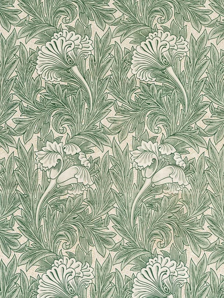
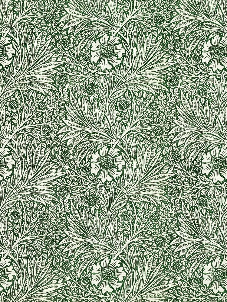
If you like a heritage look, patterned florals such as Marigold by William Morris or Honeysuckle by William Morris sit beautifully near camellia imagery in walnut or dark bronze-toned frames.
Sizing, Spacing, and Gallery Wall Placement
Scale is where floral styling usually succeeds or fails. For a single statement piece above furniture, the art should span about 60 to 75 percent of the furniture width. Above a 160 cm sofa, that means aiming for one large piece or grouped pieces totaling roughly 96 to 120 cm across.
Hanging height should be practical, not guessed. The center of the artwork is often best placed around 145 cm from the floor in a standard room. Above furniture, use the lower edge of the frame as your guide and keep it around 15 to 20 cm above the top of the sofa, headboard, or console.
For gallery walls, let the camellia print act as the visual anchor. Position it slightly off-center, then build outward with smaller works in related palettes. Keep gaps consistent — 5 to 7 cm between smaller frames, or up to 8 cm if the arrangement includes larger pieces. Mix one or two denser patterned botanicals with one airy image so the wall has rhythm.

A useful companion for this kind of layered arrangement is William Morris's vintage willow leaves, which adds movement without stealing focus from the main floral piece.
Styling Tips for a Soft Botanical Look
The easiest way to support a floral print is through texture, not more floral motifs. Linen curtains, a slub cotton cushion, a matte ceramic vase, and natural wood tones all reinforce the softness of botanical artwork. One floral artwork, one branch arrangement, and two to three tactile materials are often enough.
Keep surfaces edited. If the print hangs over a console, style the console with a low stack of books, a bowl, and one sculptural object. If it hangs above a bed, let the bedding carry the softness — washed linen in ivory, dusty rose, or pale sage works especially well. Avoid glossy synthetic finishes right beneath the artwork, as they can make delicate floral detail feel less elevated.
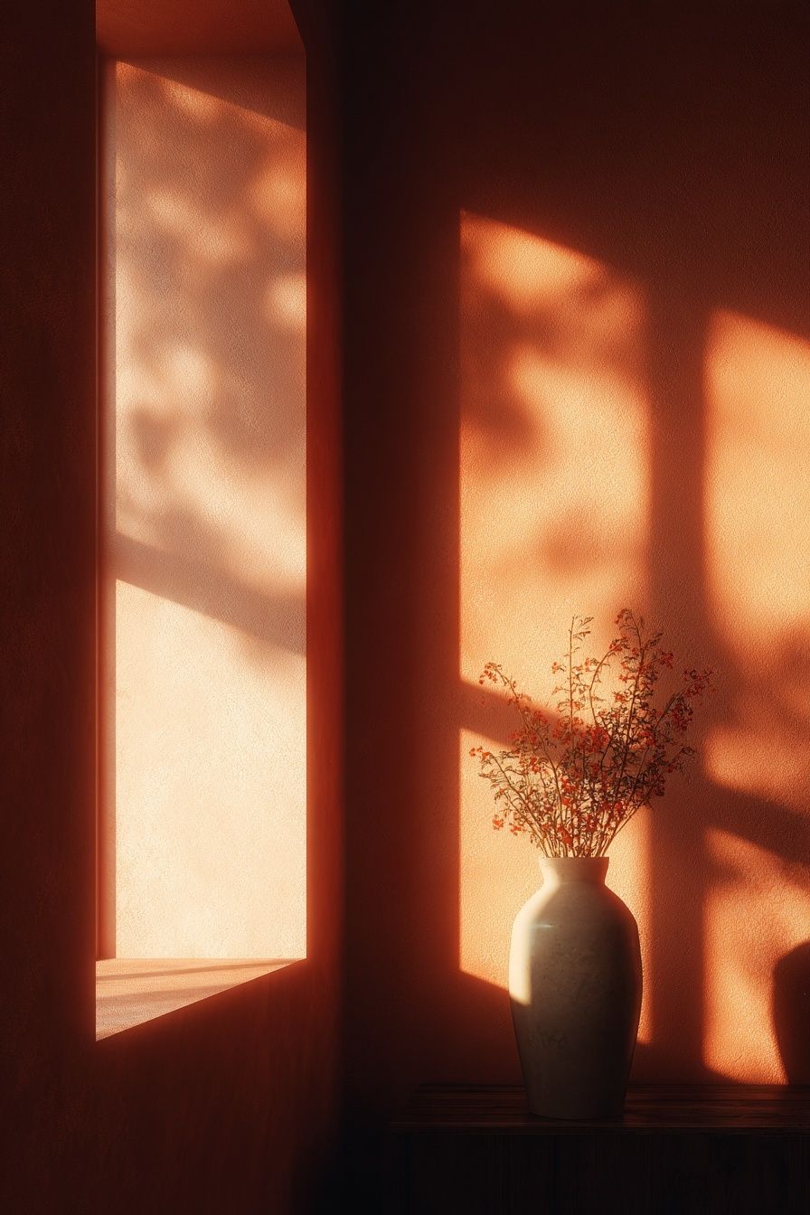
Layering across styles also works when you keep the subject linked. A camellia print next to this minimalist vase-with-flowers artwork creates a cleaner, modern botanical pairing. If you want something more painterly, a figurative floral piece like Woman with a Parasol can add softness without repeating the same flower form.
Wrap-Up: How to Make the Print Feel Collected, Not Forced
A camellias-4 of 8 poster print looks best when the room repeats its softness in measured ways — through frame choice, restrained color echoes, and natural materials. You do not need to build an entire floral room around it. One strong botanical print, the right hanging height, and a few related textures usually create a better result than over-styling.
If you want the finished space to feel collected, mix the camellia artwork with one or two complementary pieces from our botanical wall art or our minimalist collection. Keep the palette tight, vary the scale, and let the floral subject do the quiet work.
Frequently Asked Questions
What frame color is safest if I change my decor often?
Light oak is the most flexible choice. It works with warm neutrals, muted greens, blush tones, and darker seasonal accents without looking heavy.
Should I use a mat for a floral print in a small room?
Yes — a slim mat can actually make the artwork feel lighter. Choose a 4 to 5 cm off-white mat to add breathing room without making the frame look oversized.
Can botanical wall art work with grey walls?
It can, especially if the grey has a warm undertone. Add one connecting accent in sage, cream, or dusty pink so the artwork does not feel isolated against the wall.
What size works best above a bedside table instead of above the bed?
A 30 x 40 cm or 40 x 50 cm piece usually fits best. Hang it so the center lands near eye level when standing, and keep at least 10 cm of breathing room above the table lamp.