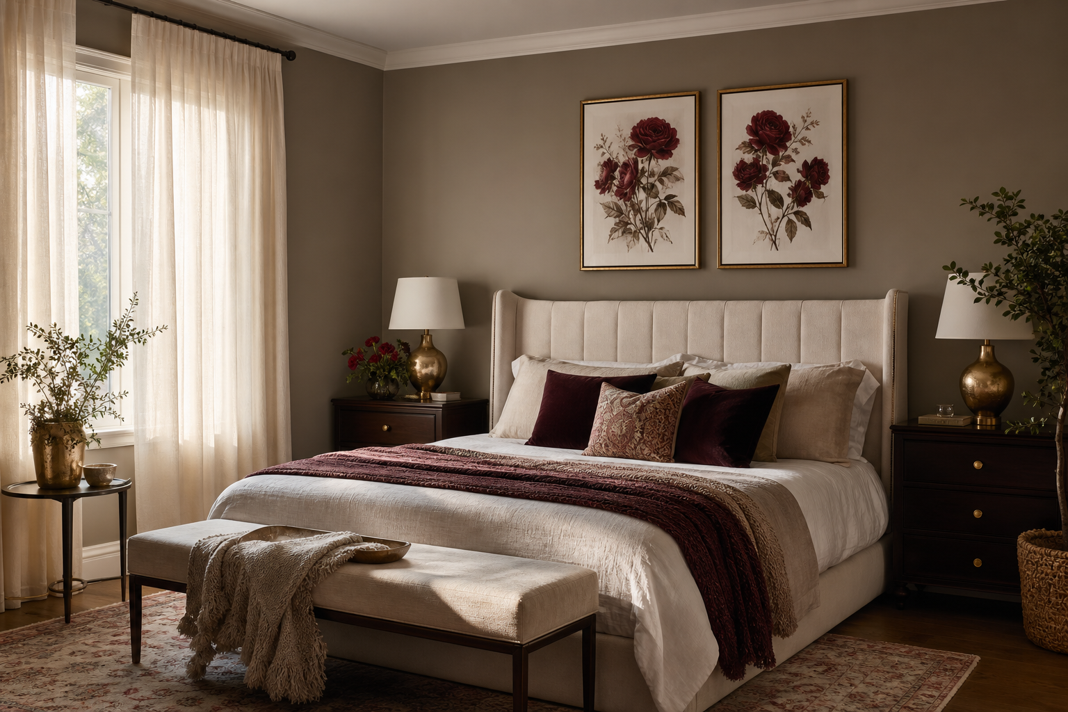
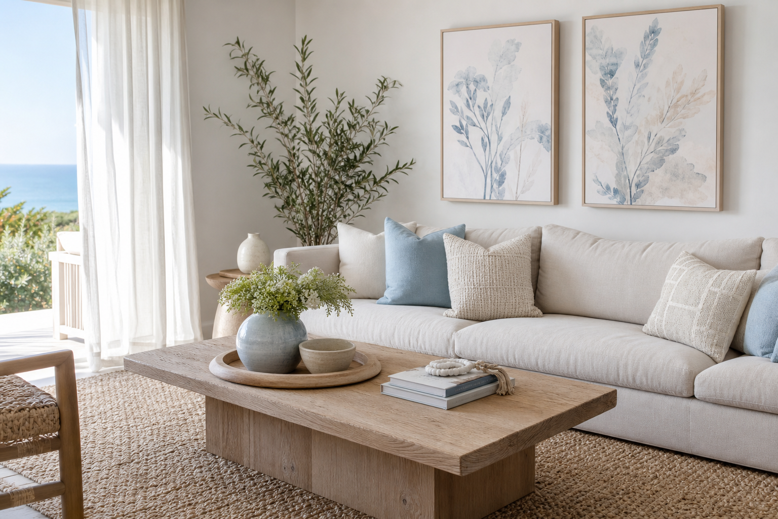
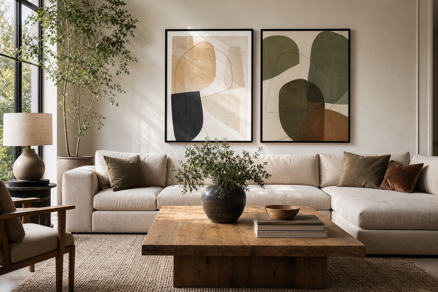
An abstract poster print is one of the easiest ways to shift the mood of a room without changing furniture, paint, or layout. It can introduce colour, sharpen a neutral scheme, or soften a space filled with straight lines and hard finishes. The key is not choosing "any abstract" — it is choosing one that matches your room's scale, palette, and energy.
Why Abstract Art Works in Modern Interiors
Abstract art works well because it is flexible. A landscape or figurative piece often pushes a room toward one theme, while an abstract poster print can sit comfortably in a minimalist interior, a mid-century modern scheme, or a layered bohemian room without feeling forced.
It also helps with mood-setting. Soft washes, curved forms, and tonal textures tend to calm a room, especially in bedrooms and reading corners. Sharper lines, stronger contrast, and geometric compositions create more energy — useful in home offices, hallways, or dining areas where you want visual movement.
If your furniture is simple, abstract wall art prevents the room from looking flat. A sofa in beige, grey, black, or off-white often benefits from a piece with visible texture or colour variation. If your room already has character — ribbed wood, boucle, brass, or patterned textiles — abstract designs can connect those materials without adding another obvious motif.

Choosing the Right Colours and Composition
Start with the 60-30-10 rule. In most rooms, 60% is the dominant colour, 30% is secondary, and 10% is accent. Your art does not need to copy all three, but it should usually reflect at least one dominant tone and one accent tone. That is why a soft cream room can handle blush, ochre, rust, charcoal, or teal so well.
For quiet interiors, choose tonal pieces with low contrast. A print such as Textured White Abstract Poster works particularly well with oak, linen, plaster walls, and other soft materials because it adds interest without breaking the palette. This approach suits Scandinavian-inspired spaces and rooms where you want the wall art to feel integrated rather than loud.
For more contrast, use one stronger colour repeated elsewhere in the room at least twice. A teal form can echo a cushion and a vase. A terracotta note can relate to a rug border and ceramic decor. If you like richer schemes, explore our abstract collection alongside fine art prints to mix painterly texture with more structured composition.



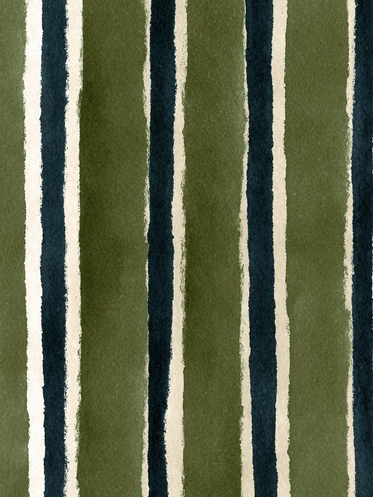
Composition matters as much as colour. Large organic shapes feel calmer than many small busy elements. Vertical movement can make a room feel taller. Horizontal compositions are strong above a sofa, headboard, or sideboard because they visually widen the furniture below. If your room already has a lot of pattern — striped curtains, woven rugs, checkerboard throws — choose simpler art so the wall does not compete.
Finding the Best Size and Placement
Size is where many rooms go wrong. As a rule, wall art above furniture should fill around 60% to 75% of the furniture width. Above a 180 cm sofa, that means art around 108 to 135 cm wide in total. That could be one large piece or a pair grouped closely.
Hang the centre of the artwork at roughly 145 cm from the floor in rooms where it stands alone. Above furniture, keep the bottom edge around 15 to 25 cm above the top of the sofa, console, or headboard. If you leave a 35 cm gap, the art often feels disconnected and floats too high.

One large statement piece gives the cleanest result, especially in modern spaces. A grouped arrangement works better when you want rhythm or need to fill a broader wall. Keep spacing between frames at 5 to 8 cm for a tight, intentional look. Wider gaps quickly feel accidental.
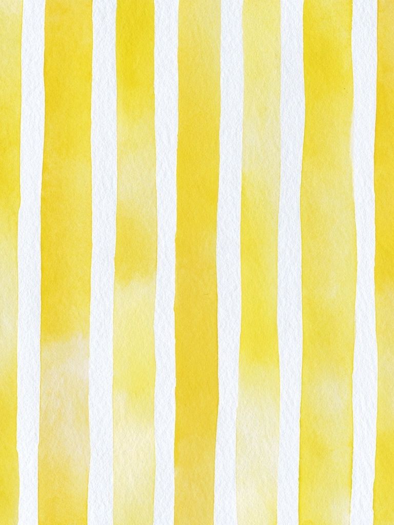
If you are styling a narrow wall, choose a vertical work with upward movement. Yellow Watercolor Stripes Poster is a good example of a composition that can help pull the eye upward. For larger uninterrupted walls, a wider design with more visual weight usually anchors the room more effectively than a tall narrow piece.
Framing Ideas That Elevate the Look
Frames change the personality of an abstract poster print more than most buyers expect. A slim black frame gives a sharper, gallery-style edge and works particularly well with high-contrast or graphic pieces. Oak frames warm up cooler palettes and connect naturally with wood furniture, cane details, and softer fabrics. White frames feel lighter, but they need enough contrast against the wall to avoid disappearing.
Mounts are useful when the artwork is smaller or more delicate in tone. A white mount around a subtle abstract creates breathing room and makes the piece feel more curated. For example, a low-contrast textured work can look much more refined with a 5 to 8 cm mount than without one. On larger statement art, skipping the mount often feels more contemporary.

If you want a polished look, repeat the frame finish in at least one other element — black in lighting, oak in shelving, brass in hardware. If your room mixes finishes already, keep the frame simple and let the artwork supply the variation.
Styling by Room: Living Room, Bedroom, and Office
In the living room, the artwork usually acts as the anchor. It should relate to the room's largest furniture piece and sit confidently within the full composition. Stronger pieces such as Yin Yang Teal Abstract Poster work well in living spaces because they can hold attention from across the room and tie together accent colours spread around the seating area.
In the bedroom, calmer is usually better. Choose softer edges, fewer colours, and less contrast than you would in a social space. Art above the bed should support rest, not dominate. Pair subtle abstracts with tactile materials such as washed cotton, boucle, linen, and warm wood for a balanced result.
In a home office, an abstract print can add focus without becoming distracting. Look for shapes with clear structure or directional flow. Graphic pieces can sharpen a simple desk setup, especially when paired with storage in white, black, or natural oak. If you lean toward retro interiors, our Retro Geometric Shapes Poster is a useful reference for how bold forms can energise a workspace while staying controlled.

You can also bridge styles by mixing categories carefully. A textured abstract beside Textured Concrete Wall — Minimalist Print can feel architectural and restrained, while combining abstract colour with pieces from our Ceramic Vases with Dried Branches — Bohemian Print direction creates a softer, earthier interior.

Common Styling Mistakes to Avoid
The first mistake is going too small. A 30 x 40 cm print above a full-size sofa often looks lost unless it is part of a larger arrangement. For most sofas, start at 50 x 70 cm and go up from there. For a bed, 70 x 100 cm or a pair of 50 x 70 cm frames usually reads better than one small piece.
The second mistake is colour mismatch. If the art introduces a bright red, cobalt, or acidic yellow that appears nowhere else in the room, it can feel random. That does not mean everything must match — only that the print should converse with the room. Pull one or two tones into cushions, books, ceramics, or a throw.
The third is overcrowding. Abstract art often has enough movement on its own. If you place it beside shelves full of objects, patterned wallpaper, and multiple competing frames, the effect weakens. Leave negative space around the piece so the composition can breathe.
The fourth is choosing a style that ignores the room's underlying character. In a highly pared-back room, a chaotic multicolour work may overwhelm. In an expressive bohemian room, an overly stark piece can feel detached. If you want a bridge between styles, products such as Terracotta Hexagon Texture Print or Blush Watercolor Abstract Poster often work because they bring abstract form in softer, more adaptable palettes.

Final Tips for Choosing an Abstract Poster Print
A good abstract poster print should still feel right after the room changes slightly — new cushions, a different rug, another lamp. That is why balanced colour, strong composition, and the right scale matter more than chasing a trend. Choose the piece that supports the room first, then build smaller accessories around it.
If you are unsure, start with one versatile print in a frame finish that already exists in your space. Measure the wall, mark the dimensions with painter's tape, and view it from across the room before ordering. That simple step prevents most sizing mistakes and helps you choose with confidence.
Frequently Asked Questions
What frame colour is safest for abstract art?
Black and oak are the most versatile. Black suits graphic and high-contrast work, while oak softens painterly or neutral pieces.
Can I mix abstract art with photography or line art?
Yes — keep one common element consistent, such as colour temperature, frame finish, or spacing. That makes different styles feel intentional together.
Should abstract wall art match my rug exactly?
No. Aim for overlap, not duplication — one or two shared tones are enough to connect the room.
Is glass glare a problem in bright rooms?
It can be near large windows or direct sunlight. Hang the frame on a side wall rather than opposite the window, or choose a softer-toned print that still reads well with some reflection.
How do I test placement before hanging?
Use masking tape or kraft paper cut to the exact frame size. Leave it up for 24 hours and check the height in daylight and evening lamp light.