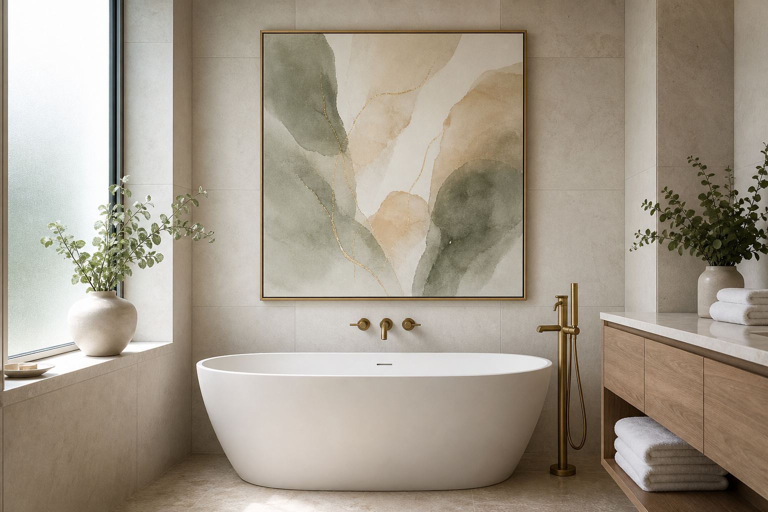
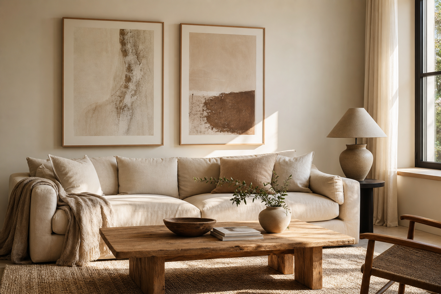
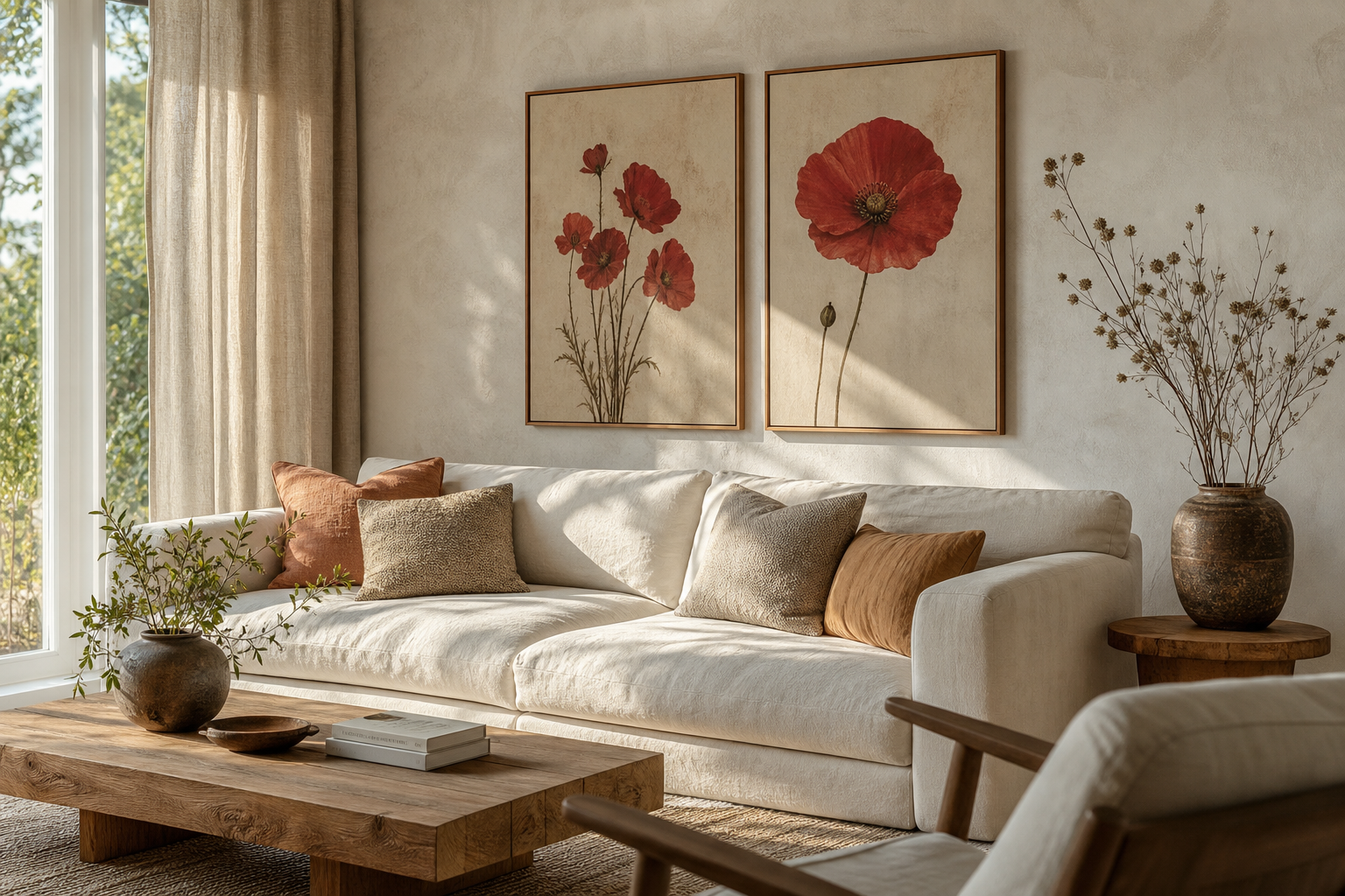
A camellias-1 of 8 poster print has the kind of detail that makes a room feel considered rather than decorated. Camellias are structured flowers — fuller and more formal than wildflowers, softer than roses — so they bridge classic and modern interiors with ease. That balance is why botanical art stays relevant year after year, especially within our botanical collection and layered spaces that need one gentle focal point.
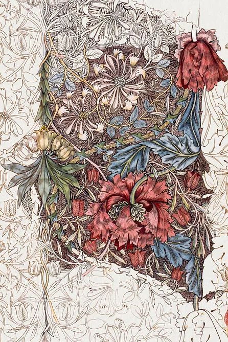
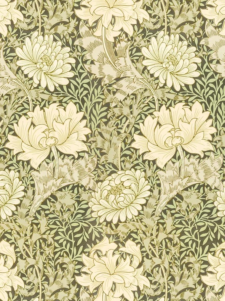
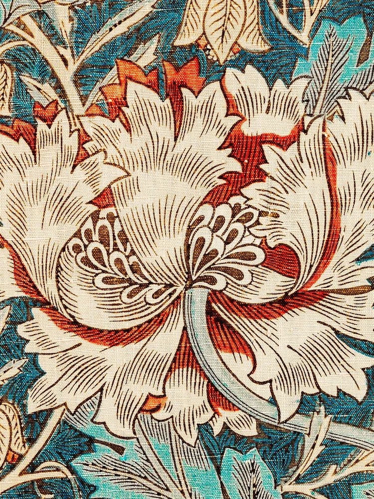
The print also works because floral subjects soften hard lines. In rooms with straight-edged furniture, plaster walls, black metal lighting, or pale oak storage, camellia artwork introduces curved shapes and organic colour variation. If you already like the refined pattern language of Honeysuckle by William Morris or the symmetry of this vintage chrysanthemum design, a camellias-1 of 8 poster print sits naturally in the same visual family.
Why Camellias Work So Well in Modern Interiors
Camellias read as timeless because their form is neat. Petals are layered, rounded, and compact, which gives the artwork a composed look even when the colours are soft. That makes the subject useful in modern interiors where you want decoration without visual clutter. A single floral print can warm up a simple room more effectively than three unrelated accents.
Botanical pieces also bring historical character without making a space feel old-fashioned. In a contemporary apartment, one floral print can echo the charm of traditional botanical motifs while still working beside clean-lined furniture, boucle upholstery, and plain ceramics. The key is restraint: one print, one strong frame choice, and a palette that repeats only two or three tones from the artwork.
Choosing the Right Room for the Print
Bedrooms are the most natural setting for camellia art because the subject feels calm and intimate. Hang one 50x70 cm print above a 140-160 cm bed for a centred, airy composition, or use a pair of florals over wider headboards. Keep the artwork width at roughly 50 to 70 percent of the furniture below it so the wall feels anchored.
Living rooms suit the print when the palette is quiet. Above a sofa, a camellia piece works best if there is breathing room around it — at least 15 to 20 cm from a shelf, lamp, or wall sconce. In hallways, a narrower 30x40 cm or 40x50 cm format gives enough detail without crowding the passage. Reading corners are another strong choice, especially next to a linen armchair, a floor lamp, and one small side table in ash or walnut.

If you want the room to feel lighter, place the print opposite a window so the floral colours catch natural light. If the room already has many patterns — striped upholstery, patterned rugs, open shelving — move the print to a quieter wall. Botanical subjects need a little negative space to feel elegant rather than busy.
How to Frame a Botanical Poster Beautifully
A botanical print nearly always looks best in a frame that supports detail rather than competes with it. Light oak is the safest choice for Scandinavian and transitional interiors. Black works well when the room already has black accents in lamps, handles, or side tables. Antique gold suits more traditional rooms, but keep the profile slim — around 1.5 to 2 cm — so the finish adds polish without stealing focus.
A mat border makes a noticeable difference. For a 40x50 cm print, a white or soft-ivory mat between 4 and 6 cm gives the artwork space and makes the floral subject feel more gallery-like. Choose clear acrylic or glass with a low-reflection finish if the print will hang opposite a window. Glossy glazing often throws too much glare across delicate artwork.

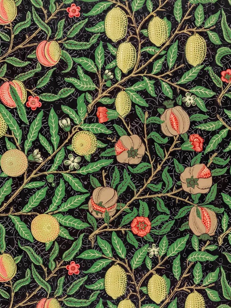
For rooms with a layered heritage look, pair the camellia piece with related floral designs rather than unrelated statement art. William Morris's vintage pomegranate flowers and the 1876 Honeysuckle print are strong references for this approach because they share botanical complexity without repeating the exact same flower form.
Best Colours to Pair with Camellia Artwork
The easiest wall colours for camellia art are warm white, chalk, putty, pale greige, and muted sage. These tones let the floral detail stay crisp while softening the contrast around the frame. If your print contains blush, cream, leaf green, or dusty red, repeat only one or two of those in the room through cushions, a throw, or one ceramic object.
For textiles, stick to tactile materials over loud pattern. Linen, washed cotton, wool bouclé, and slub weaves keep the look quiet. A room with camellia artwork often benefits from 70 percent neutrals, 20 percent botanical greens, and 10 percent accent colour. That ratio prevents the floral theme from becoming too literal.
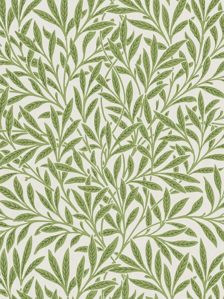
If you prefer a fresher look, pair florals with airy fine art such as Window with Sheer Curtain. If you want a more grounded arrangement, use nature-led greens from Majestic Trees or build a vintage botanical scheme from our botanical wall art selection.
Sizing and Hanging Tips for a Balanced Look
For a single statement piece, 50x70 cm is the most flexible size in standard rooms. It has enough presence above a console, chest, or bedside pair without overpowering the wall. In smaller apartments, 40x50 cm is often the better fit, especially if ceilings are under 240 cm high or furniture is compact.
Hang the centre of the frame at about 145 cm from the floor as a starting point. Above furniture, leave 15 to 25 cm between the top edge of the sofa, headboard, or console and the bottom of the frame. If you hang two pieces side by side, keep spacing consistent — usually 5 to 8 cm between smaller frames and 8 to 12 cm between larger ones.
Avoid choosing a print that is too narrow for the furniture below it. As a rule, wall art should span about two-thirds of the width of the item beneath. Above a 180 cm sofa, aim for a total art width near 110 to 120 cm. That could mean one larger camellia piece or a pair of coordinated botanical works.
Creating a Soft Gallery Wall with Floral Art
A soft gallery wall works best when one print leads and the others support. Use the camellias-1 of 8 poster print as the anchor, then add three complementary pieces with shared tones, related subject matter, or similar line quality. This is where botanical and nature art mix especially well: florals bring detail, while trees or landscapes open the composition.

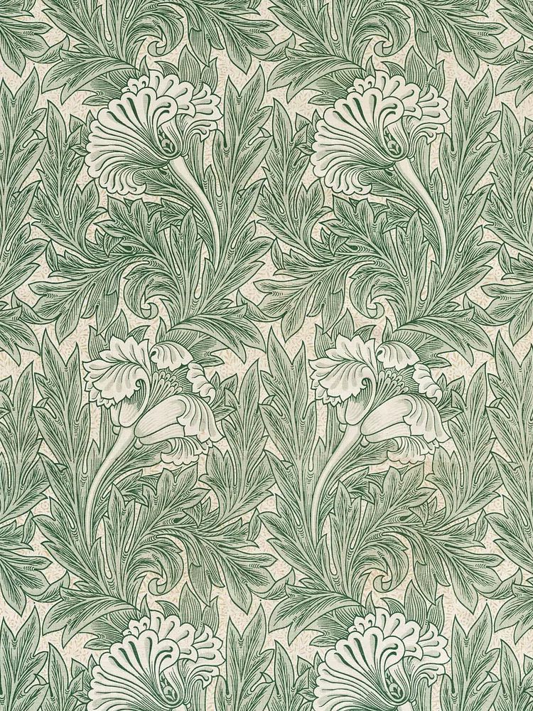
One reliable formula is 1 floral hero, 2 supporting botanicals, and 1 calm landscape. Try pairing a camellia print with Textile Fragment by William Morris for pattern depth, then add Serene Landscape to soften the arrangement. Keep every frame finish identical if the wall is small, or limit yourself to two finishes — such as oak and black — if the wall is wider than 140 cm.

Before hanging, lay the arrangement on the floor and photograph it from above. This shows whether one corner feels visually heavy. Start with 6 to 8 cm gaps between frames for a collected look. Wider spacing makes the wall feel more formal; tighter spacing makes it feel more editorial.
Style Notes and Final Touches
The finishing details matter as much as the print itself. A camellias-1 of 8 poster print looks strongest when at least one nearby object repeats its softness — a rounded lamp base, a pleated shade, a curved chair arm, or a ceramic vase with branches. That repetition helps the art feel integrated rather than simply hung.
Keep nearby surfaces edited. One stack of books, one vase, one candleholder is usually enough beneath floral art. Too many small accessories compete with petal detail and dilute the elegance that makes botanical styling work in the first place.

Final thoughts
Styling floral wall art well is mostly about proportion, restraint, and colour repetition. Choose a room with enough visual calm, frame the piece simply, and echo one or two tones from the artwork in textiles or ceramics.
If you like interiors that feel soft but not overly sweet, a camellias-1 of 8 poster print is an easy piece to build around. It brings order, detail, and warmth — especially when paired with considered framing and a few related works from the botanical category.
Frequently Asked Questions
What frame colour is safest if I change my decor often?
Light oak is the most flexible option. It works with warm neutrals, muted greens, black accents, and both modern and traditional furniture.
Should I use a mat for a floral print?
Yes, if you want a cleaner and more elevated look. A 4-6 cm mat helps delicate botanical details stand out and makes standard sizes feel more custom.
Can botanical art work on coloured walls?
It can, as long as the wall colour is muted rather than saturated. Sage, clay-beige, dusty blue, and soft greige usually support floral artwork well.
What type of glazing is best in a bright room?
Low-reflection acrylic or glass is the practical choice near windows. It reduces glare and keeps the artwork readable through changing light during the day.
What other subjects pair well with camellia art?
Leaf studies, vintage botanical patterns, and quiet landscape prints pair best. They keep the mood soft while adding contrast in shape and scale.