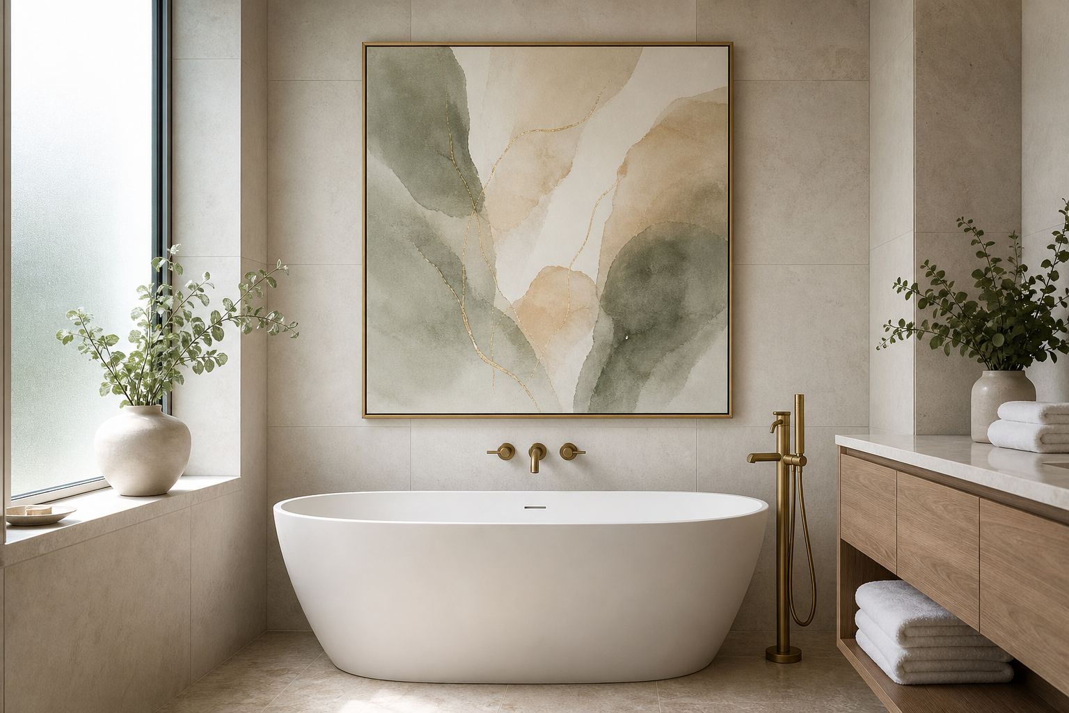
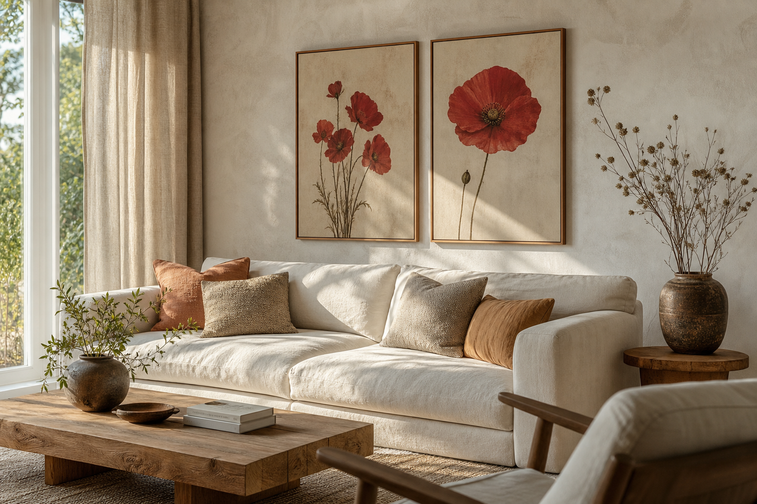
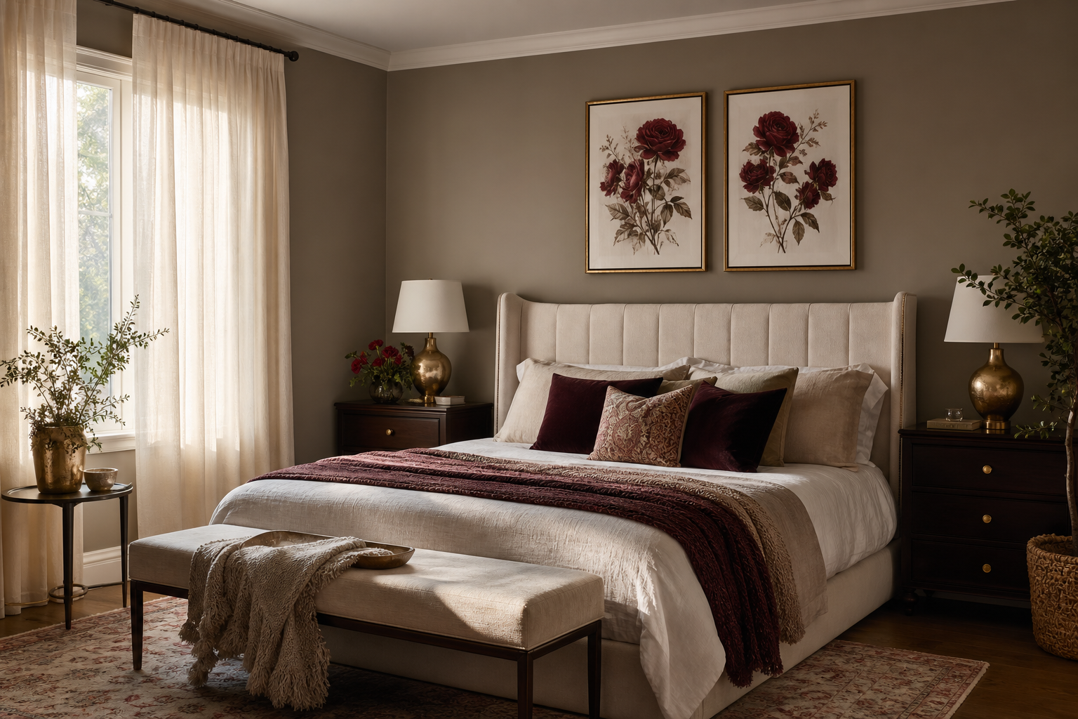
The beige on beige ii poster print works because it gives a room contrast without noise. Instead of relying on black lines or bold color blocks, it uses close tonal shifts — cream, sand, oat, taupe — to create depth. That makes it especially effective in interiors where you want the wall to feel styled, but still quiet.
A strong neutral print also solves a common design problem: beige rooms can look flat when every surface sits at the same value. Artwork with visible texture or tonal movement breaks that up by 10 to 20 percent visually, even when the palette stays restrained. If you already like our minimalist collection or soft forms from abstract wall art in muted tones, the beige on beige ii poster print fits naturally into that language.
Why Beige-on-Beige Works So Well
Layered neutrals feel timeless because they depend on material, shape, and light rather than trend color. A beige-on-beige piece reads differently at 8 a.m. than it does at 6 p.m. — morning light sharpens texture, while evening light softens edges. That shifting quality is one reason neutral art lasts longer in a room than a fast, graphic statement piece.
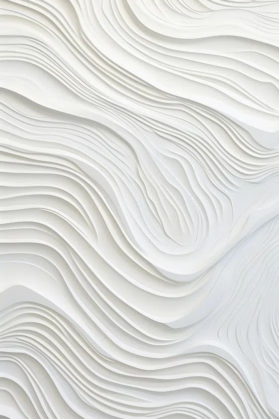
The other advantage is flexibility. Beige pairs well with white plaster, walnut, oak, travertine, boucle, brushed brass, and black accents. A print in this range can sit beside Scandinavian furniture, Japandi joinery, or a more tailored contemporary sofa without feeling forced. If you like tactile pieces such as White Cream Texture Poster or organic compositions from our fine art collection, you are already working in the right direction.
The Rooms Where It Feels Most at Home
In a living room, place the artwork above a sofa, console, or sideboard where it can anchor the seating zone. For a standard 84-inch sofa, one print at 24x36 inches or 28x40 inches usually feels balanced. If the wall is wider than 100 inches, a pair often works better than one central piece because it spreads visual weight more evenly across the room.

In a bedroom, the beige on beige ii poster print is strongest when the goal is softness. Above a queen bed, aim for artwork or a grouped arrangement that spans roughly 50 to 60 percent of the headboard width. Beige art works particularly well with oatmeal bedding, off-white walls, and warm wood bedside tables because nothing competes for attention.
Hallways and home offices benefit from the same calm effect in a more compact format. In a narrow hall, one 19x27-inch print can create a clean focal point without crowding the passage. In an office, neutral wall art reduces visual busyness behind a desk, which matters if the room already contains shelves, screens, or paperwork. Pieces like Textured Fabric — Minimalist Print or Window with Sheer Curtain — Fine Art Print are useful references for that quieter, light-filled mood.
Sizing and Placement for a Balanced Look
The safest hanging rule is simple: center the artwork around 57 to 60 inches from the floor to the middle of the frame. Above furniture, leave 6 to 8 inches between the top of the sofa, headboard, or console and the bottom of the frame. That distance keeps the art connected to the furniture instead of floating too high.
When choosing size, think in wall coverage rather than just print dimensions. A single piece should usually cover about two-thirds the width of the furniture below it. Over a 60-inch console, that means around 36 to 40 inches of total artwork width. If your beige on beige ii poster print is smaller, give it presence with a wide mat or pair it with a companion print in the same tonal family.
A gallery wall only works if you preserve the calm that makes beige effective. Keep spacing tight — 2 to 3 inches between frames — and limit the palette to neutrals, black, or natural wood. Mixing one textured beige print with three related works from our minimalist art prints or selected bohemian textures and natural forms creates interest without losing cohesion.

Frames, Mats, and Finishes That Elevate Neutrals
Frame choice changes the mood immediately. Natural oak keeps beige looking warm and organic, especially in Scandinavian or Japandi rooms. Slim black creates more definition and can be useful when the wall color is very close to the artwork. Walnut adds depth and works well if the room has darker wood flooring or leather seating.
Mats are especially useful with subtle art because they give the composition breathing room. A 2 to 3 inch off-white mat can make a 19x27-inch print feel more substantial and gallery-like. If the artwork already has a lot of negative space, skip the mat and use a simple narrow frame to keep the look crisp.

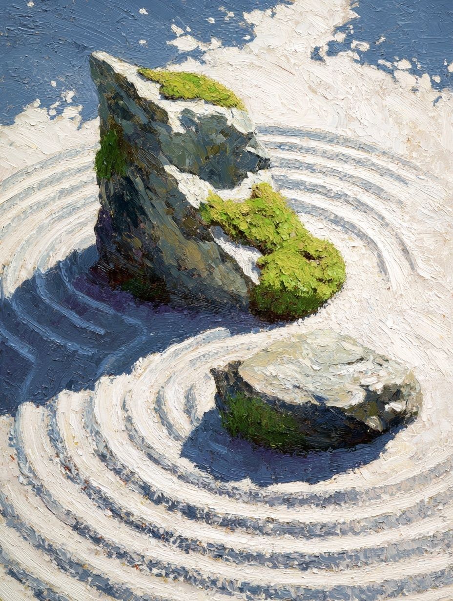
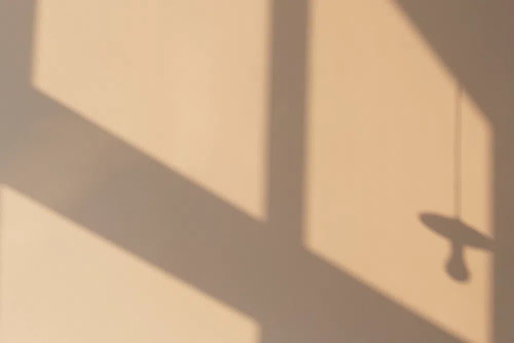
For finish, matte usually wins. Gloss introduces reflections that can flatten delicate tonal shifts, especially under ceiling spots or opposite a window. If you are styling around tactile prints such as Textured Waves — Minimalist Print or Late Afternoon Light Beige Wall, a matte finish preserves the softness that makes these works convincing.
How to Build a Palette Around the Artwork
The best palette starts with three neutrals, not ten. A reliable mix is warm white, mid beige, and taupe, with one darker grounding tone such as cocoa brown or charcoal. That 3+1 structure keeps the room layered while staying calm. Add texture through linen, boucle, wool, ceramic, and lightly grained wood rather than introducing more color.
Warm metallics work best in small doses. Brushed brass, aged bronze, or champagne-toned hardware can lift a beige scheme without making it look glossy or formal. Keep metal to around 10 percent of the visible accents — lamp bases, picture lights, drawer pulls, or a tray — so the artwork remains the visual anchor.
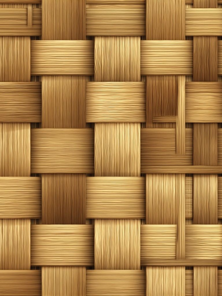
If you want a little more movement, introduce pattern through weave rather than print. A nubby throw, ribbed ceramic vase, or woven shade supports the tonal depth of the artwork better than a high-contrast cushion. That is why pieces like Woven Bamboo Texture Poster or Elegant White Fabric — Minimalist Print pair so naturally with beige interiors.
Styling Ideas for Different Interior Looks
Minimalist rooms benefit from restraint. Use one larger beige print, one clean frame, and only a few surrounding objects — for example, a low console, one sculptural vase, and a table lamp. Negative space matters here, so leave at least 8 to 12 inches of clear wall around the frame whenever possible.
Scandinavian interiors can handle a softer, more layered arrangement. Pair the main artwork with pale oak, wool textiles, and rounded furniture edges. A neutral companion piece from Elegant White Fabric or a subtle landscape-style fine art print can help the wall feel collected instead of sparse.

Japandi spaces call for stronger editing and better materials. Use fewer objects, richer texture, and lower furniture profiles. A single beige print above a bench, bed, or desk works well when the room also includes ash or oak wood, paper lighting, and matte ceramics. The goal is contrast through form, not color.
Contemporary interiors can take a sharper version of beige styling. Combine the artwork with a black side table, bronze lighting, or a deeper brown chair to add structure. If the room feels too soft, one defined line element — such as a black frame or dark marble accessory — gives the beige on beige ii poster print enough tension to avoid fading into the background.

Wrap-Up: Simple Ways to Make It Feel Intentional
A neutral wall looks curated when scale, material, and spacing are handled precisely. Choose a print size that covers roughly two-thirds of the furniture below it, keep hanging height consistent, and repeat at least one tone from the artwork elsewhere in the room — in linen, wood, ceramic, or a rug. That is what turns beige from "safe" into refined.
The beige on beige ii poster print is most successful when you let it lead the room quietly. Build around texture, limit contrast to one or two stronger accents, and choose framing that sharpens rather than competes. If you want the easiest starting point, stay within our minimalist wall art range and add one complementary piece from soft abstract prints or light-toned fine art prints.
Frequently Asked Questions
What frame color is safest if I am unsure?
Natural oak is the easiest choice for beige art because it adds warmth without overpowering the tones. If your room already has black accents, a slim black frame is the next safest option.
Can beige wall art work on a white wall?
Yes — it often looks even more textured on a warm white wall. Add a mat or a slightly darker frame if you want clearer definition.
Is this style better in large or small rooms?
It works in both. In small rooms, choose one medium piece to keep the wall clean; in larger rooms, use a larger format or a balanced pair so the art does not feel undersized.
What glass is best for reducing glare?
Use acrylic or glass with an anti-reflective or matte finish if the piece will hang opposite a window. It helps preserve subtle texture and makes the artwork easier to see throughout the day.