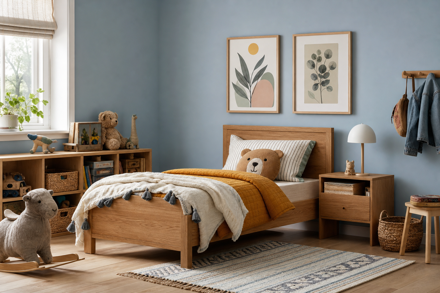
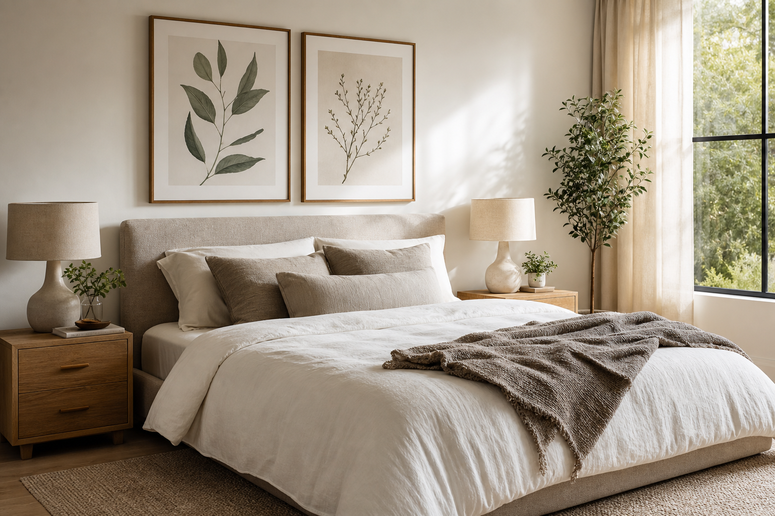
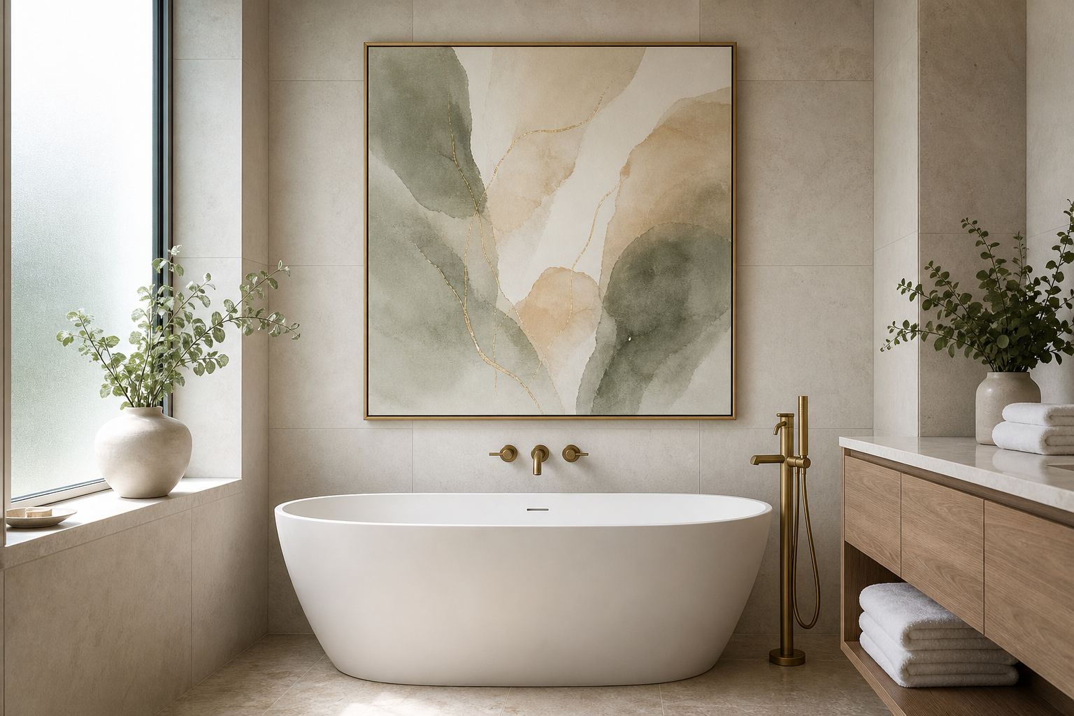
A cabbage print has a rare advantage in decorating: it can read as botanical, culinary, vintage, or witty depending on the room around it. That flexibility makes it more useful than many themed prints. In a kitchen, it feels rooted and practical; in a dining room, it can look collected and European; in a hallway, it lands as an unexpected conversation piece with real personality.
Why a Cabbage Print Works in Modern Interiors
Cabbage imagery has structure. The layered leaves create natural geometry, with tight centers and ruffled outer edges that feel both organic and graphic. That balance is why a cabbage print works so well in modern interiors that need softness without losing definition. Compared with a looser floral, cabbage forms give you more shape and presence on the wall.
It also taps into a style mix people already like: old-market still life, English botanical study, and relaxed kitchen nostalgia. If you already gravitate toward our botanical collection, a cabbage subject adds a food-adjacent twist that feels more playful than standard leaves or blossoms. If your room leans traditional, it blends easily with vintage art prints and antique wood. If your space is cleaner and more modern, the same image can feel crisp when paired with pale walls, simple frames, and disciplined spacing.
A good cabbage print also avoids looking overly sweet. The motif has weight. The leaves are dense, sculptural, and a little dramatic, which makes it easier to style in adult spaces than novelty produce art.

Choosing the Right Color Mood
Green cabbage art tends to feel freshest. Use it when the room already has warm neutrals — cream walls, oak shelves, travertine, unlacquered brass — and you want a cool counterpoint. A green cabbage print usually works best with soft whites rather than stark bright white, because the slight warmth keeps the palette from turning clinical.
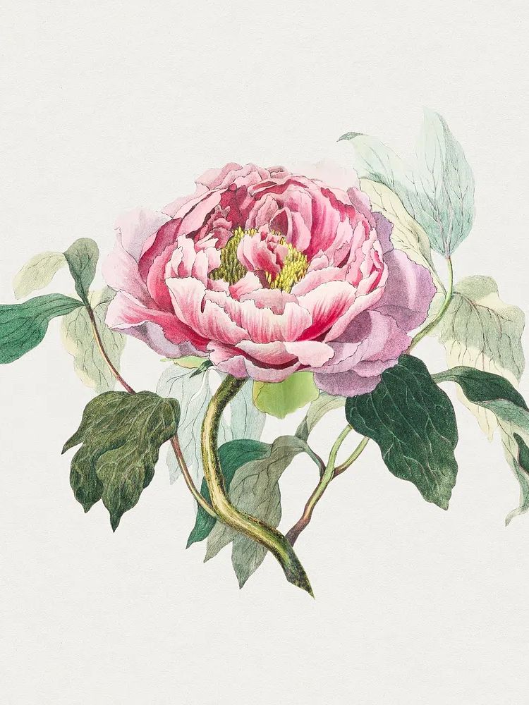
Pink and mauve tones make the image more decorative. That is where the line between vegetable study and floral elegance gets interesting. If you want a softer, more romantic take, a pink-toned cabbage image can bridge kitchen styling and classic botanical decor, especially near plaster walls, dusty rose textiles, or vintage ceramics. For homes that already use muted reds or terracotta, this hand-drawn pink cabbage rose makes that connection naturally.
Darker vintage tones — olive, plum, tobacco, deep cream — create more drama. They suit dining rooms, butler's pantries, and moodier corners better than bright family kitchens. In these spaces, think about contrast ratio: if the wall color is mid-tone or dark, choose a print with at least 30 to 40 percent lighter background so the artwork doesn't disappear from a distance.
If you want the room to feel less literal, bring in one neighboring theme rather than repeating cabbage everywhere. A cabbage print can sit comfortably beside fruit, vines, or still life art as long as the tones overlap. That is one reason food and drink wall art often works well in adjacent pairings.
Best Rooms for a Cabbage Print
The kitchen is the most natural home, but placement matters. A cabbage print looks strongest where there is visual pause — above a breakfast nook bench, at the end of a run of cabinets, or over a narrow console wall that is not crowded by appliances. Keep the center of the frame about 145 cm from the floor in standard spaces, or 15 to 20 cm above a backsplash shelf if you are styling it lower.

Dining rooms are ideal when you want the art to feel more collected than themed. A single 50x70 cm print above a sideboard has enough scale to anchor ceramics, candlesticks, or a lamp. If the room is formal, pair it with darker wood and a narrower frame. If it is casual, use a wider off-white mount to give the image breathing room.
Pantries, sculleries, and utility corners are often overlooked, but they are exactly where a cabbage print can add charm. Smaller sizes — 30x40 cm or 40x50 cm — work well here because the wall area is limited and the print is viewed at close range. In these compact spaces, detailed botanical work feels intentional rather than decorative filler.
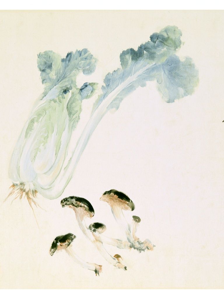
An eclectic hallway can also carry a cabbage print, especially as part of a salon-style arrangement. In transitional areas, the surprise factor matters. A vegetable subject adds wit without becoming kitsch when the surrounding pieces are grounded — think Chinese Cabbage and Mushrooms Print beside older botanical studies or restrained still lifes.
How to Frame and Size It Well
Frame choice changes the tone more than most people expect. Natural oak gives a cabbage print a lighter, Scandinavian feel. Black wood sharpens the lines and works best in modern kitchens with black hardware or metal lighting. Antique gold or dark walnut makes more sense when you want the artwork to feel inherited or slightly formal.
Paper finish matters in bright kitchens. If the wall gets direct sun for several hours a day, a lower-glare finish is easier to live with than a glossy surface because it keeps the leaf detail visible from different angles. In rooms with pendant lighting, glare can flatten the artwork quickly, especially if the print has a pale background.
For sizing, use simple ratios. Over a 120 cm sideboard, aim for art that spans roughly 60 to 90 cm total width. Over a breakfast bench that is 140 cm wide, one 50x70 cm piece or two 30x40 cm works well. On open wall sections, a cabbage print should usually occupy about two-thirds of the furniture width beneath it for a balanced look.

If you are hanging a single statement piece, give it at least 12 to 18 cm of clear space on each side. If you are building a gallery wall, keep spacing tighter — around 5 to 8 cm between frames — so the grouping reads as one composition rather than scattered objects.
Pairing Cabbage Art with Other Prints
The easiest companion is botanical work with similar line quality. If your cabbage print is detailed and vintage in mood, pair it with decorative foliage, tulips, or vine-based designs rather than something overly photographic. That keeps the set visually consistent. Pieces from our botanical art selection are especially useful for this layered, old-world look.
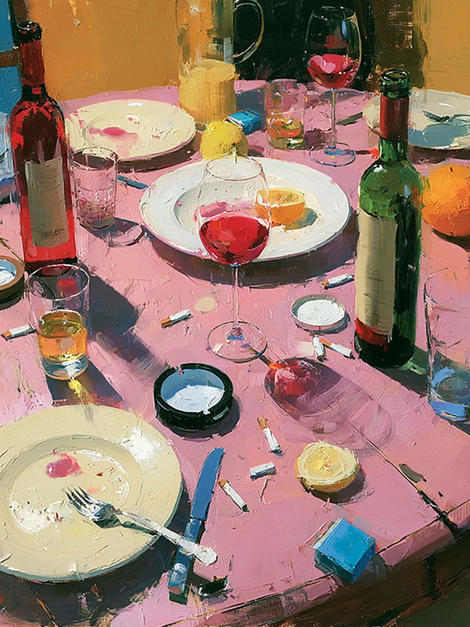
A second strong route is still life. Fruit, wine, and table scenes make a cabbage print feel less novelty-driven and more like part of a classic dining story. This works particularly well in dining rooms, where food-adjacent art can echo the purpose of the space without being too on-the-nose. Wine Table Still Life is a good example of a companion piece that adds warmth and depth.


For a more contemporary scheme, contrast the cabbage with one abstract or simplified piece instead of another botanical. The rule is 3:1 — if three elements in your arrangement are vintage or detailed, one cleaner piece prevents the wall from feeling busy. That contrast works especially well in homes where traditional kitchen cabinetry meets modern lighting and minimal surfaces.
Avoid pairing a cabbage print with too many novelty food images. One or two related works can feel curated; five can make the room read as themed. Restraint is what gives the subject character.
Styling Tips to Keep It Fresh
The easiest way to make a cabbage print feel intentional is to repeat its colors in small doses. Olive glassware, a striped green tea towel, a cream ceramic bowl, or a mauve linen napkin can quietly reinforce the artwork without matching it too closely. Limit yourself to two or three repeated accents in the immediate zone — more than that starts to feel staged.
Open shelving nearby should stay simple. If the print is detailed, let the shelf objects be broad and quiet: stacked white plates, one stoneware pitcher, one brass object, one small trailing plant. The visual rhythm should alternate between solid and delicate forms. That prevents the leafy detail of the art from competing with too many fussy accessories.

Wall color can do half the work for you. Soft chalk white, mushroom, pale sage, and muted clay all flatter cabbage imagery. Bright blue-white walls can make green vegetable tones look harsher than intended, while very yellow creams can muddy cooler purples. If you are painting around the art, sample at least three swatches and view them morning and evening before choosing.
If you want a more decorative, pattern-rich room, a cabbage print also sits comfortably with heritage-inspired botanical pieces such as William Morris's Vintage grapes vines or William Morris's vintage pomegranate flowers. The shared natural forms help the mix feel deliberate rather than random.
Final thoughts
A cabbage print works best when you treat it as serious decorative art with a bit of wit — not as a gimmick. Focus on structure, color balance, and placement, and it will hold its own in kitchens, dining rooms, and transitional spaces with real charm.
The strongest result usually comes from one clear decision: either let the cabbage print be the quiet focal point, or build a broader botanical-and-still-life story around it. Both approaches work. The room simply needs enough space, contrast, and restraint to let the image speak.
Frequently Asked Questions
What frame color suits a cabbage print best?
Oak is the most versatile for relaxed interiors, while black gives a cleaner modern edge. Dark walnut or antique gold works best in dining rooms with richer wood furniture.
Can I hang a cabbage print in a small kitchen?
Yes — choose a 30x40 cm or 40x50 cm size and place it on a wall with some visual pause, not squeezed between cabinets and appliances. Smaller rooms benefit from one clear piece rather than a crowded cluster.
What other subjects pair well if I do not want a full botanical gallery wall?
Try still life, fruit studies, or one restrained abstract piece. That mix keeps the look collected and less literal.
How do I keep kitchen wall art from feeling too themed?
Use only one direct food or vegetable subject as the focal point, then support it with neutral ceramics, simple linens, and one or two related artworks. Limiting repetition keeps the room refined.
Should I use a mount around the print?
A mount is useful for detailed artwork because it gives the image breathing room and makes smaller sizes feel more substantial. In most cases, a 4 to 8 cm mount width is enough.