Why Burger Posters Work So Well in Modern Spaces
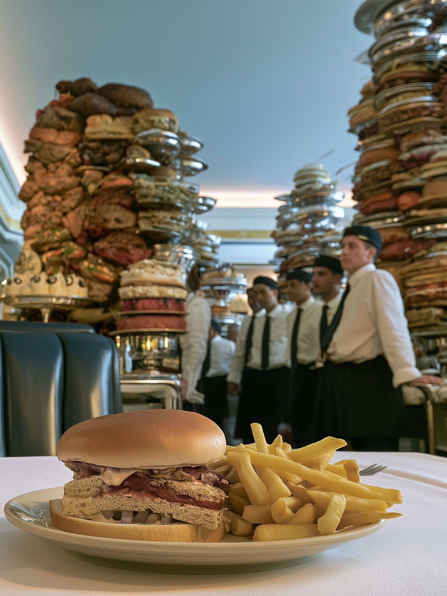
Burger posters land well because they do two jobs at once: they add subject matter people instantly recognize, and they bring in bold shape and color. A burger naturally stacks warm browns, creamy neutrals, saturated greens, mustard yellow, and tomato red — a palette that already feels balanced on a wall. In rooms that can feel purely functional, especially kitchens and breakfast spaces, that visual punch makes the space feel intentional.
They also carry a useful mix of nostalgia and graphic clarity. A burger image can lean diner-retro, pop-art bright, or stylized enough for a more design-led interior. That flexibility is why burger posters suit homes that already use food and drink wall art, playful illustration prints, or even a few stronger photographic statement pieces. In practical terms, they work best where people gather, eat, or entertain — spaces that benefit from personality more than visual restraint.
If you want the look without making the room feel themed, choose one strong burger image and support it with simpler accents. That could mean one 50 x 70 cm print over a breakfast bench, or a pair of 30 x 40 cm pieces above a bar cart. The key is to treat burger posters as graphic art first, novelty second.
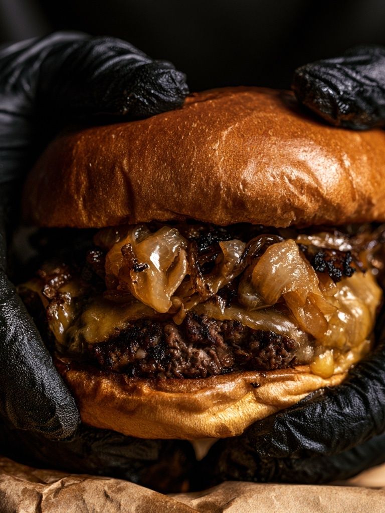
Choosing the Right Style: Vintage Diner, Pop Art, or Minimal
A vintage diner approach suits homes with chrome details, checkerboard flooring, timber stools, or retro appliances. These pieces usually work best with cream, cherry red, teal, and black. If you already like vintage-inspired wall art or retro kitchen styling, burger imagery in a nostalgic direction feels connected rather than random.
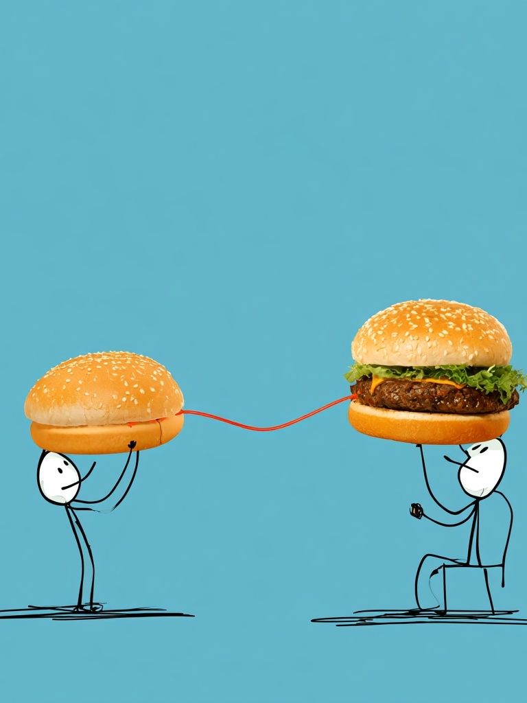
Pop-art and playful illustration styles are louder and more expressive. They fit family kitchens, home bars, games rooms, and apartments where the wall art should carry some wit. Illustration also softens the food theme. Instead of looking like menu decor, it reads more like character-led design — especially with quirky pieces such as Robot with Burger or other offbeat works from the funny print collection.

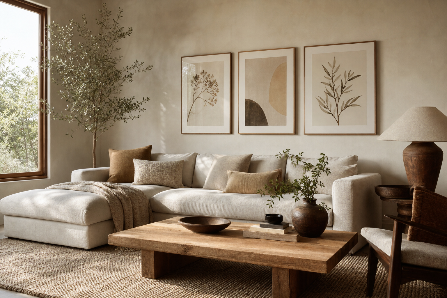
Minimal burger art is the most versatile if you want a cleaner finish. Look for simplified forms, restricted palettes, and lots of negative space. These prints work especially well with white walls, slim black frames, and interiors that borrow from mid-century modern prints or streamlined Scandinavian styling. In that setting, burger posters feel graphic and curated rather than overtly playful.
Best Rooms for Burger Posters
Kitchens are the most obvious fit, but not every kitchen wall needs one. The best placement is usually a dry zone: above a breakfast table, beside a pantry door, or over a sideboard rather than directly behind the hob. Leave at least 15 to 25 cm between the top of a backsplash and the bottom of the frame so the art has breathing room.
Dining rooms can handle larger burger posters because the space is built for lingering. One 61 x 91 cm statement print on a central wall works well in compact dining rooms. In larger rooms, try a pair or quartet aligned with the width of the table. Keep the total art width to around 60 to 75 percent of the furniture below — a reliable proportion that stops the wall from feeling undersized or overcrowded.
Breakfast nooks and home bars are where burger posters often look best. These spots already welcome a bit of mood and humor. Pair burger imagery with drinks-led pieces from our Pink Martini print or bar-friendly art from the broader food and drink collection for a more layered setup.

Games rooms and casual entertaining areas are another strong option, especially if the room has darker paint, neon accents, or black metal shelving. In those interiors, a bold burger image keeps the room relaxed and social. Even one print near a mini fridge or snack station can give the area a finished look.

How to Pick the Right Size and Layout
For a single image, 50 x 70 cm is the easiest all-round size. It reads clearly from across the room and has enough impact for most kitchen and dining walls. Go down to 30 x 40 cm if the print sits between shelving or next to cabinetry. Move up to 70 x 100 cm only when the wall is open and the furniture below has enough visual weight.
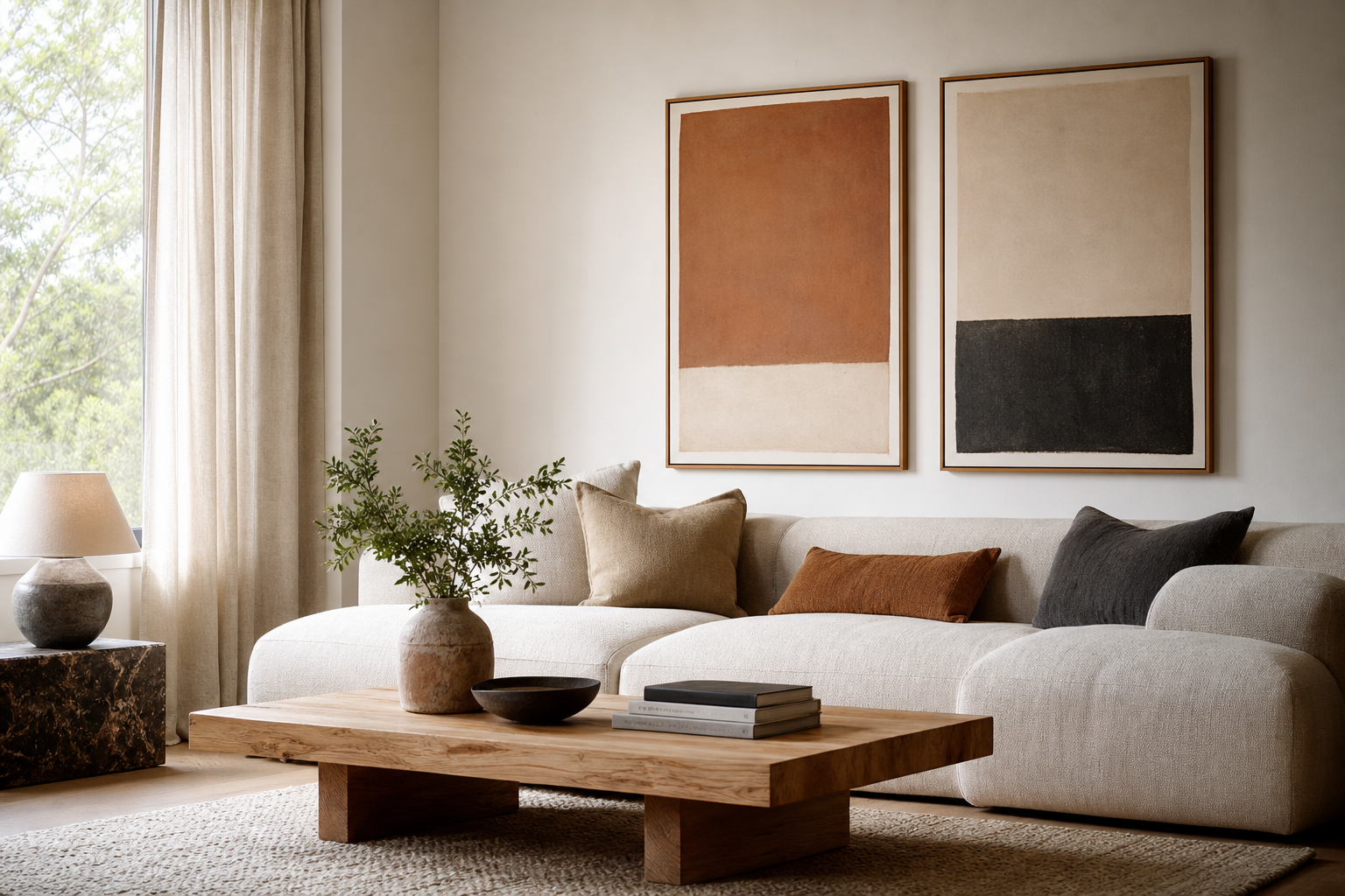
Pairs work well when you want symmetry. Two 30 x 40 cm or 40 x 50 cm pieces with 5 to 7 cm spacing create a neat, structured look. This is useful over banquettes, bar carts, or sideboards where you want balance rather than one dominant focal point. If the prints are visually busy, keep frames identical to reduce clutter.
Gallery walls suit burger posters when you mix them with adjacent food, drink, or graphic subjects. Use 4 to 6 pieces total, and let one burger print be the anchor. Keep spacing consistent — usually 4 to 6 cm — and repeat at least one frame finish throughout. If you want more texture in the arrangement, pair a burger image with pieces that share shape or palette rather than theme alone, such as Delicious Margherita Pizza or geometric designs from Retro Geometric Shapes.
Colour, Framing, and Finishing Touches
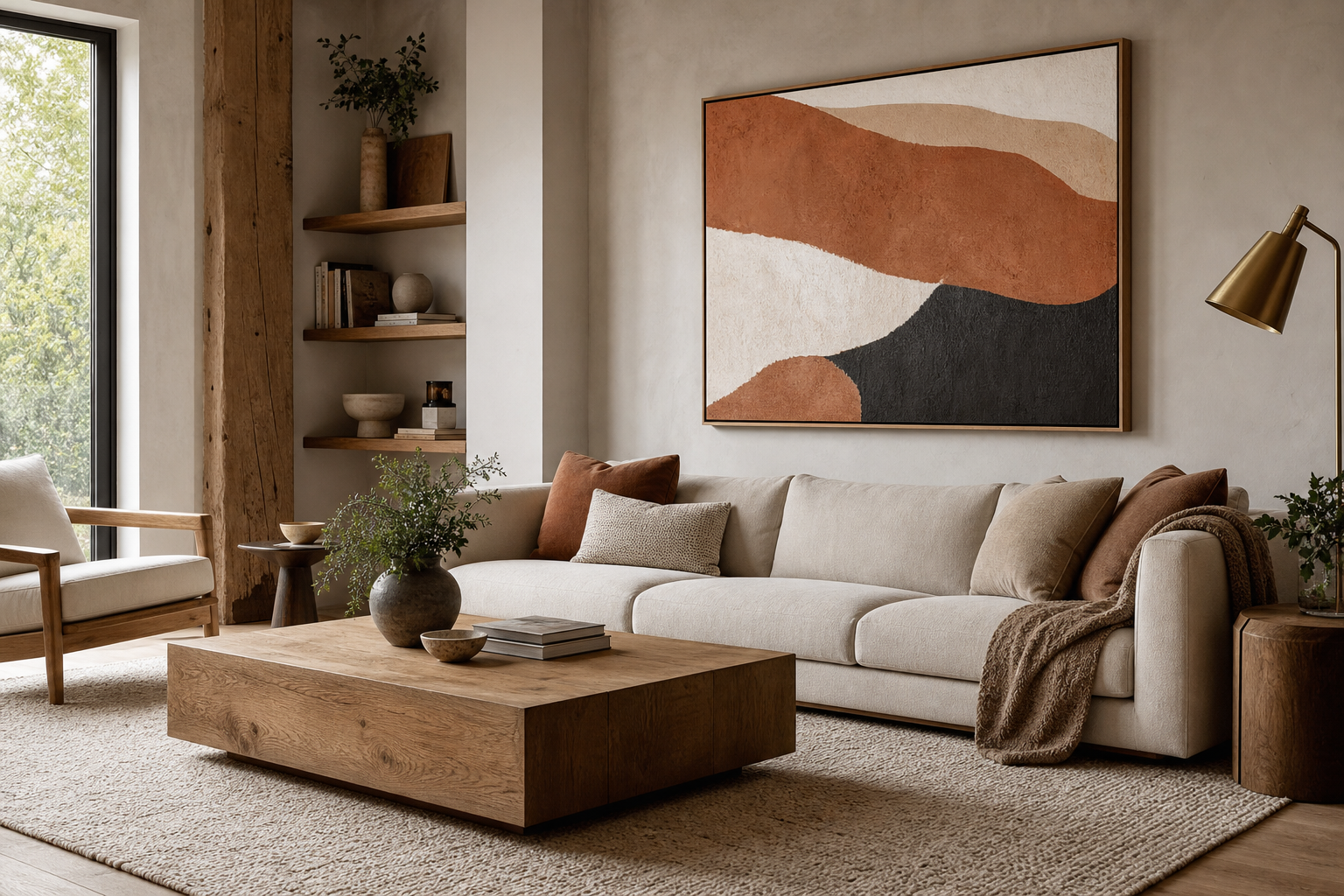
Burger posters already contain warm, appetite-friendly tones, so framing should support rather than compete. Black frames sharpen photography and pop-style prints. Oak or walnut frames soften the look and connect well with wood cabinetry, dining tables, and open shelving. White frames are useful when the wall color is strong — olive, navy, terracotta — because they keep the piece crisp.
If your kitchen has stainless steel appliances, chrome seating, or glossy tile, use a slim black or silver-toned frame to echo those hard finishes. If the room leans rustic with timber, linen, and matte paint, a natural wood frame will feel more integrated. Matting can help too. A 3 to 5 cm white mount makes smaller burger posters feel more gallery-like and less casual.
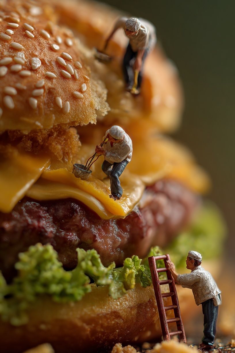
Colour repetition is what makes the display feel designed. Pull one or two tones from the art and repeat them elsewhere — a mustard tea towel, red seat pad, green glass bottle, or brown leather stool. Keep it to two repeated colors at most. Once every accent starts referencing the artwork, the room tips from stylish into novelty.

Styling Tips for a Fun but Elevated Look
The fastest way to make burger posters look elevated is to avoid overexplaining the theme. You do not need burger cushions, burger clocks, and burger signage in the same room. One or two art pieces are usually enough. Let the artwork deliver the joke or appetite cue, then keep the rest of the room grounded with plain ceramics, simple glassware, and unfussy textiles.
Contrast matters. If the art is bright and playful, place it against quieter materials — limewashed paint, wood veneer, stone, or white tile. If the room already has pattern, choose one burger print with strong composition and fewer colors. This keeps the eye from bouncing between too many focal points.
A good trick is to mix burger imagery with one adjacent subject. Drinks, diner references, or bold typography can all work. That is where pieces like Martini Cocktail or Ground Rules — Retro Typography can help build a wall that feels broader than a single-food theme. The result is more editorial, less gimmick-led.
Final Tips for Building a Burger-Inspired Wall
Start with the room, not the print. Check the wall width, note the finishes already present, and decide whether the art should be the focal point or a supporting layer. If the room is neutral, burger posters can provide the color hit. If the room is already busy, go for cleaner compositions and tighter framing.
The best burger posters feel intentional because they connect with the rest of the interior through palette, proportion, and placement. Pick one style direction, repeat one or two colors, and leave enough empty wall around the art for it to breathe. Done well, the look is cheerful, graphic, and surprisingly polished.
Frequently Asked Questions
What frame size should I choose if I want a mounted look?
Add 6 to 10 cm overall if you want a visible mount around the print. A 30 x 40 cm print often looks strongest in a 40 x 50 cm frame with a white mat.
Can burger wall art work in a small apartment kitchen?
Yes — choose one compact print, usually 30 x 40 cm, and place it on a clear wall rather than near upper cabinets. Smaller spaces benefit from one defined focal point instead of several small pieces.
Which frame finish is easiest to match with most kitchens?
Black is the safest option because it works with stainless steel, white cabinetry, dark grout, and wood. Natural oak is a close second for softer, warmer interiors.
How high should I hang burger posters above a dining table or sideboard?
Keep the bottom of the frame about 15 to 25 cm above the furniture below. That gap looks connected and avoids the floating effect that happens when art is hung too high.
Do glossy or matte prints suit food imagery better?
Matte usually looks more refined at home because it cuts glare from kitchen lighting and windows. Gloss can boost color, but it tends to reflect under spotlights and pendants.