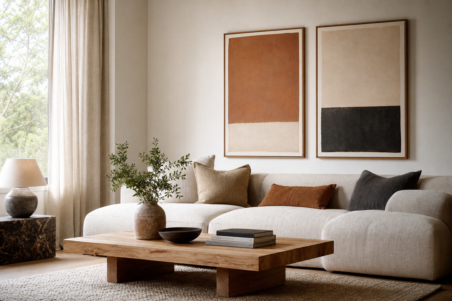
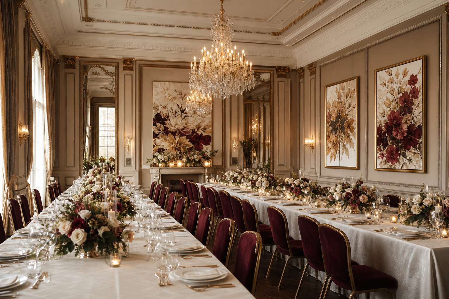
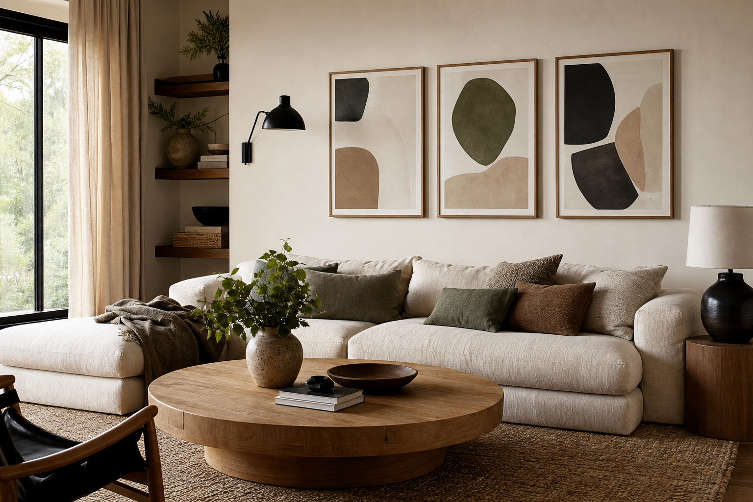
An abstract poster changes a room fast because it adds movement, contrast, and color without locking you into one literal subject. In spaces that already have strong furniture lines, neutral walls, or simple materials, abstract art brings variation that feels intentional rather than busy. That flexibility is why it works across our abstract collection, pared-back minimalist wall art, and even warmer mid-century modern prints.
Why Abstract Art Works So Well at Home
Abstract art gives the eye somewhere to travel. A landscape or portrait tells a clear story, while an abstract poster leaves room for shape, texture, and mood to do the work. That makes it easier to live with long term, especially in rooms you use every day for reading, working, or relaxing.
It also bridges styles that might otherwise clash. A curved bouclé chair, a sleek black floor lamp, and a rustic oak sideboard can sit comfortably together when the wall art repeats two or three of those elements through form or color. If you like layered interiors, browse fine art prints for painterly depth, or use illustrative wall art when you want a slightly more graphic edge.

Pieces with visible texture or soft tonal shifts are especially effective in common areas. Textured Waves — Abstract Print works well because it adds visual movement without introducing hard contrast. In a living room with beige, walnut, and black accents, that kind of composition fills the wall while keeping the atmosphere calm.
Choosing the Right Colors and Mood
Color is the fastest way to set the temperature of a room. Warm abstract art — terracotta, rust, blush, ochre — makes a space feel softer and more grounded. Cool tones like teal, slate, and off-white feel cleaner and quieter, which is useful in bedrooms and home offices.
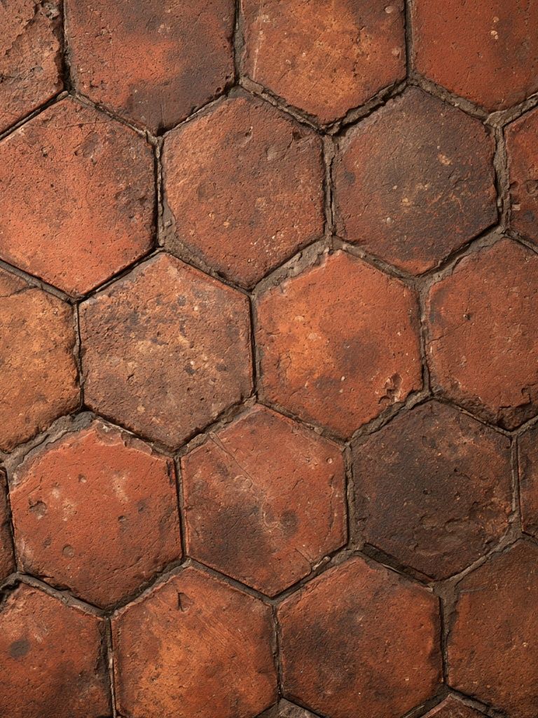
If your room already has 70 to 80 percent neutral surfaces, one stronger color-led piece can do most of the decorative work. A cream sofa, pale walls, and a natural rug often need only one accent family repeated twice — perhaps in a cushion and one abstract poster — to feel complete. For softer palettes, Blush Watercolor Abstract Poster or Terracotta Hexagon Texture Print can add warmth without overpowering the room.



High-contrast work suits rooms that need energy. Black and white geometry sharpens an entryway or office, while saturated color fields can wake up a dining area. If you prefer a restrained scheme, look at black-and-white abstract geometry or mix one bold piece with quieter works from the minimalist collection so the room still breathes.

Finding the Best Size and Placement
Scale is where many walls go wrong. Art that is too small looks disconnected, even if the colors are right. Above a sofa, your framed piece or arrangement should cover roughly 60 to 75 percent of the furniture width. For a 200 cm sofa, that means aiming for a total art width of about 120 to 150 cm.
A single abstract poster works well above beds, sideboards, and desks when you want one strong focal point. In practical terms, 50x70 cm suits narrow walls, 70x100 cm has more presence in standard living rooms, and 100x140 cm starts to feel architectural. Hallways usually benefit from vertical formats or a sequence of smaller works spaced 5 to 8 cm apart.
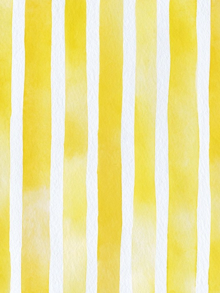
In workspaces, choose art that adds rhythm rather than distraction. Yellow Watercolor Stripes Poster is useful in a study because its repeated lines create structure without the intensity of a heavily detailed image. If your desk sits against a blank wall, hang the artwork so the center lands around 145 cm from the floor — slightly adjusted for lower furniture or higher headboards.

Framing and Finishes That Elevate the Look
The frame changes the tone as much as the artwork does. Thin black frames make abstract compositions feel crisp and architectural. Oak frames soften them and connect better with Scandinavian or organic interiors. White frames are strongest when the artwork itself has contrast or texture and the wall color is not stark white.
A matte finish usually gives abstract wall art a more refined result because it reduces glare and lets tonal variation show properly. That matters with pieces built from subtle gradients, brush textures, or layered neutrals. If your room gets direct sunlight for several hours a day, avoiding reflective glass can make the image easier to enjoy from different seats in the room.

A restrained piece like Textured White Abstract Poster proves how much presentation matters. In a slim oak frame, it feels warm and sculptural. In a black frame, it becomes more graphic and modern. The artwork stays the same, but the finish changes the entire reading of the wall.

Styling an Abstract Poster With Your Existing Decor
Start by repeating one element from the artwork elsewhere in the room. That could be a terracotta note in a cushion, a charcoal line echoed in a lamp base, or a cream tone already present in curtains. Repetition is what makes an abstract poster look integrated instead of added at the end.
If your furniture is visually heavy — deep sofas, dark wood, thick rugs — choose art with breathing space, open composition, or lighter grounds. If the room is sparse, a denser piece can add needed complexity. Geometric works pair well with clean-lined furniture, while watercolor or smoke-like forms soften sharper interiors.
For eclectic rooms, mixing categories works well when the palette stays disciplined. An abstract print can sit beside pieces from our bohemian collection or even selected retro geometric designs if both share the same warm rust, sand, or black accents. Limit yourself to two dominant colors and one accent tone for a more editorial finish.
When to Go Big: Gallery Walls vs Statement Pieces
Go large when the wall is uninterrupted and the room needs a focal point. A single oversized abstract poster above a sofa, bed, or dining bench feels confident and reduces visual clutter. It is often the better choice when the furniture below already has enough detail through cushions, throws, shelving, or lighting.
Choose a gallery wall when you want to spread interest across a wider zone or connect several functions in one space. In open-plan rooms, four framed works can visually anchor the living area without relying on one dominant piece. Keep the spacing consistent — usually 5 to 7 cm — and repeat either frame color or palette across all four works.

A strong grouping should still have one lead voice. That might be a high-contrast print balanced by three quieter companions, or four related tonal works with one deeper accent color. If you like this approach, combine pieces from the abstract wall art range with cleaner companions from the minimalist print selection to avoid a wall that feels too dense.
Final Tips for Choosing an Abstract Poster You’ll Love
A good abstract poster should still feel right after the first visual hit. Look at the room from the doorway, from the sofa, and in both daylight and lamplight before deciding on color strength and scale. If you already know the room needs more warmth, more contrast, or more softness, choose art that solves that specific problem rather than buying on impulse.
The safest timeless move is simple: pick a piece that matches your room's proportions, repeats one or two existing tones, and adds one quality the space lacks — movement, texture, or depth. Done well, an abstract poster does not just decorate a wall; it sets the pace of the whole room.
Frequently Asked Questions
What frame color works best for abstract art?
Black suits high-contrast or graphic pieces, while oak works better with warm neutrals and textured compositions. White frames are best when you want the wall art to feel light and discreet.
Can I mix abstract art with photography or figurative pieces?
Yes — keep one shared element consistent, usually palette, frame finish, or overall scale. A 2:1 balance often works well, such as two abstract pieces with one photographic print.
How much space should I leave around an abstract print?
Leave at least 15 to 25 cm from nearby furniture edges so the artwork can breathe. In gallery walls, 5 to 8 cm between frames usually looks clean and intentional.
Do abstract prints work in small rooms?
They do, especially in vertical or medium-size formats like 40x50 cm or 50x70 cm. Choose lighter grounds or simpler compositions so the room feels open rather than crowded.
What decor pairs especially well with abstract wall art?
Natural wood, linen, boucle, metal accents, and plain ceramics all pair well because they let color and form stand out. Avoid adding too many competing patterns in the same sightline.