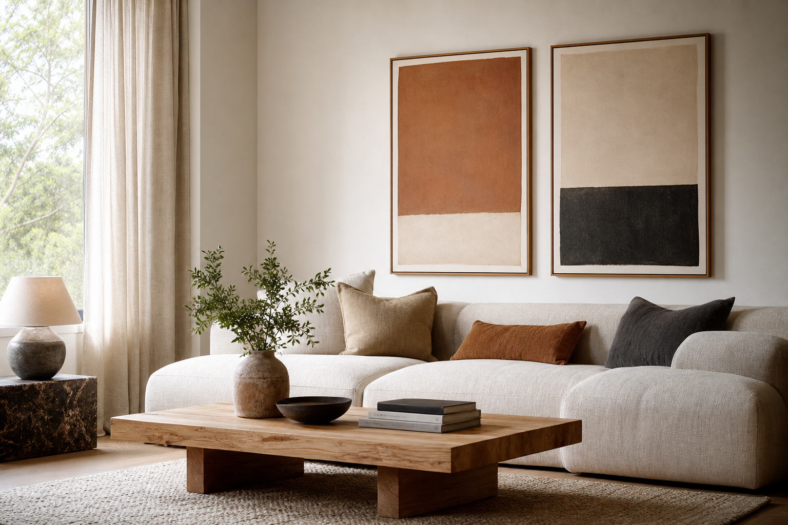
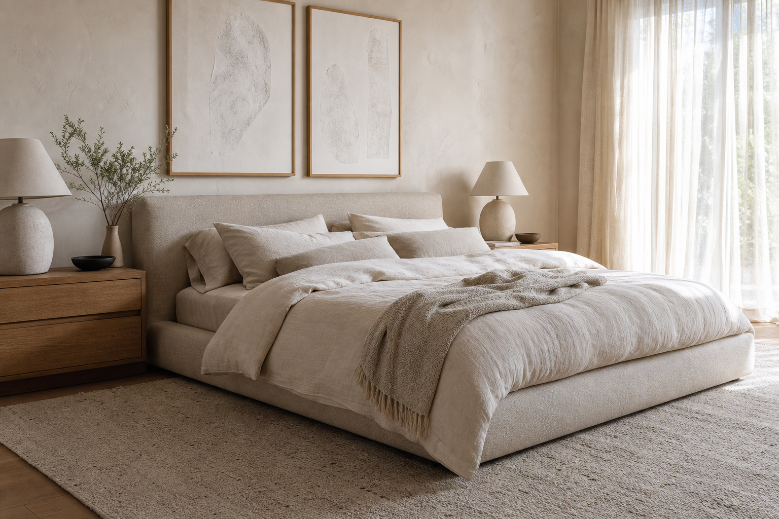
Banquet posters do more than fill empty wall space. In a large dining room, reception hall, or event venue, they create visual rhythm across wide walls, help guests read the mood of the occasion within seconds, and make the whole setup feel considered rather than rented. A room with strong table styling but blank walls often feels unfinished from about 3 to 5 meters away.
The most effective banquet posters repeat what is already working in the room: the color of the linens, the tone of the florals, the finish of the candleholders, or the level of formality in the place settings. That is why a formal anniversary dinner suits restrained minimalist art prints or elegant vintage figure artwork, while a lively drinks reception can carry more playful pieces from our food and drink collection.
Why Banquet Posters Matter
A banquet room usually has three visual zones: the arrival point, the dining area, and the focal zone around a stage, sweetheart table, cake table, or speech area. If those zones are styled separately without a unifying thread, the room feels fragmented. Banquet posters solve that quickly by repeating one language across all three zones — similar framing, related palette, or one clear motif.
For guest experience, they also guide attention. A framed print near the entrance slows people down for a beat. A pair of coordinated works beside the bar gives that corner purpose. A larger artwork behind a head table anchors photographs, especially when the wall would otherwise disappear into neutral drapery.
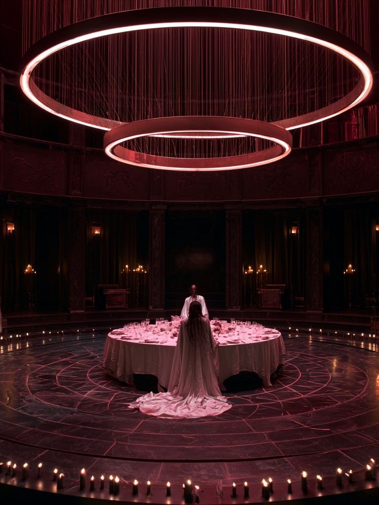
A good rule is to give every major wall one job. One wall sets tone, another supports wayfinding, and another becomes a photo backdrop. That approach keeps banquet posters useful, not random. If your event leans classic, Classical Banquet Hall Fine-Art Print can reinforce ceremony and grandeur without overwhelming the tablescape.
Choosing the Right Style for the Occasion
Different events call for different visual signals. For weddings and black-tie dinners, soft florals, architectural scenes, and elegant portraiture feel right because they support the pace of the evening. In those settings, work from our Mid Century Modern collection can also look sophisticated when the palette stays muted and the geometry is clean.
Corporate banquets usually need more restraint. A simple composition with limited colors reads polished from a distance and does not compete with logos, presentation screens, or table numbers. This is where typography wall art can help — especially for a welcome area or drinks station — but keep the wording minimal and the contrast strong.
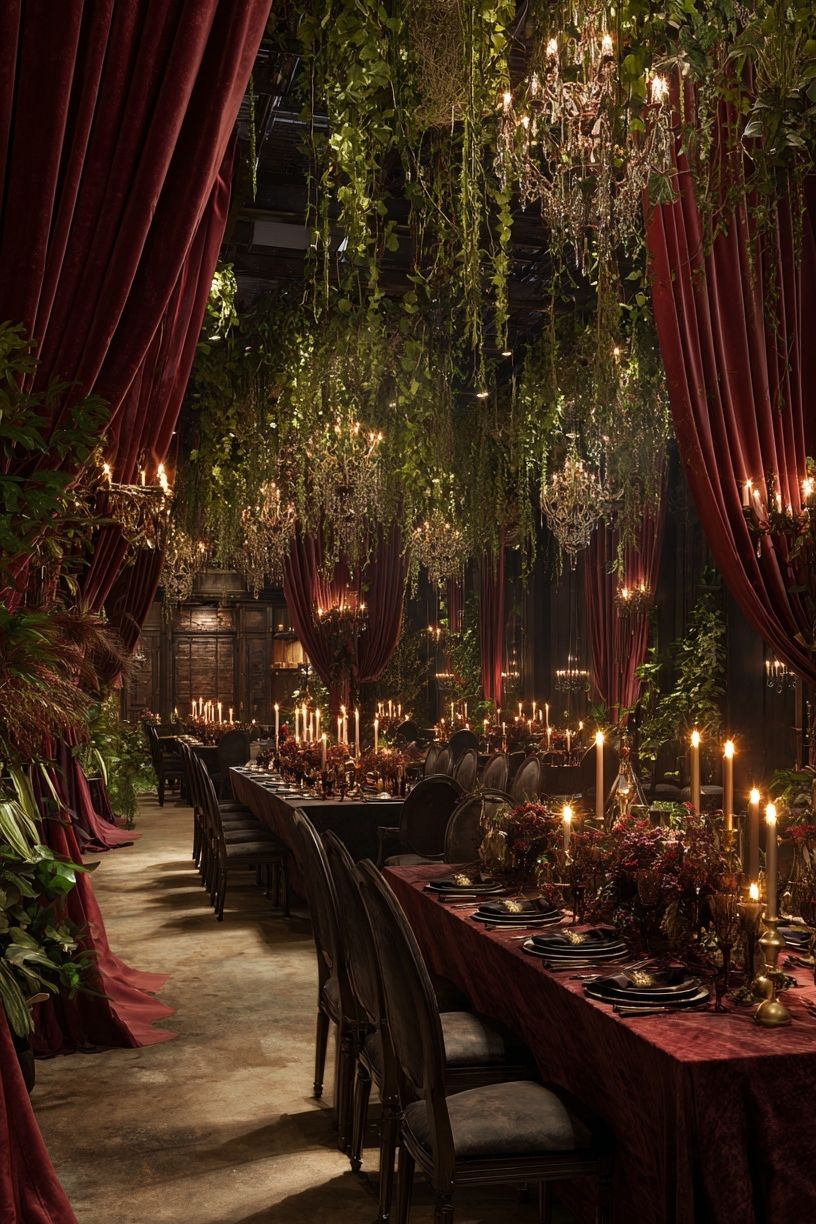
For seasonal celebrations, banquet posters should carry the atmosphere without relying on obvious novelty. Rich berry tones, deep greens, antique golds, and candlelit imagery work better than overly literal event graphics. A winter dinner, for example, benefits from moody still lifes and low-contrast glamour rather than heavy signage.

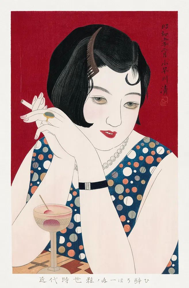
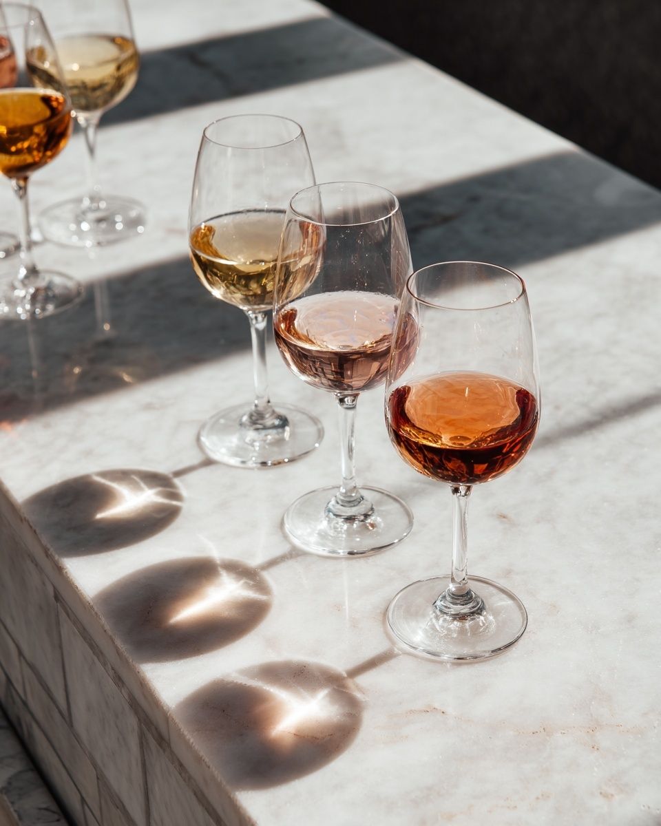
If the event centers on dining, wine service, or a tasting menu, art with subtle culinary references feels especially coherent. Wine Glasses on Marble Table works well near a drinks station, while Elegant Woman with Cocktail suits formal receptions and cocktail-hour transitions.
Size, Scale, and Placement
Scale is where many banquet posters fail. Small art disappears in a room with 3-meter ceilings, wide round tables, and long sightlines. For most banquet walls, framed pieces below 30 x 40 cm read like accessories, not anchors. A safer minimum is 50 x 70 cm for secondary walls and 70 x 100 cm for key focal points.
Placement matters just as much. Center artwork at roughly 145 to 150 cm from the floor to the middle of the frame in guest circulation areas. Behind a buffet, head table, or stage where furniture already raises the visual weight, you can shift the centerline slightly higher — around 155 cm. If guests will view the wall from across the room, bigger is almost always better.
Use banquet posters at the entrance first. People remember the first 10 seconds of the room more than the sixth table arrangement. A pair of vertical framed works flanking the welcome sign creates symmetry. One larger horizontal piece above a sideboard or escort-card table can do the same with less effort.

For long walls, work in groups of two or three with 8 to 12 cm between frames. For a stage backdrop, leave at least 20 to 30 cm of breathing room from the top of chairs, lecterns, or buffet risers so the art does not feel cramped in photos. Banquet posters should support the room's architecture, not fight it.
Color Palettes That Work in Banquet Settings
Color is the fastest way to make banquet posters feel custom to the event. Start with the largest surfaces: linens, drapery, carpeting, and chair upholstery. Then choose art that repeats one dominant tone and one accent tone. In practical terms, if your room uses ivory linens and dark walnut chairs, posters with cream, charcoal, olive, or muted gold will feel integrated.
Warm banquet rooms lit by candles or 2700K bulbs usually flatter dusty pink, aubergine, cognac, moss green, and sepia. Cooler hotel ballrooms with gray carpeting and LED uplighting look cleaner with black, white, deep navy, and soft taupe. Mixing both temperature families often makes the walls feel disconnected from the tables.
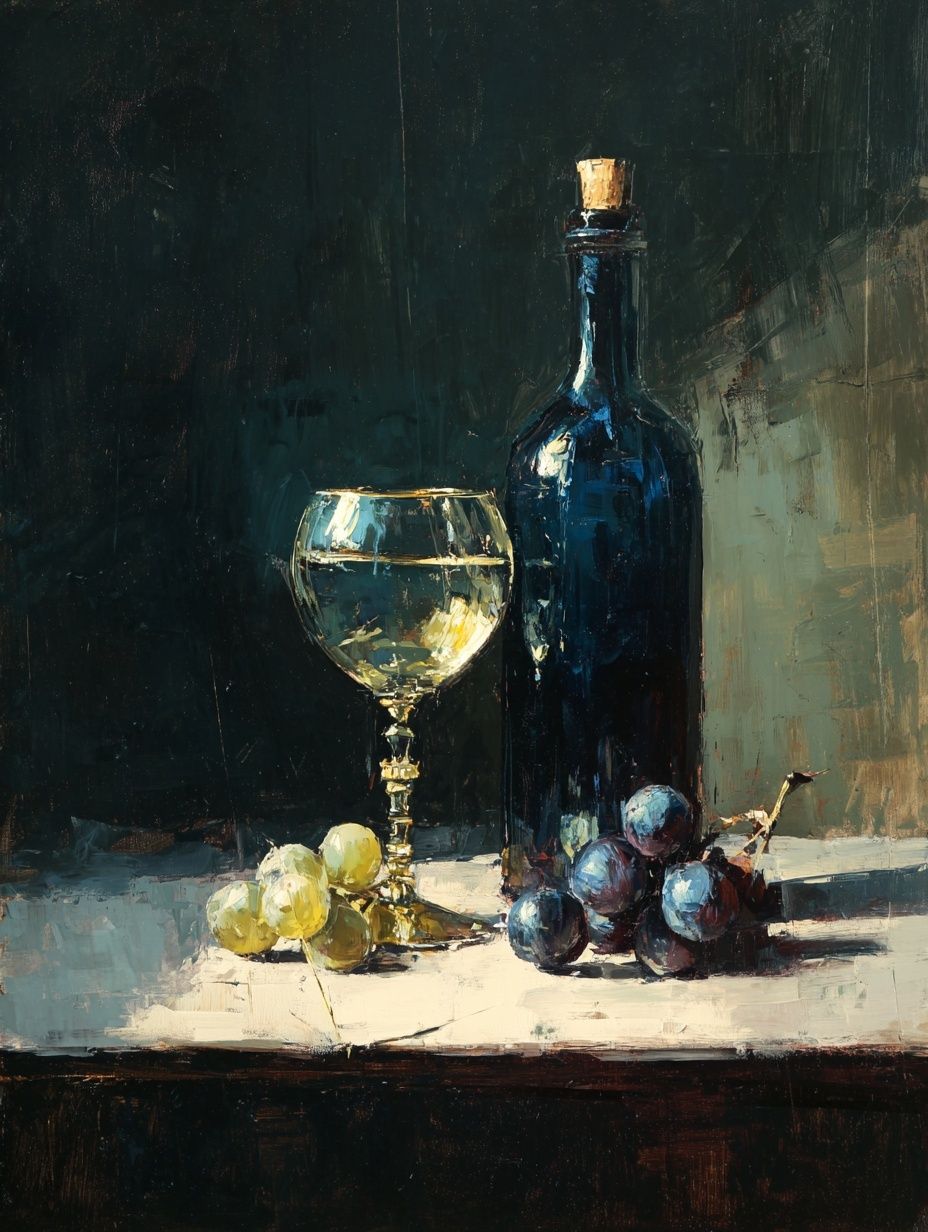
Food-and-drink imagery is especially useful here because it often carries layered tones naturally — glass highlights, fruit, linen, wood, and shadow in one composition. If you need softness near florals, White Wine and Flowers is a natural fit. If you need more contrast for a darker venue, Dark Luxury Typography Poster can sharpen the look around a bar or lounge area.
One practical tip: match no more than 60 to 70 percent of the room exactly. If every print repeats the exact flower color or napkin tone, the result feels staged. Banquet posters look more expensive when they echo the palette loosely rather than mirror it.
Framing and Finish Details
Frames change the level of formality immediately. Slim black, antique gold, and dark walnut are the most reliable finishes for banquet spaces because they photograph well under mixed lighting. White frames can work in daytime garden settings, but at evening events they often lose definition against pale walls or drapery.
Matte surfaces are usually the best choice. Gloss catches chandeliers, flash photography, and window light, which can make framed art unreadable from certain angles. If the venue has strong overhead spots or mirrored walls, a matte print behind glass with minimal reflection is worth prioritizing.

For temporary events, foam board or lightweight mounts can work for single-day installations, especially on easels. For anything that needs a polished hospitality look — welcome areas, sponsor walls, or recurring venue styling — framed banquet posters are the stronger investment. They store better, travel more safely, and look intentional from every angle.
If your decor leans pared back, Golden Sunrise Minimalist Poster or Vase with Flowers — Minimalist Print pairs well with slim metal frames and understated florals.
Styling Ideas for Memorable Moments
The most successful banquet posters are placed where guests naturally pause. That includes the welcome table, bar queue, cake display, photo corner, and exit path. Instead of concentrating every piece behind the dining tables, distribute them so the room unfolds in stages.
At the entrance, choose one strong visual statement rather than a cluster of small frames. Near the bar, use art with drinks, marble, glassware, or vintage social scenes to reinforce the entertaining aspect of the event. Around a photo moment, keep colors restrained and framing consistent so people stand out in pictures.
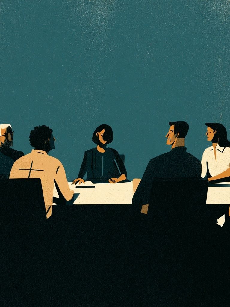
A useful formula is 1 focal piece, 2 supporting pieces, and 1 conversational accent. For example, one large atmospheric artwork behind the head table, two medium prints at the entrance, and one smaller piece near the drinks station. That layout gives banquet posters a clear hierarchy and keeps the room from looking oversaturated.
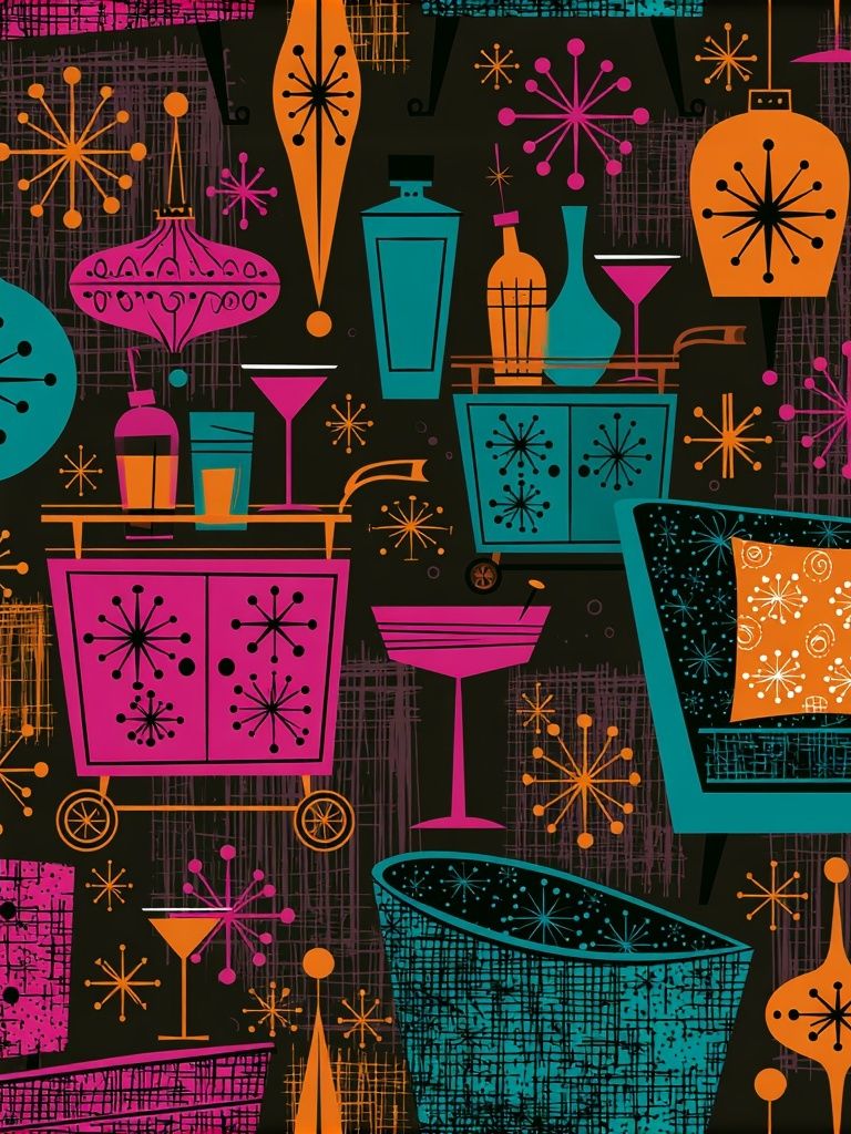
If you want the space to feel curated rather than themed, combine one atmospheric interior or hall scene with one food-and-drink piece and one portrait or abstract work. That mix creates depth. Mid-Century Dinner Party Poster is especially strong for social events because it references gathering without becoming literal signage.
Wrap-Up: Simple Ways to Make Banquet Posters Stand Out
Banquet posters work best when they are sized for the room, tied to the event palette, and placed where guests actually look. Start with the entrance, scale up more than you think you need, and keep frames consistent across the venue. In most banquet rooms, two to four well-chosen pieces will do more than eight undersized ones.
For a polished result, build from one mood — classic, celebratory, modern, or romantic — and shop within related collections like food-and-drink art, vintage wall art, or minimalist framed prints. When banquet posters repeat the room's tone instead of competing with it, the whole event feels sharper, warmer, and more memorable.
Frequently Asked Questions
What size works best for banquet posters in a large hall?
For most banquet spaces, start at 50 x 70 cm for supporting walls and 70 x 100 cm for focal areas. In rooms with ceilings above 3 meters, smaller sizes often disappear.
Should banquet posters be framed for one-day events?
Yes, if the event is formal or heavily photographed. Frames give cleaner edges, reduce curling, and make the setup look more premium than loose prints or lightweight clips.
Which frame color is safest for mixed event decor?
Black, antique gold, and dark walnut are the easiest to coordinate. They work across warm and cool palettes and hold their shape well in photos.
Can banquet posters work in venues with patterned carpet or bold drapery?
They can, but keep the artwork simpler and the palette tighter. Choose prints with one dominant tone and avoid overly busy compositions that compete with the room.
How do I hang posters without damaging venue walls?
Use easels, removable picture hooks approved by the venue, or freestanding sign frames. Always confirm wall rules in advance, especially in hotels and historic properties.