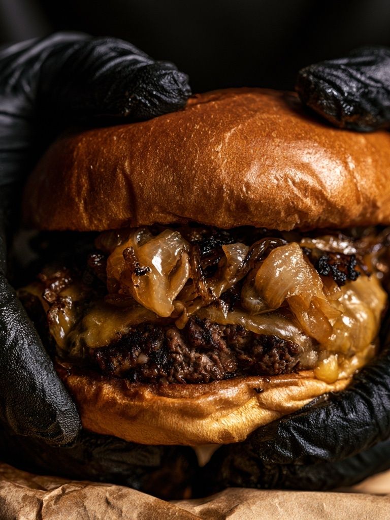
A well-chosen burger poster brings instant appetite, humor, and graphic punch to a room. Food art works because it is familiar and visually bold at the same time — rounded shapes, layered colors, and rich browns, reds, and yellows naturally stand out against neutral walls. In spaces that can feel purely functional, such as kitchens or breakfast corners, that kind of image adds personality fast.
Why a Burger Poster Works So Well
A burger poster succeeds when the room needs energy more than formality. Unlike delicate botanicals or quiet monochrome prints, burger imagery has built-in contrast: bun, greens, cheese, patty, sauce. That stacked composition reads clearly from 2 to 4 meters away, which makes it especially effective on kitchen walls and dining areas where you want a focal point without filling the room with heavy decor.
It also taps into a relaxed social mood. A burger is casual by nature, so the art instantly makes a space feel more welcoming and less stiff. That is why food-themed walls work so well near entertaining zones — a breakfast nook, a compact bar corner, or a games room where people gather. If you like the wider look of culinary styling, our Food Drink collection offers the easiest starting point for building a cohesive food-art wall.
Best Rooms for a Burger Poster
The most natural home for a burger poster is the kitchen, especially above a breakfast table, banquette, bar cart, or open stretch of wall near shelving. In a narrow kitchen, a single vertical piece in 30x40 cm or 40x50 cm keeps the look tidy. In a wider kitchen-diner, a 50x70 cm print above a bench or sideboard has enough scale to anchor the zone.
Dining nooks are ideal because they benefit from art that feels cheerful rather than formal. A burger image can make a small two-seat area feel deliberate and designed, especially when paired with wood, black metal, or checkerboard textiles. If your room already includes food imagery, connect it with neighboring subjects such as pizza wall art or pasta-inspired prints so the whole corner feels curated rather than gimmicky.
Home bars and game rooms can handle the boldest approach. Here, saturated color, retro references, and playful illustration make sense because the room is already built around leisure. If you want a wink of humor, a burger print beside drinks imagery — like our cocktail-inspired art or whiskey wall print — creates a smart food-and-drink pairing without overcomplicating the wall.

Choosing the Right Style and Mood
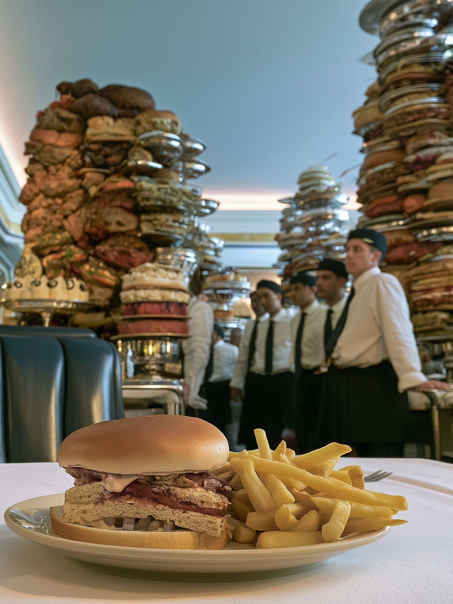
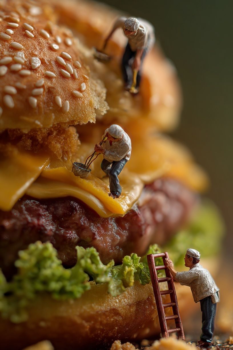
The style of the artwork changes the room more than the subject does. A photographic burger print feels rich, direct, and appetite-driven. It suits modern kitchens, home bars, and loft-style dining spaces with concrete, tile, leather, or dark wood. If you want the art to feel like a statement piece, photography is usually the strongest route.
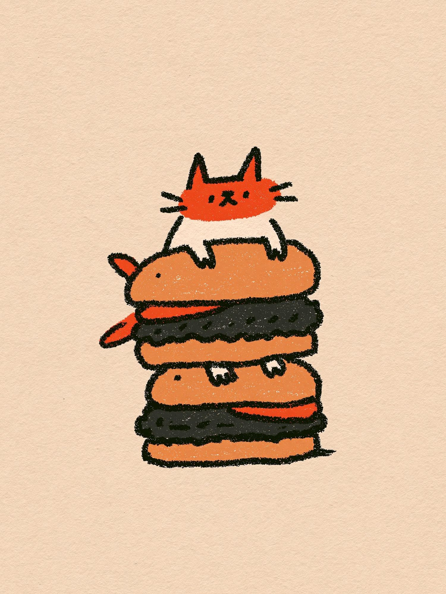
Illustration takes the same subject in a lighter, more playful direction. It works especially well in casual family kitchens, creative apartments, and spaces with color accents. A piece like the Robot with Burger print brings character without feeling childish because the humor comes through the concept, not just the color.

Vintage diner styling is another strong option. It pairs well with checkerboard floors, chrome details, red accents, and nostalgic lighting. If your room already leans retro, combine burger-themed art with selections from our Vintage collection or even a clean text-based piece from Typography wall art to sharpen the theme.
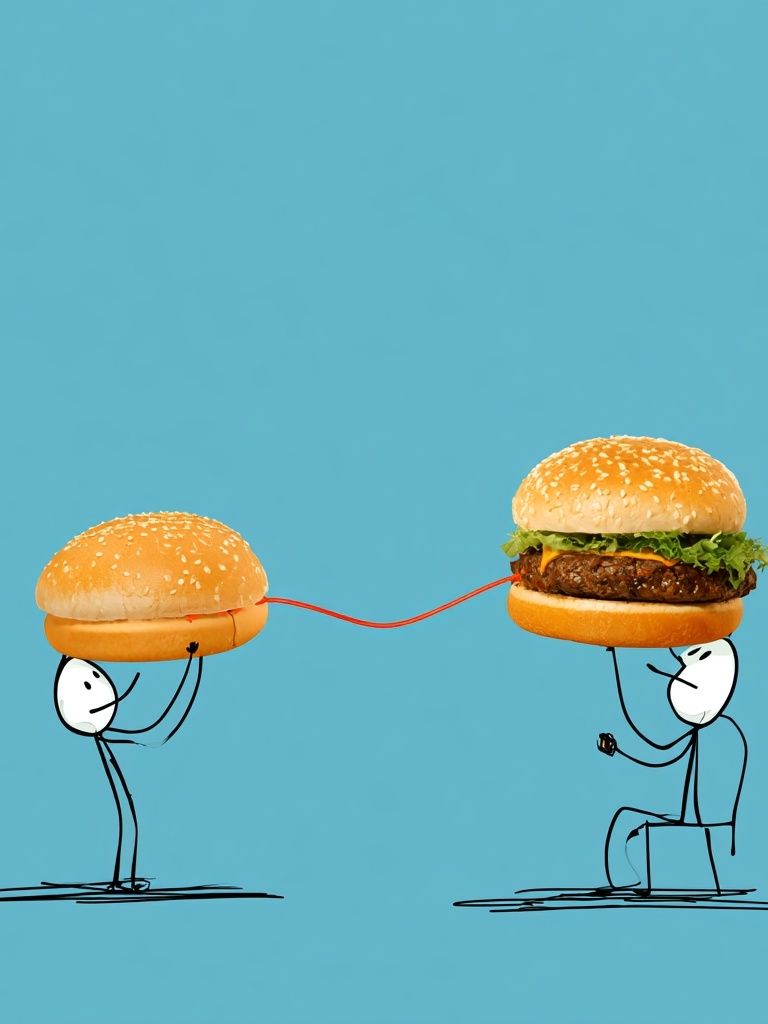
For a more graphic, contemporary look, choose simplified shapes, fewer colors, and plenty of negative space. That keeps the burger motif stylish instead of novelty-led. A playful hybrid such as Burger Connection artwork can work well if the rest of the room stays restrained.
Sizing and Placement Tips
For placement, use the same rules you would for any focal wall art. Hang the center of the frame around 145 cm from the floor in open wall areas. Above furniture, leave 15 to 25 cm between the top of the table, bench, bar cart, or sideboard and the bottom of the frame. That spacing keeps the burger poster visually connected to the furniture instead of floating too high.
Match the size to the wall width. A single frame should cover roughly 50 to 70 percent of the furniture width beneath it. Above a 120 cm dining bench, a 60 to 80 cm wide artwork usually looks balanced. Typical easy sizes are 30x40 cm for small walls, 50x70 cm for medium focal points, and 70x100 cm for statement placement in larger dining spaces.
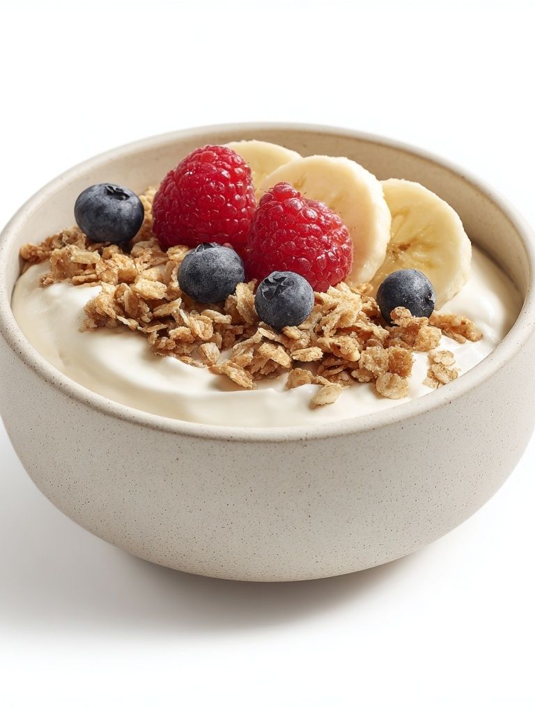
If you are creating a gallery wall, keep the burger print as either the largest piece or the boldest one. Then support it with simpler food-and-drink works rather than competing novelty images. That is where a broader category like fresh breakfast-themed art or elegant food-and-wine photography can soften the composition.

Frames, Colors, and Finishing Touches
Frame choice decides whether burger art feels elevated or overly loud. Black frames give burger imagery a crisp, urban edge and suit industrial kitchens, modern bars, and white tile walls. Oak or walnut frames warm up the subject and help it sit naturally with wood chairs, butcher-block counters, and open shelving. White frames work best when the artwork itself is busy and you want the overall look to stay light.
Use room colors already present in the print. Most burger art contains warm browns, creamy neutrals, tomato red, mustard yellow, and greens. Repeat one or two of those tones in practical details — a tea towel, stool cushion, vase, or tableware. Keep it controlled: repeating 20 to 30 percent of the artwork's palette around the room is enough to make the wall feel coherent.
If the room needs contrast, pair the burger image with cleaner supporting decor. Matte ceramics, plain linen, simple wood grain, and brushed metal all help. Avoid stacking too many novelty elements together. One burger poster plus one or two subtle food-related accents looks designed; five themed accessories can start to feel like a set.
How to Make It Feel Stylish, Not Shouty
The easiest way to keep burger-themed decor chic is restraint. Let the artwork deliver the joke or the appetite, then keep the rest of the room straightforward. A neutral wall color — off-white, warm gray, soft sage, or muted clay — gives the image room to stand out without turning the whole space into a theme.
Limit the supporting accessories to a few functional pieces. On a nearby shelf, choose one stack of cookbooks, one ceramic bowl, and one small lamp rather than filling every surface. In a home bar, pair the artwork with clean glassware and one bottle tray. In a breakfast nook, add one striped cushion or a simple checked textile, not a full diner set.

Scale matters here too. Oversized art can look polished, but only if the room has enough visual breathing space. In a compact room, a single 40x50 cm or 50x70 cm burger poster often looks smarter than an oversized piece that dominates every sightline.
Wrap-Up: Where to Shop for the Perfect Burger Poster
A burger poster works best when you treat it like serious wall art with a playful subject. Choose the room first, then the mood: photography for richness, illustration for humor, retro styling for nostalgia, and pared-back graphics for a cleaner edge. After that, focus on practical basics — size, frame finish, and color repetition — so the print feels integrated into the room.
If you want to build the look beyond one piece, start with our food and drink wall art selection and layer in complementary styles from illustration prints or retro-inspired wall decor. The right burger poster should feel bold, fun, and intentional — more interior statement than novelty purchase.
Frequently Asked Questions
What frame color works best for burger wall art?
Black is the safest choice for a modern look, while oak or walnut softens the image and suits warmer kitchens. If the artwork is very colorful, a thin frame usually looks cleaner than a chunky one.
Can I hang a burger print in a small kitchen?
Yes — choose a 30x40 cm or 40x50 cm size and place it on a clear wall away from splashes and steam-heavy zones. Smaller art works best when centered over a table, shelf, or cart.
Should food-themed art match my kitchen colors exactly?
No. It only needs to repeat one or two tones already in the room, such as red, green, wood brown, or cream. Exact matching often looks too deliberate.
What materials around the artwork make it feel more refined?
Natural wood, matte ceramics, linen, brushed steel, and glass all balance playful food imagery well. These surfaces add texture without competing for attention.