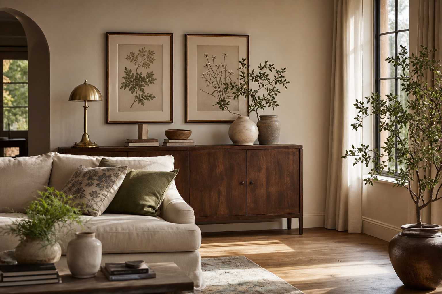
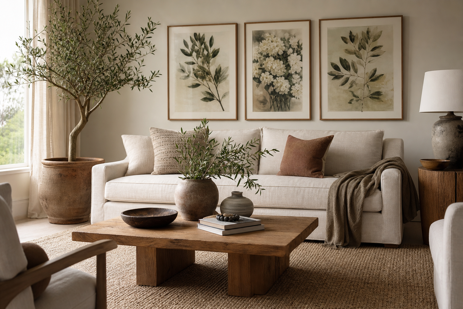
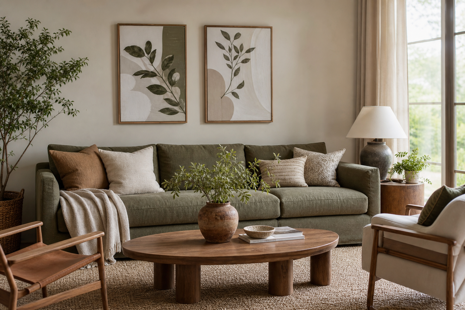
A botanical vintage poster works because it layers two design qualities people rarely tire of: nature and history. The botanical element adds organic shapes, recognisable plant forms, and soft colour variation; the vintage element brings patina, detail, and a sense of collected taste. Together, they feel less trend-led than bright graphic art and less formal than traditional oil paintings.
Why Botanical Vintage Posters Feel So Timeless
Old botanical illustrations were originally made to study real plants, which is why they still feel precise and grounded. Even when the palette is faded — olive, ochre, dusty rose, parchment cream — the subject matter stays fresh because leaves, stems, and blossoms never read as dated. A good Botanical collection also sits comfortably beside wood, linen, rattan, antique brass, and painted walls in off-white or green.
A botanical vintage poster also has a built-in sense of craftsmanship. Fine line work, engraved textures, and slightly imperfect backgrounds add visual depth without overwhelming a room. If your space feels flat, one detailed floral print often does more than a large abstract in a similar colour range because the eye keeps finding smaller shapes within it.
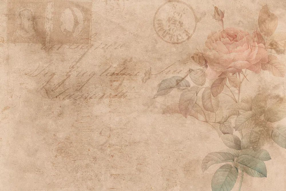
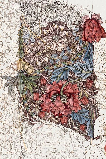
Design history helps too. Many vintage botanical designs connect naturally with Arts and Crafts, cottage, heritage, and English country interiors, while others suit cleaner rooms with just one traditional note. For example, the layered foliage in Honeysuckle by William Morris or the richer pattern work found across our Vintage wall art can make a plain wall feel established rather than newly decorated.
Choosing the Right Colours and Prints
Start with the undertone already in the room. If your walls, rug, or upholstery lean warm, choose prints with cream backgrounds, terracotta petals, muted yellow, or moss green. If the room is cooler — grey-beige, slate, eucalyptus, soft blue — look for sage leaves, faded teal, or more neutral paper tones. A botanical vintage poster should echo at least one colour already present in the room and introduce one extra shade for contrast.
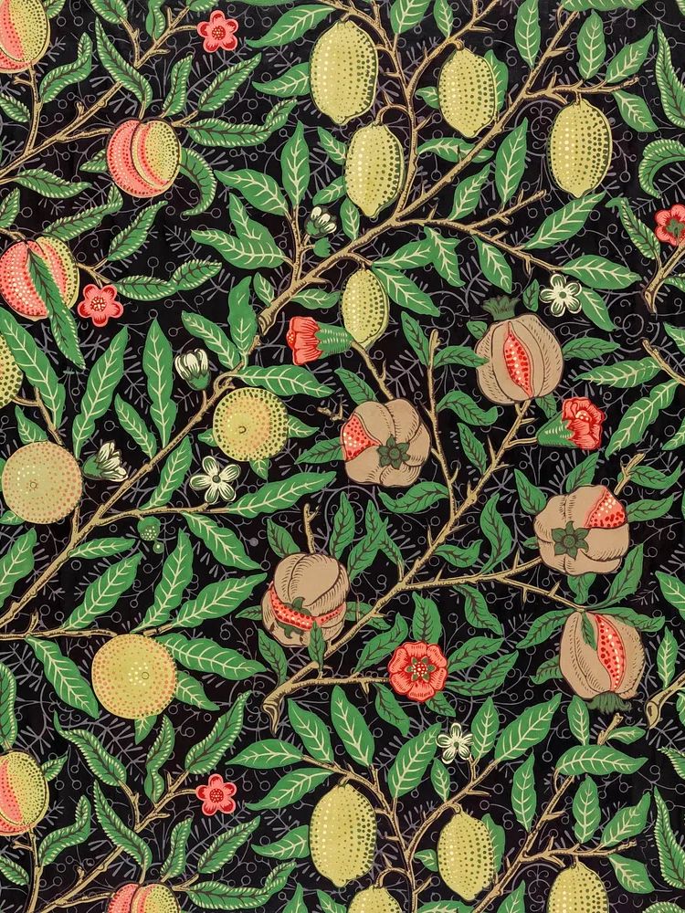
Small floral studies suit quieter interiors better than dense all-over patterns. If your room already has a patterned rug, striped upholstery, or open shelving, pick a print with one central stem or bouquet. In a simpler room, you can go richer with layered foliage or repeating decorative motifs such as William Morris's vintage pomegranate flowers.

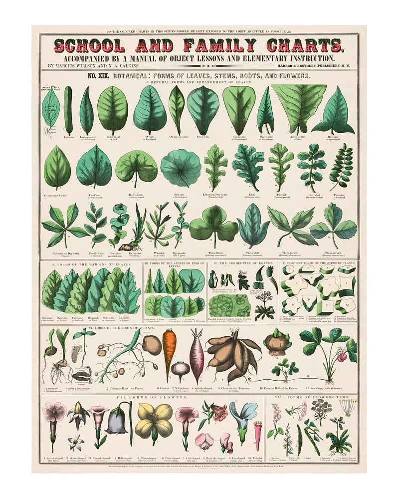
Illustration style matters as much as colour. Scientific studies with labeled-plate energy suit classic and collected spaces; decorative floral patterns lean more romantic; watercolor botanicals feel lighter and more casual. If you want a softer entry point, Vintage botanical art print. School has an academic feel that works well in reading corners, home offices, and hallways where you want character without heaviness.
For more layered rooms, combine traditional botanical work with adjacent styles rather than matching everything too perfectly. A floral study can sit next to Fine Art prints or even restrained Bohemian wall art if the colours overlap within a 2- to 4-tone palette.
Best Places to Display One at Home
The easiest place for a botanical vintage poster is above a sideboard, console, or chest of drawers. These surfaces visually "anchor" the artwork, making even a 40 x 50 cm print feel intentional. Hang the frame so the centre sits around 145 cm from the floor, or 15 to 25 cm above the furniture below it.
In living rooms, botanical prints soften hard lines from televisions, shelving, and rectangular sofas. A single large piece — 50 x 70 cm or 61 x 91 cm — works well above a two-seat sofa. If the sofa is wider than 180 cm, aim for artwork that spans roughly 60 to 75 percent of its width.
In bedrooms, the best placement is usually above the headboard or on the wall opposite the bed. Bedrooms already contain plenty of soft surfaces, so choose artwork with stronger line definition to keep the wall from fading into the textiles. Floral patterns like Chrysanthemum by William Morris add depth without feeling busy when paired with plain bedding.

Kitchens and hallways are often overlooked, yet they suit this style especially well. In a kitchen, place one framed print near a breakfast nook, dresser, or open shelf wall — but keep it at least 40 cm away from major heat or steam sources. In a hallway, a vertical arrangement of two or three smaller pieces, each around 30 x 40 cm, can make a transitional space feel curated instead of empty.
Sizing, Framing, and Layout Tips
The frame finish changes the mood more than most people expect. Oak and walnut make a botanical vintage poster feel warmer and more relaxed. Black frames sharpen the artwork and work well in more modern interiors. Antique gold adds elegance, but use it selectively — one gold frame can be beautiful, five can start to feel formal.
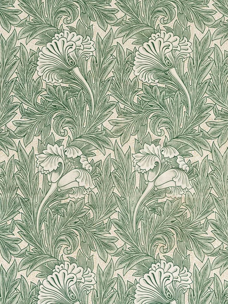
Matting is useful when the print itself is visually dense. A white or warm ivory mount of 5 to 8 cm gives the eye breathing room and makes medium-size art look more substantial. This is especially effective for intricate pieces such as William Morris designs, where the pattern benefits from a clean border.

For layout, use one oversized print if the wall is narrow and you want a strong focal point. Use a pair if the furniture beneath is long and symmetrical — for example, above a 160 to 200 cm sideboard. Use a set of three or four if you're filling a larger wall and want the room to feel collected rather than styled in one purchase. Keep spacing tight: 5 to 7 cm between smaller frames, 7 to 10 cm between larger ones.

If you're styling a botanical vintage poster in a modern room, give it more negative space. One frame on a plain wall with a lamp, a chair, and one ceramic object often looks stronger than surrounding it with too many decorative accessories.
How to Build a Gallery Wall with Botanical Art
A strong gallery wall needs one clear lead piece. Make your botanical vintage poster the largest item, then support it with 3 to 6 smaller works. Good companions include old-style landscapes, soft figure studies, floral patterns, and restrained typography with minimal visible text. The goal is variety in subject, not chaos in colour.
A reliable formula is 1 large botanical print, 2 medium supporting works, and 2 smaller accents. Keep all pieces within the same family of warm neutrals, green, faded red, and muted yellow. If one piece is dark, repeat that dark tone in at least one other frame or artwork so it does not feel isolated.
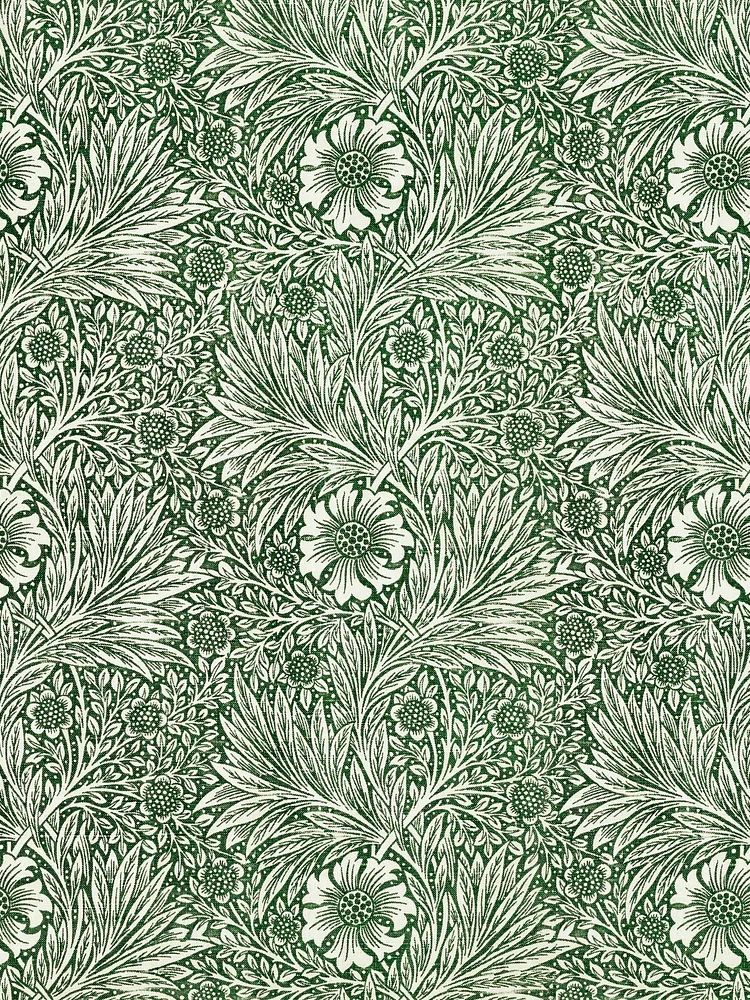
Botanical art pairs especially well with Nature prints and selected Illustration wall art because they share line work and observational detail. For a softer, decorative mix, combine a structured floral study with Floral Bouquet — Bohemian Print or a quieter field scene such as Windmill and Tulip Field — Watercolor Print.
When planning the arrangement, lay everything on the floor first and build outward from the largest frame. Aim for an overall shape — rectangle, loose square, or vertical column — rather than random spreading. On most walls, a gallery wall looks best when the full grouping covers about 70 to 80 percent of the furniture width beneath it.
Final Styling Ideas and Shop Tips
Refreshing this look seasonally is easy because the base is timeless. In spring and summer, echo the print with fresh green stems or lighter linen nearby. In autumn, bring in darker woods, amber glass, or ochre textiles. In winter, the same botanical vintage poster can feel richer simply by adding a brass lamp and deeper-toned accessories around it.
When shopping, focus on three things first: subject, palette, and scale. If the plant form feels right, the colours repeat at least one tone from your room, and the size suits the wall, the piece will usually work. A botanical vintage poster should feel collected, not forced — detailed enough to reward a closer look, calm enough to live with every day.
Frequently Asked Questions
What frame size works best for a 30 x 40 cm botanical print?
A 40 x 50 cm frame with a mount gives it more presence and suits hallways, shelves, and bedside walls. If you want a cleaner look, frame it edge-to-edge at 30 x 40 cm.
Should I choose glass or acrylic for botanical wall art?
Glass offers a clearer, slightly more premium finish, while acrylic is lighter and safer for larger frames or busy households. For pieces above a bed, acrylic is often the more practical choice.
Do botanical vintage prints work with white walls?
Yes — especially warm white or off-white walls. The aged paper tones stand out better on softer whites than on very stark, blue-based whites.
How do I stop a gallery wall from looking too busy?
Limit the palette to 3 or 4 main colours, repeat one frame finish throughout, and keep spacing consistent. Leaving one or two pieces matted also helps the arrangement breathe.
What pairs well with botanical art besides floral prints?
Landscape studies, bird illustrations, antique-style maps, and quiet figure art all pair well. Choose companion pieces with similar muted tones rather than matching every subject exactly.