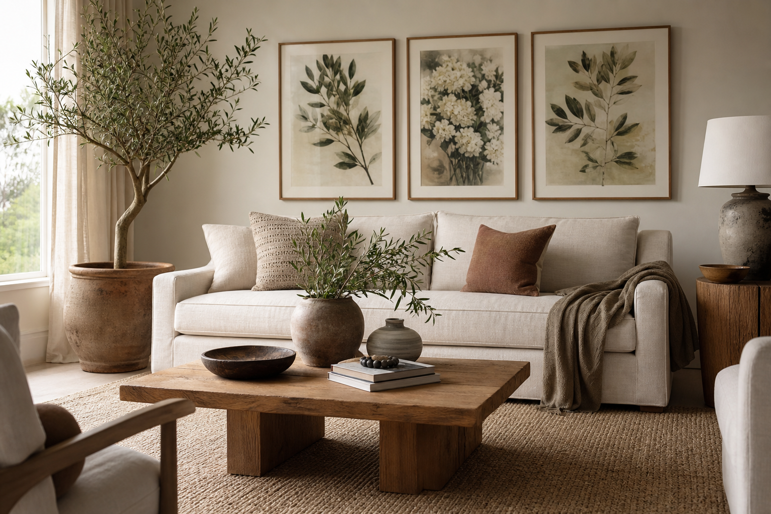
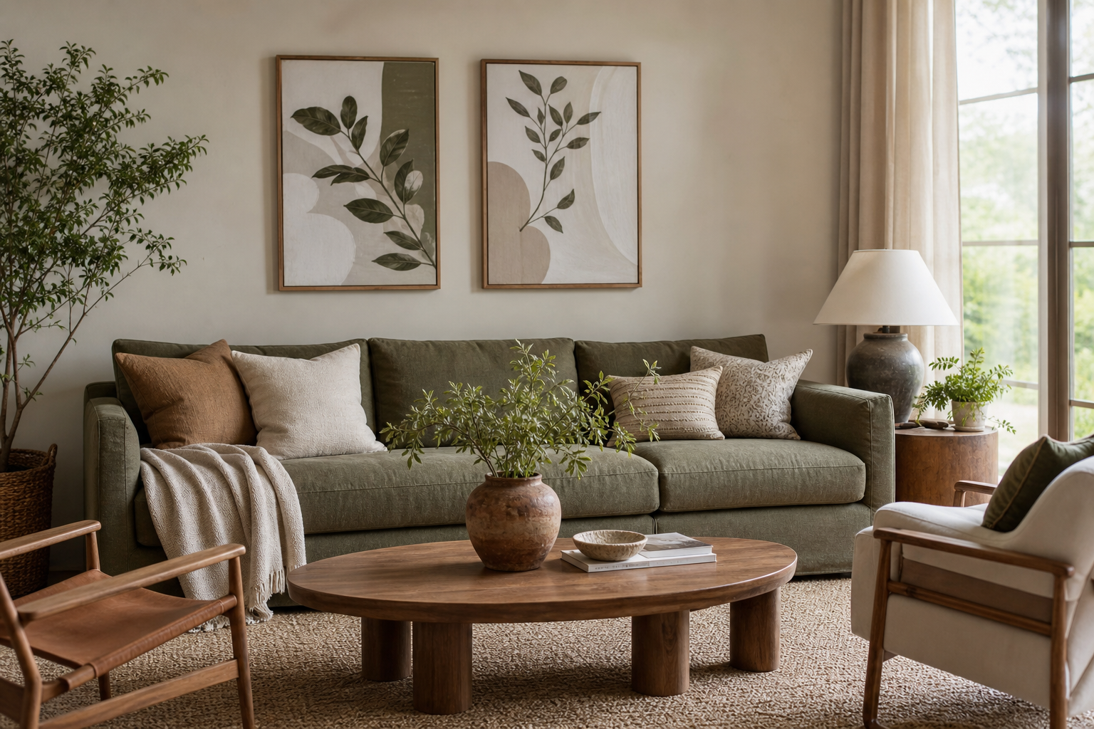
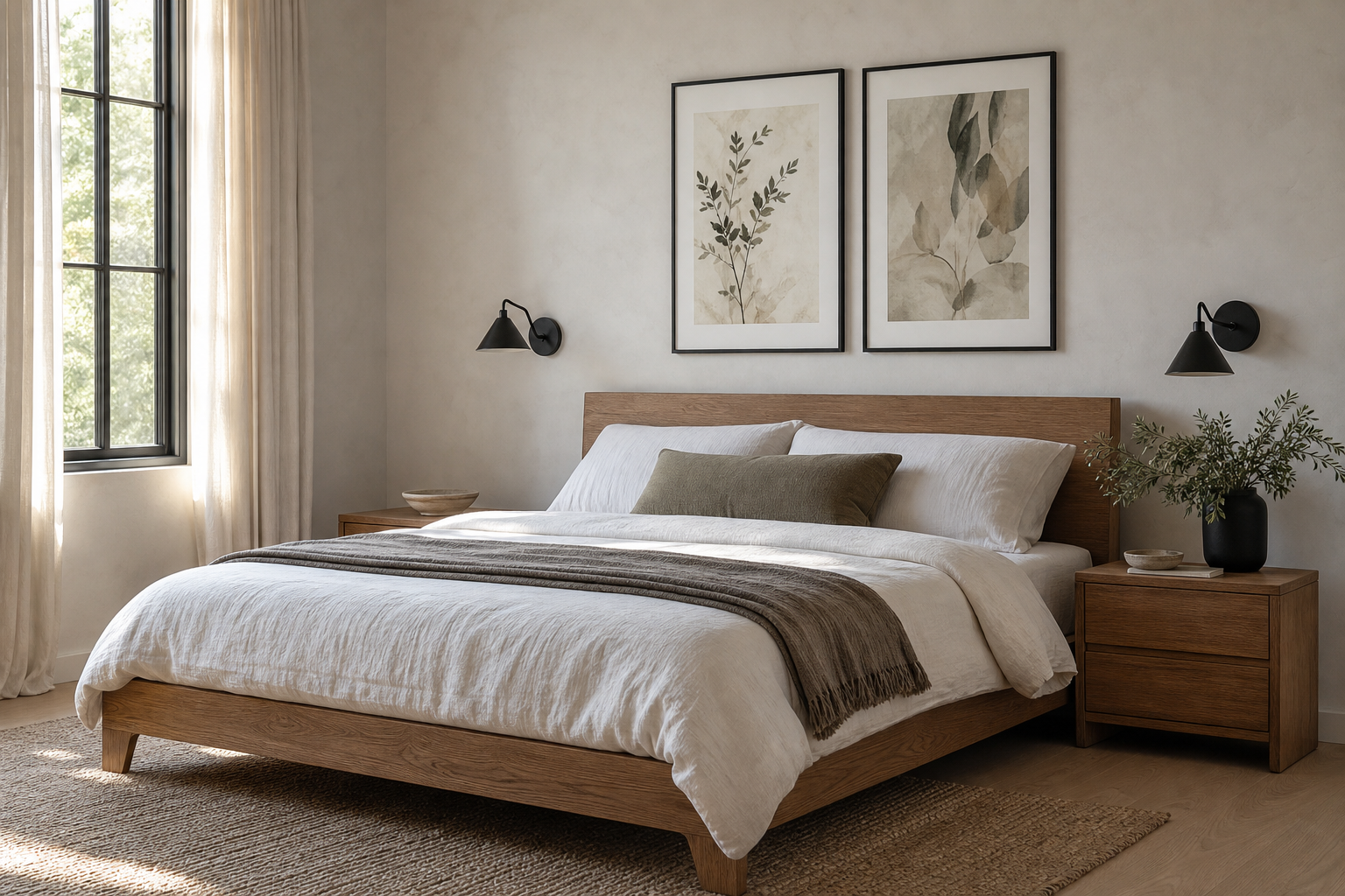
A botanical poster vintage look does something many trend-led prints cannot: it adds age, detail, and calm at the same time. Botanical studies were originally made to record plant forms with precision, so they carry a built-in sense of structure. That scientific clarity is exactly why they still sit comfortably in modern rooms with cleaner lines and fewer accessories.
Why Vintage Botanical Prints Still Feel Fresh
Vintage botanical art balances decoration with discipline. Leaves, stems, seed heads, and flowers create organic movement, but the compositions are usually orderly—often centred, labelled, or symmetrically arranged. In interiors, that means a botanical poster vintage piece can soften a room without making it feel busy. It works especially well with simple furniture silhouettes, pale walls, and natural materials like oak, linen, and rattan.
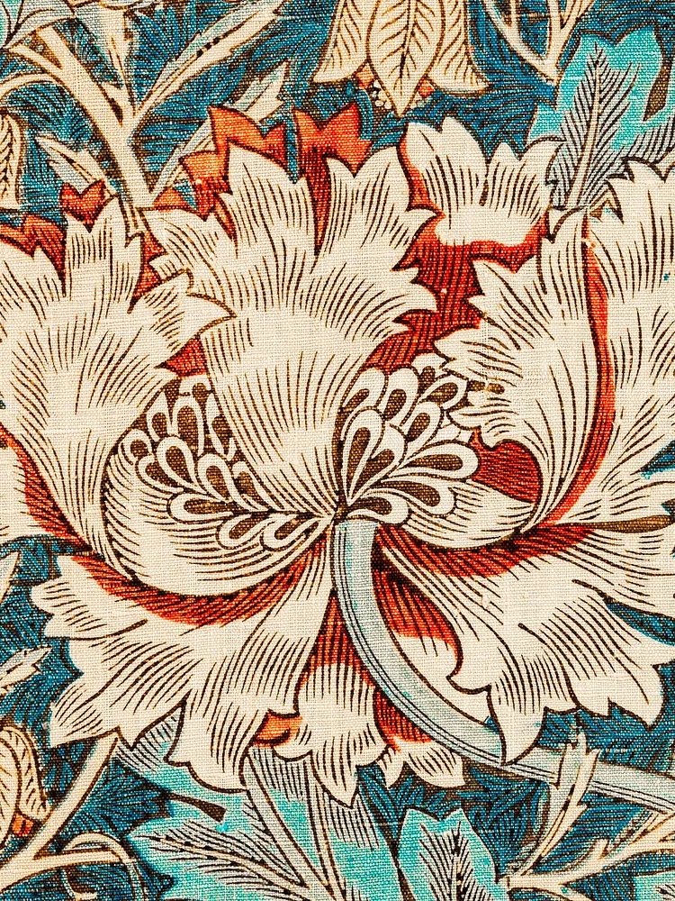
The other reason these prints last is colour. Most vintage plant studies rely on muted greens, faded ochres, dusty reds, and cream paper tones rather than hard contrast. Those shades are easy to repeat through upholstery, ceramics, or wood finishes. If you already like the layered character of our botanical collection, or the patina and depth found in our vintage art prints, botanical subjects sit neatly between both worlds.
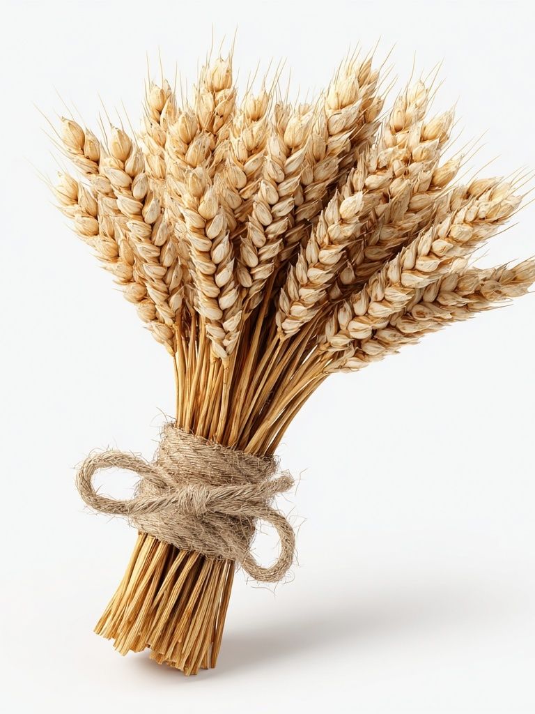
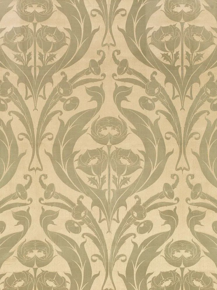
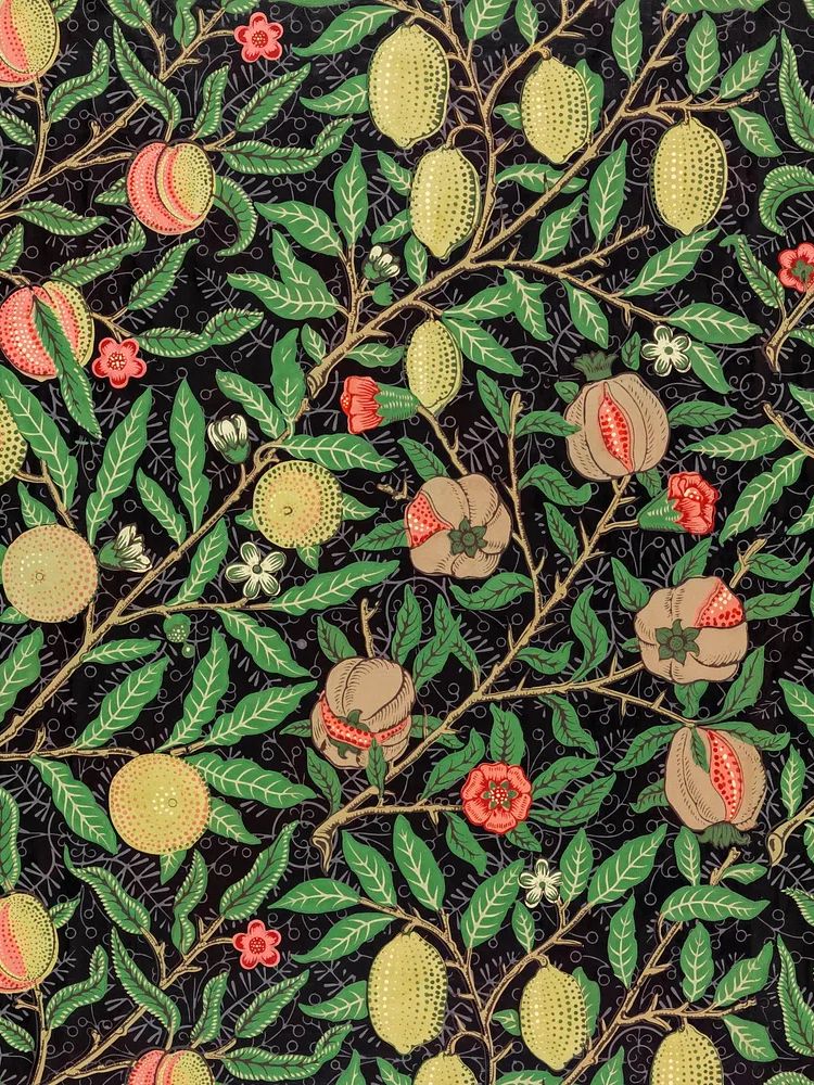
A single stem or seed-head composition is often the easiest starting point because it reads clearly from 2 to 3 metres away. More pattern-led pieces can be richer and denser, which makes them ideal when a room needs visual weight—above a sideboard, fireplace, or bed.
Choosing the Right Plant Study for Your Space
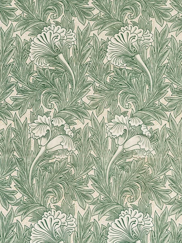
Start with the room's existing palette. If your walls are white, greige, or pale stone, green-led studies are usually safest because they add colour without overpowering the space. Green Tulip by William Morris is a good example of a print that introduces foliage tones while still feeling refined and historic.
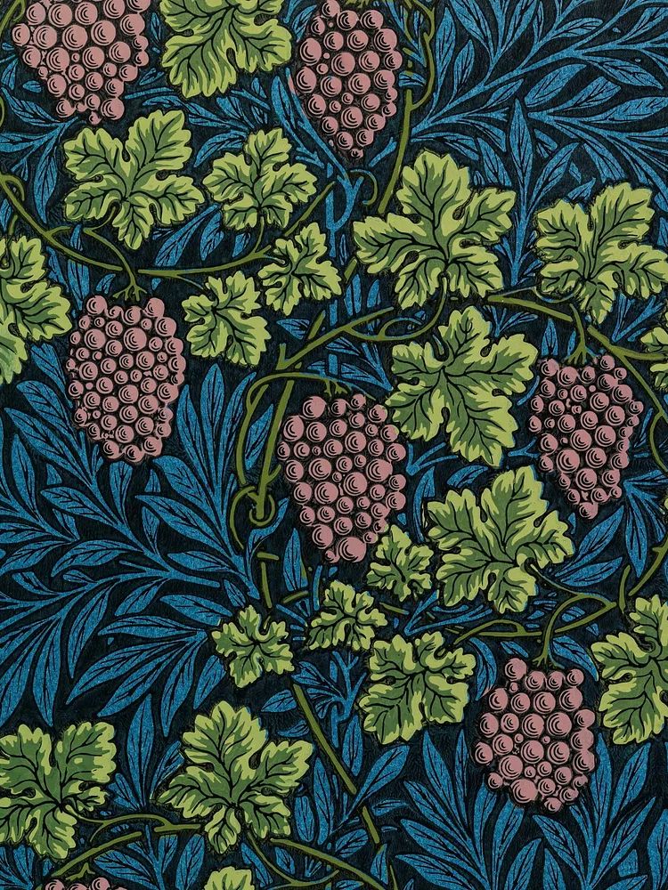
If your room already has warm woods, rust textiles, or antique brass, look for florals with muted gold, burgundy, or soft terracotta in the artwork. Those colours echo older interiors naturally and make the art feel integrated rather than newly added. In kitchens and breakfast corners, fruiting vines and floral motifs can feel especially appropriate, which is why pieces from our illustration prints and nature wall art can also complement botanical work when you want a looser, less formal look.
Scale matters as much as subject. A 30 x 40 cm print suits narrow wall sections, shelves, or layered styling on a picture ledge. For a sofa, bed, or large console, move up to 50 x 70 cm or 70 x 100 cm so the artwork does not disappear. As a rule, wall art above furniture should cover roughly 60 to 75 percent of the furniture width for balanced proportions.

Best Rooms for a Botanical Poster Vintage Look
Living rooms are the most flexible place to use botanical art because the subject feels calm but not sleepy. Over a sofa, a pair of matching studies spaced 6 to 8 cm apart creates a tidy, collected effect. On a chimney breast or narrow wall, one larger piece often works better than several small frames.
Bedrooms benefit from softer, less contrast-heavy studies. Choose prints with cream backgrounds and washed greens rather than dark black line work. That keeps the wall restful, especially above the headboard. If you want more romance than formality, a floral work from our bohemian floral prints can sit beside vintage botanical pieces without clashing.
Kitchens and dining spaces suit fruit, grain, vine, or herb imagery because the connection feels natural. Hallways are ideal for smaller works hung as a row—three 30 x 40 cm frames can turn a pass-through wall into something considered. In a home office, botanical studies help soften desks, shelving, and screens, especially when paired with simple timber frames and neutral mats.

How to Frame Botanical Art for a Collected Feel
Framing is what turns a casual print into a convincing interior feature. For a botanical poster vintage style, the best frame materials are oak, walnut, dark stained wood, or slim antique-look gold. Black can work, but it tends to sharpen the mood and make the piece feel more graphic than archival.
Mounts matter too. A cream or off-white mount that is 5 to 8 cm wide gives the artwork breathing room and mimics the proportions of older framed studies. Bright white mounts can feel too crisp against aged paper tones. If your print already has a visible border, keep the mount narrow or skip it entirely to avoid crowding the composition.
Choose glass based on the room. Standard glass is fine in lower-glare spaces, but acrylic or anti-reflective glazing is better opposite windows or in bright kitchens. In practical terms, anti-reflective glass makes more difference than people expect—especially on artwork with fine line work and subtle colour shifts.
If you want a more traditional look, use identical frames for a set of two or four. If you prefer a collected wall with more character, mix frame finishes within a tight range—say, oak, walnut, and dull brass—while keeping the mount colour consistent. The coherence should come from repetition, not perfect matching.

Pairing Botanical Posters with Other Wall Art
Botanical pieces pair best with art that shares either a palette or a sense of line. Landscape watercolours, bird illustrations, and restrained decorative patterns all sit comfortably beside plant studies. For example, Yellow Bird — Illustration Print can bring a little contrast and life to a botanical grouping, while still keeping the natural-history mood intact.
If you want a gallery wall, build around one anchor print first. That might be a larger floral or foliage piece, then add two to four supporting works in smaller sizes. Use spacing of 5 to 7 cm between frames for a tighter, more intentional arrangement. Mix vertical and horizontal formats, but keep at least one unifying element—frame finish, background tone, or subject matter.
Contemporary pieces can work too, especially if they reference leaves, branches, or organic forms in a looser way. A print from our mid-century modern collection can stop a botanical arrangement from feeling overly period. The key is balance: if one work is dense and patterned, pair it with simpler neighbours.
Colours, Textures and Styling Details That Work
Once the art is on the wall, repeat two or three colours from it in the room. If the print includes sage green and faded red, echo those in a cushion, lampshade, throw, or ceramic glaze. You do not need perfect matching—close tonal relatives are usually better because they look more natural.
Texture is what makes botanical styling feel lived-in. Linen curtains, jute rugs, woven baskets, patinated metals, and matte ceramics all support the softness of vintage paper tones. Smooth lacquered furniture or very glossy surfaces can fight that mood unless used sparingly. In rooms with lots of hard lines—metal shelving, stone countertops, glass desks—botanical wall art adds welcome irregularity.
Wood tone should also be deliberate. Pale ash creates a lighter Scandinavian feel, while medium oak and walnut deepen the vintage character. If your room feels flat, introduce one darker timber piece near the artwork—a console, bench, or side table—to give the wall more grounding.

You can also bridge eras by styling botanical art with painterly or decorative pieces from our fine art selection. That approach works well if the room already has antiques mixed with newer furniture and you want the wall to reflect that same layered mix.
Final Styling Tips for a Timeless Botanical Display
For a single statement piece, go larger than instinct suggests. A 50 x 70 cm or 70 x 100 cm botanical print above a console or bed will usually feel more resolved than a small frame trying to fill a big wall. If you are building a set, start with two matching sizes, then add one contrasting smaller piece only if the wall still needs rhythm.
Keep hanging height practical. The centre of the composition should usually sit around 145 to 150 cm from the floor, or slightly lower above furniture. If you are hanging multiple pieces, treat the grouping as one shape rather than measuring each frame in isolation.
A botanical poster vintage arrangement works best when it feels edited. One excellent frame in the right size beats five unrelated pieces every time. Start with a subject and palette that already speak to your room, then build slowly from there.
Frequently Asked Questions
What frame colour is safest for vintage botanical art?
Medium oak, walnut, and antique gold are the most versatile. They warm up cream paper tones and suit both traditional and modern interiors.
Can I use botanical prints in a small hallway?
Yes—choose slimmer formats like 30 x 40 cm and hang them in a vertical line or a neat row. Keep frames narrow so the wall does not feel crowded.
Should botanical prints be hung behind glass?
In most cases, yes. Glass or acrylic protects the surface from dust, kitchen grease, and humidity, which matters most in dining areas, hallways, and workspaces.
What wall colour works best with a botanical poster vintage look?
Soft white, warm cream, pale sage, and muted stone are the easiest options. They support the artwork's aged tones without competing for attention.
Do all pieces in a botanical gallery wall need to match exactly?
No. Matching sizes can look polished, but a mix of two or three formats often feels more collected—as long as spacing, frame style, or colour palette stays consistent.