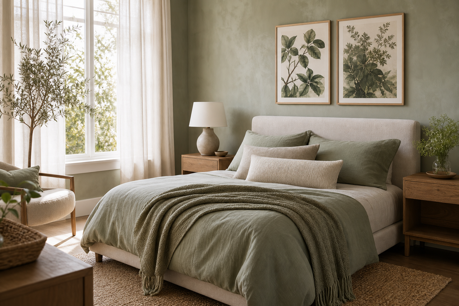
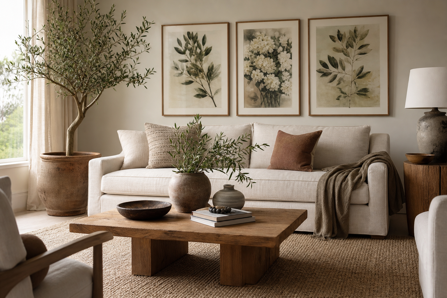
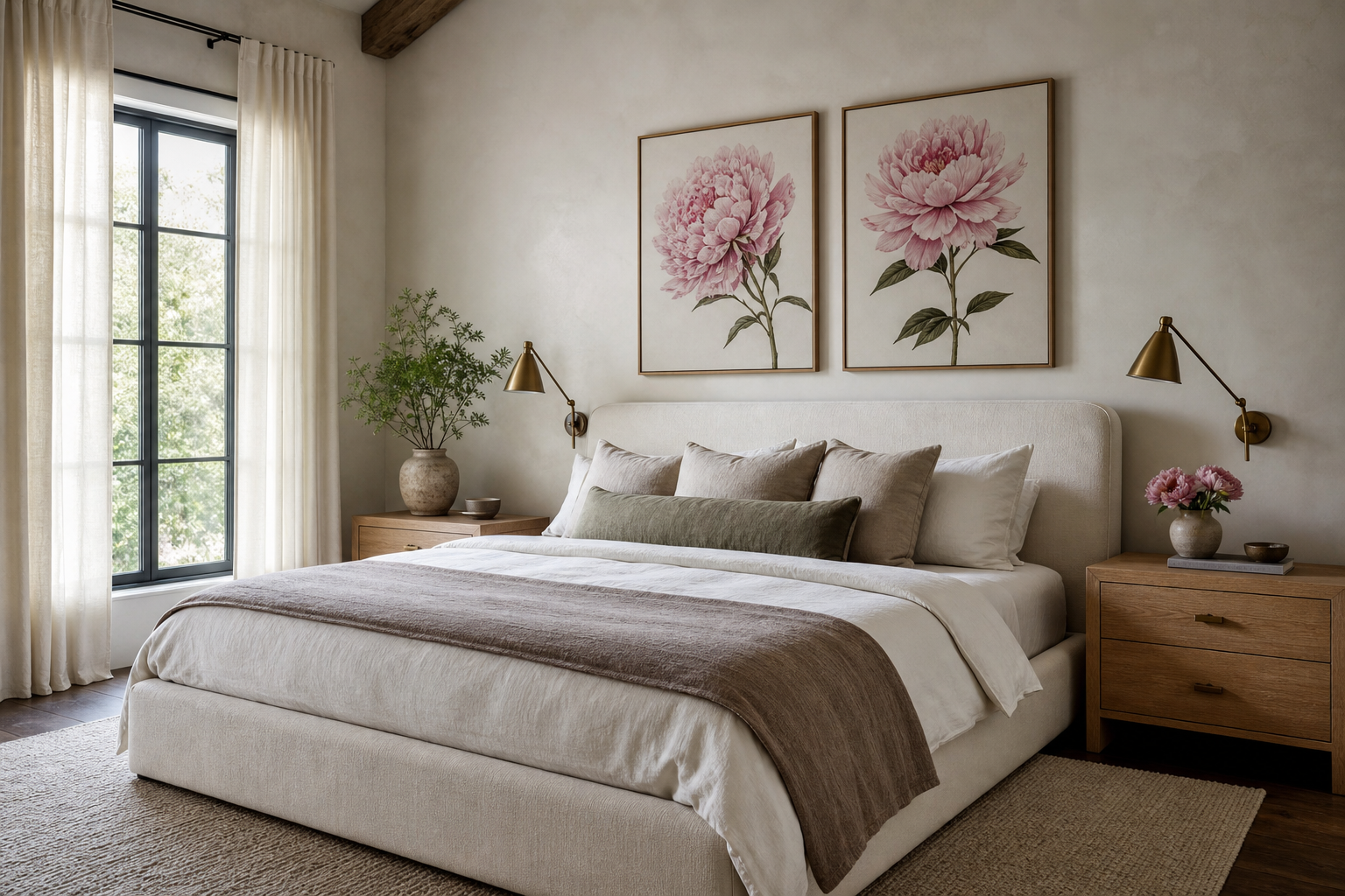
A well-chosen botanical rose print adds structure as much as softness. The flower itself is romantic, but the scientific linework, stem detail, and balanced petal form keep it from feeling overly sweet. That balance is exactly why botanical rose wall art works in homes that lean classic, modern, or somewhere in between.
Why Botanical Rose Art Feels Timeless
Botanical rose imagery has lasted because it sits between art and study. Vintage botanical plates were made to record shape, colour, and species accurately, which gives them a clarity that still feels fresh on a wall. A botanical rose piece can read decorative from across the room, then reveal fine stem veins and layered petals up close.
That mix of beauty and order makes botanical rose art especially easy to live with. Unlike trend-driven motifs, roses have enough historical depth to feel grounded. Pair a rose print with pieces from our botanical collection or older-inspired works from the vintage wall art selection, and the room immediately gains a sense of permanence.
If you want that classic botanical look with the subject made explicit, choose a piece with one bloom or a clearly isolated stem rather than a dense floral pattern. A single specimen feels calmer, especially in smaller rooms where too much detail can crowd the eye.

Choosing the Right Style for Your Space
A minimalist botanical rose print usually has more negative space, fewer colours, and a cleaner silhouette. It works best in rooms with pale walls, simple upholstery, and restrained materials like oak, black metal, or matte white ceramics. In those spaces, one 50x70 cm print is often enough to carry the wall.
Vintage botanical rose works differently. It suits deeper wood tones, antique brass, pleated lampshades, and traditional trim. If your room already includes layered textiles or classic furniture profiles, a rose print with an aged paper background will feel intentional rather than decorative. Pieces from our broader fine art collection also pair well if you want a more painterly floral story.
Contemporary floral styling tends to sharpen the contrast. Think rose imagery next to charcoal, olive, or even black-painted walls. In that setting, a botanical rose can stop the room feeling hard. If you like a more decorative, illustrative direction, mix in selections from our illustration art prints rather than staying strictly academic.
Best Rooms for Botanical Rose Prints
Bedrooms are the easiest place to start. Above a queen bed, aim for art that spans roughly 60 to 75 percent of the headboard width. That usually means one 70x100 cm print, two 50x70 cm frames, or a trio of smaller pieces. Botanical rose art works particularly well here because it softens the room without introducing visual noise.

Living rooms benefit from scale and restraint. A botanical rose arrangement over a sofa should feel deliberate, not fussy. If your sofa is 220 cm wide, a grouped arrangement around 140 to 165 cm wide tends to look balanced. Rose prints also work beautifully near shelving because the organic forms offset books, ceramics, and straight architectural lines.
Hallways are ideal for narrower formats. One vertical botanical rose print can sharpen a quiet passage, while a row of smaller works creates rhythm along a longer wall. In transitional spaces, stick to frames with consistent finishes so the display reads cohesive from a distance.
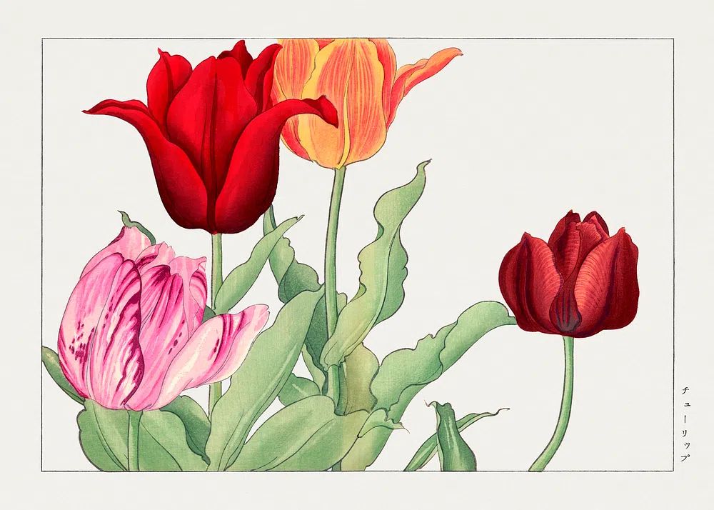
Kitchens and bathrooms can handle floral art well if the styling stays crisp. In kitchens, place a rose print away from direct splashes and use a frame with acrylic glazing if needed. In bathrooms, choose one medium piece above towel hooks or opposite a mirror, especially if the room already has soft greens, warm white tile, or brushed nickel fixtures. If you want to build a fuller floral story beyond roses, our Tulip Bouquet botanical print and the wider nature print collection can broaden the palette without breaking the theme.

How to Frame and Hang Rose Artwork
Frame finish changes the mood more than most buyers expect. Oak and ash feel relaxed and natural. Black frames sharpen botanical rose imagery and suit modern interiors. Antiqued gold works best when the print itself has a vintage base tone or visible illustration detail. If the art is delicate, keep the frame profile slim — around 1 to 2 cm — so the subject stays dominant.
Matting is useful when the artwork is detailed. A white mat of 5 to 8 cm gives a botanical rose print breathing room and makes even a smaller 30x40 cm piece look more substantial. For a more collected look, combine one rose print with complementary botanical works in matching frames rather than mixing too many finish types.
Hang the centre of the arrangement at around 145 cm from the floor in most homes. Above furniture, leave 15 to 25 cm between the top of the sofa, headboard, or console and the bottom of the frame. That gap keeps the art connected to the furniture instead of floating awkwardly above it.

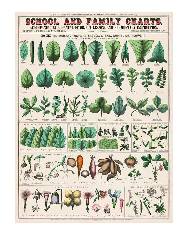
If you are building a small gallery wall, repeat one element consistently — frame colour, mat size, or subject family. A botanical rose piece pairs naturally with other softly structured florals such as Wheat Bouquet or archival-looking works like this vintage botanical school print.
Colour Palettes That Work Beautifully
Blush, cream, and sage are the most forgiving companions for botanical rose art. They echo the subject without becoming literal. Use a 60-30-10 split if you want the room to feel balanced — 60 percent warm neutral base, 30 percent secondary tone like sage or taupe, 10 percent rose or deeper accent.
Charcoal is a strong counterpoint if you prefer a more tailored room. Against dark walls, botanical rose imagery feels more sculptural, especially when framed with a wide white mount. This is one of the easiest ways to make a floral subject feel less cottage-style and more editorial.
Warm neutrals — oatmeal, sand, mushroom, camel — are another safe foundation. They allow both pink-toned and cream-toned rose imagery to sit comfortably. If the artwork has a vintage paper ground, repeat that warmth in lampshades, wood finishes, or woven textiles so the palette feels connected rather than accidental.

Styling Ideas for Different Interior Looks
In modern rooms, keep the composition spare. One botanical rose print over a console, a black frame, and a stone vase with a few branches is enough. Avoid adding too many floral fabrics nearby — the contrast between organic art and clean-lined furniture is what makes the look work.
For cottagecore interiors, layer more freely. Botanical rose art can sit with painted wood furniture, gathered curtains, gingham, and worn brass hardware. Here, a collected arrangement of two to four botanical works feels appropriate, especially when the prints share a soft, faded palette.

Classic interiors benefit from symmetry. Try a pair of matching botanical rose prints above a sideboard or bed, each in identical frames and mounts. That kind of arrangement suits rooms with moldings, tailored upholstery, and balanced furniture placement.
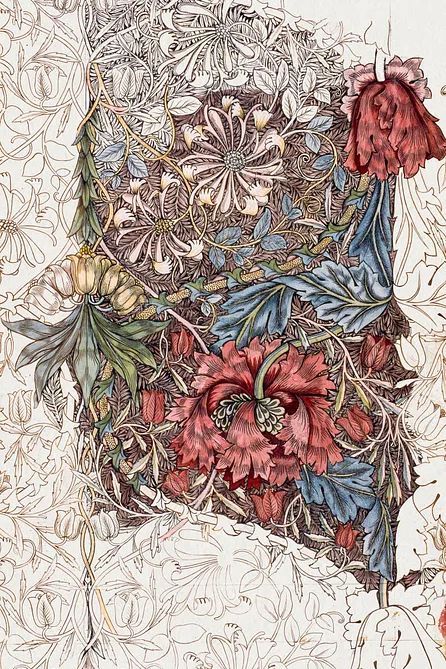
Maximalist spaces can also use botanical rose pieces — but they need stronger companions. Mix them with richer tones, patterned textiles, and bolder floral or ornamental works such as Honeysuckle by William Morris or decorative designs from our botanical art prints. The key is to repeat at least one colour from the rose artwork elsewhere in the room so the wall feels integrated.
Wrap Up: Making Botanical Rose Art Feel Personal
The most successful botanical rose styling starts with the room, not the flower. Look at your wall colour, furniture width, wood tone, and the amount of detail already present. Then choose a rose print that either softens the space or gives it needed structure. Botanical rose art works best when it echoes something already in the room — a pink undertone in the upholstery, a vintage note in the lighting, or a natural material like linen or oak.
If you want a result that lasts, stay close to pieces you will still enjoy in five years: clear composition, balanced colour, and a frame finish that suits your home. Start with one strong floral focal point, then build outward only if the wall truly needs more.
Frequently Asked Questions
What frame colour works best with botanical rose prints?
Oak is the safest all-round choice, black feels more modern, and antique gold suits vintage-style rose artwork. Match the frame to your room's hardware and wood tones for a cleaner result.
Can I hang botanical rose art in a bathroom?
Yes — just keep it away from direct steam and use protective glazing. A frame with acrylic glazing is a practical option in smaller bathrooms with limited ventilation.
What size should I choose for a narrow hallway?
A 30x40 cm or 40x50 cm vertical print usually fits well without overwhelming the passage. For a longer hallway, repeat 3 to 5 smaller frames with even spacing of about 5 to 8 cm.
Does botanical rose wall art pair well with other floral prints?
It does, especially when the pieces share a similar paper tone, frame finish, or botanical style. Keep one element consistent so the grouping feels curated instead of random.
Should I use glass or a mat for detailed botanical prints?
A white mat helps fine linework stand out and makes the piece feel more finished. Glass or acrylic glazing protects the print and reduces dust, which matters most in kitchens, hallways, and bathrooms.