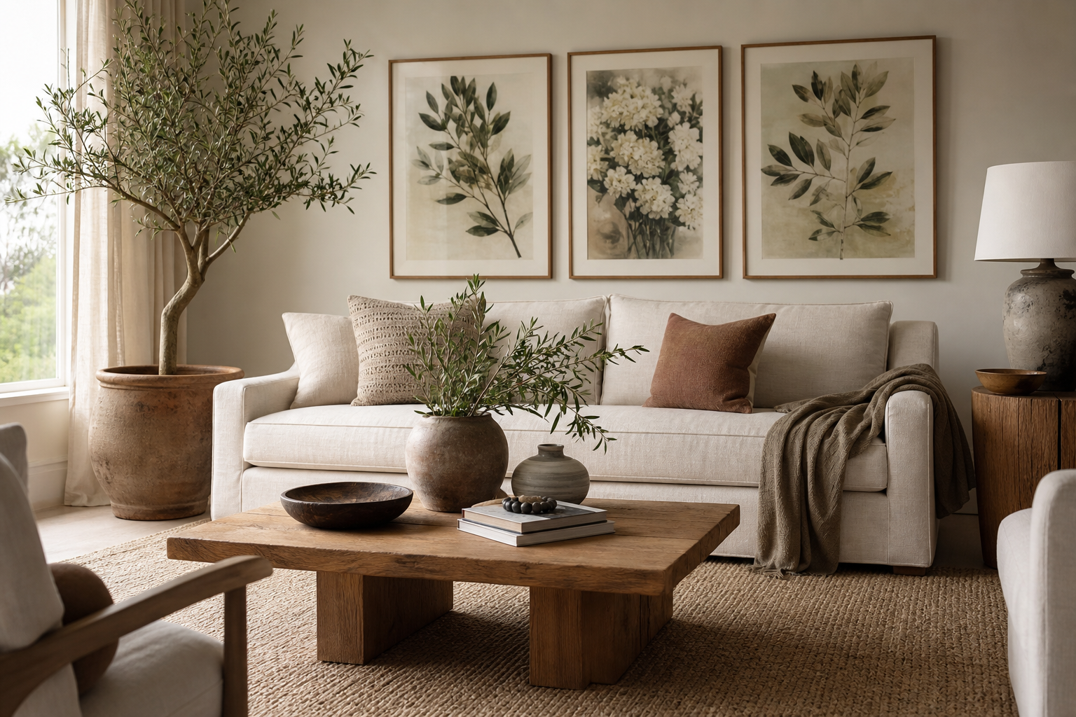
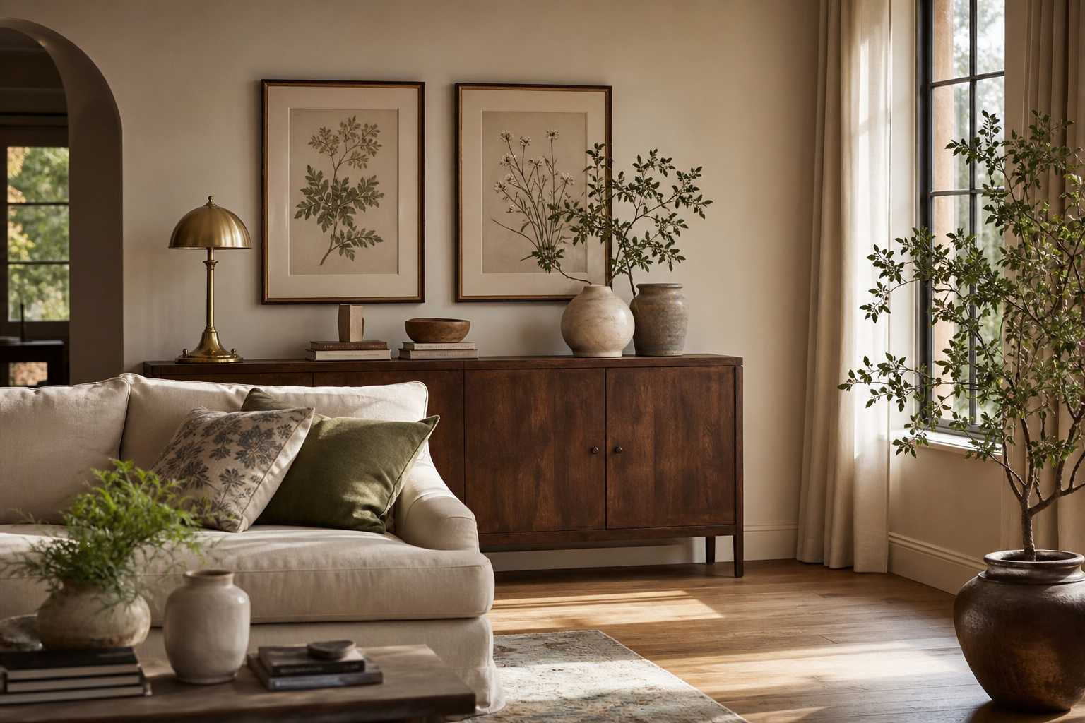
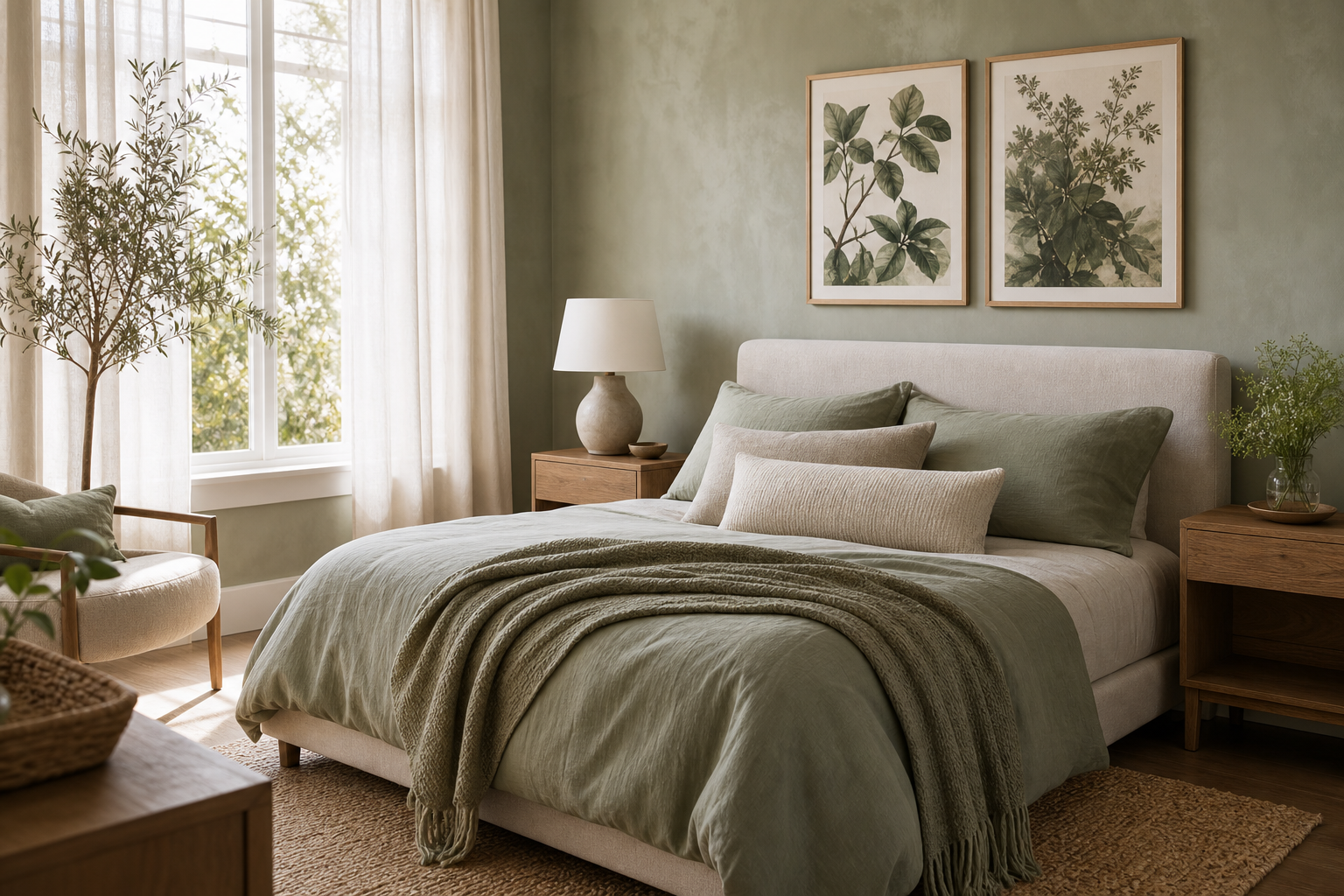
A strong botanical illustration peony print does two jobs at once: it adds floral softness and brings the disciplined detail of natural study to the wall. That balance is what makes peony imagery more lasting than trend-led florals. The petals are full and romantic, but the structure is precise, which helps peonies sit comfortably in both traditional and clean modern interiors.
If you want a floral subject that feels decorative without becoming sugary, botanical illustration peony styling is one of the easiest ways to get there. It works especially well when paired with pieces from our Botanical collection or layered into a broader illustration wall art mix where line, shape, and muted color matter as much as the flower itself.
Why Peony Illustrations Feel So Timeless
Peonies have a natural geometry that reads well from both 1 meter and 4 meters away. Up close, you notice the layered petals and tonal shifts from cream to blush to deep rose. From across the room, you get a rounded, sculptural bloom with a clear silhouette. That makes peonies more adaptable than many loose floral motifs, especially on medium walls between 120 and 220 cm wide.
Vintage botanical art also gives peonies a second layer of appeal. A flower rendered with observational accuracy feels grounded, even when the bloom itself is lush. That is why peony art pairs so well with heritage-inspired pieces such as Vintage Rose Botanical or the more pattern-led rhythm of William Morris floral designs. The result is floral decor with backbone.

Choosing the Right Peony Print Style
The best peony print style depends on how much visual detail the room already has. In a minimal room with flat-front cabinets, plain linen, and a restrained palette, choose an antique botanical plate or a clean floral study with visible negative space. That gives the wall definition without crowding it. If the room already includes patterned textiles, carved wood, or ornate lighting, a quieter floral illustration usually works better than a busy all-over design.
For soft, romantic rooms, watercolor is the easiest entry point. A piece like our vintage rose botanical print shows how a bloom can feel delicate without disappearing into the wall color.
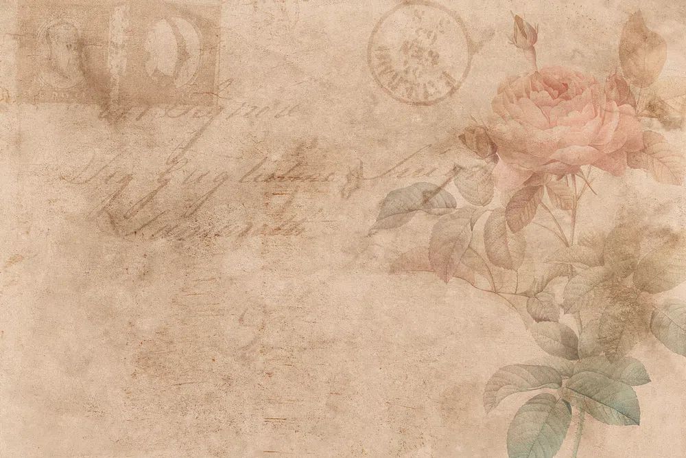
If you prefer a more collected, archival look, combine peony-inspired florals with heritage botanical and decorative works. These four pieces create a strong bridge between scientific illustration, floral softness, and classic pattern:
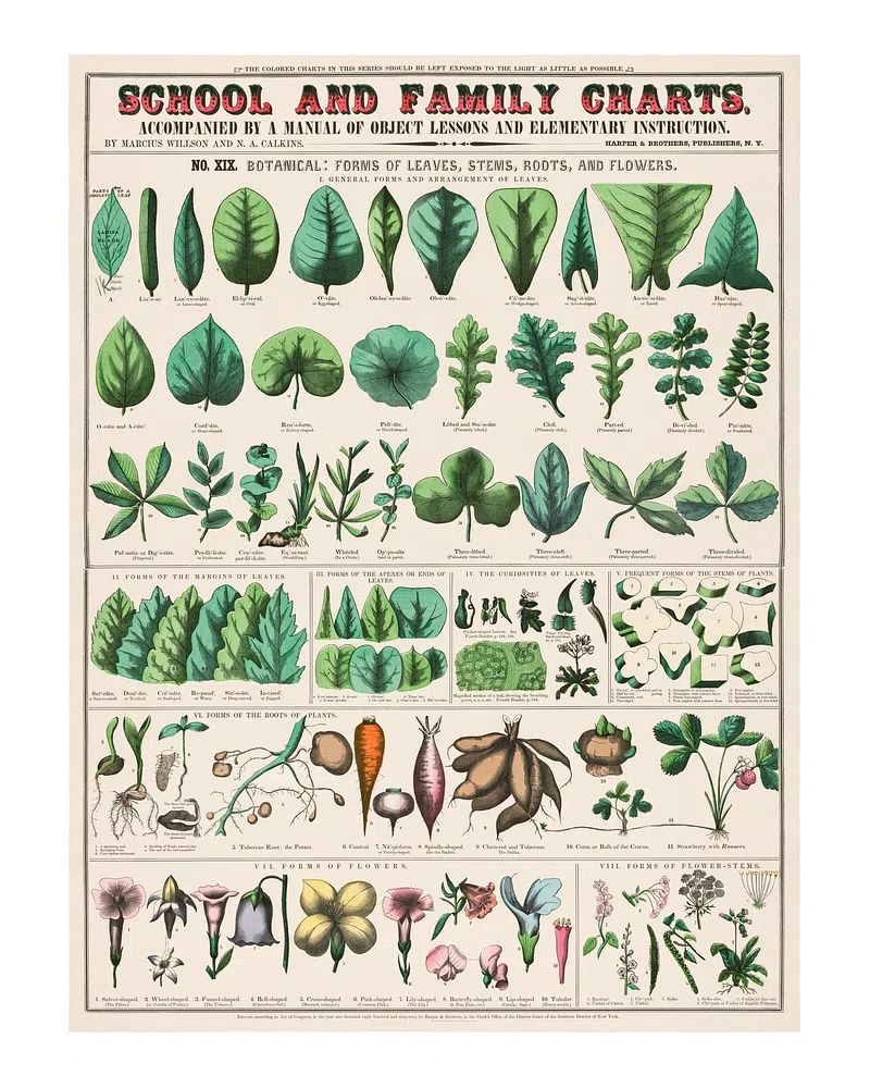
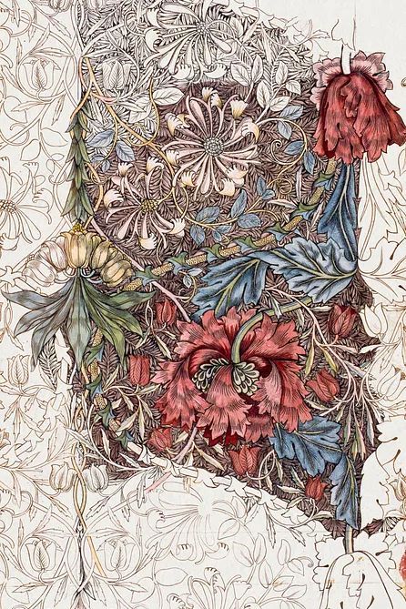
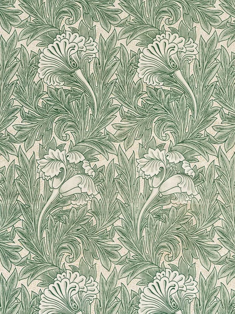
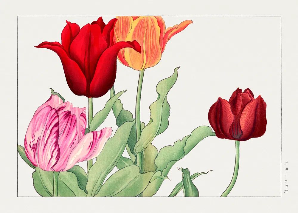
The key is consistency of mood rather than matching subject matter exactly. A peony wall looks more refined when every piece shares one or two qualities — similar paper tone, muted pigments, or vintage-inspired line work.
Best Rooms for Botanical Peony Wall Art
Bedrooms are the natural first choice because peonies soften the hard lines of bed frames, wardrobes, and lamps. Center a single print 15 to 20 cm above the headboard, or hang a balanced pair spaced 6 to 10 cm apart. In a bedroom, blush, cream, and faded sage tend to work better than high-contrast black frames unless the room already has strong dark accents.
Living rooms benefit from larger-scale placement. Over a 180 cm sofa, aim for art that covers roughly 60 to 75 percent of the sofa width. That means a pair of 50x70 cm framed prints, or one larger piece around 70x100 cm, usually feels right. If you already own pieces from our nature wall art selection, peony illustrations can soften landscapes and add detail to a mixed gallery wall.

Hallways and home offices are often overlooked, but both suit floral studies extremely well. In a hallway, two vertical prints can add rhythm without making the passage feel narrower. In a home office, one botanical illustration peony print above a shelf or credenza can offset screens, cables, and square furniture edges. Choose a piece with cream background tones so the room stays calm during long work hours.
How to Build a Palette Around Peony Artwork
Peony art works best when 70 to 80 percent of the room stays neutral. Cream, warm white, putty, light taupe, and pale greige give the floral detail room to breathe. Then pull 1 or 2 accent shades from the artwork — usually blush, dusty pink, sage, olive, or deep leaf green. That is enough to make the wall art feel integrated rather than isolated.
If your peony print has pink petals, repeat that color lightly through textiles rather than large furniture. A cushion edge, a throw, or a ceramic object is often enough. For fresher contrast, pair floral art with green-based companions from our botanical art prints such as foliage, tulips, or decorative vine studies.
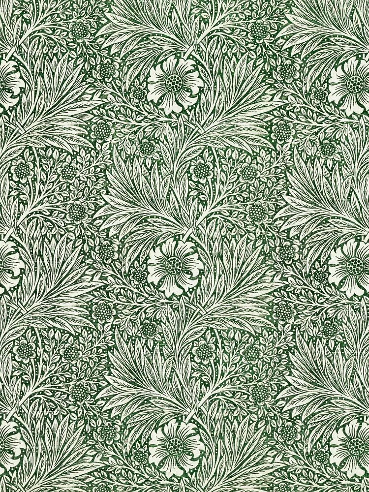
A more heritage look comes from pairing peony-inspired florals with deeper tones — moss, walnut, muted burgundy, and aged brass. Pieces like Marigold by William Morris show how floral color can feel rich rather than pastel. If you prefer an airy scheme, keep frames in natural oak and limit the palette to cream, blush, and one green note.
Sizing, Framing, and Hanging Tips
Scale makes more difference than style. For small walls under 90 cm wide, a 30x40 cm or 40x50 cm print is usually enough. For medium walls — above a bedside table, desk, or chest — 50x70 cm gives you proper presence. On larger feature walls, a pair of 50x70 cm prints or a single 70x100 cm piece creates a stronger anchor.
Frames should support the art, not compete with floral detail. Oak frames warm up blush and cream petals. Thin black frames sharpen vintage botanical work and suit more modern rooms. White frames can work, but only if the wall color has enough contrast; on bright white walls they often lose definition. A mat around 4 to 8 cm wide helps detailed floral studies feel more finished and gallery-like.

When hanging a small gallery wall, keep spacing consistent at 5 to 8 cm between frames. The center of the grouping should usually sit around 145 cm from the floor. If you mix floral works with patterned botanicals, balance one detailed piece with one quieter one so the eye has a place to rest. That is especially useful when combining a botanical illustration peony print with decorative works like Honeysuckle by William Morris.

Styling Ideas for Seasonal and Gift Moments
Peony artwork is easy to refresh for spring without redecorating the entire room. Swap in lighter textiles, bring in one branch or fresh stems, and let the floral print carry the seasonal shift. Even one framed peony study on a shelf can change the mood more effectively than several small accessories.
For weddings, housewarmings, and birthdays, floral botanical art is a safer gift than trend-based abstract work because it suits more interiors. Choose medium sizes like 40x50 cm or 50x70 cm, which are practical for apartments and easier to frame if gifting unframed. If the recipient likes classic interiors, look toward the vintage art collection; if their home is cleaner and more contemporary, browse the fine art selection alongside botanical studies for softer pairings.
A good gift rule is to match the print to the room they use most. A calm floral for the bedroom feels intimate, while a more structured botanical suits an office or hallway. If you want to build a set, pair one bloom-focused print with one foliage or textile-inspired floral so the arrangement feels layered, not repetitive.
Final Tips for Shop-Worthy Peony Displays
The most successful peony walls are edited. Choose one main floral direction — archival botanical, soft watercolor, or decorative vintage — and repeat it with restraint. Two coordinated prints will usually look stronger than five unrelated florals competing for attention.
Start with the room mood, then choose the art. If the space needs softness, go lighter and airier. If it needs structure, choose cleaner line work or deeper floral contrast. Botanical illustration peony styling works best when the wall feels intentional, measured, and calm rather than overly sweet.
Frequently Asked Questions
What frame color works best with peony prints?
Natural oak is the most versatile because it warms pink and cream tones without overpowering them. Thin black works well if the room already has dark accents like iron lighting or black side tables.
Can peony wall art work in small rooms?
Yes — just keep the scale focused. One 30x40 cm or 40x50 cm print with a mat often looks cleaner than several tiny pieces on a compact wall.
Should I use glass or acrylic for framed botanical prints?
Acrylic is lighter and easier for larger frames, especially at 50x70 cm and above. Glass gives a crisper feel but is heavier and better for smaller, more formal arrangements.
What other floral subjects pair well with peonies?
Roses, tulips, and chrysanthemum studies pair especially well because they share rounded forms and layered petals. Foliage or vine-based botanicals also help break up repeated bloom shapes.