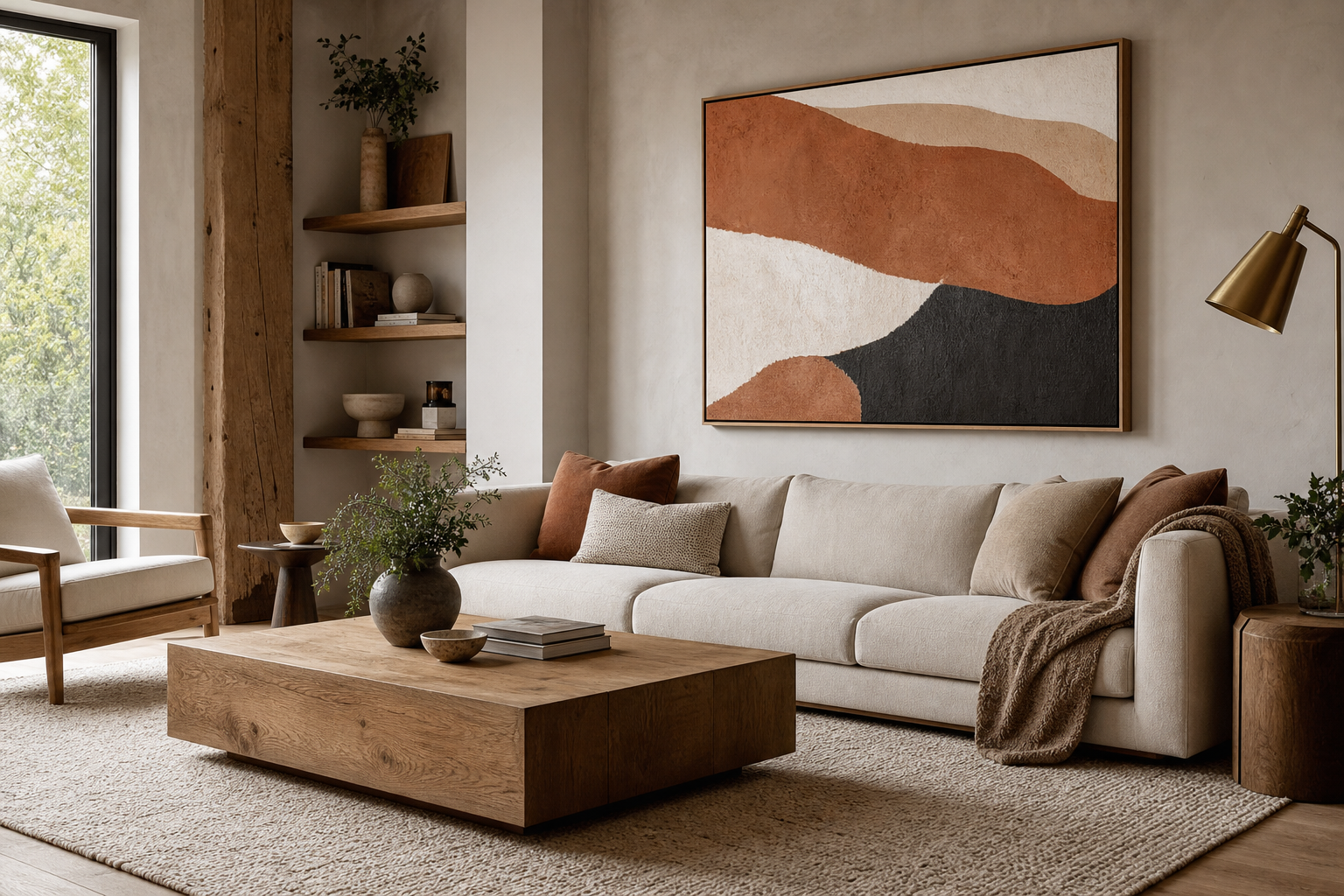
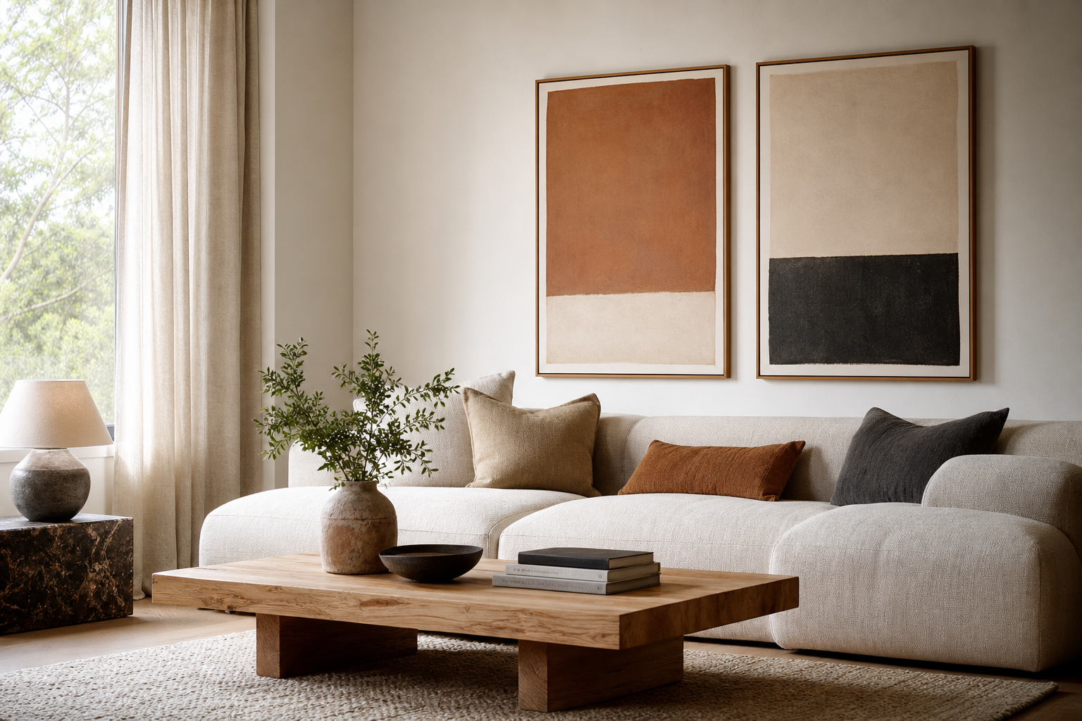
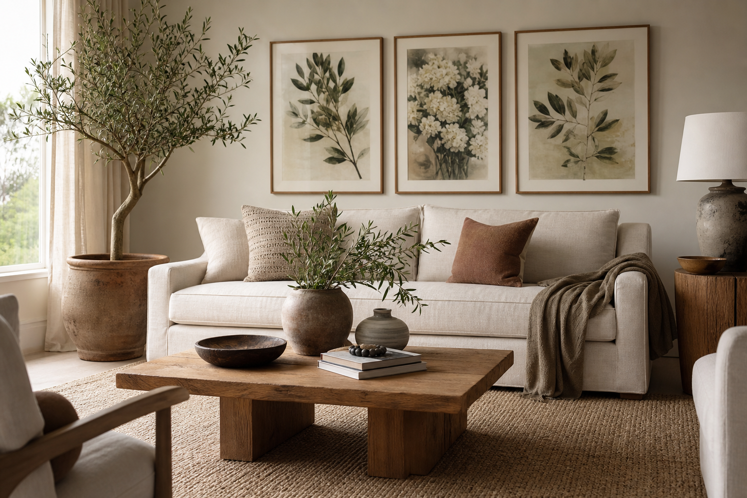
Botanical poster prints have a rare advantage in decorating: they add detail without making a room feel busy. A leaf study, floral illustration, or vintage garden motif introduces shape, color, and movement in a way that still reads calm. That balance is why they work just as well in pared-back Scandinavian rooms as they do in layered, traditional interiors.
Nature-based art also ages well because it is not tied to one short trend cycle. A room may shift from warm neutrals to olive accents, or from black metal to oak finishes, yet a thoughtful piece from our botanical collection still feels relevant. If you want wall art that can move from a bedroom to a kitchen or hallway over the years, botanical poster prints are one of the safest and most versatile choices.
Why Botanical Prints Never Feel Out of Style
Botanical themes stay current because they connect to forms people already live with: branches, petals, vines, seed heads, and organic silhouettes. These shapes soften straight architectural lines — think square shelving, flat cabinet fronts, or a large rectangular sofa. Even a single framed print can break up that rigidity and make a room feel more relaxed.
They are also easy to update seasonally without replacing the art. In spring, botanical work feels fresh next to pale linens and glass vases. In autumn, the same print can look richer beside walnut wood, rust textiles, and deeper green tones. That flexibility is one reason many customers start with vintage-inspired wall art or nature prints and keep them in rotation for years.

Choosing the Right Botanical Mood
Not all botanical art creates the same atmosphere. Delicate florals tend to feel softer and more decorative, especially in bedrooms, guest rooms, or reading corners. A piece like Vintage Rose Botanical Poster suits spaces with curved furniture, lighter fabrics, and muted palettes because its detailing brings elegance rather than contrast.

Vintage herb studies and archival-style illustrations feel more collected and grounded. They work particularly well in kitchens, dining spaces, and hallways where you want something timeless rather than sweet. If your room already has aged brass, dark wood, or shaker-style cabinetry, looking through our classic botanical art prints and fine art collection can help you find pieces with that slightly scholarly, layered character.
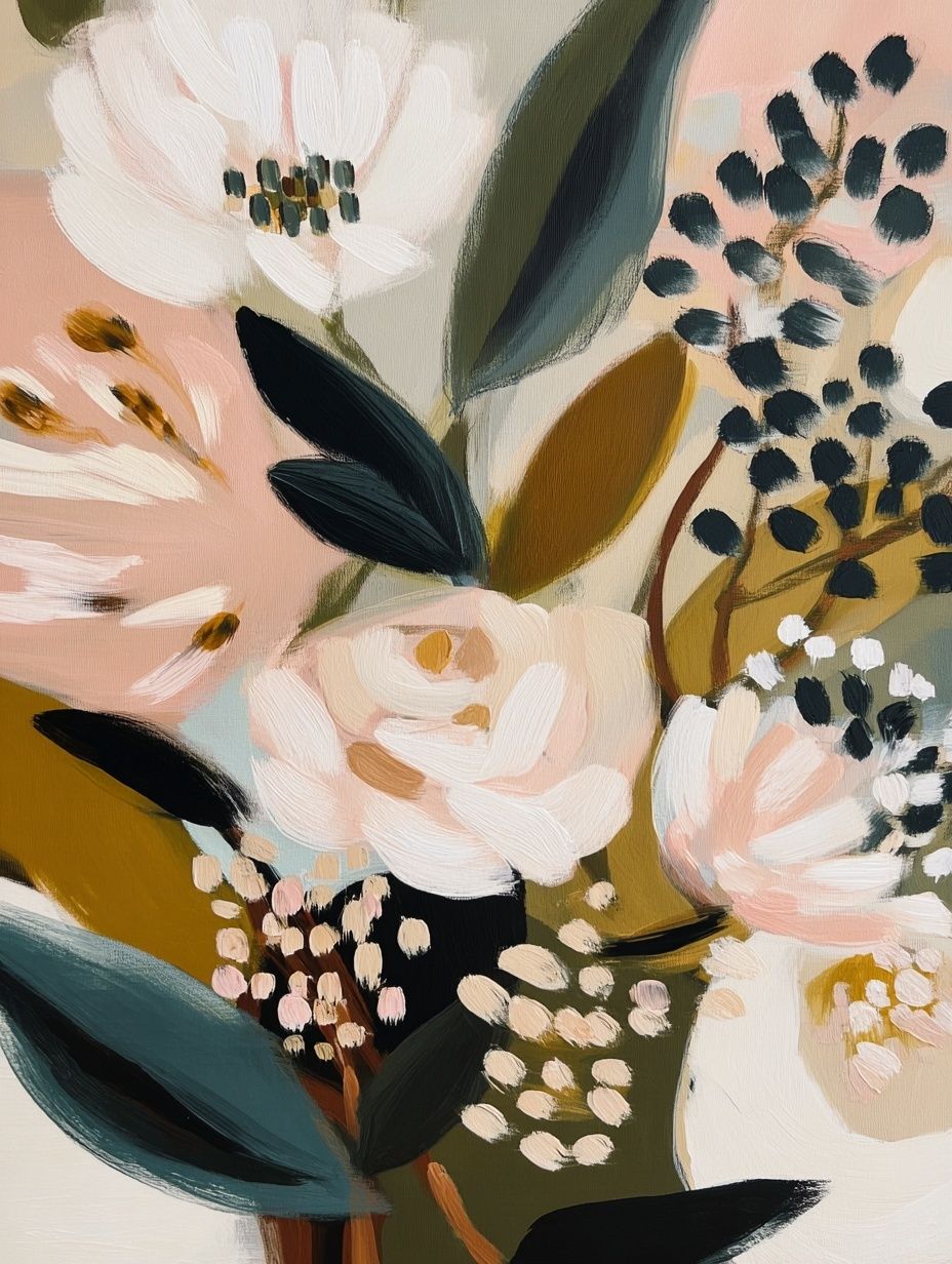
For a cleaner look, choose simplified flowers or line-led compositions. These sit comfortably in modern homes where every item needs visual discipline. minimalist art prints can bridge the gap between botanical subject matter and a spare interior, especially if you prefer white walls, black frames, and limited color variation.

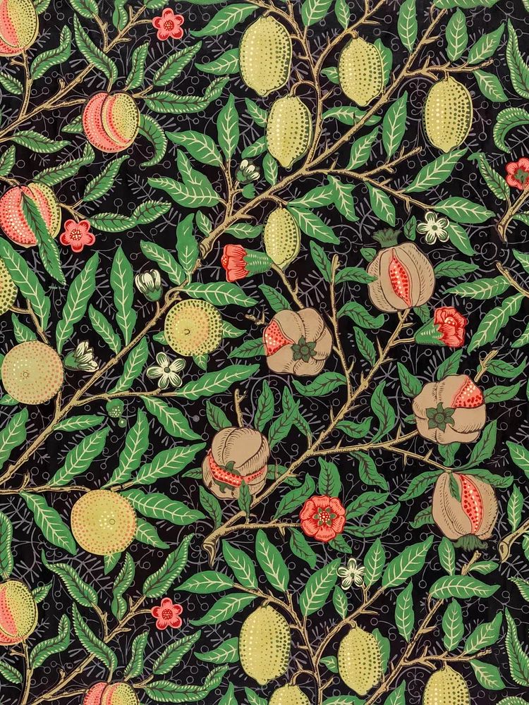
If you want more fullness and pattern, William Morris designs are especially effective. Their repeating leaves, flowers, and vines create a room with more rhythm and texture, which can make a plain wall feel finished quickly.
How to Match Prints to Your Room Palette
The simplest way to choose botanical poster prints is to match their color temperature to the room. Warm rooms — with beige, terracotta, camel, or honey wood — usually suit cream backgrounds, dusty pink florals, ochre details, and softer greens. Cooler rooms — with grey, charcoal, blue, or crisp white — often look better with eucalyptus, forest green, black line work, or desaturated sage.
Use one dominant art color that already appears in the room at least twice. For example, if you have olive cushions and a moss-toned throw, choose a botanical print with similar green notes. That 2-to-1 repetition makes the wall art feel integrated instead of added as an afterthought. In very neutral rooms, a floral print with one stronger shade can act as the accent, but limit that new accent to around 10 to 15% of the visible palette for a balanced look.
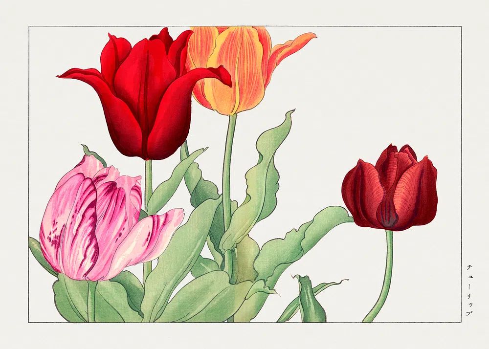
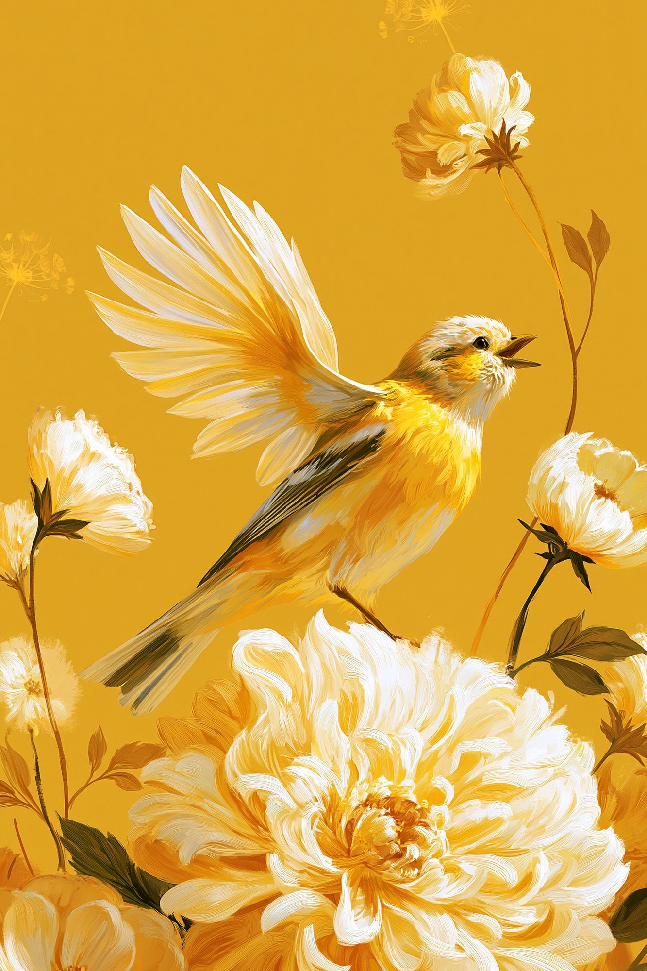
A practical trick for gallery walls is to keep either the background tone or frame finish consistent. Four pieces can contain different subjects — tulips, leaves, birds, and stems — but if all four share soft ivory grounds or the same oak frame, the arrangement reads as one story.
Sizing, Framing, and Layout Ideas
Scale matters more than people expect. Above a bed, sofa, or sideboard, aim for artwork that covers roughly 60 to 75% of the furniture width below it. Over a 160 cm bed, that means a total art span of about 96 to 120 cm. You can get there with one 70x100 cm statement piece or a pair of 50x70 cm frames with 7 to 10 cm spacing between them.

For more decorative rooms, patterned botanicals can carry a wall on their own. William Morris's vintage pomegranate flowers has enough detail to work as a focal point in a hallway or above a console, especially in a larger size like 50x70 cm or 70x100 cm.
Frame finish changes the entire impression. Oak feels lighter and more relaxed. Black sharpens the outline and suits contemporary rooms. Gold or brass-toned frames bring out warmer floral shades and pair well with antique details. If the artwork is intricate, use a wider mount — around 5 to 7 cm — to give the image breathing room.
If you are building a set, mix one hero piece with quieter companions. Pair a dense pattern with simpler studies from our botanical wall art range or a restrained piece from the illustration collection so the arrangement does not feel equally busy in every frame.
Best Places to Hang Botanical Art
Bedrooms are the easiest starting point because botanical subjects naturally support a restful mood. Place one larger print above the headboard or two medium works stacked vertically on a side wall if the bed wall already has sconces. Soft florals and stems are especially effective here because they introduce movement without the visual energy of bold abstract shapes.
Kitchens benefit from vintage or herbarium-style pieces. Hang them near a breakfast nook, above open shelving, or on the wall leading into the dining area. Keep at least 20 to 30 cm of distance from direct heat or heavy steam if placing them near a cooker. In smaller kitchens, a 30x40 cm or 40x50 cm frame often looks more considered than trying to force a large statement piece.
Hallways and home offices are strong candidates too. A narrow corridor can take a vertical series of two or three botanicals to draw the eye forward. In a work area, leaf or branch motifs feel calmer than high-contrast graphics, which helps the room stay visually steady during long hours at a desk.

How to Create a Fresh, Layered Look
The best botanical walls do not rely on art alone. They feel richer because the room repeats the same natural language in three or four places — wall art, greenery, wood grain, woven texture, or floral fabric. Start with the print, then echo one element nearby. If the art has slender stems, place a tall branch in a ceramic vase below it. If it has warmer blooms, pull that tone into a cushion or lampshade.
Mirrors and shelves also help. A small mirror next to framed botanicals reflects light and stops the arrangement feeling too flat. A picture ledge lets you overlap one or two smaller pieces with a vase or candle holder, which makes the display look collected rather than rigid. Keep overlap modest — around 2 to 4 cm — so the art still reads clearly.
Pattern mixing works best when one pattern is organic and the other is simple. Botanical wall art can sit easily with a narrow stripe, a small check, or a solid linen texture. If your room already has a floral curtain or bedspread, choose more restrained pieces, such as Vase with Flowers — Minimalist Print, to avoid visual competition.
Shop Tips for Picking Prints You’ll Love Long Term
Buy for versatility first, intensity second. A print that works in both a bedroom and a hallway is likely to stay with you longer than one that only suits a very specific color scheme. Mid-tone greens, soft creams, muted pinks, and botanical line work are generally easier to reframe and relocate than very bright tropical palettes.
Material quality matters because botanical art often depends on subtle detail. Fine lines in petals, faded tonal shifts, and paper-like backgrounds need crisp printing to look refined from both 1 meter away and across the room. When you browse our Marigold by William Morris or Tulip Bouquet — Botanical Print, think about whether the piece still feels appealing beyond one current trend board. If the answer is yes, it is usually a strong long-term choice.
Final thoughts
Botanical poster prints work because they bring shape, softness, and color into a room without asking for a complete redesign. They can be classic, modern, romantic, or minimal depending on the subject, frame, and palette you choose.
Start with one piece that matches your room's mood, then build around it with texture, scale, and a few repeated natural elements. Done well, botanical wall art makes a space feel more alive and more settled at the same time.
Frequently Asked Questions
What frame color works best with botanical prints?
Oak is the safest all-round choice for botanical art because it adds warmth without overpowering the image. Black works best in modern rooms, while brass-toned frames suit vintage florals and richer patterns.
Can botanical wall art work in a small room?
Yes — use one 30x40 cm or 40x50 cm piece, or a tight pair of smaller frames. Lighter backgrounds and slim frames help the wall feel open.
Should I choose glass or acrylic for framed prints?
Acrylic is lighter and easier to hang, especially for larger sizes like 50x70 cm and above. Glass offers a slightly crisper surface but is heavier and more fragile.
How high should I hang botanical prints?
As a guide, place the center of the artwork around 145 to 150 cm from the floor. Above furniture, leave roughly 15 to 25 cm between the frame and the top edge of the piece below.
What pairs well with botanical prints besides plants?
Ceramic vases, woven shades, linen textiles, and antique brass details all work well. They repeat natural texture without making the room feel overly themed.