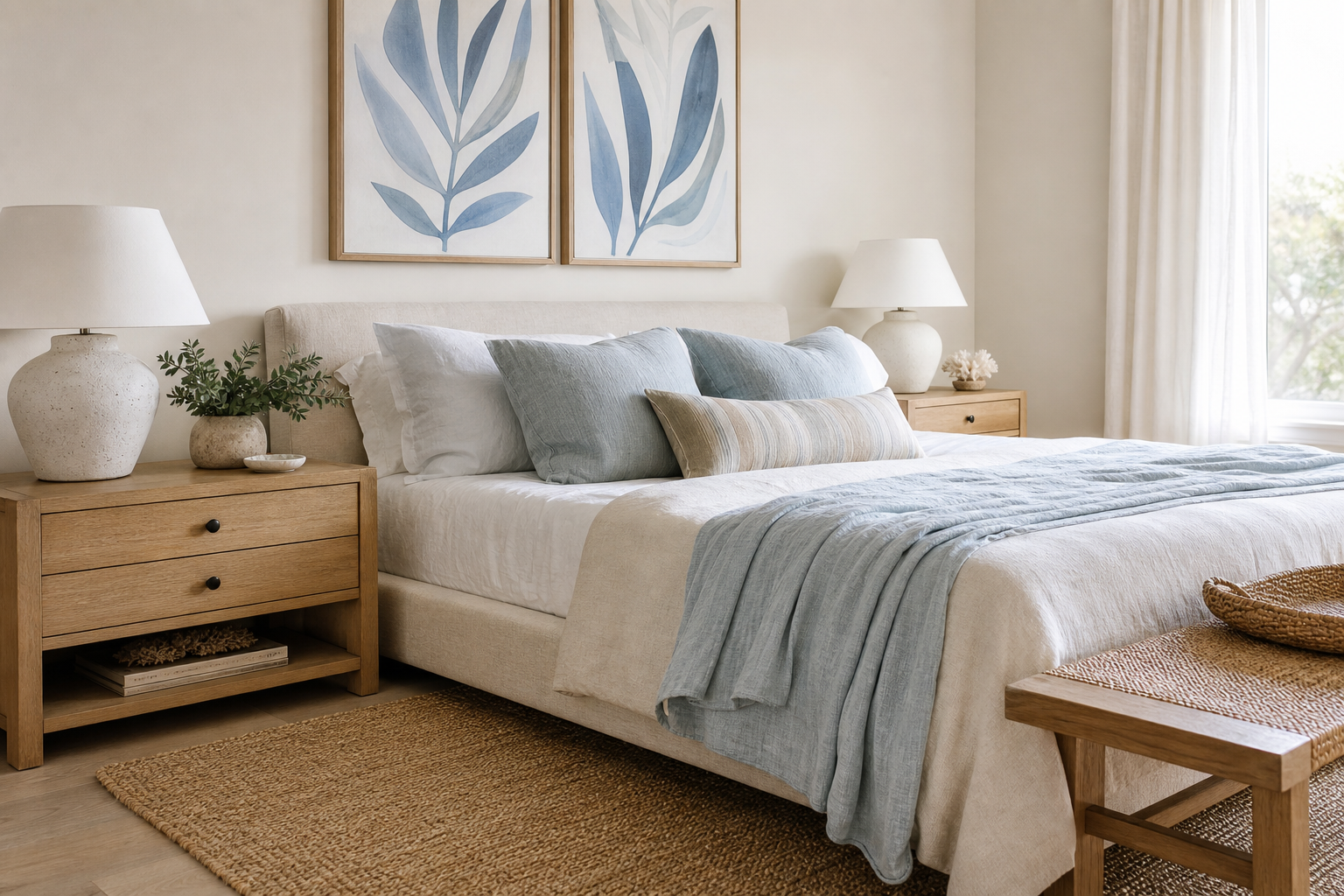
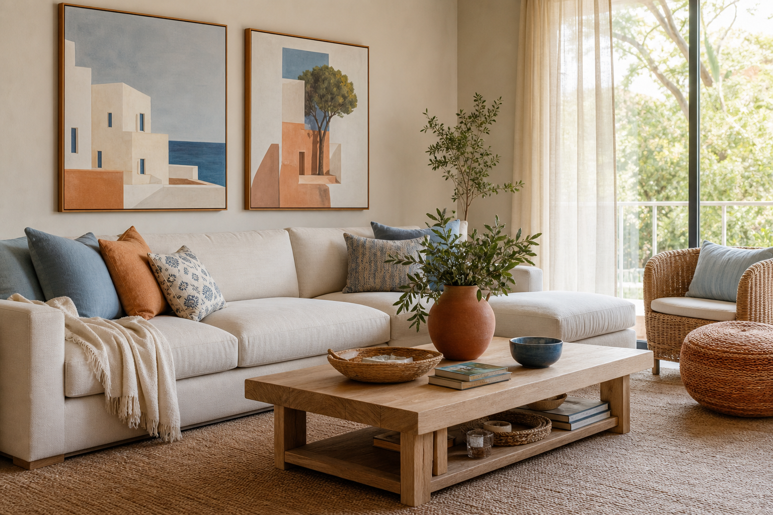
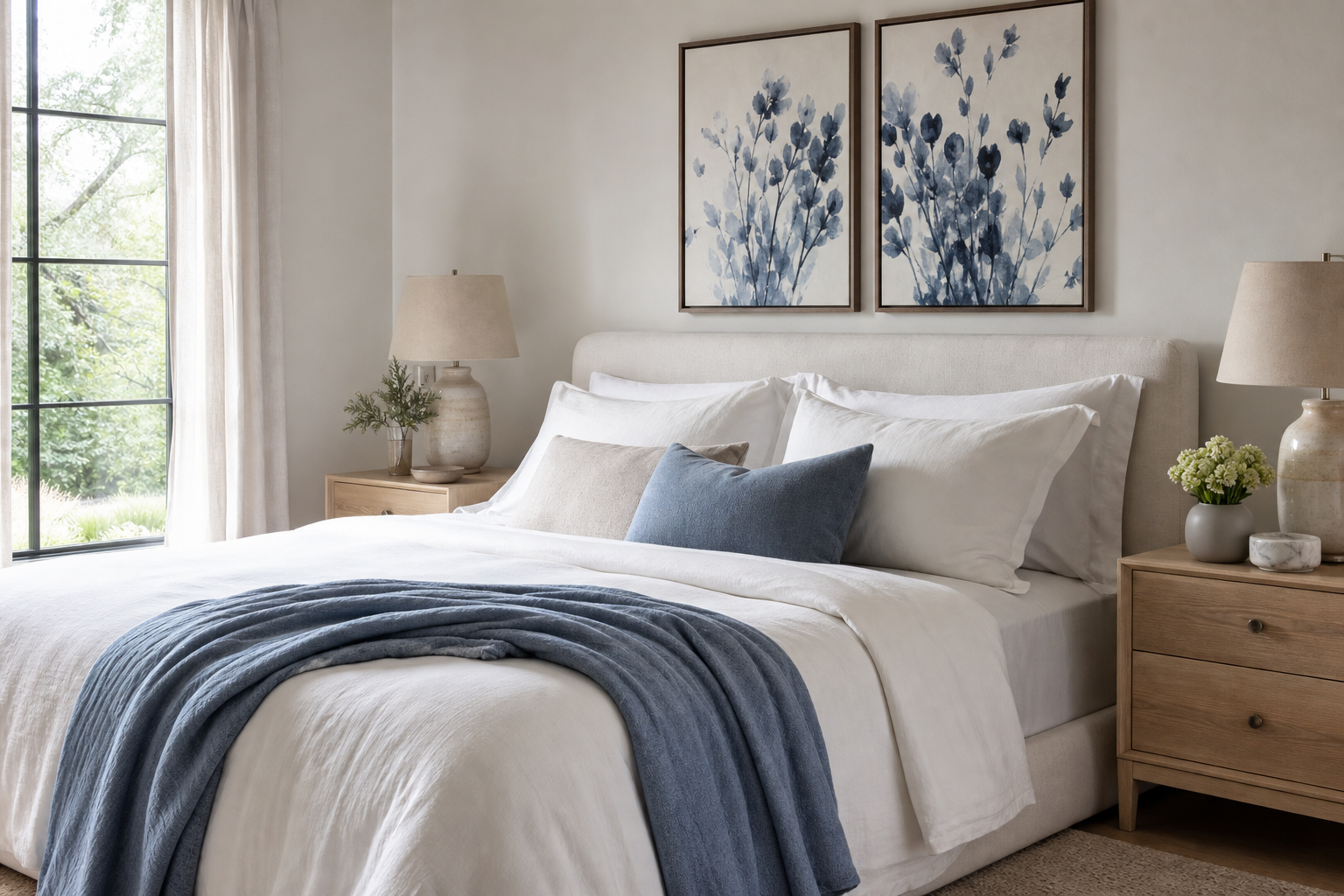
A blue floral poster print does two jobs at once: it introduces color without noise, and pattern without clutter. Blue reads as steady and restful in most interiors, while floral forms keep it from feeling cold. That balance makes it useful in rooms that need softness but still benefit from structure.
Why Blue Florals Work So Well
Blue sits in a rare middle ground. Darker versions such as navy feel grounded and tailored, while lighter tones such as sky and powder blue open a room visually. Floral motifs add movement through curved stems, petals, and layered leaves, which is why a botanical collection can soften hard architectural lines like square shelving, black metal frames, or a large straight-backed sofa.
A blue floral poster print also bridges classic and modern styling better than many trend-led motifs. Traditional interiors already understand florals, especially when the artwork draws from historic textile and garden references. Modern rooms benefit because blue florals bring in organic detail without the visual weight of heavy landscapes or dense geometric patterns. If you like collected interiors, pieces from our fine art selection and vintage-inspired botanical prints layer especially well with this look.
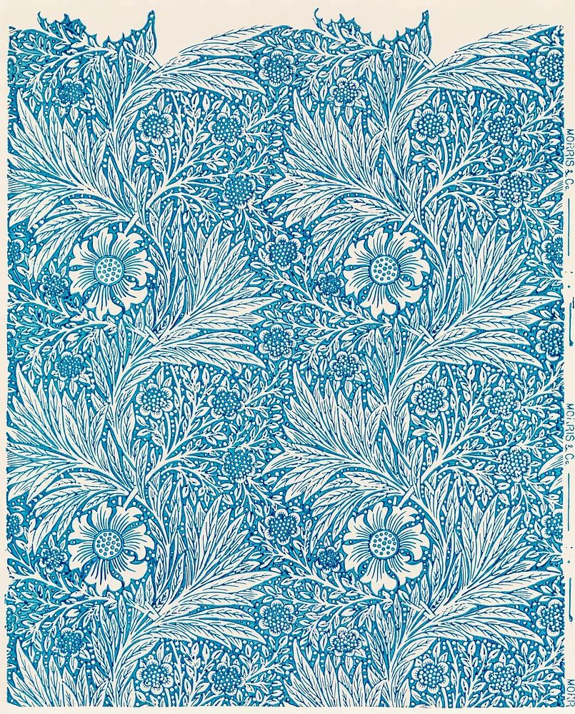
Historic blue florals tend to work because their palettes are disciplined. A piece like William Morris's Blue print uses repetition and negative space to keep ornament feeling refined rather than busy. That matters in smaller rooms, where one strong pattern often has more impact than several competing accents.
Choosing the Right Shade of Blue
Navy blue is the most architectural option. It pairs cleanly with white walls, walnut wood, black lighting, and warm brass. If your room already has contrast — charcoal upholstery, dark timber, or iron hardware — navy floral art reinforces that depth and prevents the wall from looking washed out.
Cobalt is brighter and more decorative. Use it when the room needs energy: a reading nook, entry wall, or creative studio corner. Cobalt also plays well with terracotta, rust, and ochre, which is why it can sit comfortably near pieces from our bohemian art prints without feeling disconnected.
Sky blue and dusty blue are easier in bedrooms and calm living rooms. These shades work well with off-white walls, flax linen, pale oak, and soft grey upholstery. If your palette is already quiet, choose artwork with visible stems, layered petals, or trailing foliage so the piece still has presence from 2 to 3 meters away.

When matching blue to your room, use a simple 60-30-10 ratio. Let the wall and large furniture hold roughly 60% of the visual field, secondary tones such as wood and textiles take 30%, and artwork provide the final 10% accent. In practical terms, a blue floral piece should echo at least one other blue note in the room — a cushion, throw, book spine, or vase — so it feels integrated rather than isolated.
Best Rooms for a Blue Floral Poster Print
Bedrooms are the easiest fit because blue supports rest. A single vertical print above a nightstand works well in small spaces, while one large horizontal piece above a 140 to 180 cm bed creates a calmer focal point than multiple tiny frames. If you want a quieter composition, mix blue florals with restrained pieces from our minimalist wall art collection.
Living rooms benefit when the artwork introduces softness to balance larger furniture volumes. Hang one statement piece above a sofa, or place two coordinated floral works side by side over a console. In open-plan layouts, blue floral art can visually connect seating and dining zones without adding more furniture or accessories.
Home offices are often overlooked, but blue is useful there because it reduces visual agitation. A floral print above a desk or on the wall opposite your screen gives the eye a place to rest. Hallways also respond well to this style because the pattern adds interest in a narrow footprint, especially where there is little room for shelves or decor.

If you want a room that feels lighter and cleaner, pair a detailed botanical with a simpler adjacent piece like White Flower Silhouette. That mix keeps a blue floral poster print from making the wall feel overly ornate.
Sizing, Placement, and Framing Tips
For a single piece above furniture, aim for artwork that spans 55% to 75% of the furniture width. Over a 160 cm sofa, that means roughly 90 to 120 cm total width. Common single-print sizes such as 50x70 cm and 70x100 cm are reliable starting points. In narrower areas like hallways, 30x40 cm or 40x50 cm vertical formats feel proportionate.
Hang the center of the piece at about 145 cm from the floor in most rooms. Above furniture, leave 15 to 25 cm between the top of the sofa, headboard, or console and the bottom of the frame. Closer spacing feels more intentional; gaps over 30 cm often make the artwork look disconnected.

Frame choice changes the mood quickly. Natural oak makes blue florals feel fresh and Scandinavian-leaning. Black frames sharpen the composition and suit modern rooms with stronger contrast. Gold or brushed brass finishes bring out the decorative side of heritage-inspired florals, especially alongside pieces like William Morris's Honeysuckle (1876).
How to Build a Gallery Wall Around It
A strong gallery wall needs one lead voice and two supporting ones. Let the floral piece be the anchor, then add one abstract or minimalist work for breathing room and one botanical or nature-based print for continuity. This 1:2 balance helps the wall feel collected rather than repetitive.

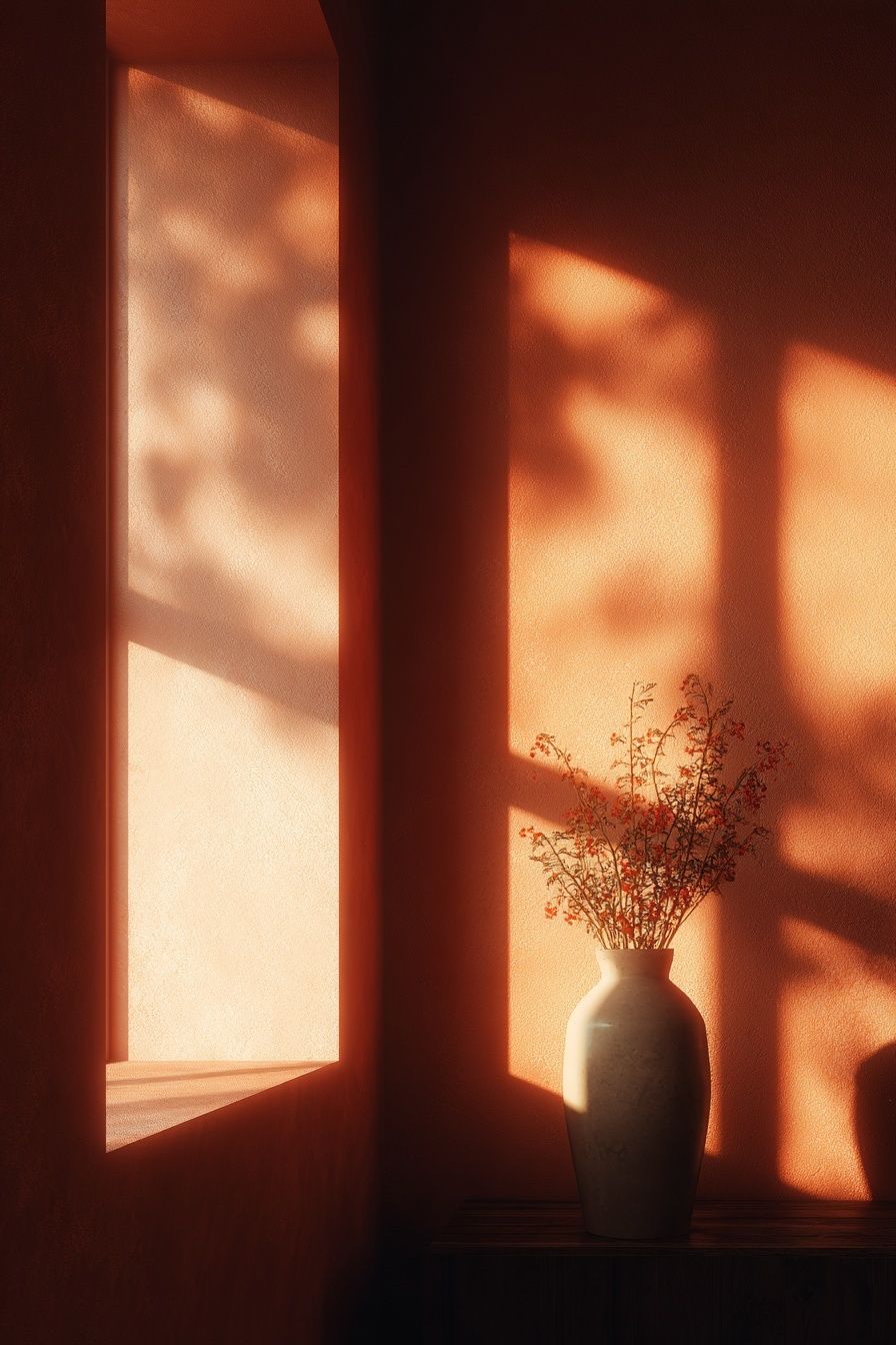
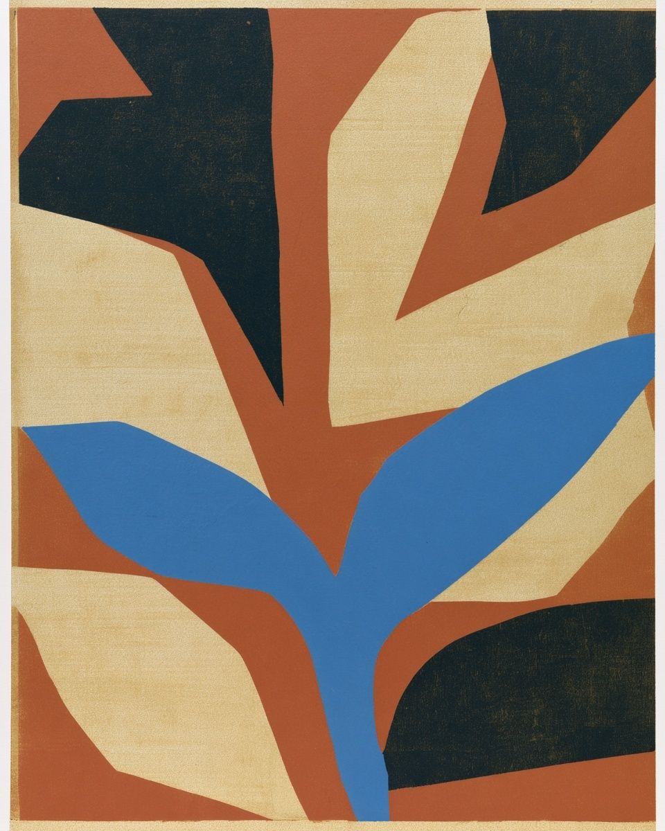

Spacing matters as much as content. Keep gaps between 5 and 8 cm for a tighter salon-style cluster, or 8 to 12 cm for a cleaner modern arrangement. Start with the largest piece slightly off-center rather than perfectly centered — that usually feels more natural in lived-in interiors.
A useful combination is a decorative floral, a pared-back line or silhouette piece, a softer landscape, and one pattern-led work. That creates variation in density. Browse our nature prints for airy supporting pieces, or explore mid-century modern wall art if you want stronger shape and color blocking beside florals.
Styling Ideas by Mood and Season
For a serene look, keep the palette within blue, ivory, stone, and pale wood. Add washed linen, ribbed ceramics, and a simple table lamp with a parchment or off-white shade. This works especially well with cooler blue botanicals and pared-back floral silhouettes.
For a coastal direction, combine blue floral art with sand tones, weathered oak, striped textiles, and glass accessories. The key is restraint: one or two sea-toned accents are enough. Too many obvious nautical references flatten the look. A softer landscape, such as Serene Landscape — Watercolor Print, can support the palette without competing with the floral subject.
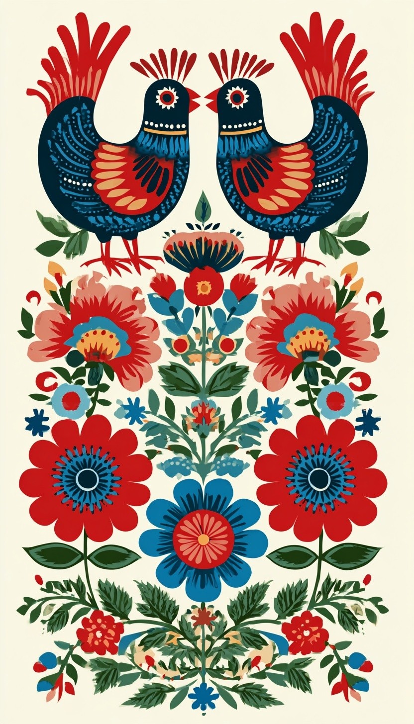
For a more romantic wall, bring in curved shapes, antique brass, and richer textiles like velvet or slub cotton. Blue pairs beautifully with mauve, faded rose, and warm cream. If you want more pattern, pieces from our ornamental botanical art and select works in the illustration collection can add layered detail without shifting away from the floral theme.

Spring styling benefits from fresh greens and clearer whites, while autumn versions of the same wall can shift through deeper woods, heavier textiles, and darker blue notes. The artwork can stay the same; changing the surrounding accessories by even 20% is often enough to refresh the room.
Final Thoughts and Easy Shop Tips
A blue floral poster print is one of the safest ways to add color while keeping a room composed. It suits bedrooms, living rooms, workspaces, and transitional areas because it combines the calming effect of blue with the easy familiarity of botanical forms.
When choosing your final piece, focus on three things: the blue tone, the scale, and the frame finish. Start with the room palette, then choose a size that fills at least half the wall zone above your furniture, and finish with a frame that matches your hardware or wood tones. If you want a timeless starting point, explore our botanical wall art first — it offers the strongest foundation for a blue floral poster print that will still feel right after seasonal styling changes.
Frequently Asked Questions
What frame color works best with blue floral art on white walls?
Natural oak is the easiest choice for a soft look, while black creates more contrast. If your room has brass lighting or handles, a warm metallic frame can also work well.
Should I use a mat around a floral print?
A white mat helps detailed florals breathe, especially in smaller sizes like 30x40 cm or 40x50 cm. It also makes the piece feel more finished in classic interiors.
Can blue floral wall art work in a room with beige furniture?
Yes — beige and blue are one of the most reliable pairings. Add one or two blue accents elsewhere in the room so the artwork feels connected to the palette.
How many pieces should I use in a floral gallery wall?
Three to five pieces is enough for most walls under 180 cm wide. Mix one detailed floral anchor with simpler supporting works so the arrangement stays balanced.
What paper finish is best for a calm, elegant look?
Choose a matte or lightly textured paper rather than a glossy finish. It reduces glare and gives floral details a softer, more refined appearance.